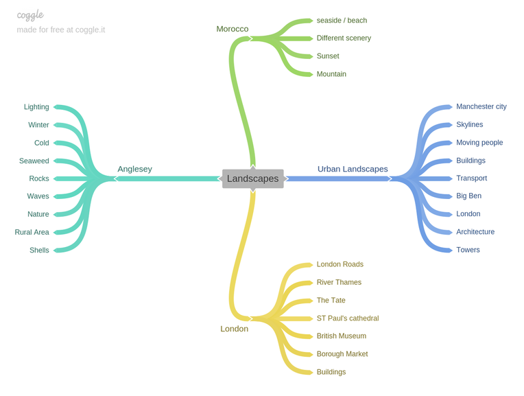
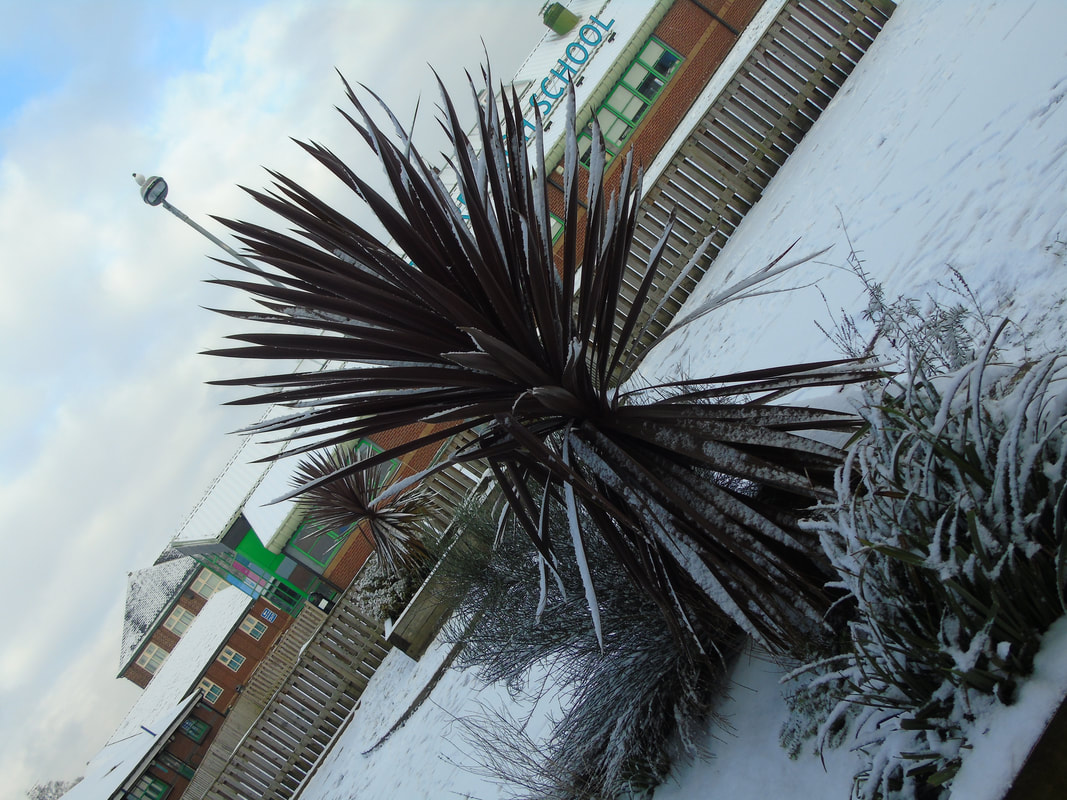
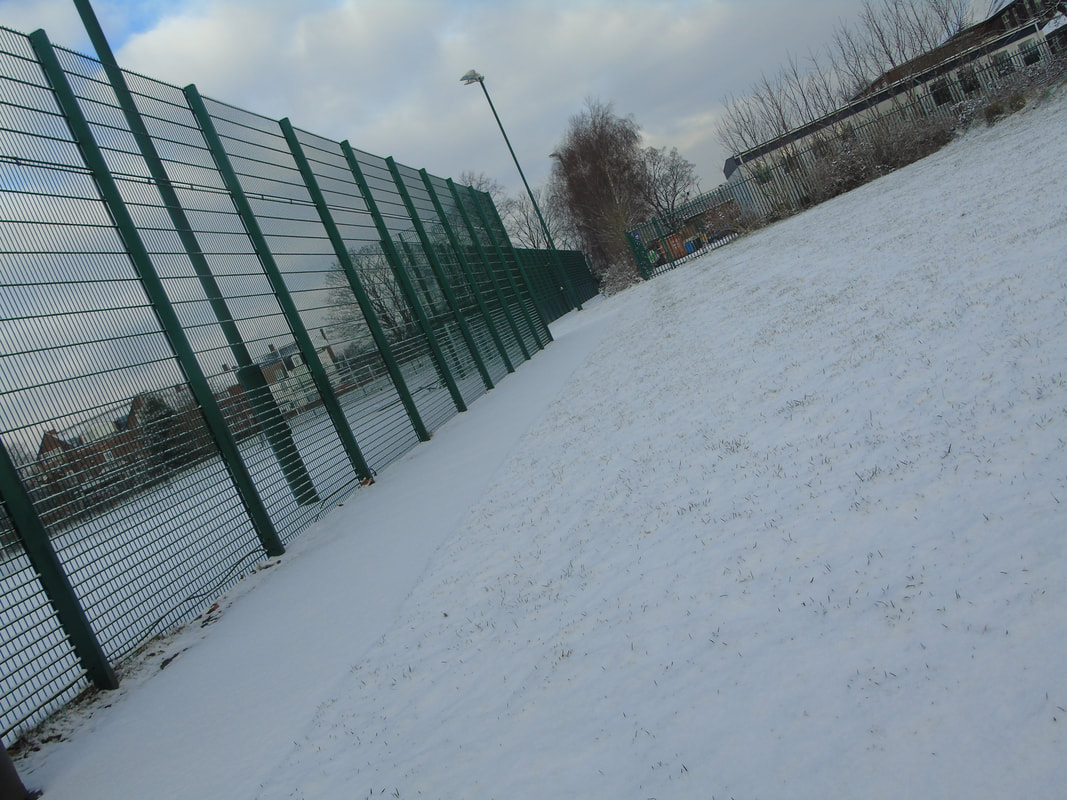
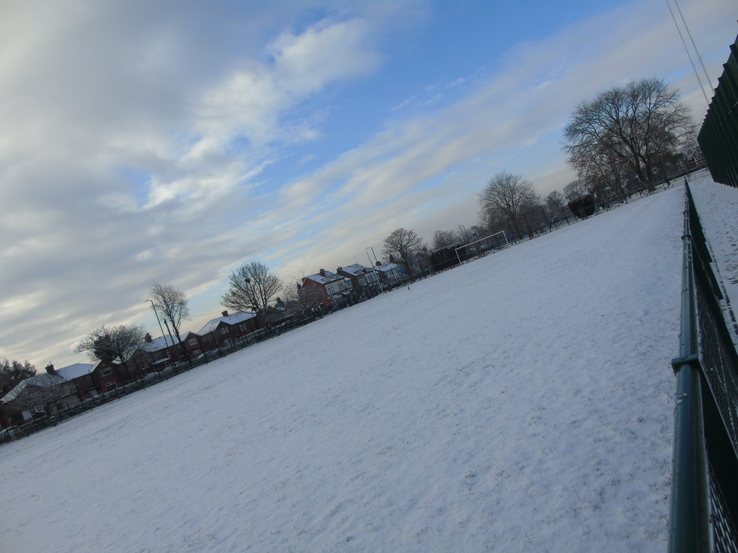
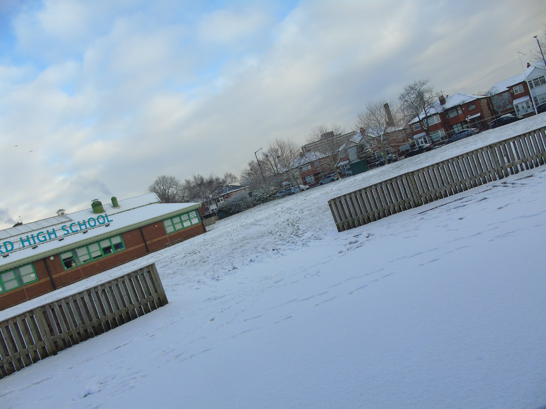
Changing landscapes
Statement of Intent
I aim to work on a project with the theme 'landscapes' to demonstrate my understanding of the differences between landscapes, such as urban and rural. I strive to produce a portfolio with all my images and my own ideas and also the development of my own images. At the end of this project, I intend to have all my developed images together so they are easily viewed.
I will begin this project my researching different photographers, to see which one links the best to the theme 'landscapes' and also my work. So far I have two photographers in mind to get my inspiration from, such as Irene Suchoki and James Mathews. I specifically chose these photographers because their work has given many ideas on what images I should be taking and the techniques I should use. I particularly want to work around Irene Suchocki's images as they link to my work the most. The majority of her landscape images are urban, she captures images in, New York, London, Paris of all the different types of buildings. I also plan to go to London to capture my images, therefore her London images will inspire me the most. However, I do intend to also look at James Mathews photography and also other photographers based on the theme 'landscapes' in more depth to gain more ideas and inspiration for my own work.
The reason I chose to work on the theme landscapes is because, I feel that the world in this day and age is developing a lot, such as new buildings are being built, and the different landscapes are being developed, so this project is the perfect opportunity to show this in my work and also all the different landscapes there are and the contrast in them.
When I first chose this theme my initial thoughts on landscapes was, buildings, mountains, and fields, however as I did more research around the theme I realised there were many more routes to go down and more to go into, such as plants, sea, sky/clouds, rocks, designs, architecture, sunset, and nature. This has broadened my mind and given many ideas on the images I should be capturing.
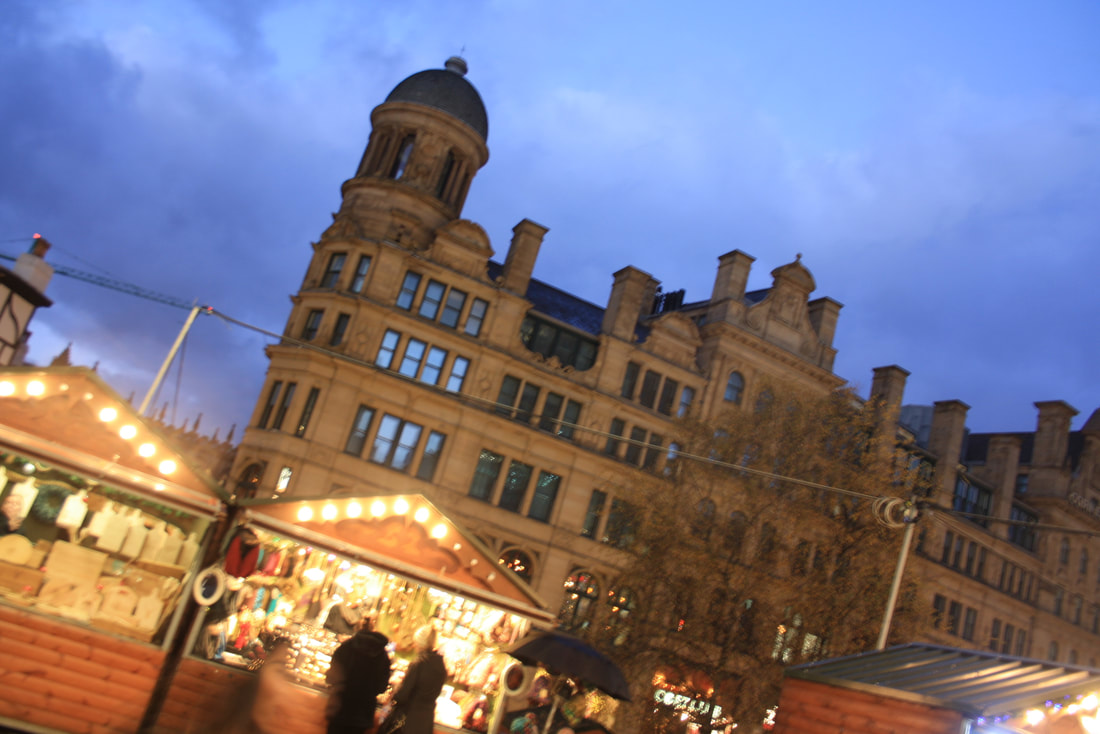
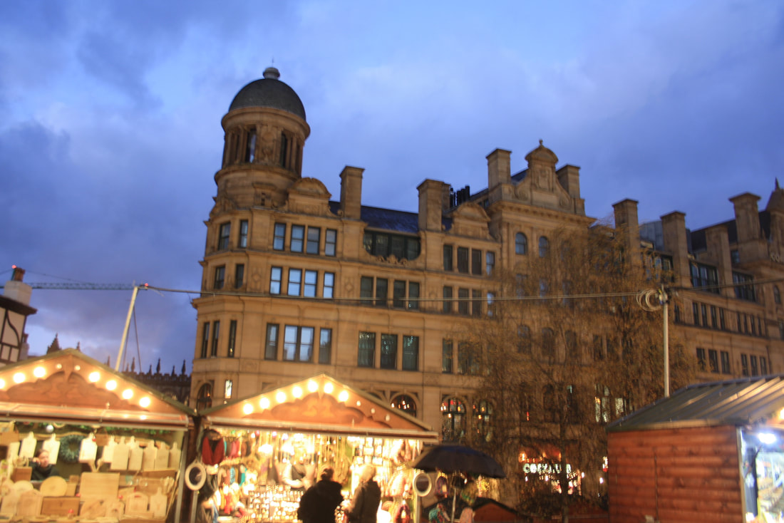
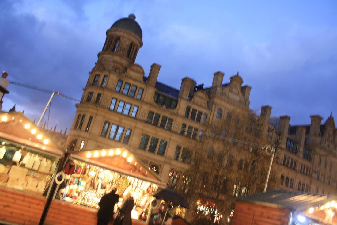
To show progression in my work I will start by capturing the basics of my local town and also I intend to go to different places such as London in the summer to capture different urban landscapes. When I go to London I hope to get images of the different buildings there are the busy roads of London, different styles and designs of the Buildings and also the skyline view of London. I also hope to go to a rural landscape where there aren't many buildings and people, to show the contrast between both of the different landscapes. During winter time in November, I plan to go Manchester Town to capture images of the European market and also the different buildings, however, this will be in the dark, this will show the difference of urban landscapes in the night and day.
After I have the majority of my images, I will start to develop my images by using Photoshop. I will experiment on a wide range of techniques to develop my work and see which techniques/effects work the best. To do this I will have to be creative and also do some research to gain ideas and inspiration from other photographers or peers for my own images. I will push myself further and ask my teachers what I can do to improve my work and how to get it to a higher standard. This will help me to get the grade I want.
I will be working on this project for a few months, this will give me plenty of time to work on it, as I want to visit different places to capture different images. In the first week, I want to get my artist research finished and have a solid idea on what I want to be working on and how I will achieve that. In the third/fourth week, I want to start capturing my images and to develop my portfolio. After that, I would need to start developing my work by using Photoshop and to get my final bank of complete and developed images.
As my project progresses I will add more to my portfolio such as mood boards, best and worst images, analysis of different images, this clearly shows my understanding of the theme landscapes. After my final piece has complete I will write an evaluation on the whole project reflecting what I have done.
I will begin this project my researching different photographers, to see which one links the best to the theme 'landscapes' and also my work. So far I have two photographers in mind to get my inspiration from, such as Irene Suchoki and James Mathews. I specifically chose these photographers because their work has given many ideas on what images I should be taking and the techniques I should use. I particularly want to work around Irene Suchocki's images as they link to my work the most. The majority of her landscape images are urban, she captures images in, New York, London, Paris of all the different types of buildings. I also plan to go to London to capture my images, therefore her London images will inspire me the most. However, I do intend to also look at James Mathews photography and also other photographers based on the theme 'landscapes' in more depth to gain more ideas and inspiration for my own work.
The reason I chose to work on the theme landscapes is because, I feel that the world in this day and age is developing a lot, such as new buildings are being built, and the different landscapes are being developed, so this project is the perfect opportunity to show this in my work and also all the different landscapes there are and the contrast in them.
When I first chose this theme my initial thoughts on landscapes was, buildings, mountains, and fields, however as I did more research around the theme I realised there were many more routes to go down and more to go into, such as plants, sea, sky/clouds, rocks, designs, architecture, sunset, and nature. This has broadened my mind and given many ideas on the images I should be capturing.
To show progression in my work I will start by capturing the basics of my local town and also I intend to go to different places such as London in the summer to capture different urban landscapes. When I go to London I hope to get images of the different buildings there are the busy roads of London, different styles and designs of the Buildings and also the skyline view of London. I also hope to go to a rural landscape where there aren't many buildings and people, to show the contrast between both of the different landscapes. During winter time in November, I plan to go Manchester Town to capture images of the European market and also the different buildings, however, this will be in the dark, this will show the difference of urban landscapes in the night and day.
After I have the majority of my images, I will start to develop my images by using Photoshop. I will experiment on a wide range of techniques to develop my work and see which techniques/effects work the best. To do this I will have to be creative and also do some research to gain ideas and inspiration from other photographers or peers for my own images. I will push myself further and ask my teachers what I can do to improve my work and how to get it to a higher standard. This will help me to get the grade I want.
I will be working on this project for a few months, this will give me plenty of time to work on it, as I want to visit different places to capture different images. In the first week, I want to get my artist research finished and have a solid idea on what I want to be working on and how I will achieve that. In the third/fourth week, I want to start capturing my images and to develop my portfolio. After that, I would need to start developing my work by using Photoshop and to get my final bank of complete and developed images.
As my project progresses I will add more to my portfolio such as mood boards, best and worst images, analysis of different images, this clearly shows my understanding of the theme landscapes. After my final piece has complete I will write an evaluation on the whole project reflecting what I have done.
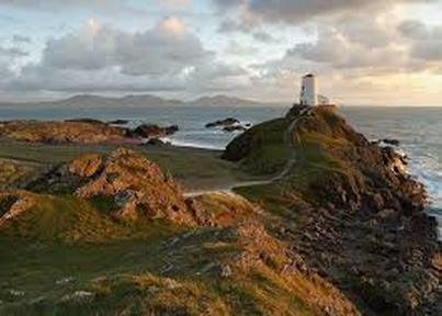
Llanddwyn Island, Anglesey, Wales
composition-
In this image, the whole image is in focus, as we can see every detail of the image. The lighting in this image is quite bright and vibrant, therefore looks like the picture has been captured in the middle of the day. The lighthouse has been placed onto a rocky, grassy hill onto the side of the image. Also this image demonstrates the contrast between land and sea. To me the photographer has used a large depth of field to capture this picture as there is no detail that is not unfocused.
Content-
In this image it is clear there has been light house placed on the right hand side, to me it looks like there is a rocky, concrete stairs leading to the lighthouse, also surrounded by rocks, a large field of grass and a large depth of water. To me it looks like it is a quite a windy, cloudy day, as majority of the sky is covered is clouds and the grass is at a slight slant. In the background of this image there are mountains, which shows the large distance from the mountains to the lighthouse.
context-
To me, this picture has been taken in the day, on a windy day. This image has been captured in llanddwyn island, in anglesey wales. In my opinion, I think the photographer has captured this image to show the contrast in landscapes from an urban atmosphere to a mobile area and also to be published. To me, I think this image has been captured recently as there has been a variety of camera techniques used for this image.
Connection-
This image connects to my work because the project we are working on in photography is landscapes, so it gives me ideas and inspires me for my own work, and gives me an objective on what I could be taking pictures of. Also this image gives me ideas on what camera techniques I should be using when capturing pictures of landscapes .
Comment-
In my opinion, I like this image because it is a clear shot and also sets and peaceful and relaxing mood. The main strength of this image is the photographer has used a variety of techniques and also taken every detail to consideration which shows clearly what is happening in this image. Also the photographer has chosen a good view to capture this image.
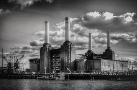
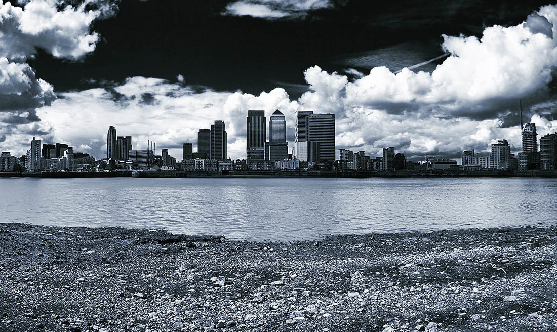
Battersea Power Station
Content-
In this image there is a large factory that takes up majority of the image, and has been placed in the center of the image. To me I think this image has been captured on a windy, cloudy day as there a black thick clouds taking up the sky. In front of the factory there is a large depth of water which shows the distance from the photographer to the factory. On the left side there are 2 cranes been placed which shows the separation from the factory and the cranes.
Composition-
In this image, the whole image is in focus, to me I think the photographer has used a large depth of field. As a viewer we can see every detail of this image as it is a clear shot. Also the photographer has used a black and white effect on the image which makes the image quite dull and not as vibrant or bright. This image has been captured in a urban area which shows the contrast from a mobile area to an urban area. To me I think the lighting in this image is quite harsh as the effect in this image is black and white, this bring more effect to the image. The clouds in this image take up most of the sky.
Context-
This image has been taken in Central London, and I think this image has been captured many years ago, as now The Power Station is an art gallery. I think this image has been captured to show the difference between the old version of the building, to the more modern version. To me this image has been captured many years ago as this is an old building and is not used for a power station anymore.
Connection-
This image links to my work because the project we are currently working on is Landscapes, and we have also gone to London to capture similar images. This image also gives me ideas and inspiration for my own work and also shows me how I should be capturing urban areas. In this image I like the way he has compositioned the camera to get the whole image in and also has used a variety of techniques to capture this image.
Comment-
In my opinion, the only weakness in this image is they have used a black and white filter which covers the colours of the image, therefore it is harder to put a full description of the image. However, to me the photographer has used a large depth of field which puts the whole picture in clear focus and shows every detail.
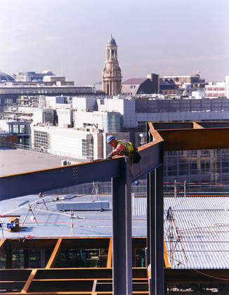
After the boom in Manchester
Content-
In this image there is a man on a scaffolding surrounded by several buildings. In the background of this image there has been a tower placed right in the centre which will catch the viewers attention immediately. To me below the man it looks like there are many shops, which also shows the high distance from the ground to the man. Also the man is level with majority of the buildings which also demonstrates the hight and shows the scary side of the picture.
Composition-
This whole image is in focus and every I can see every detail of this image, so to me I think the photographer has used a large depth of field, as the background and foreground are all in focus. I think the photographer has used a f/4 in aperture because on the buildings on the left, light has been exposed onto it. The photographer has thought about the composition as the man and the tower has directly been placed in the centre of the image.
Context-
"This image was taken in Manchester after the bombing, this image was taken by a photographer called Len Grant. To me this image has been captured recently because the picture looks quite modern. I think the photographer has captured this image to show what happend after all the bombing, and also to show the contrast between what the surroundings looked like before and after the whole boom." (Research from the internet)
Connection-
This image links to my work because the project I am currently working one is Landscapes, and this image gives me ideas and inspiration on how I can capture my own images. Also I am going to visit Manchester to capture pictures of the buildings so it also gives me more ideas where I should take my pictures for the best images. In this image I like the way the photographer has used a whole image, so everything is in view and nothing is left out or unfocused.
Comment-
In my opinion, the only weakness of this image is the aperture and the light that has been exposed, which makes the buildings on the left looks unclear and covers them with a sheet of light, however the photographer has considered to use other good techniques while capturing this image such as, large depth of the field, and also has used good composition as he has place the man and the tower right in the centre of the image. This image sets a scary and nervous mood for some viewers as the man is quite high and is in quite a dangerous position.
Artist Research
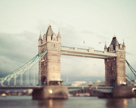
Irene Suchoki
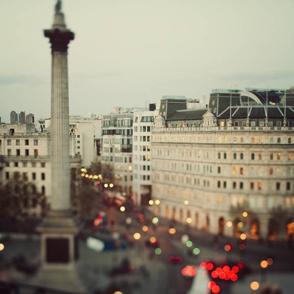
Irene Suchoki is a fine art photographer behind eye poetry. When she left Toronto in 2001, this is when she became quite serious upon Photography. Irene loves and has great interests in travelling around the world, and this is where she gets inspiration and also where she captures majority of her pictures. Her series of photographs from, Paris, London, New York strive to show these iconic places in a unique and emotive way. Irene has been one of the top selling photographers on Etsy since 2007.
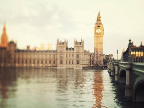
Content-
In this image there is a captured picture of London Bridge and part of the River Thames. To me this image looks like It has been captured in the bright day light which gives a good colour to the image as it is more visual for the viewer. Also the top of London Bridge has been blended into the clouds which shows a contrast between the distance and also gives a dull color to the sky. There is a slight reflection in the river of London bridge which makes the image look more realistic and real for the viewers. The bridge is an old bridge, however looks quite modern in this image due to the effects and techniques the photographer has used. The main colours in this picture that stand out to me are brown, grey and white, also has a variety of colours at the bottom of the image such as, green, red, yellowy/gold, black.
Composition-
In my opinion I think the photographer has used a shallow depth of field while capturing this image as it is not all in focus, the top half is in focus and quite sharp a this is the set focus point of the image, this gives a clearer vision of the Bridge, however the bottom half of the image is mainly blurred out, this gives a misty and soft effect to the image.To me I think Irene has used a slow shutter speed as there are no movements as it is a still image of a Bridge, also has used to this technique to get a blur in the image. In the background of this image there is a long distance of water and the London city, this shows the vast distance between London Bridge and the rest of London city. Also I think the photographer has captured this image at a slight angle which shows the realistic size of the Bridge and also shows the length of the Bridge. London Bridge has been placed right in the centre of the image as that is the main focus and attention of the image and catches the audiences eye immediately. To me I think Irene captured this image quite close to the bridge to get the blurry and misty effect it has. This image has a light calm lighting to it however the lighting goes quite harsh and dull as it gets to the clouds as they are white and greyish. I think Irene has used a tripod to capture this image as you would have to be still and steady to capture an image like this to ensure, there are no movements with your hand that could ruin the blur of the image.
Context-
This image was taken in London by a photographer called "Irene Suchoki, who is famous for her landscape photography. I think this image is quite modern and has been captured recently as there has been a variety of techniques used to capture this image. Irene has a great interest in travelling the world and this image of London Bridge was captured when she travelled to London for a visit. I think she captured this image to show the different types of famous buildings around the world and contrasts between them and also to show them in there unique ways." (Research From the internet)
Connection-
This image relates to my work because the project I am currently working on is 'landscapes', I went to London to capture some images of the different buildings and the famous land marks of London City. Also Irene gives me lots of inspiration for my own work on how I should be capturing my images and the kind of techniques I should be using to make my work effective and realistic. Irene gives me ideas on where I should take the images for my own project as her main theme is landscapes urban landscapes.
Comment-
The reason I chose this image was because Irene has used a variety of techniques to capture this image and has also thought well about the angle and the position of the bridge, however to me a weakness about this image is that too much light has been let in, this has made the image look quite bleached out from the sky view. I don't think there is a specific meaning behind this image, in my opinion I think she captured this image to show the different buildings around the world in there own unique ways.
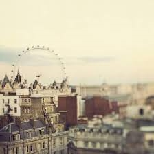
Other examples of Irene's Photography.
Morroco
Sunset
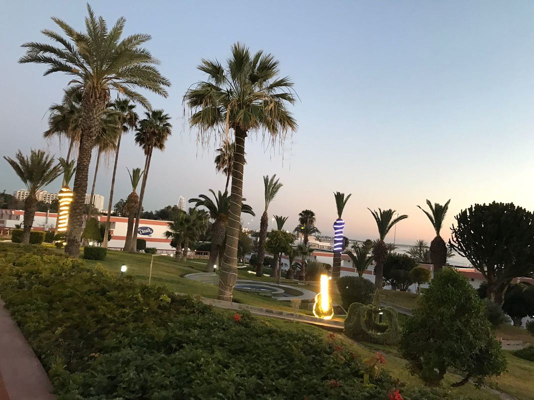

Birds eye view

Beach

Mountain

Trees


Best |
Worst |
This is my best picture I captured in Morocco because because of the bright sunset colors shows in the sky and are all blended together, the main colours shown in the sky are blue, orange and yellow , and also the trees have been blacked out, this shows a contrast between the distance of the trees and the sky. Also my picture is all in focus as is it all clear and in focus.
|
To me this is my weakest picture of Morocco as the buildings are in the way of the view. Also the angle is not straight and also haven not used any techniques or thought about the composition of the image.
|
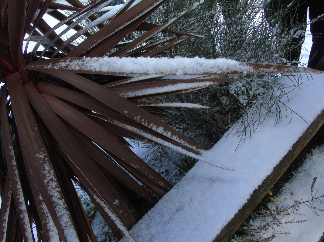
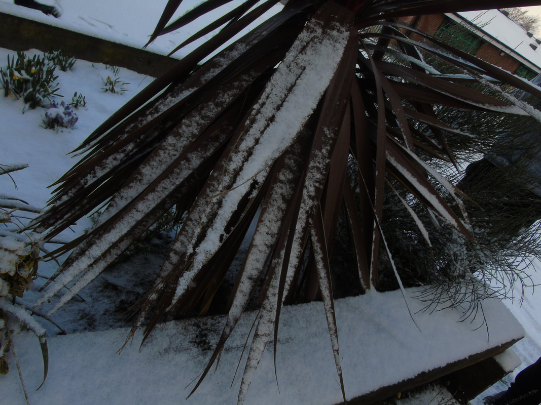
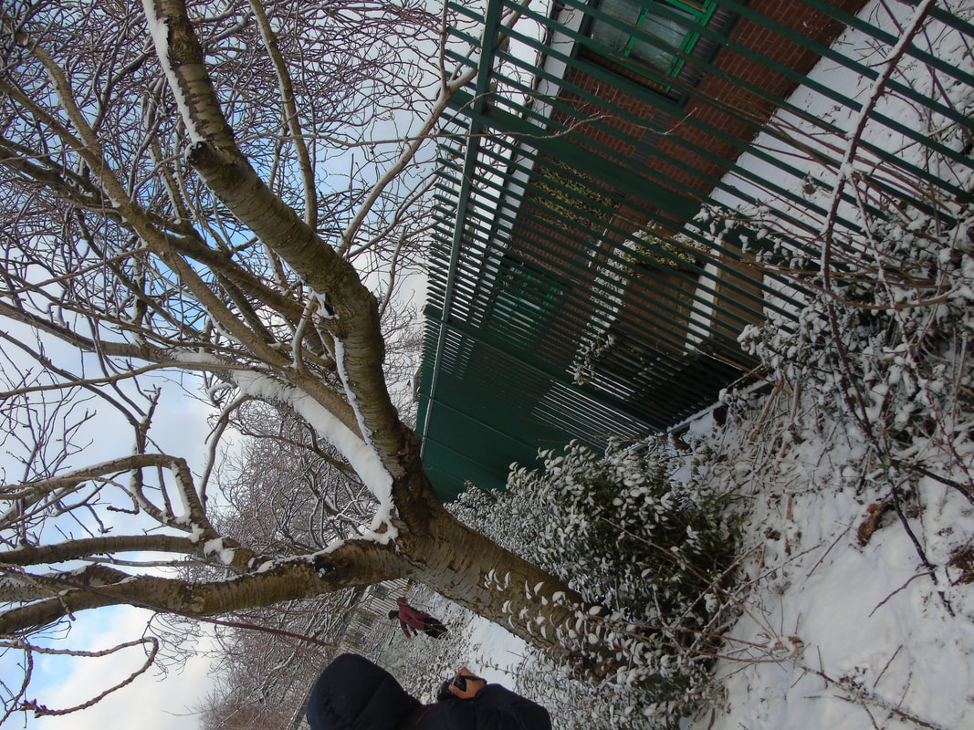
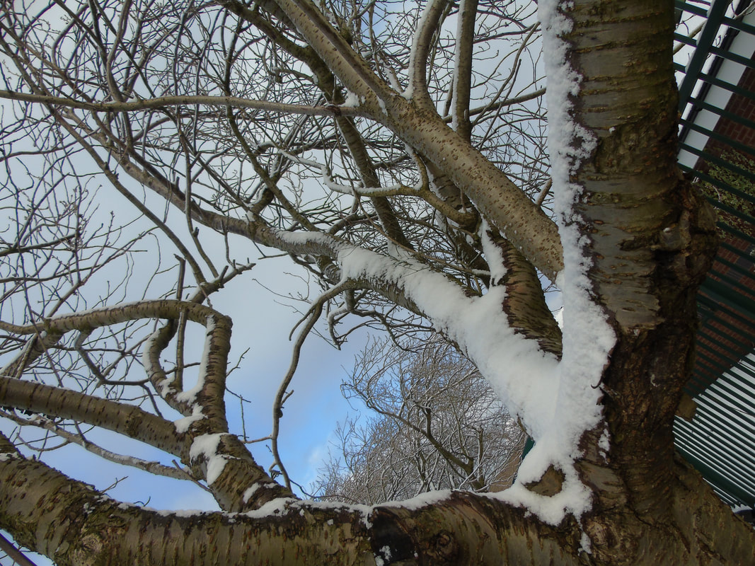
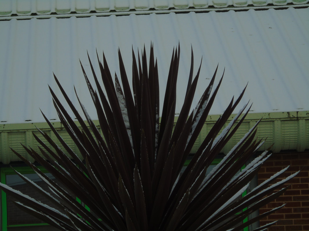
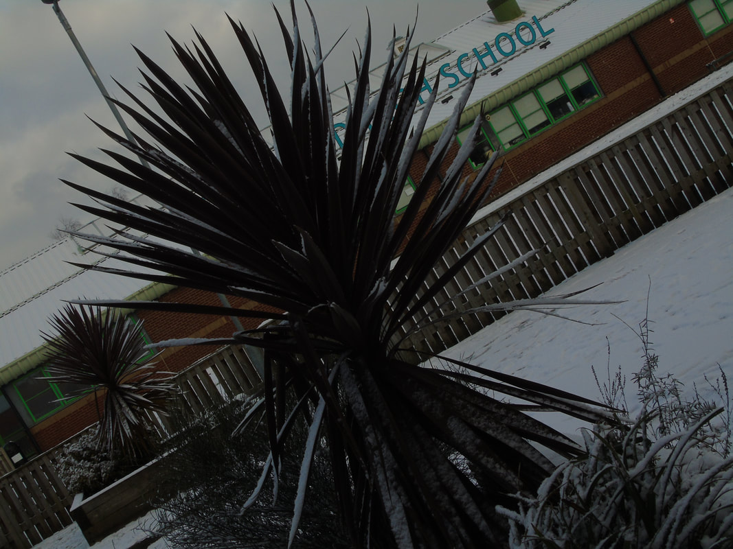
Winter Landscapes
Close up
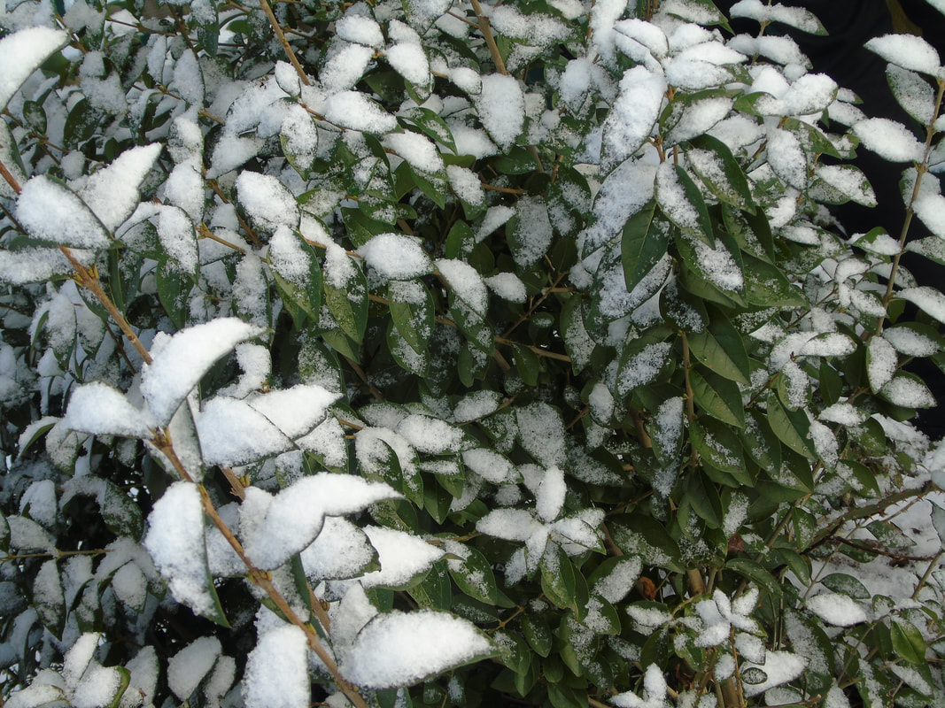

Trees Covered In Snow
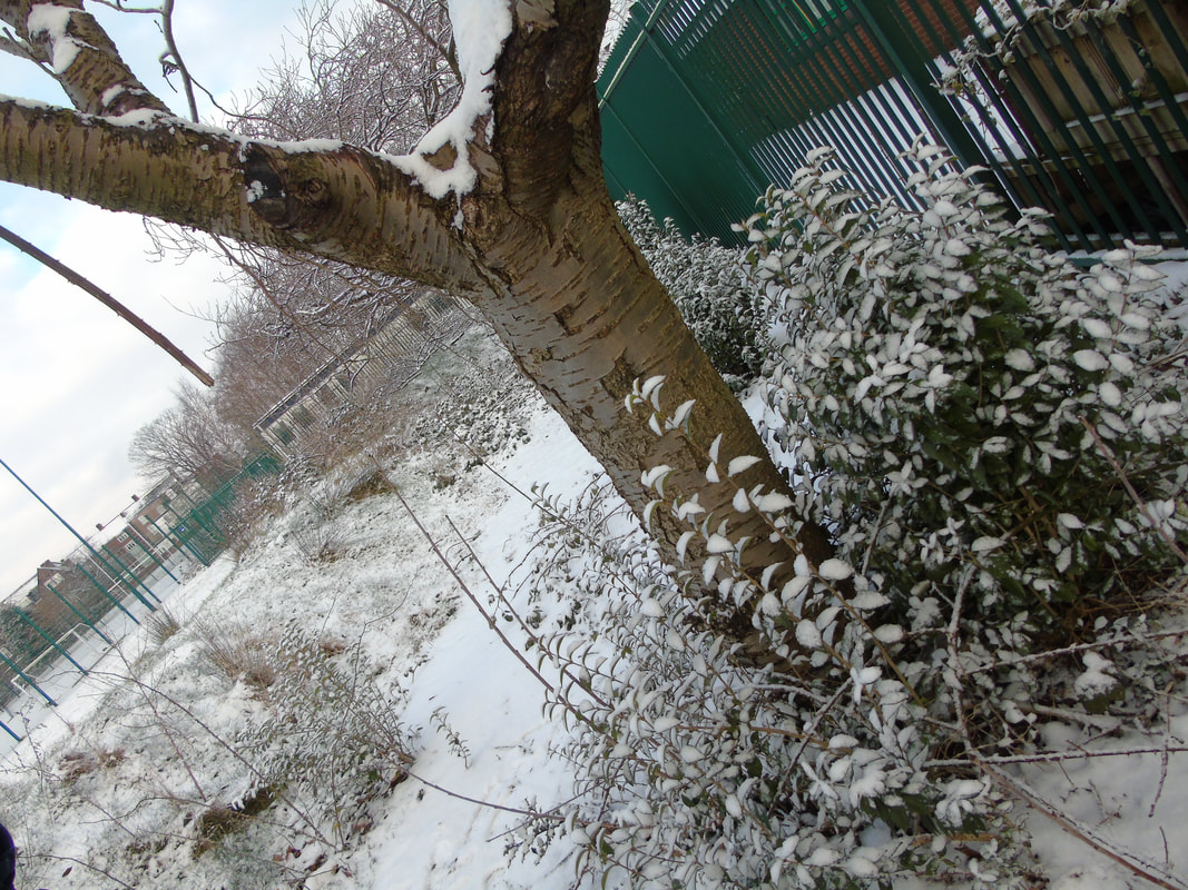
Snowy field


Linking Paragraph
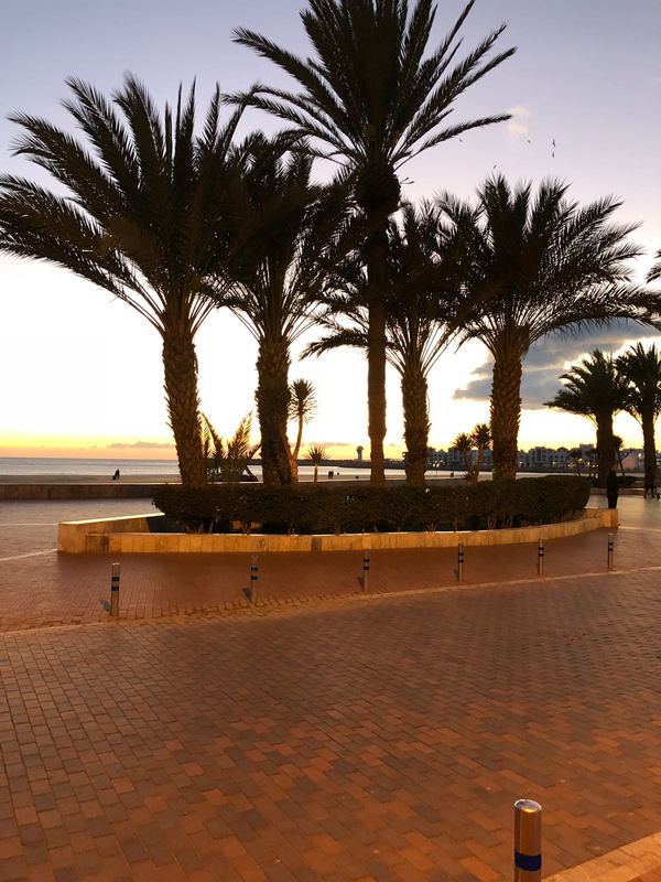
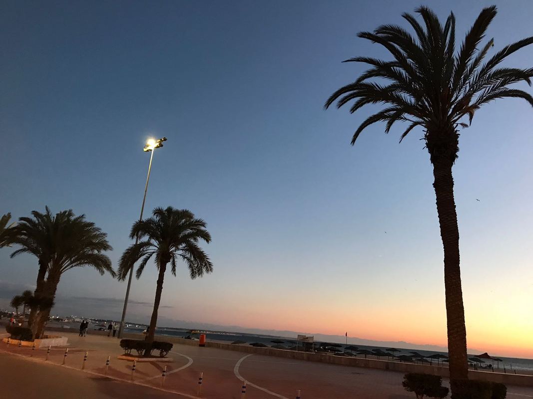
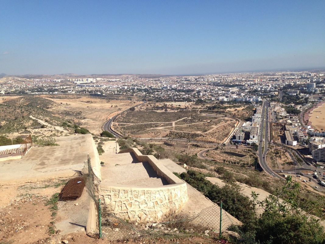
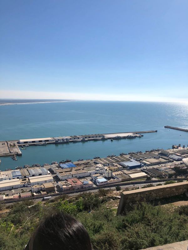
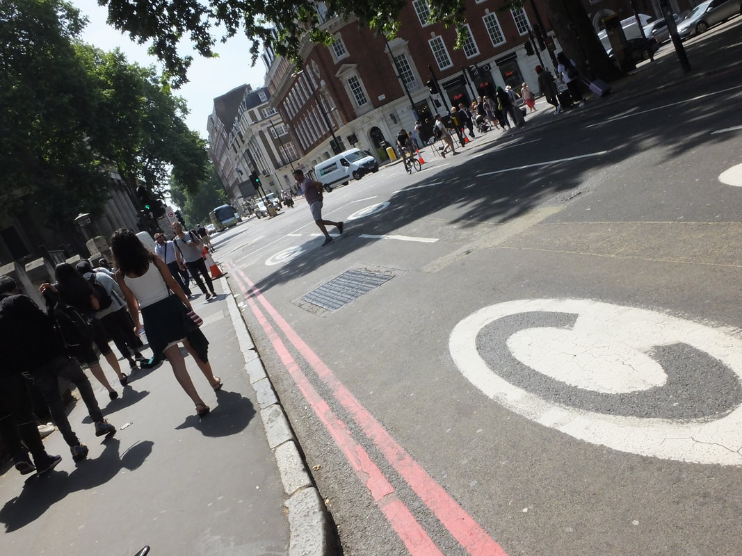
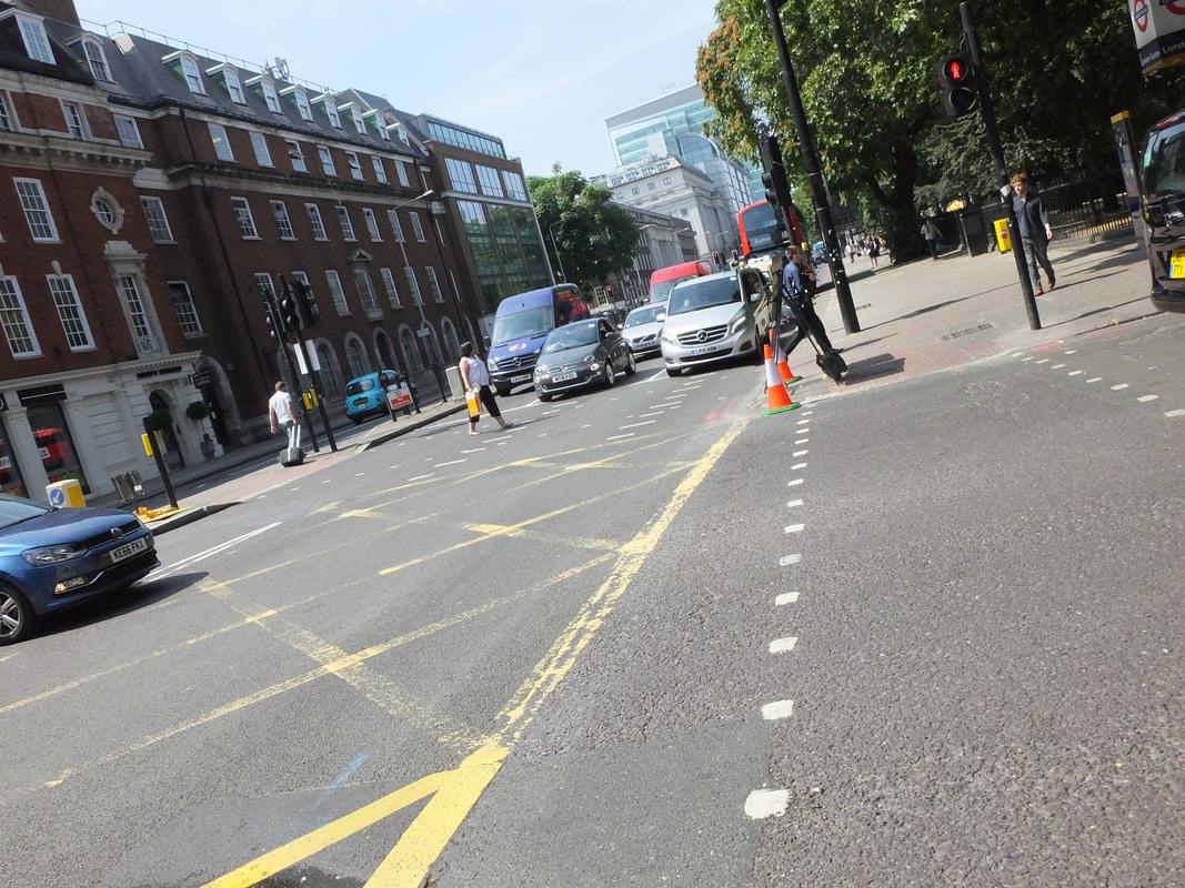
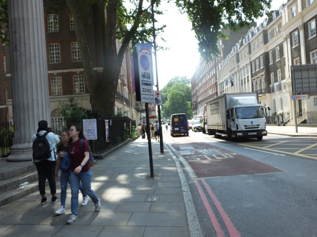
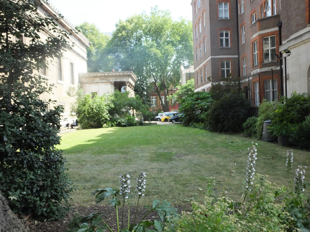
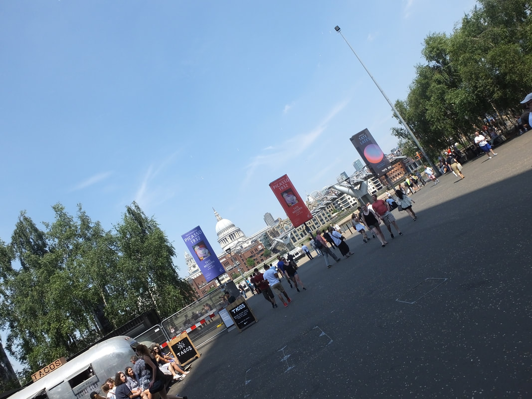
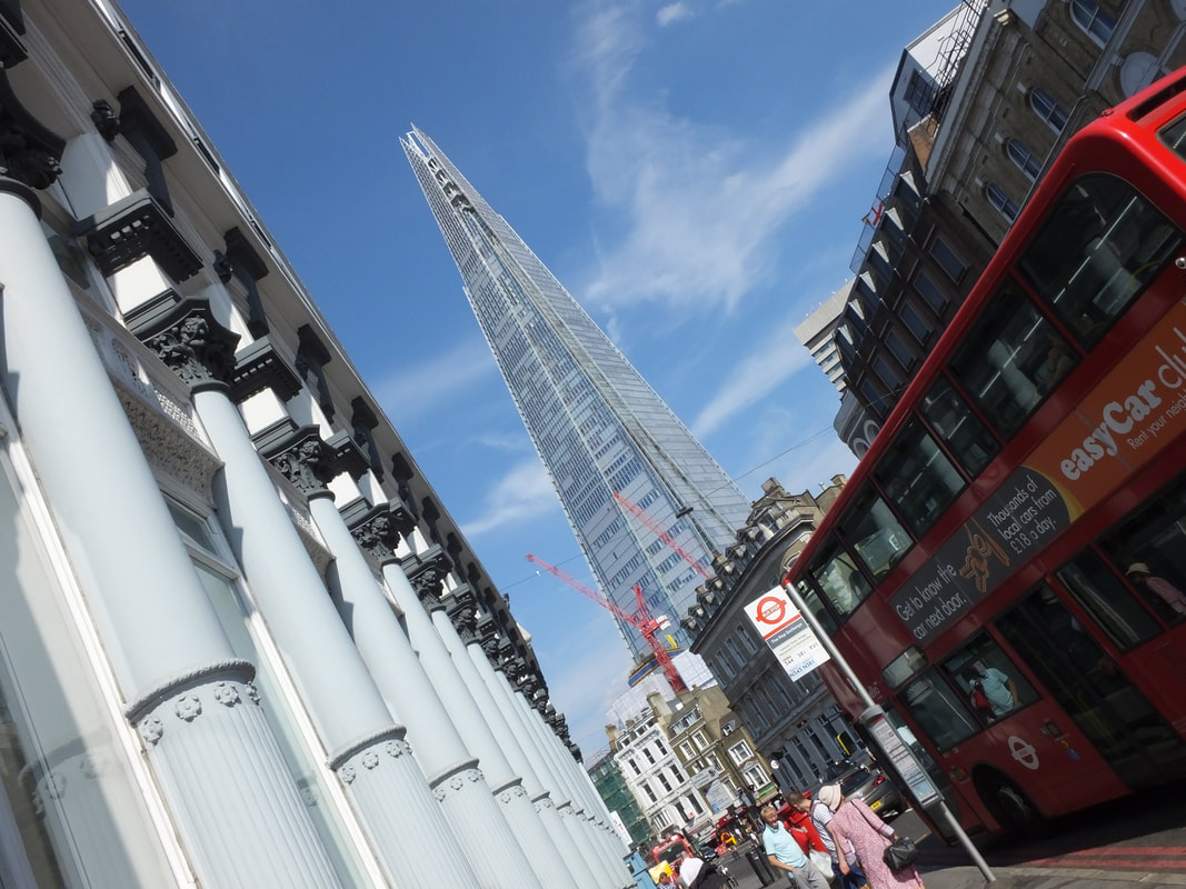
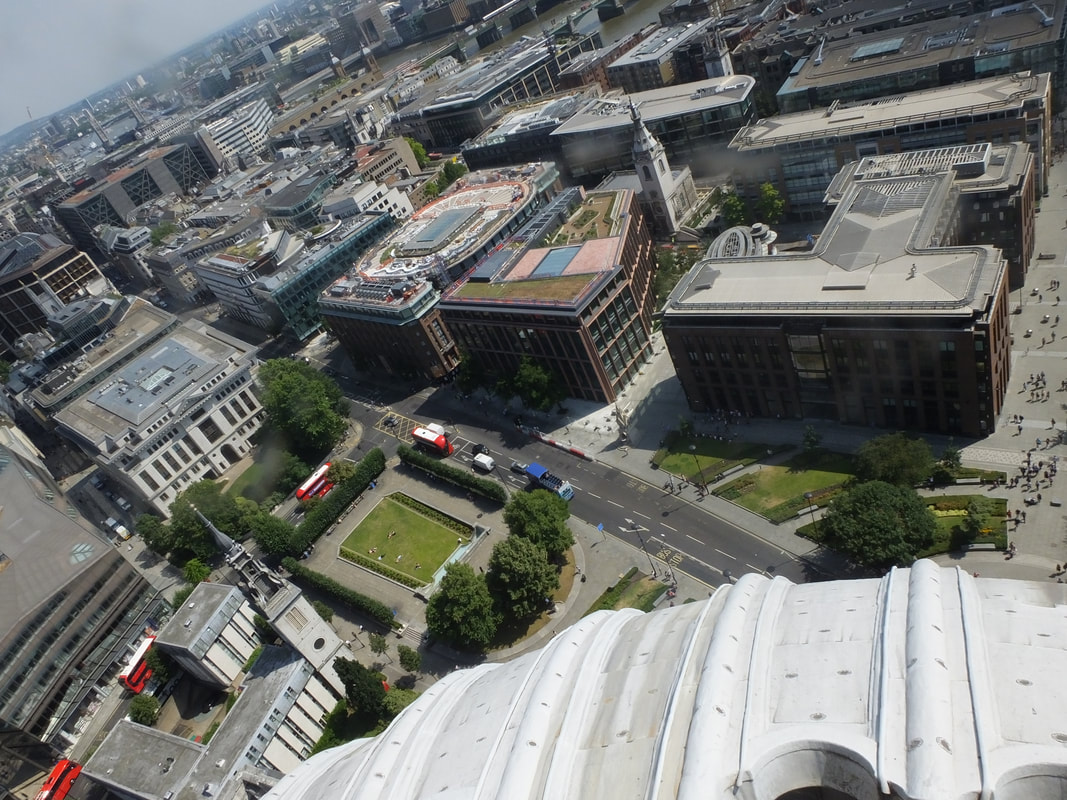
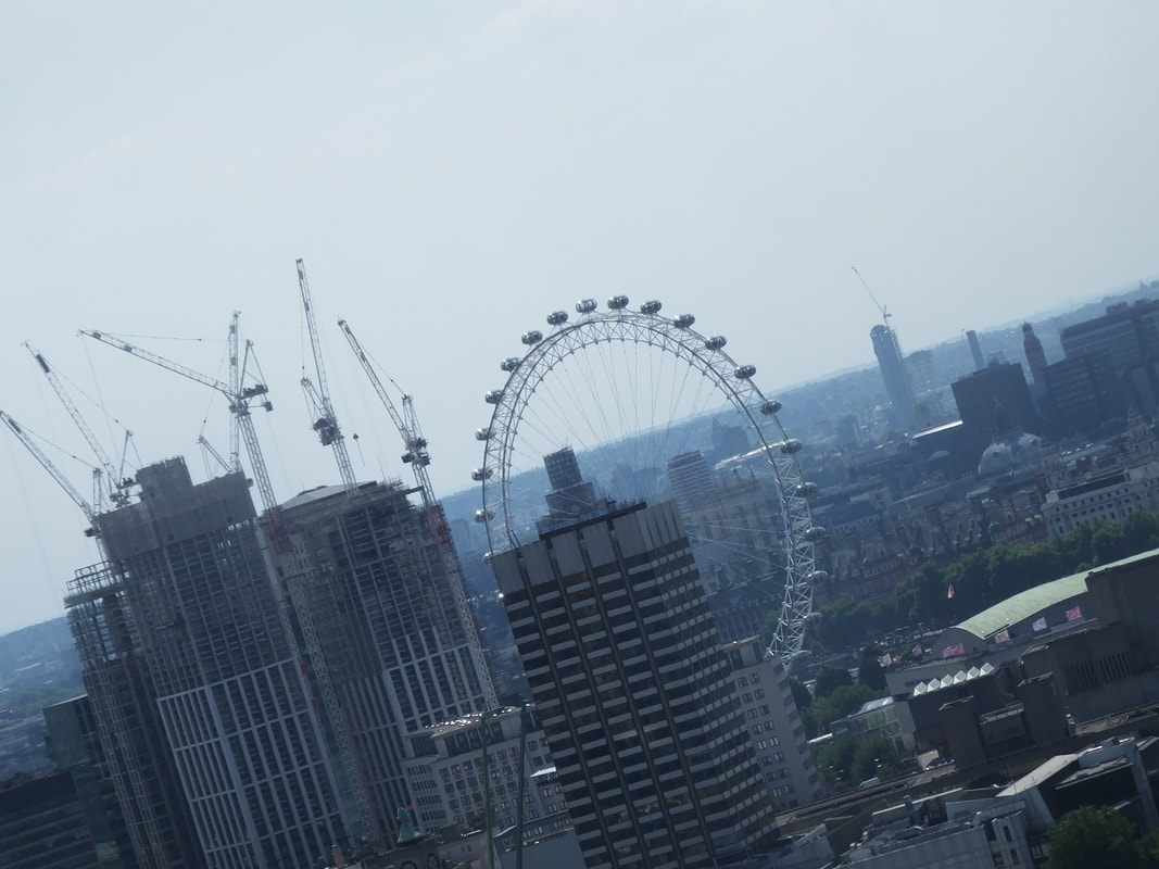
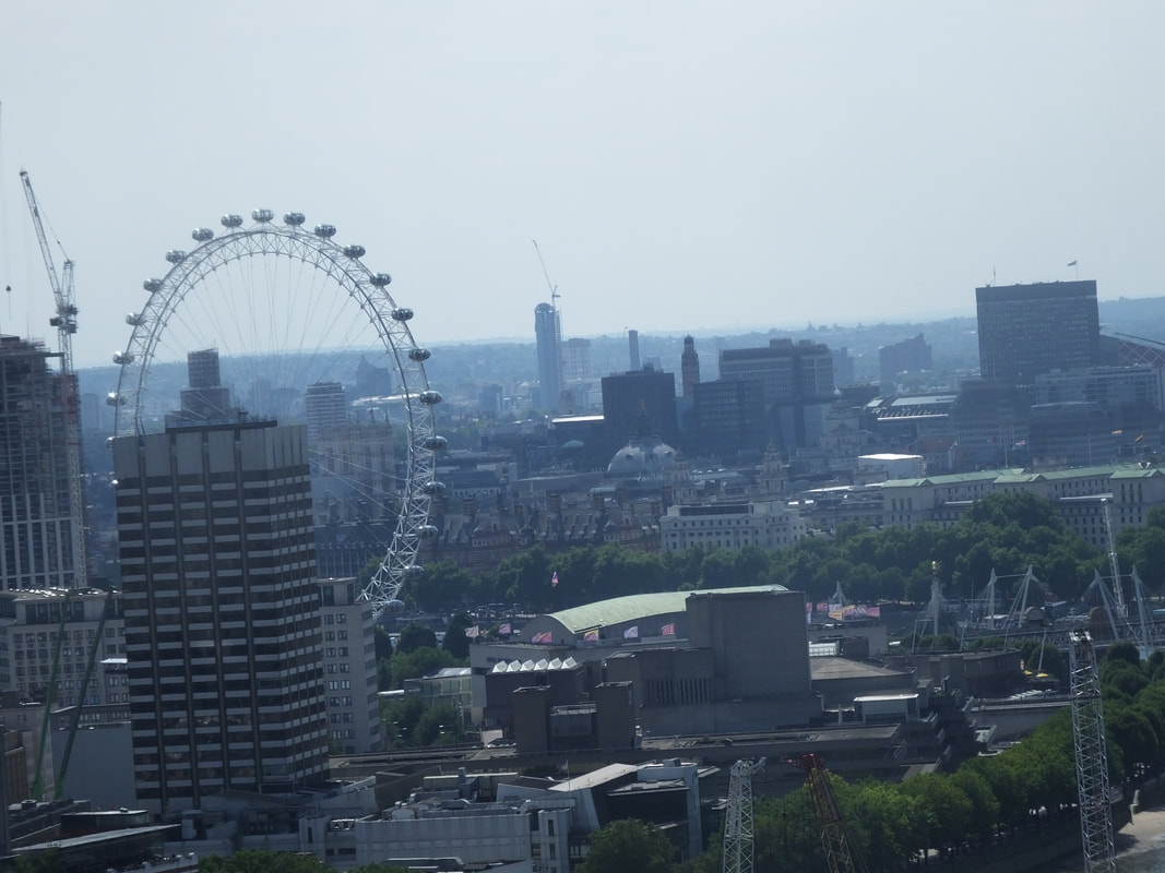
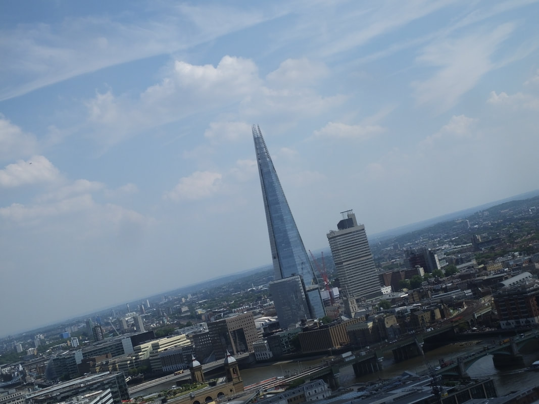
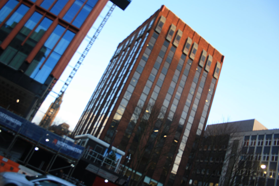
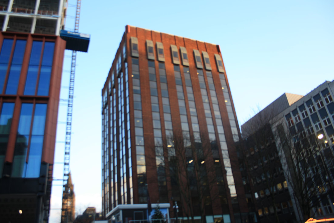
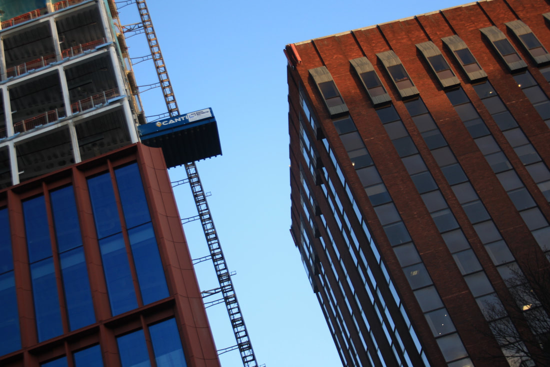
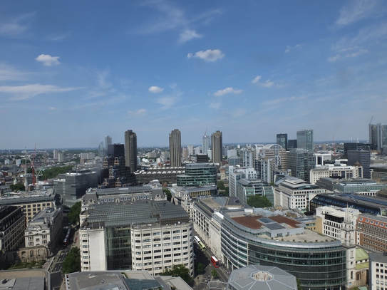
I went to London in the summer to capture urban landscapes, also I went to Morocco in February as I didn't get a chance to go Anglesey, however I do intend to go Formby Beach in Wales soon to catch up on my landscape photography to show the difference between a rural and an urban landscape . While I was in Morocco I managed to capture different sunset images, birds eye view of the city I went to and also captured images of the different beaches I visited. In summer, in July we went to London and visited many landscapes such as, River Thames, British Museum, The Tate, Borough Market, St Paul's Cathedral and also other different buildings around London. We also managed to go to the top of St Pauls and captured and overall view of London city, this shows a contrast from birds eye view and also the normal human view . The images I am going to focus on in this project are my London Urban landscapes pictures because I got a much more variety of pictures and experienced a lot with my camera techniques. The main techniques I used for my London images were, a large depth of field, shutter speed, and thought carefully about my composition and the angle of my images. London showed a rich rural landscape in the summer compared to my images in Morocco. While we were in London the sun was quite harsh and was extremely hot so I had to play around which my light exposure and aperture as some of my pictures were coming out too bleached and unclear, however the bright sun and good weather was good for our images as it made them more realistic, bright and also makes them more clearer for the viewer. In the winter I plan to go into Manchester city and take pictures of the buildings in the dark, which shows the contrast of the urban landscapes in the night and day. I plan to go around Manchester and visit different places and buildings to show different contrasts from London to Manchester. To make good progress I would need to take a variety of images and experience different techniques to see which ones work best for my images.
Iain MacMillian, Beatles Abbey Road, 1969

Content-
This image is a picture of 4 men who are equally spreaded out in the middle of the road, who are oddly dressed, this shows the time period and shows the type of fashion there was. There is a long row of cars on the right hand side lane, and above the cars are numerous amount of trees covering the sky, this shows the long distance between all the main objects. This image is a quite a dull image has dull and no very bright colours have been used and also it is clear there has been an effect added onto this image to give it an older look. The main colours in this image that stand out to me are black, white, brown and dark green, this shows a different side of photography as it shows a more unique way of using effects and also shows the type of camera lenses they had in 1969 as the image is not recent.
Composition-
The main focus in the image are the four men stood in the middle of the road, as they are directly in the centre of the image, the four man will catch the viewers eye immediately. I think the photographer has used a fast shutter speed to capture this image because the men are all clear and all in focus, if the photographer used a slow shutter speed then the men would all be in a blur. Also I think the photographer has used a large depth field while capturing this image, because as the image goes further down the smaller the cars get and the road goes narrow, this shows the distance between the men and also the long distance of the road. In this image the lighting is quite natural but also bazaar at the same time because, because to me I think the photographer has added an effect on this image to show the unique and weird lighting. There isn't a specific angle shows in the image, to me I think this image has been captured straight to show clearly the road and also the size and distance. To me this image has been broken down into three sections, the first lower section is the main focus and attraction which are the four men, the second section is the long narrow road that goes across this image, and the final section are the trees that are covering the sky, however leaving only a little bit of the sky exposed in the top middle of the image. The effect of these sections is to show the natural contrast of the roads and the distance they have between each other, the photographer makes everything all look so close and compacted together, where as in reality there would been a large distance between them.
Context-
This image was taken from a photographer called "Iain MacMillian, this image was captured on a road called Beatles Abbey Road in 1969" (Research From the internet) , also this image is clear to me it was captured in this specific time period because of the old fashioned cars that have been lined up on the side of the pathways, and also the type of clothes the men are wearing in the centre of the image. The place where this image has been taken is a famous tourist place in London where many famous photographers come and take iconic snapshots. This image has been published on a website of London's best ever 40 images that have been taken, this shows this is a famous and creative image that have been captured and also I think the photographer has taken as lot of time and thought in the position of the camera and also the techniques that should be used to make the image perfect.
Connection-
This image connect tom my work because the project I am currently working on is urban landscapes, and this is and image of London, also I went to London in June Summer 2018 to capture some of London's most famous landmarks, during the trip I captured images of the London Roads, which I then created my own gallery on it. This image does give me inspiration as it shows the different techniques the photographer has used and also the position the photograph has been taken. I think this image has it's own unique way of standing out as most photographers take angles pictures, where as this image is a straight and clear shot of the road, also everything is in focus.
Comment-
I really like this image because of the techniques that the photographer has used and also this image stands out to me because it is unique and different from a lot of the other images. However I think there has been a effect added onto this which stops it from showing the true colours of this image and also makes the image look quite dull. On the other hand this image has given me a mass amount of inspiration for my own images and has also given me ideas for the future, on how I can also take my images and how to make them more effective.
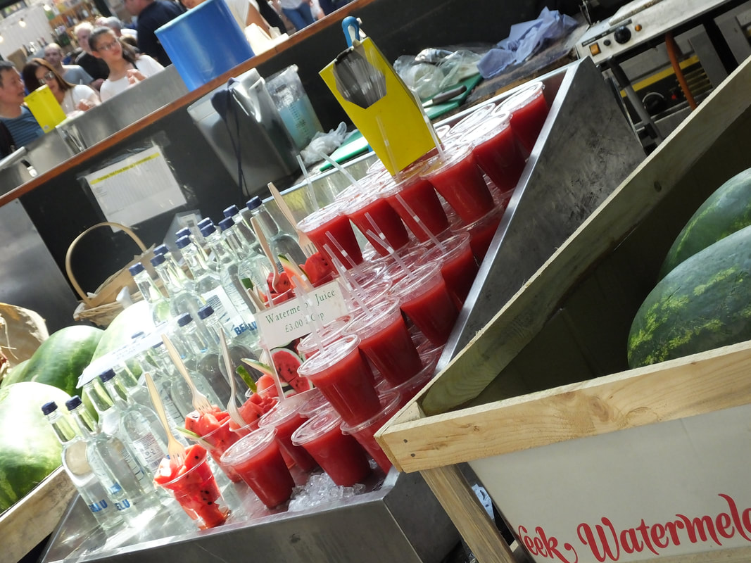
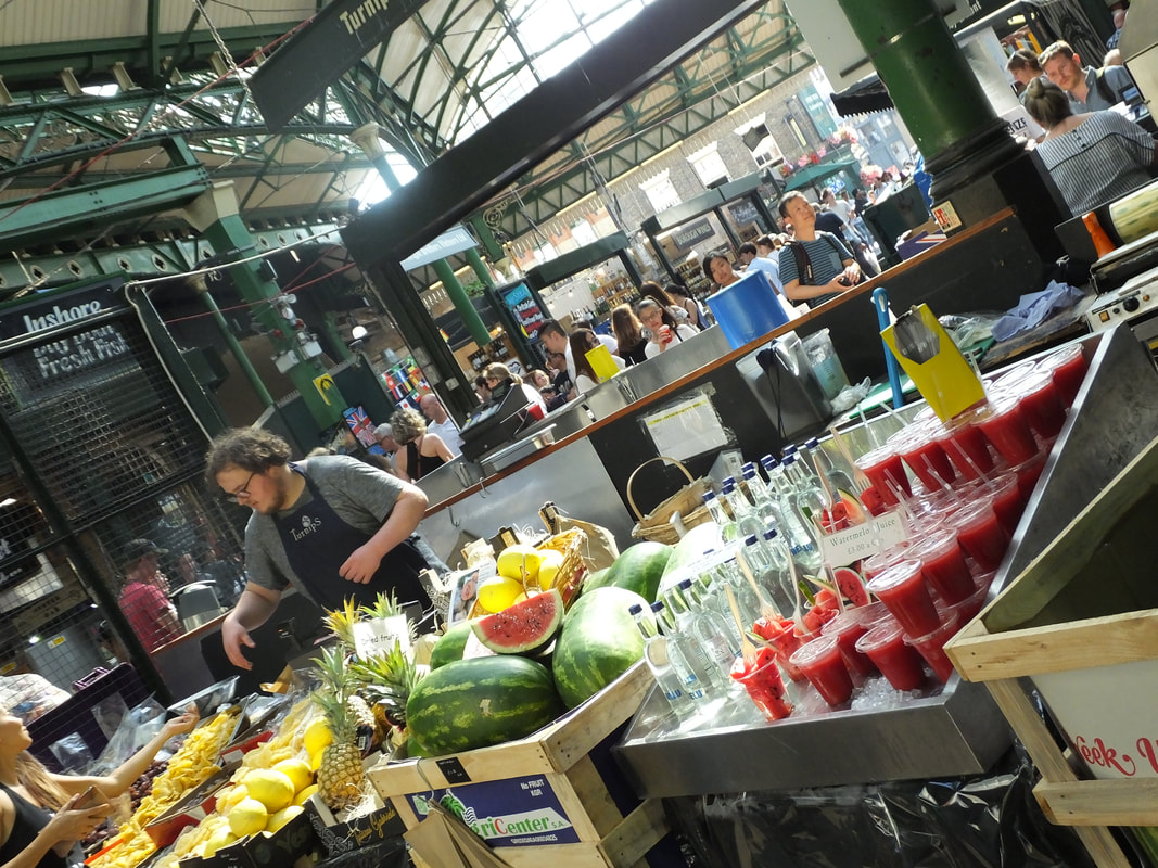
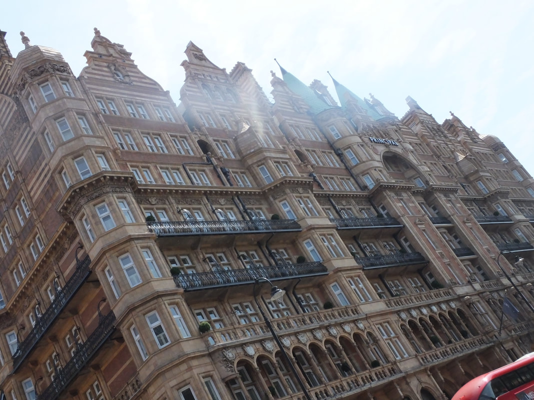
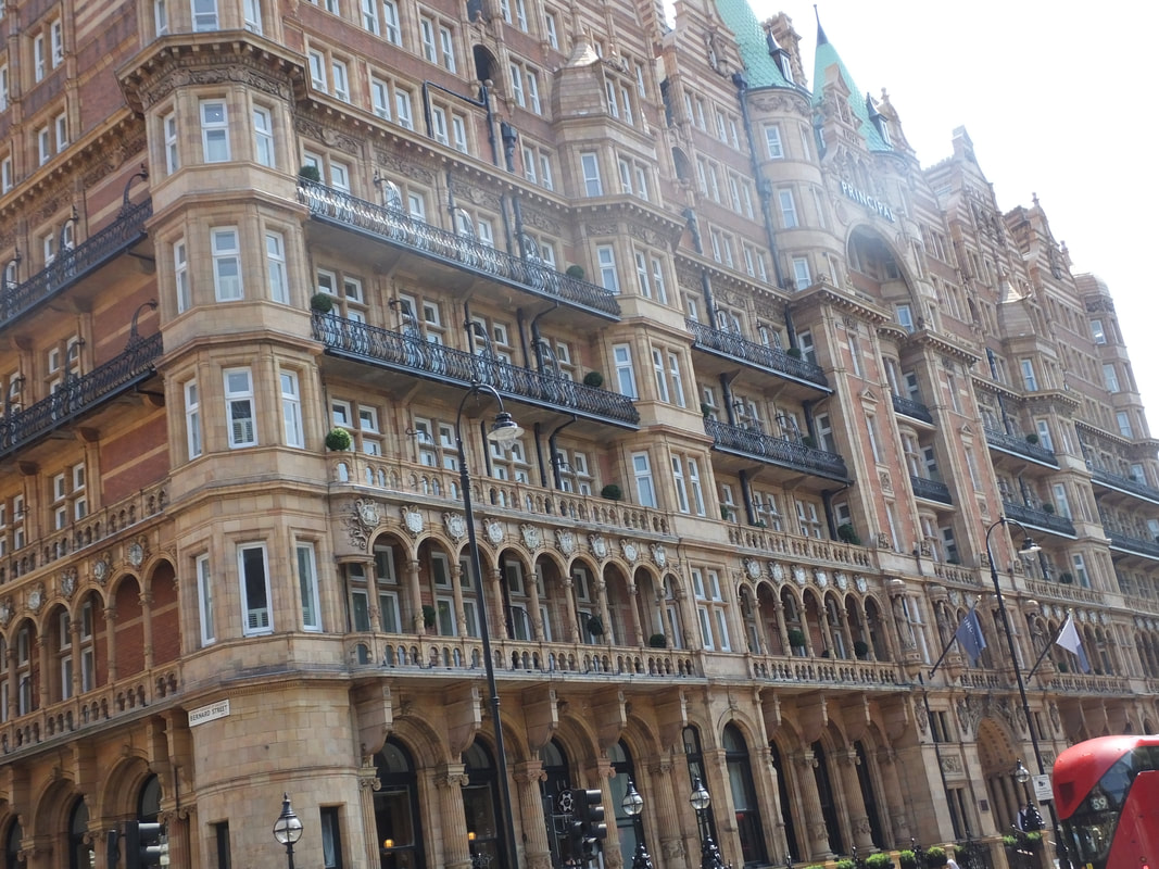
London
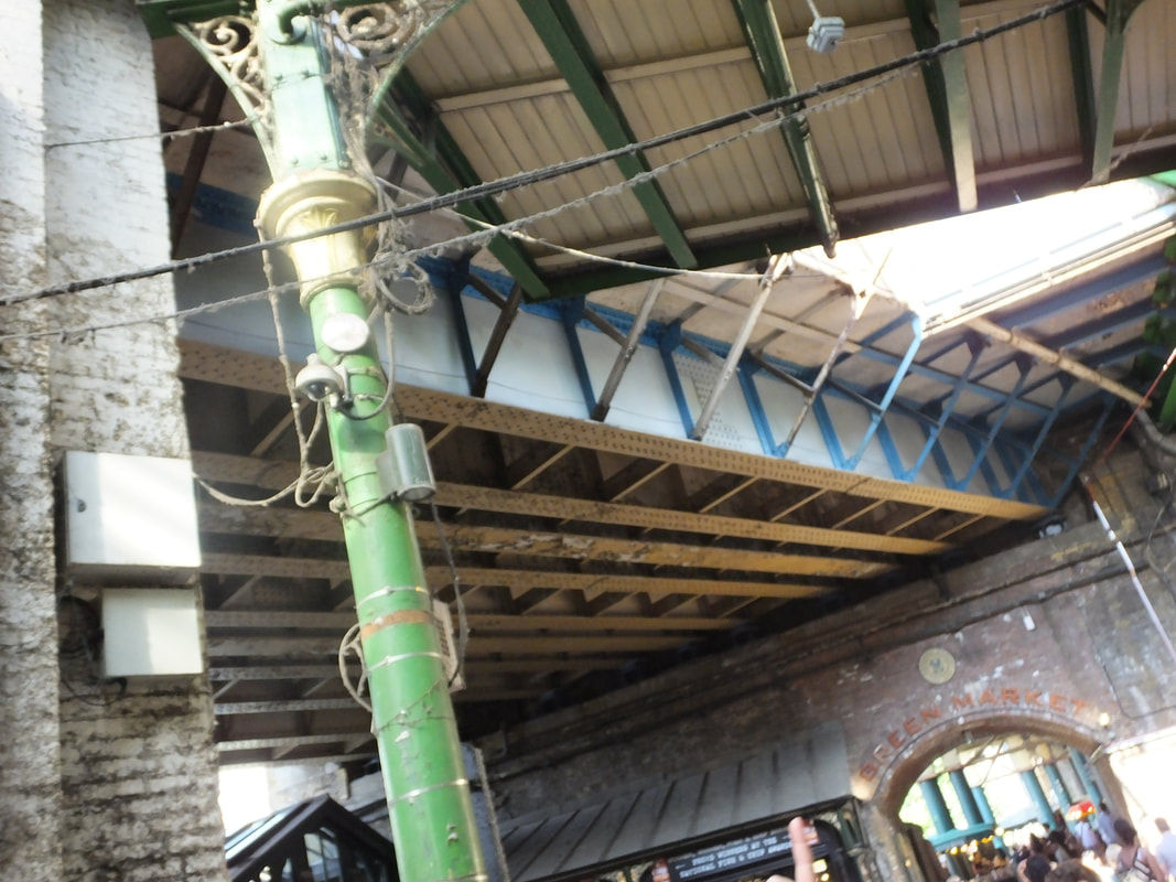
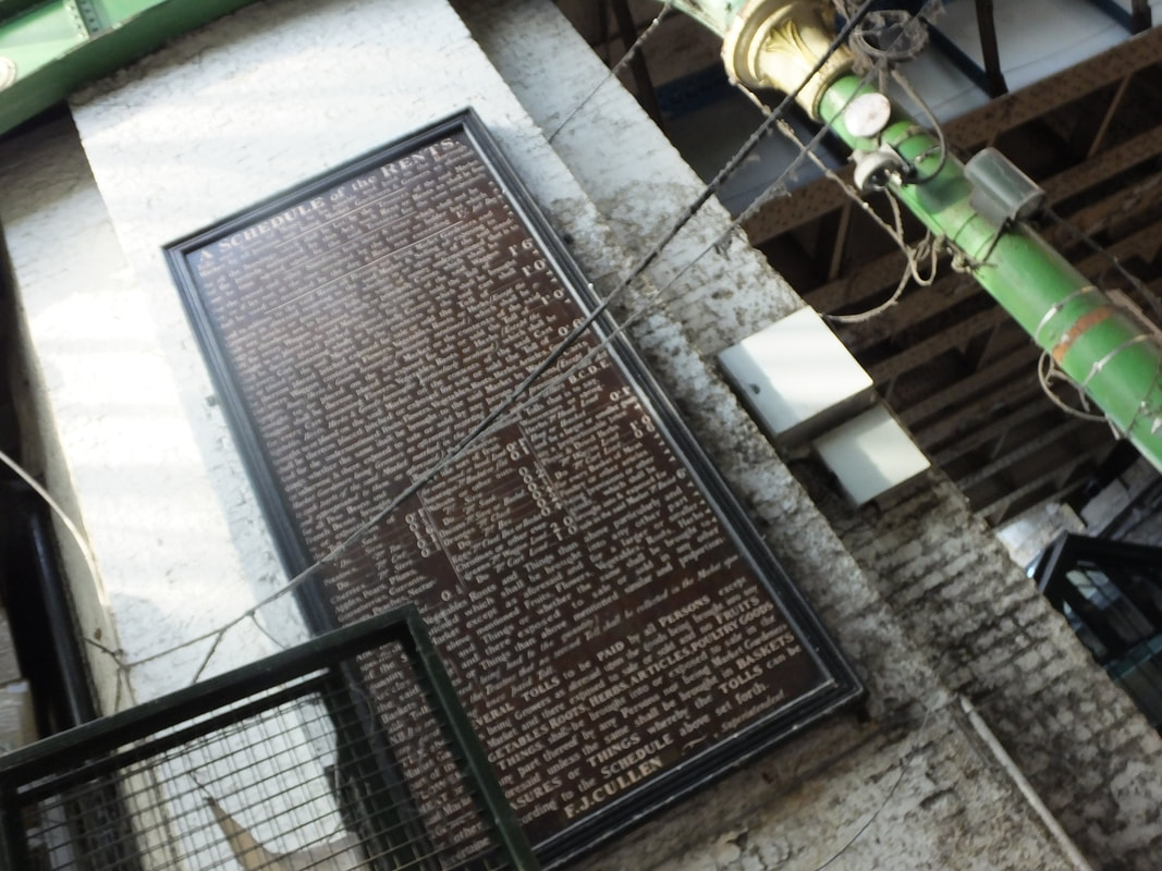
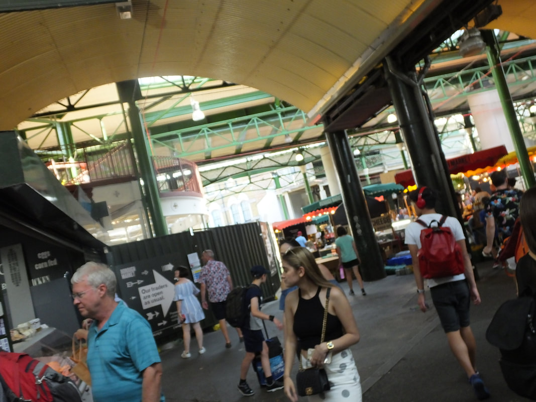
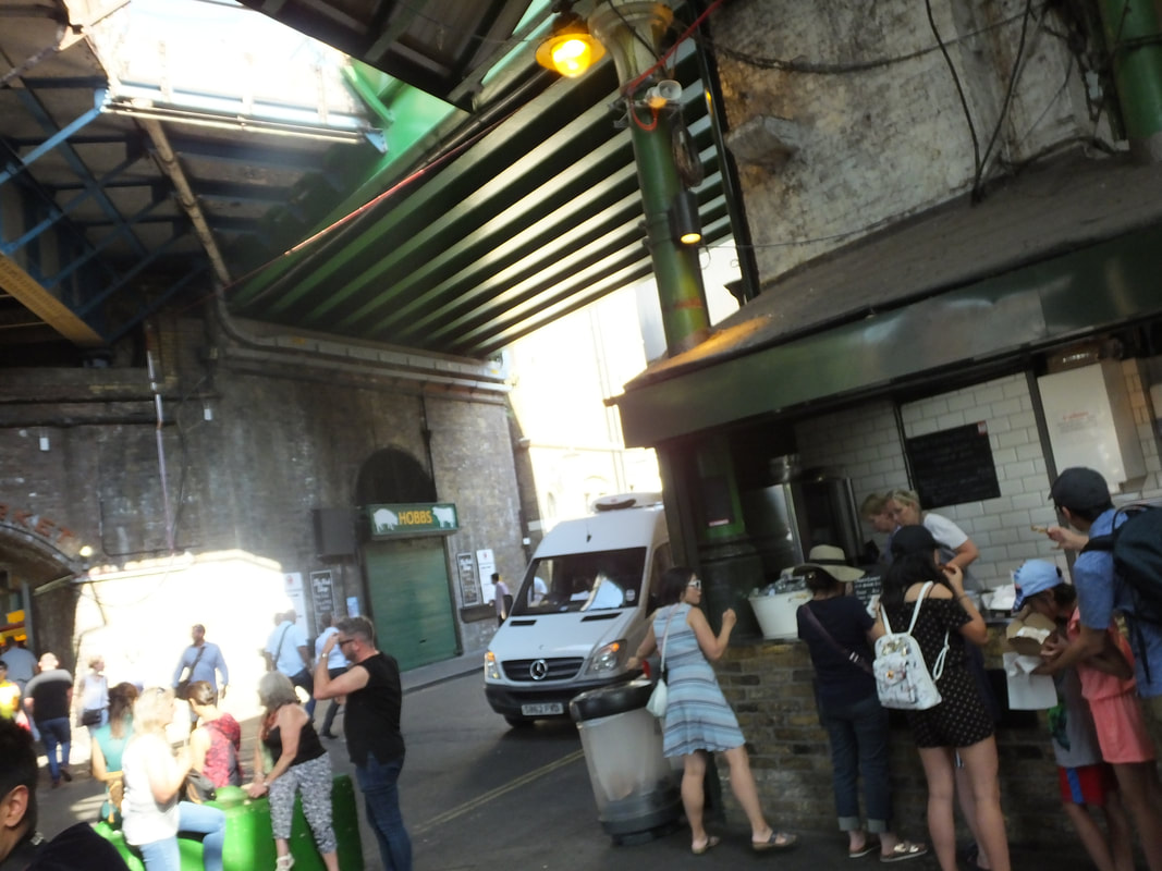
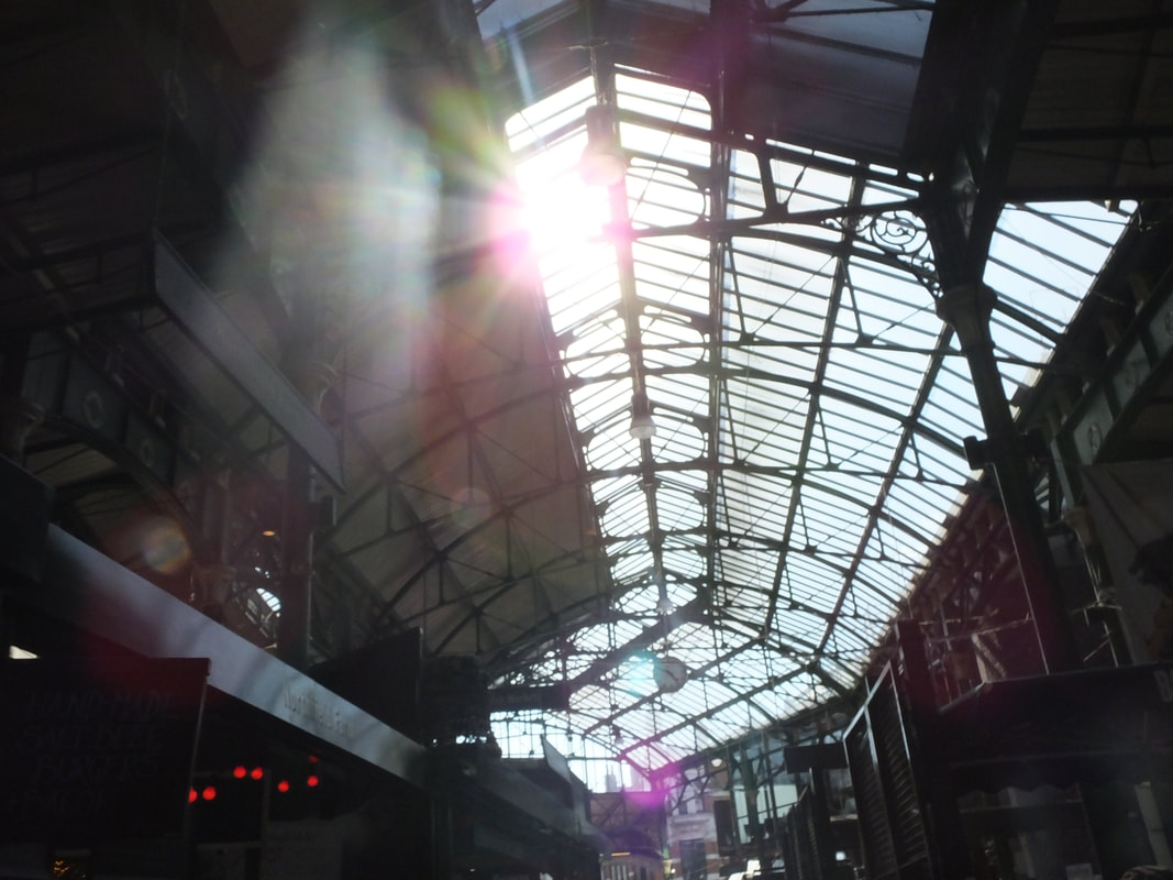
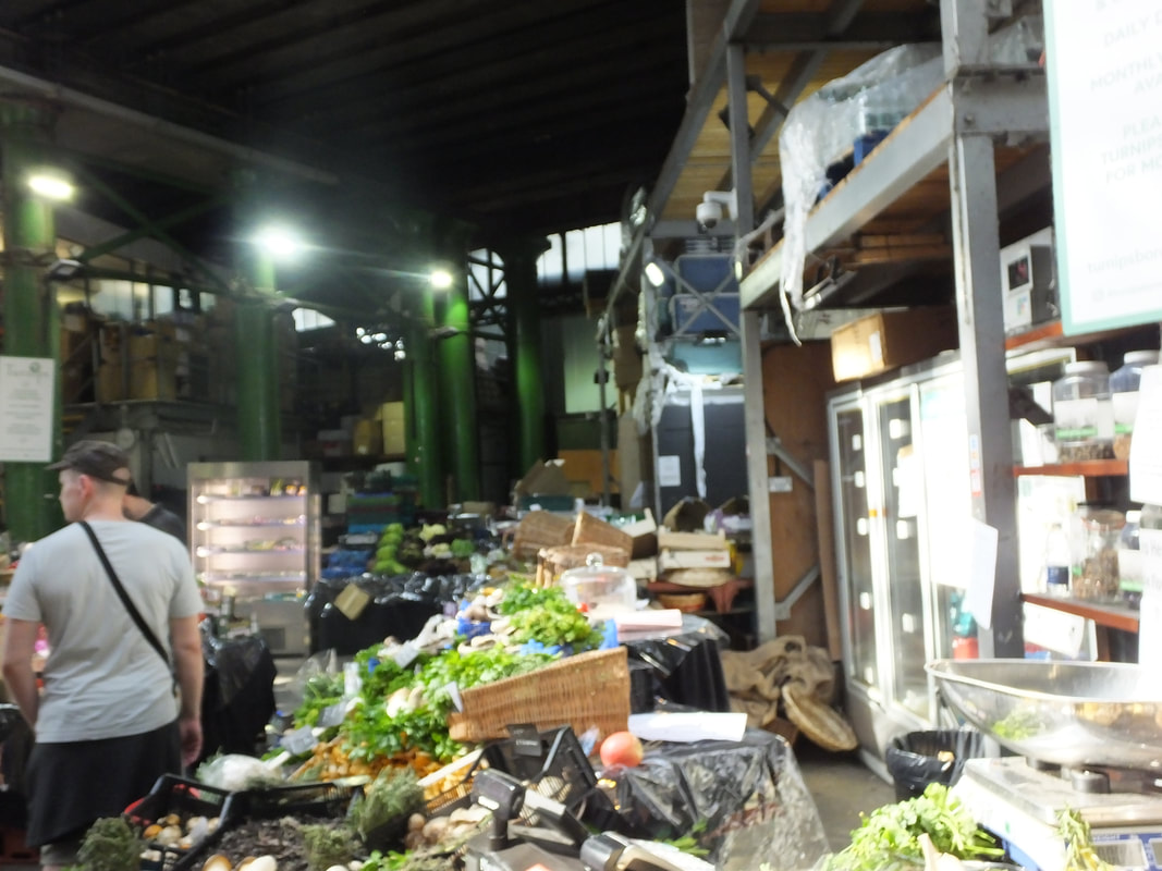
Borough Market
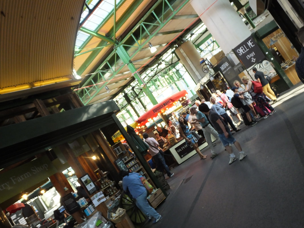
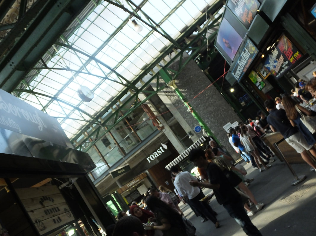
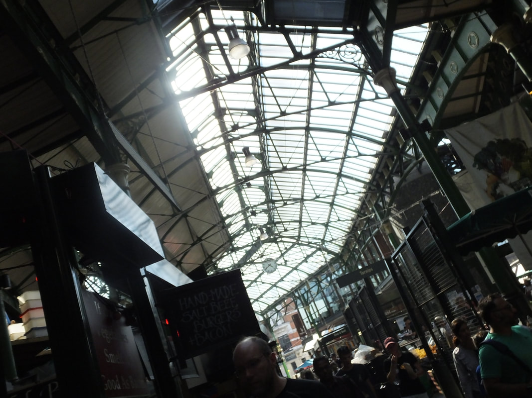
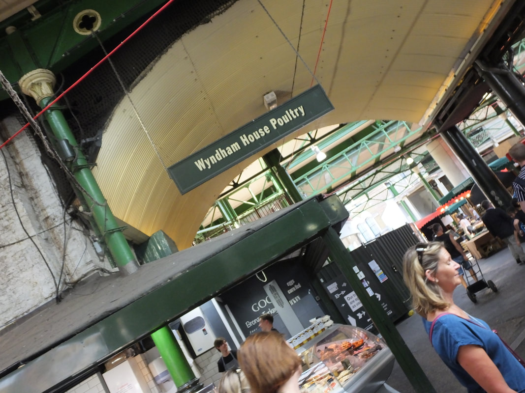
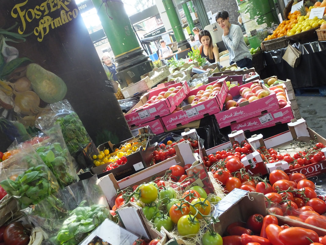
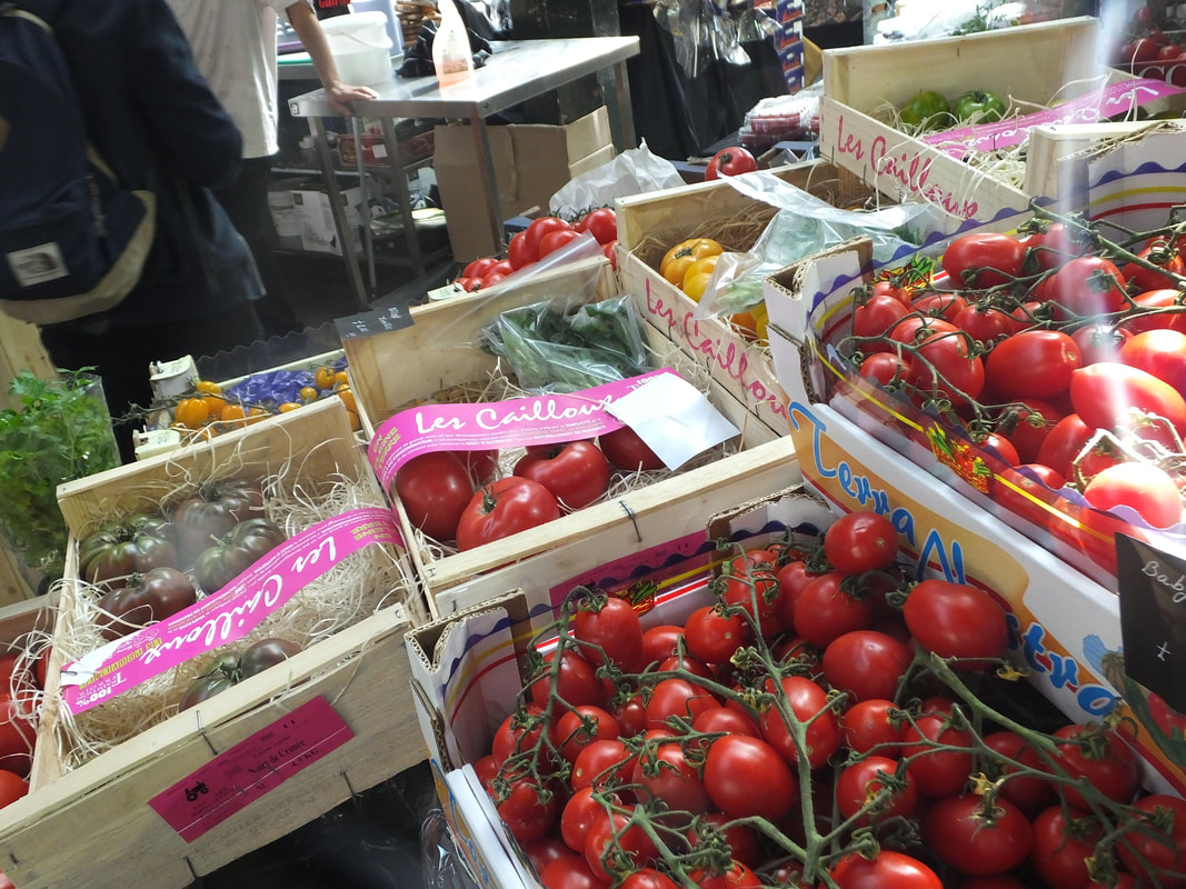
Best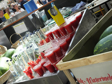
This is my best image of Borough Market because it is all in focus and a clear image, also I have angled my image on the side to my make my image more effective and also make it clearer on what I am capturing. My image is also bright as then a deep red stands out for the viewer.
|
Worst
This is not my strongest image of Borough Market because it is not a clear shot, as my image is on a slight blur and also people are in the way. There are also bleached out parts of my image on the sides which cover some of the market. When taking this image there hasn't been many camera techniques used which doesn't make my image effective.
|
Kat Molesworth Photography
|
My Photography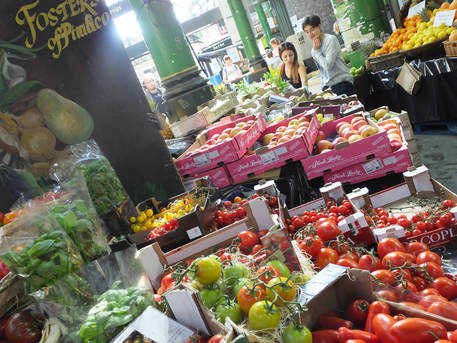
|
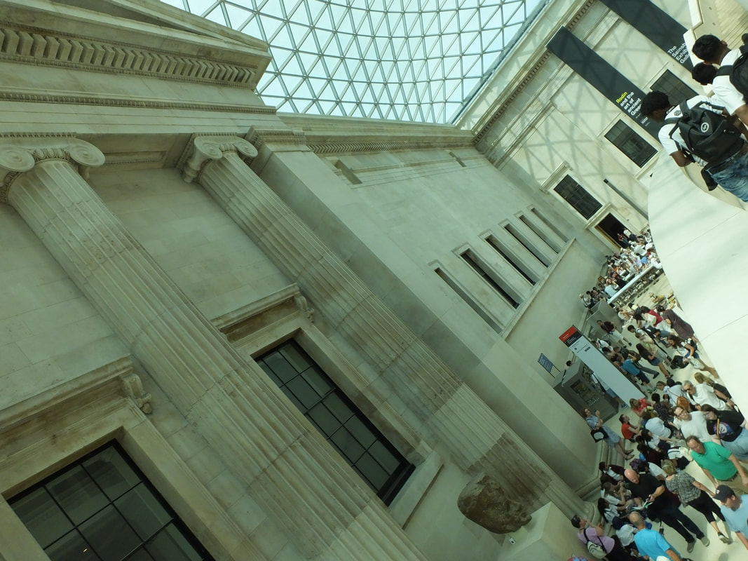
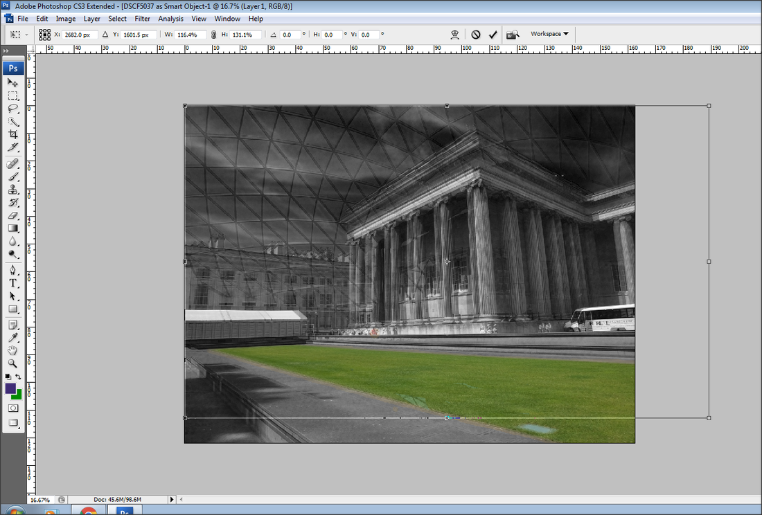
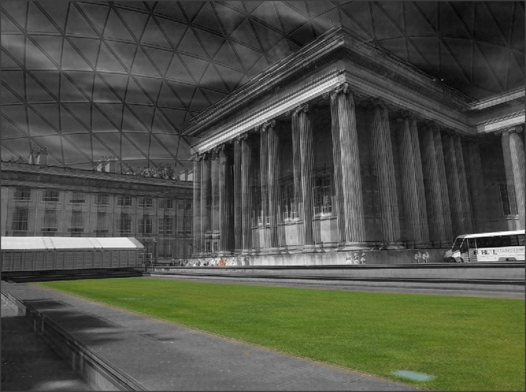
British Museum

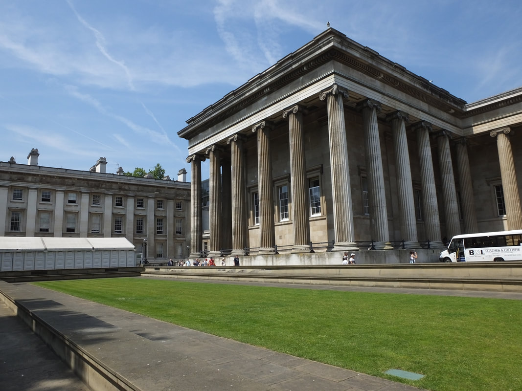

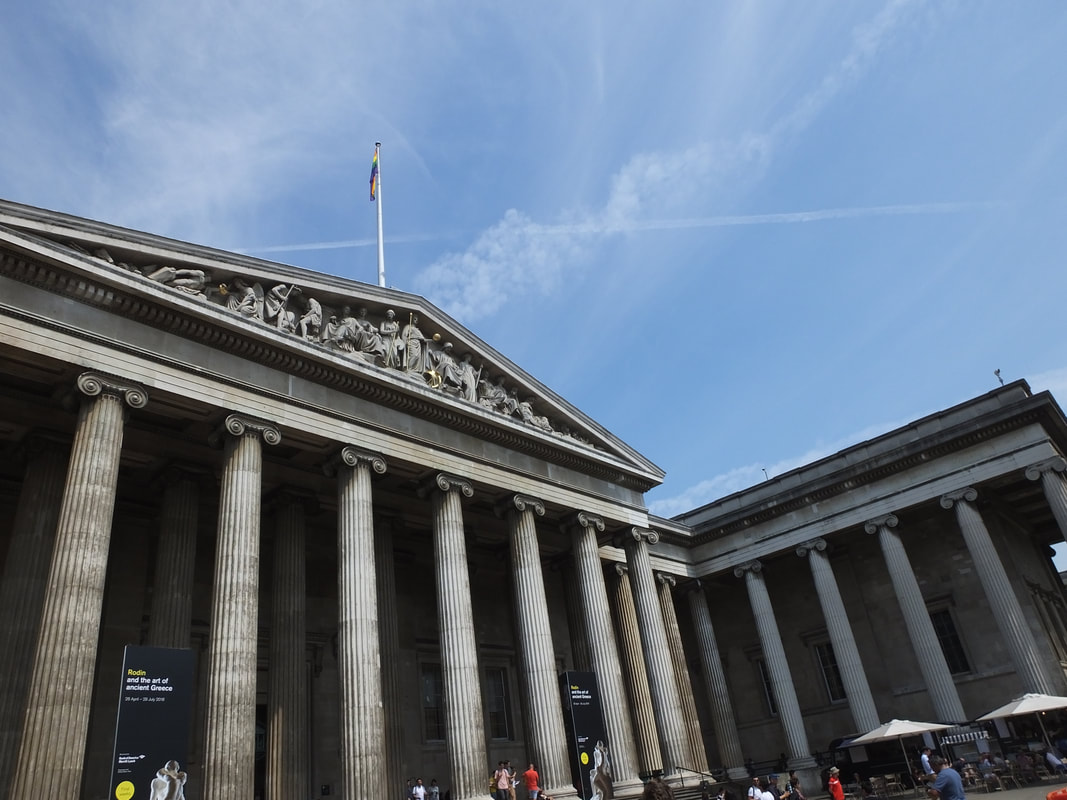
Best
This image is a full capture of the British Museum , and is all in focus. For this image I have used a fast shutter speed as the image is clear, also I have used an f/4 aperture to let the right amount of light in so my image isn't to bleached or too dark. I captured this image on a slight angle to get the side view of the museum.
Katy Wrights Photography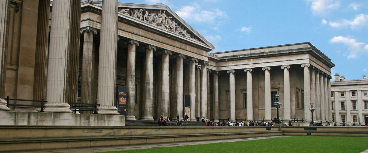
|
Worst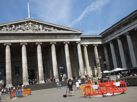
This image has too many objects and people in the way of museum which blocks the view of the stairs and the pillars. Also in this image the camera is quite close to the museum, therefore not allowing to show the full landscape and also the full picture of the museum.
My Photography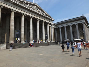
|
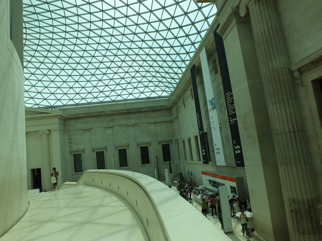
Inside the British Museum
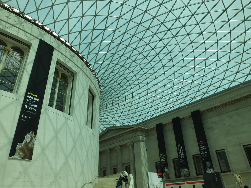

Best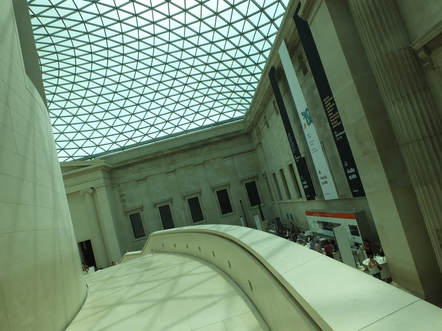
This Is my strongest image I captured of inside the British Museum, because there is an example of large depth of field on the small wall on the side. Also this image is all in focus and clear. For this image I had to play around with the aperture because too much light was coming into the lens of the camera therefore making the image quite bleached out.
My photography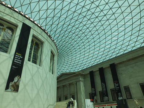
|
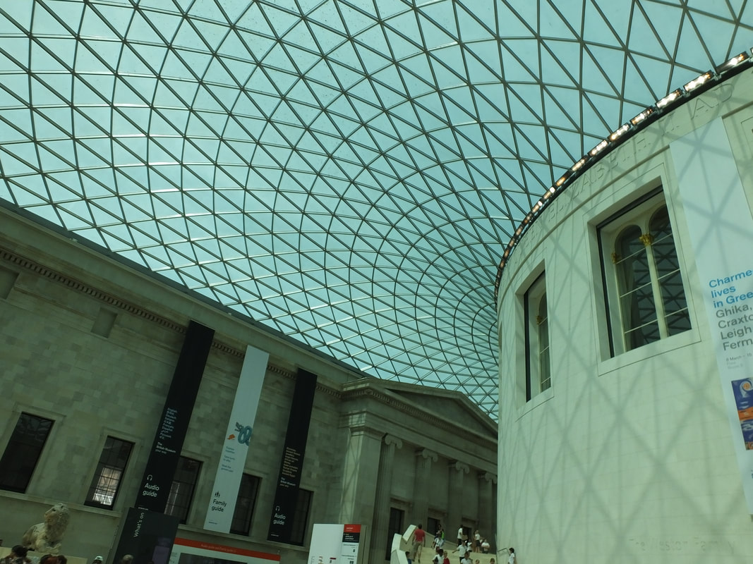
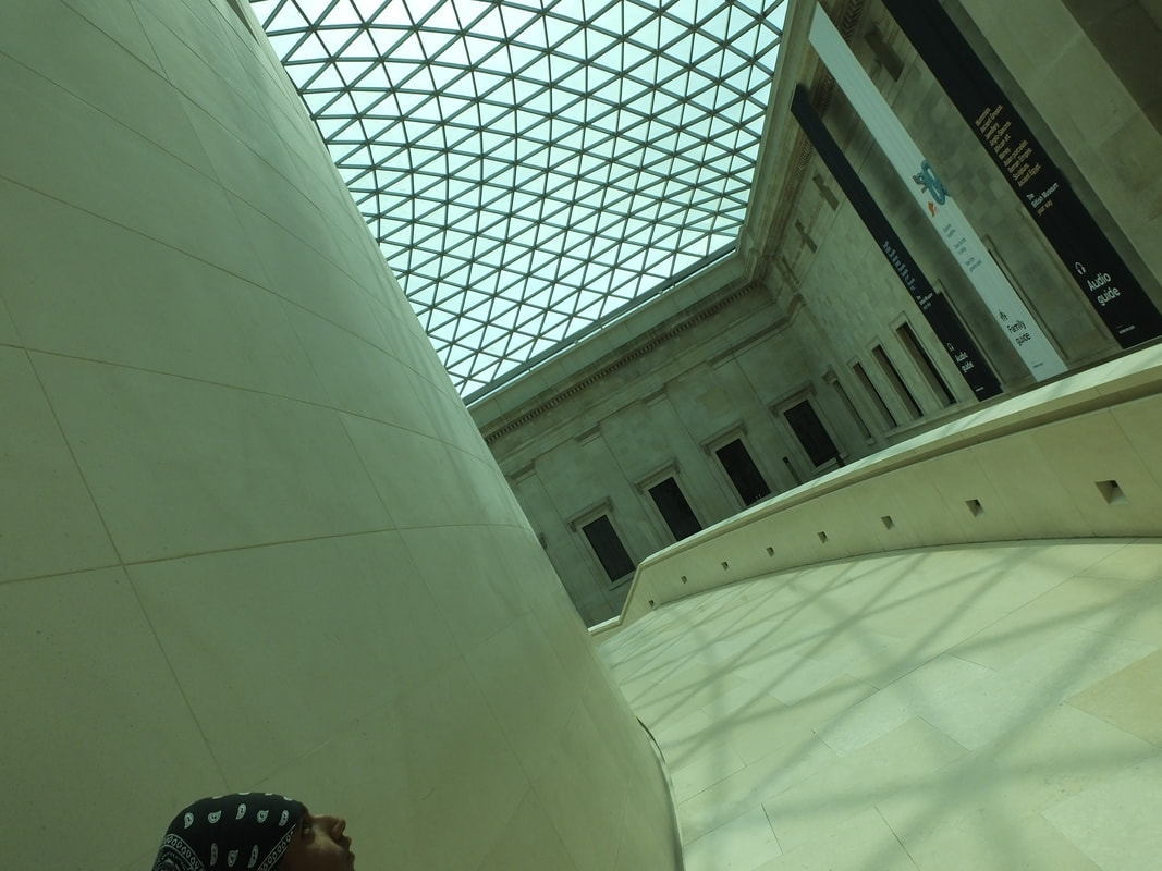
Worst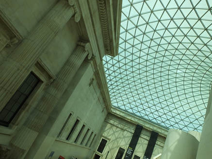
This is my worst image I captured of inside the British Museum because there are not many examples of different camera setting and techniques been shown, and also while capturing this image, the angle was not in a good position as the camera only captured mostly the top half of the museum.
Nigel Young's Photography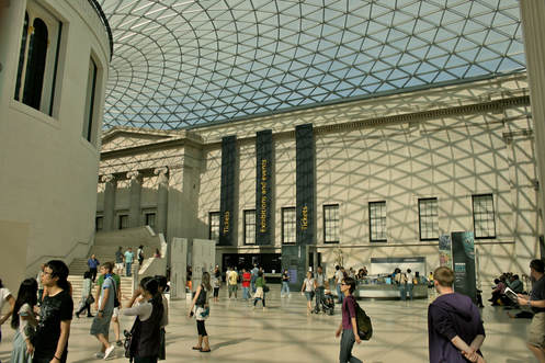
|
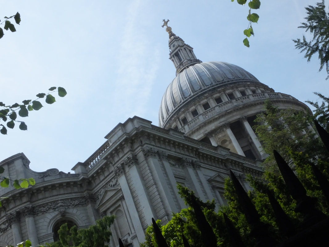
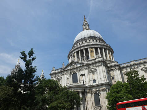
Buildings
Inside St Paul's
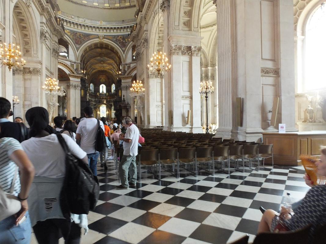
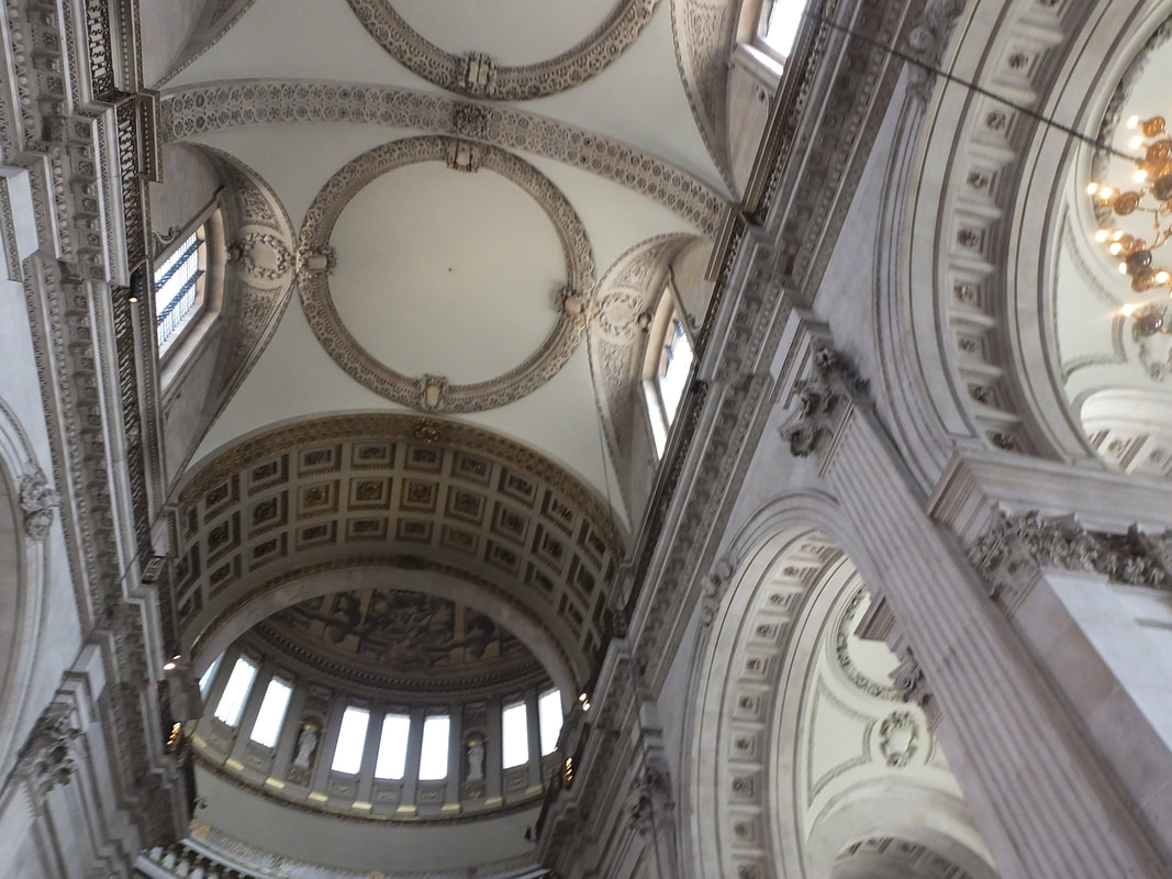
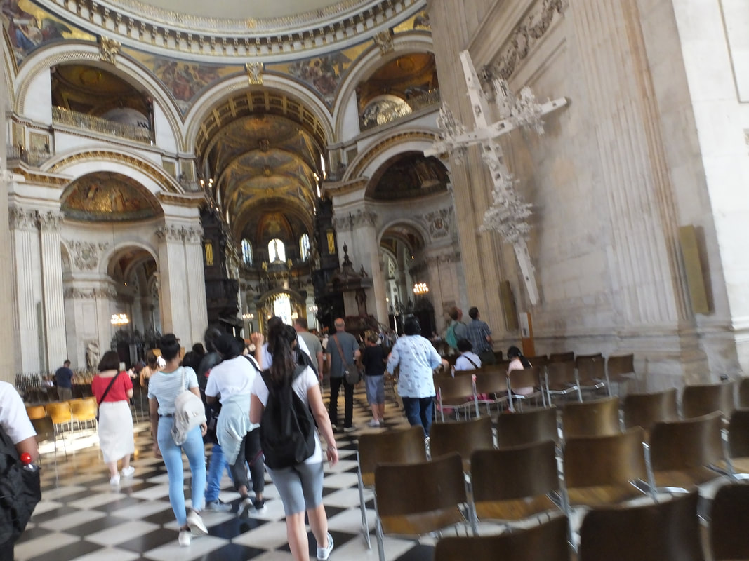
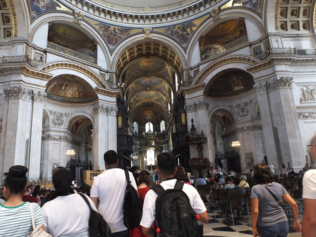

Best
This is my strongest image of the inside of St Paul's as it is a clear image and also you can see all the fine detail of the inside of the church and of the walls.
My photography
|
Worst
This is my weakest image of the inside of St Paul's as the whole image is in blur and not in focus.
Jean-Christophe's Photography
|
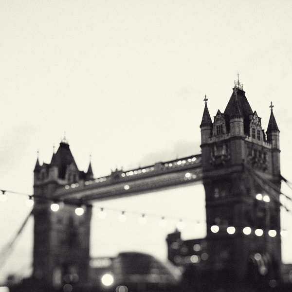
London bridge
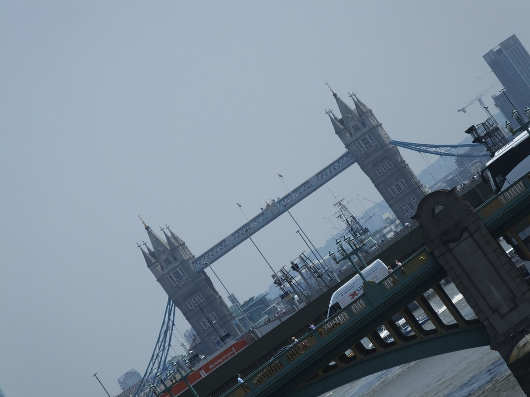
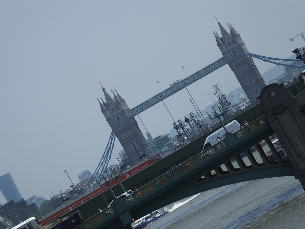
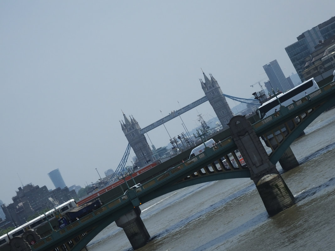
My photography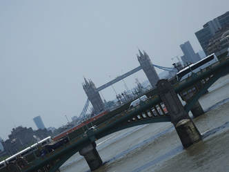
|
Alexander J.E Radley's photography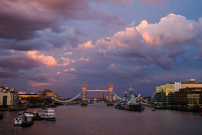
|
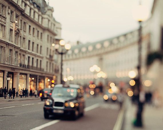
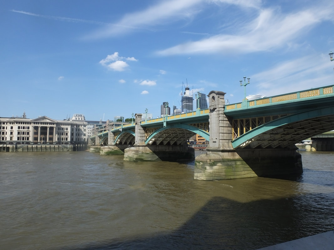
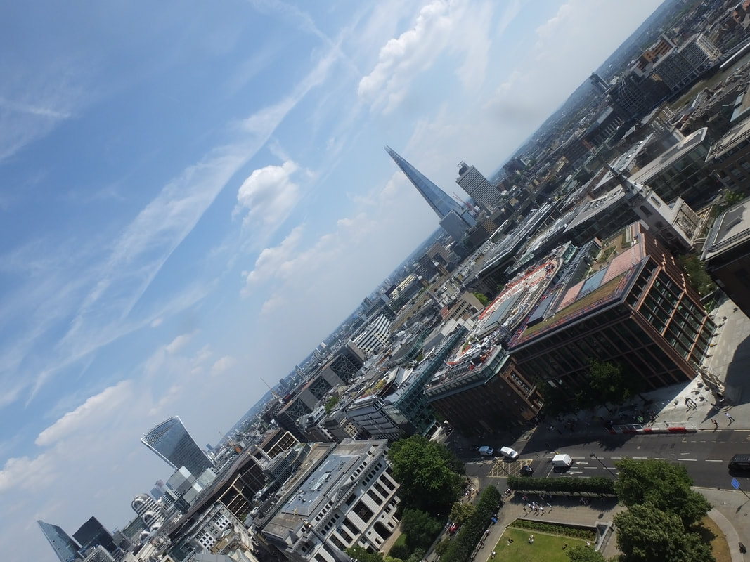
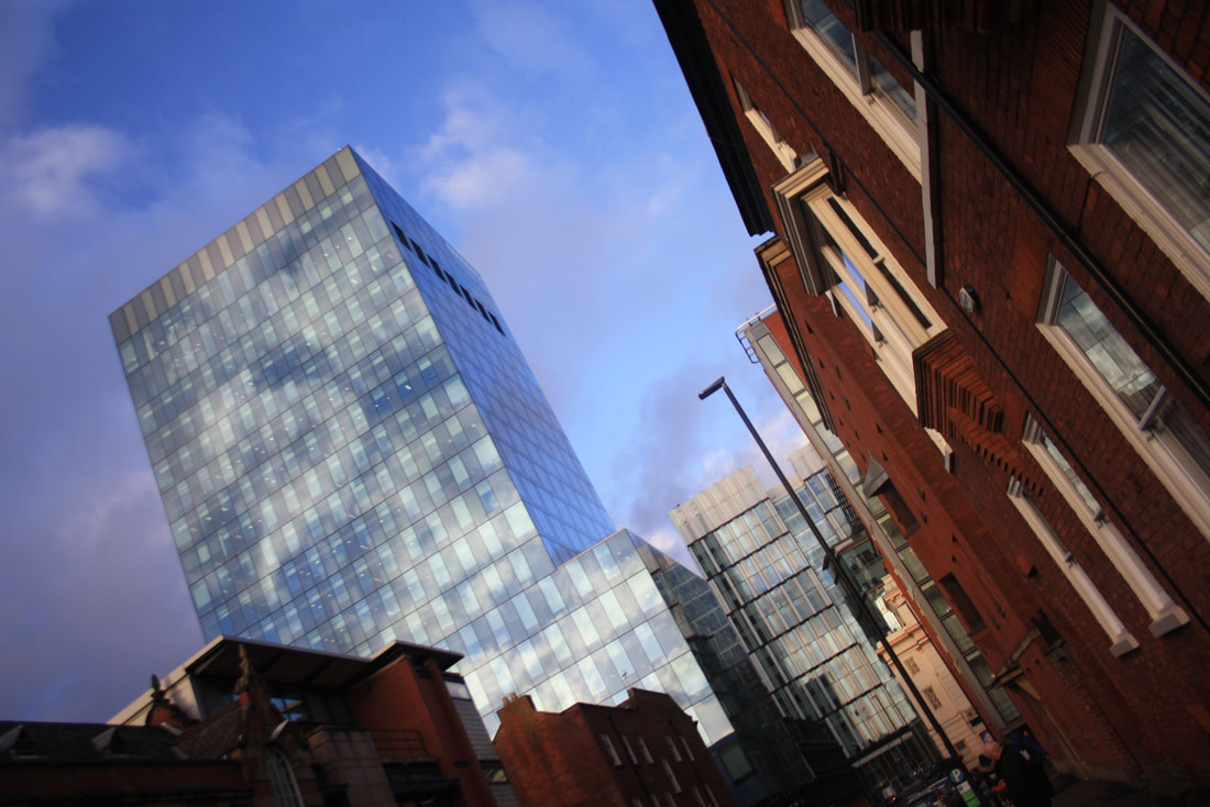
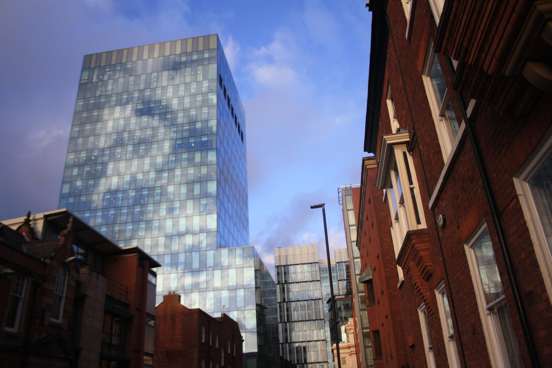
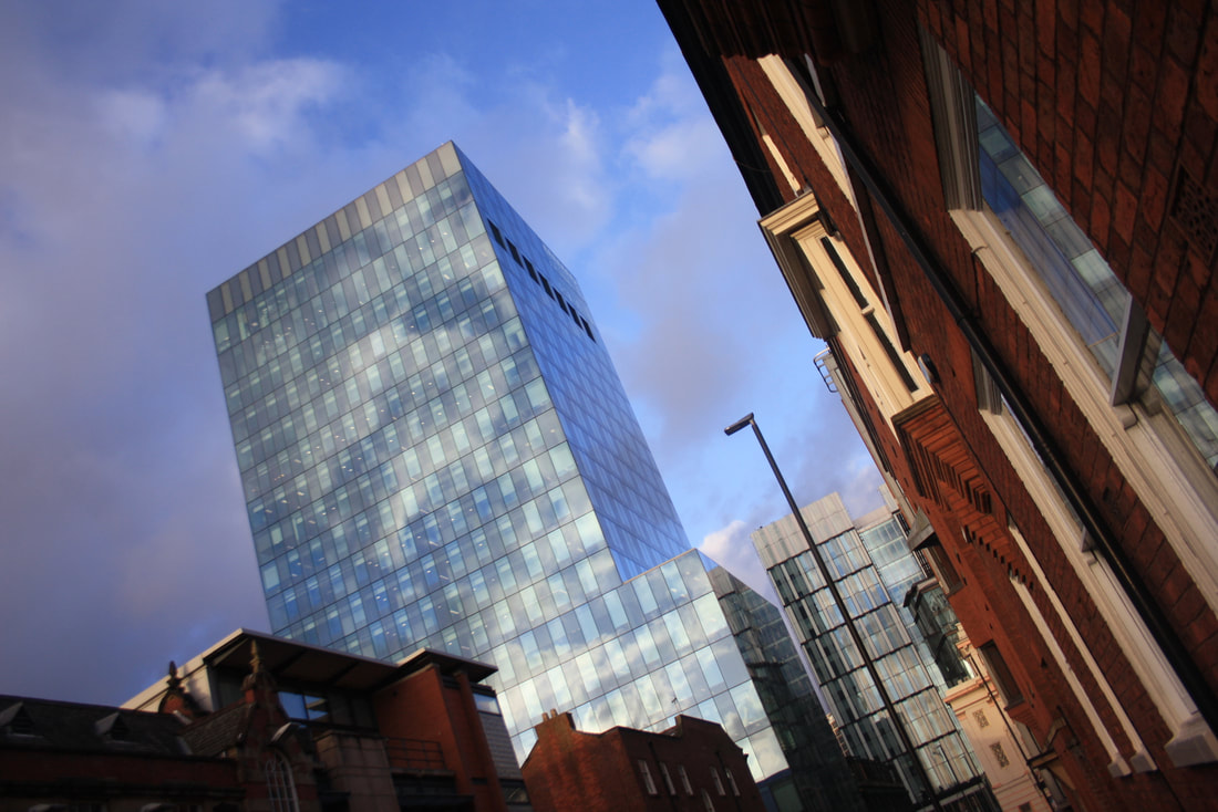
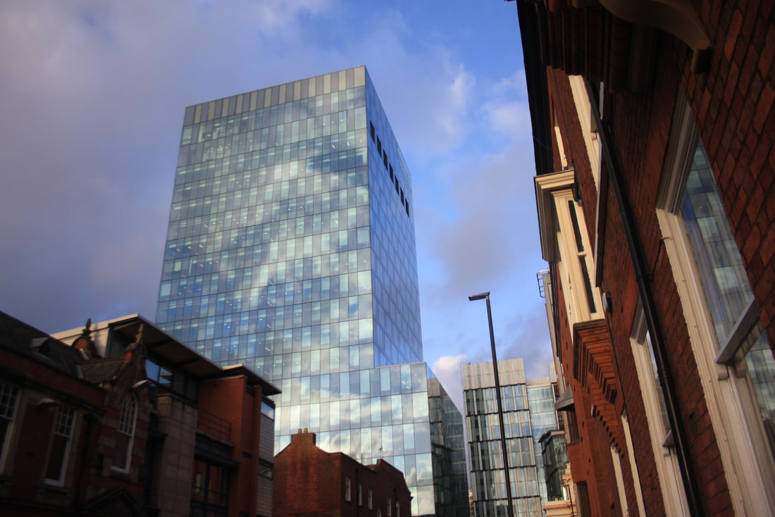
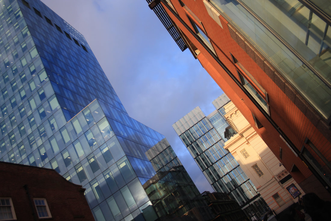
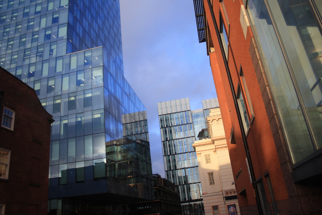
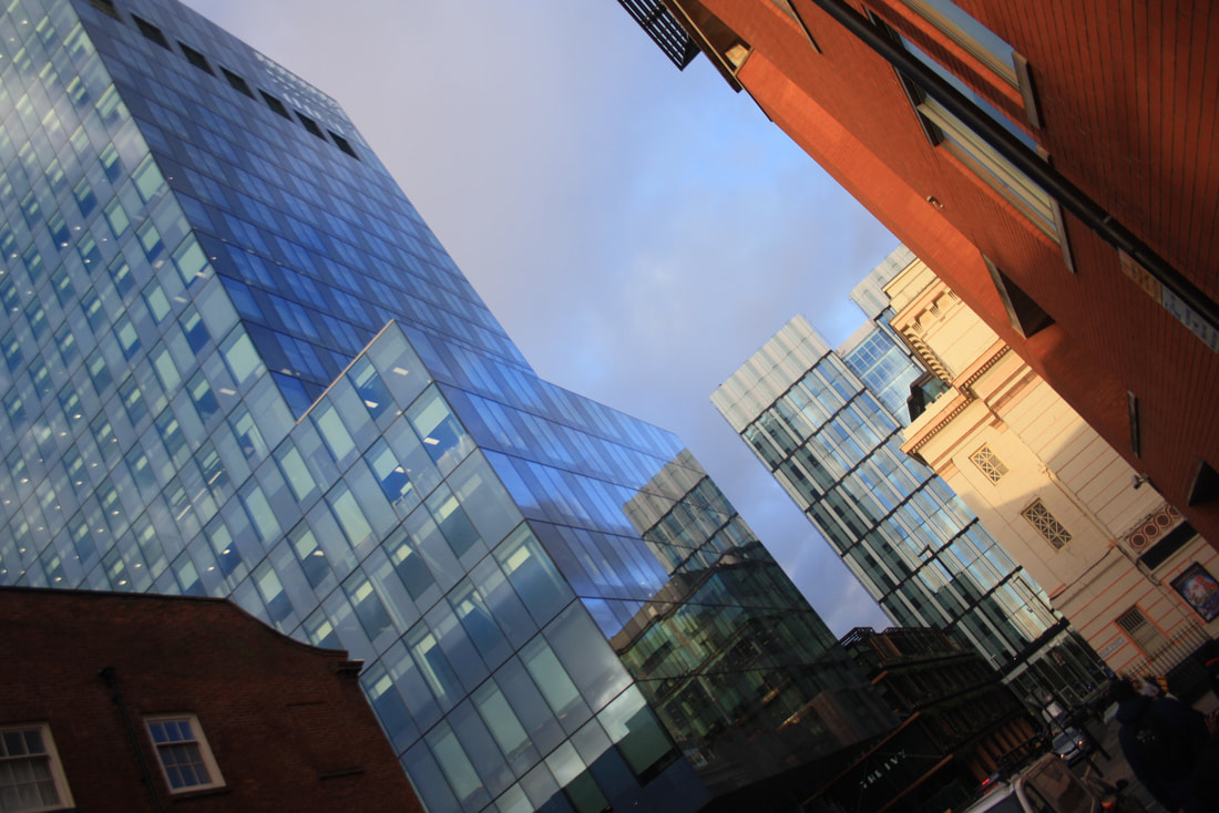
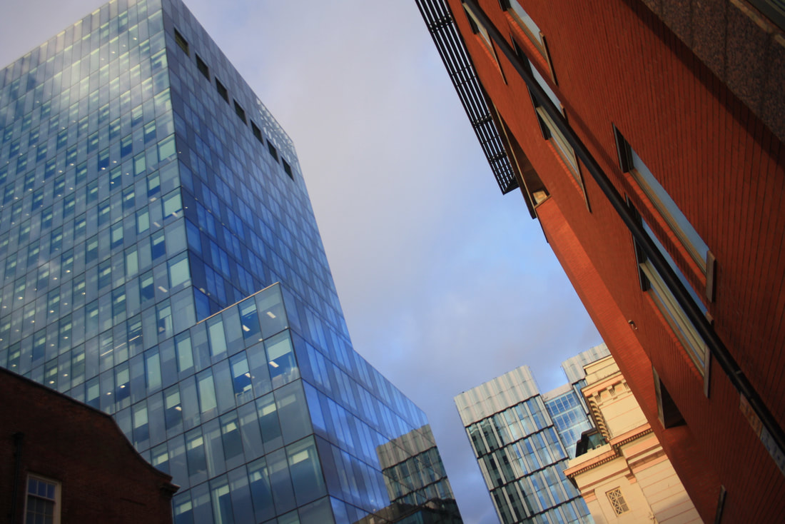
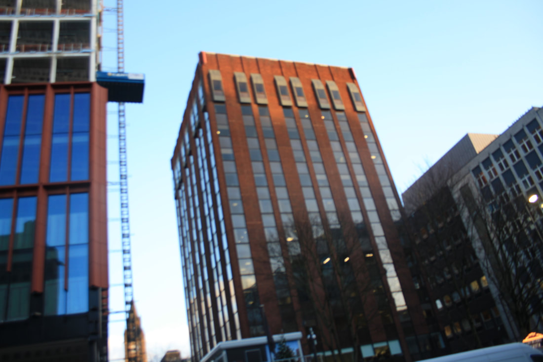
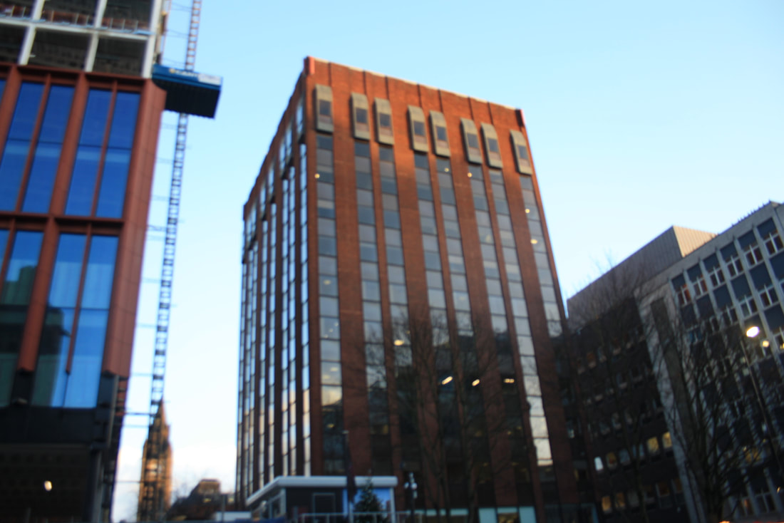
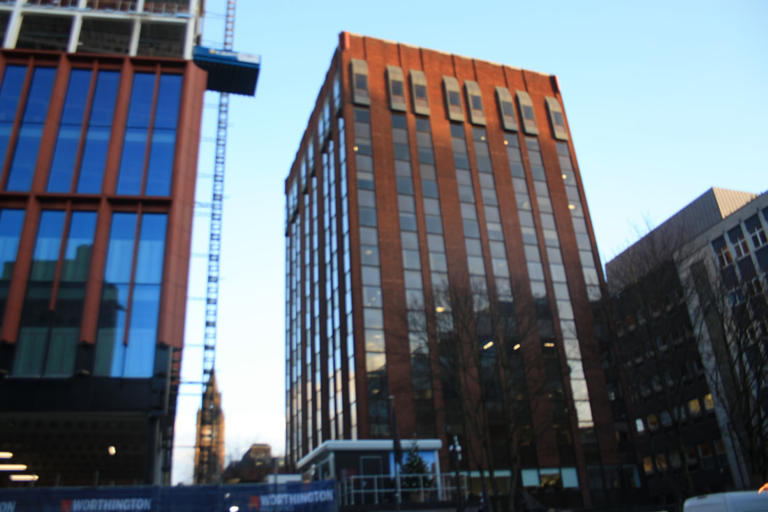
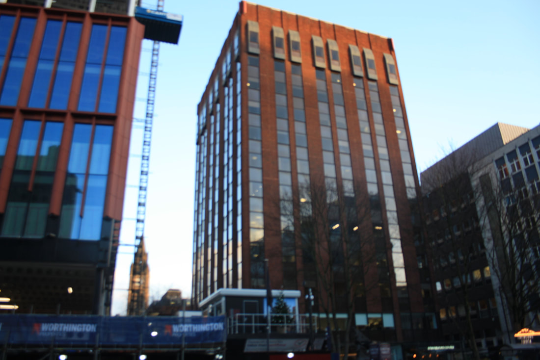
London Roads

River Thames
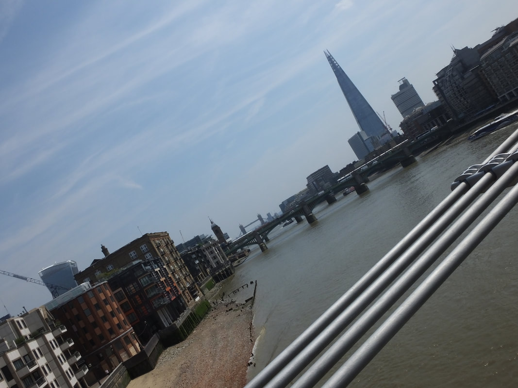
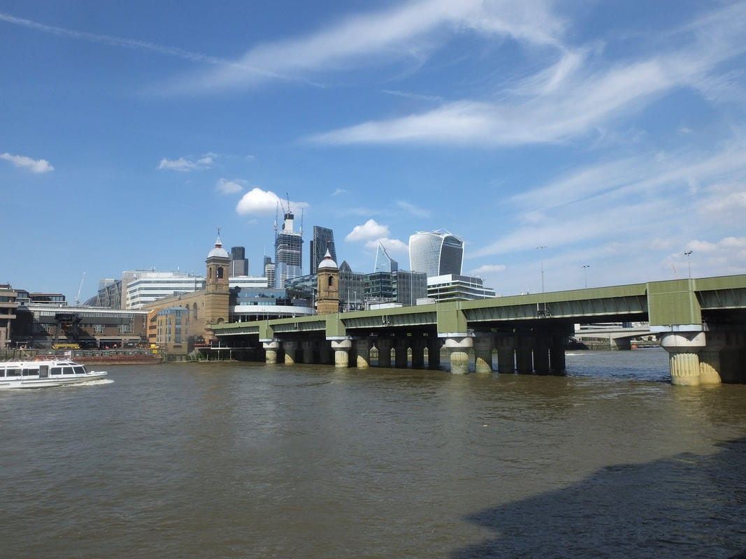
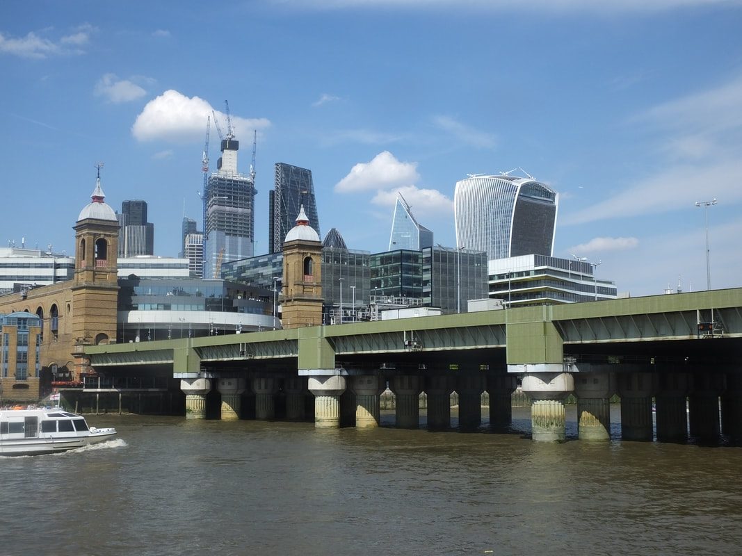
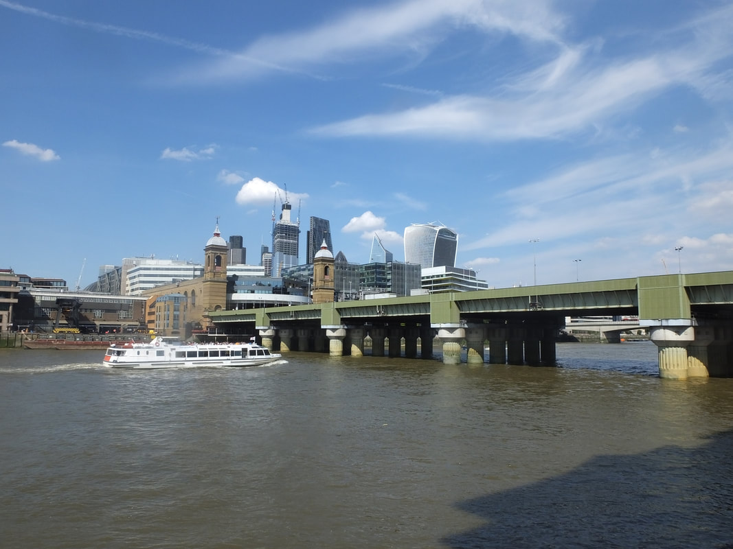
Best |
Worst |
This is my best picture I captured of River Thames because it is a full capture and it is also clear. It also is an example of large depth of field as the bridge starts off clear and as it goes down it gets smaller and less viewable. It also shows a clear view of the sky and demonstrates the clear use of aperture as there is a steady balance of the amount of light that has been let in. I also thought about the angle while I was capturing this image to make sure my picture looks effective for the viewer.
|
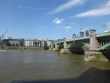
To me this is my weakest picture I captured of River Thames because I did not really think about using any camera techniques and didn't take the angle in consideration. There is also metal poles blocking the view of the Thames which doesn't make the picture clear enough and also makes it look quite unprofessional.
|
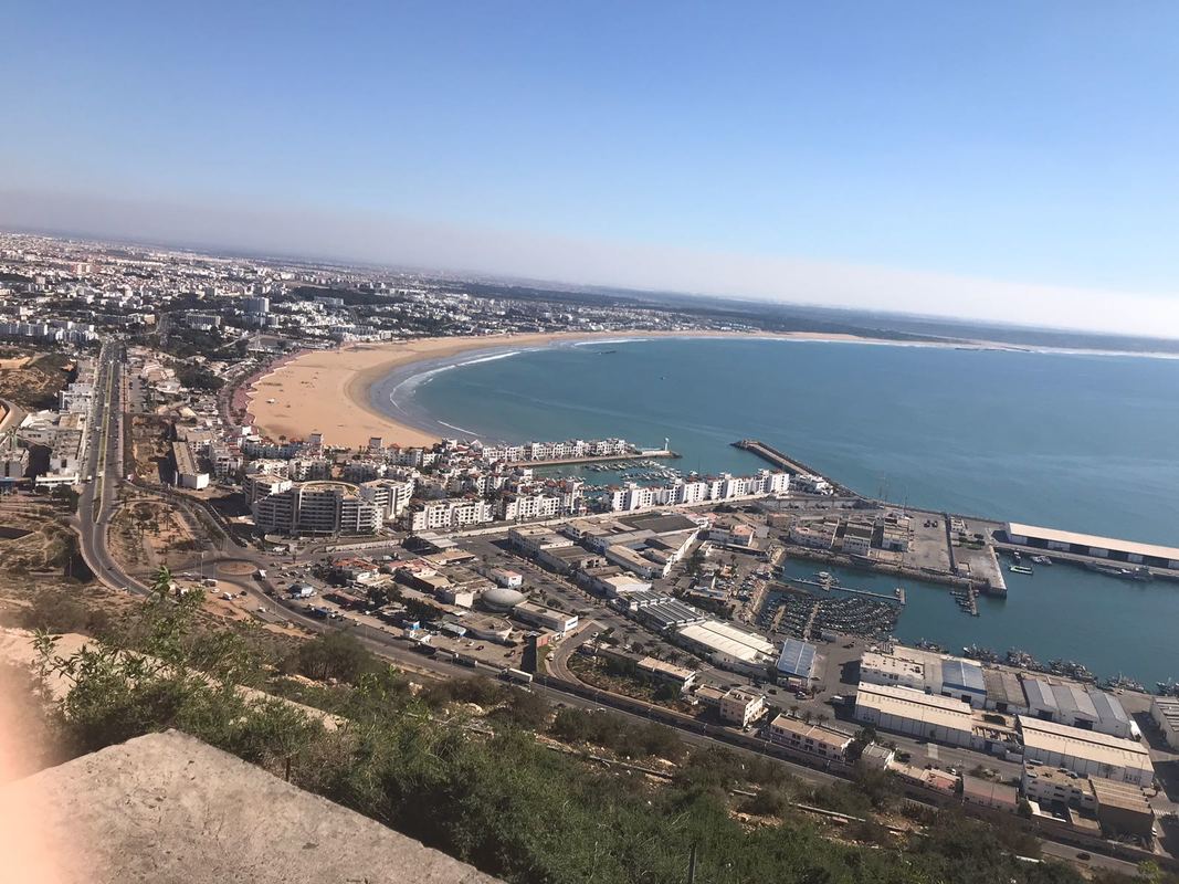
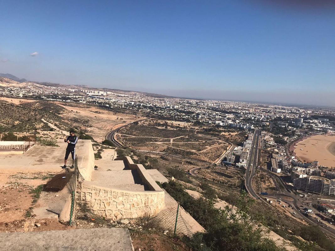
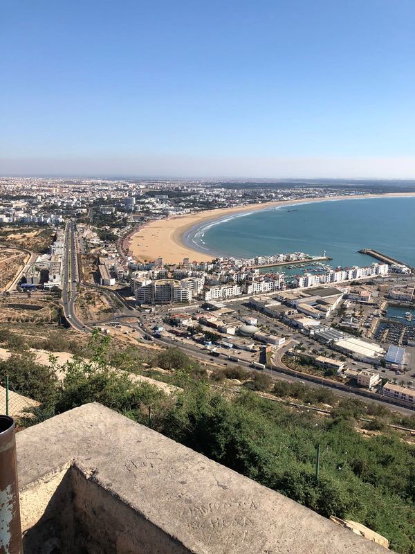
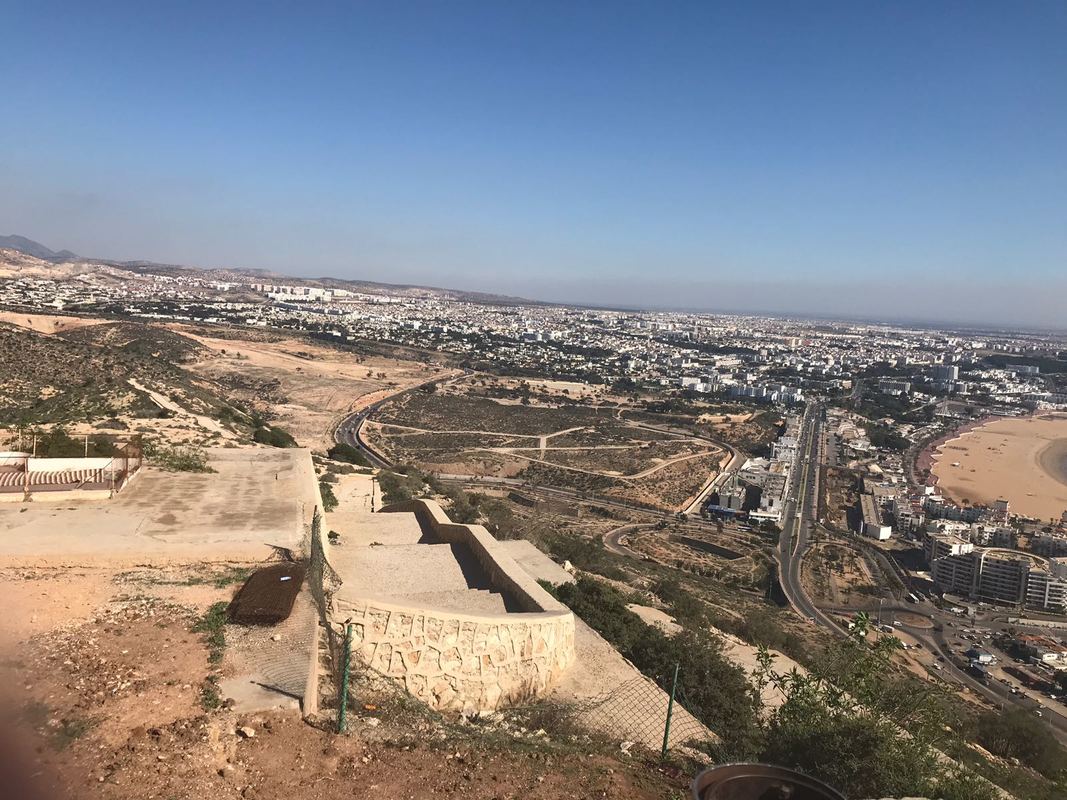
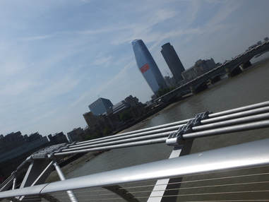
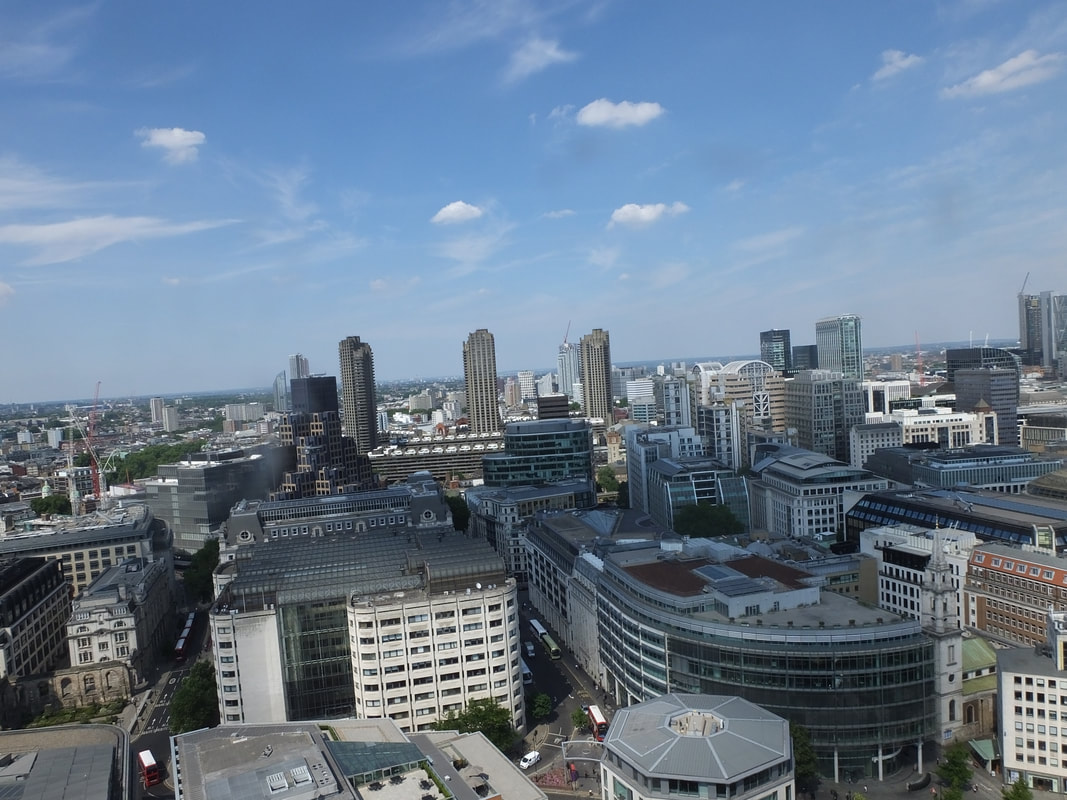
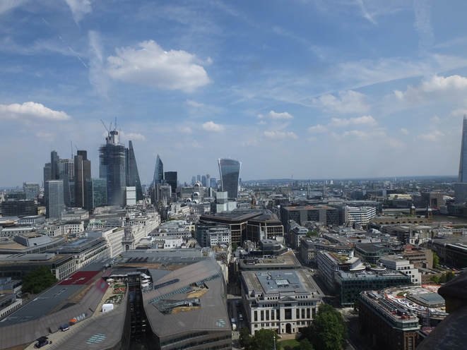
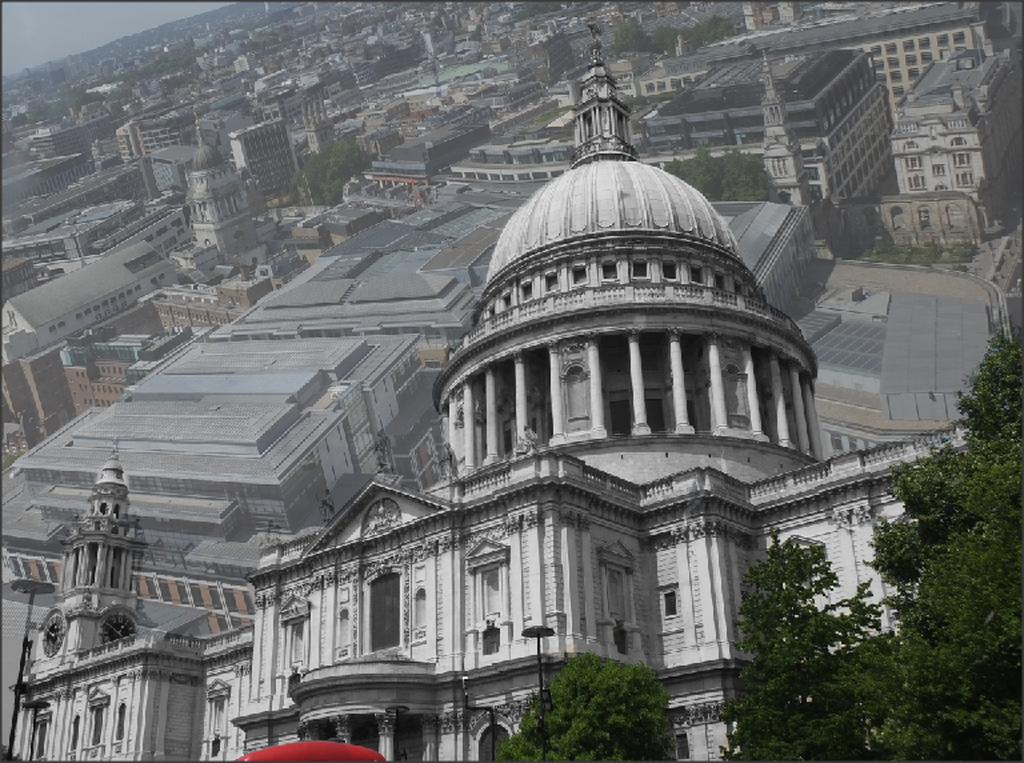
Sky Line, Bird's Eye View
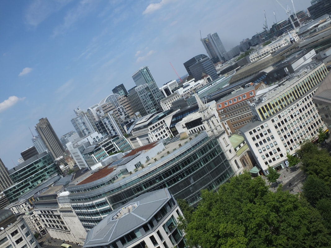
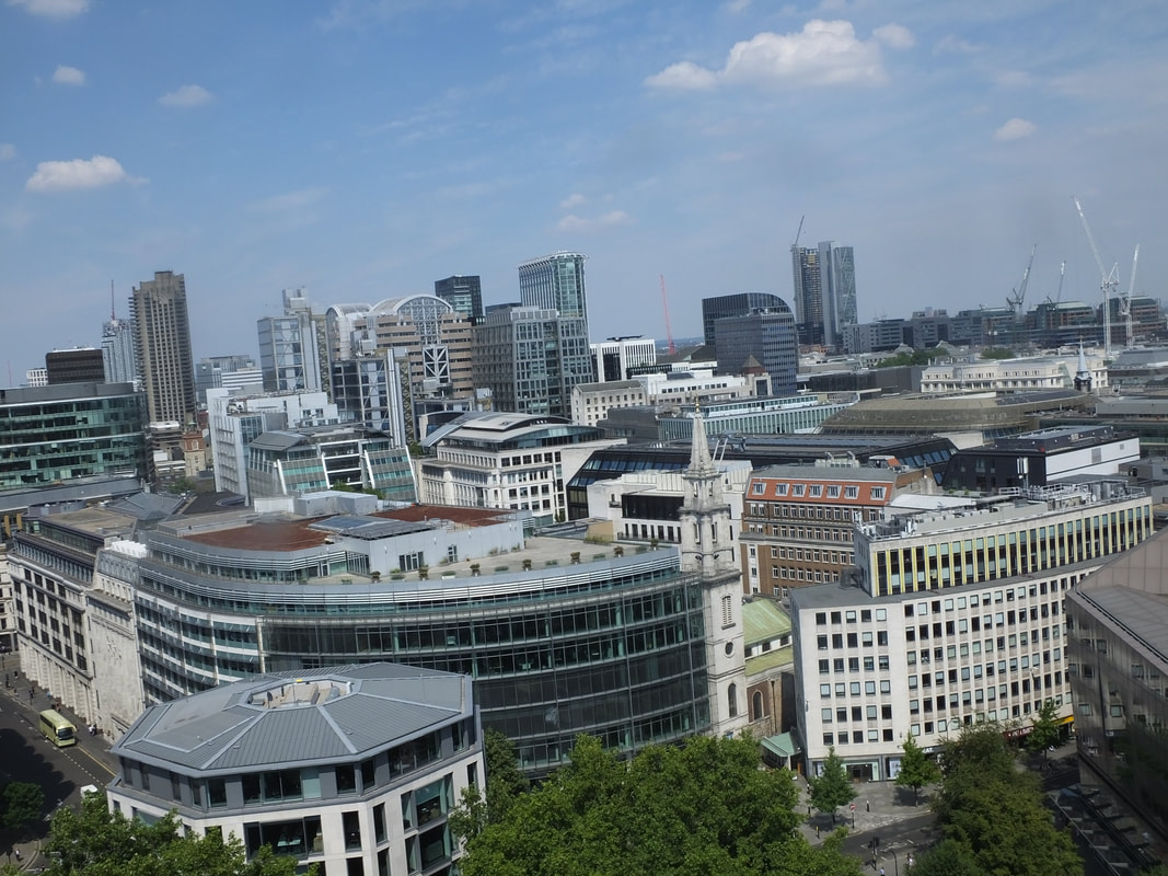
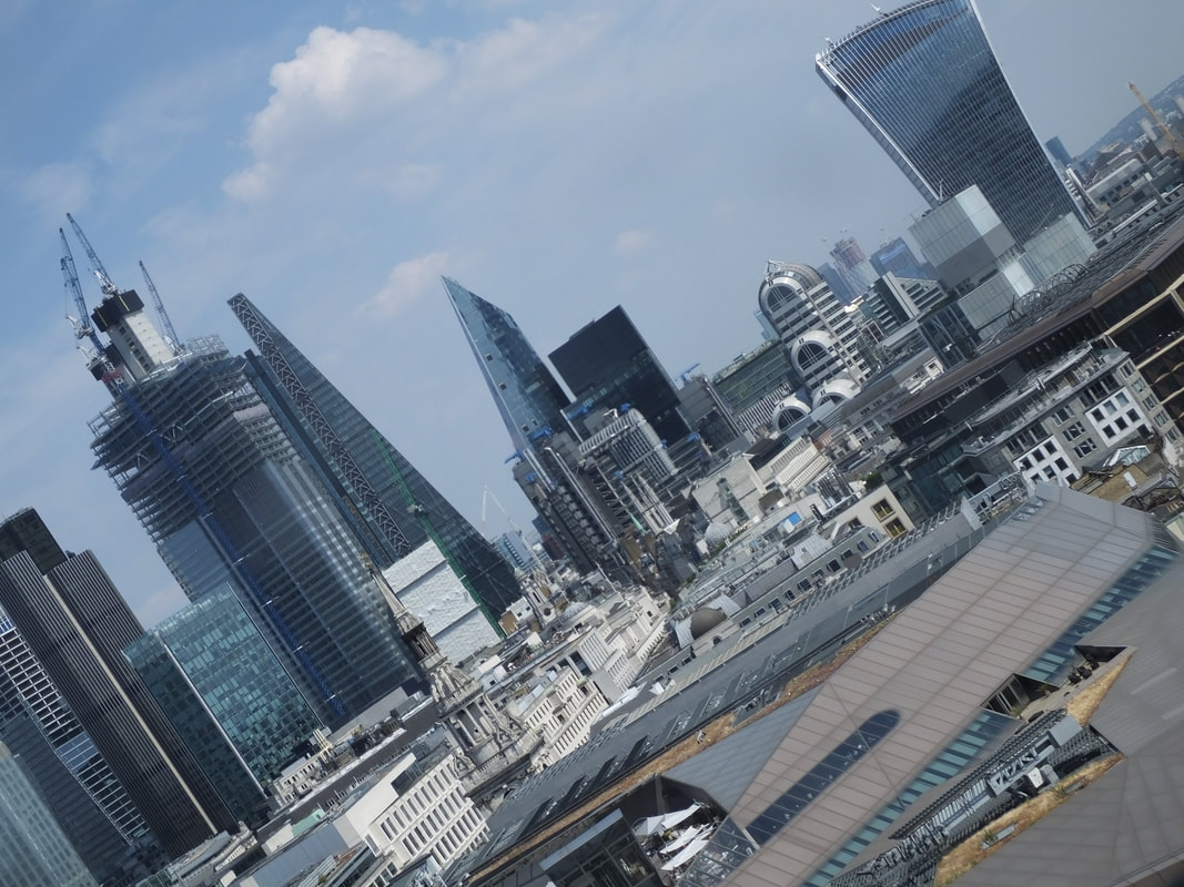
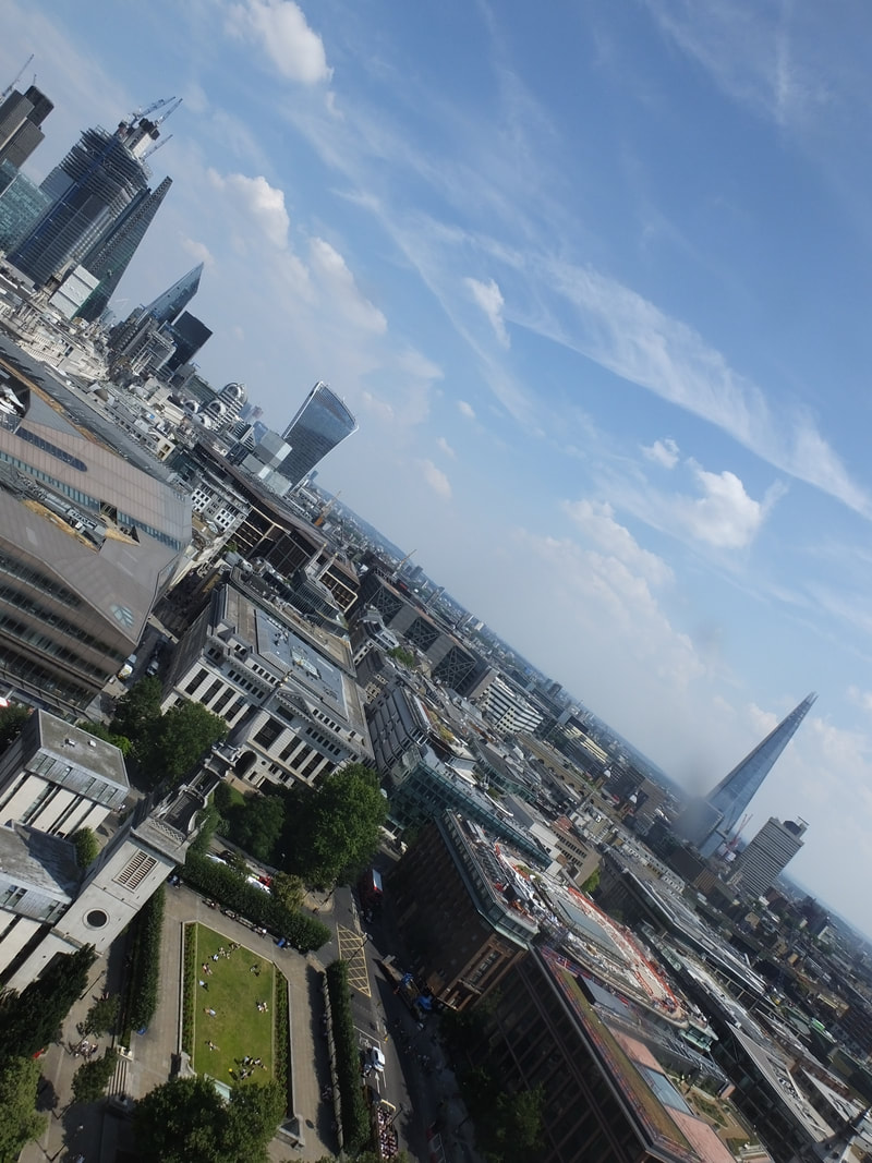
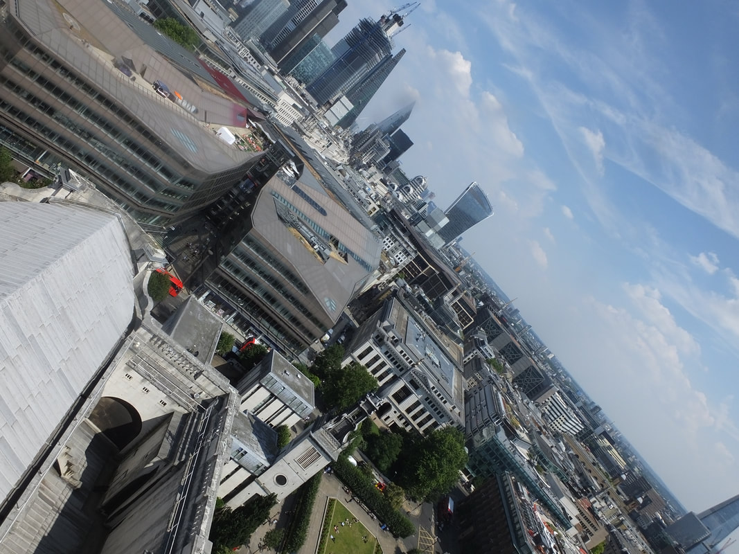
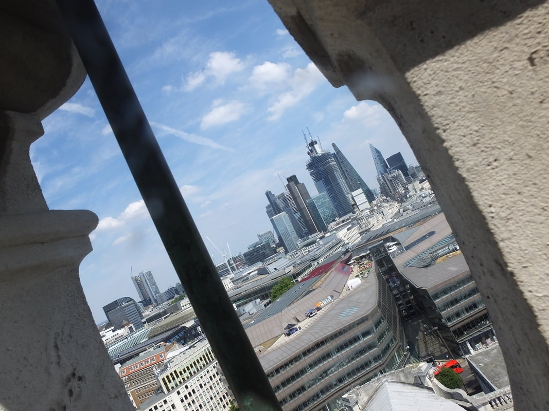
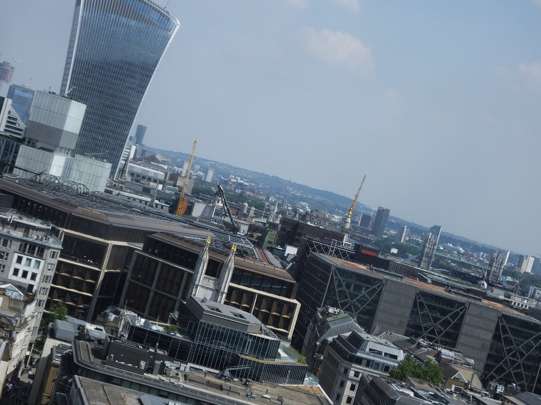
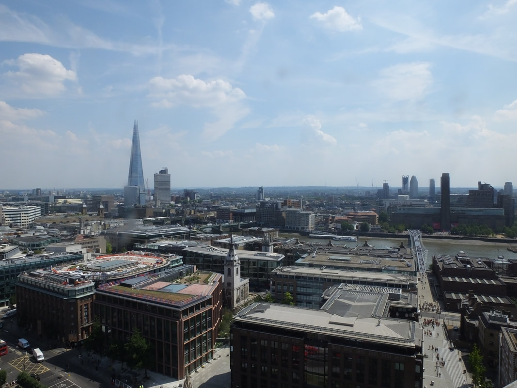
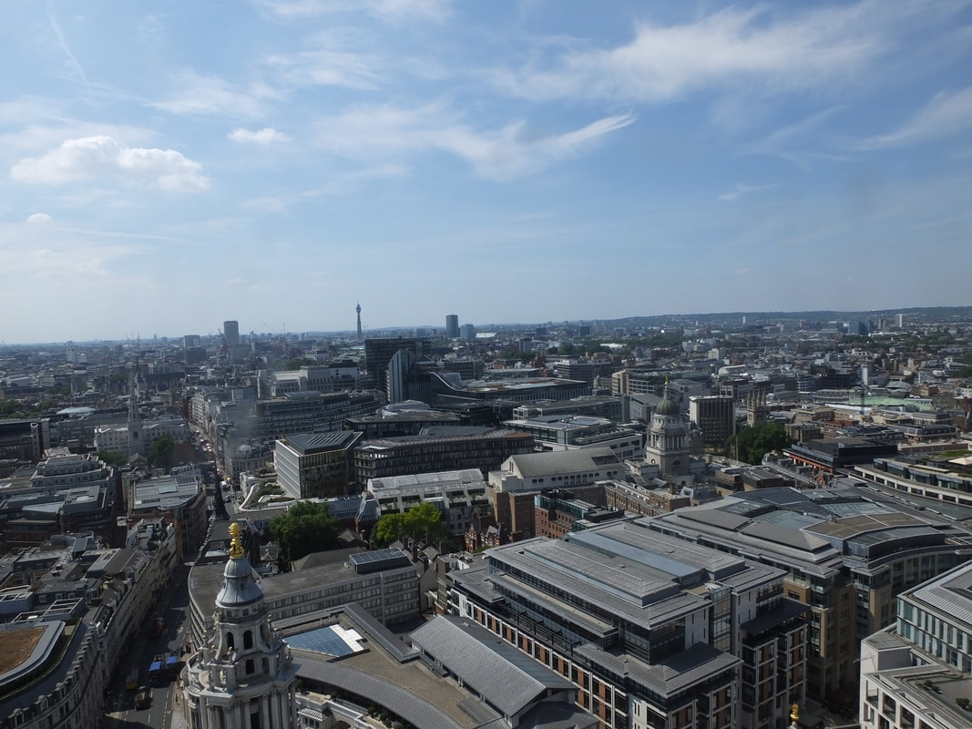

St Paul's


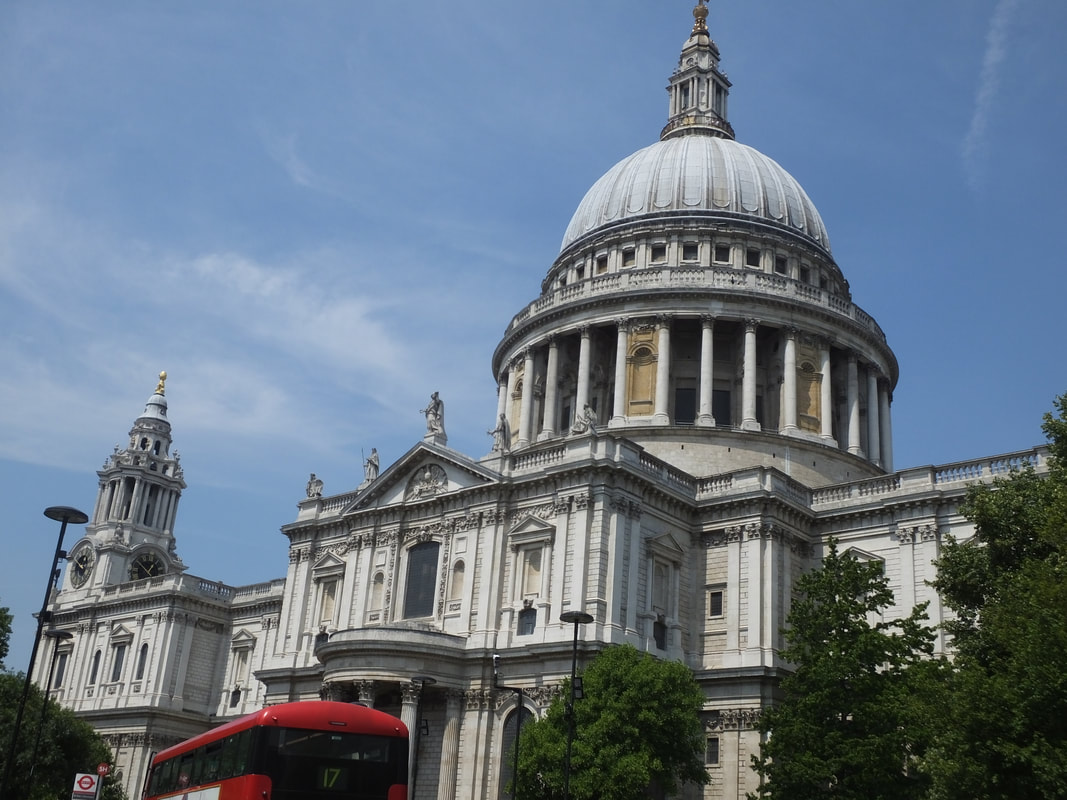

Best
To me this is my best image of the outside of St Paul's as it is a full shot and is clear and in focus. Also I have used the right aperture so the image isn't too dark and also isn't too bleached which makes it harder to view and also covers some of the image. Also In this image I have used a fast shutter speed and the moving is clear and is not blurred out.
|
Worst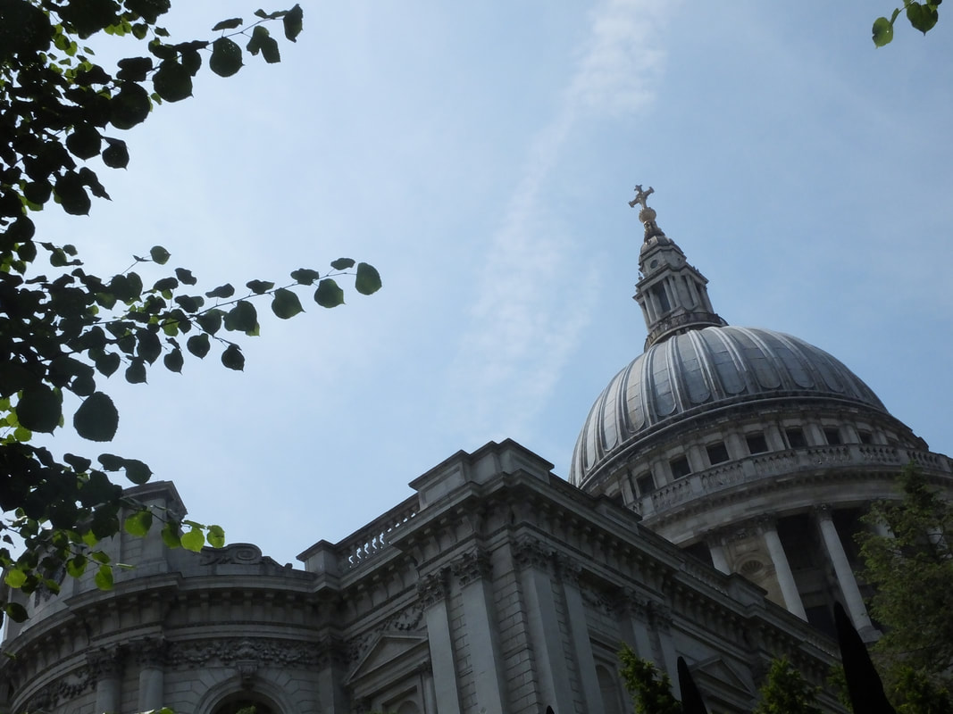
This my worst picture of St Paul's because it is not positioned in a clear way and also the angle of the image is not demonstrated clearly and effectively compared to my other images of St Paul's.
|
James Mathew's Photography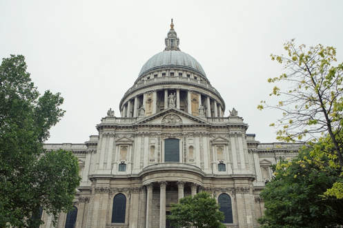
|
My Photography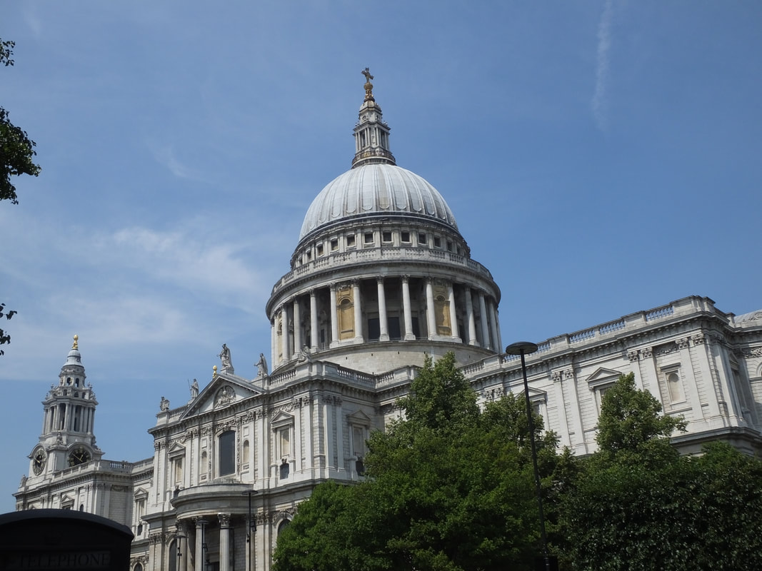
|
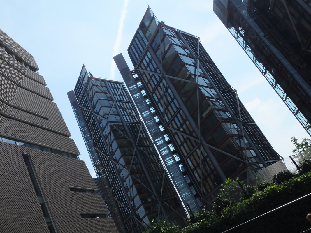
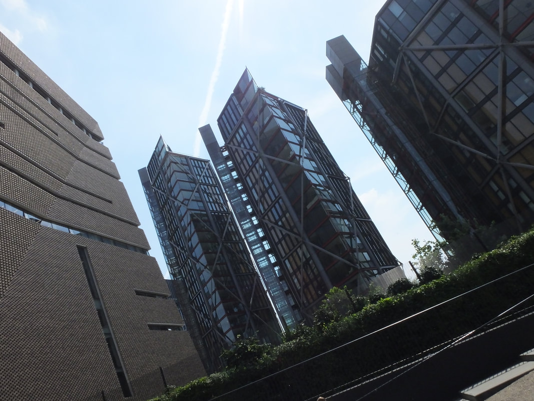
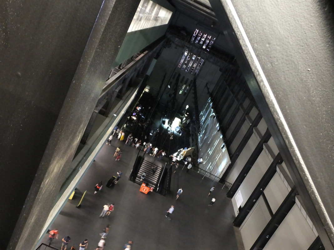
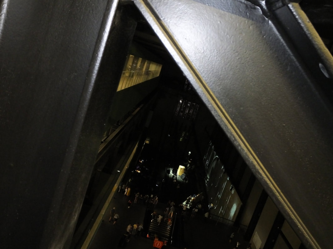
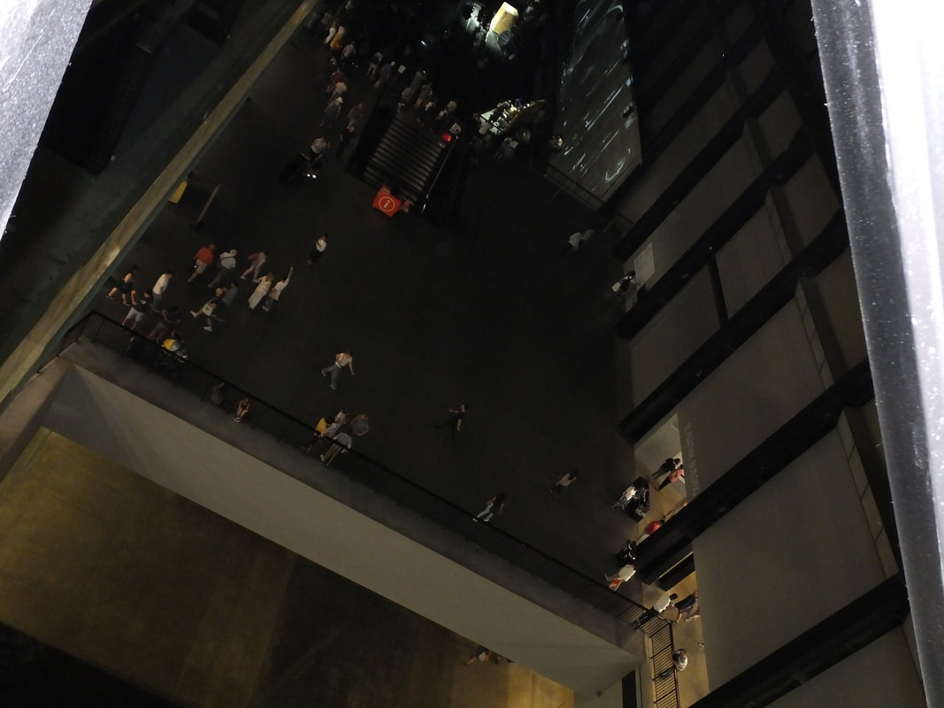
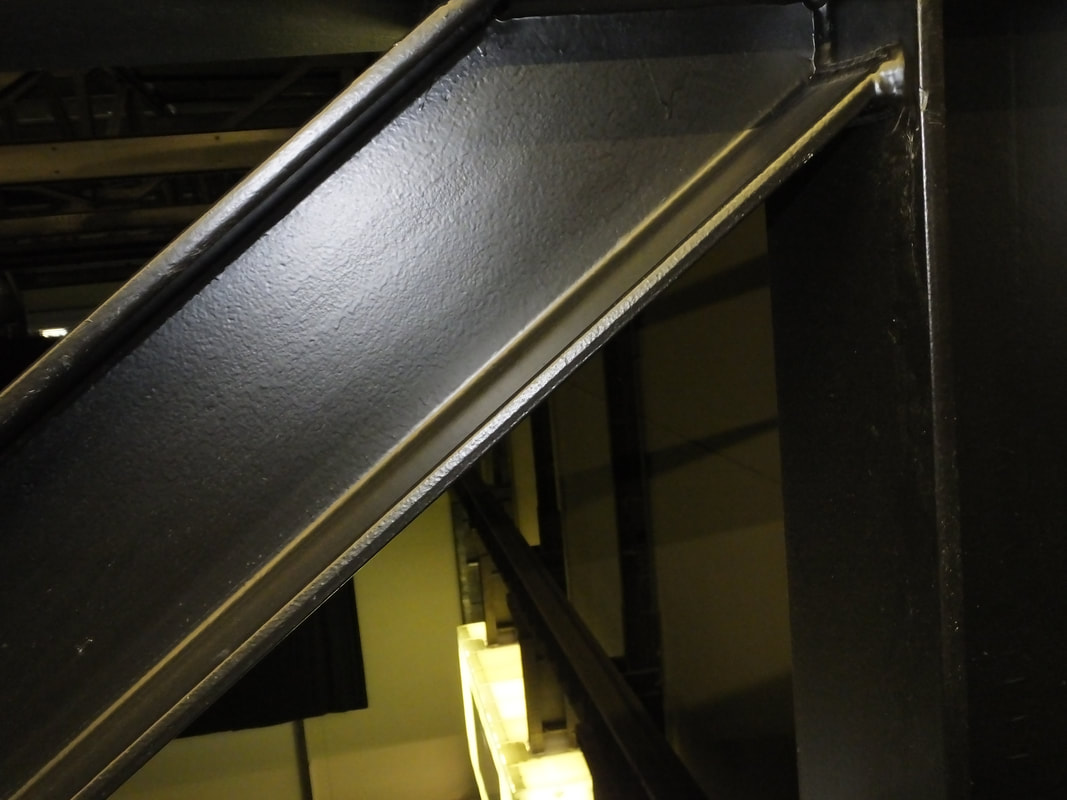
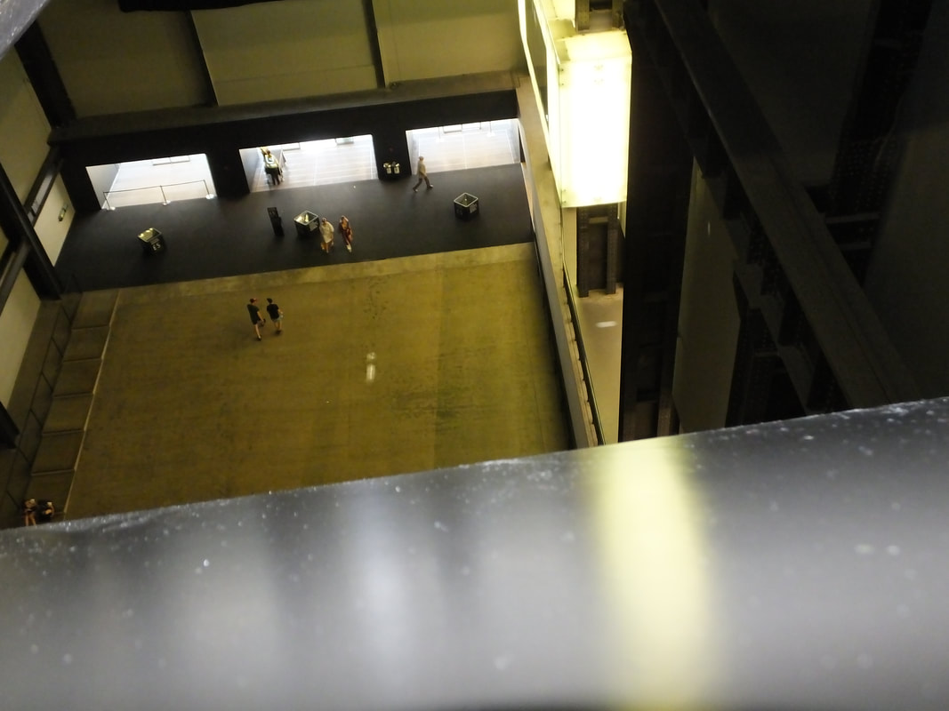
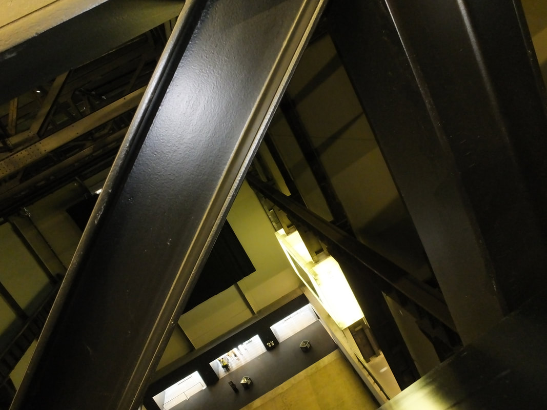
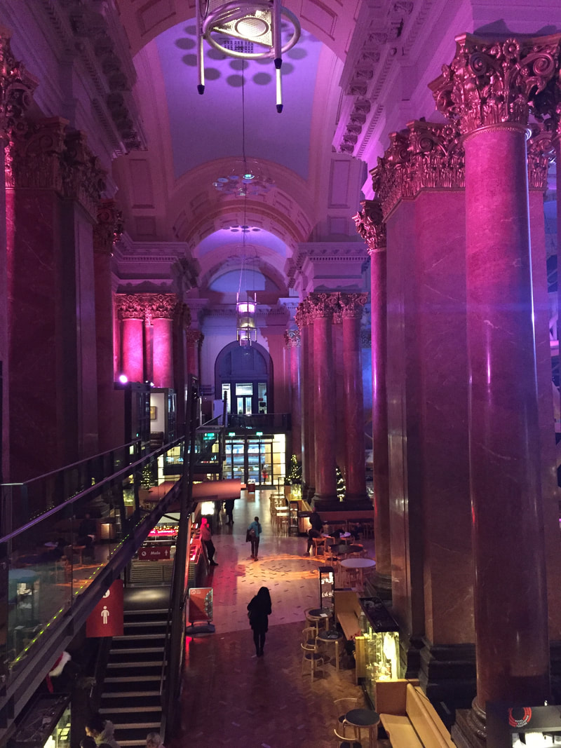
Inside The Tate
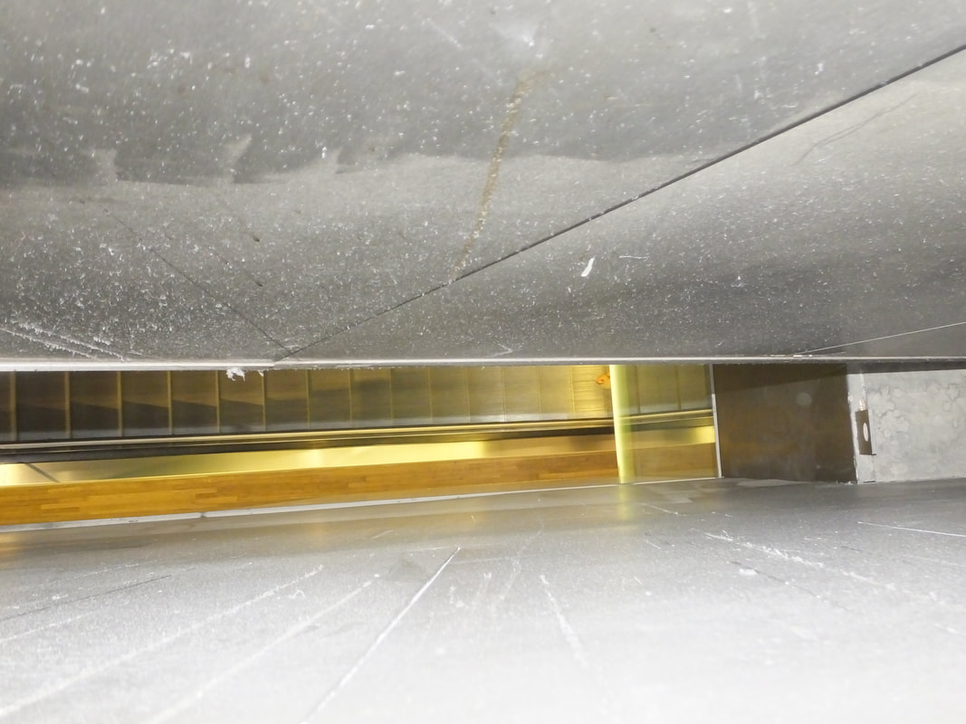
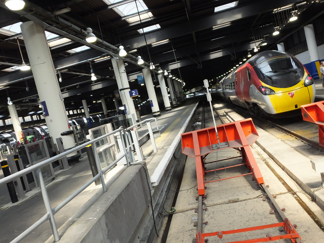
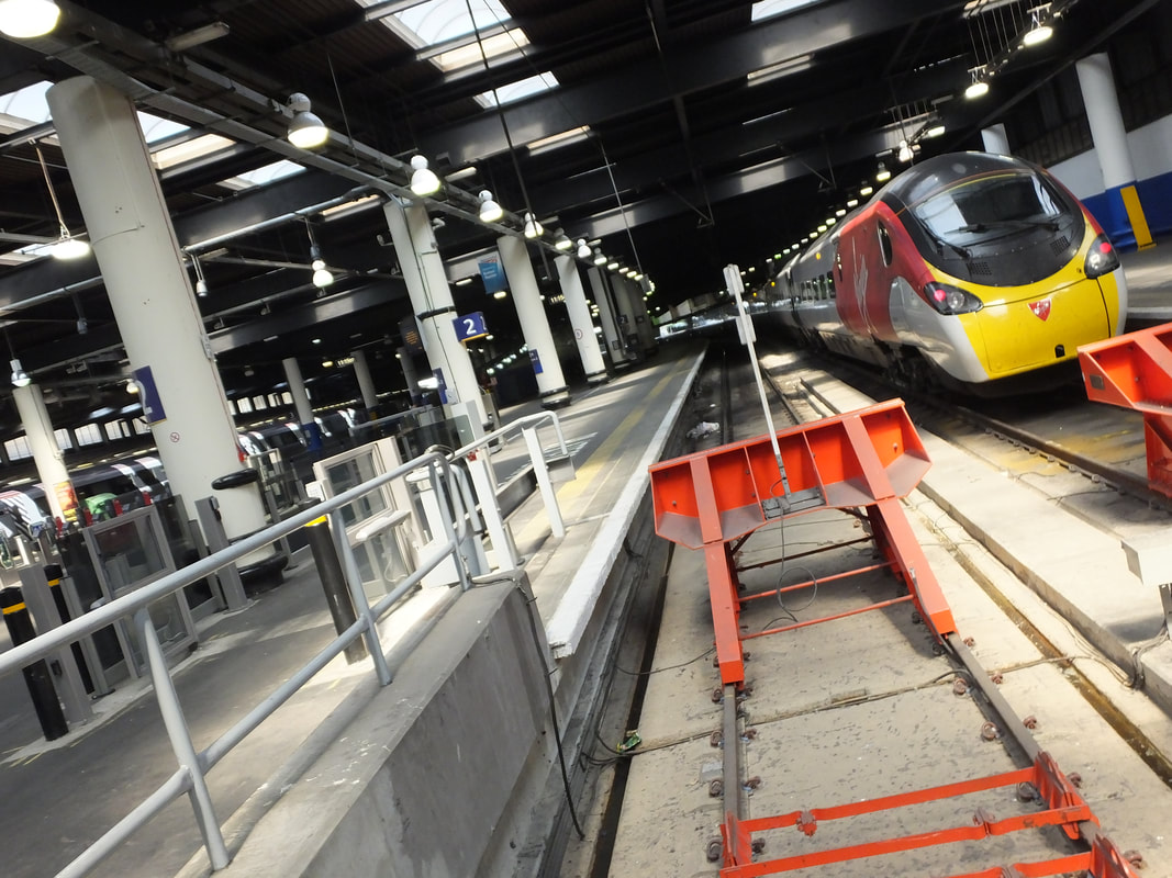
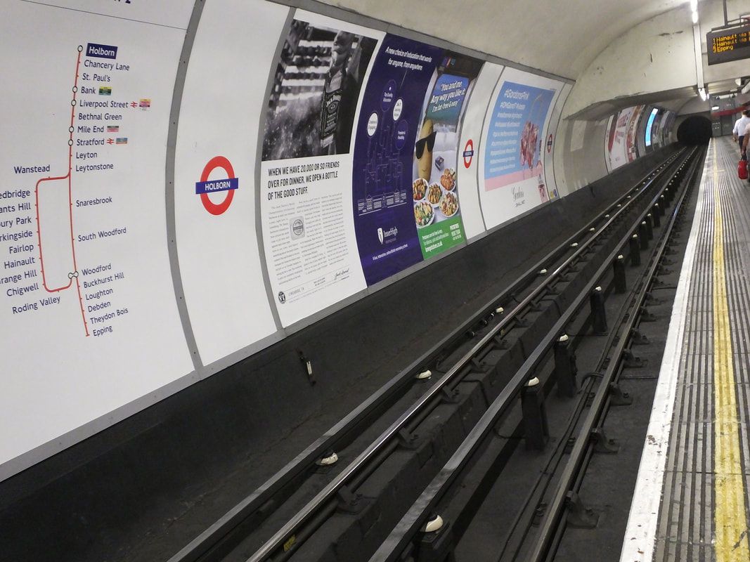
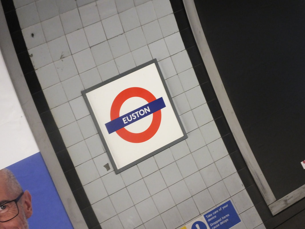
London Underground And Euston
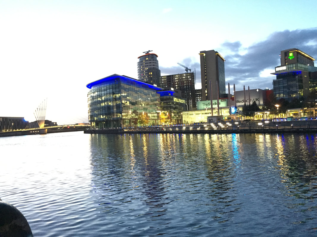
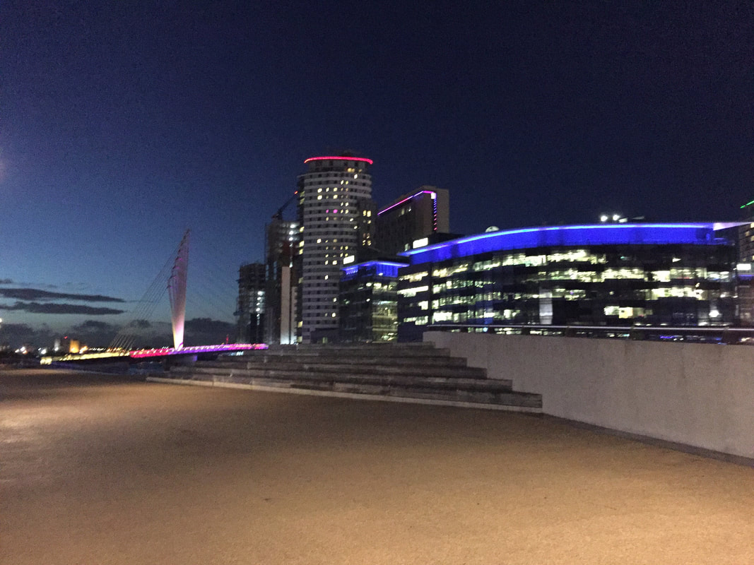
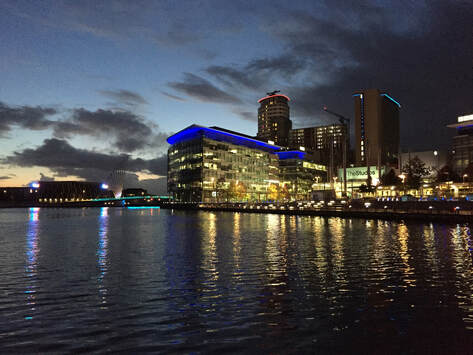
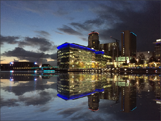
Salford Quays
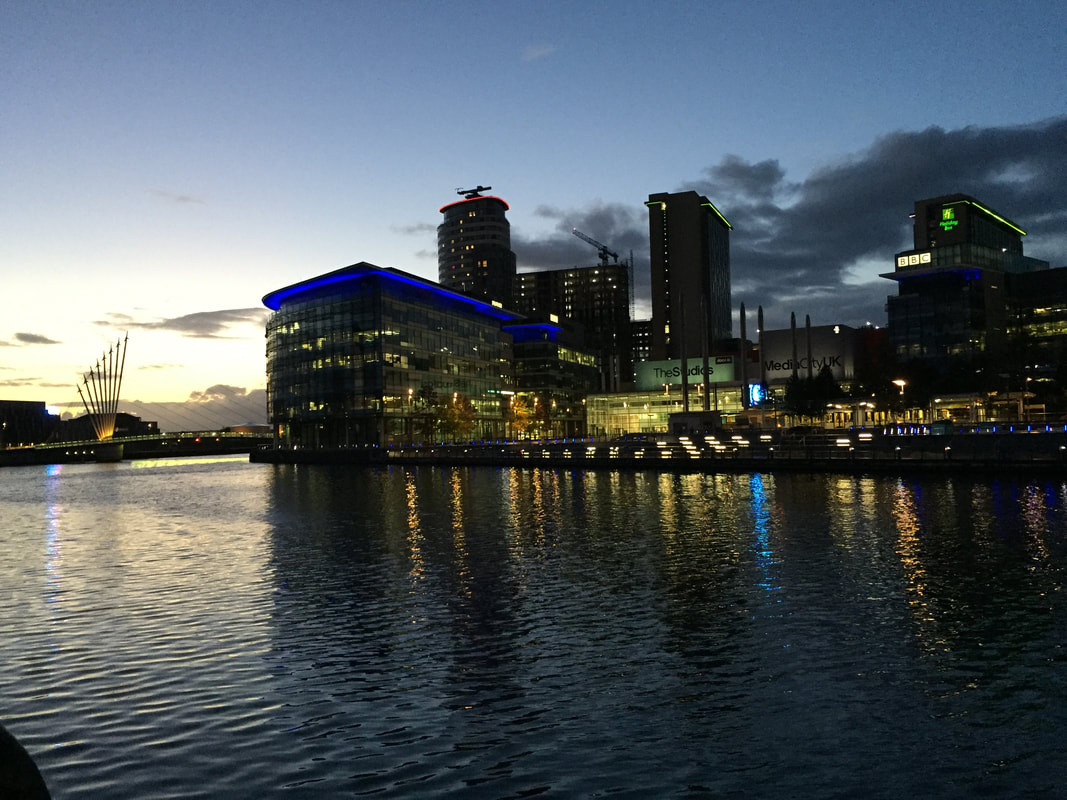
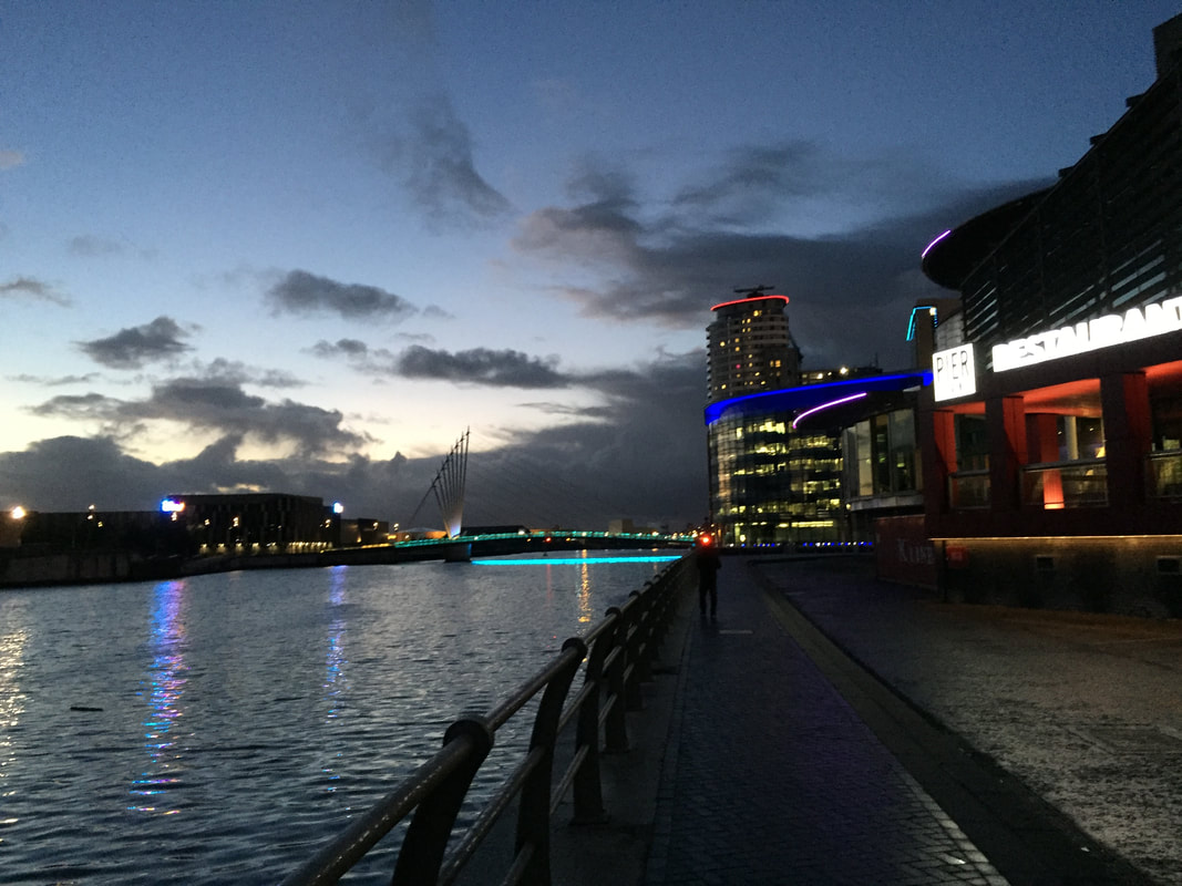
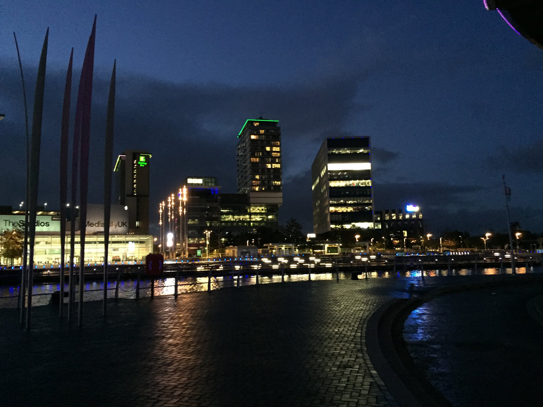
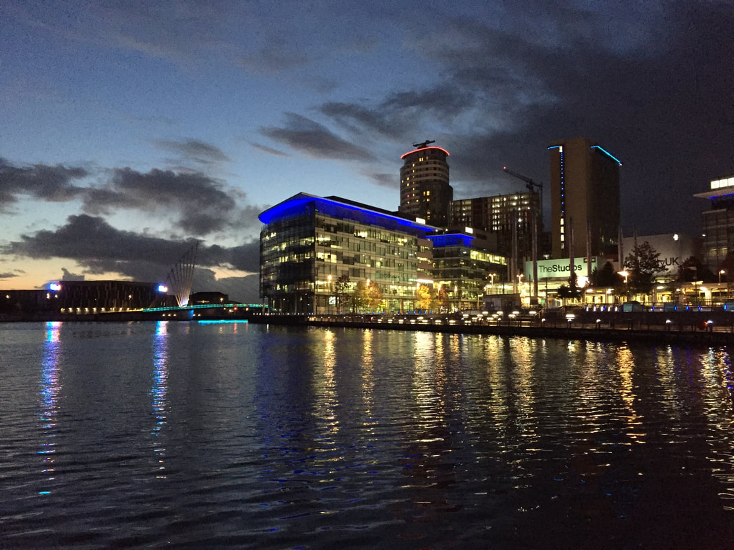
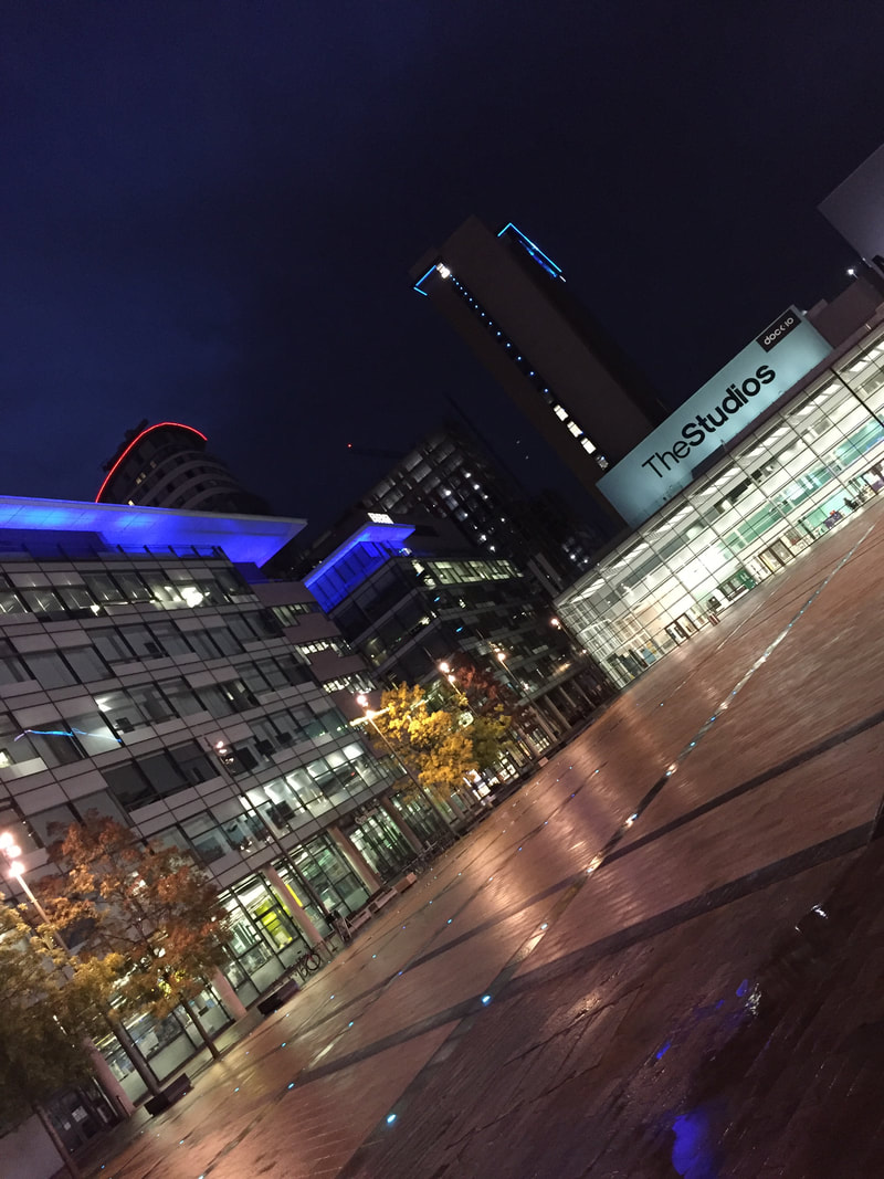
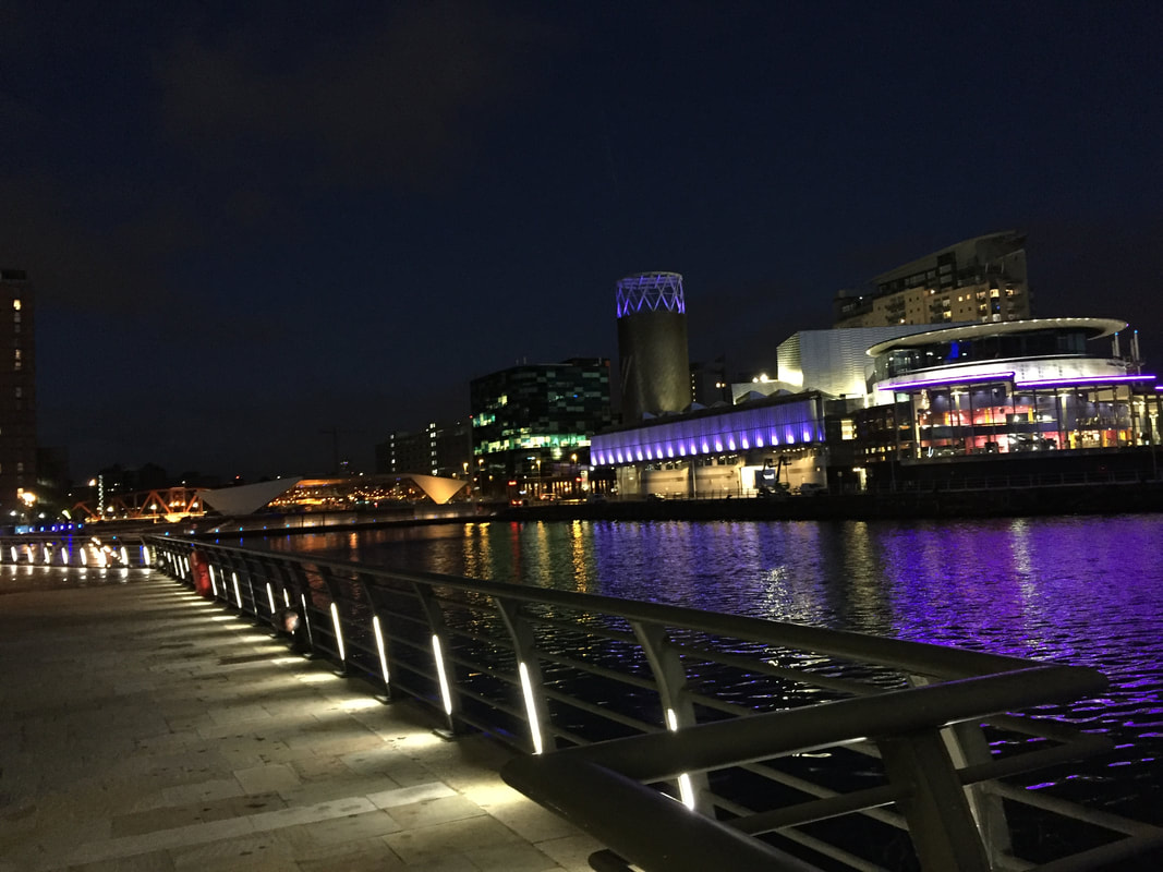
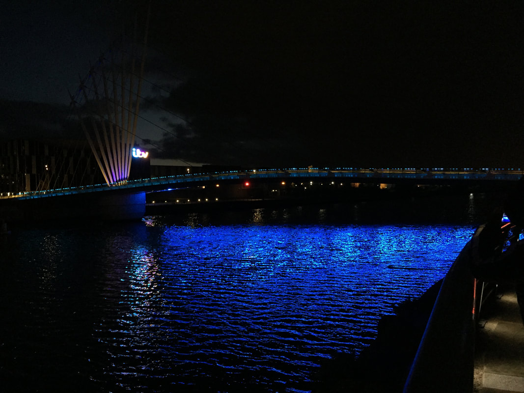
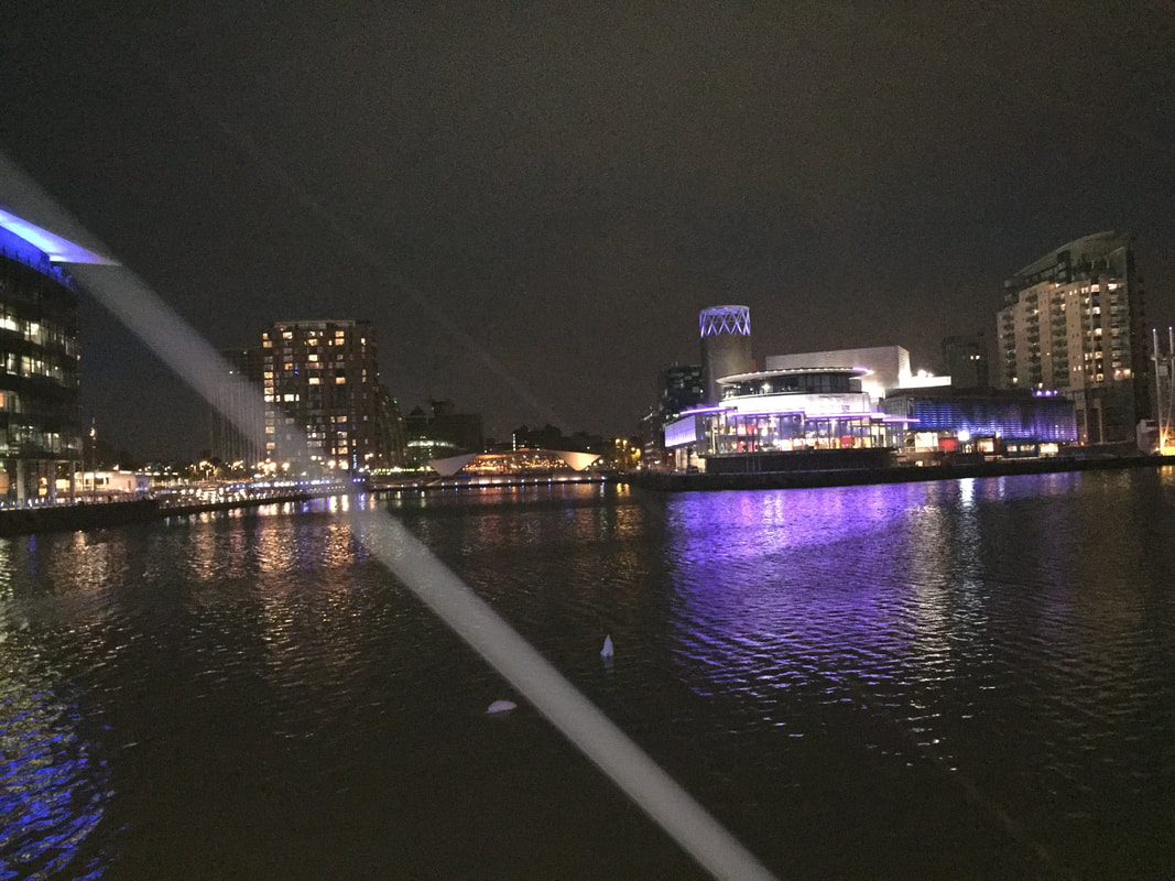
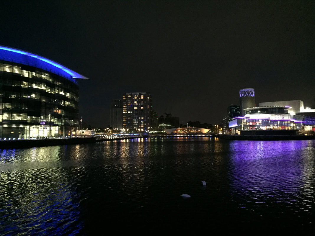
Best
This is my my strongest picture of Salford Quays as it is a clear and bright shot, this image stands out as there are many bright colours and also the lights of the urban landscapes are reflecting onto the river which makes my image stand out and more effective. Also my whole image is clear and in focus which makes it easier to view.
|
Worst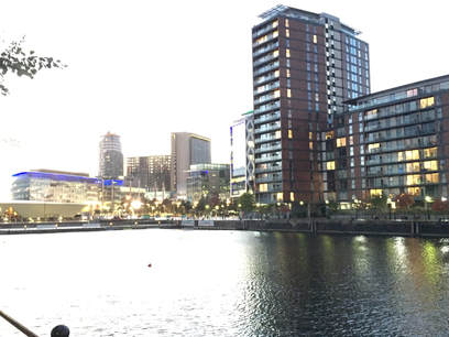
This is my weakest picture I captured of Salford Quays, as the aperture is too high, this has made my image quite bleached out and has made it harder to view and doesn't make it clear. Also I didn't take the angle in as much consideration as my other images, therefore the full view of Salford Quays did not show.
|
My photography
|
Matt's photography
|
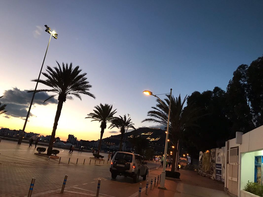
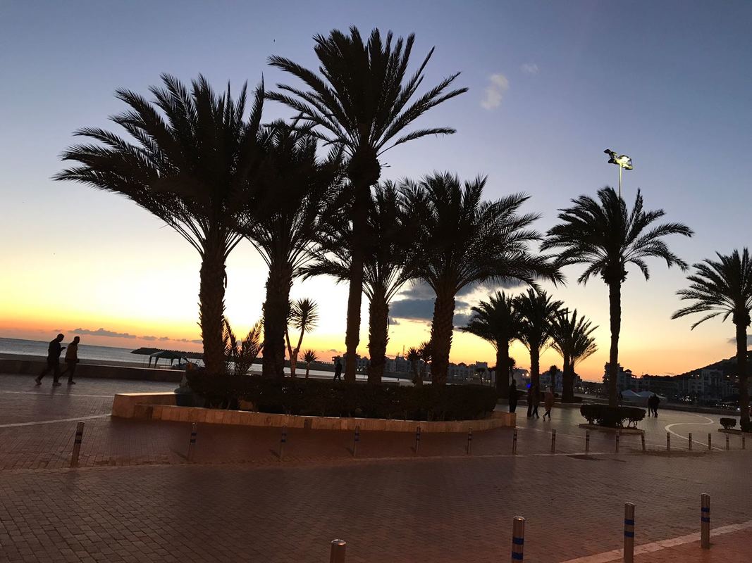
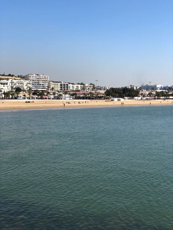
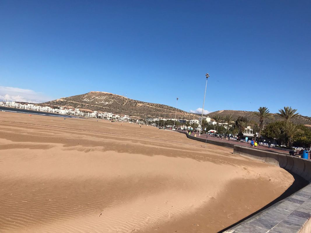
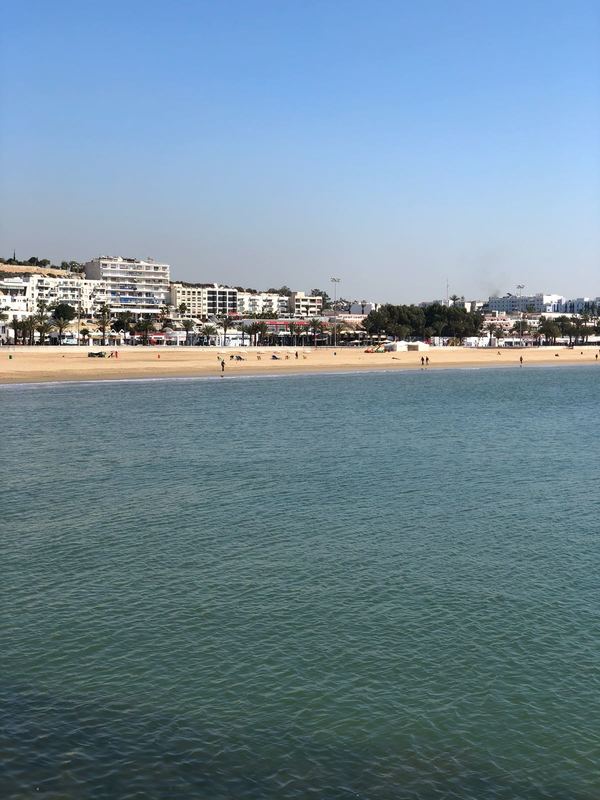
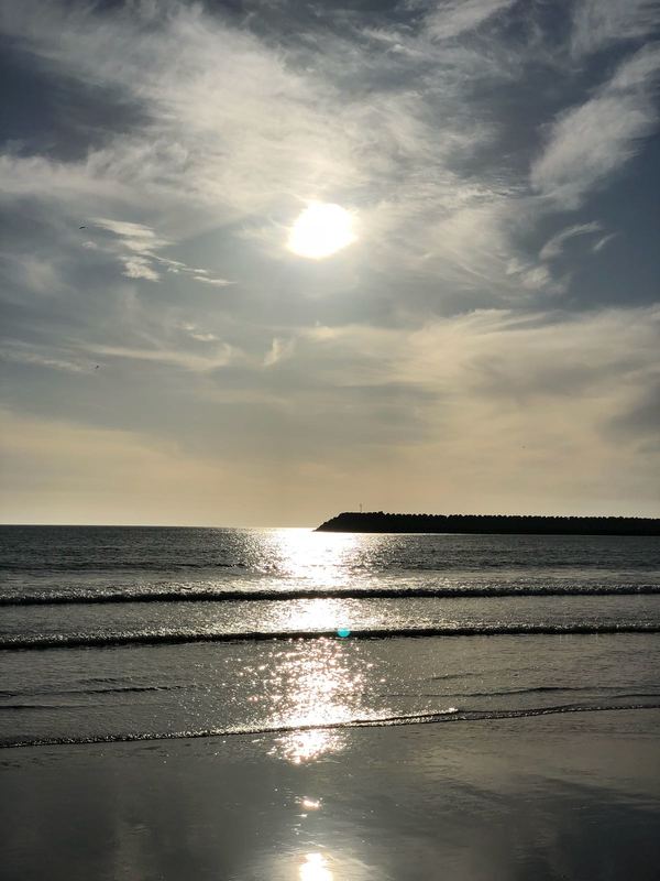
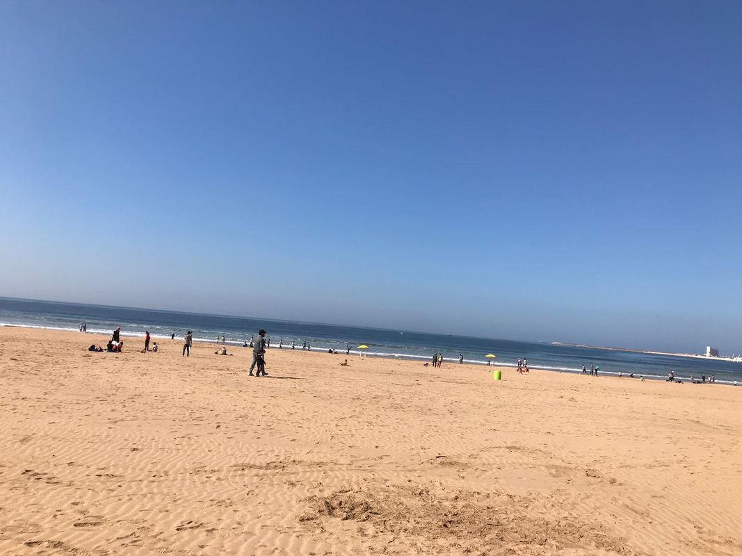
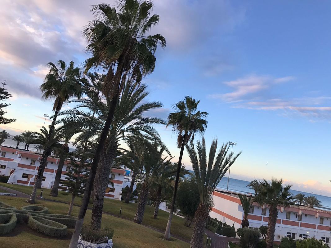
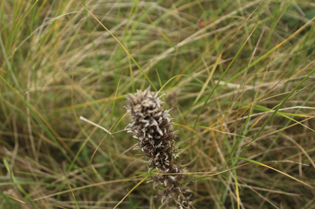
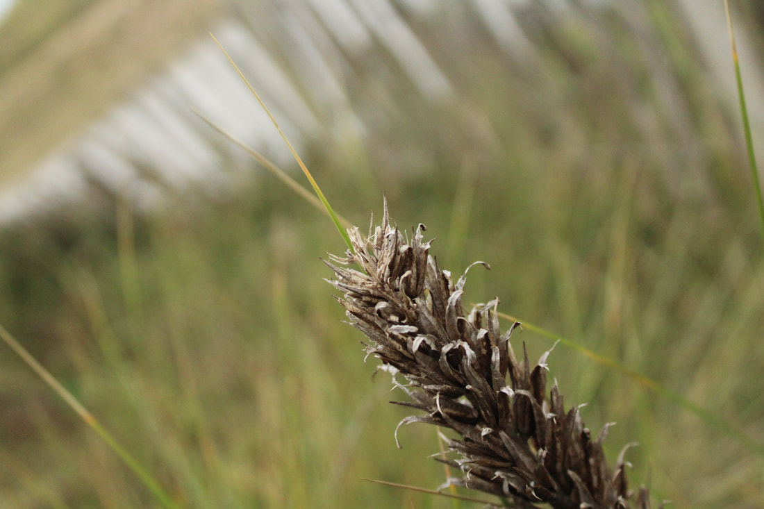
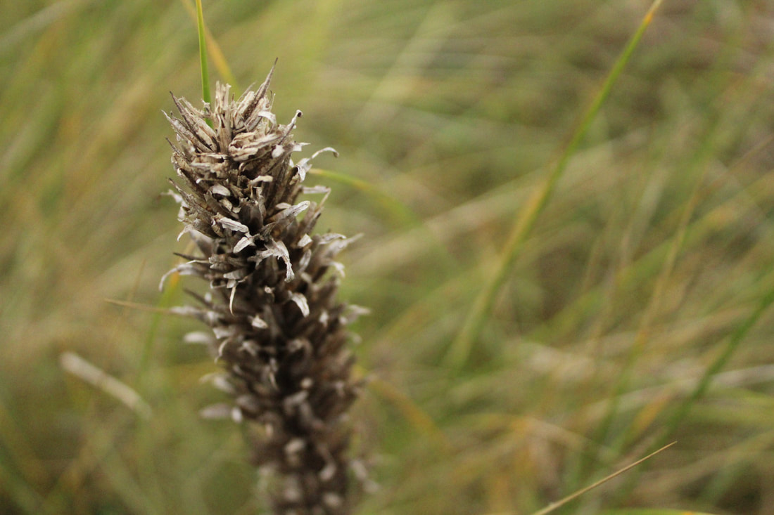
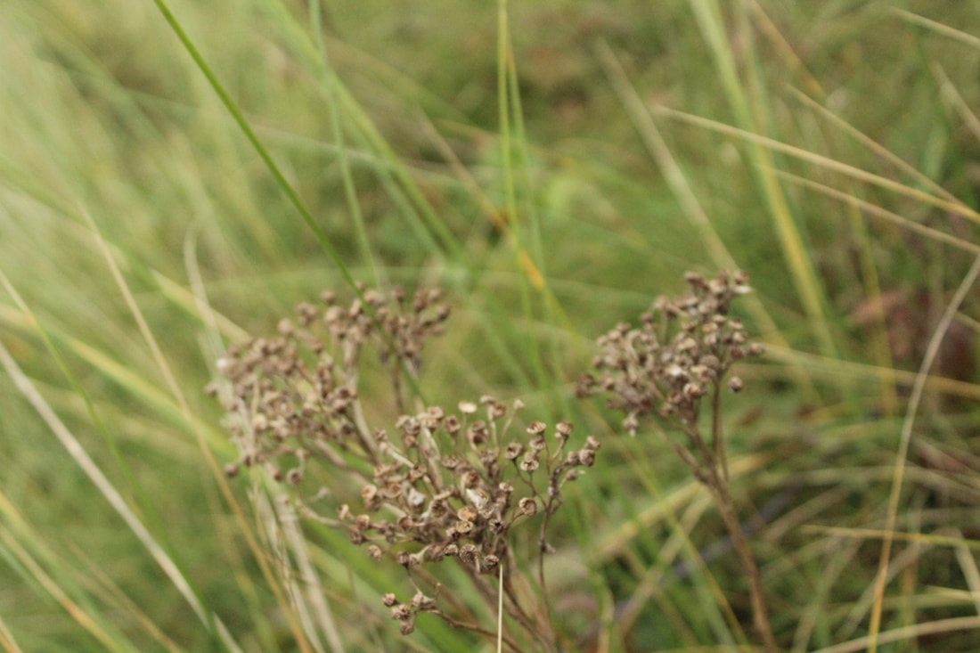
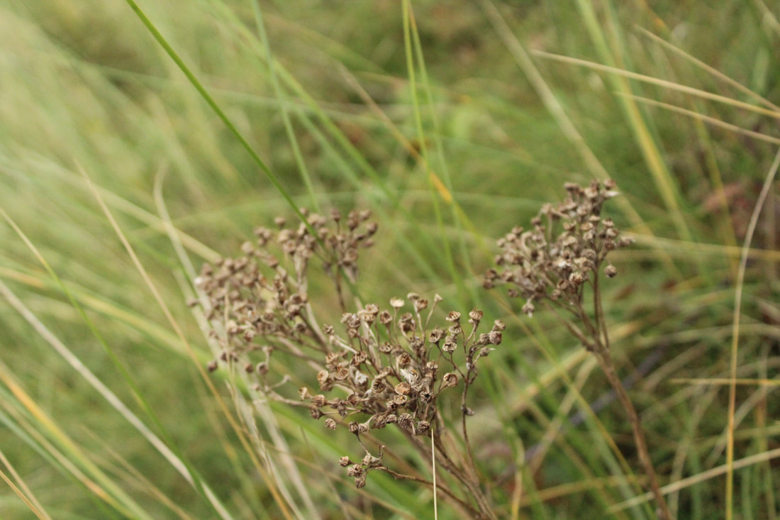
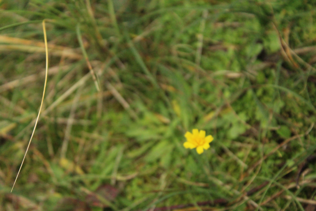
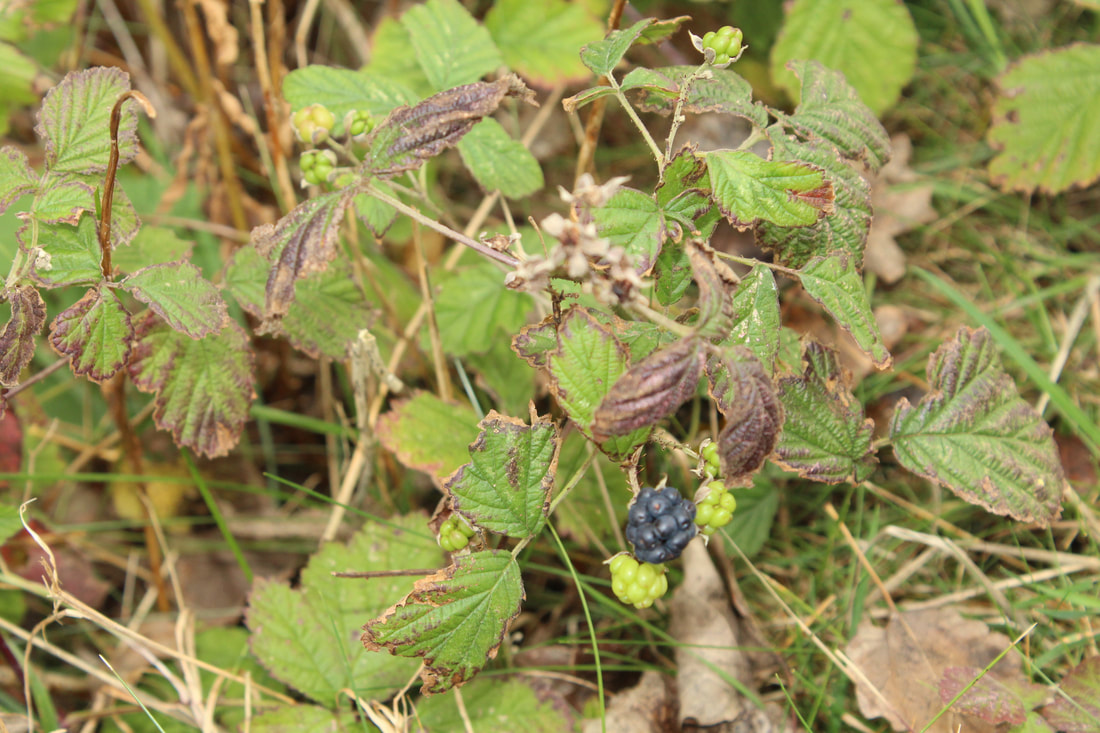
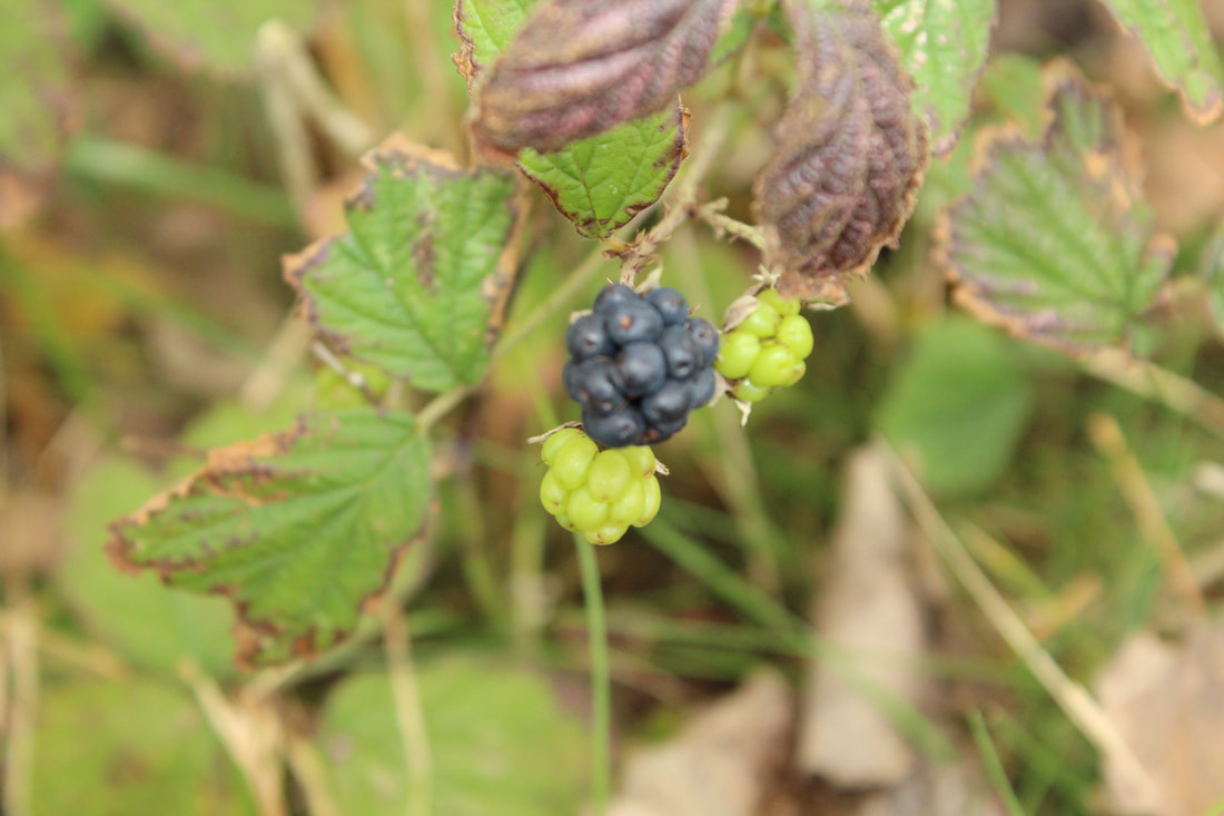
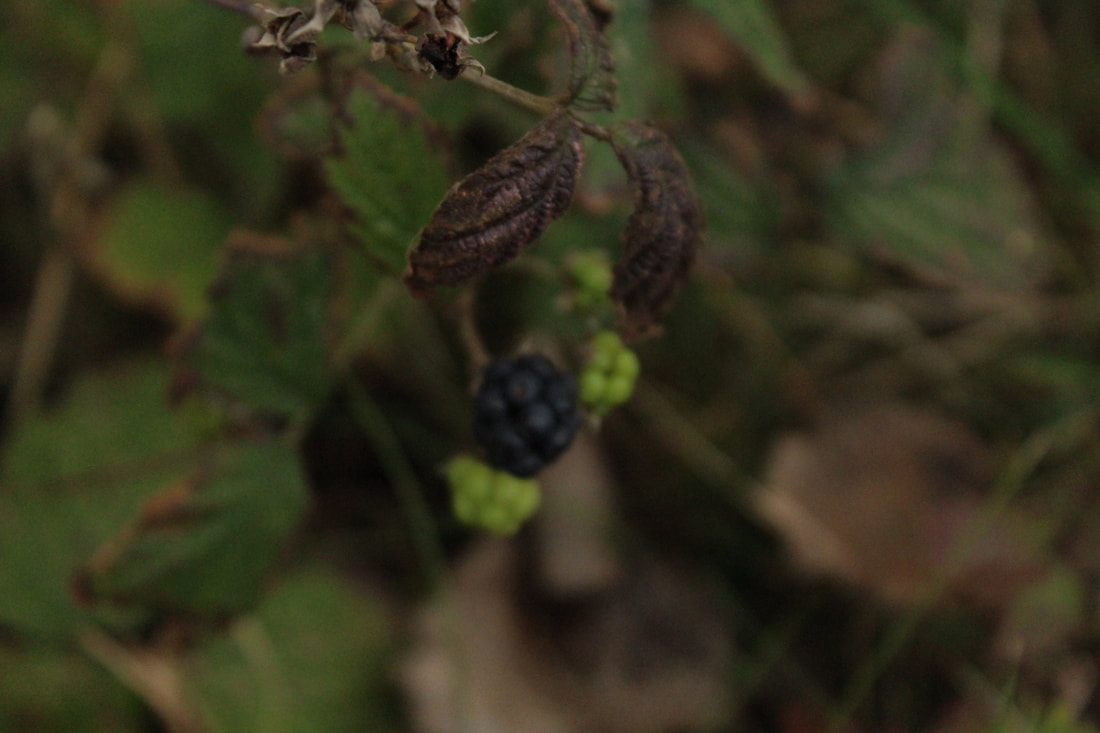
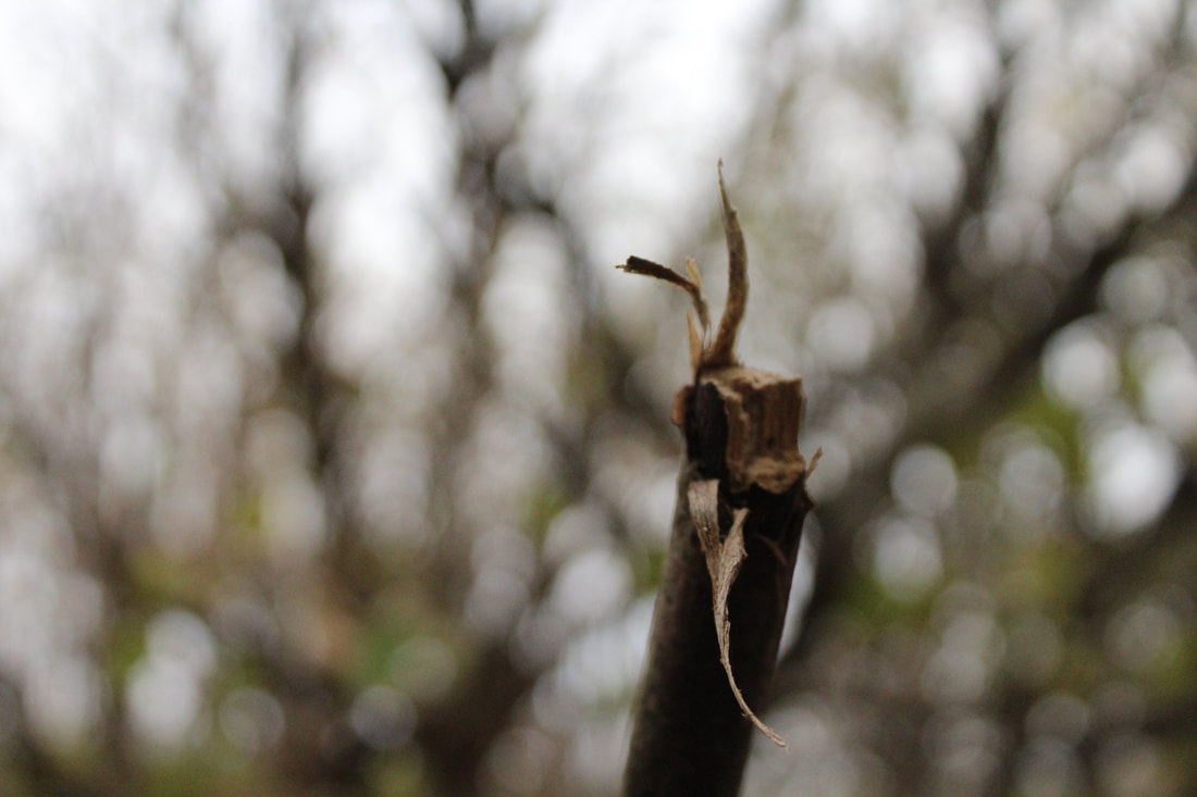
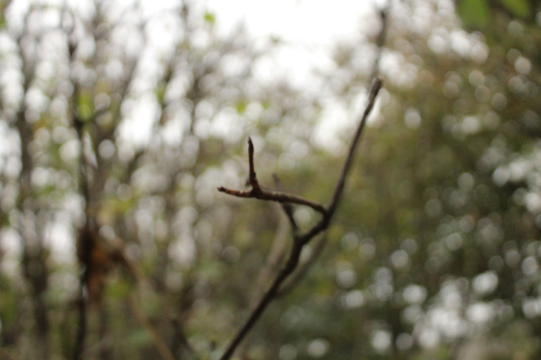
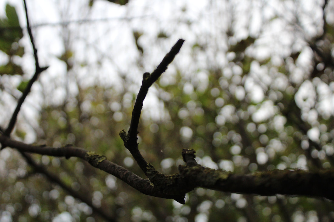
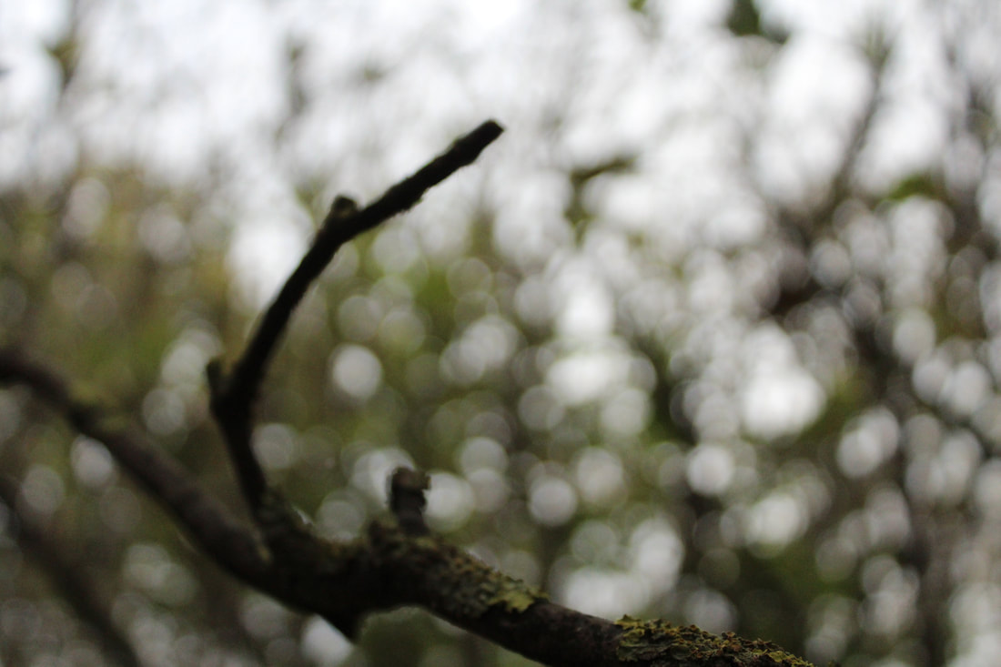
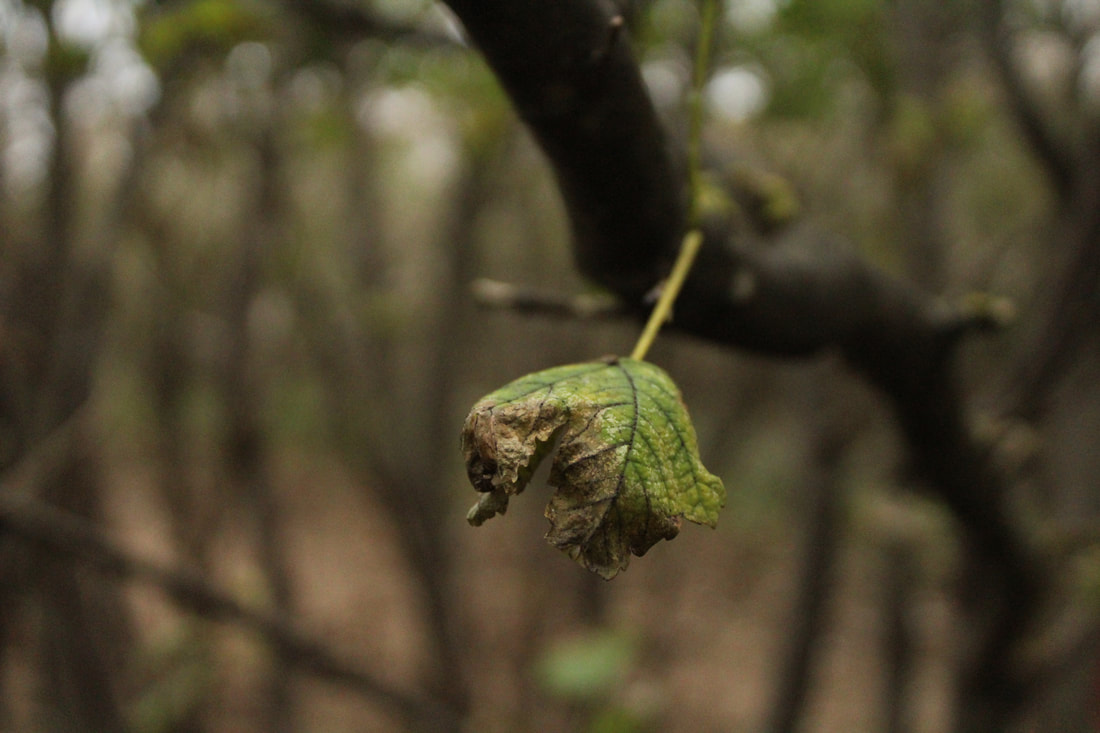
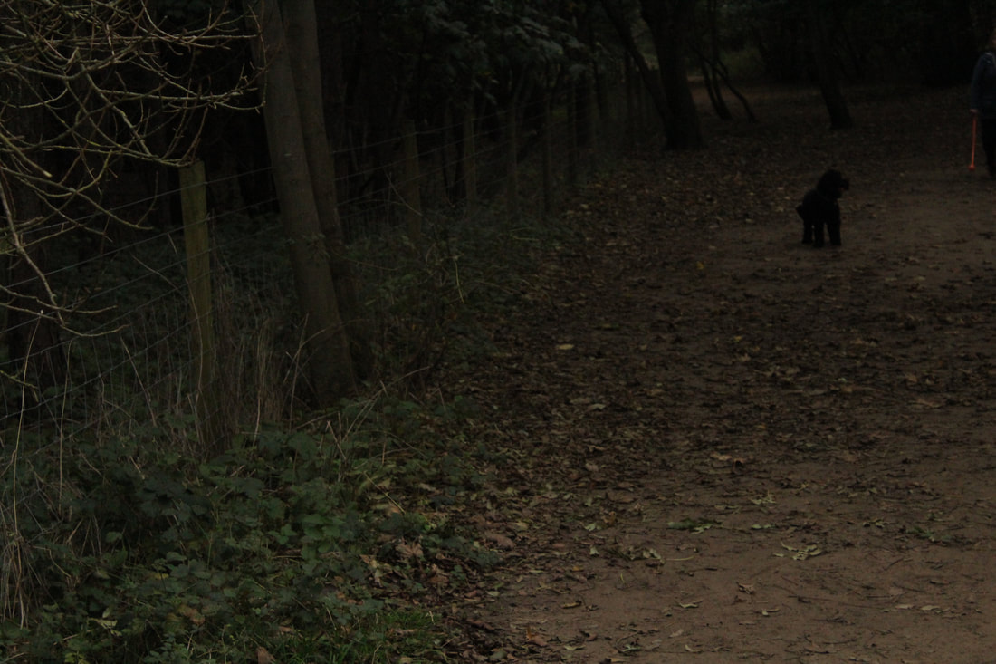
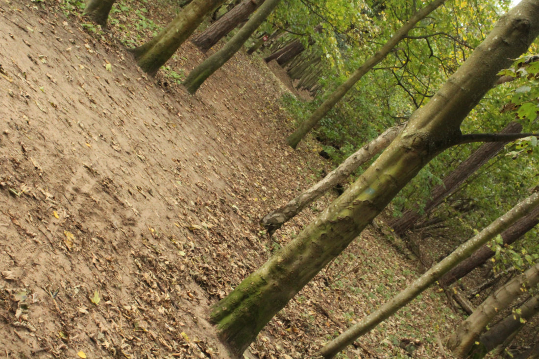
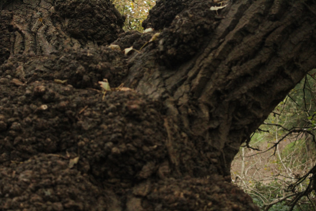
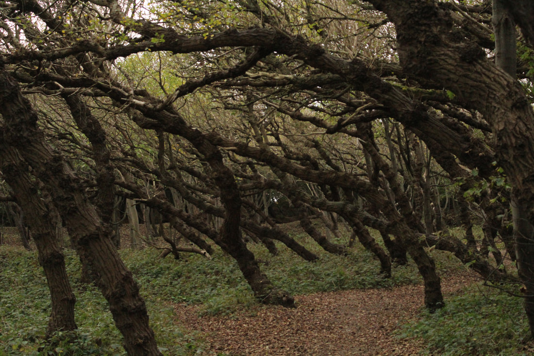
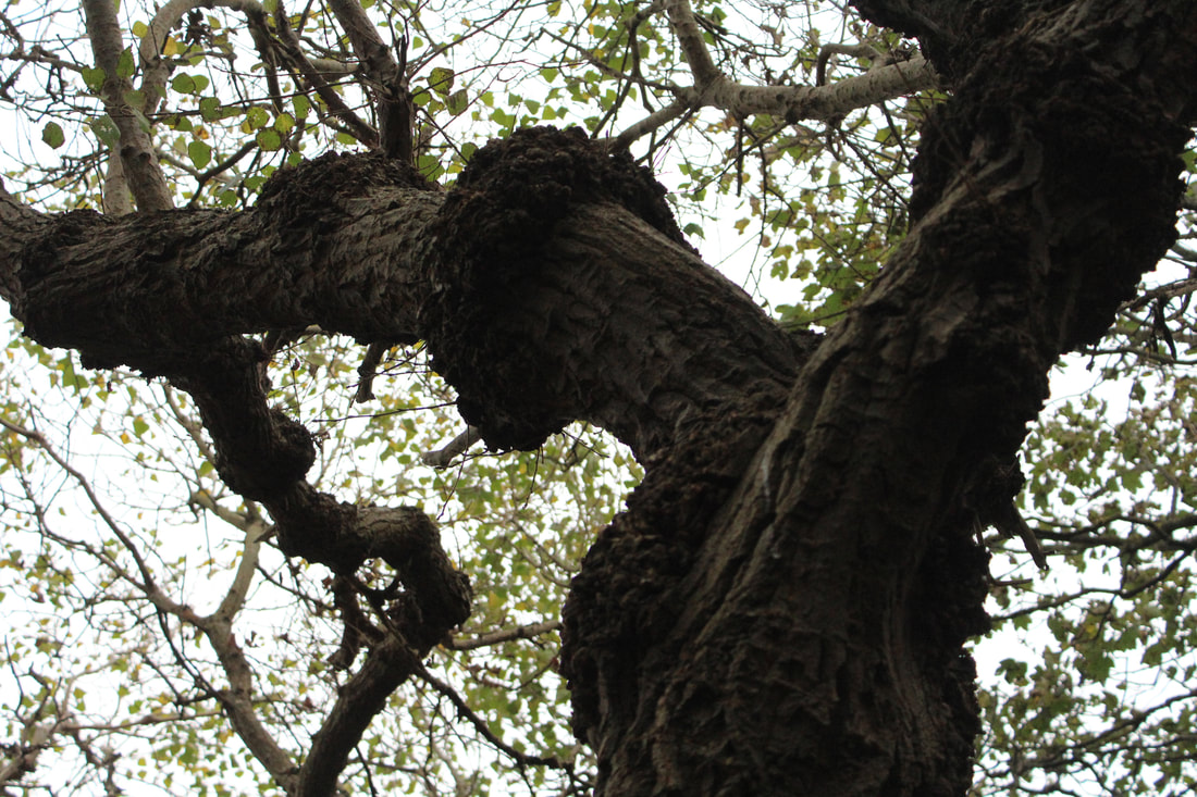
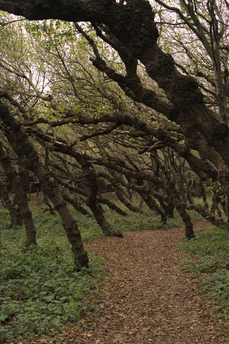
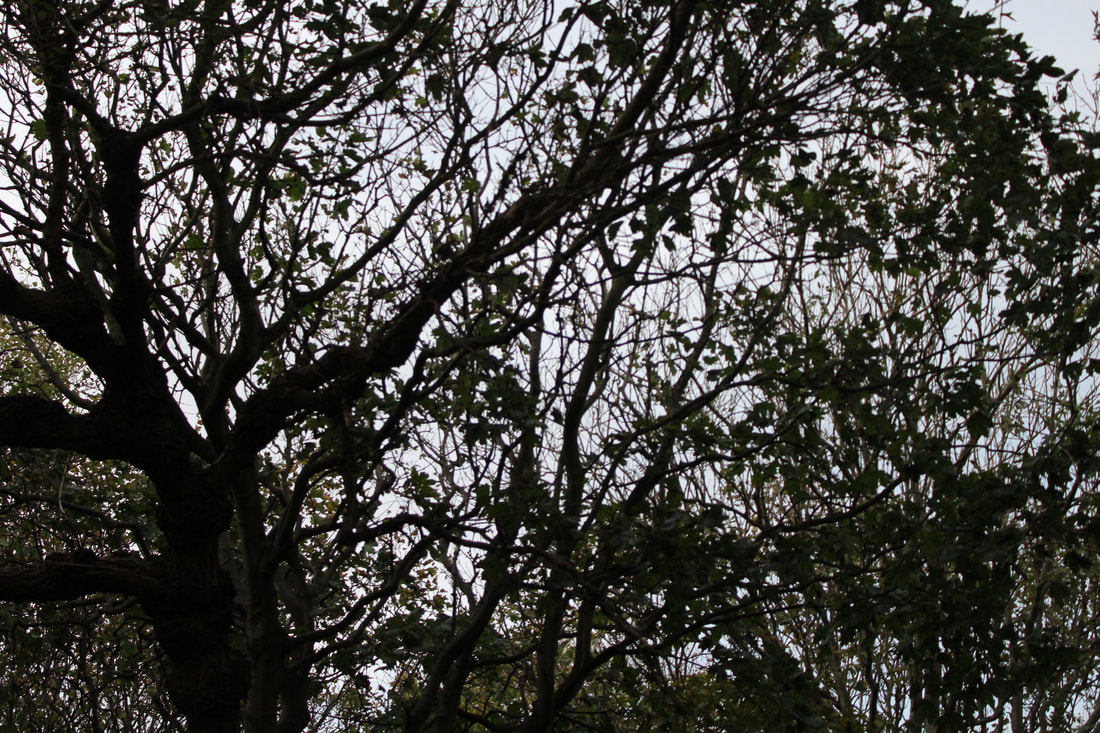
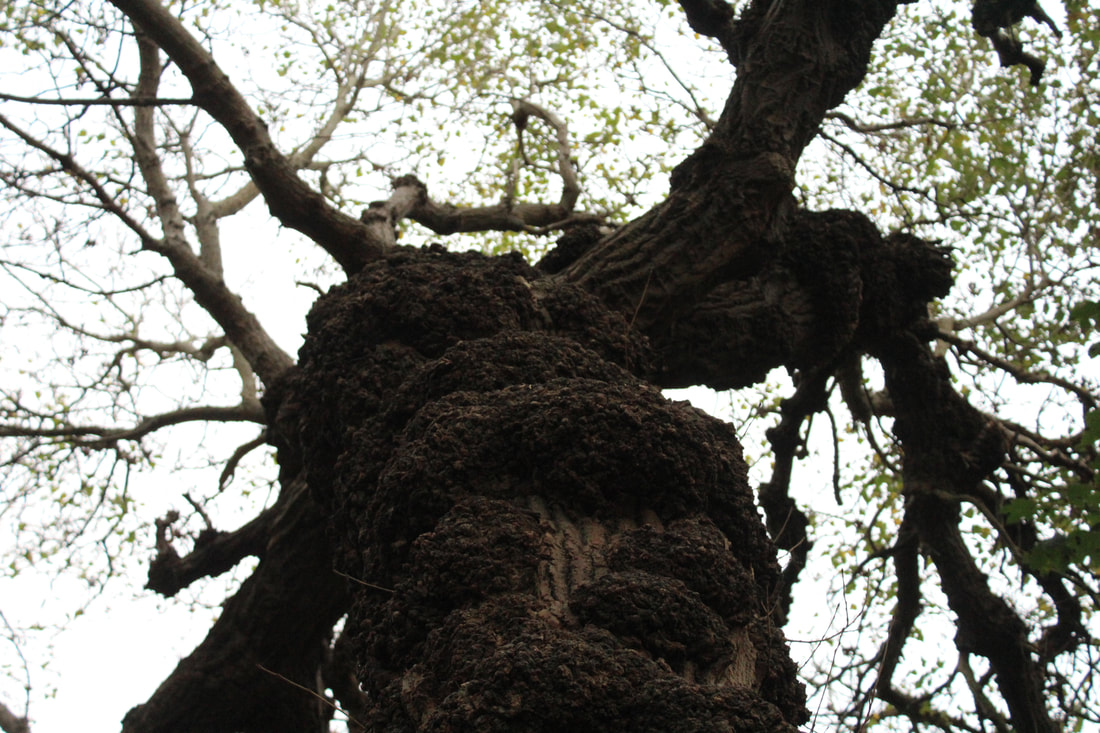
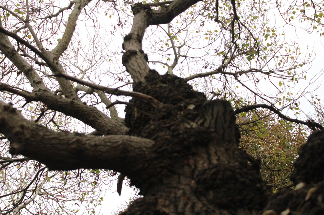
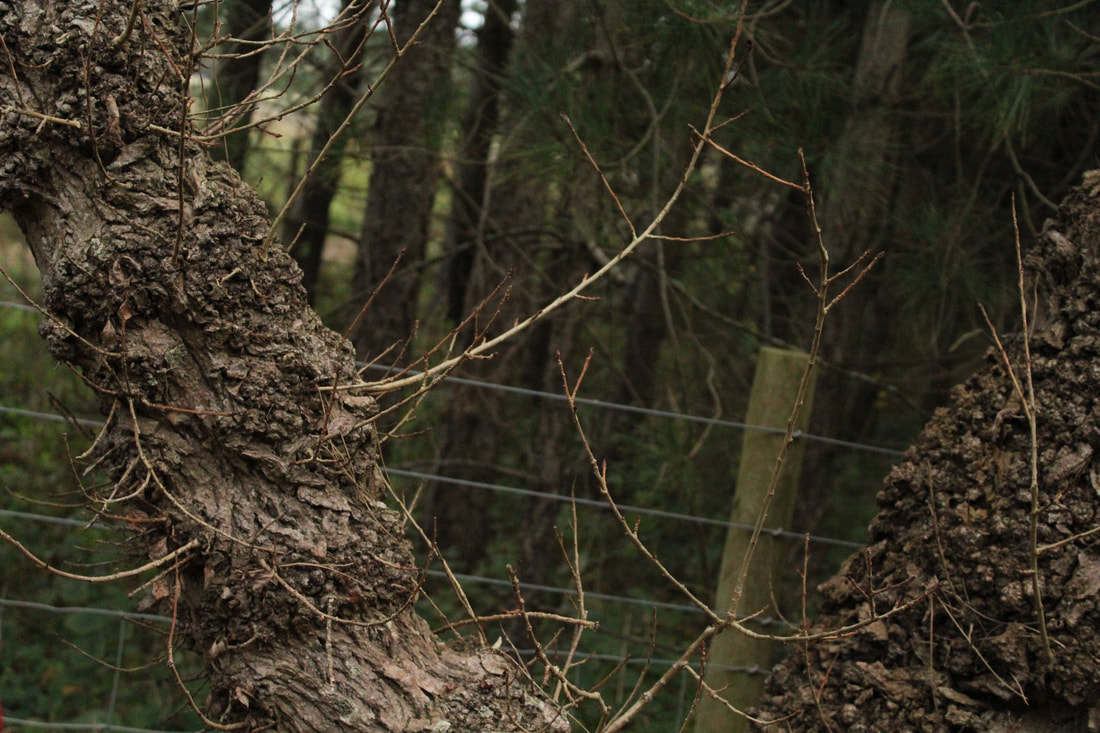
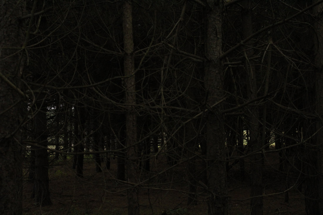
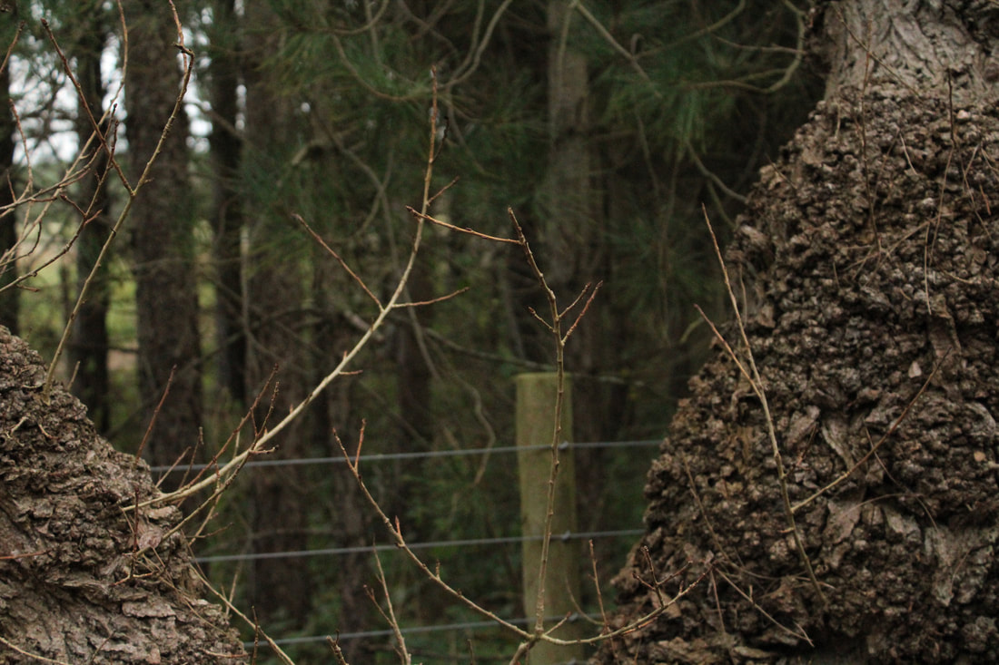
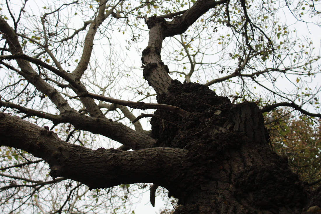
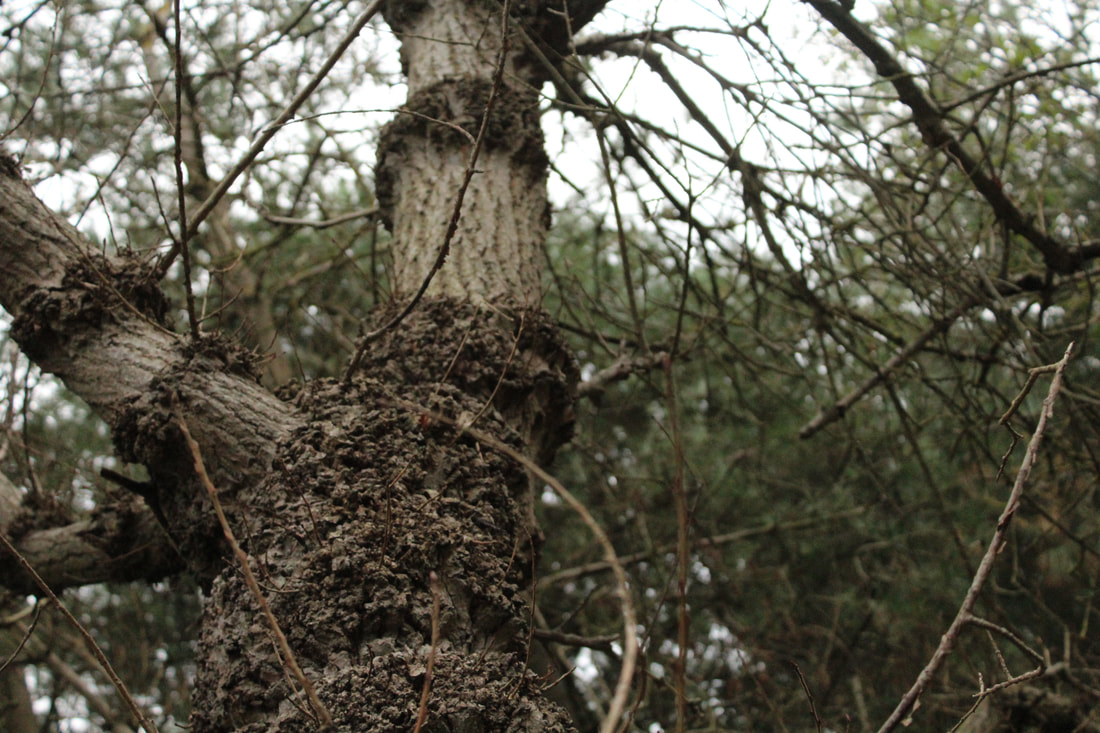
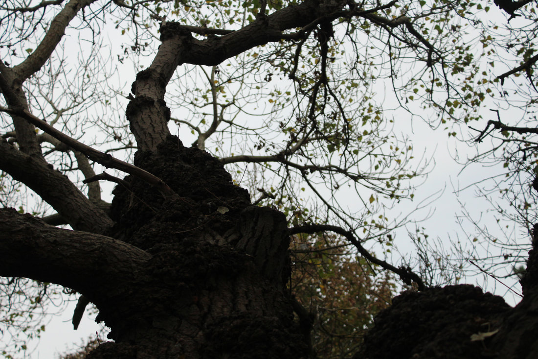
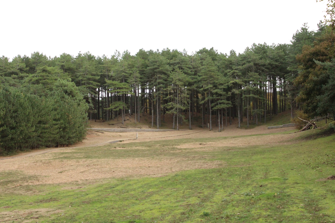
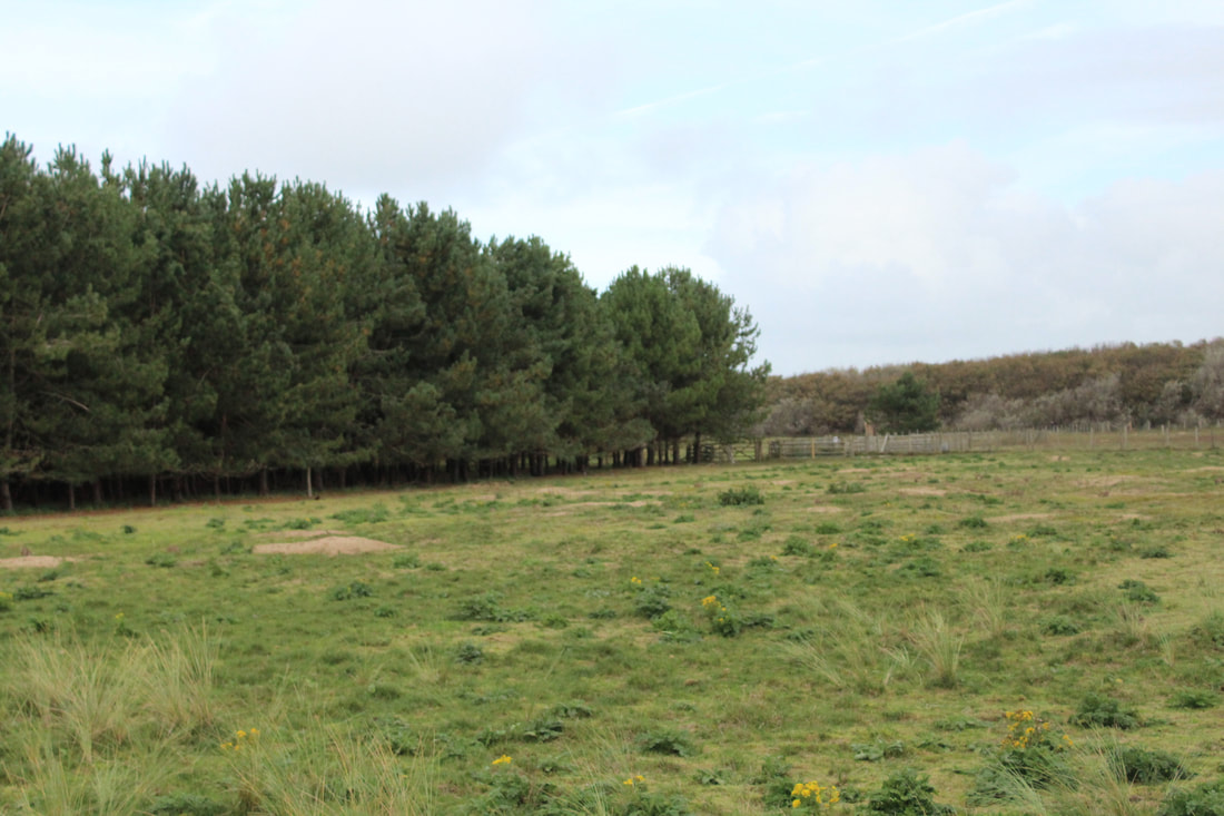
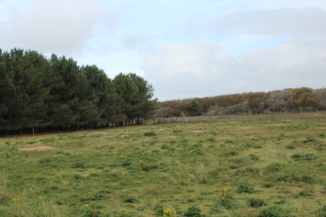
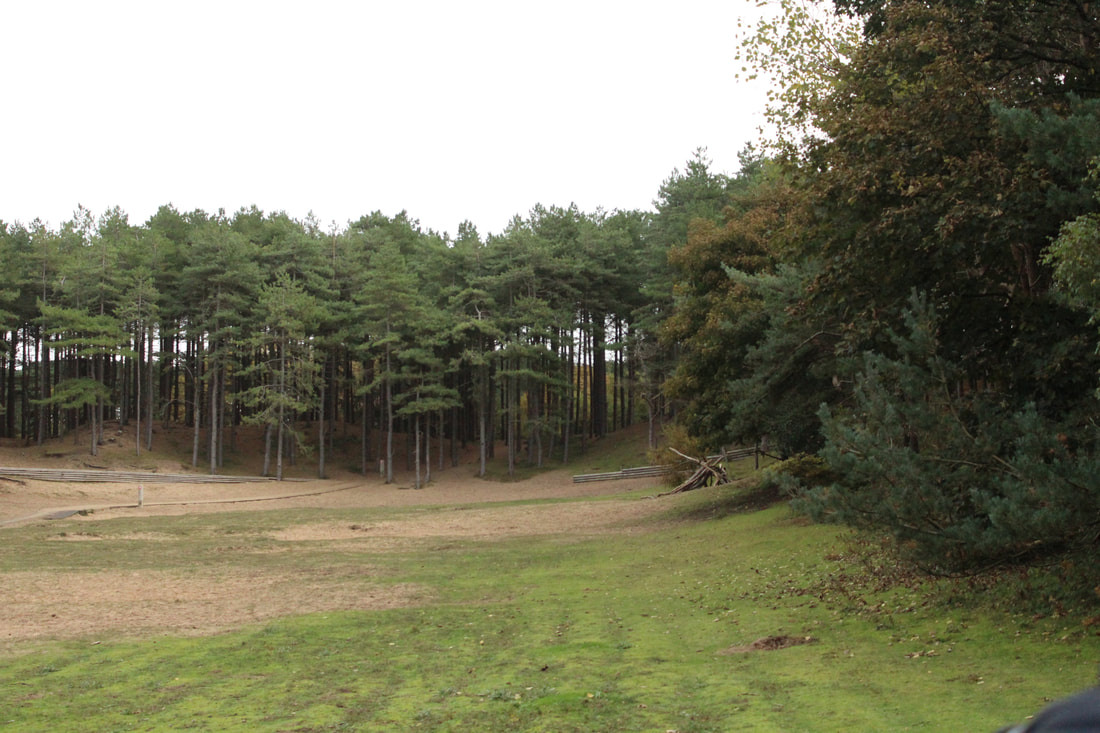
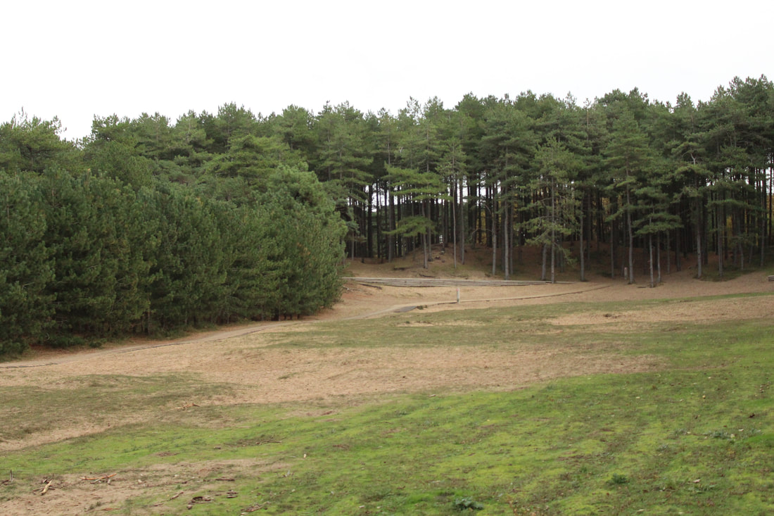
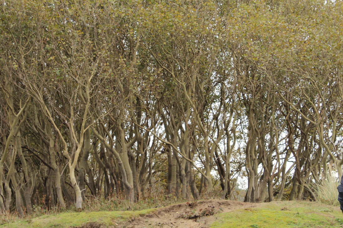
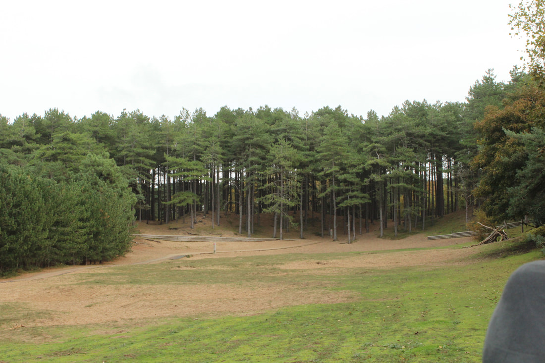
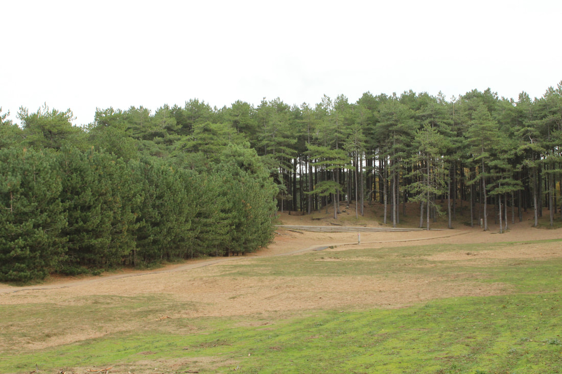
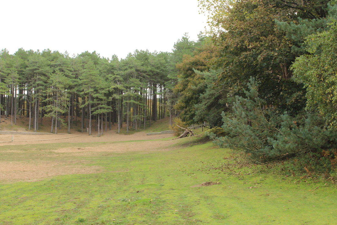
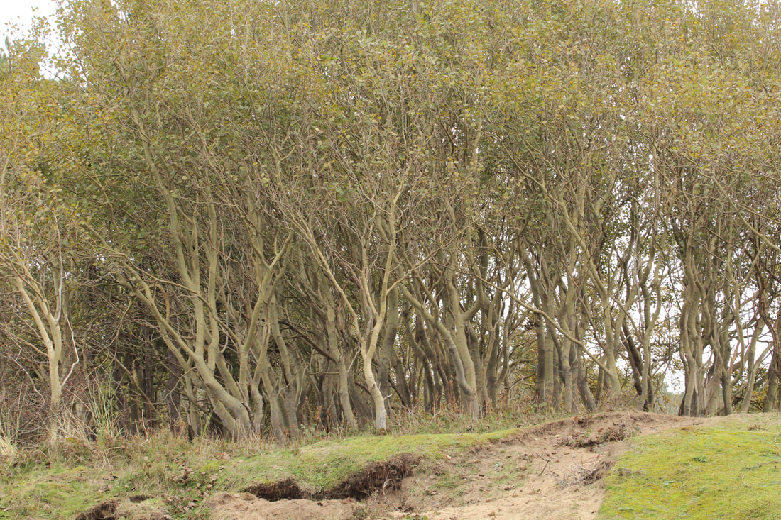
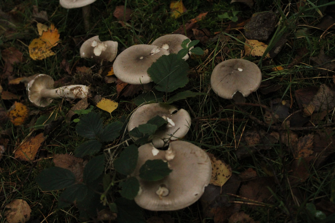
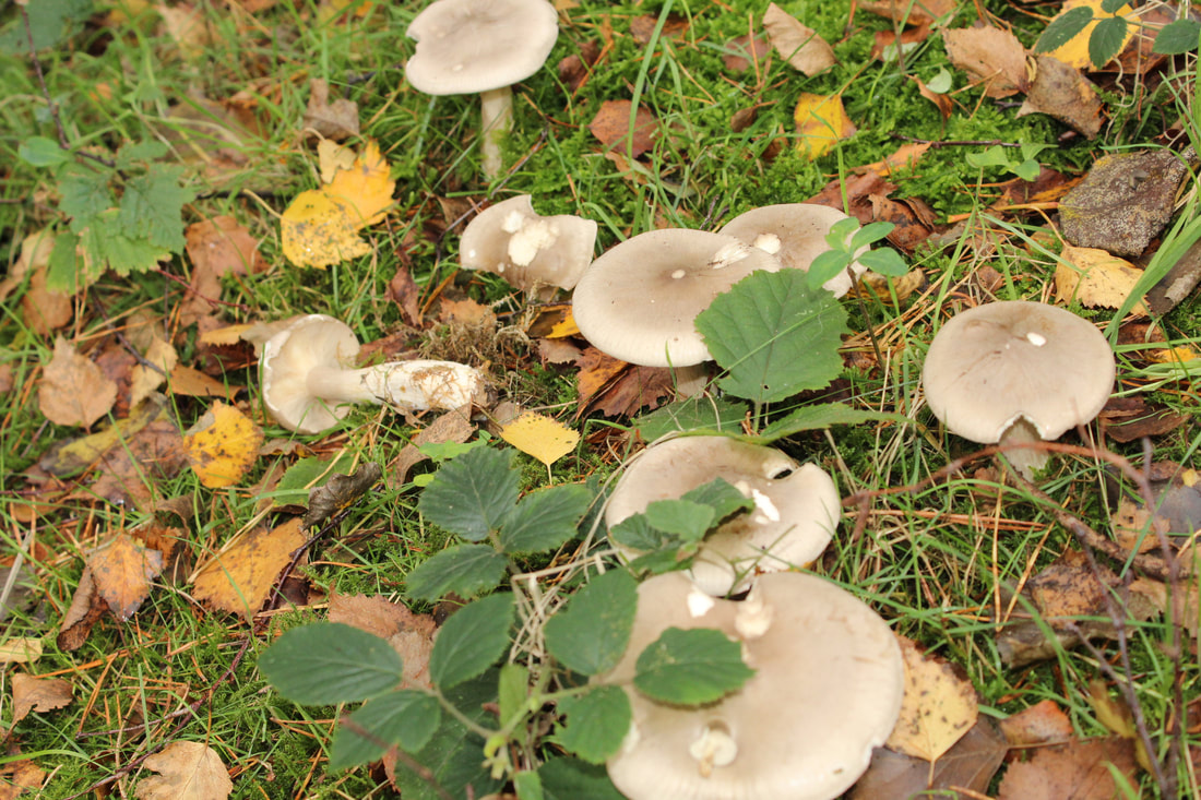
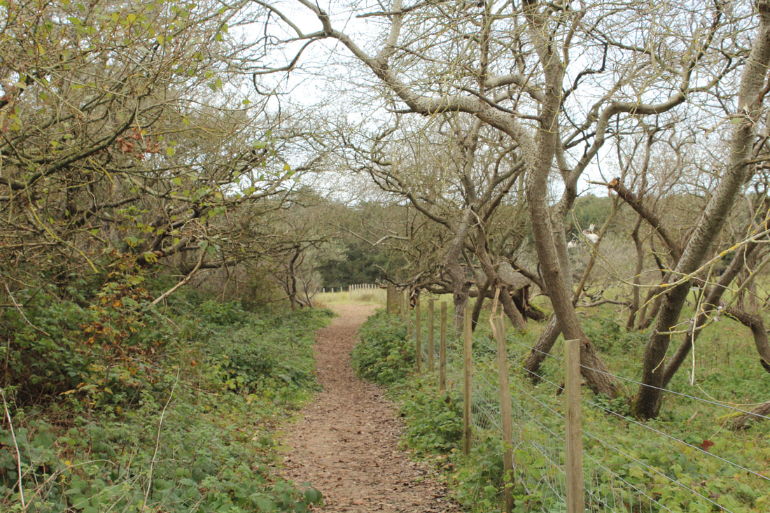
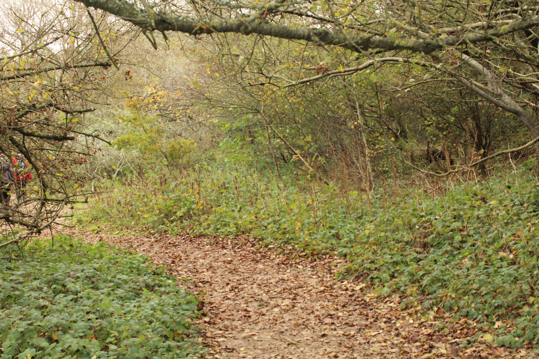
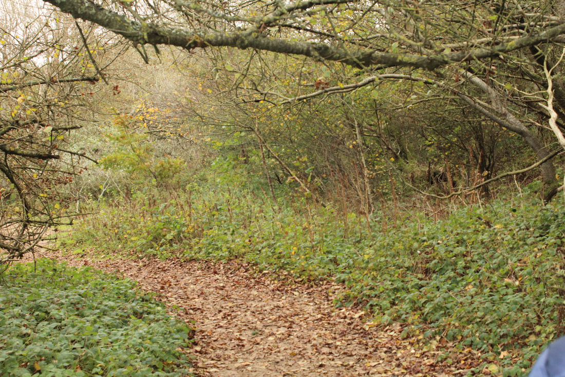
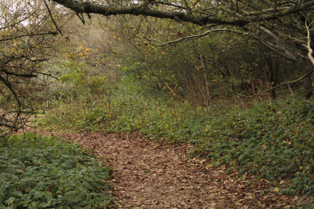
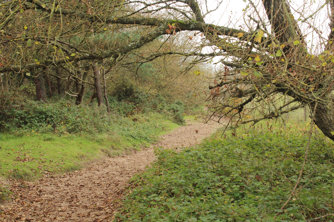
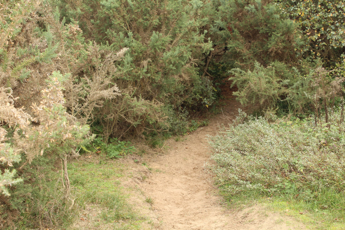
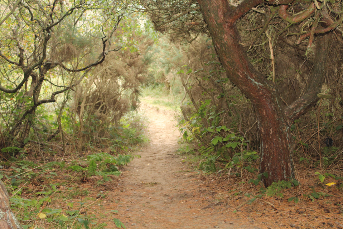
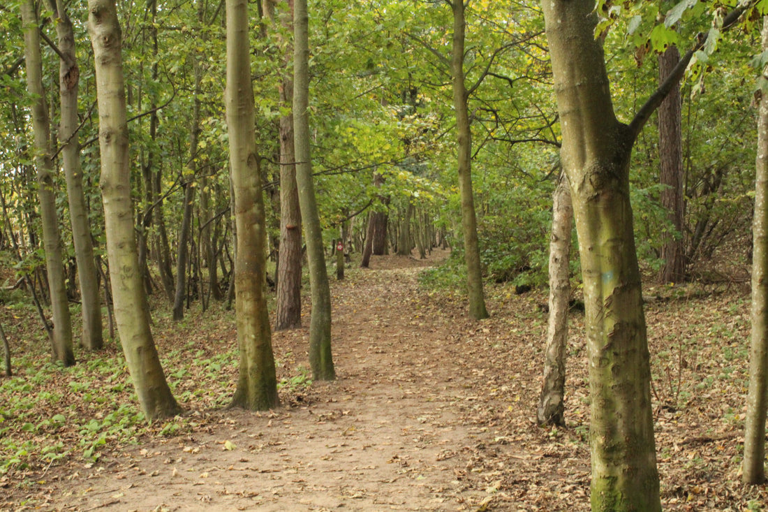
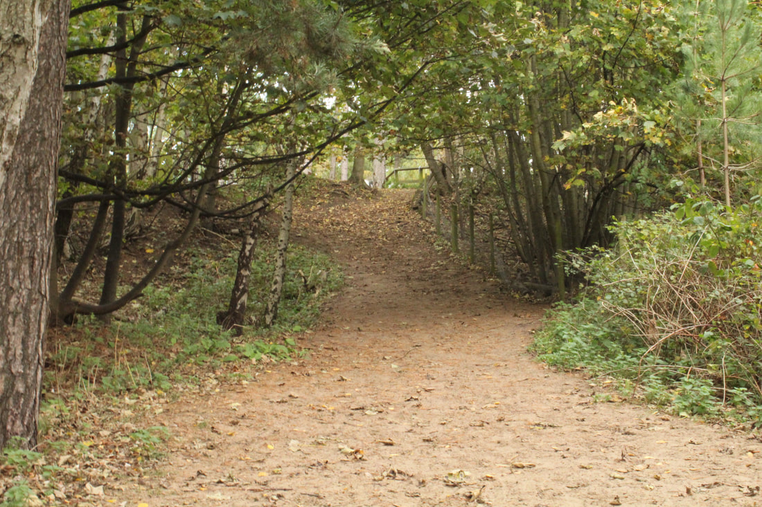
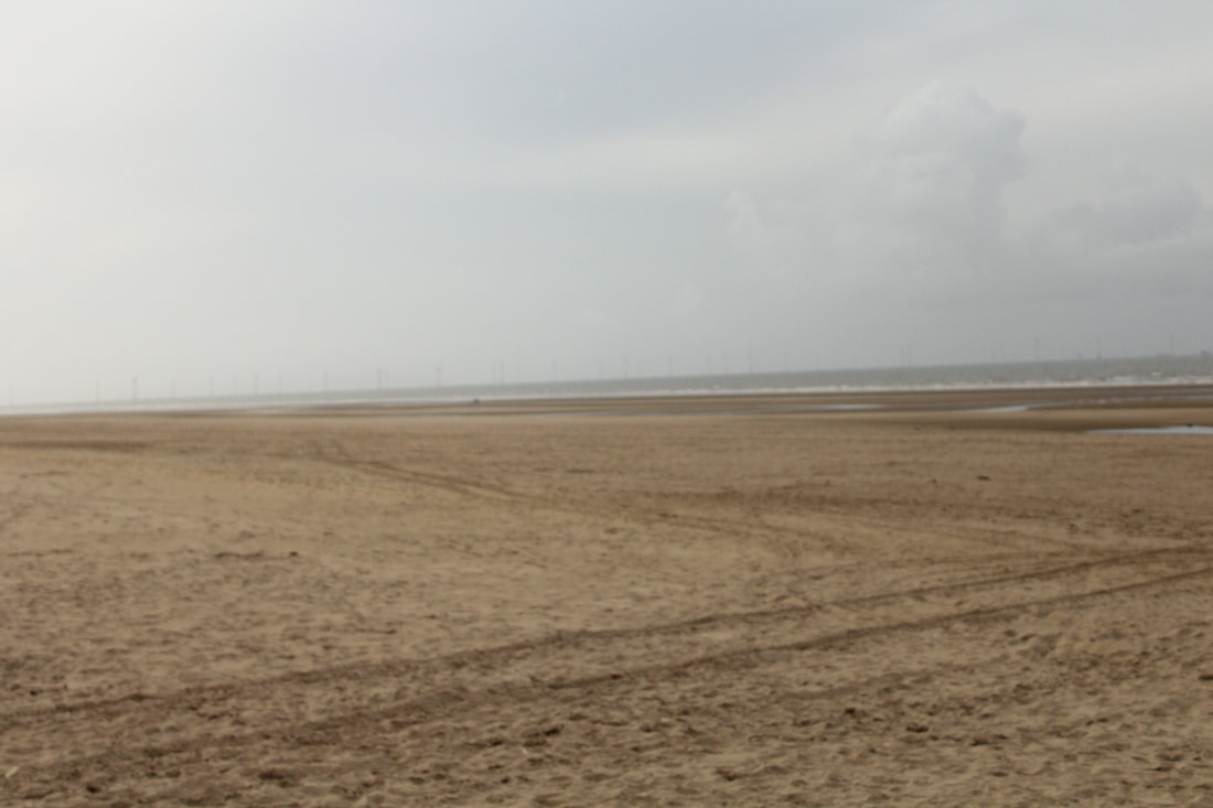
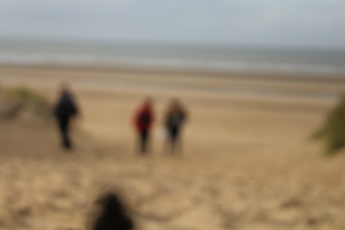
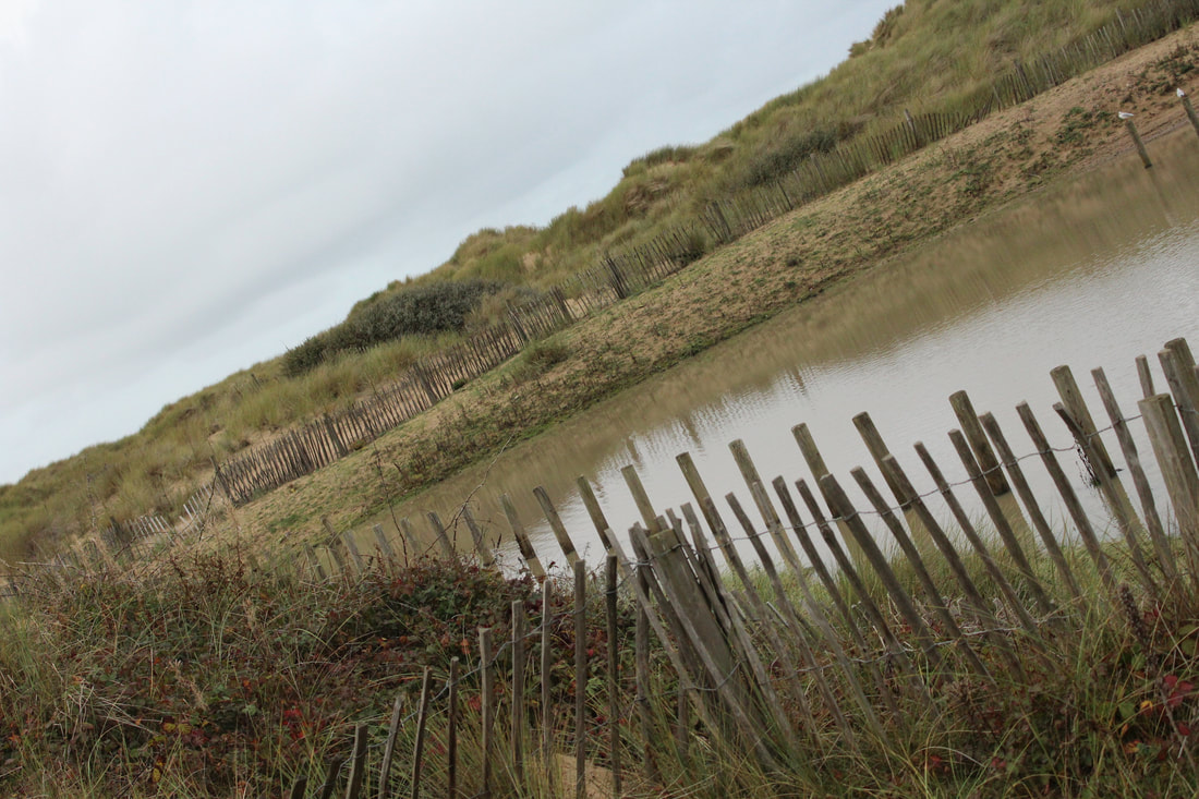
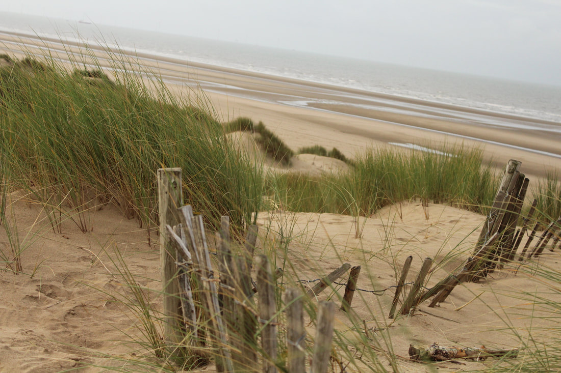
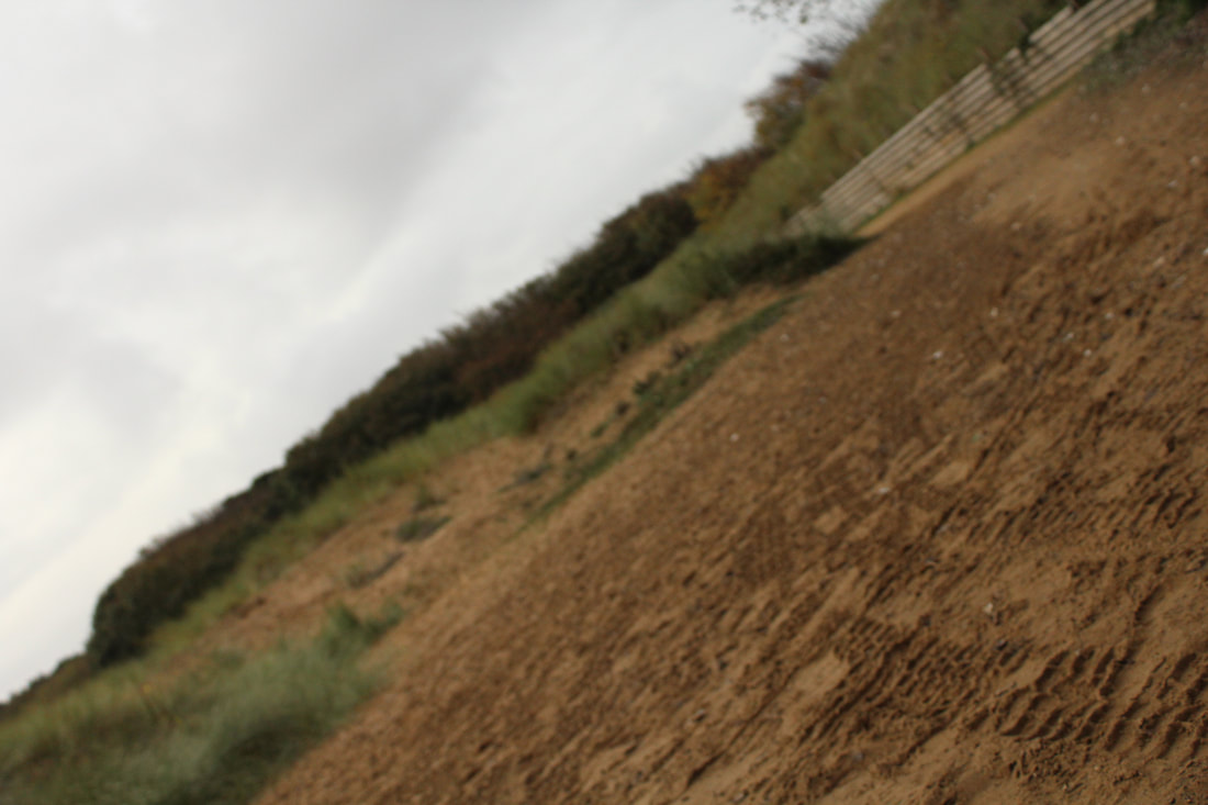
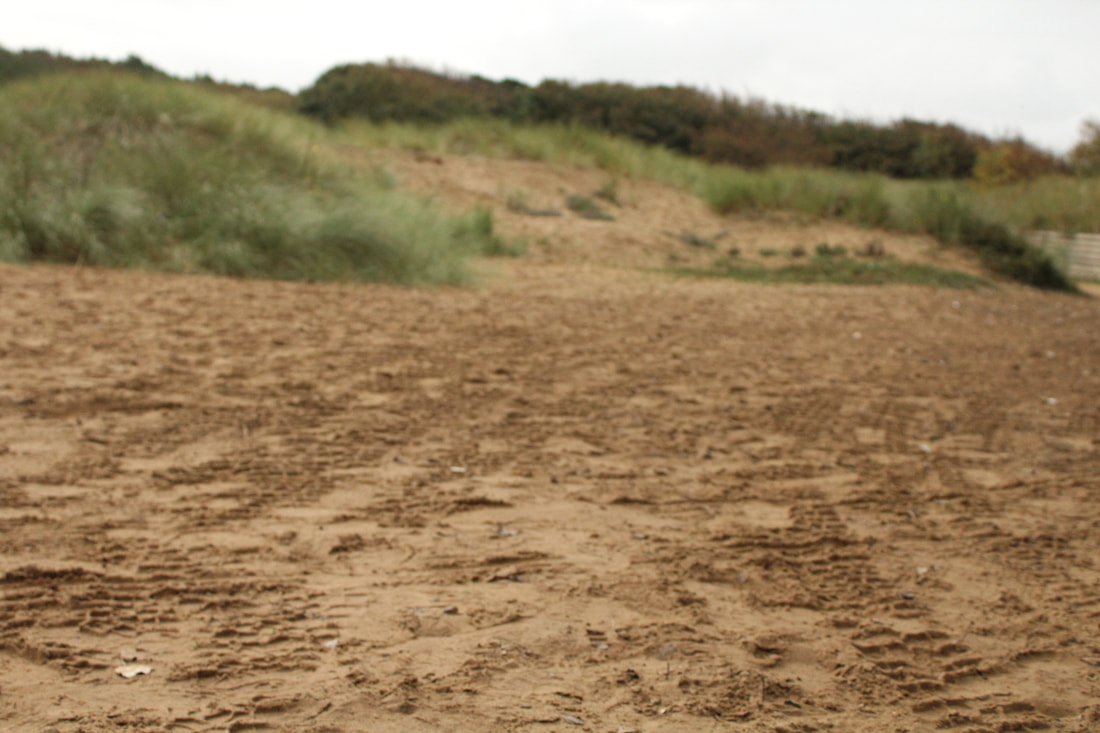
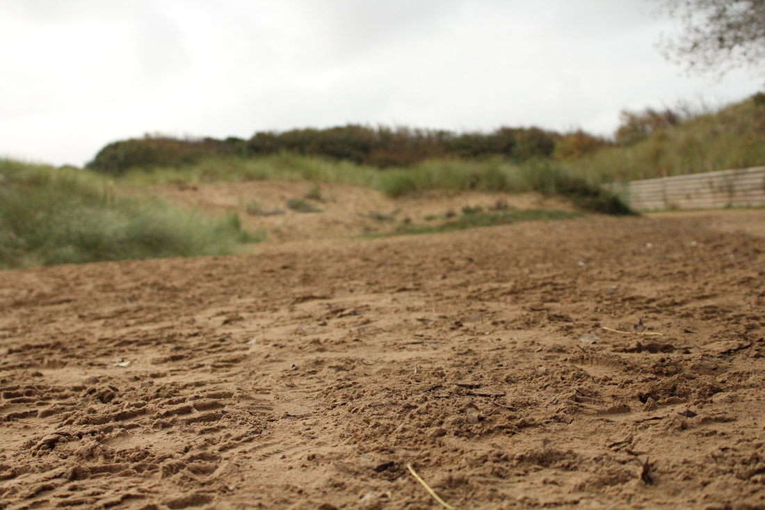
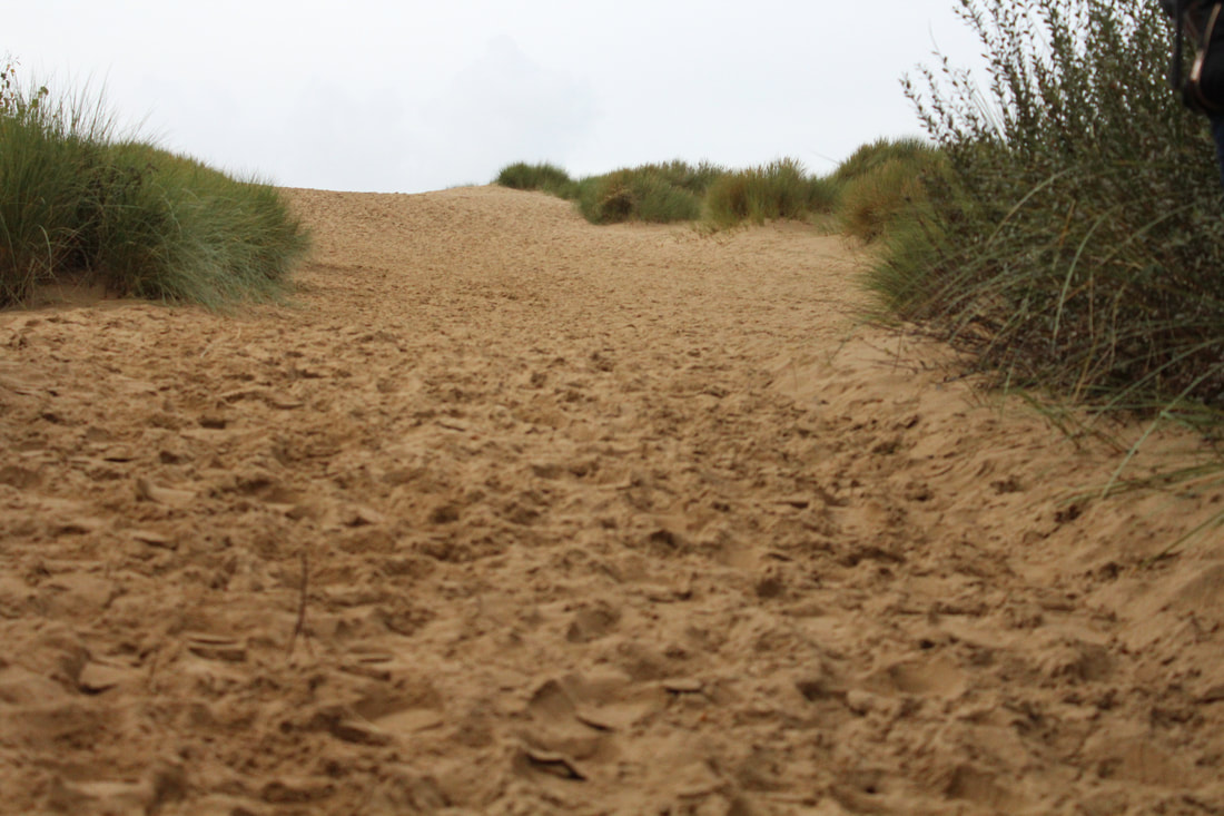
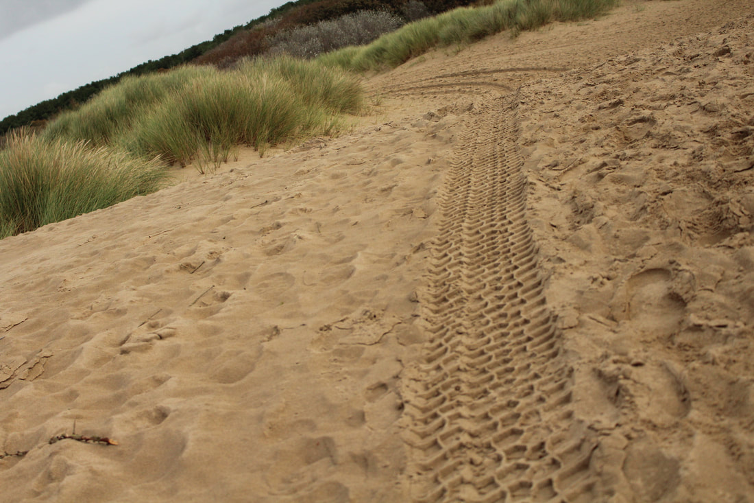
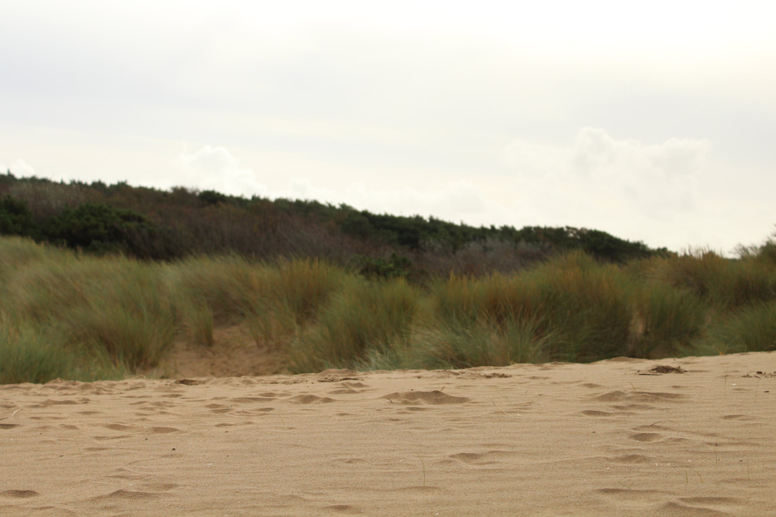
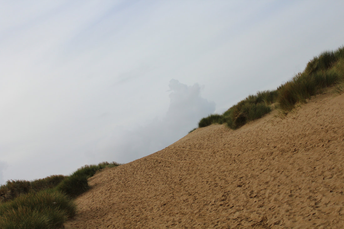
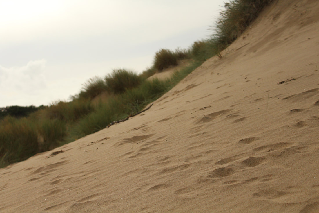
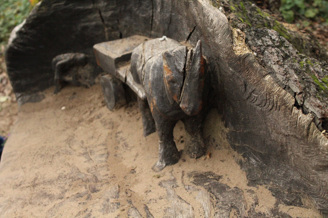
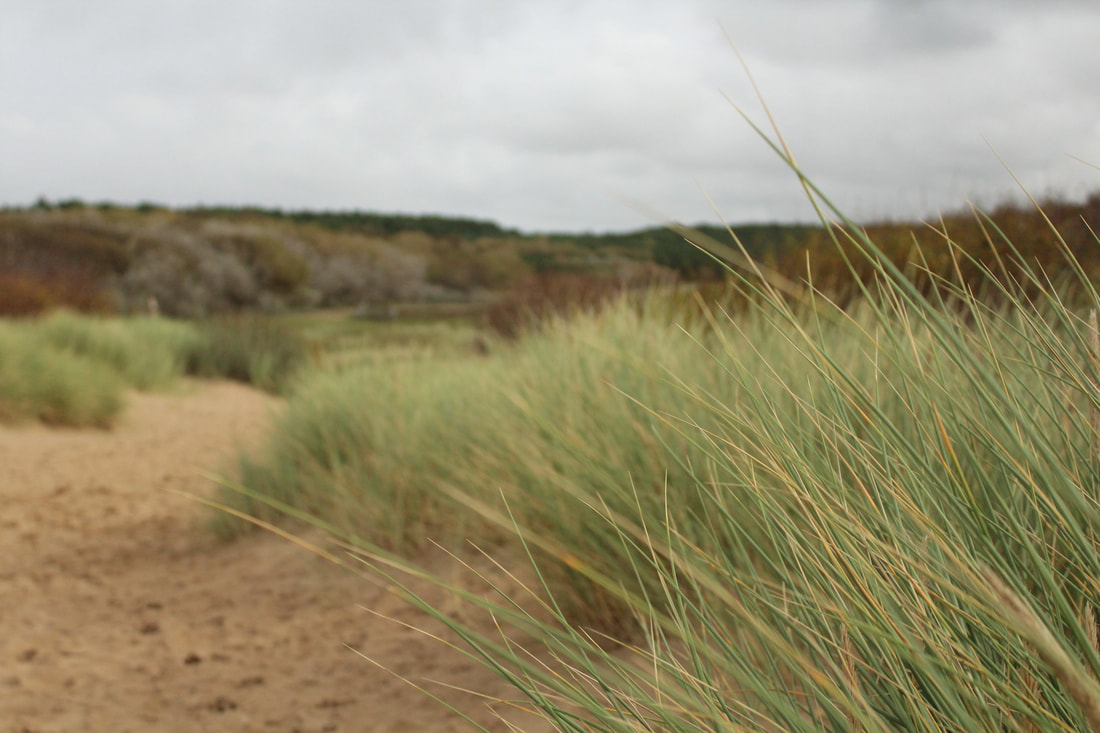
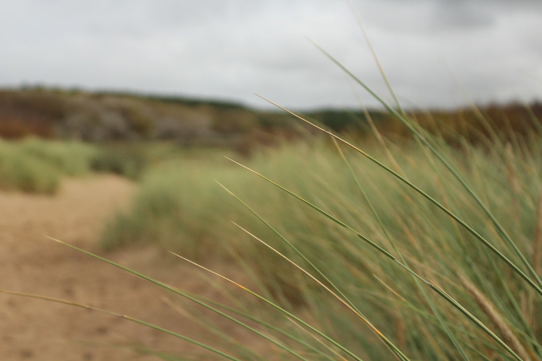
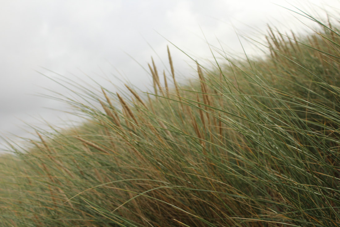
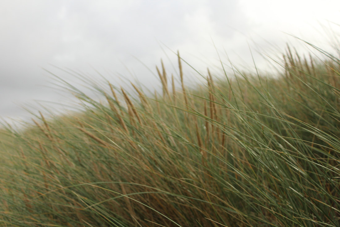
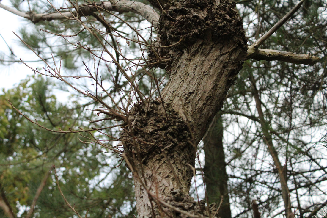
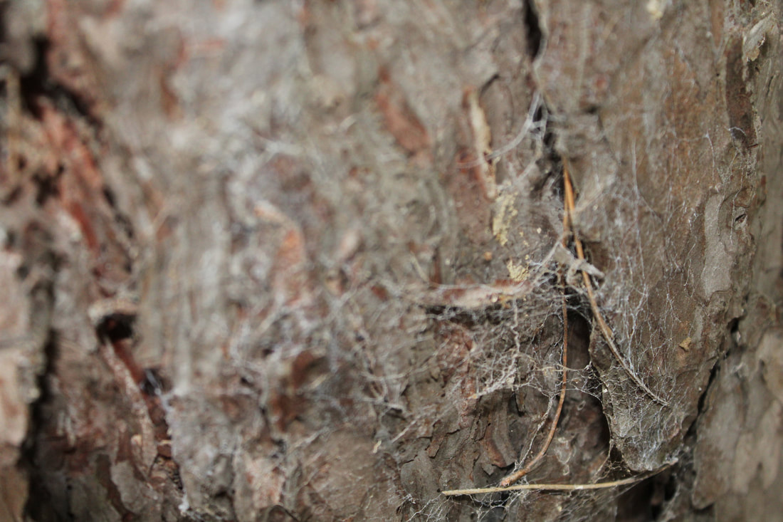
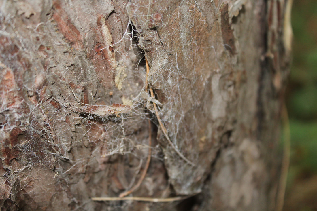
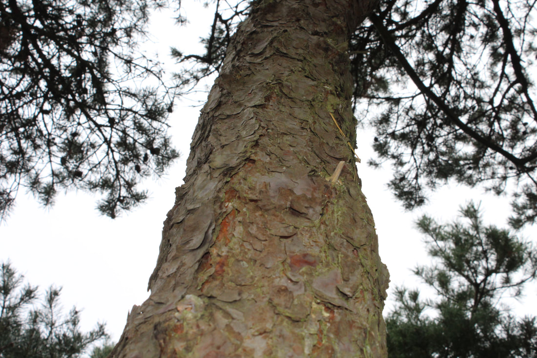
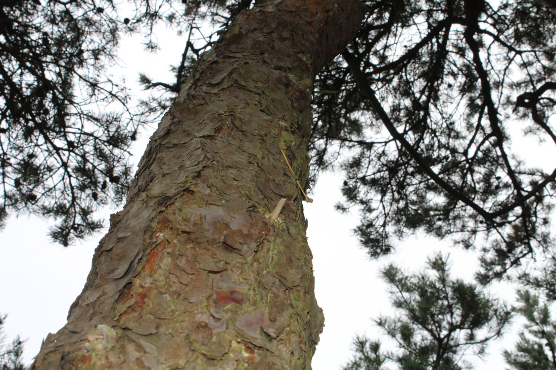
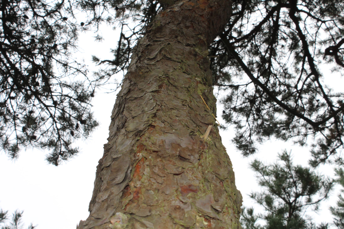
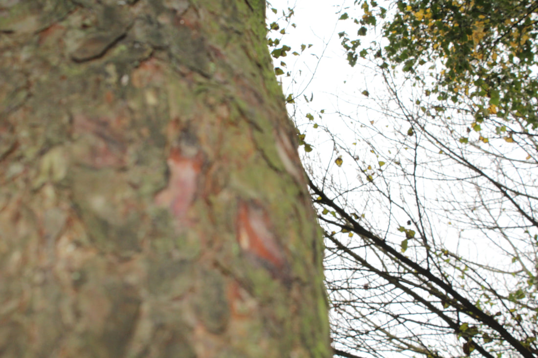
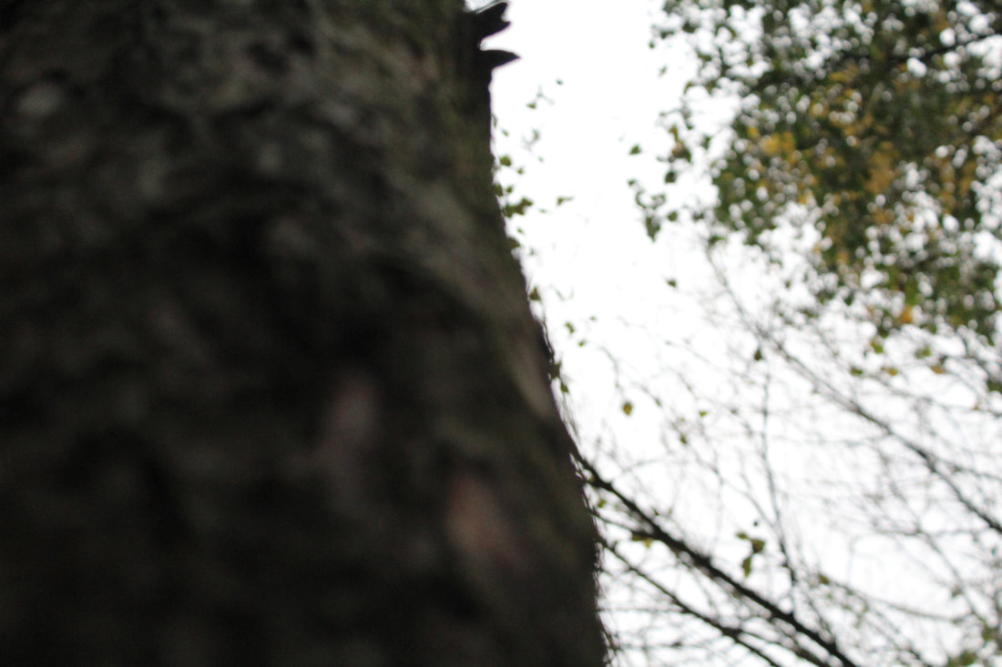
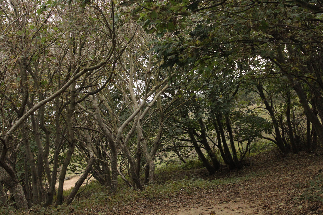
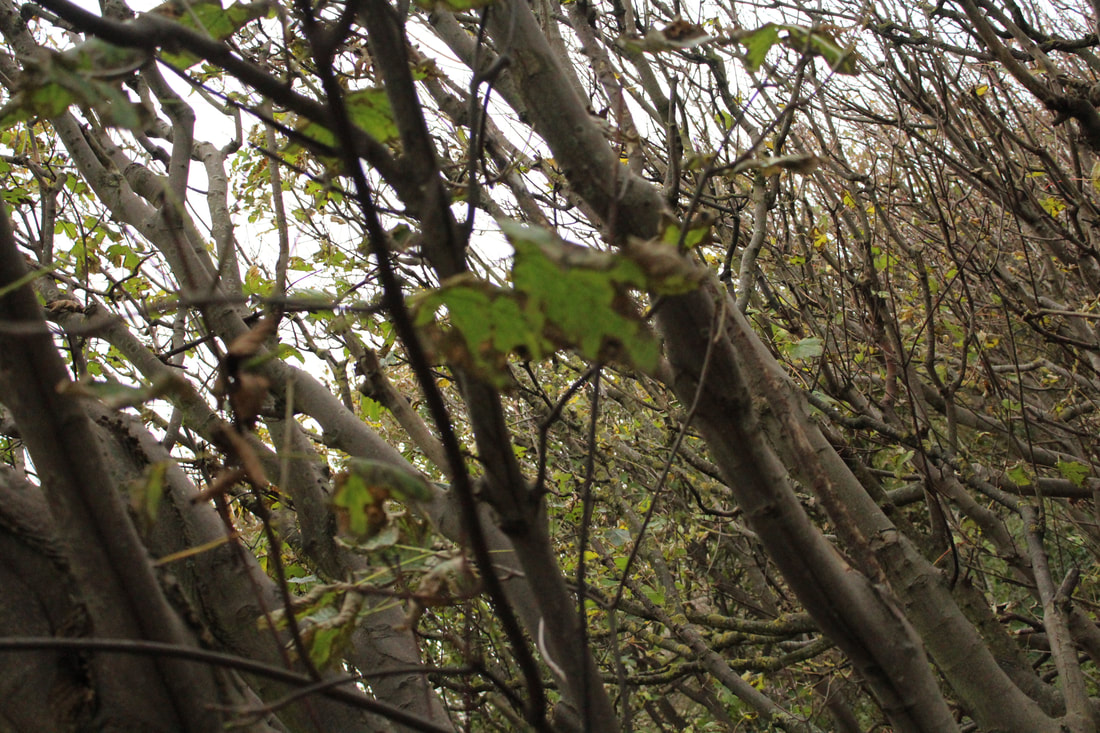
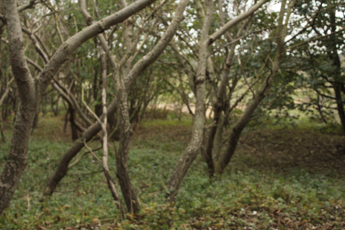
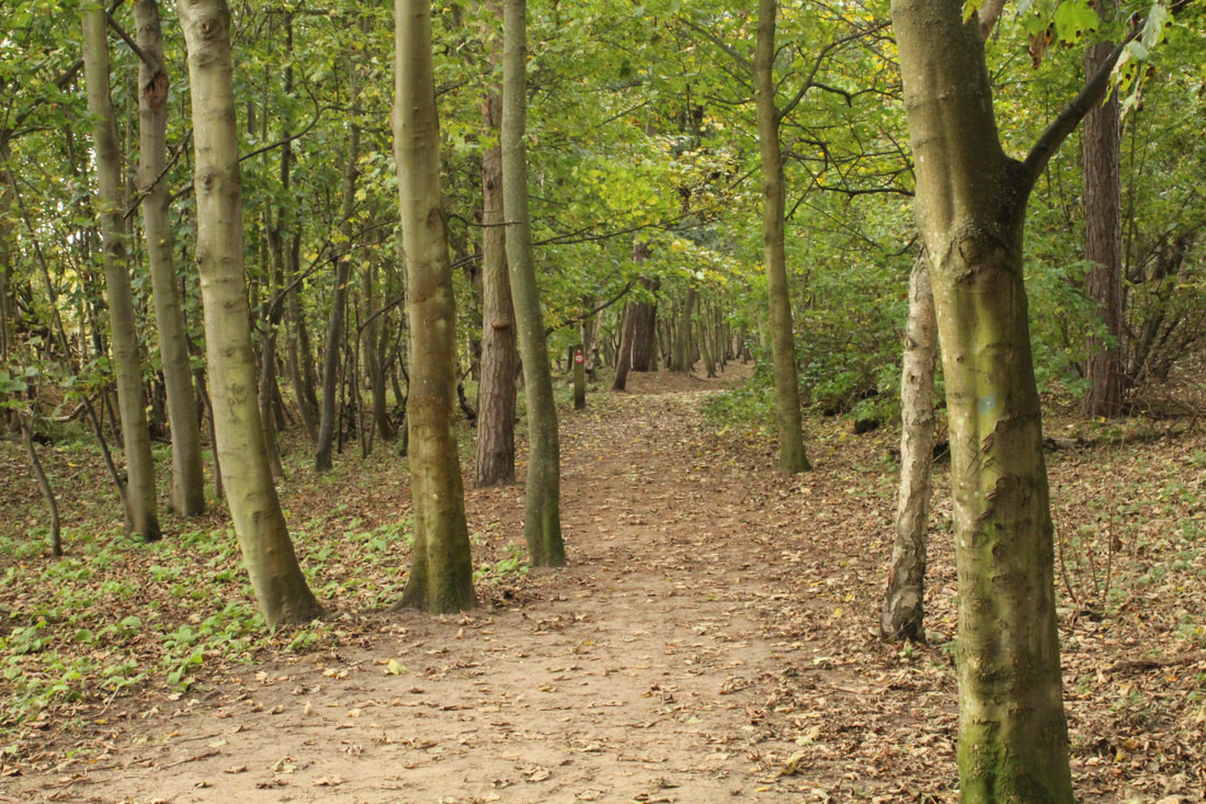
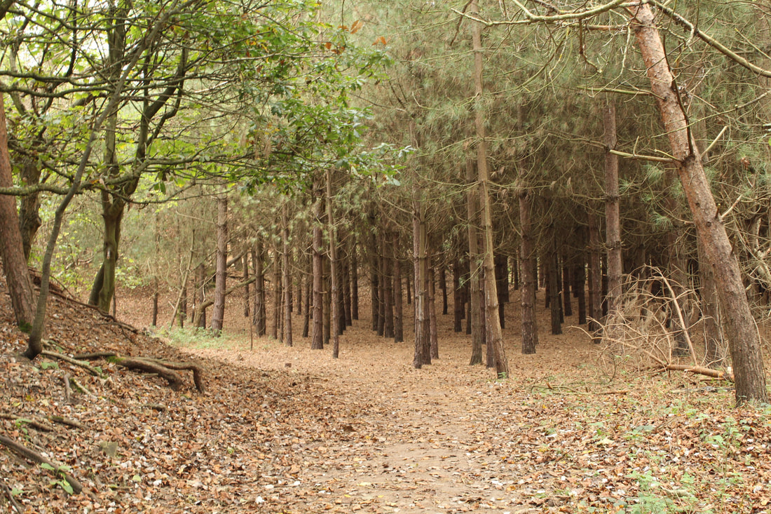
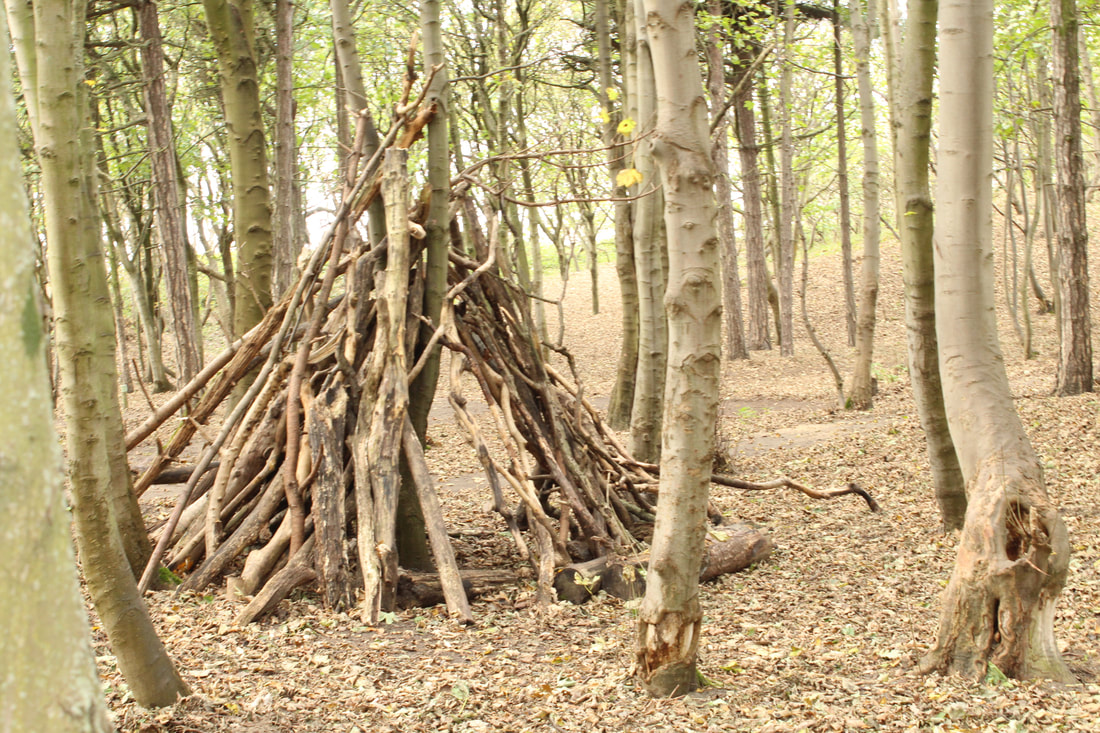
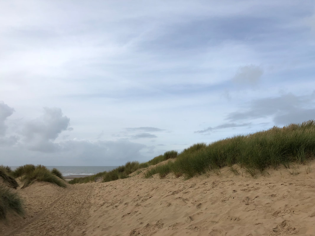
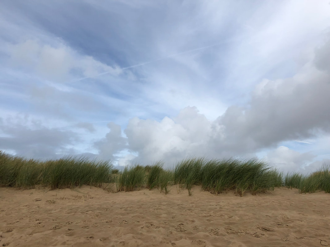
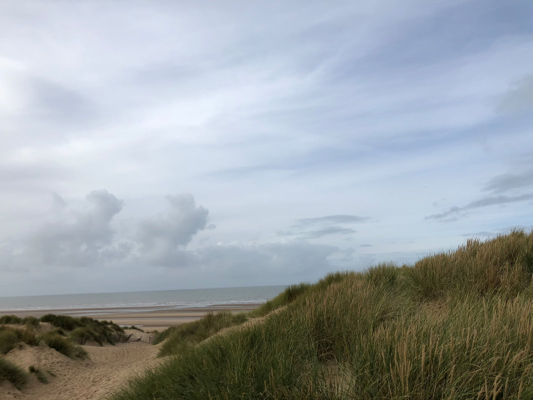
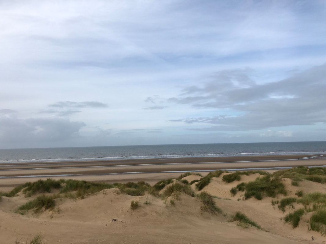
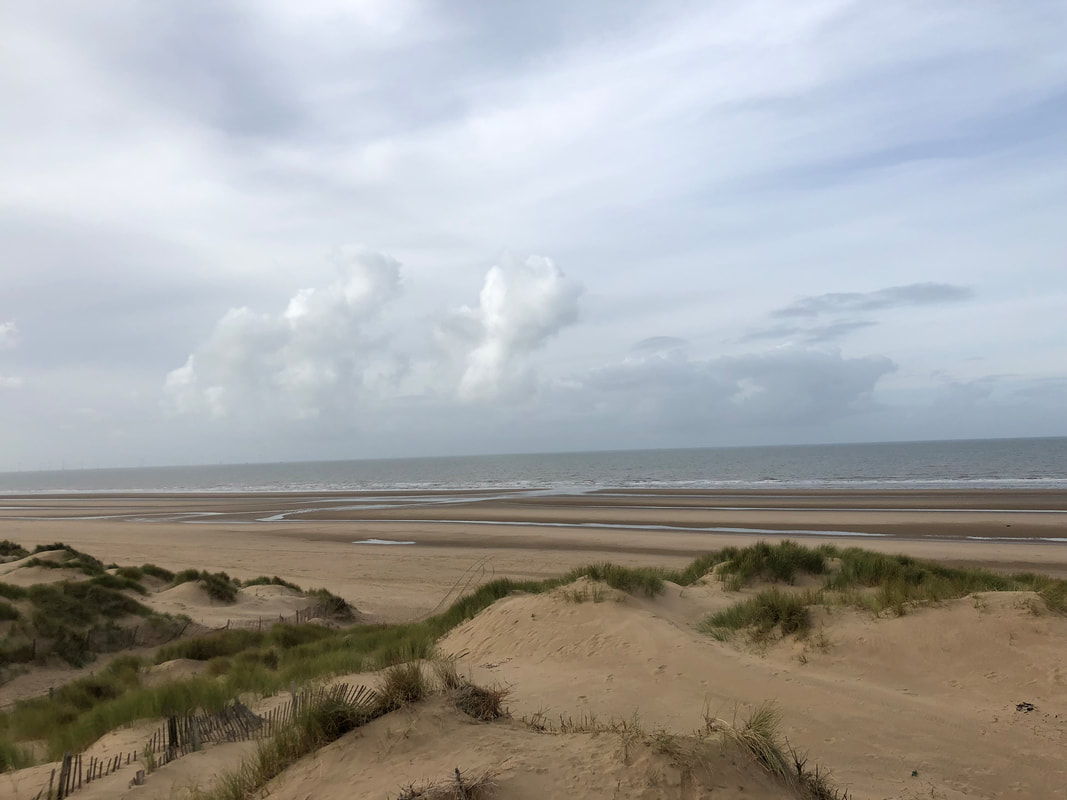
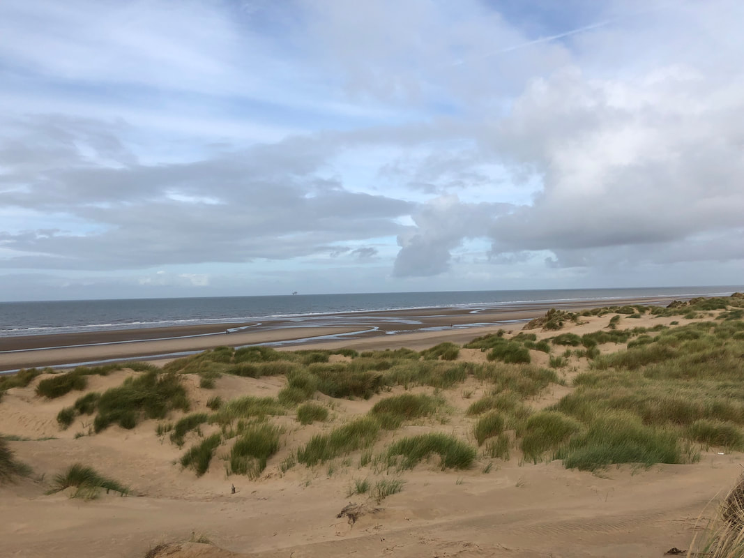
Formby Beach
Close up plants
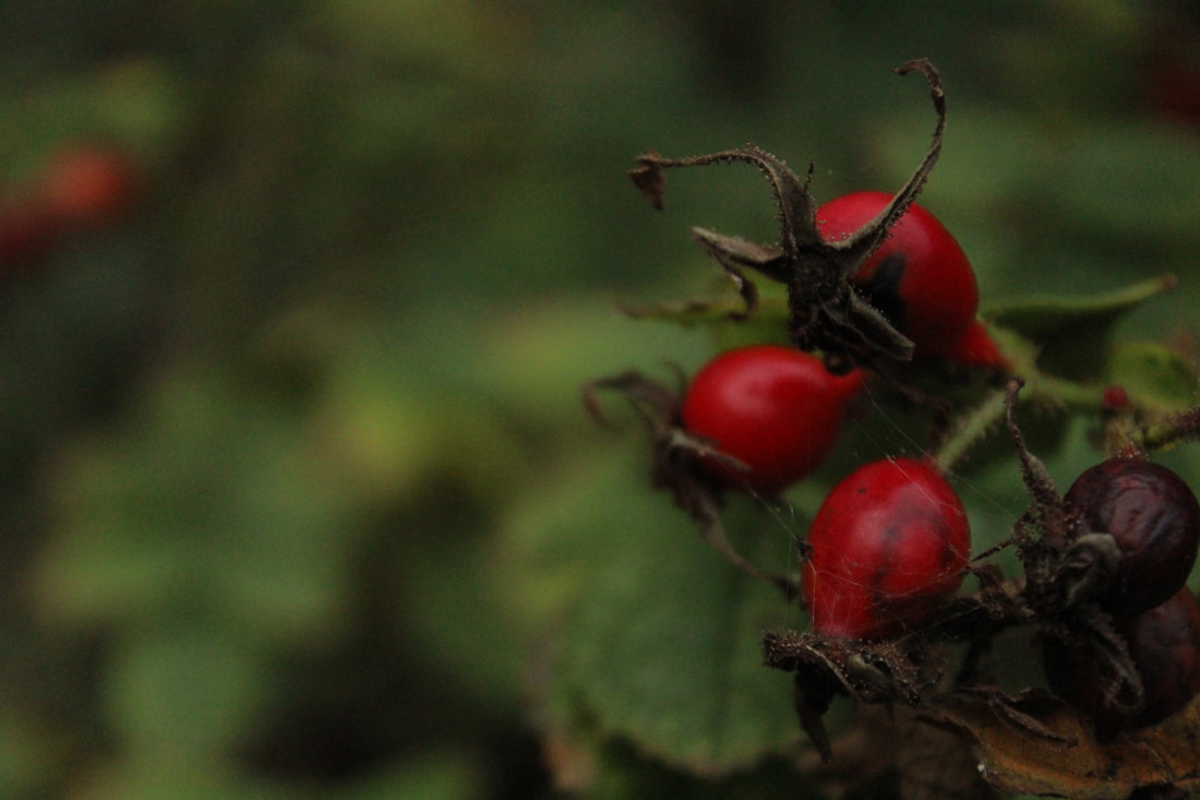
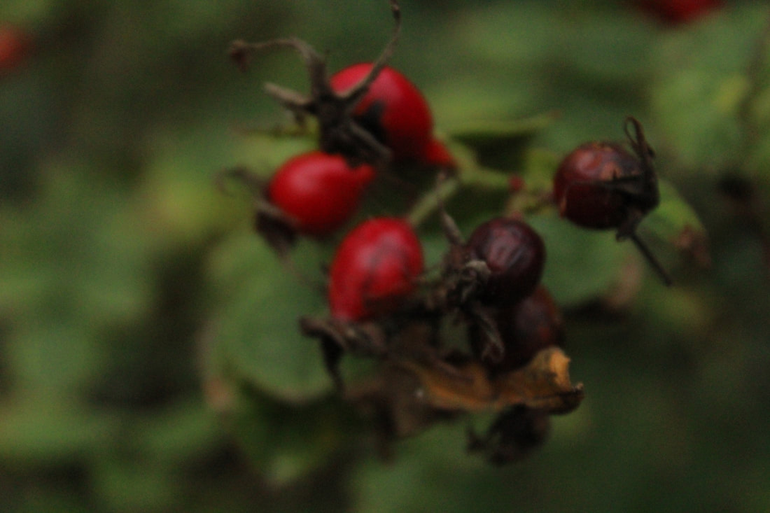
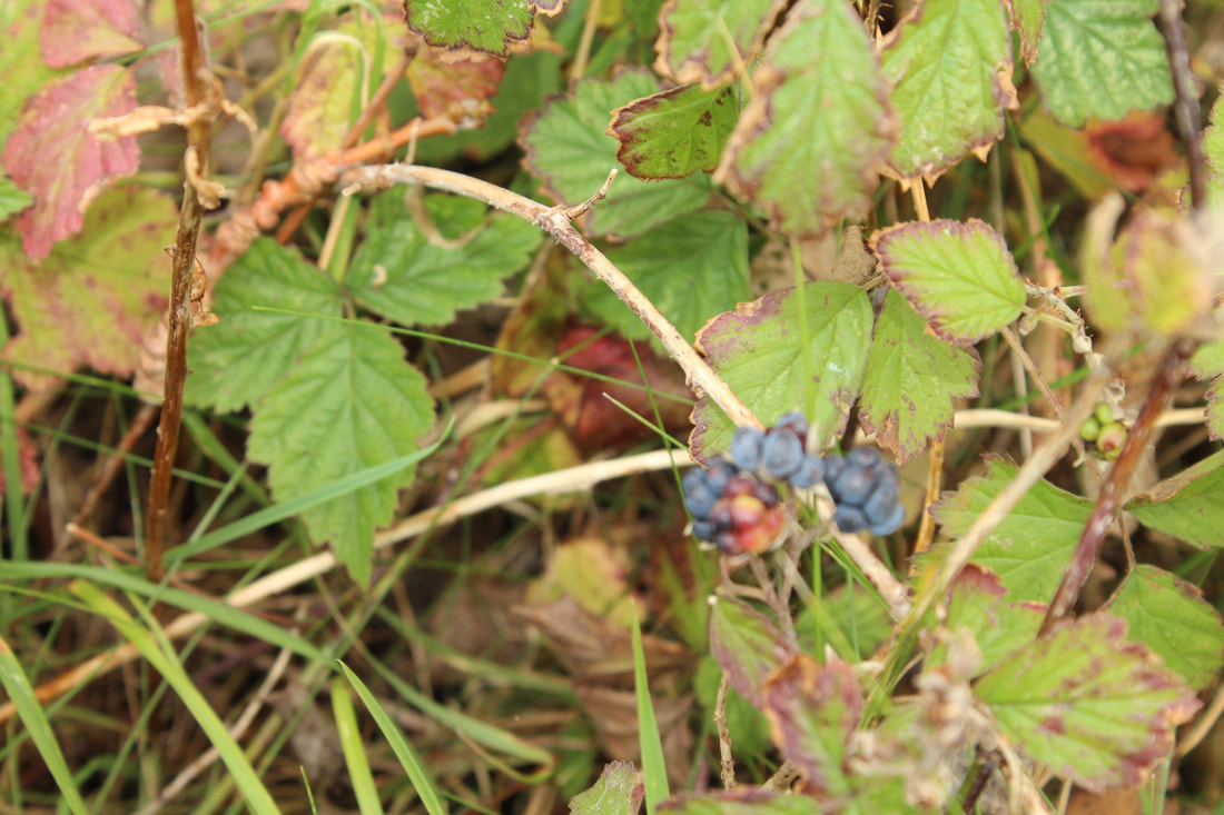
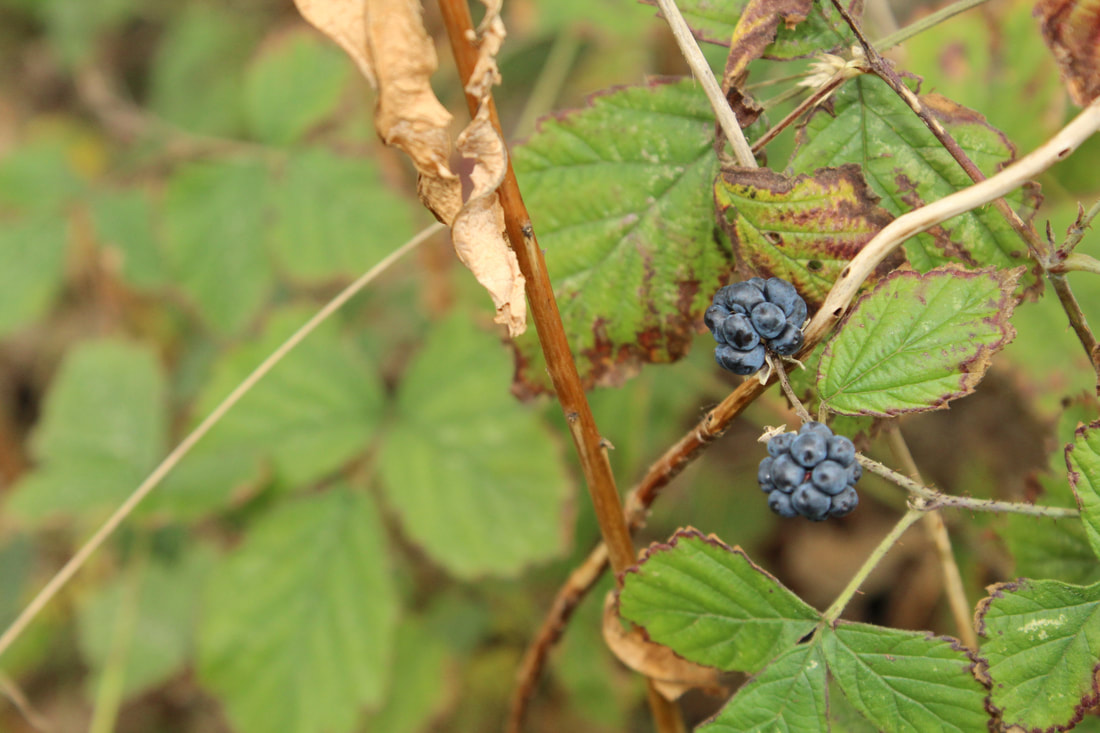
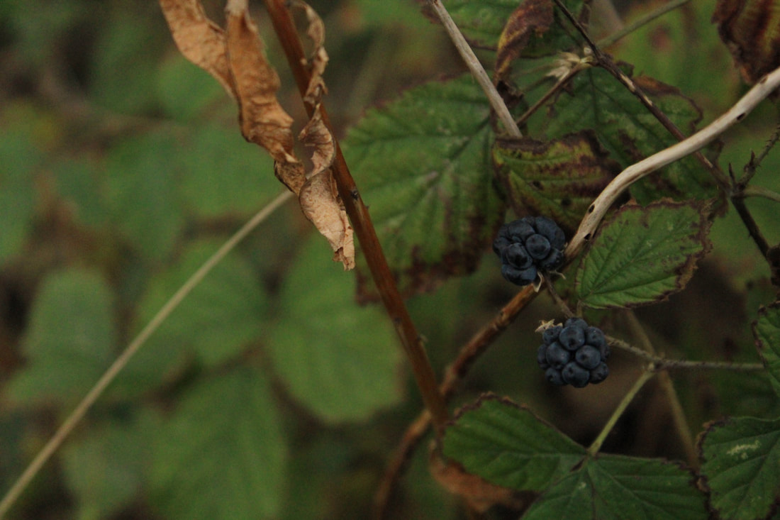
Blueberries
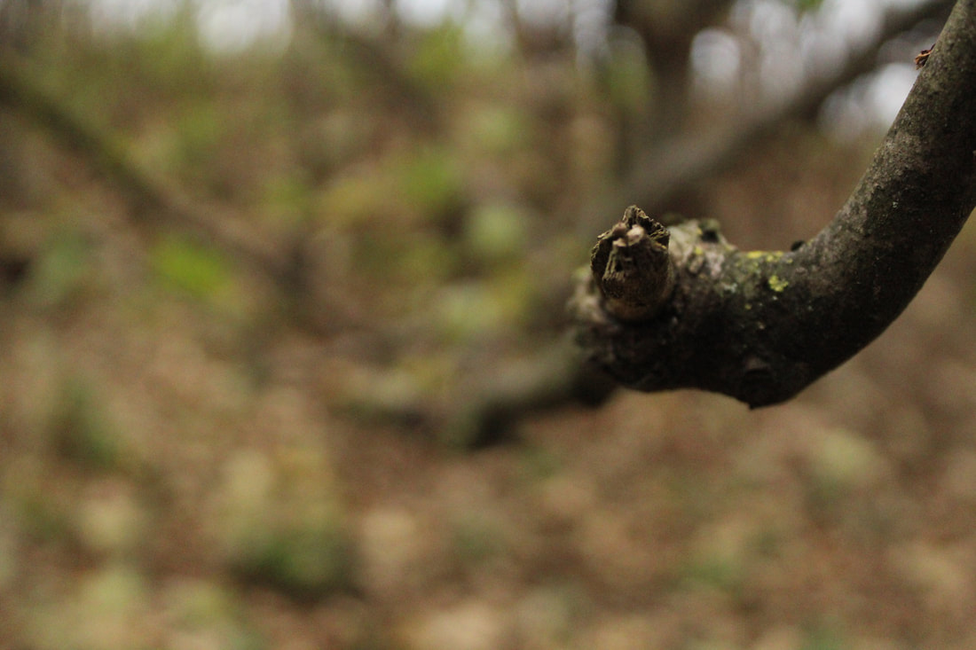
Branches
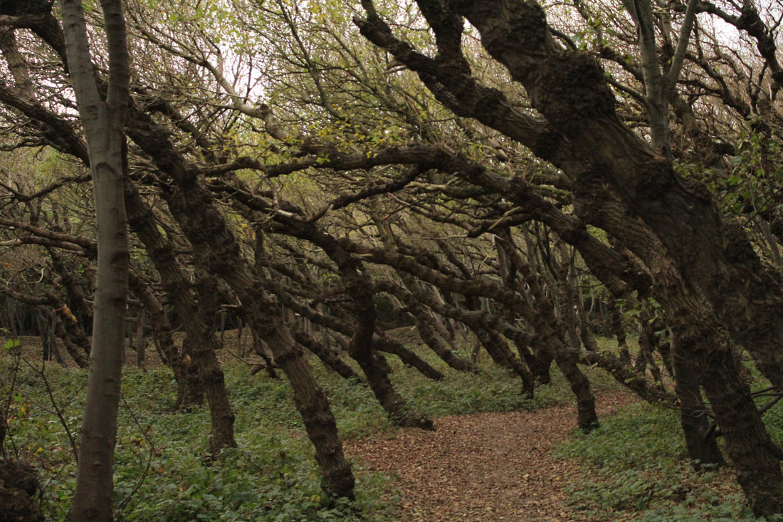
Trees

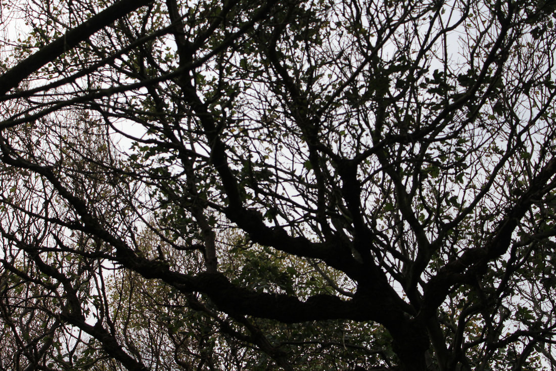
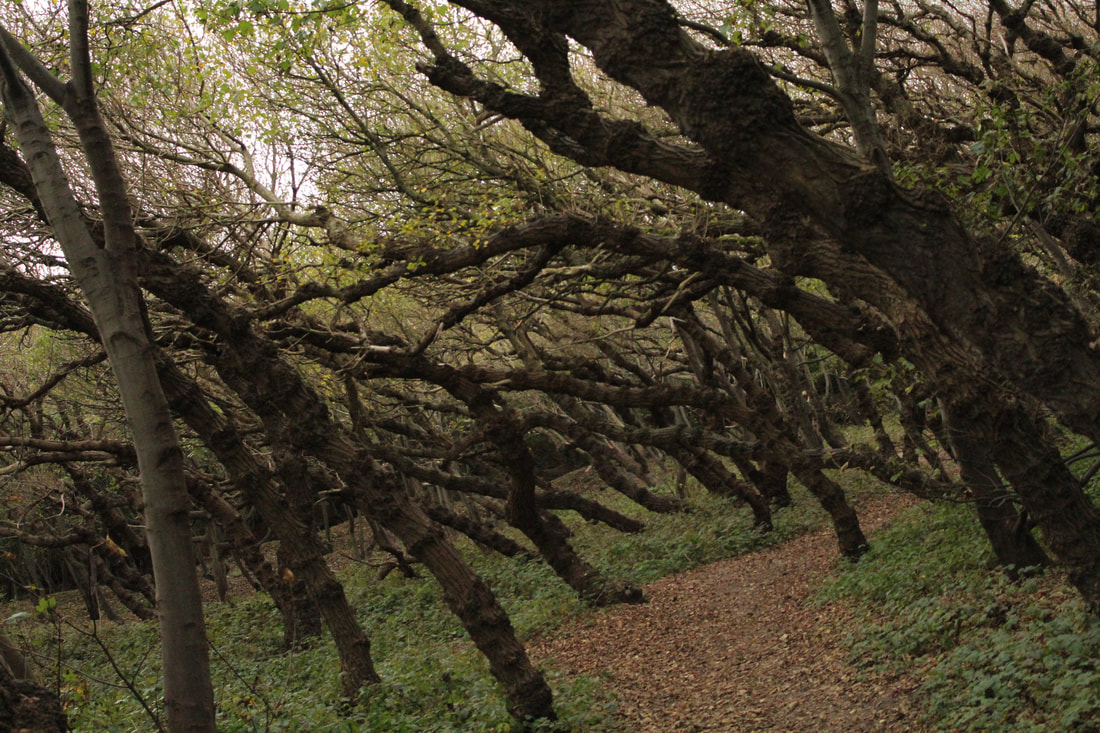
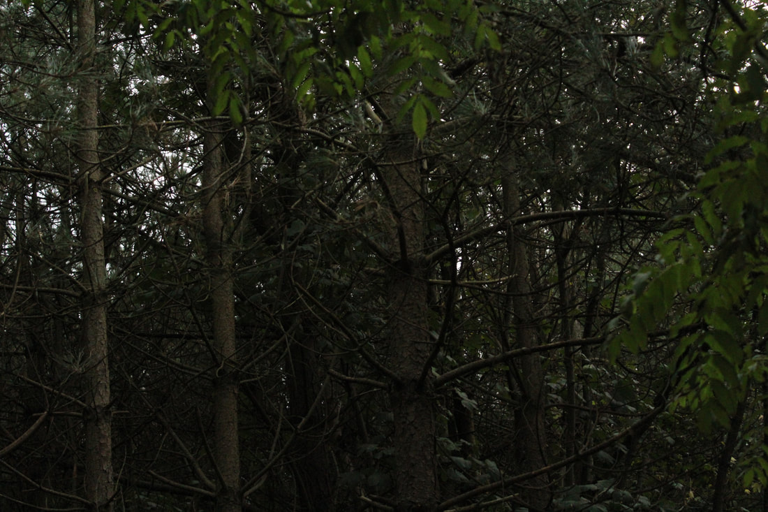


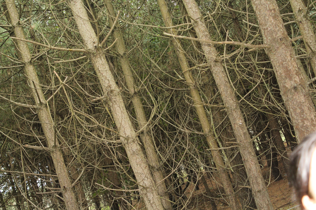


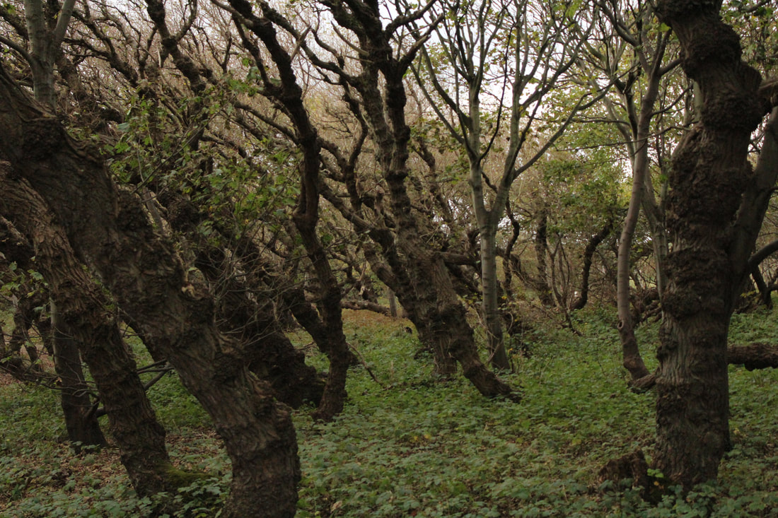
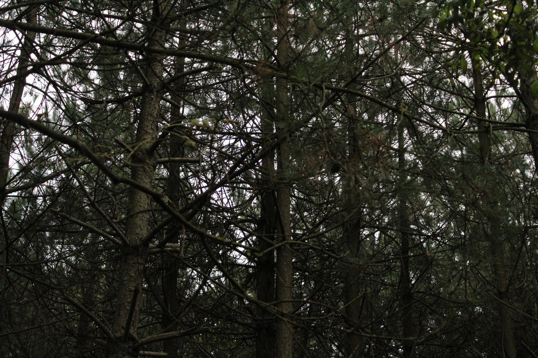


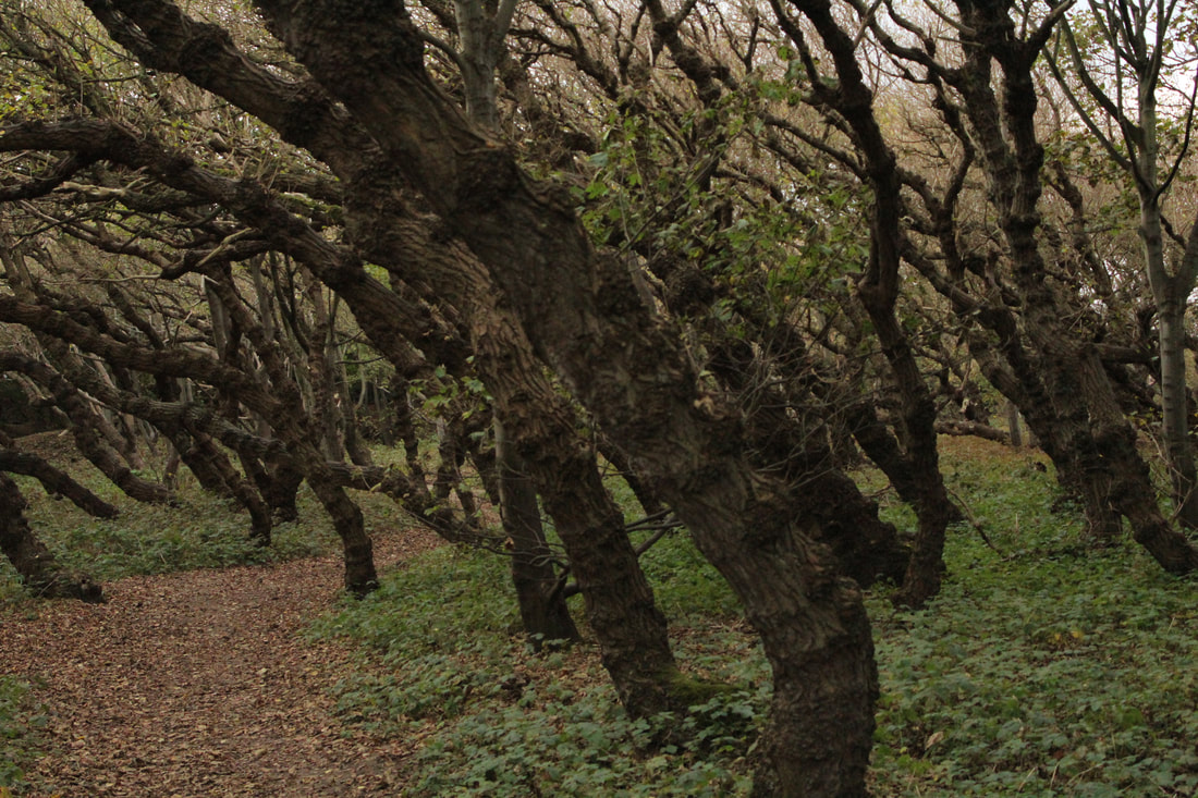
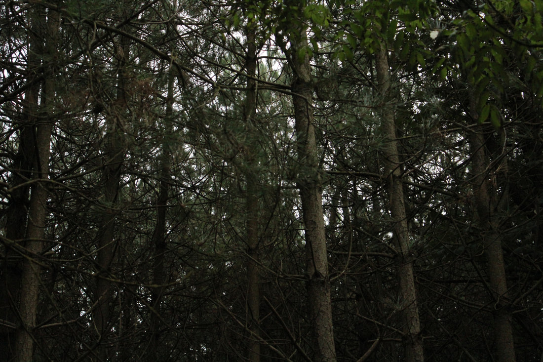
Forests


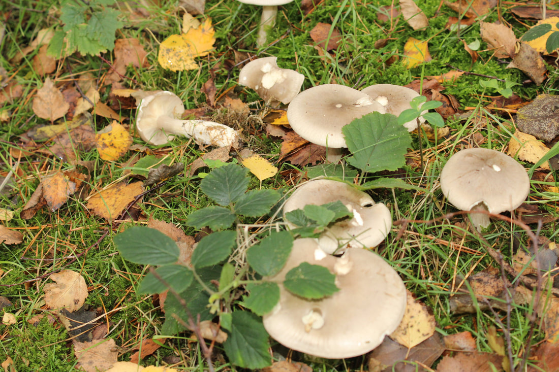
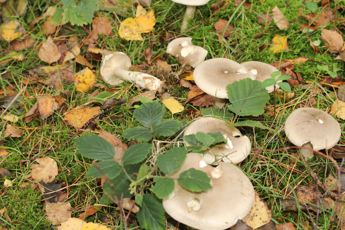
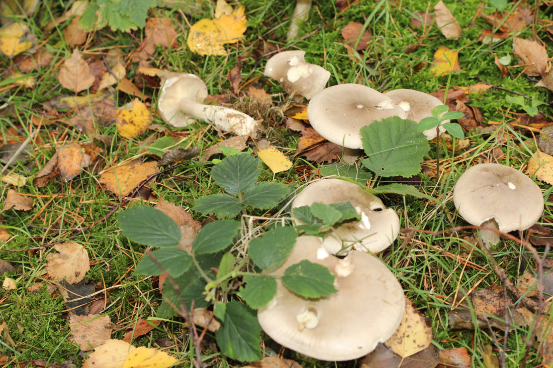
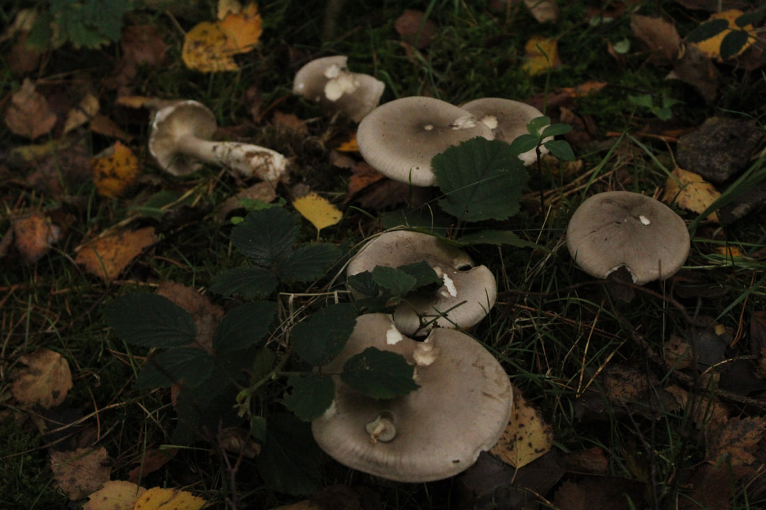
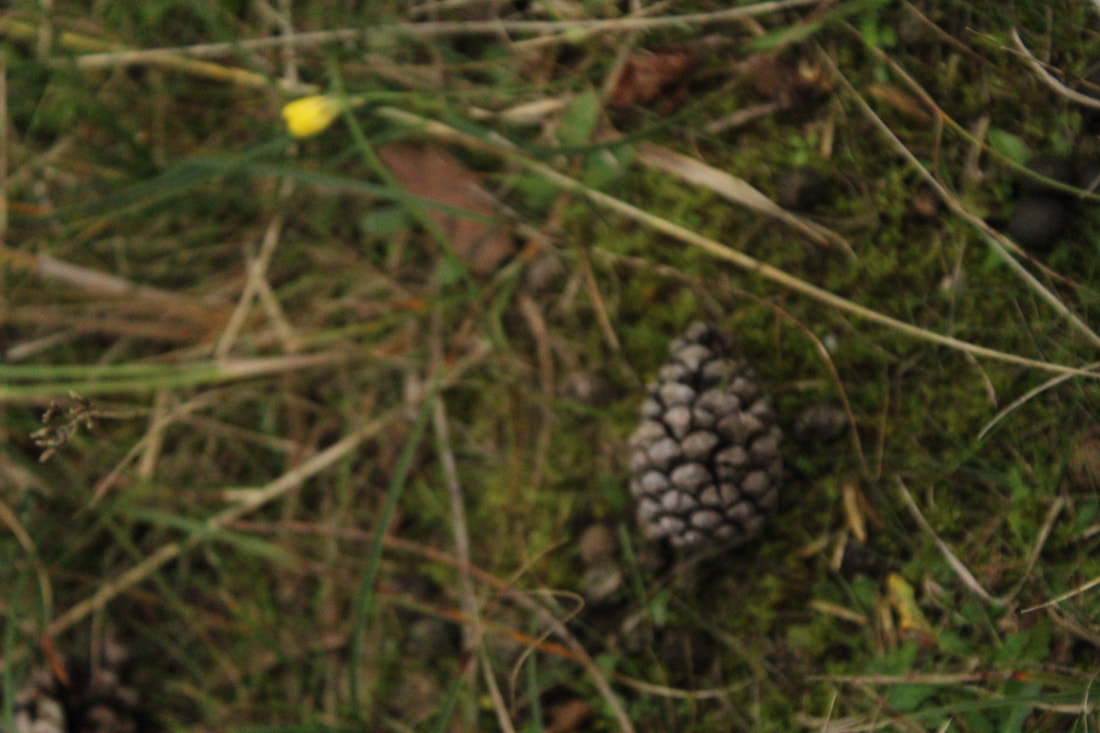
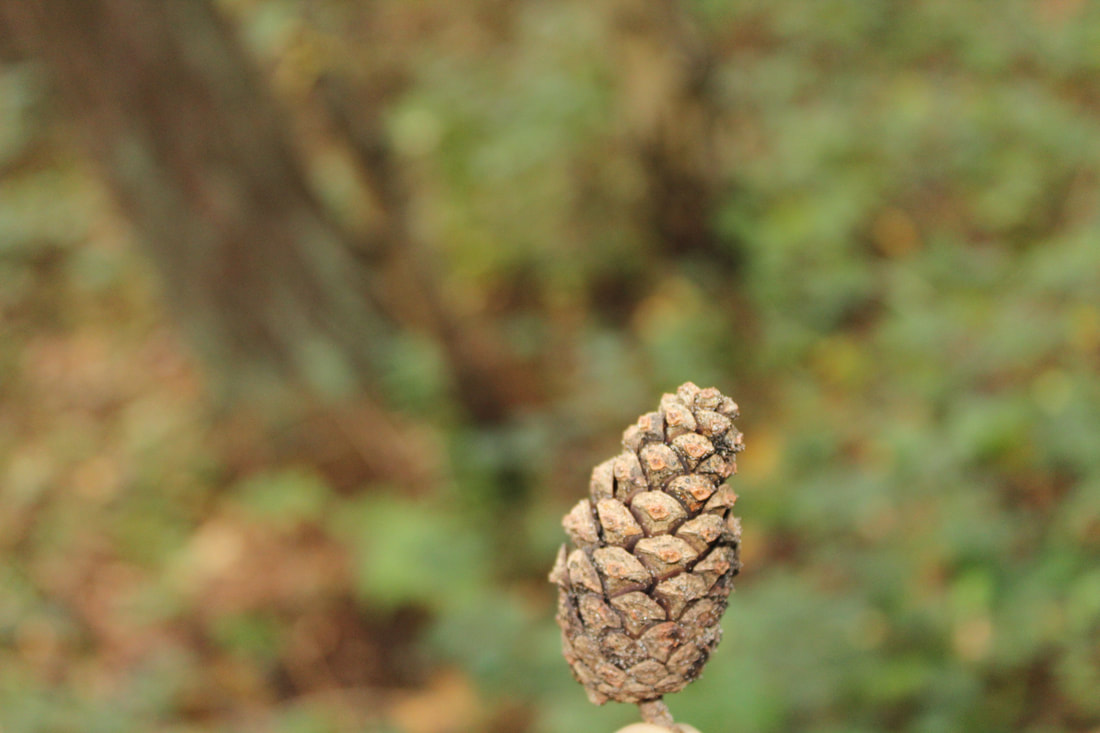
Mushrooms
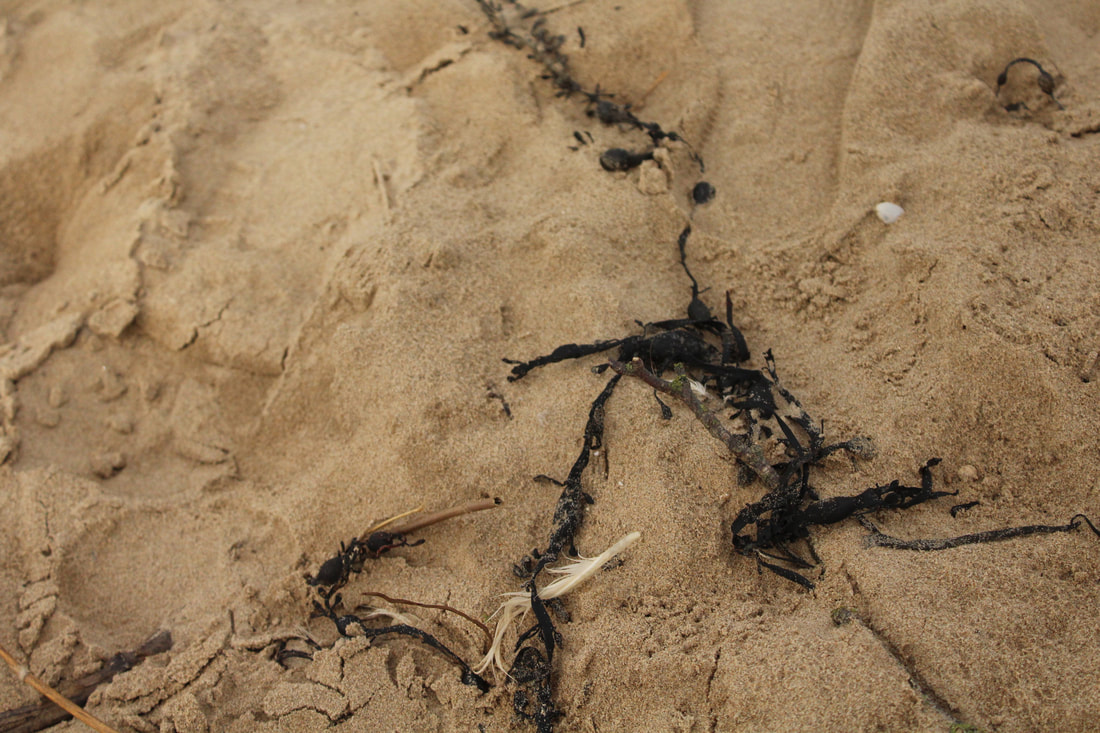
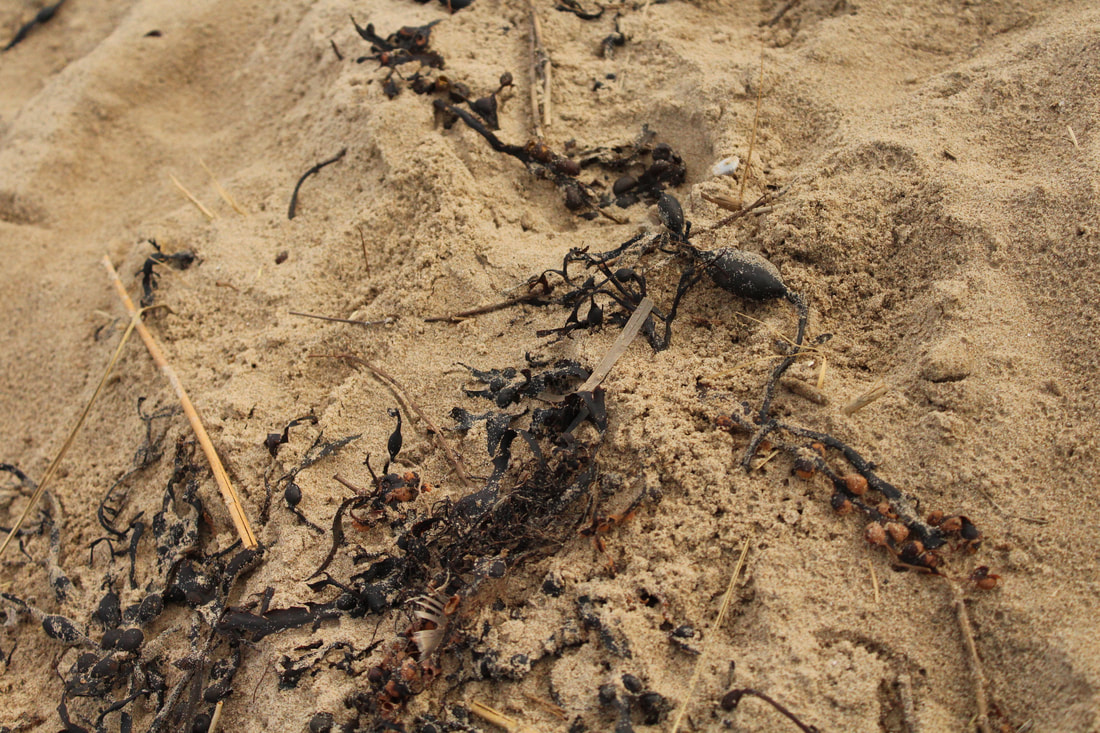
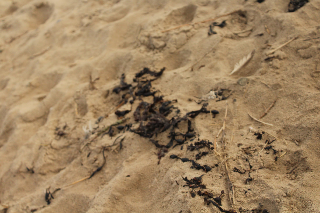
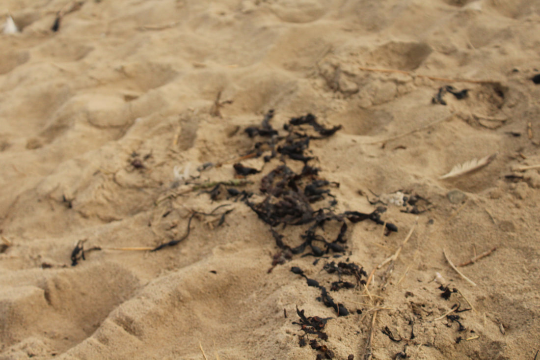
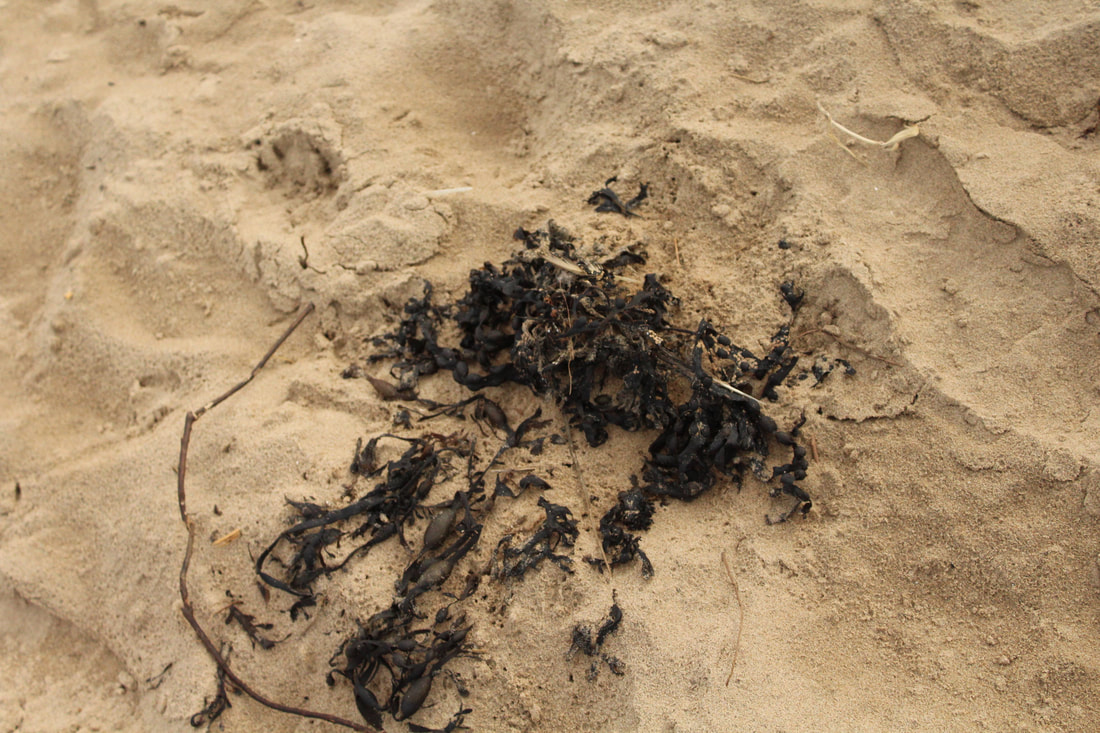
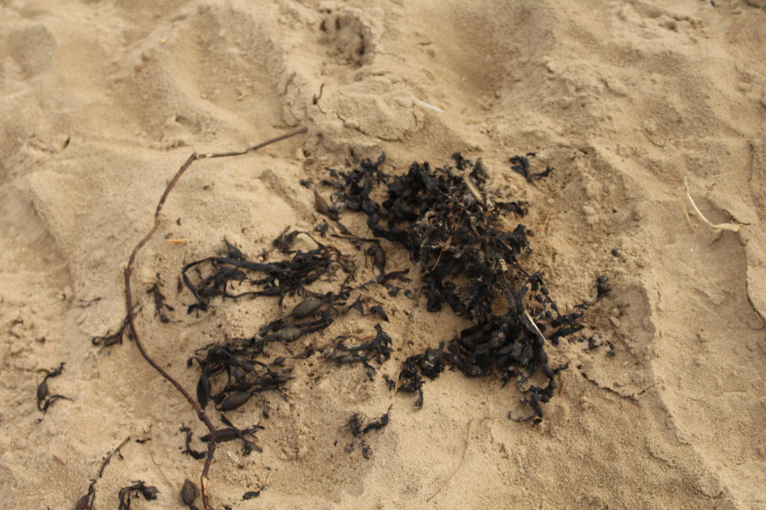
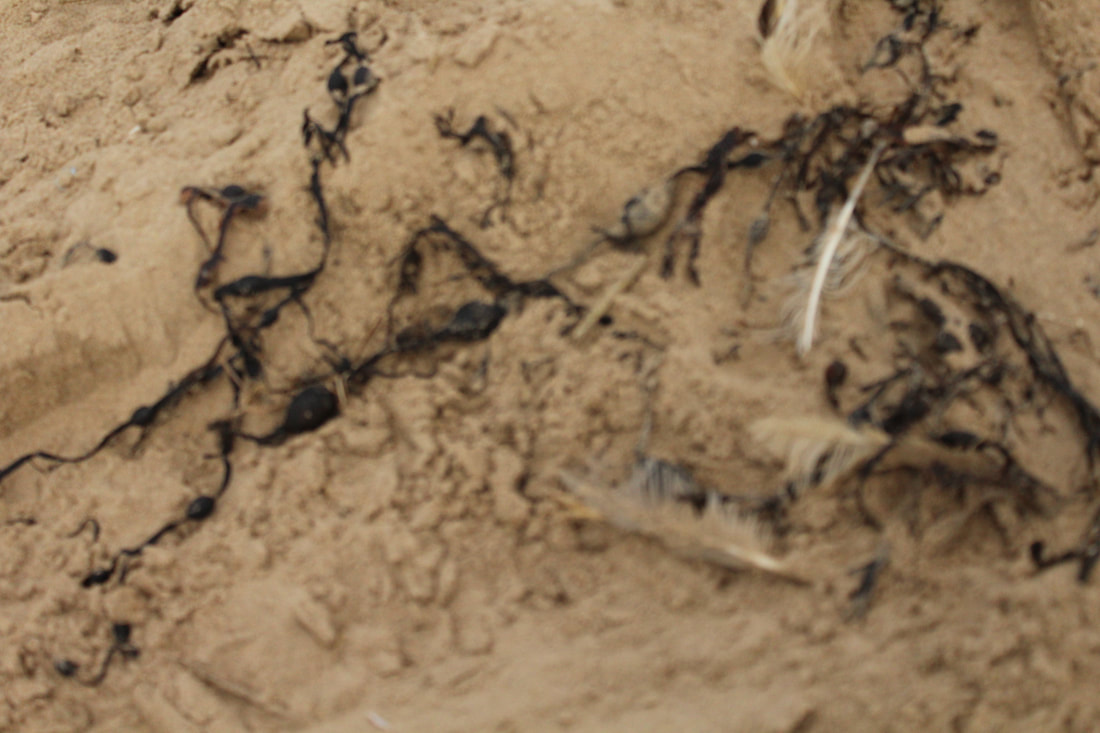
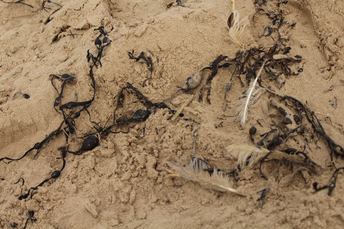
Seaweed
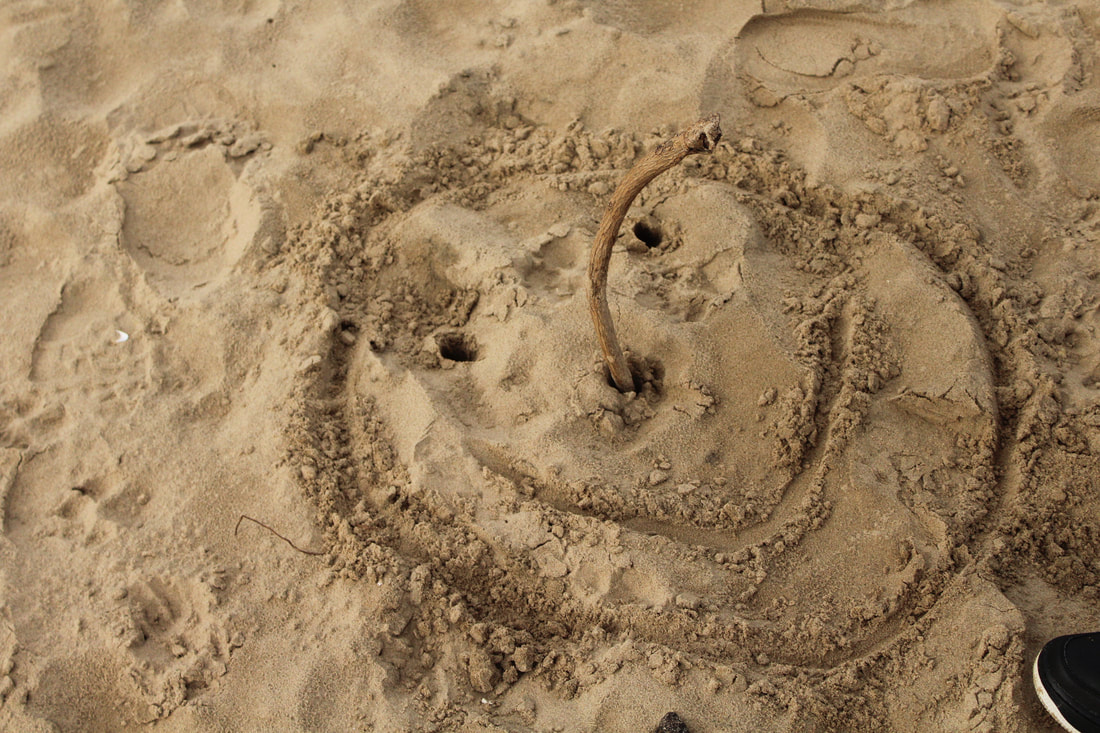
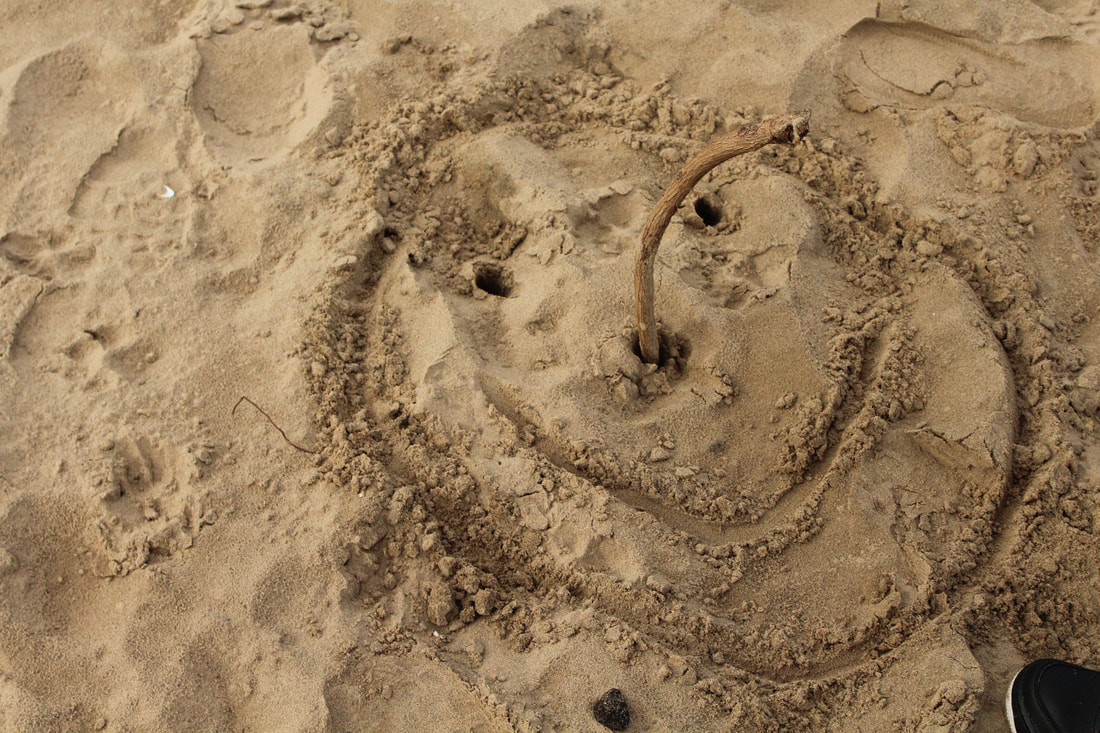
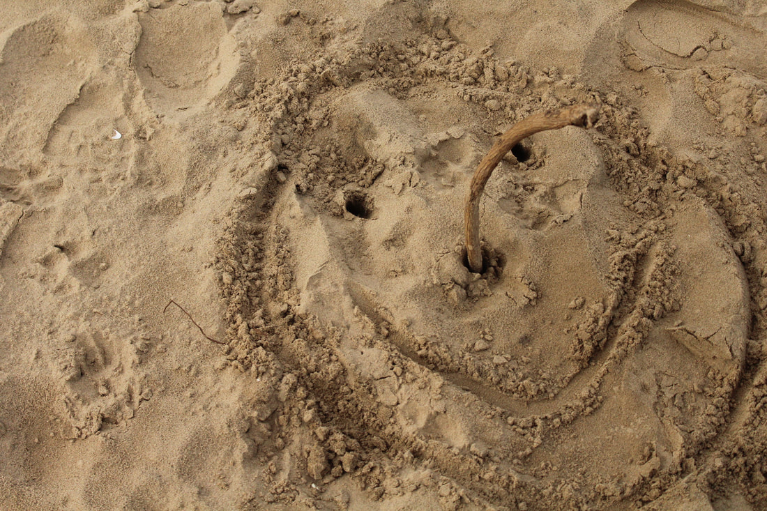
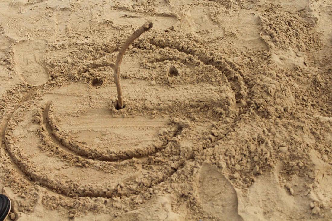
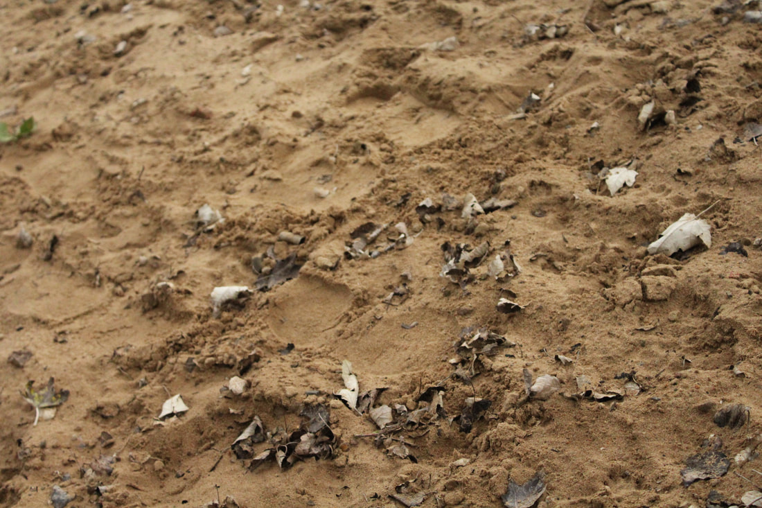
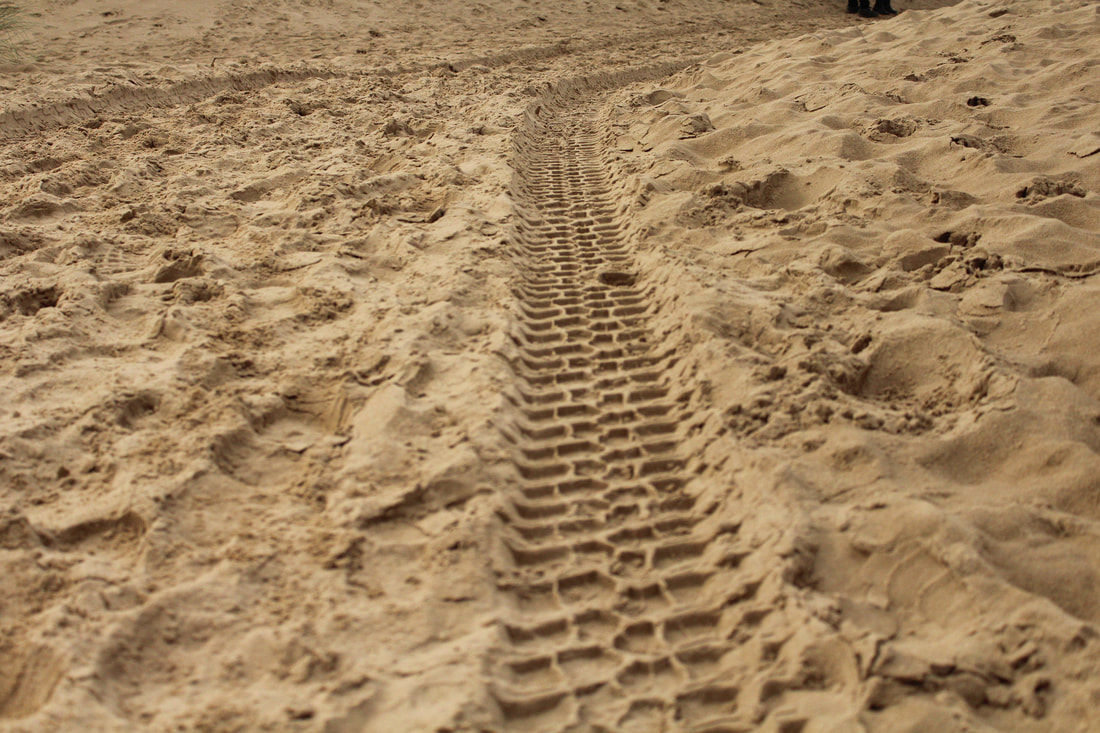
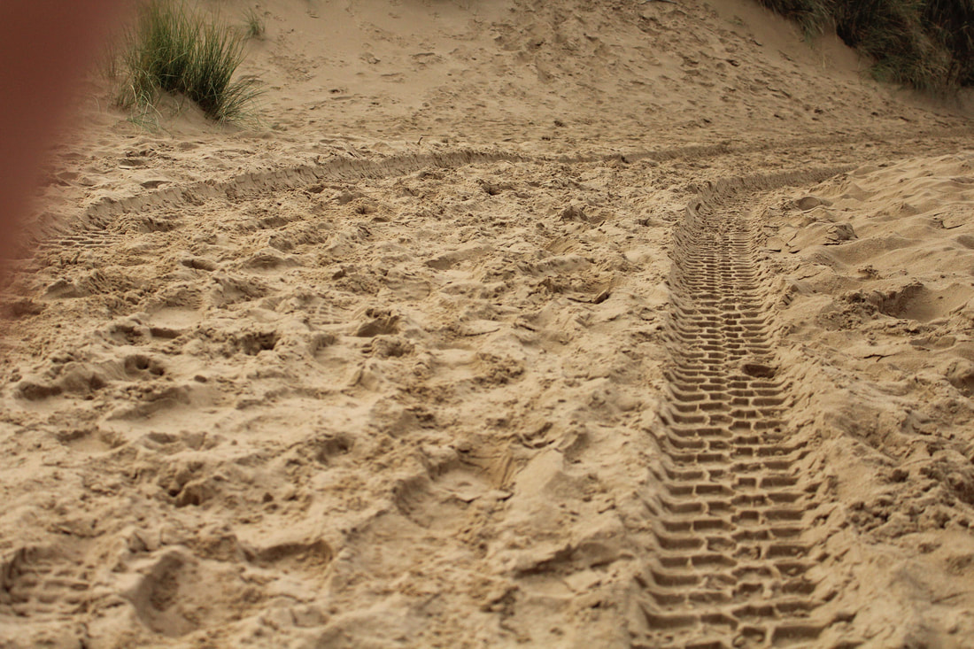
Designs in the sand
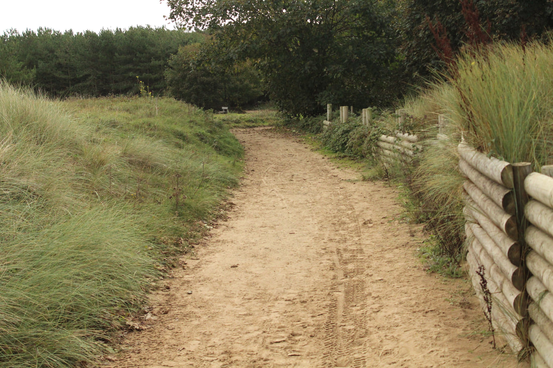
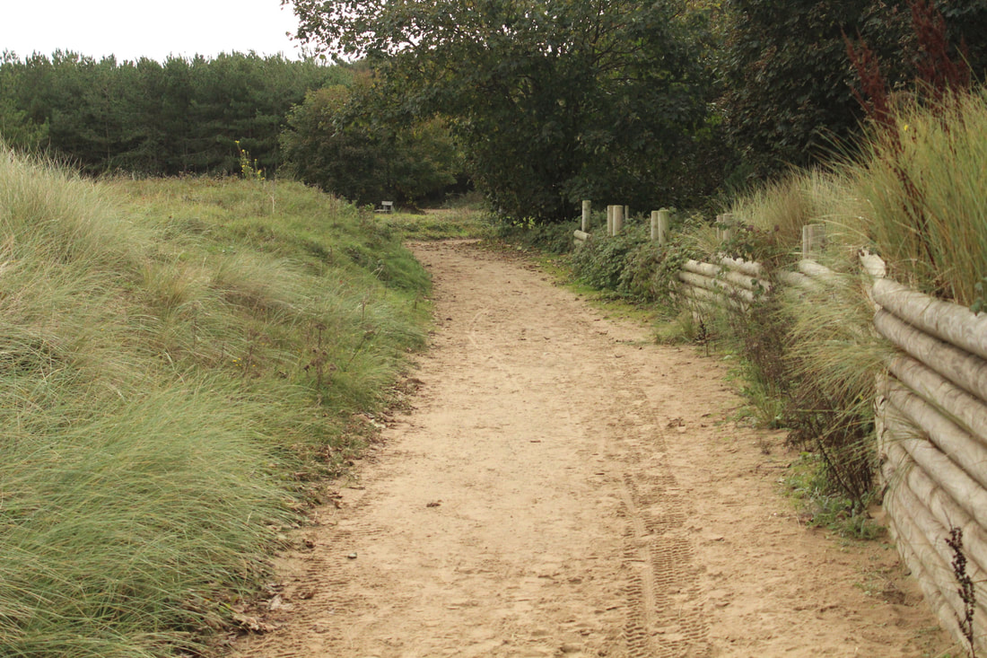
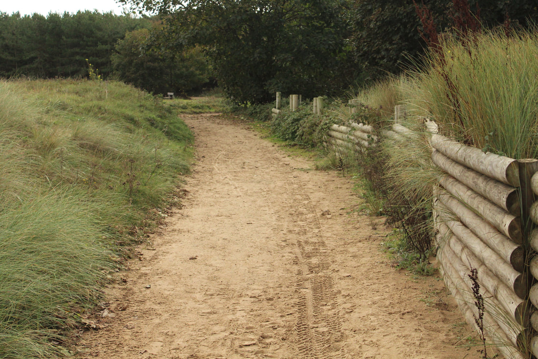
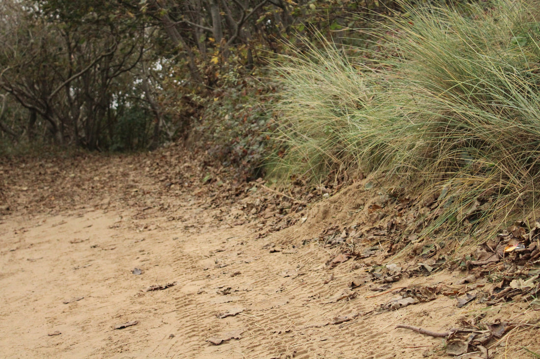
Pathways

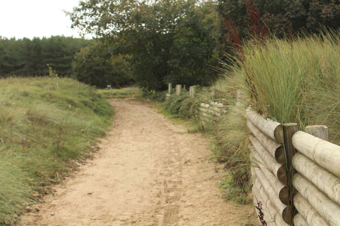
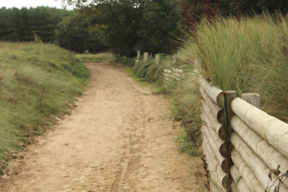
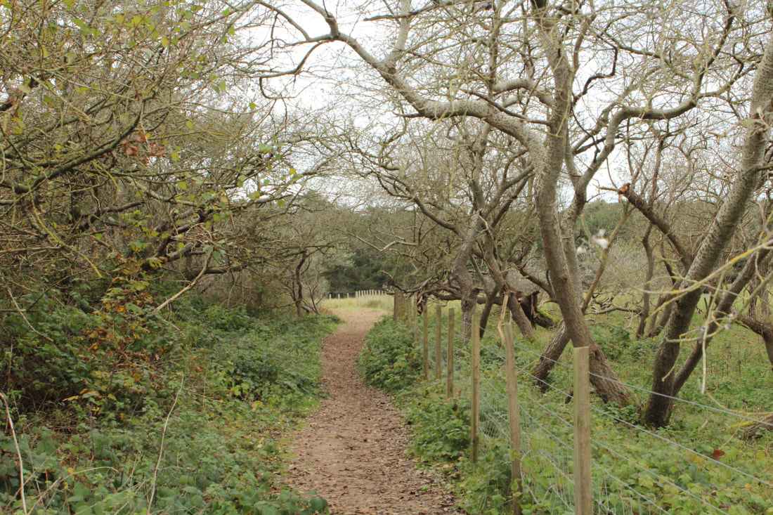

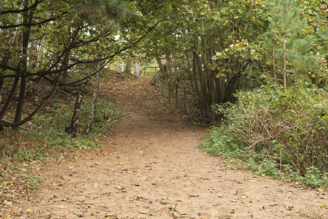
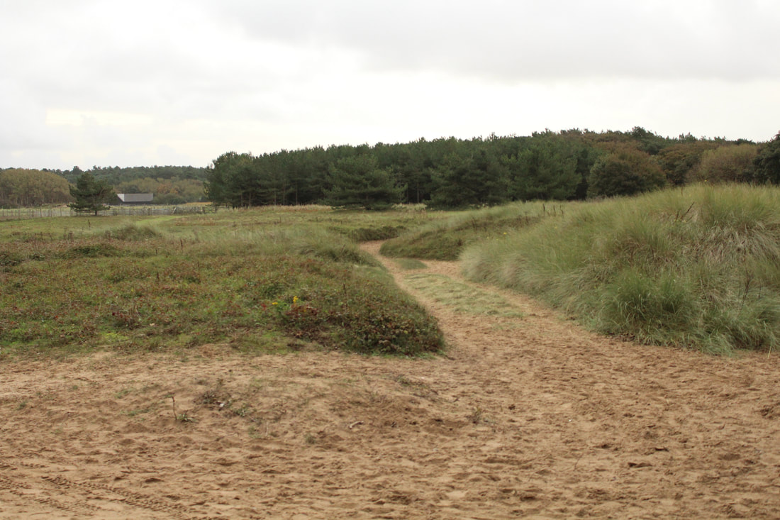
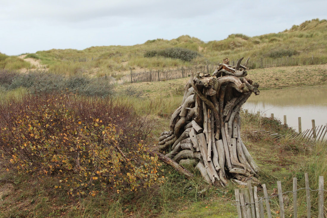
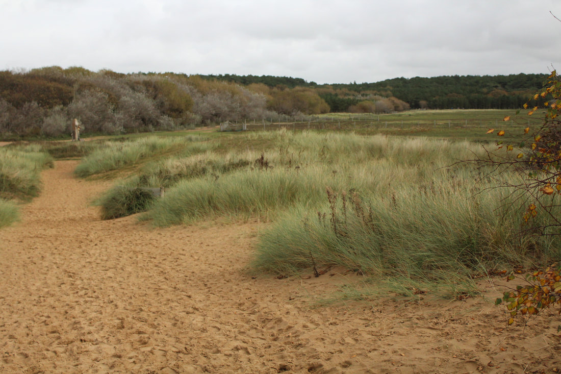
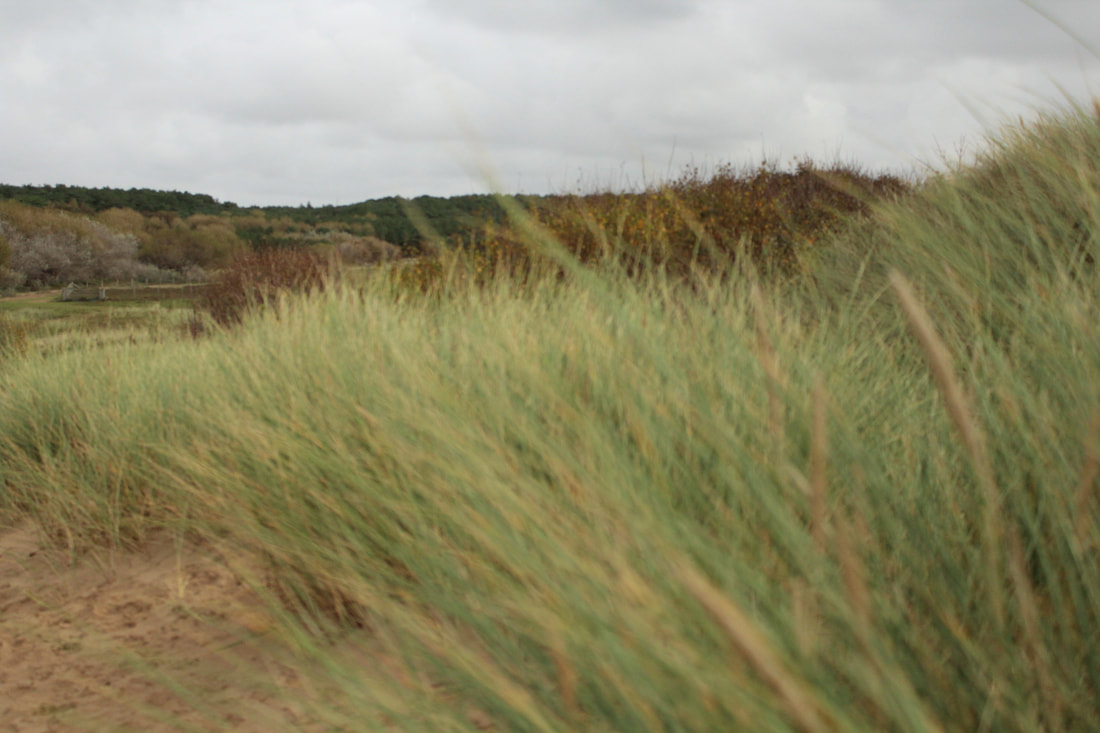
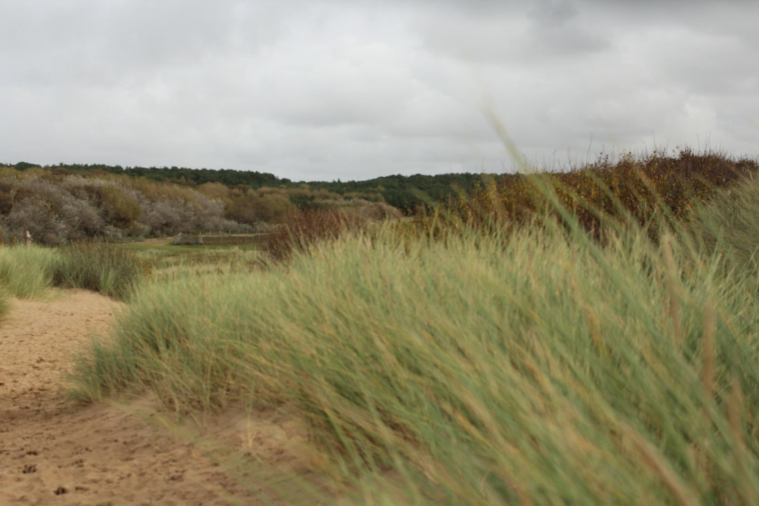
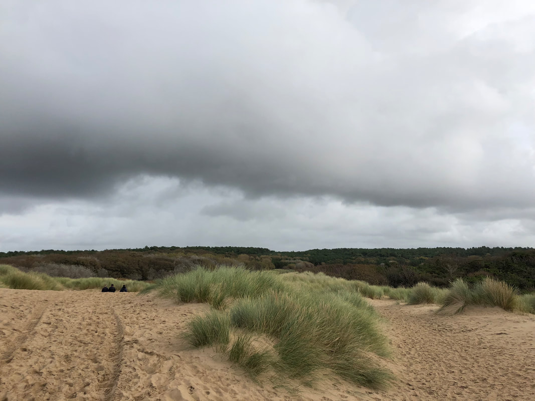
Sand Dunes


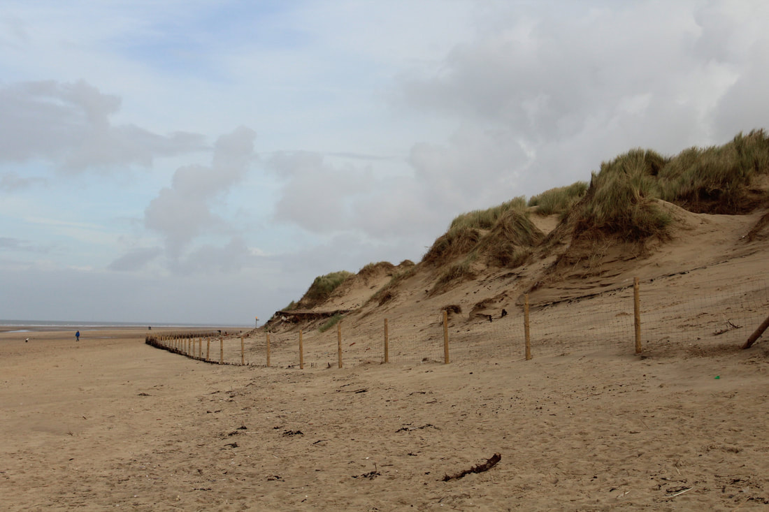
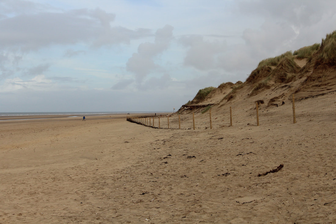


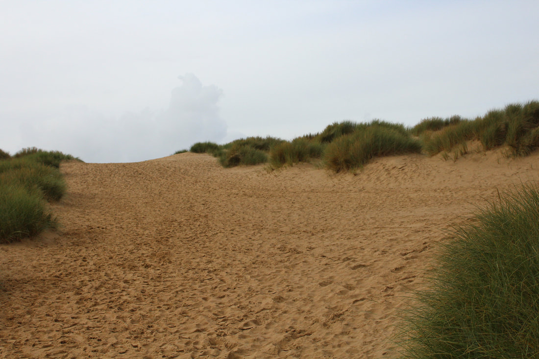
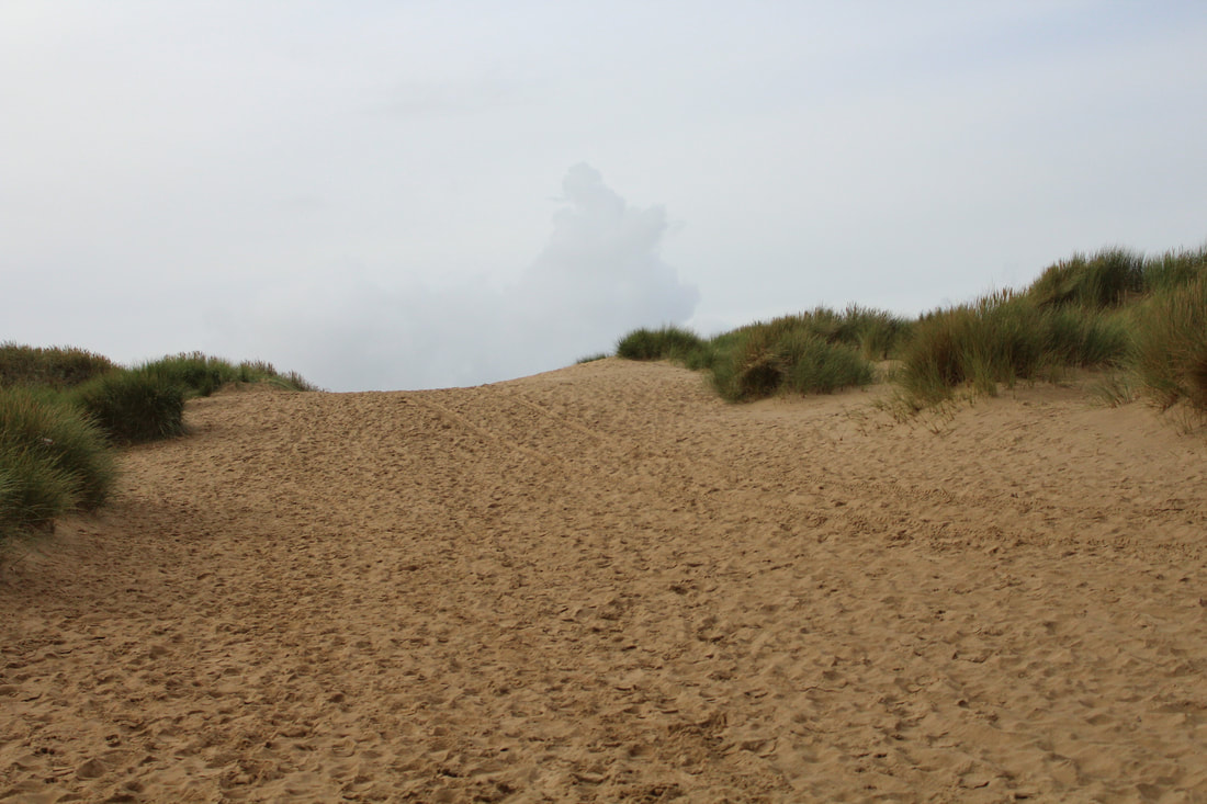
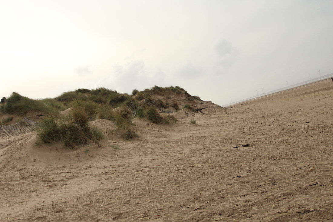
Beach


People on the beach


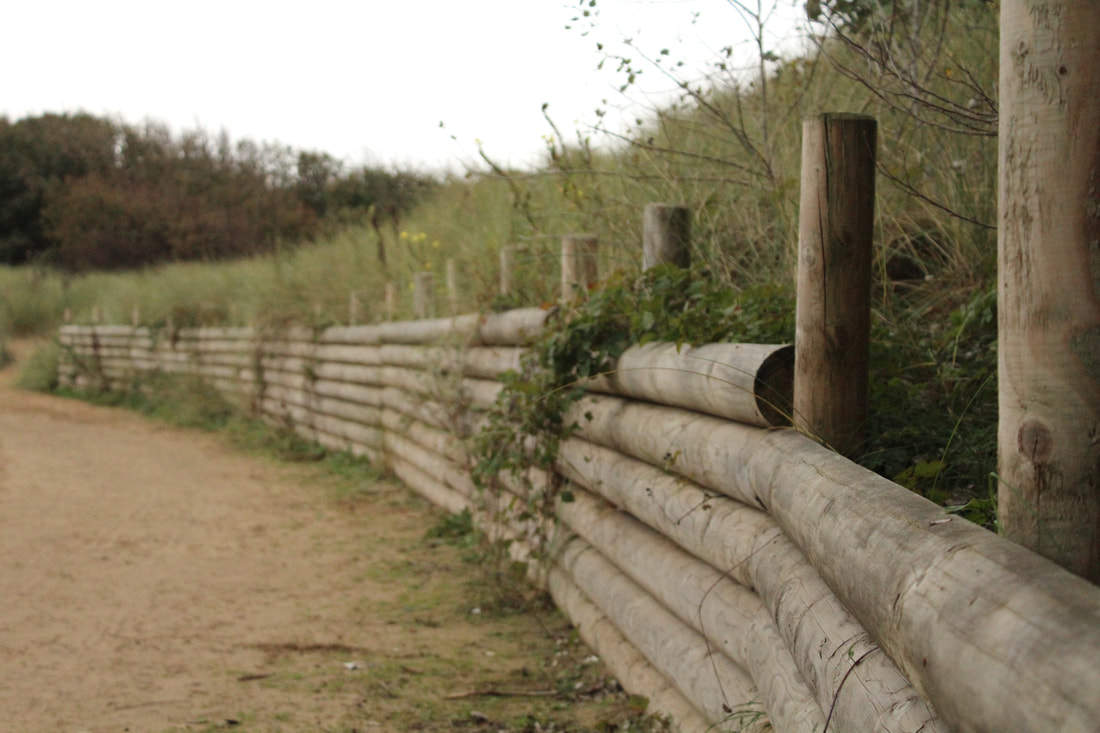
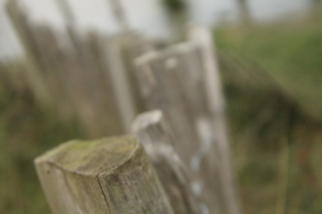
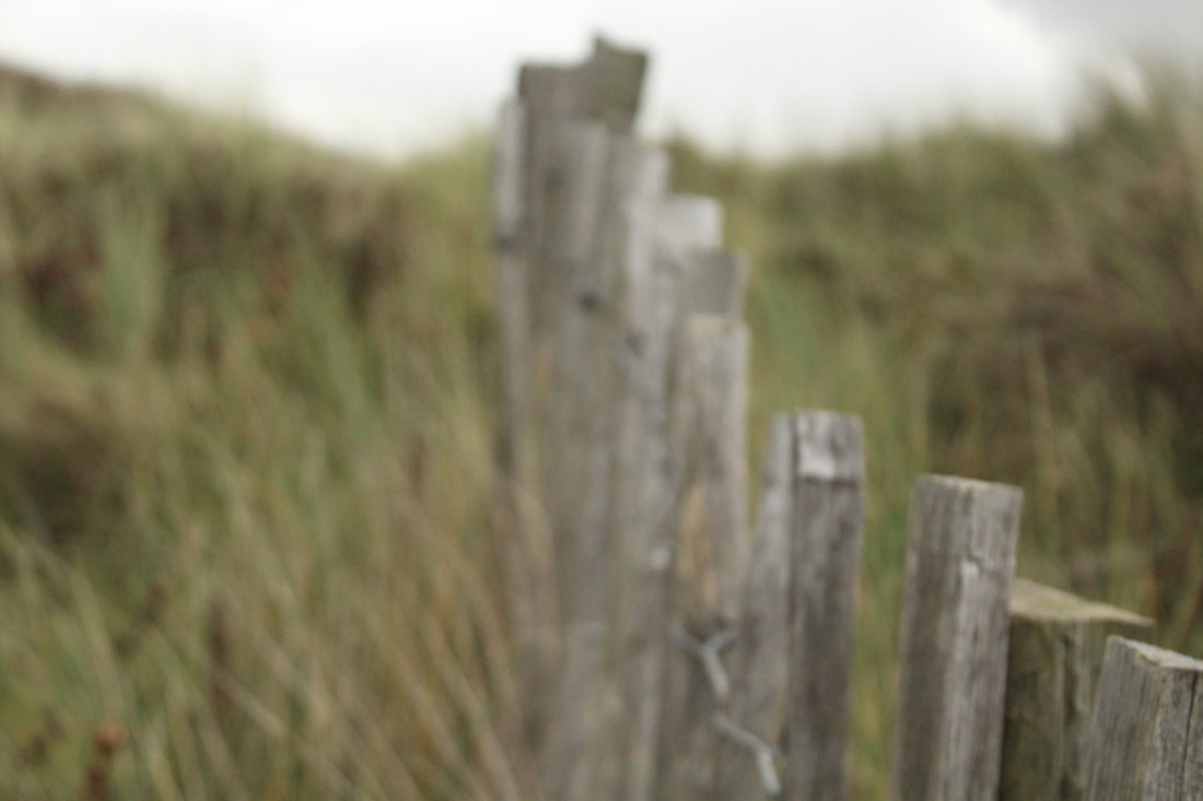
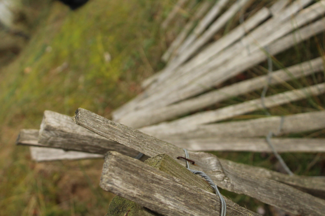
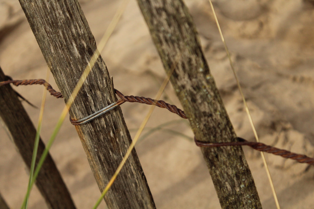
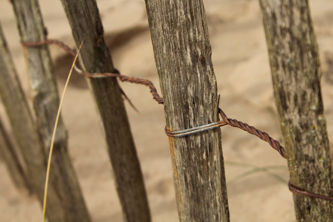
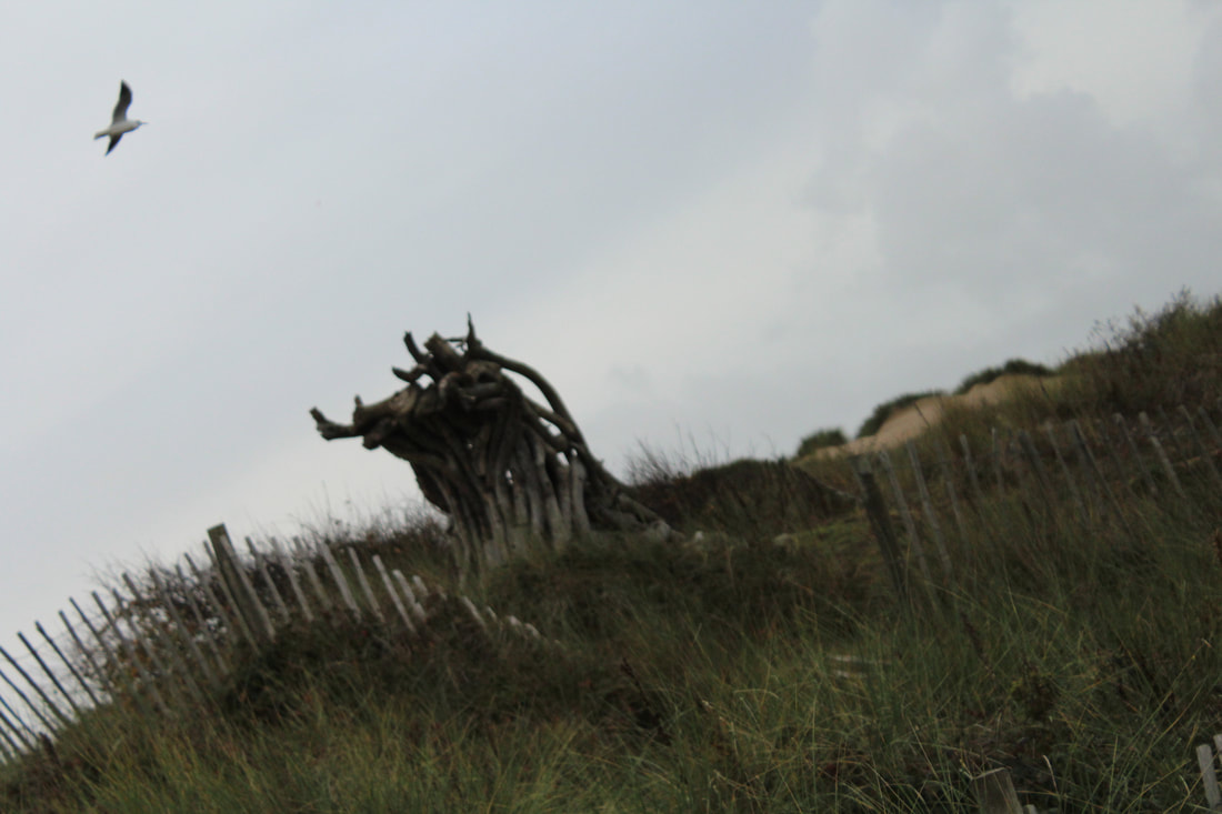
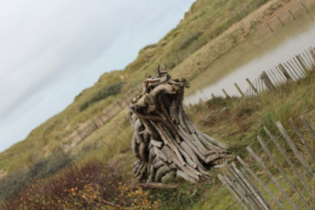
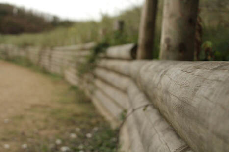
Fences

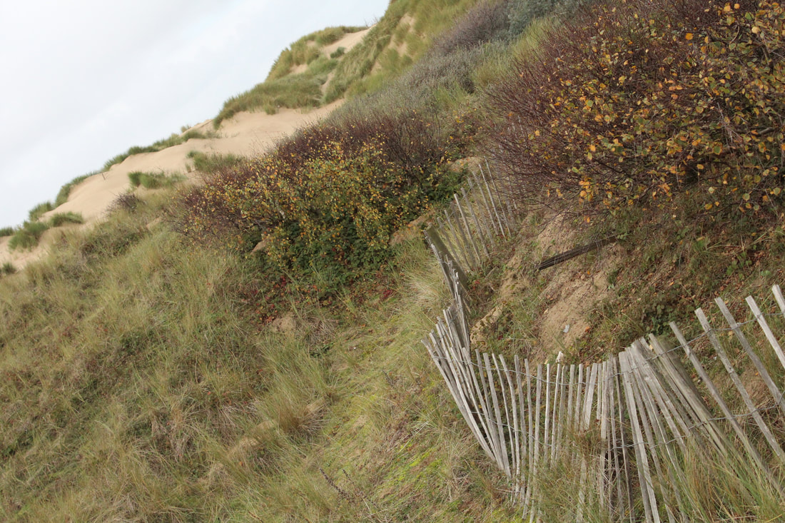
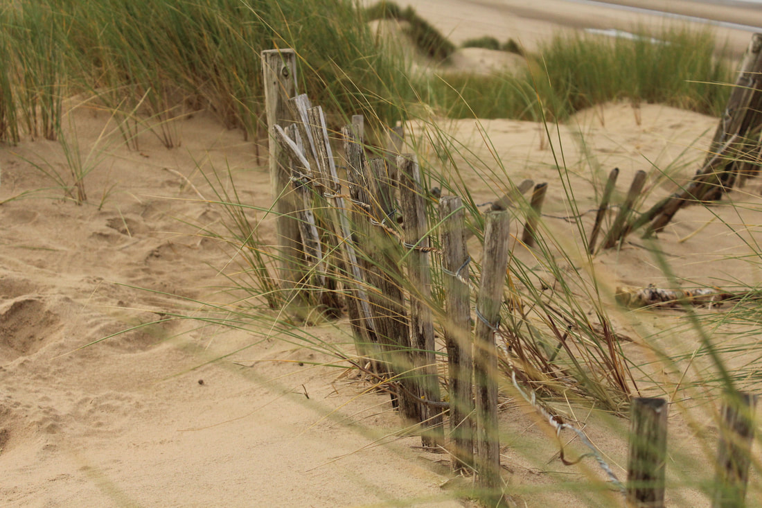
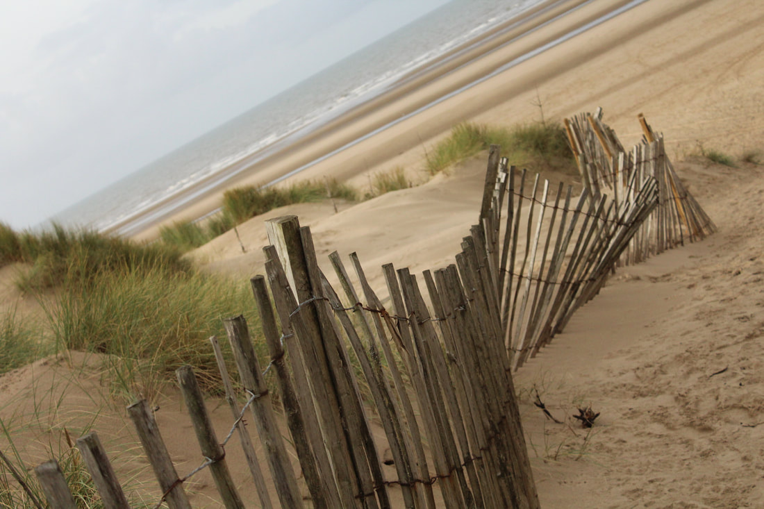
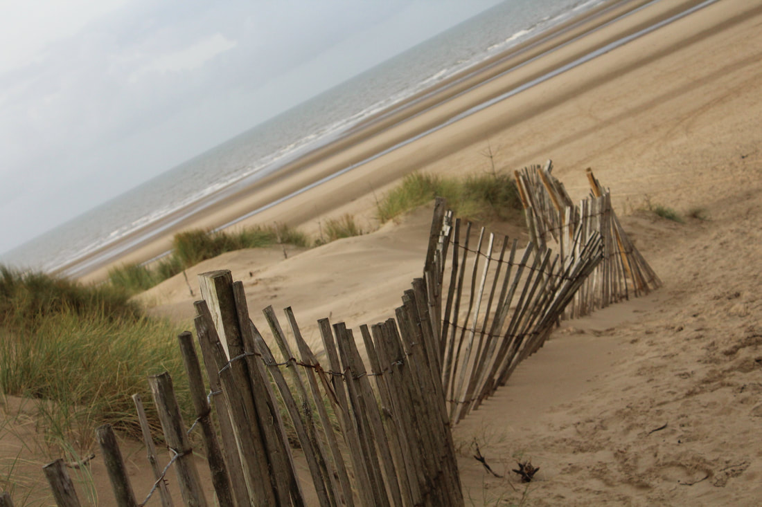
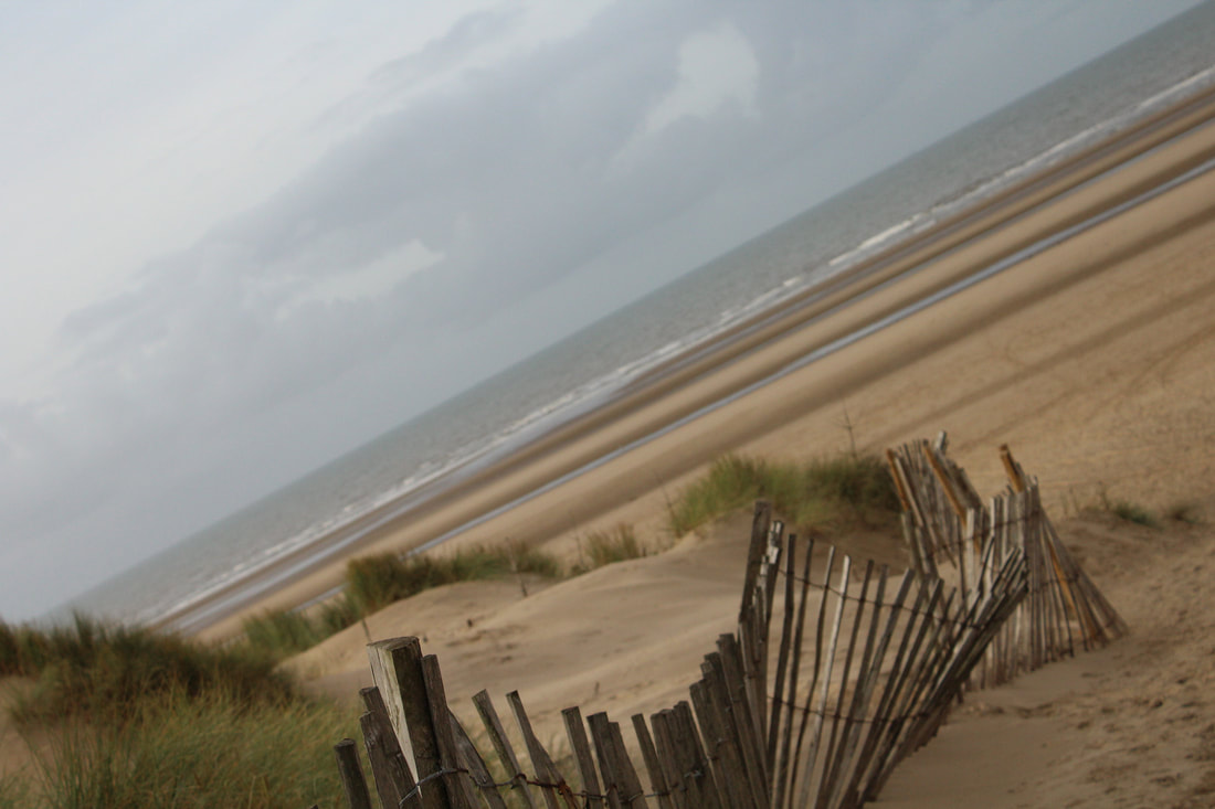
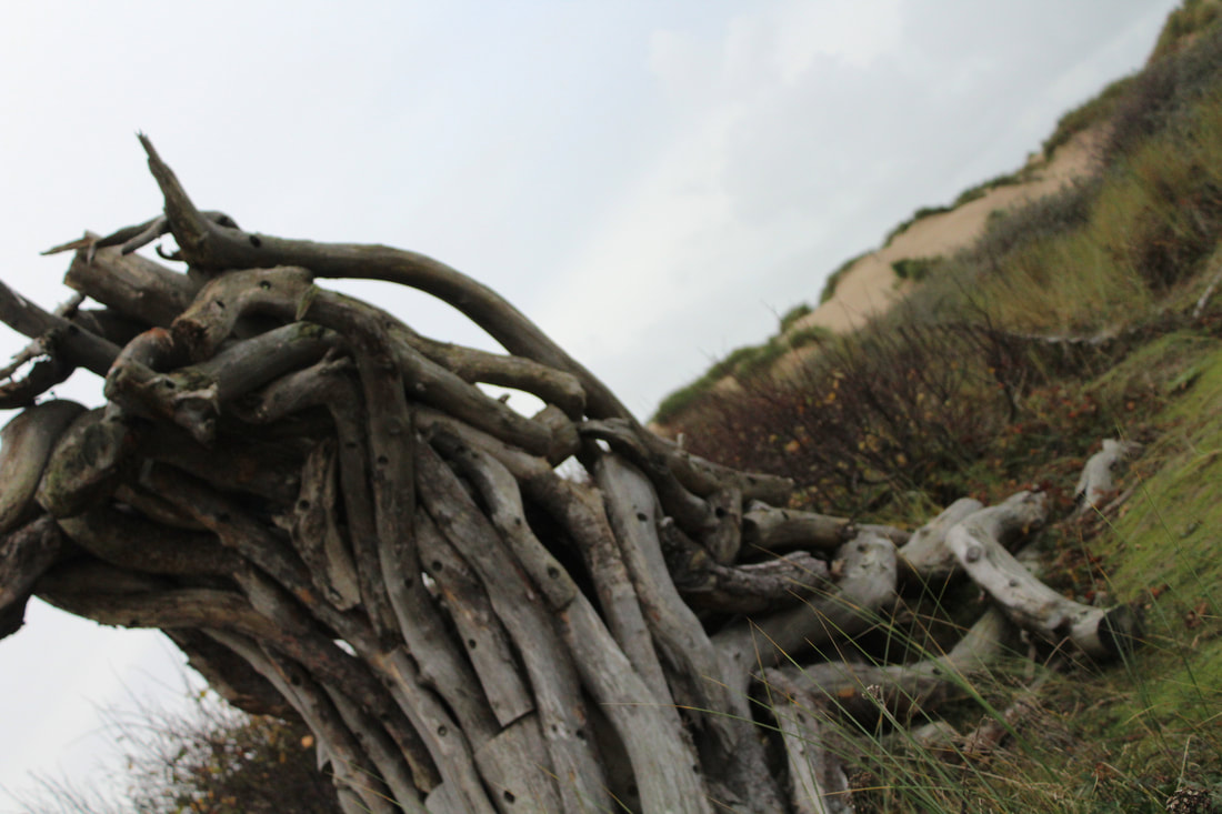
Close up fences


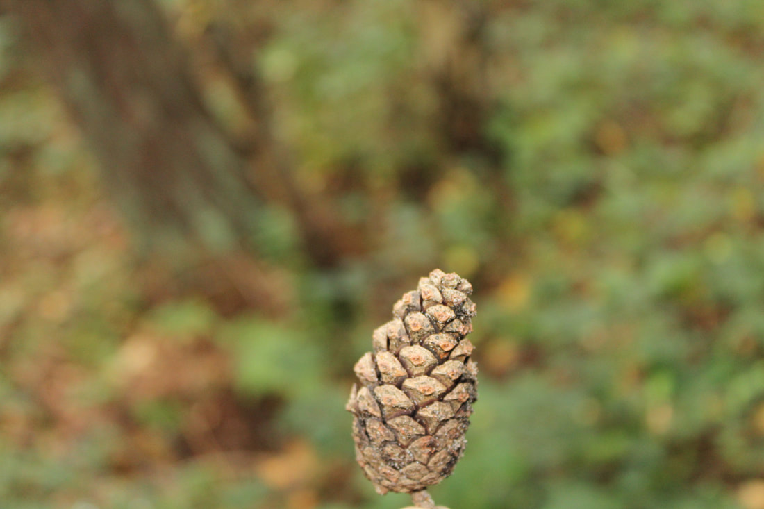
Acorns

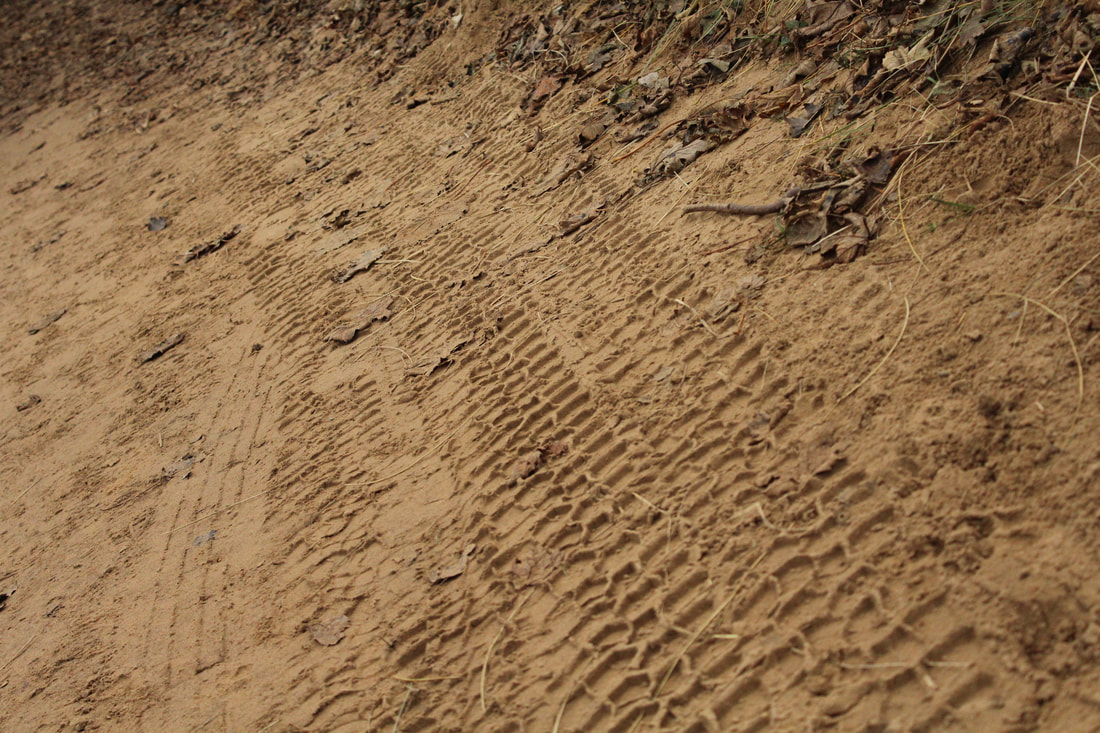
Prints in the sand

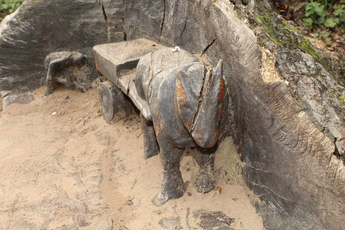
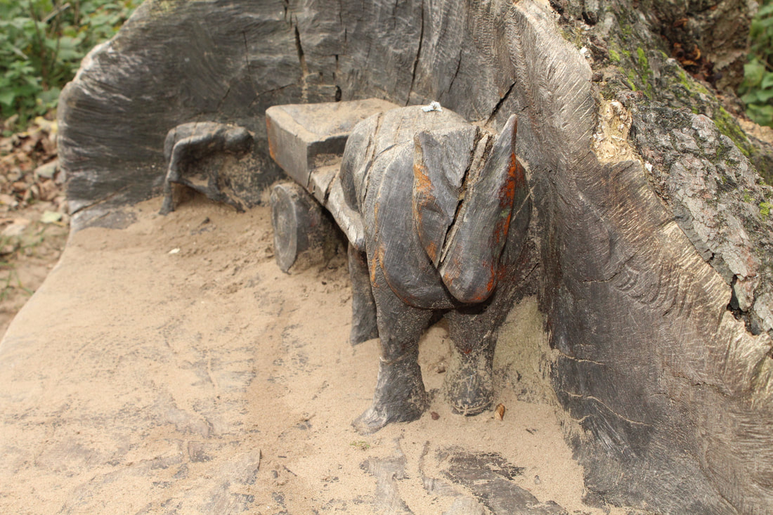
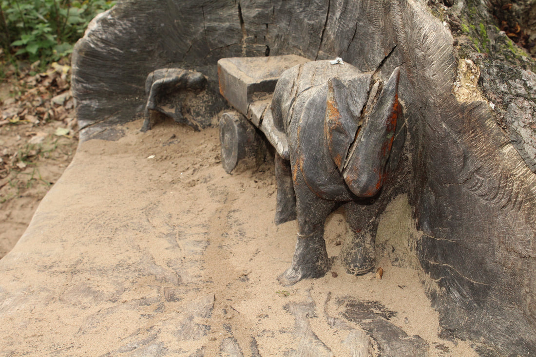
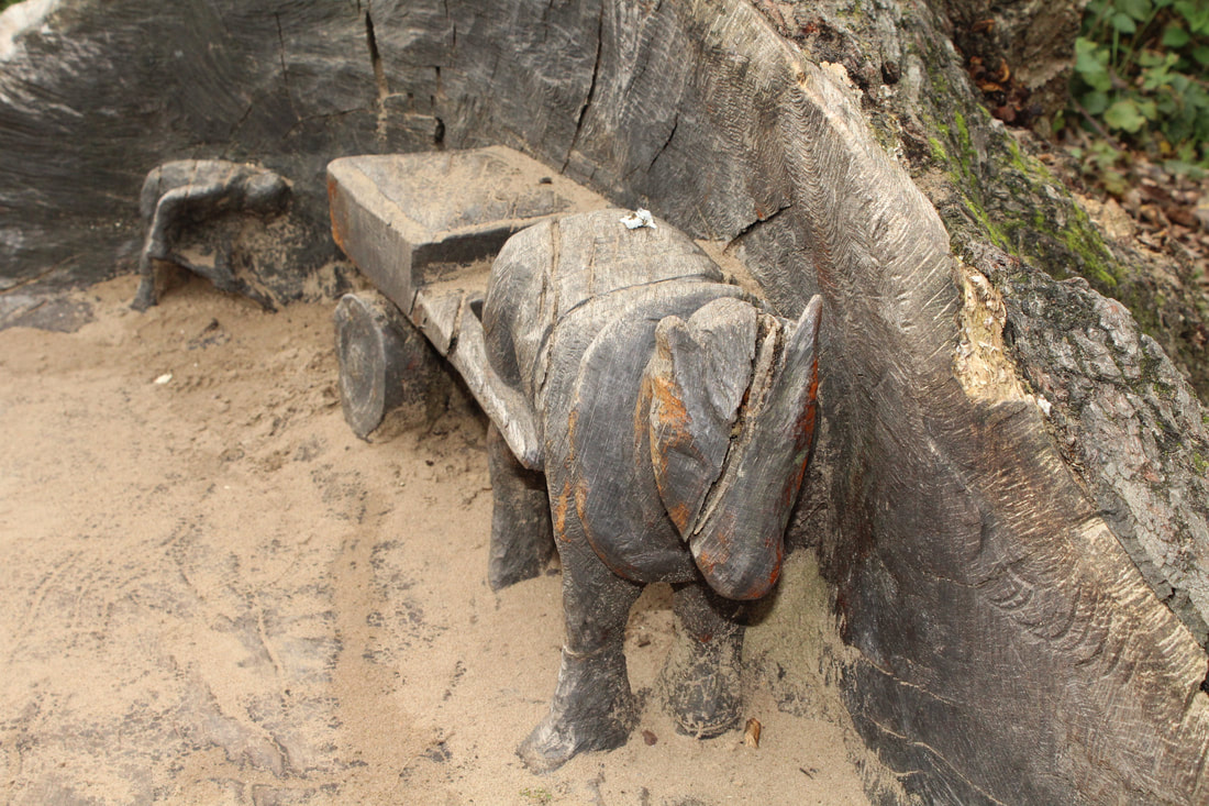
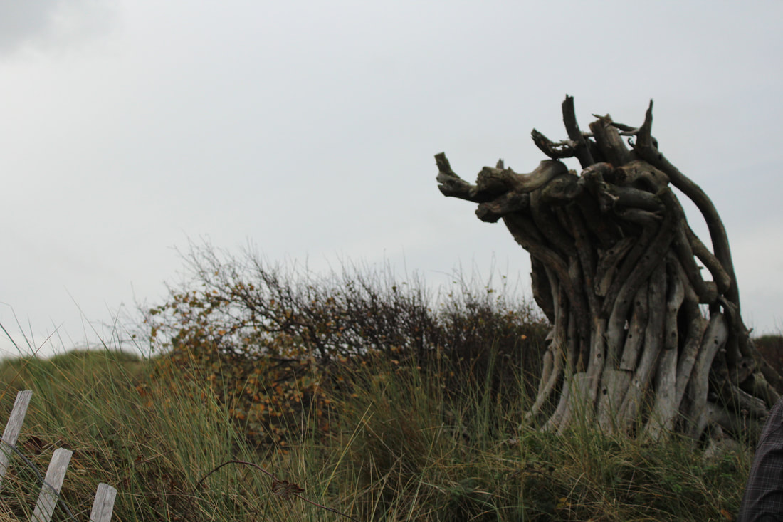
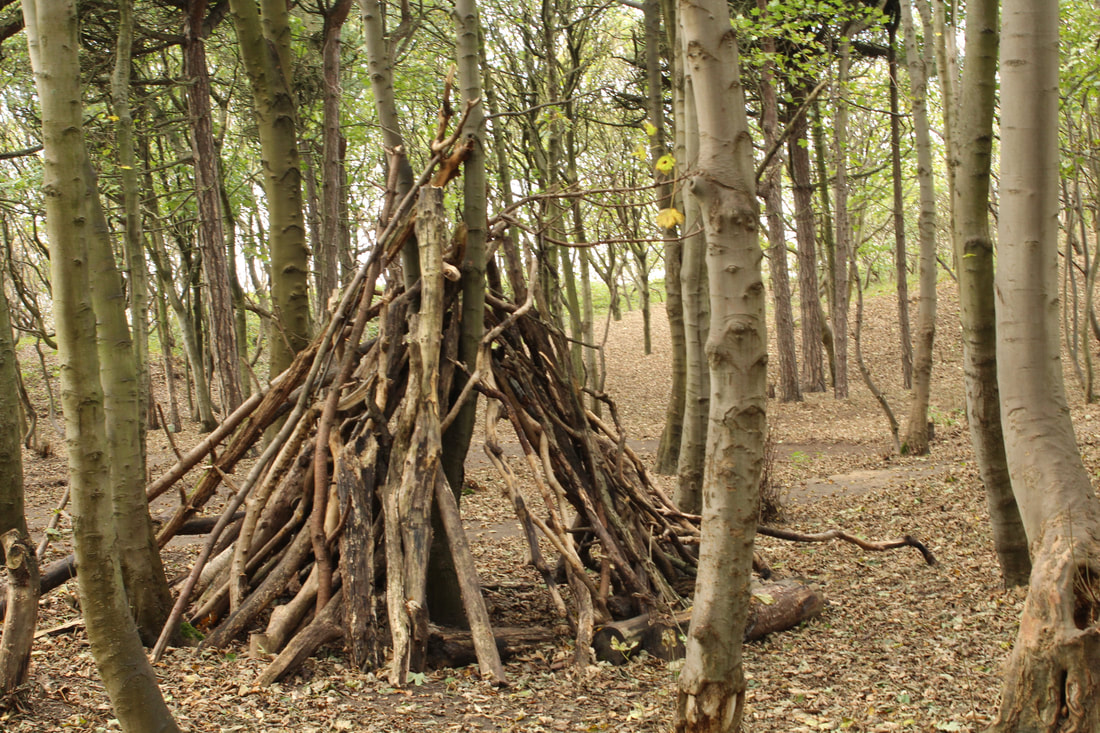
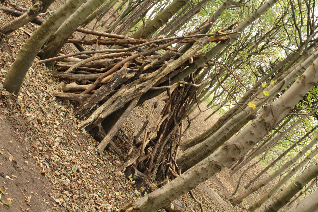
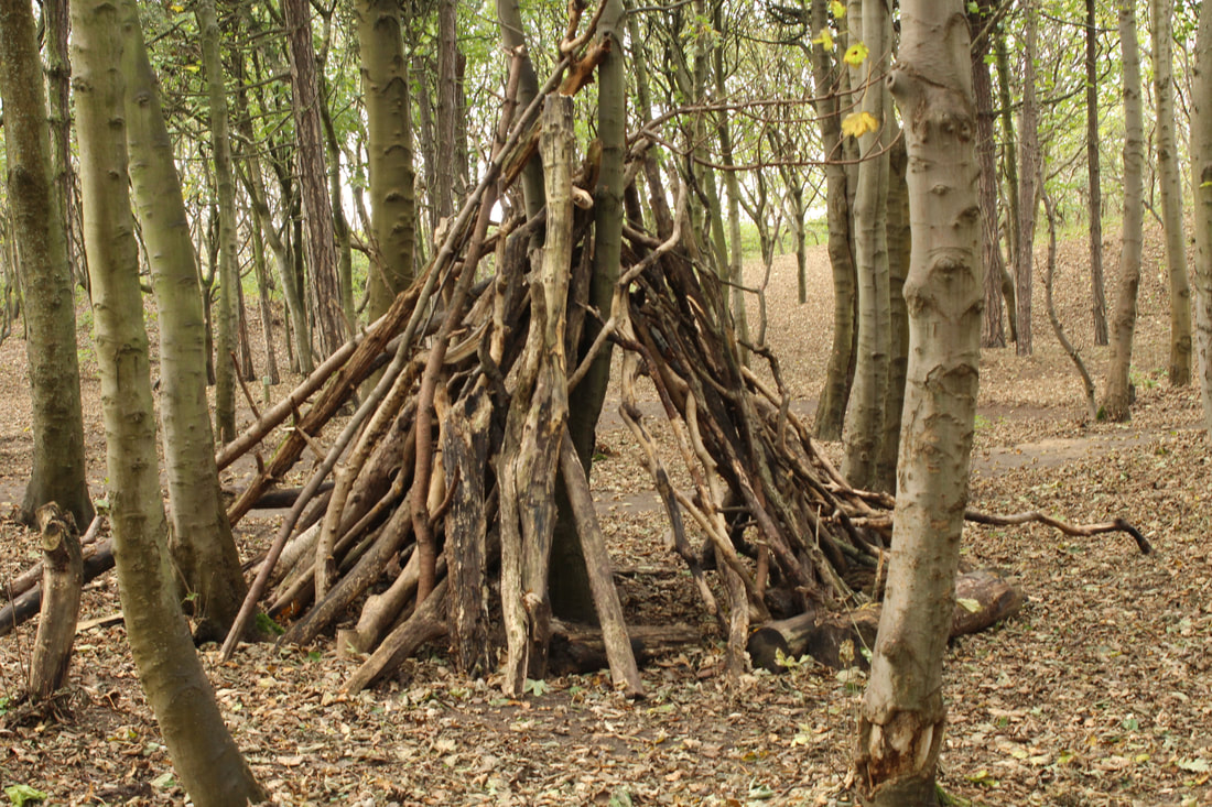
Sculptures Made Out Of Woods


Grass And Sand

Tree Trunks
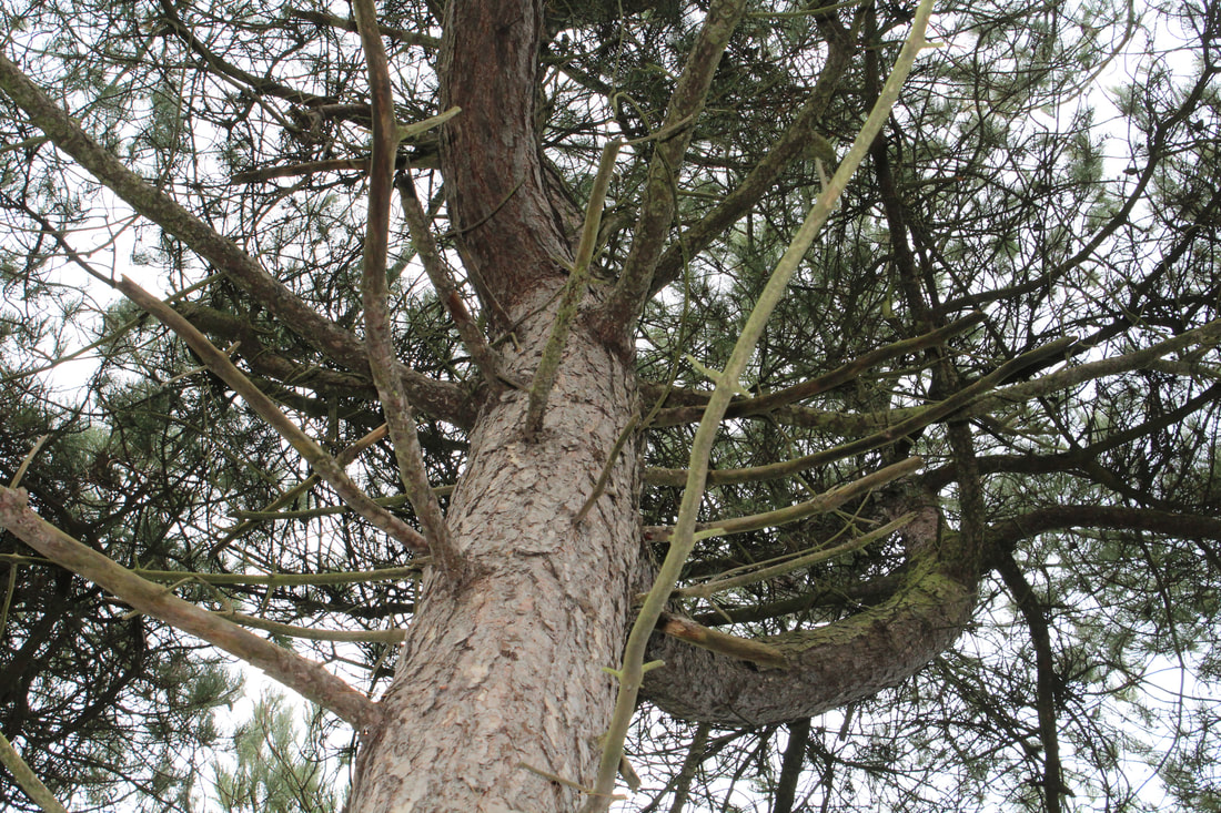

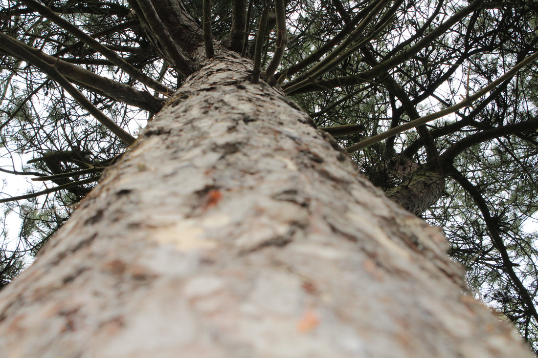
Inside The Woods


Wood Shelter
Top View Of The Beach

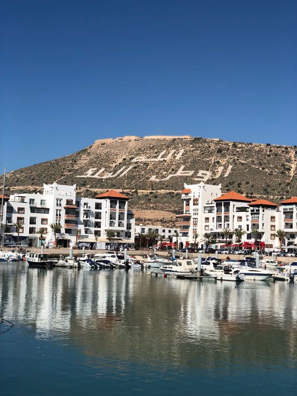
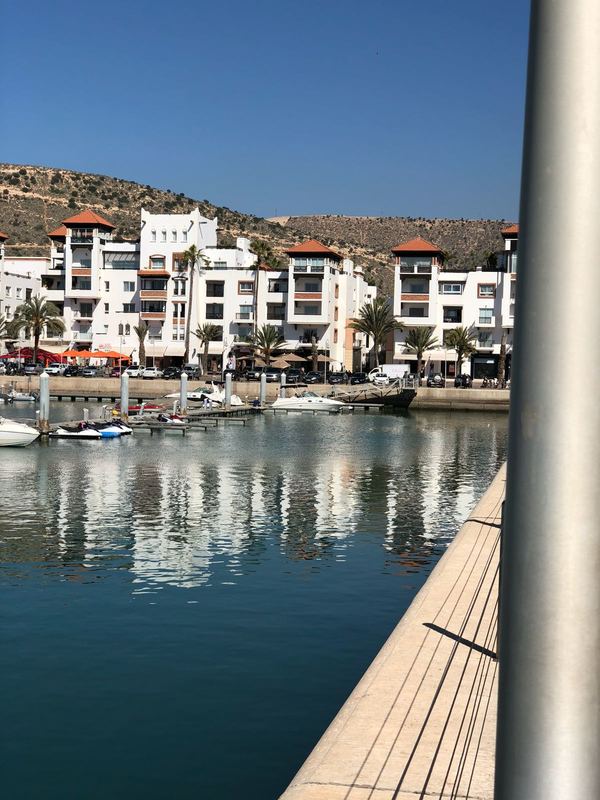
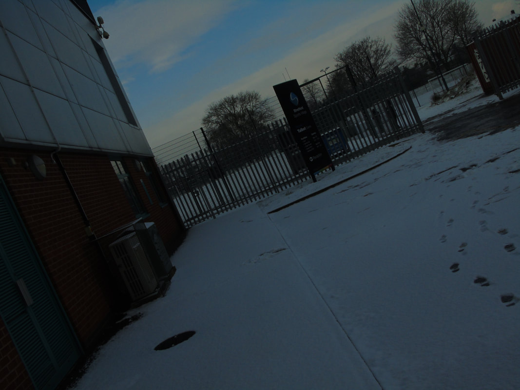
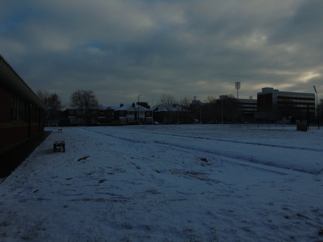
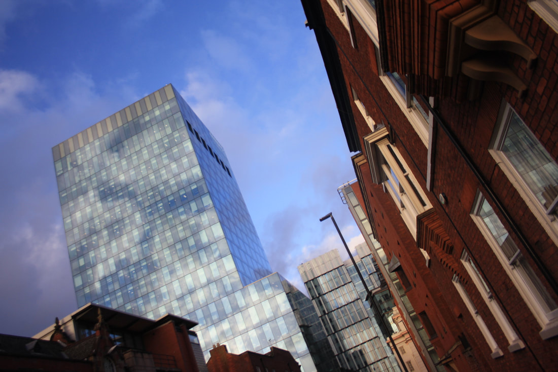
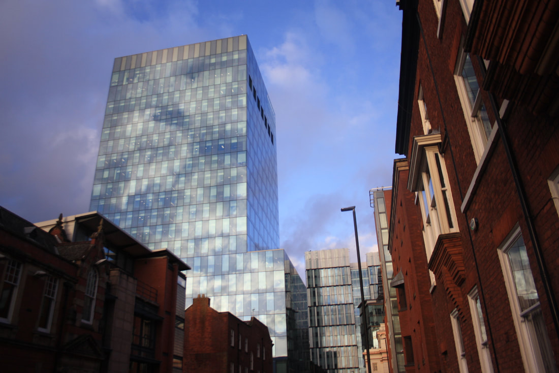
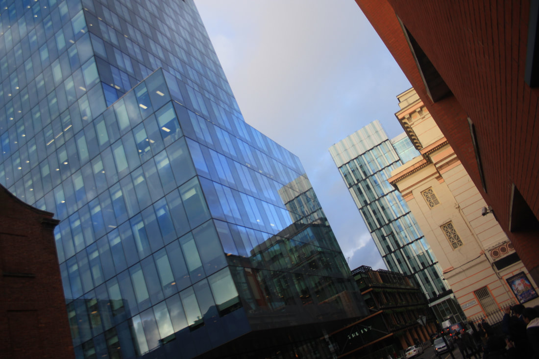
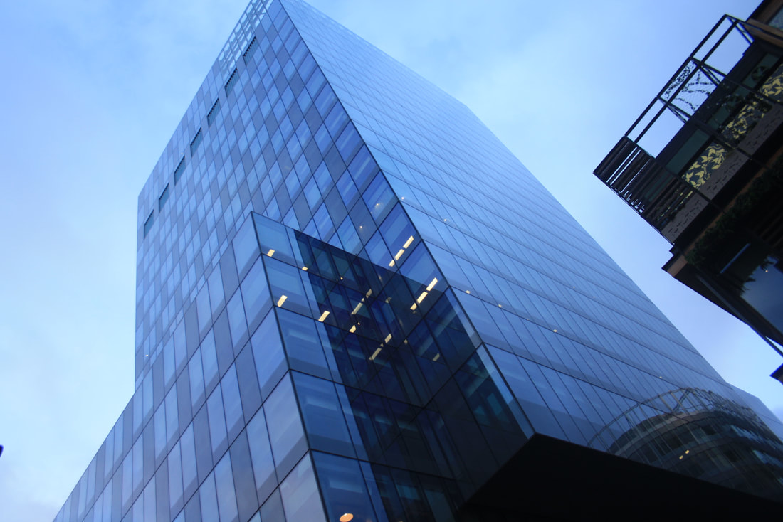
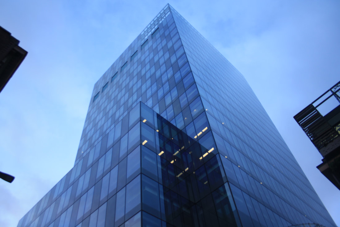
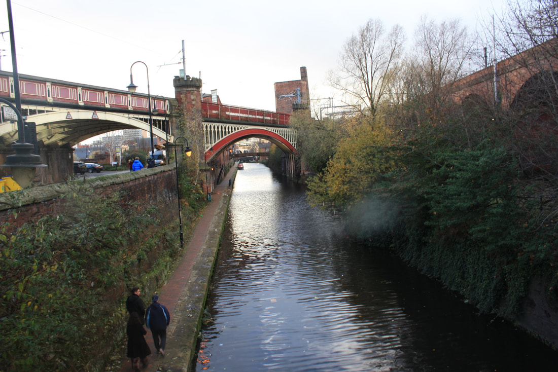
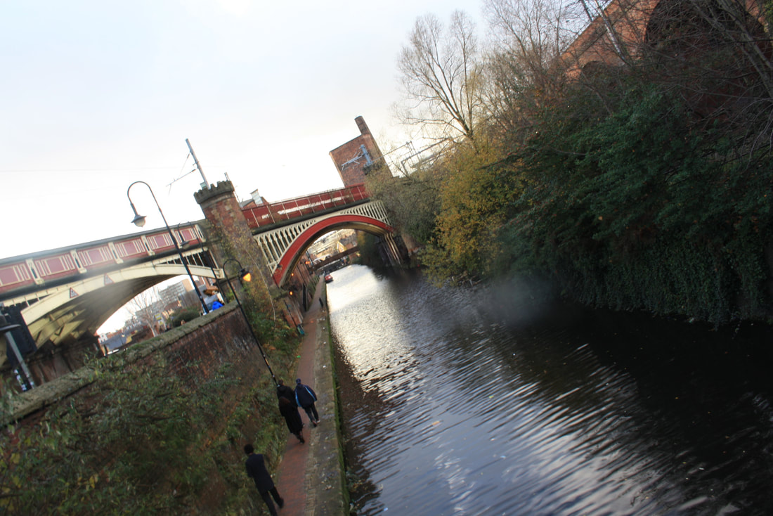
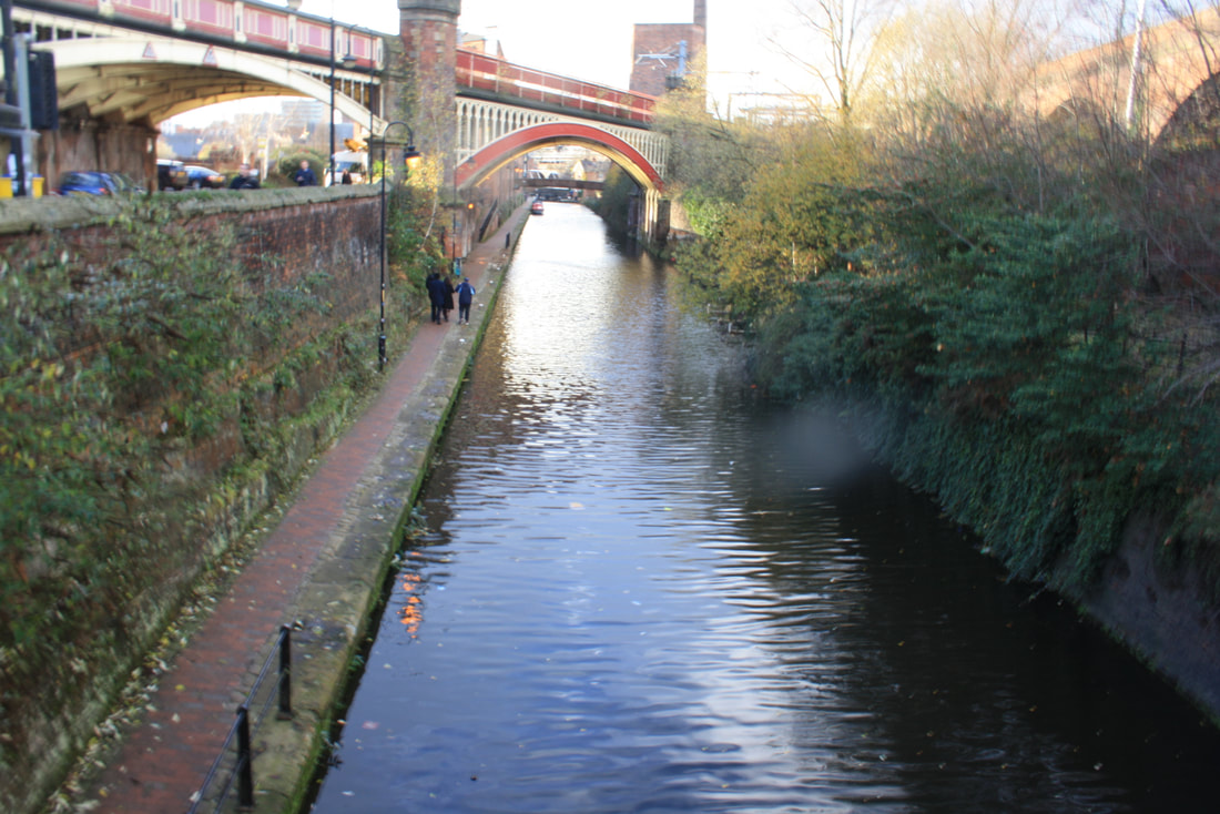
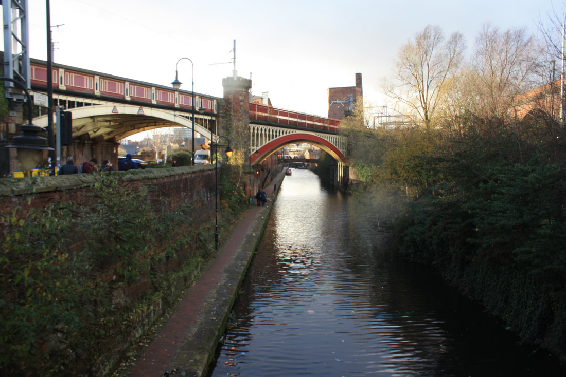
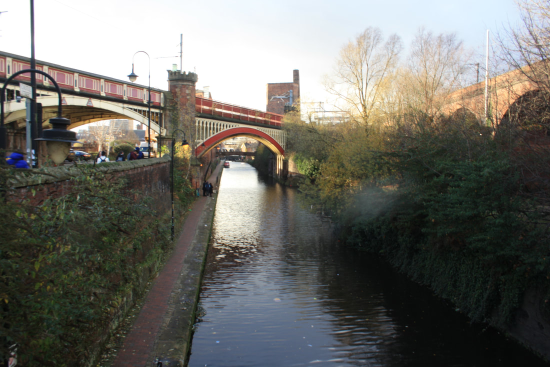
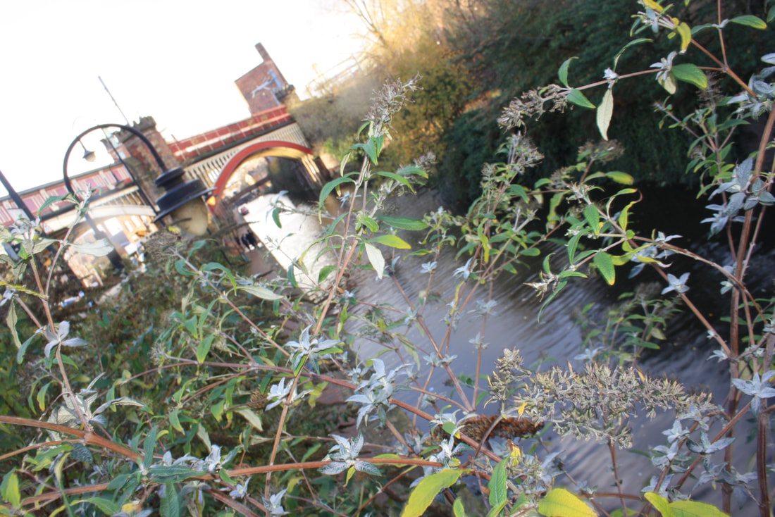
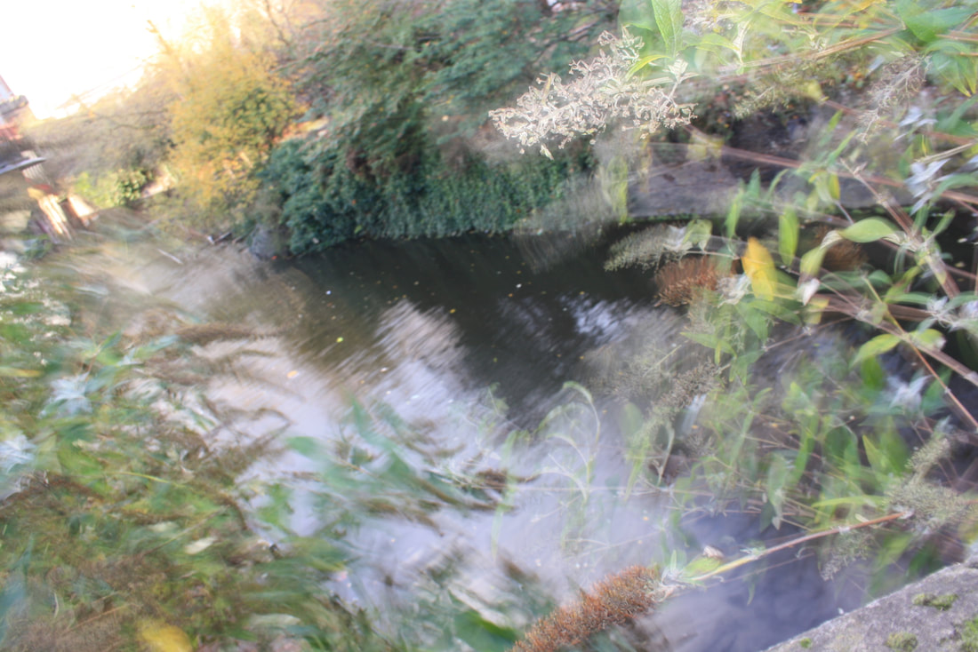
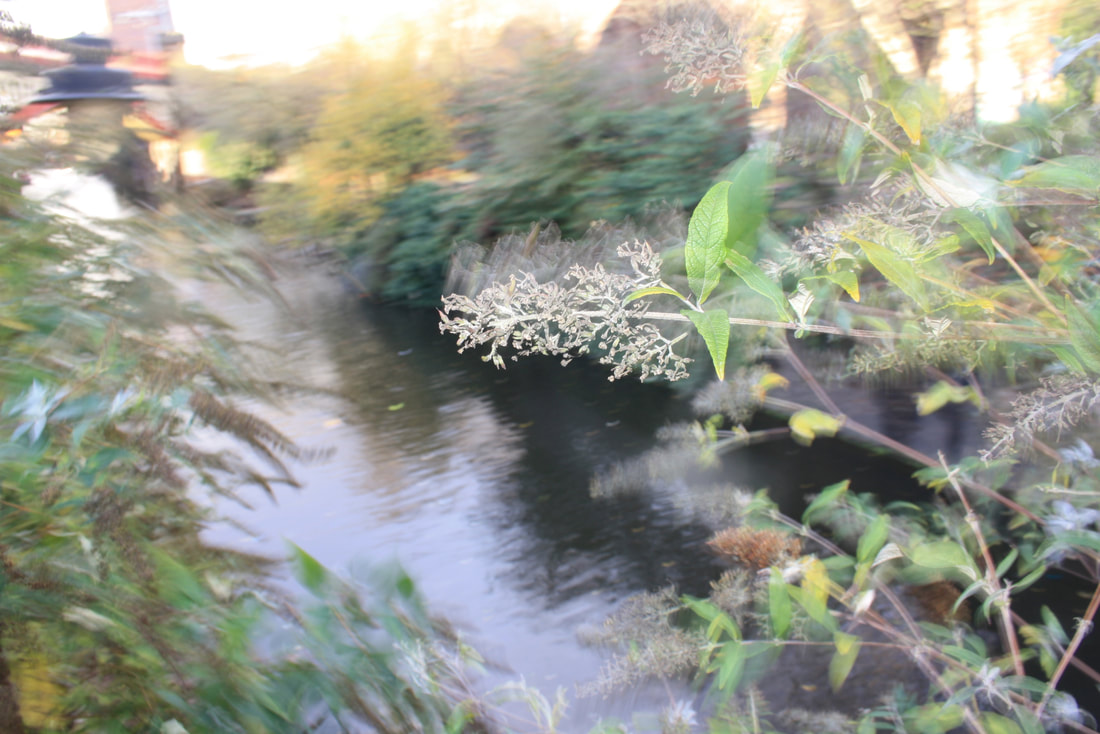
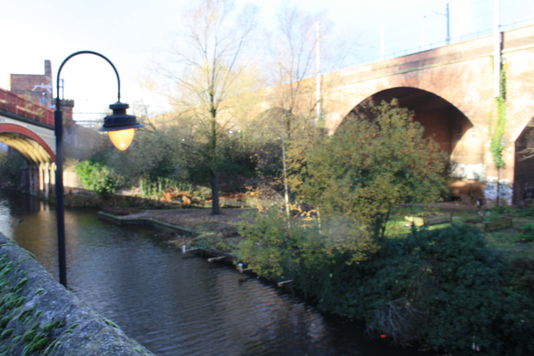
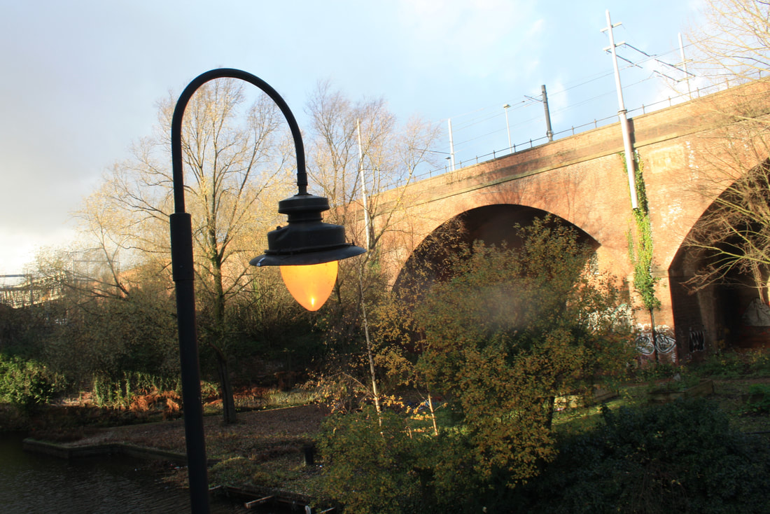
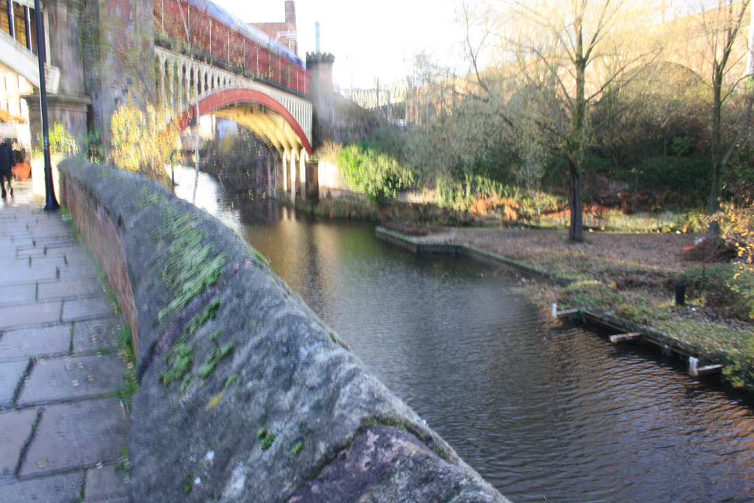
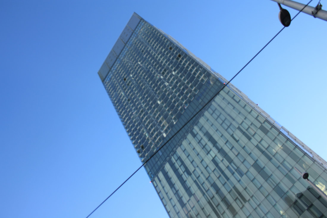
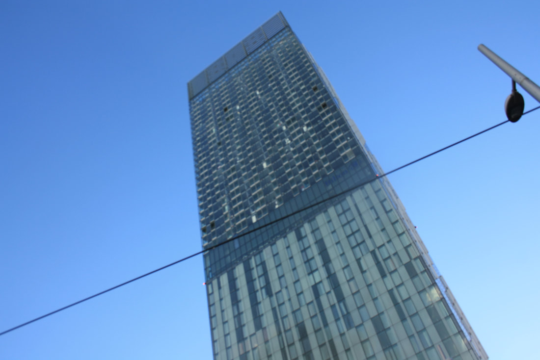
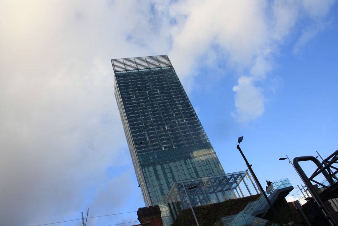
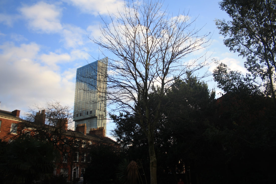
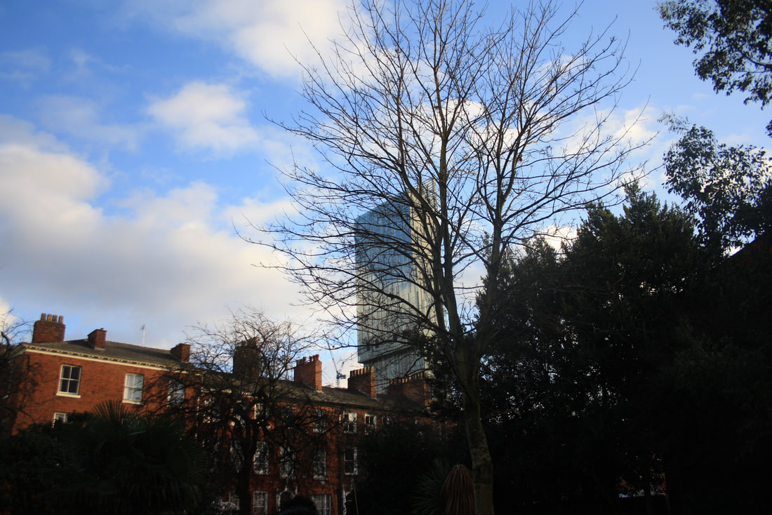
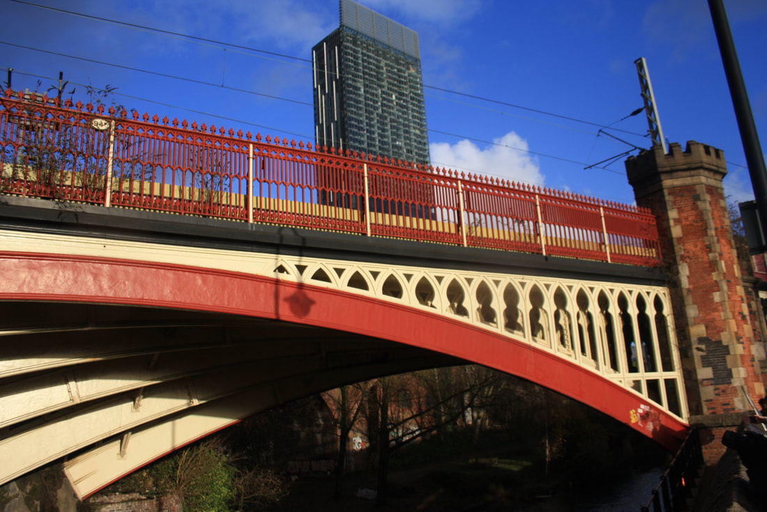
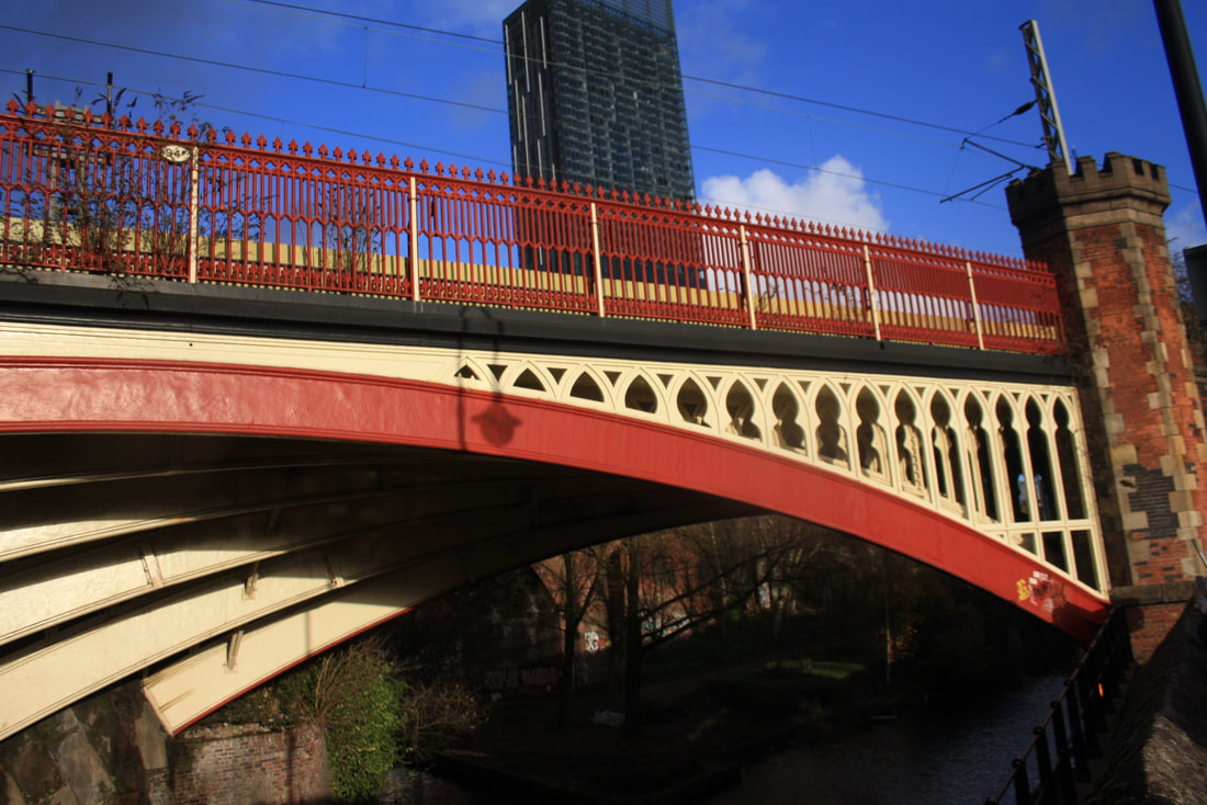
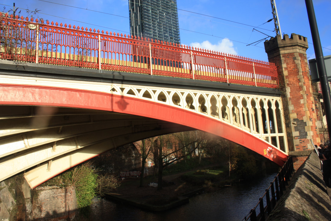
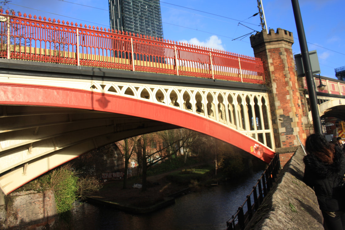
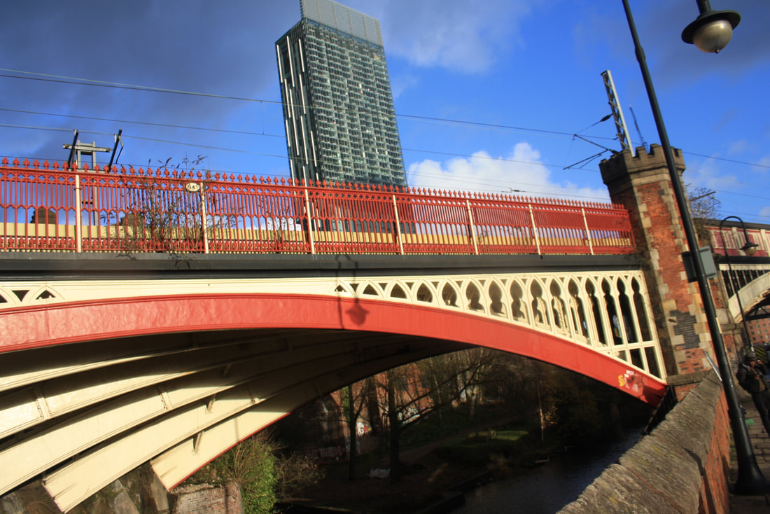
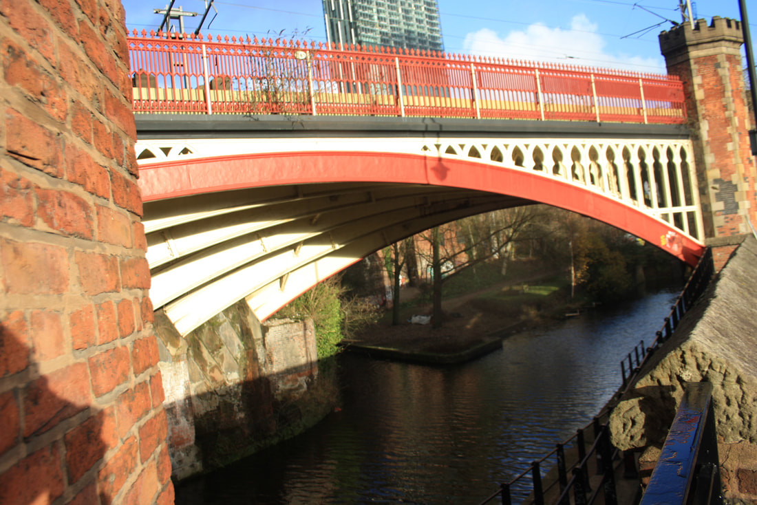
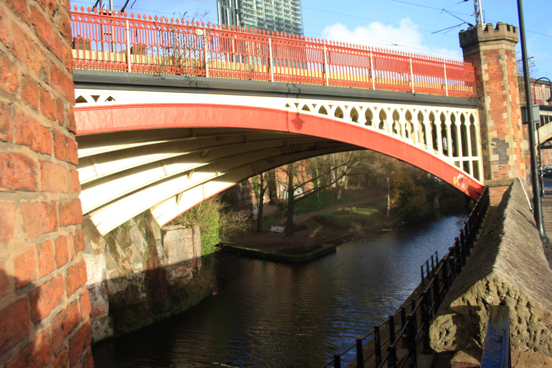
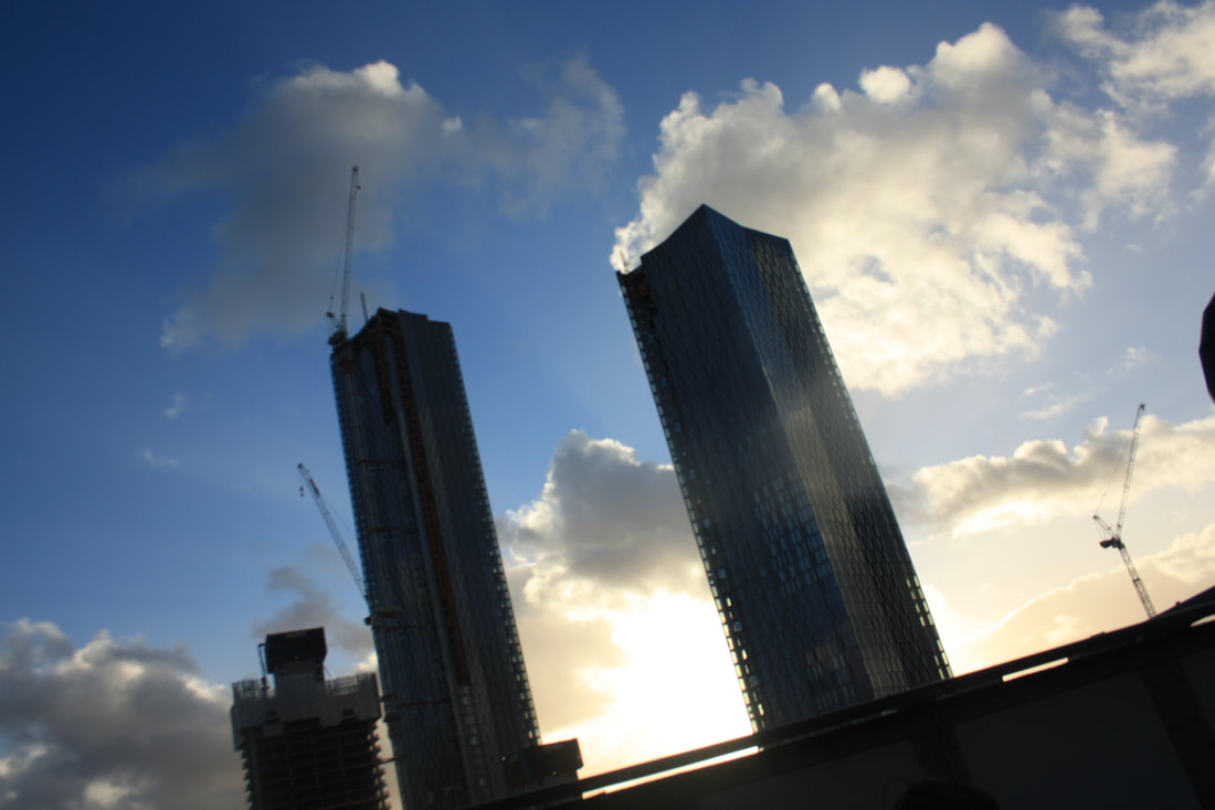
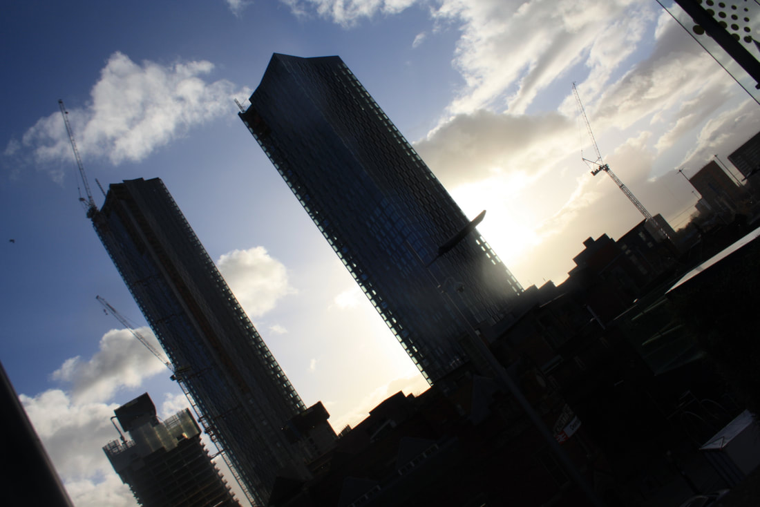
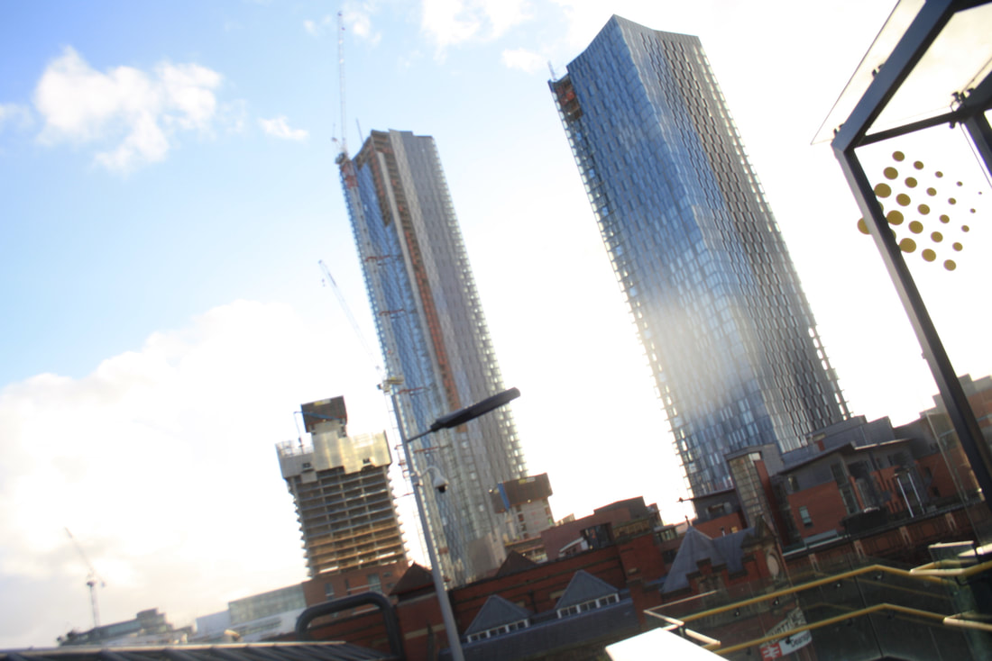
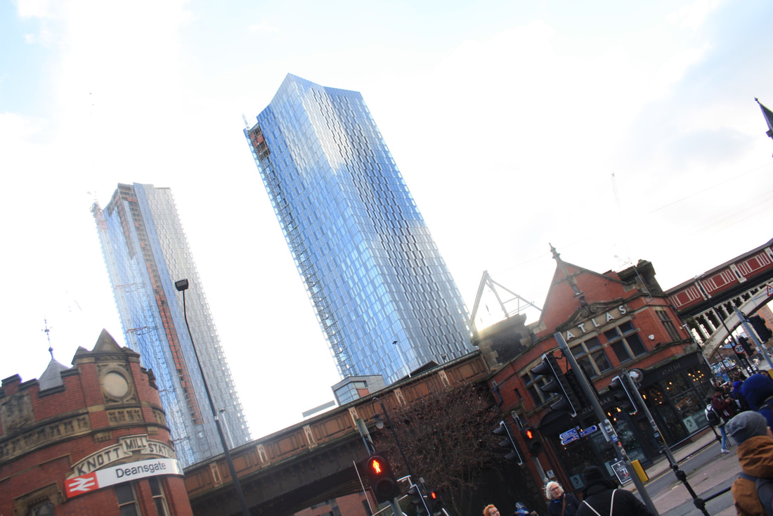
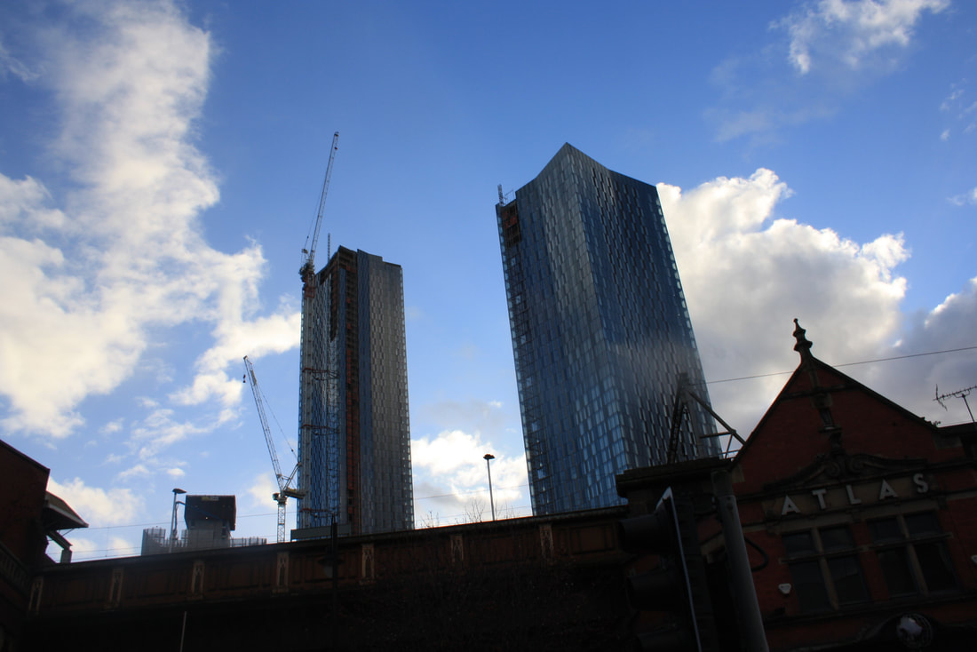
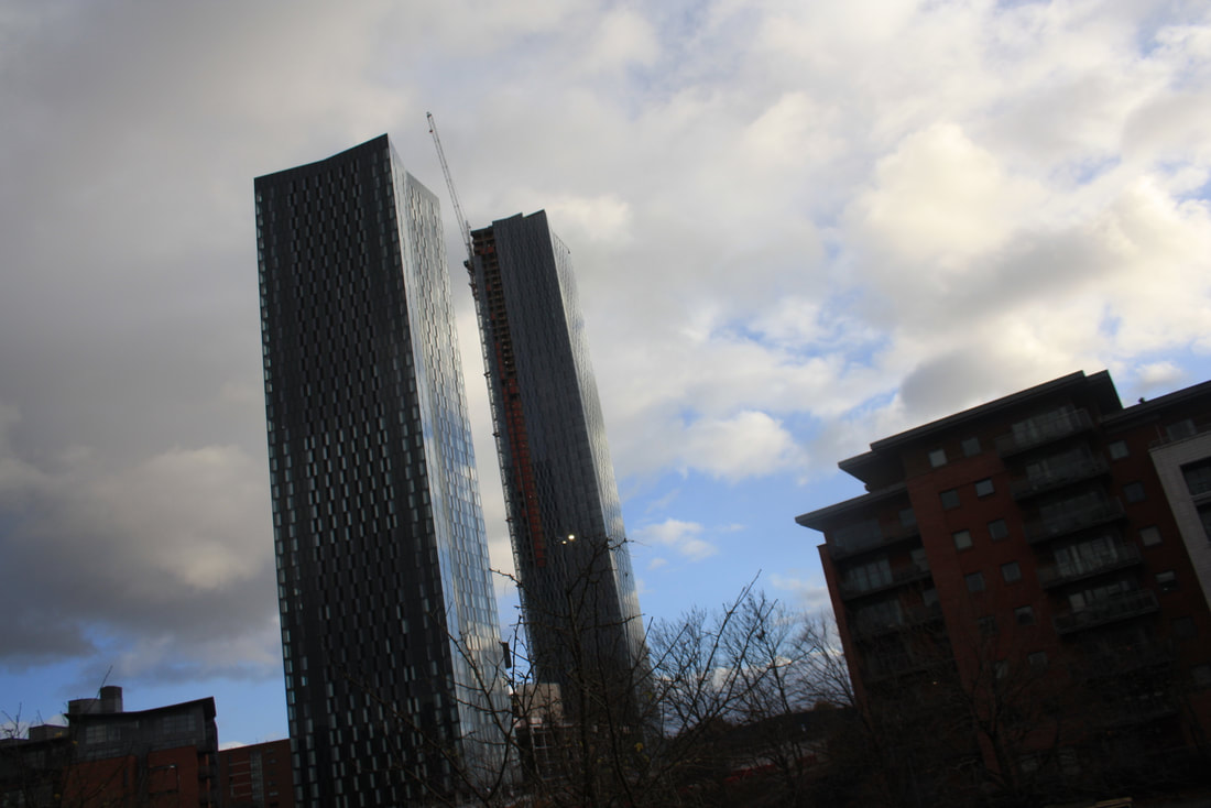
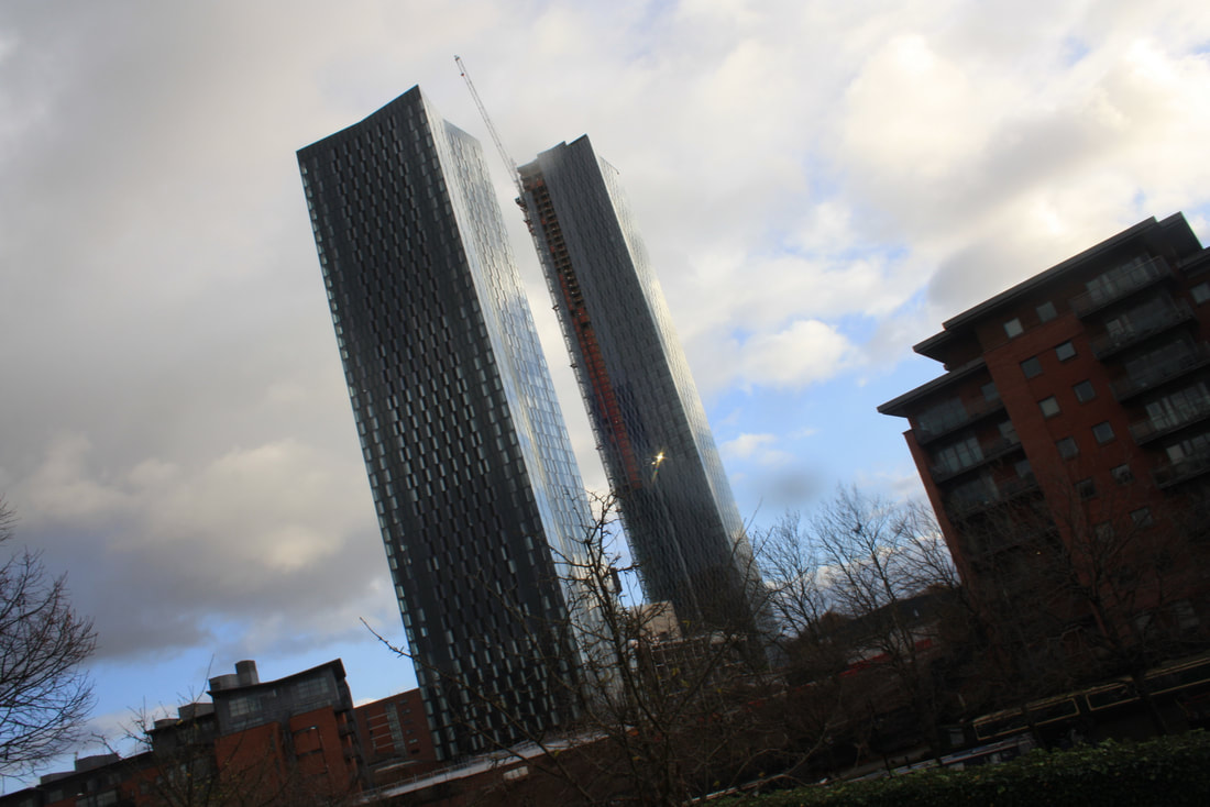
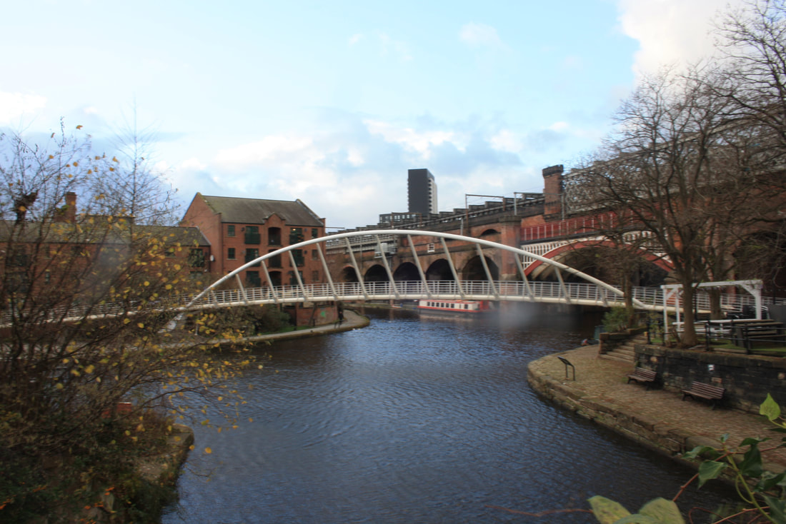
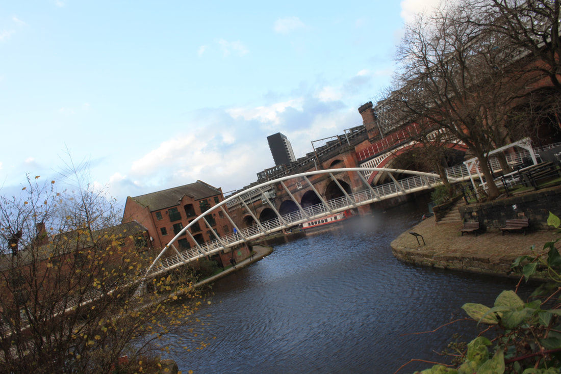
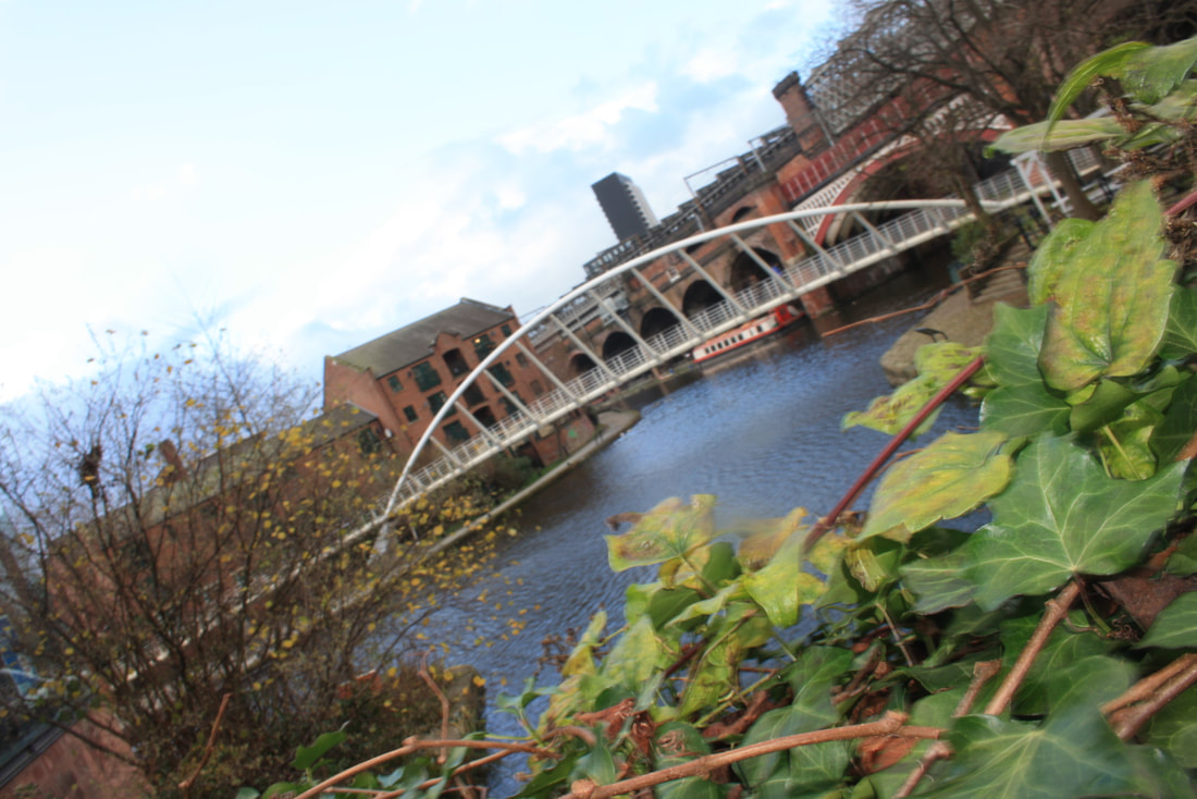
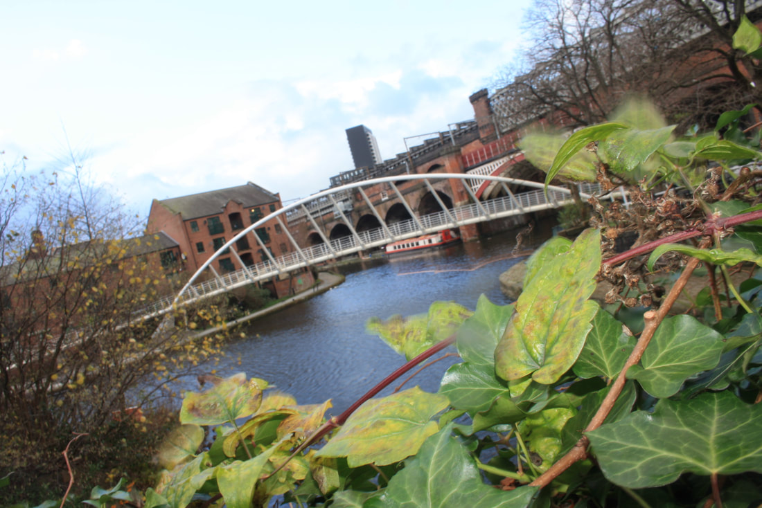
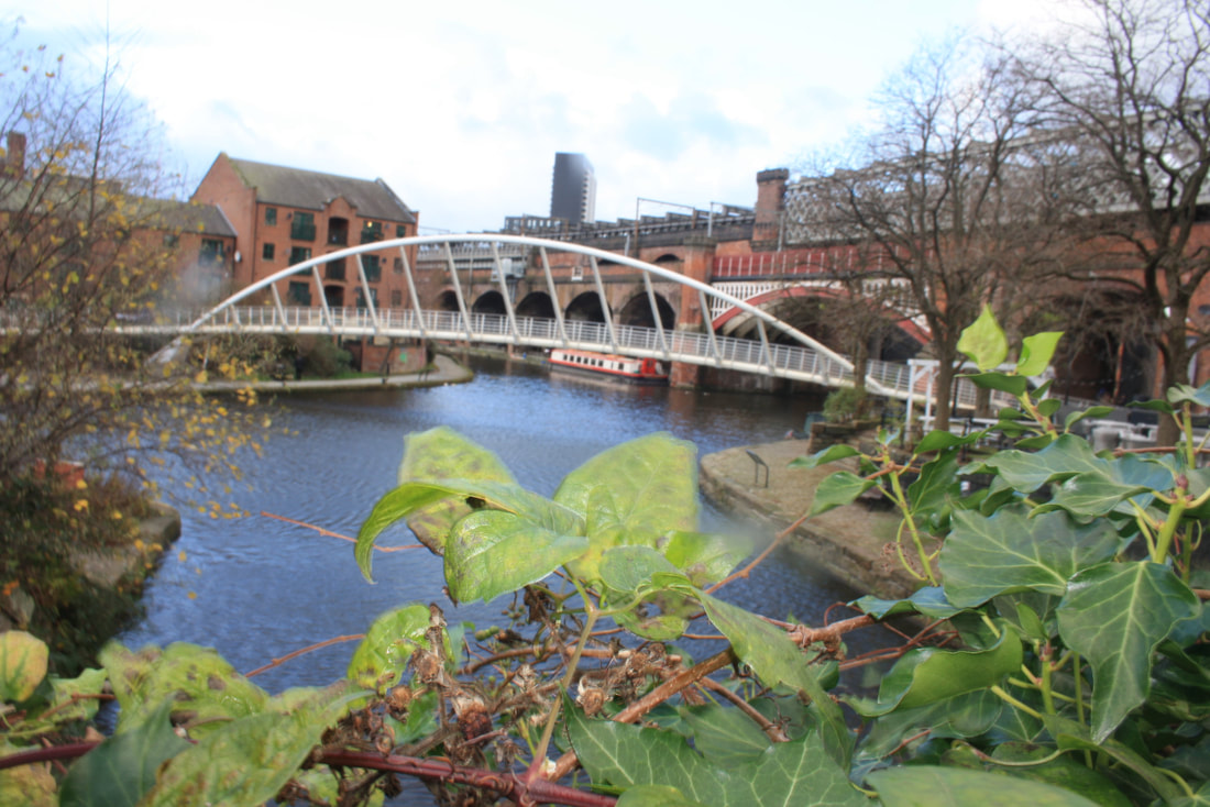
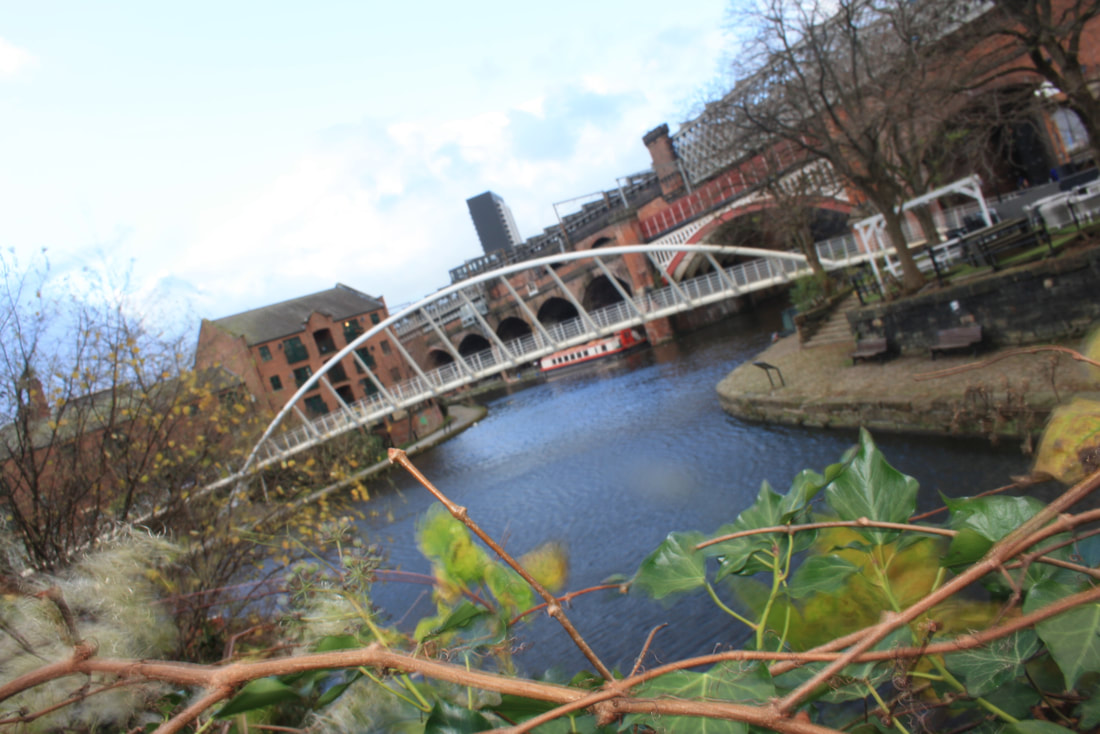
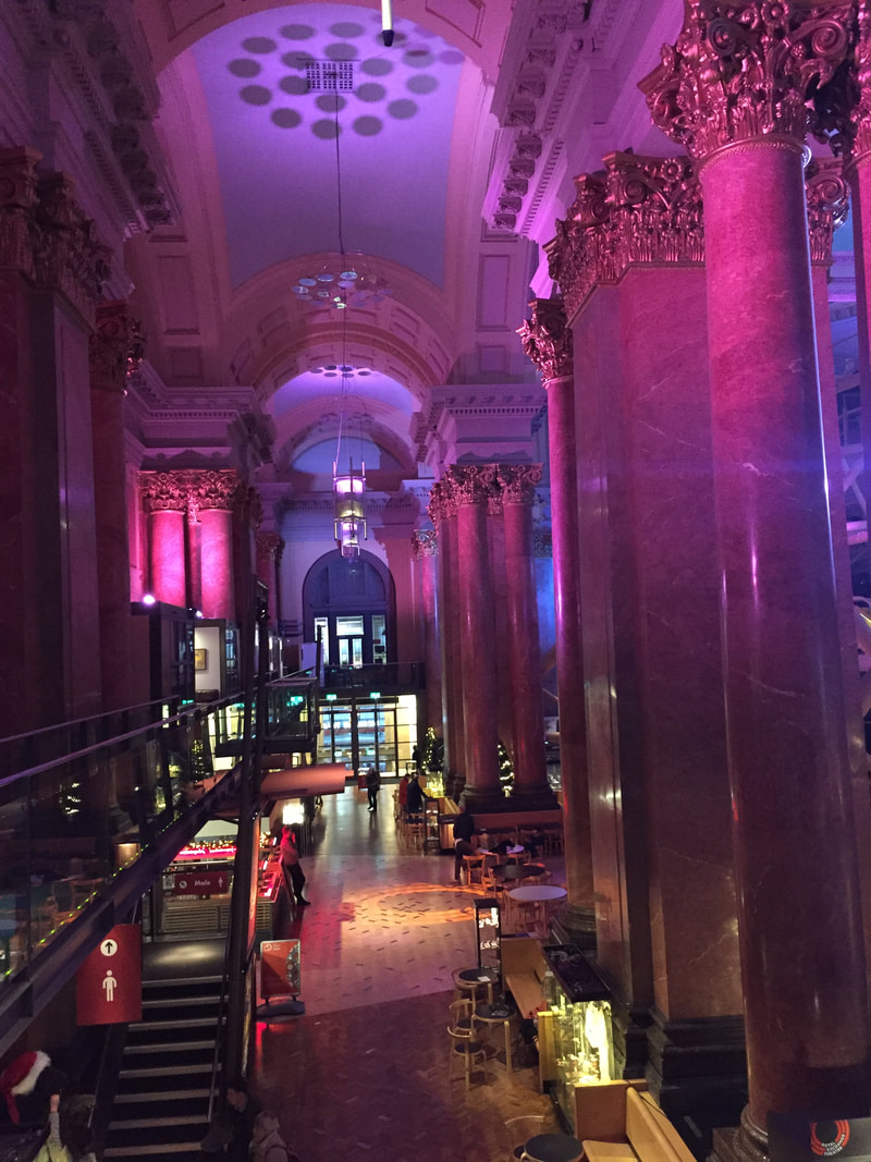
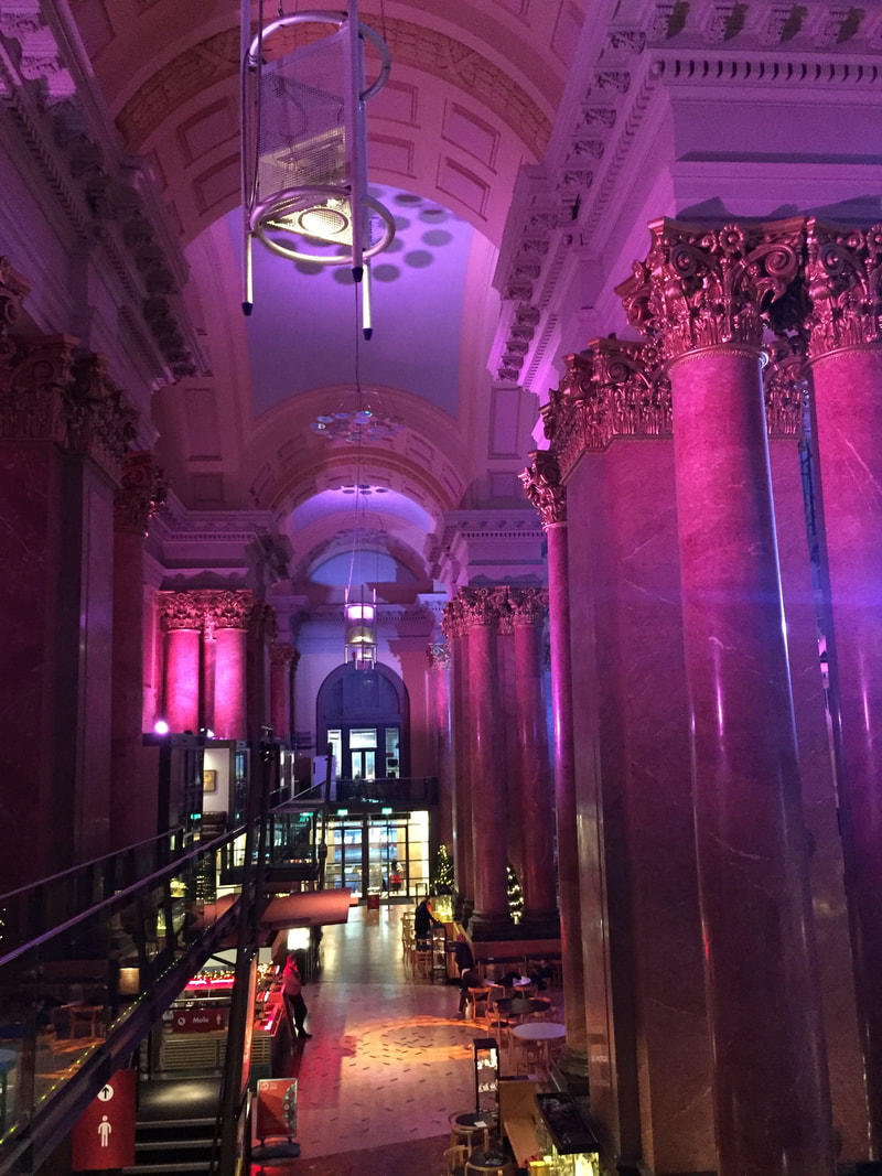
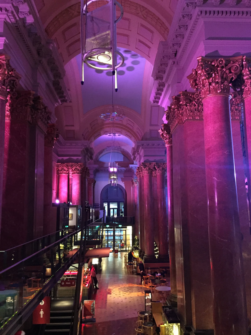
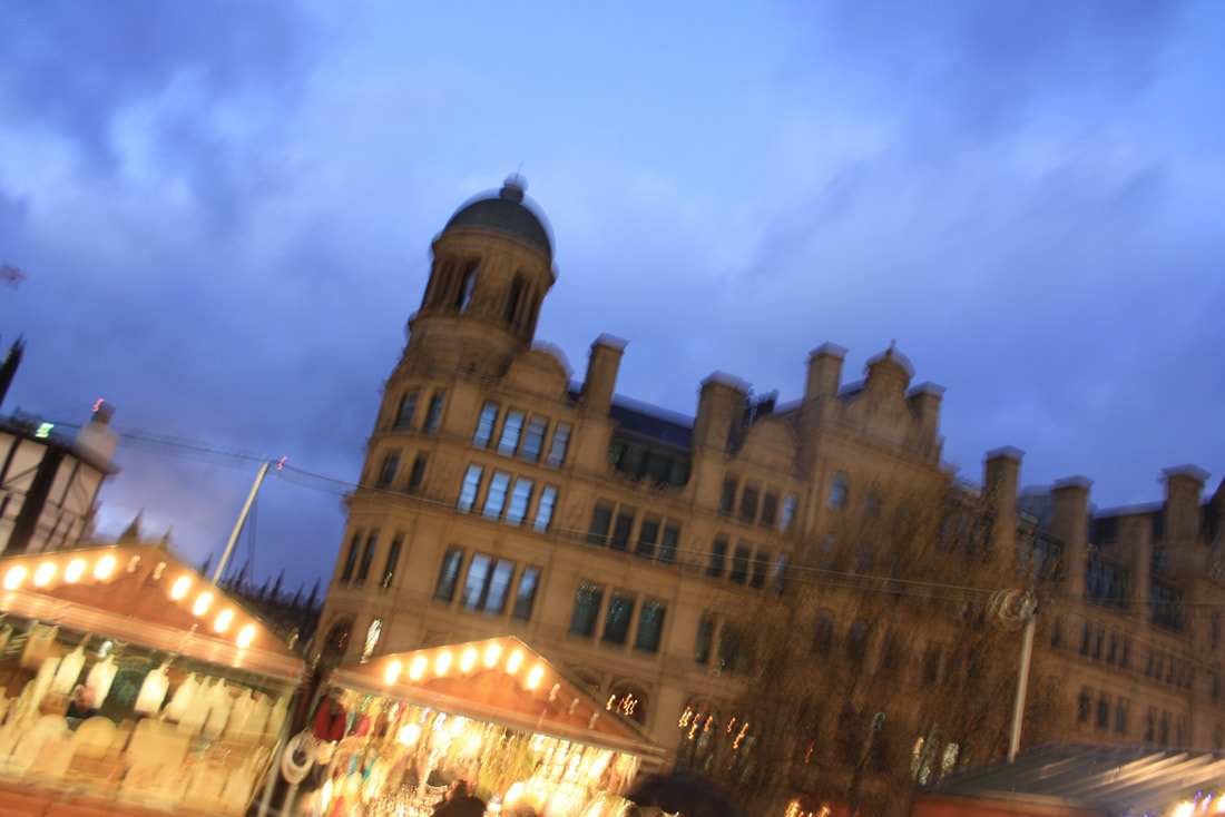
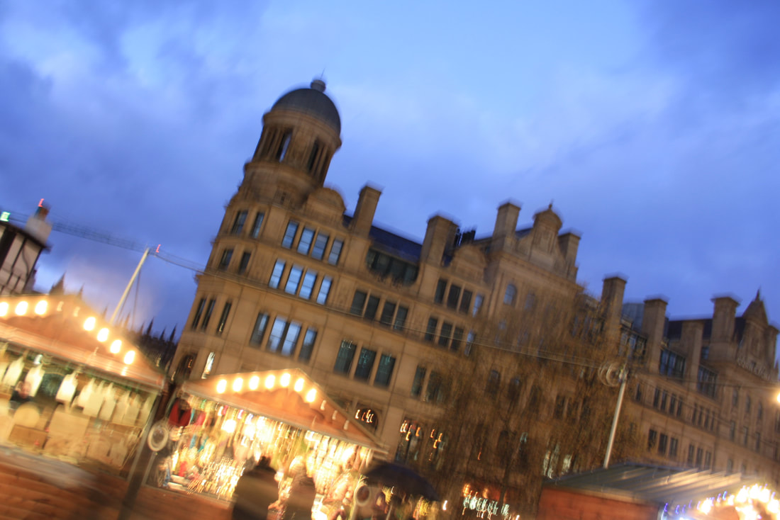
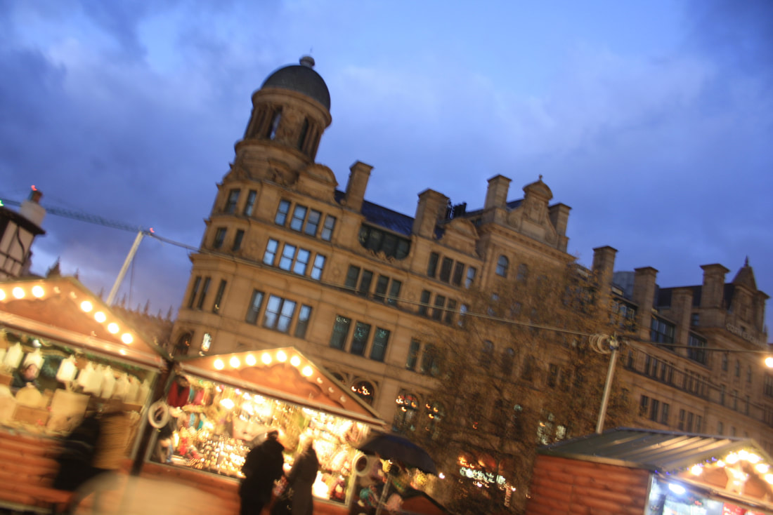
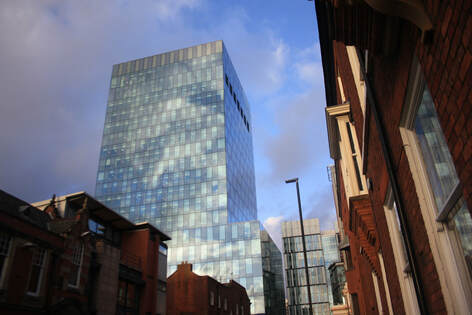
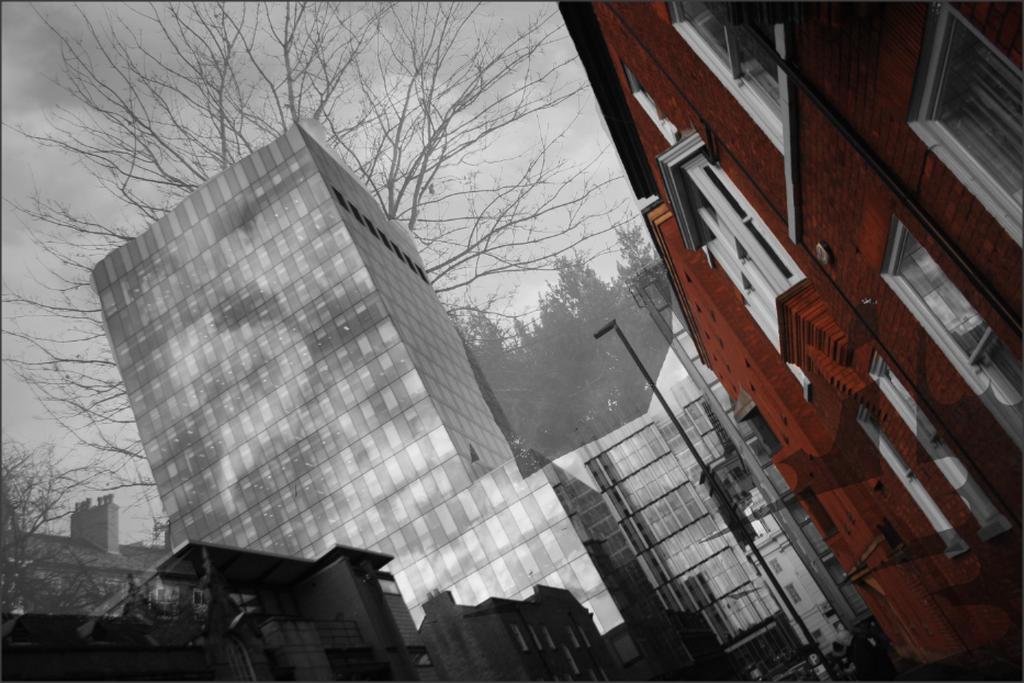
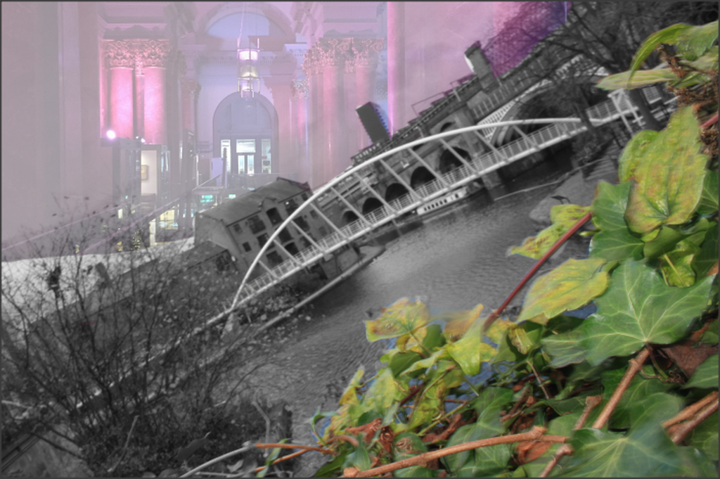
Manchester
Reflective Buildings
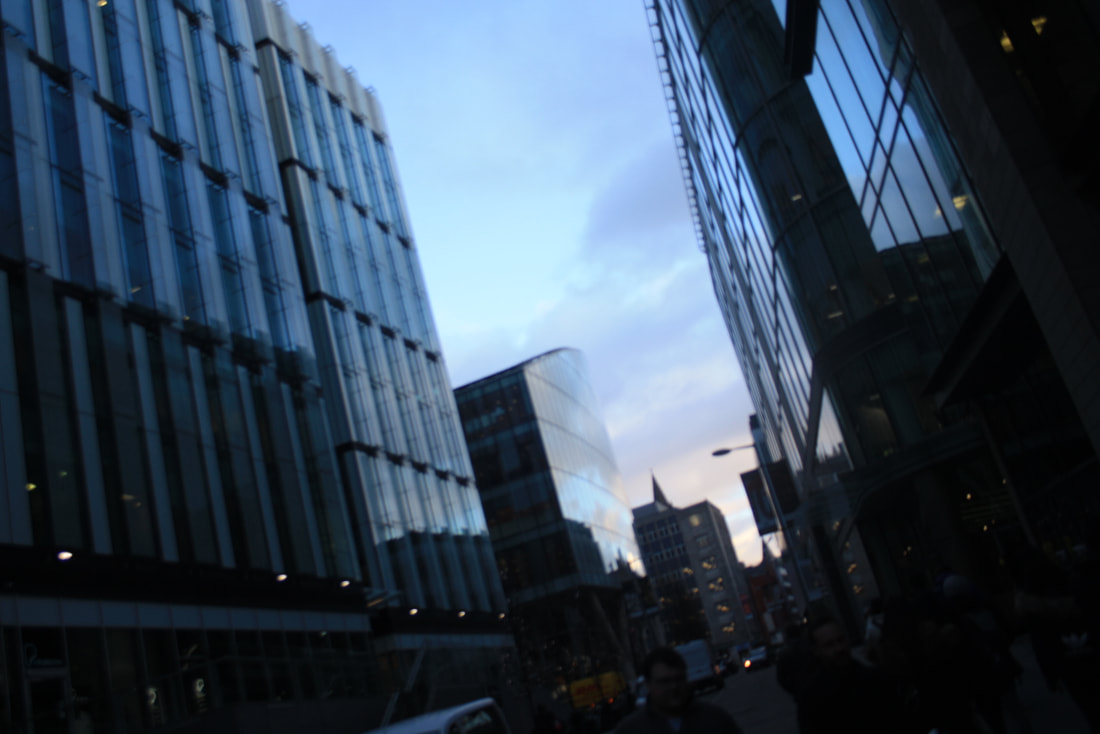
River and Bridge
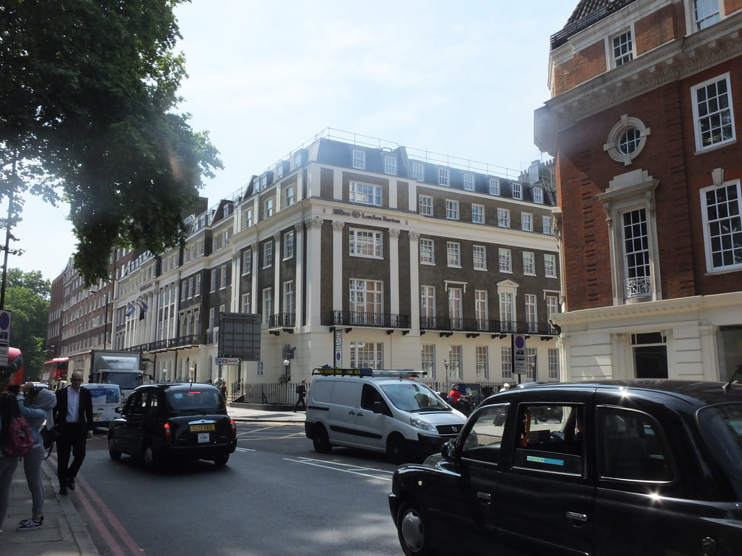
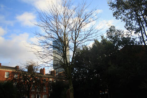
Hilton
Hilton Through Trees

Other Building
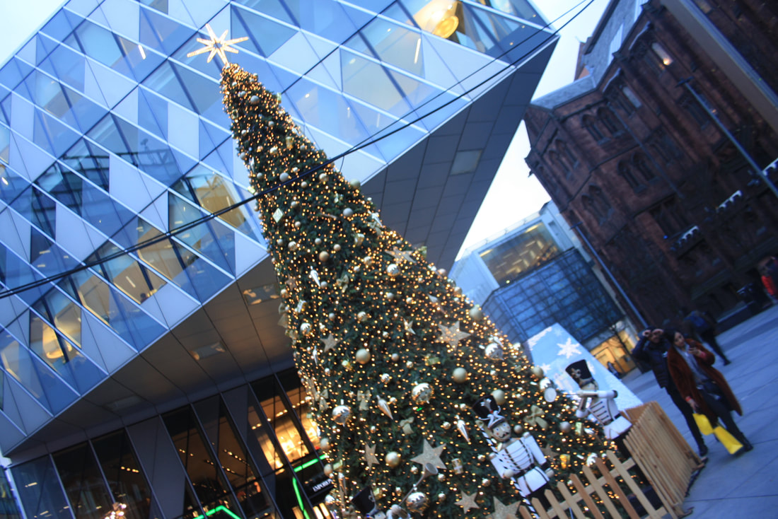
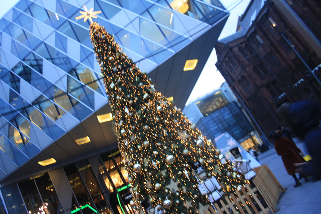
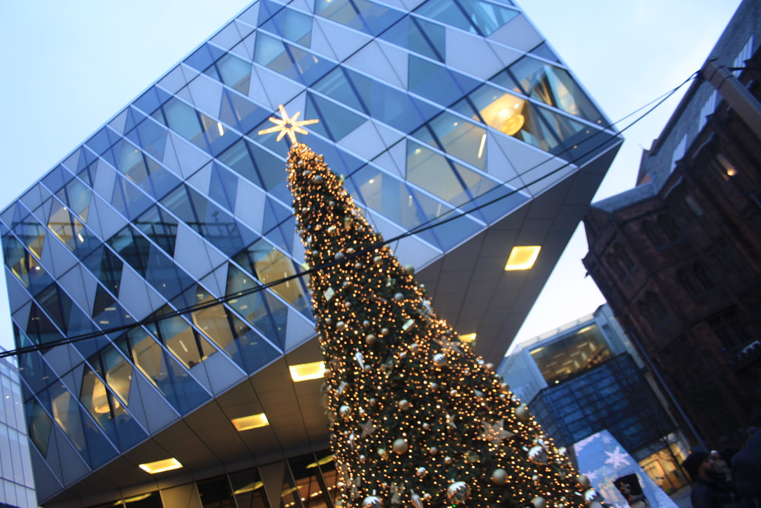
Christmas Trees
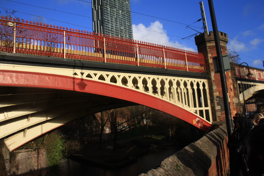
Red Bridge
Twin Building
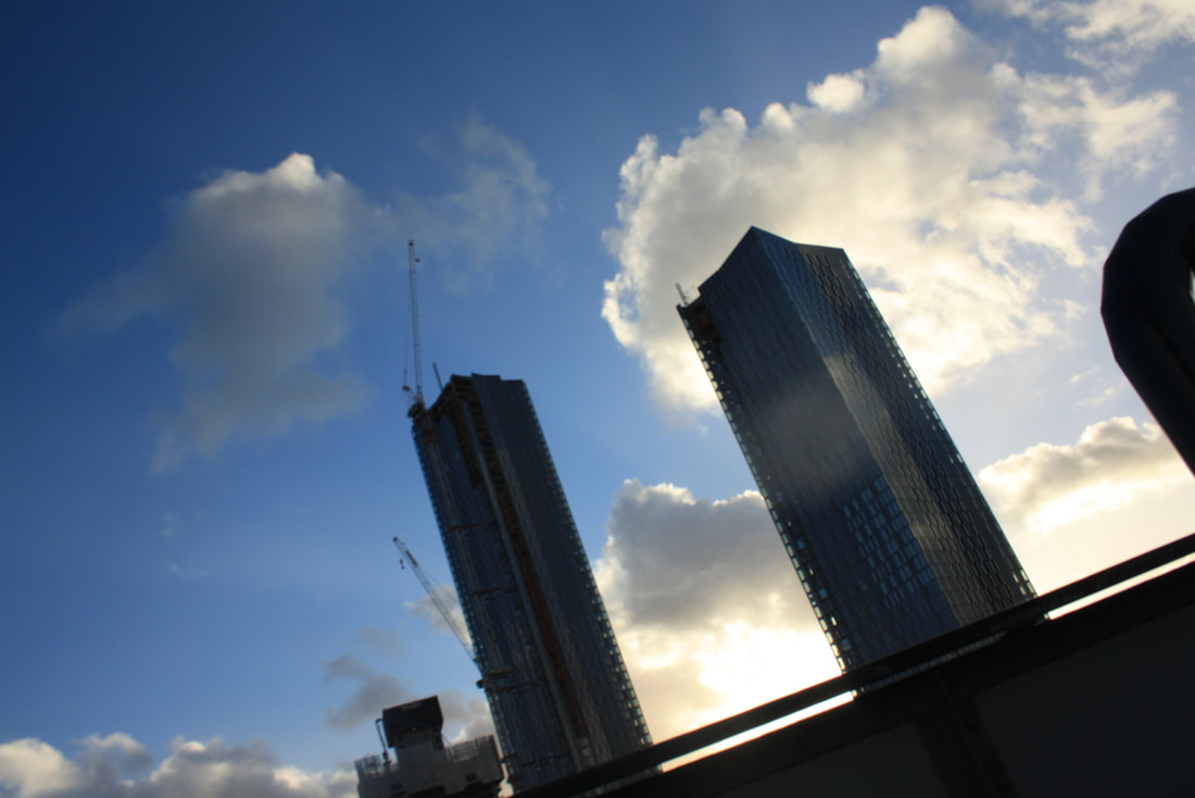
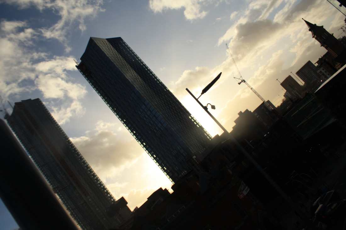
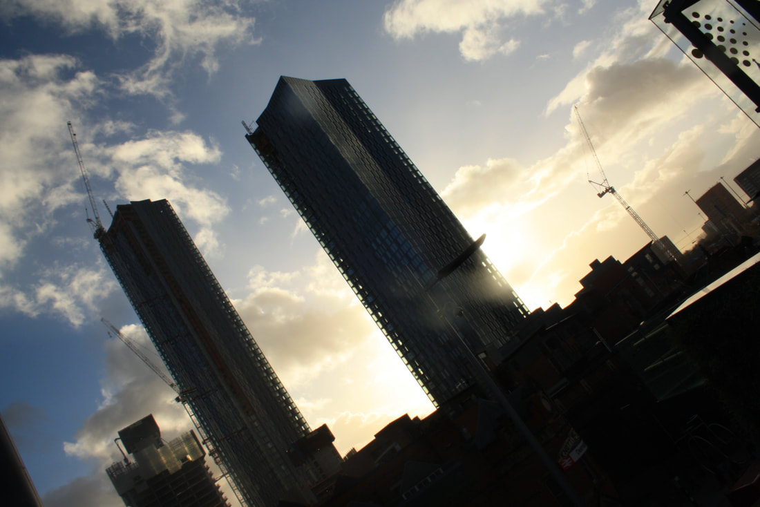
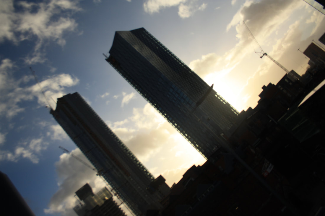
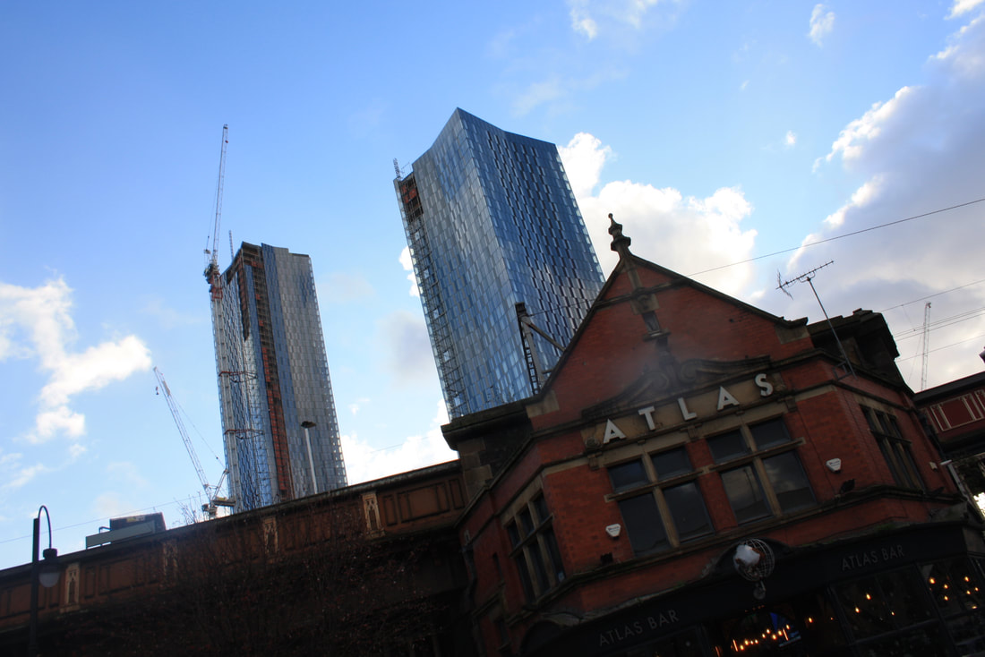
Close up Leaves, Bridge, River
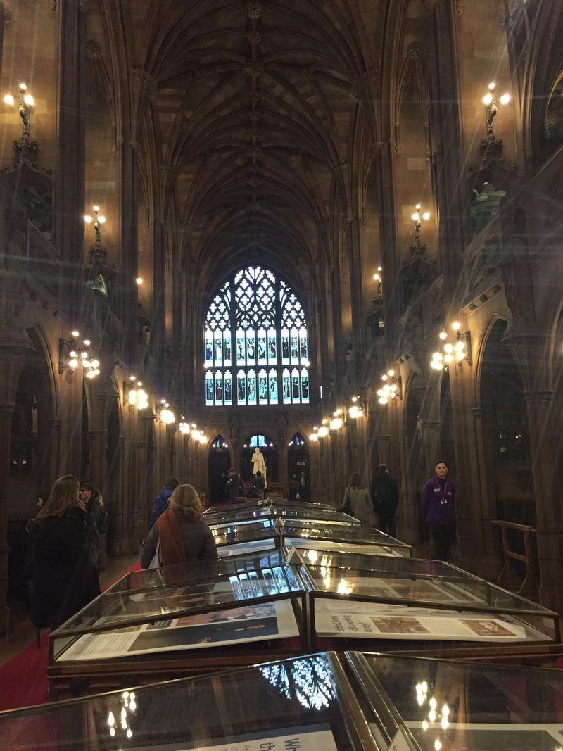
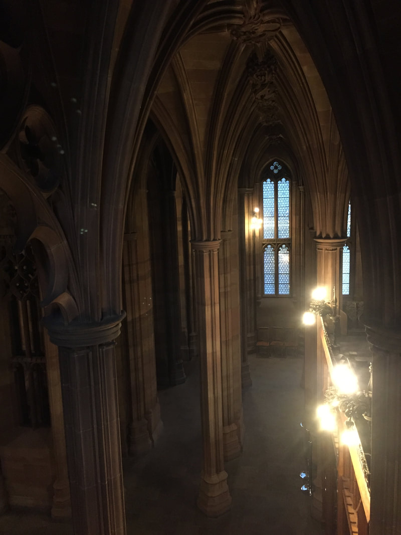
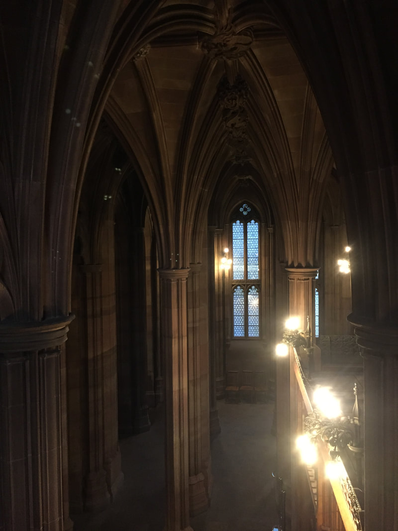
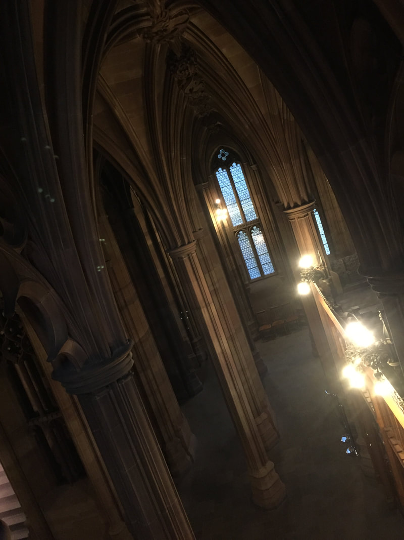
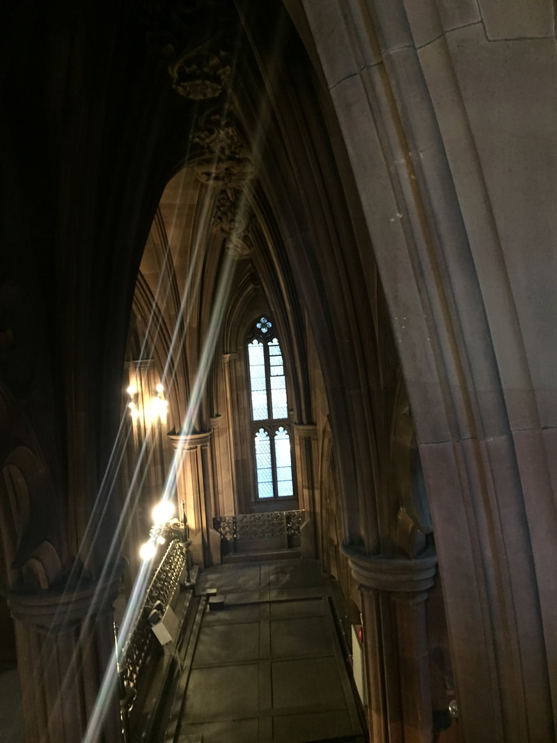
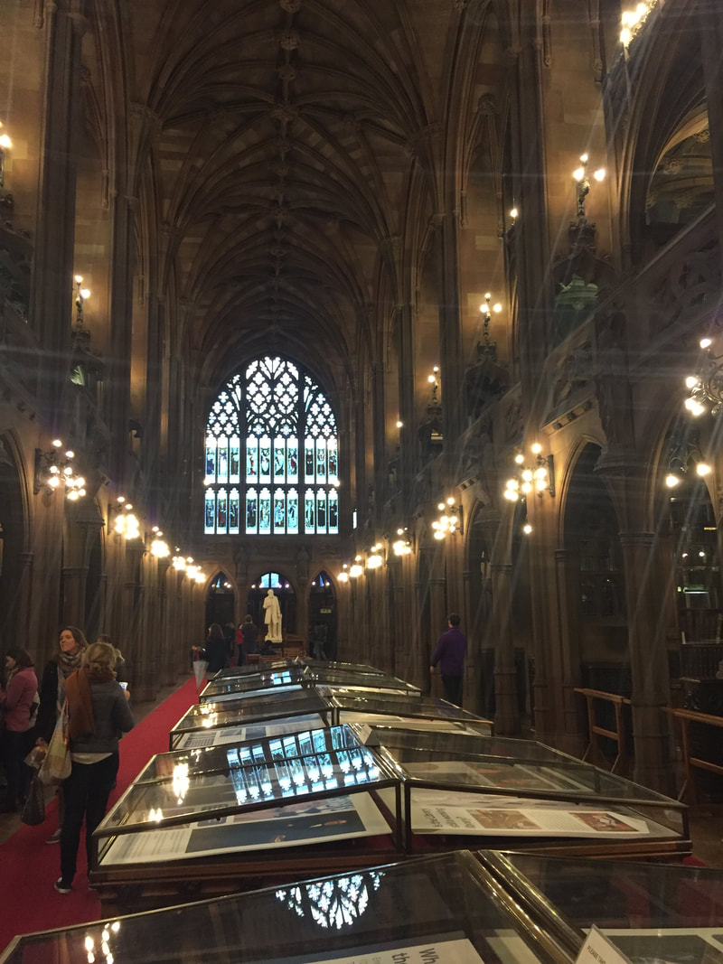
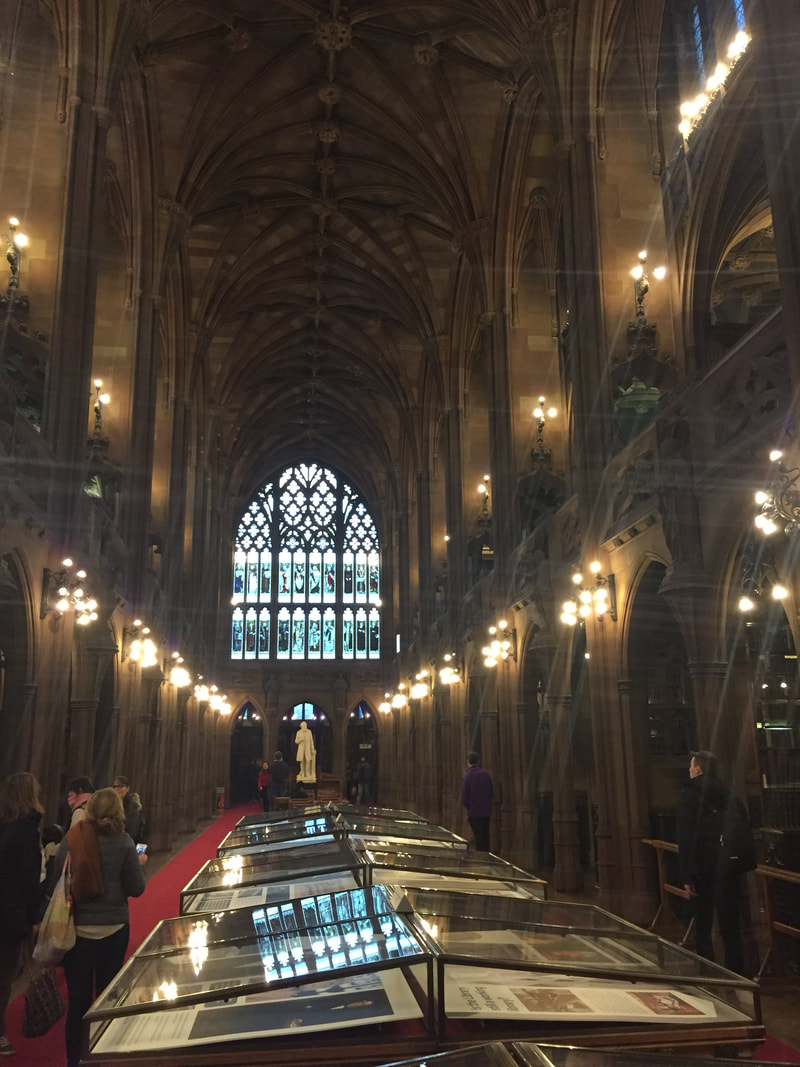
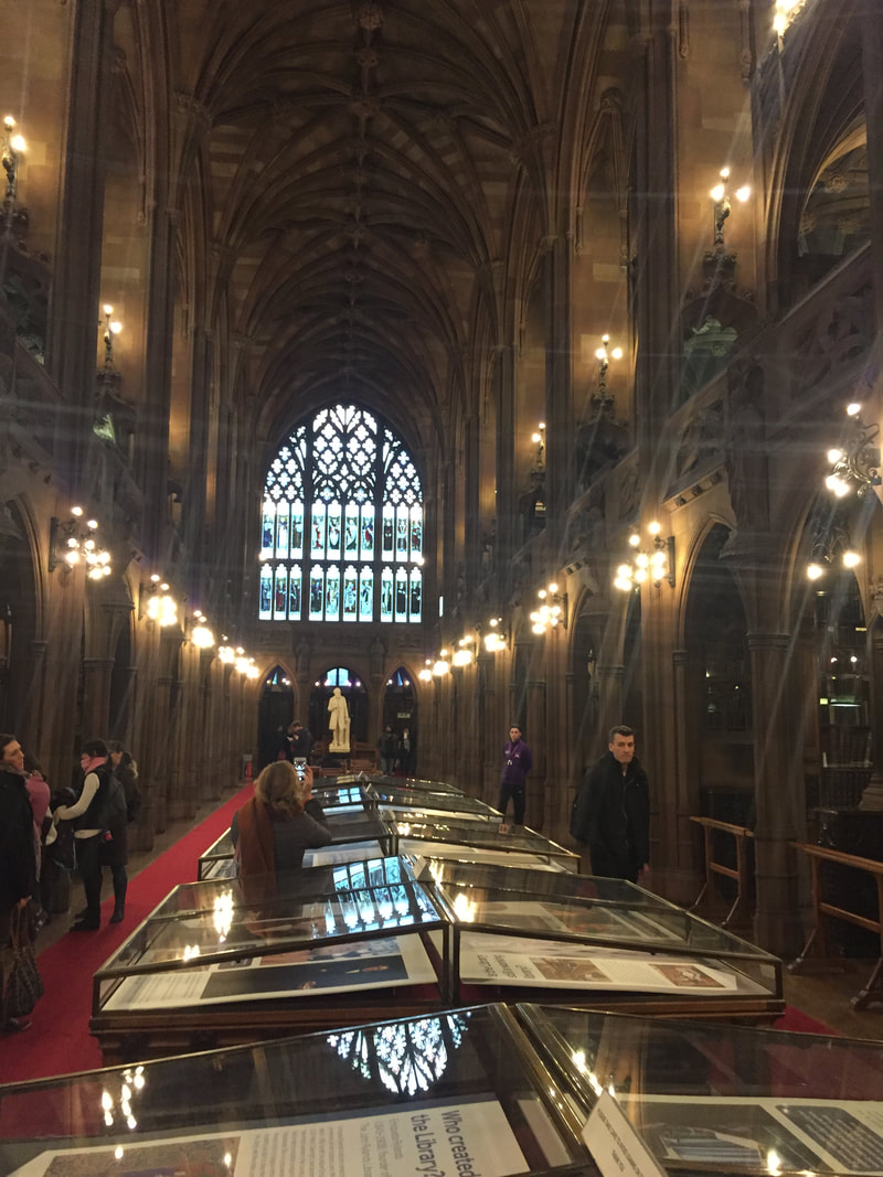
Jhon Rylands Library
Royal Exchange
Old Building
MY BEST IMAGES
Formby Beach
|
|
London

|
|
Manchester
|
|
Salford Quays
|

|
The images I have decided to focus on in this project are my urban landscape images such as my London ones. The reason I have chosen these set of images is because I feel I can show a creative and more imaginative side of them while experimenting with photoshop, while using photoshop I am going to get ideas from watching tutorials and help videos to give inspiration with my own images.
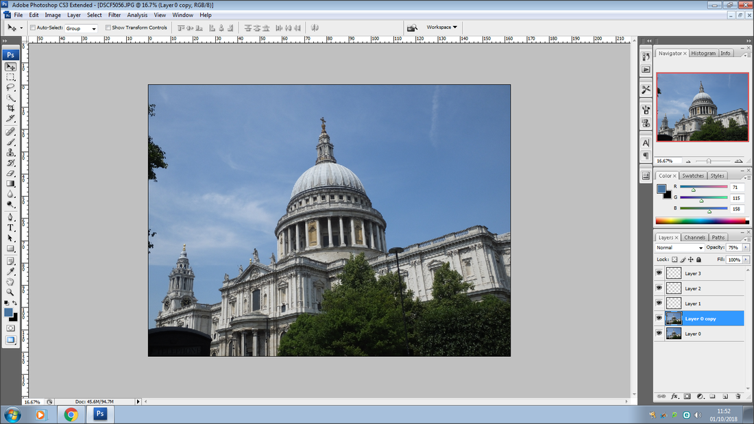
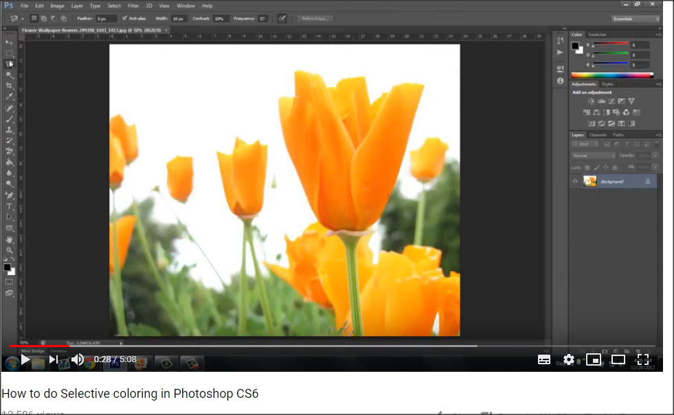
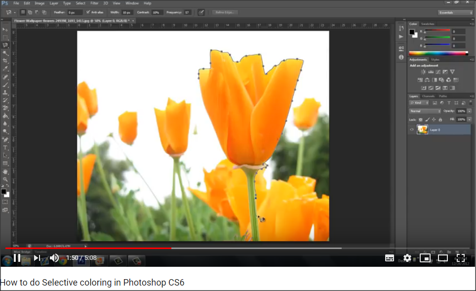
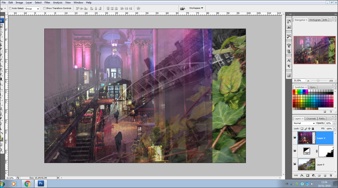
Experimenting With PhotoShop
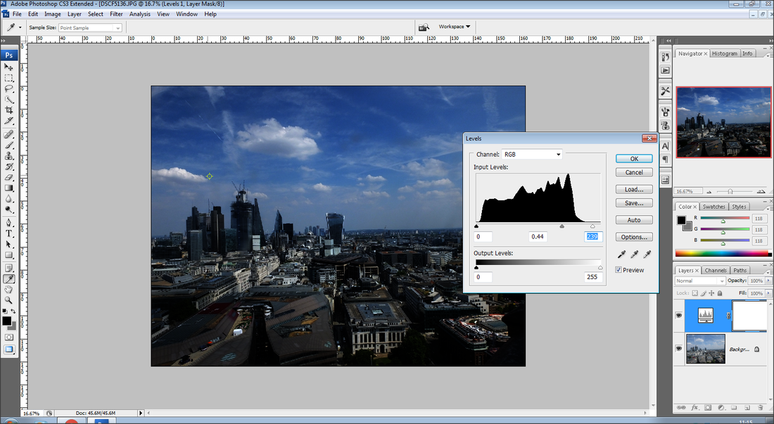
First Image
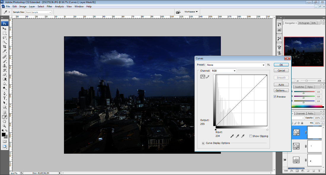
Second Image
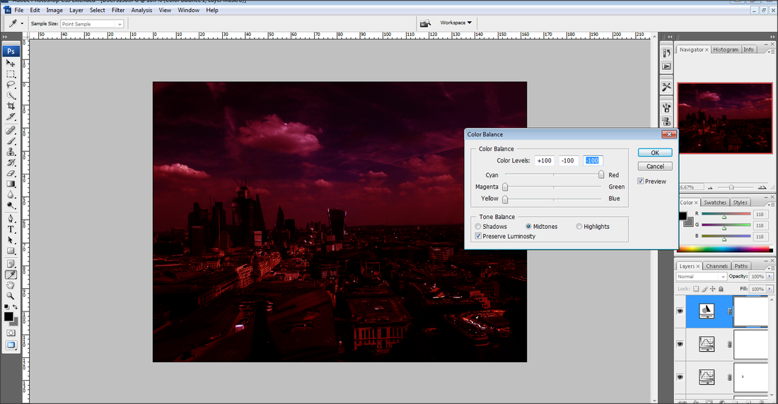
Third Image
Fourth Image
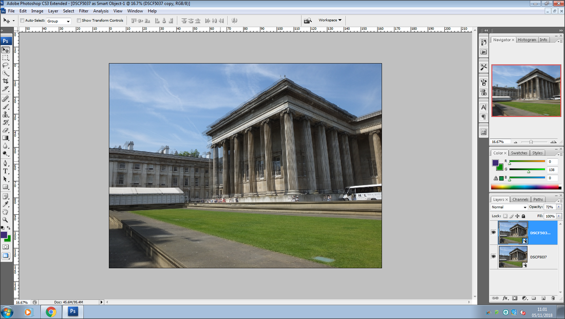
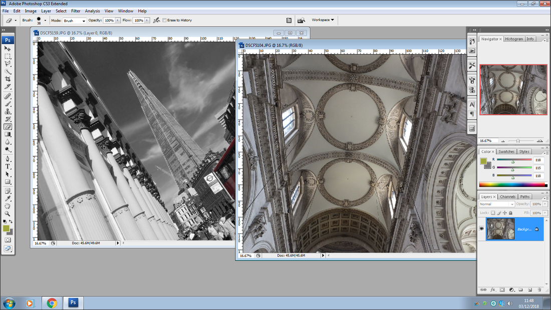
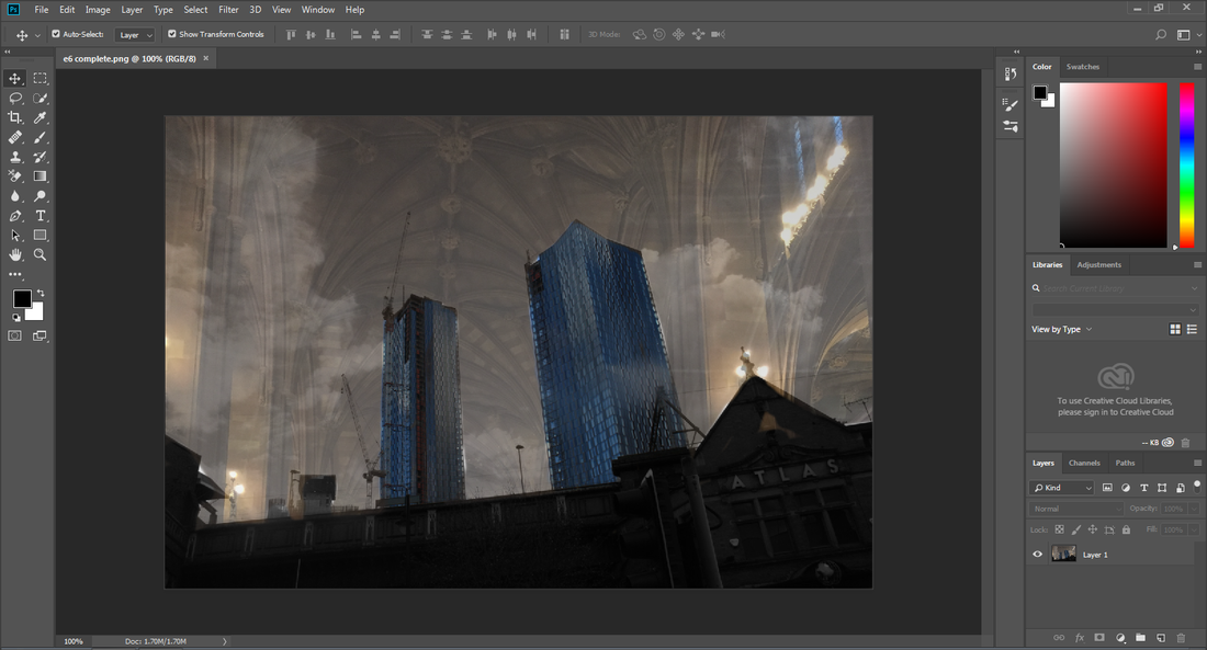
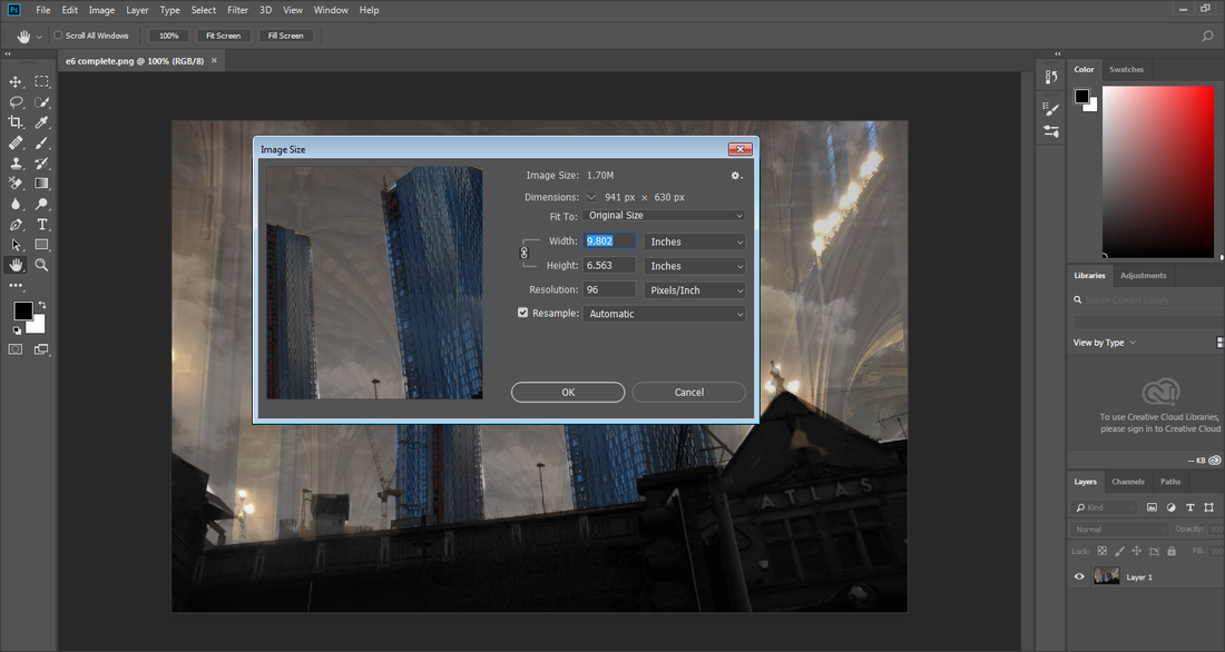
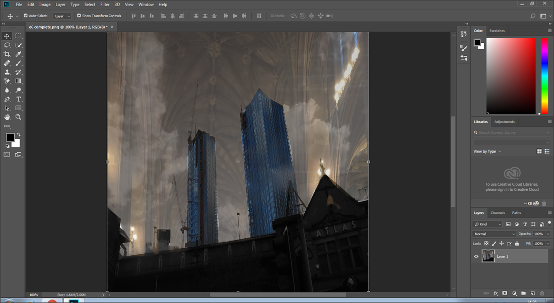
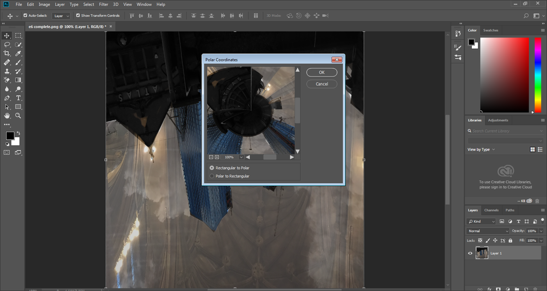
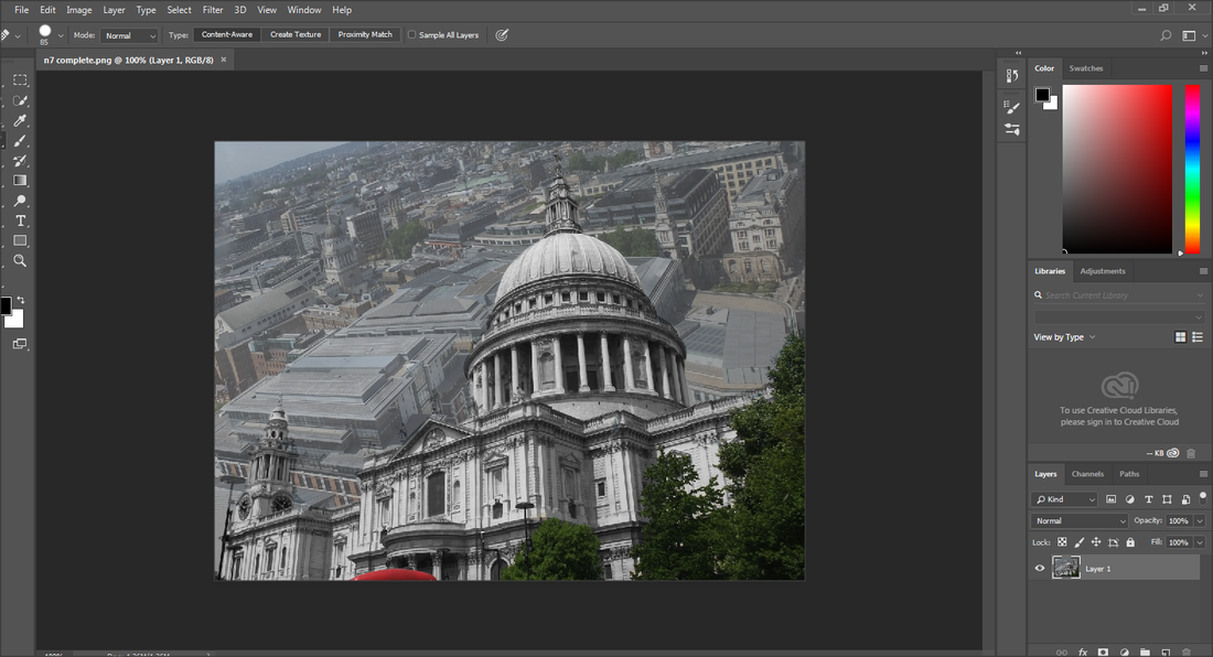
This is the image I am going to be working on, for my next Photoshop
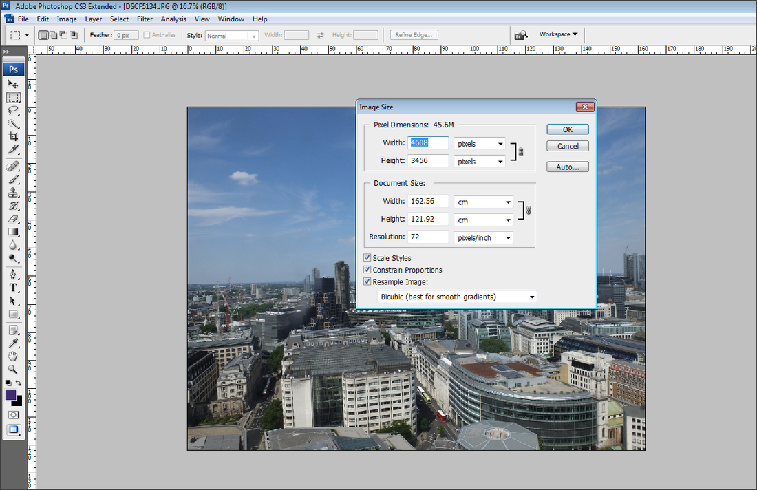
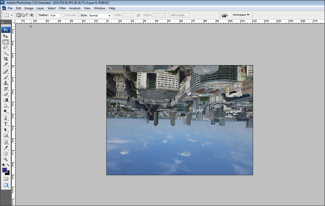
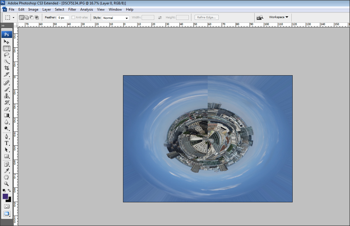
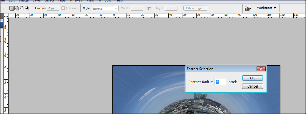
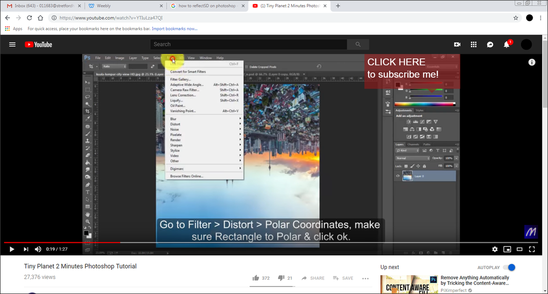
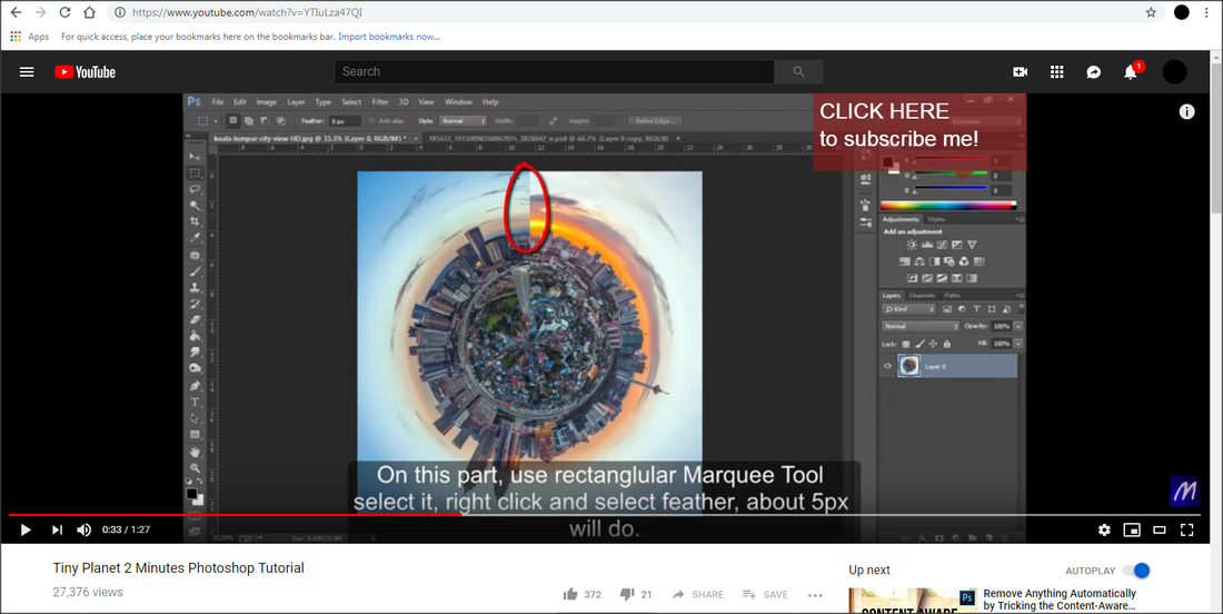
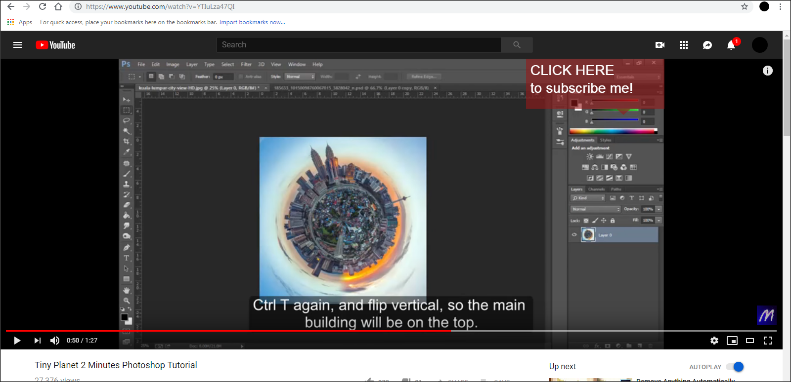
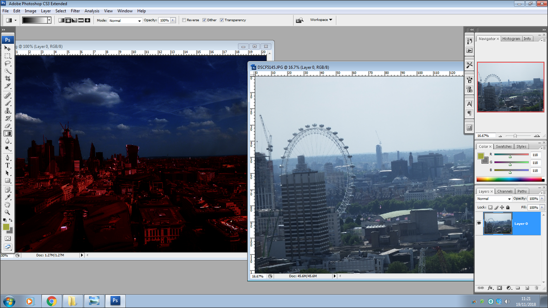
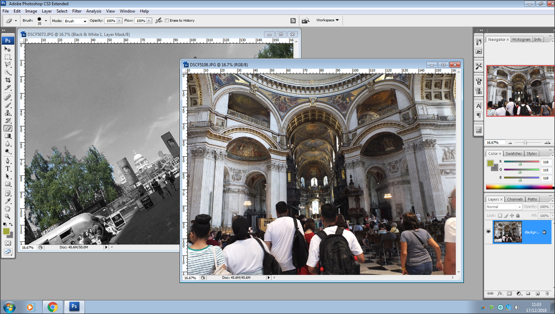
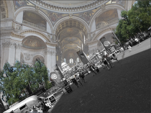
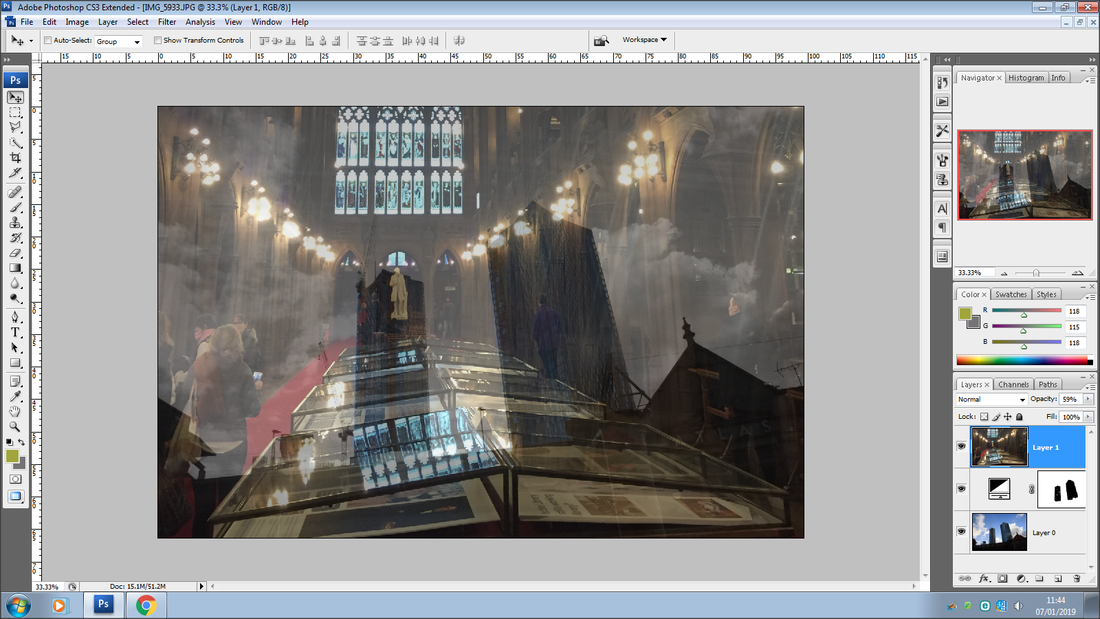
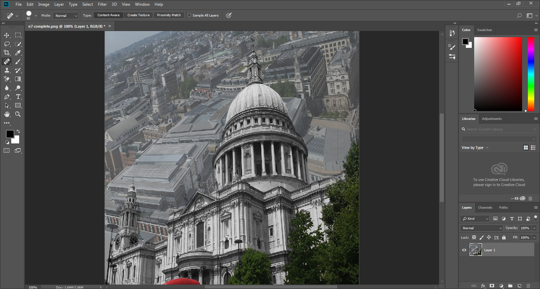
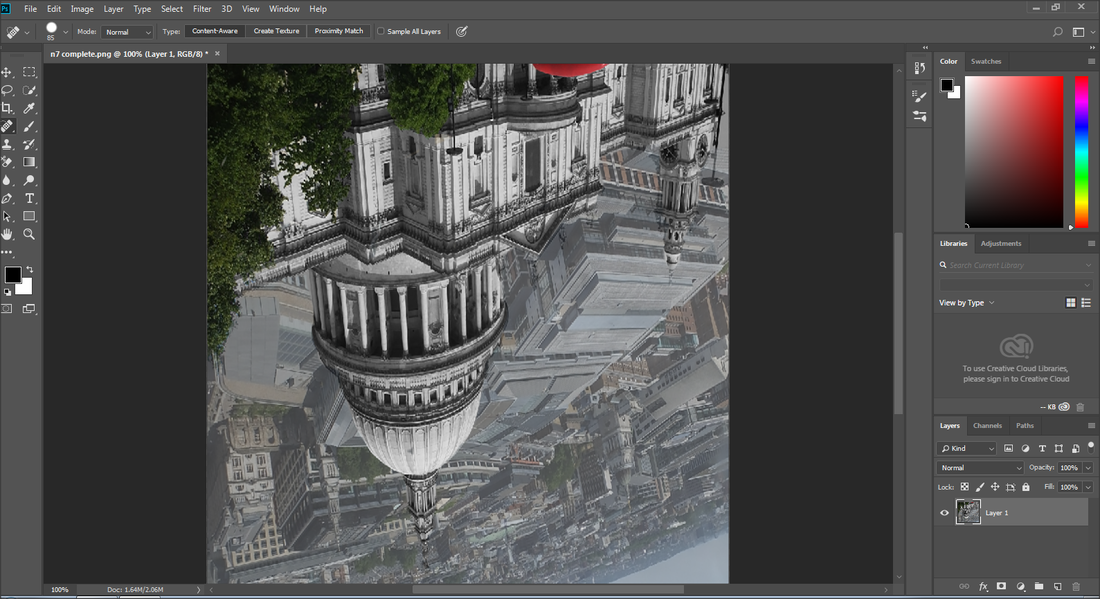
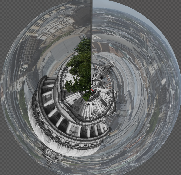
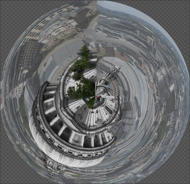
I did some research on different Photoshop ideas and came across the 'tiny planet' technique, this idea caught me instantly and wanted to experiment on it straight away. I searched on YouTube for a tutorial on how to do the technique and found this tutorial shown above, which has helped me step by step on how to do this technique on Photoshop.
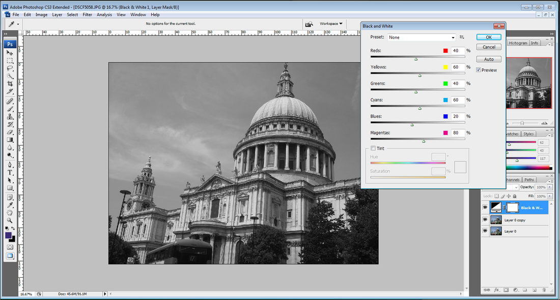
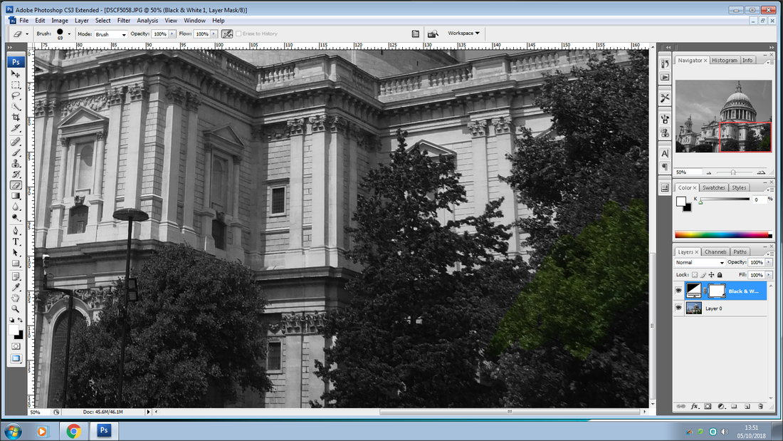
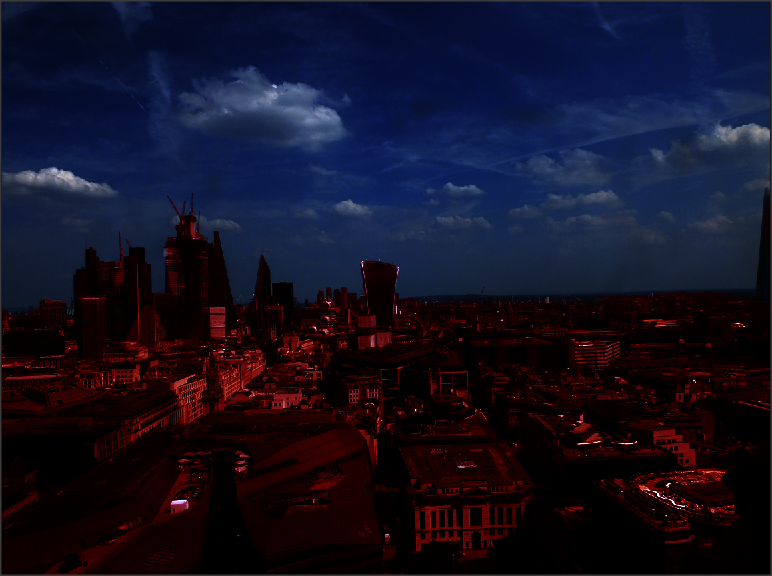
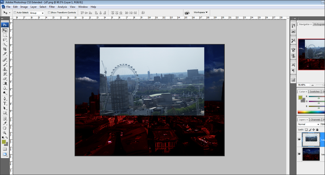
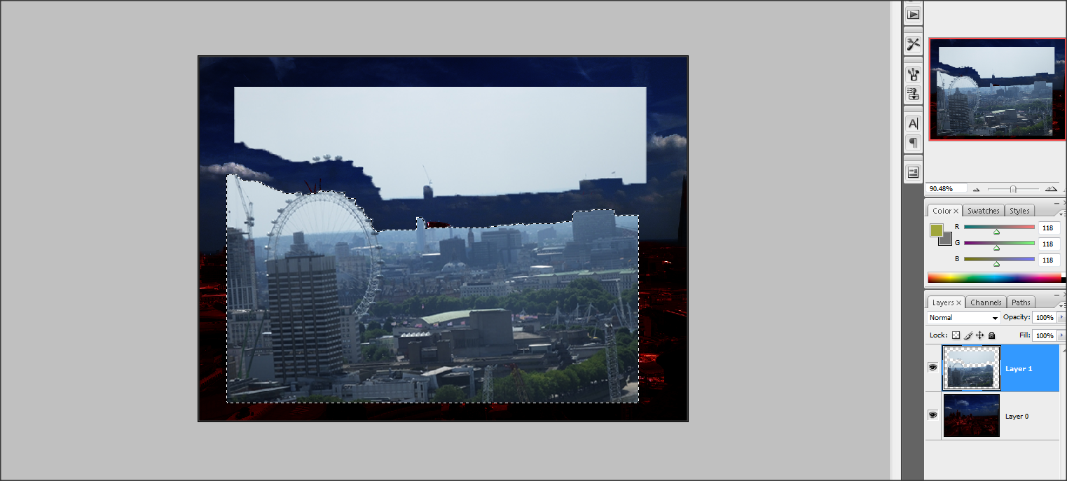
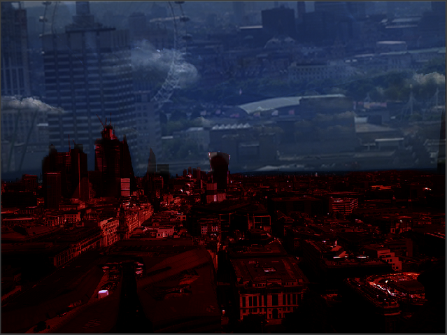
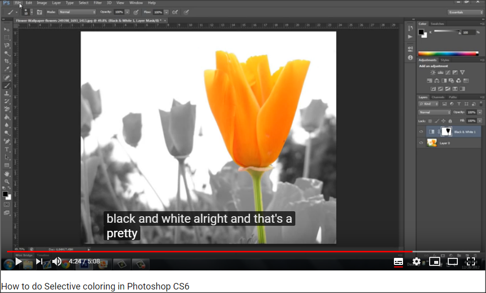
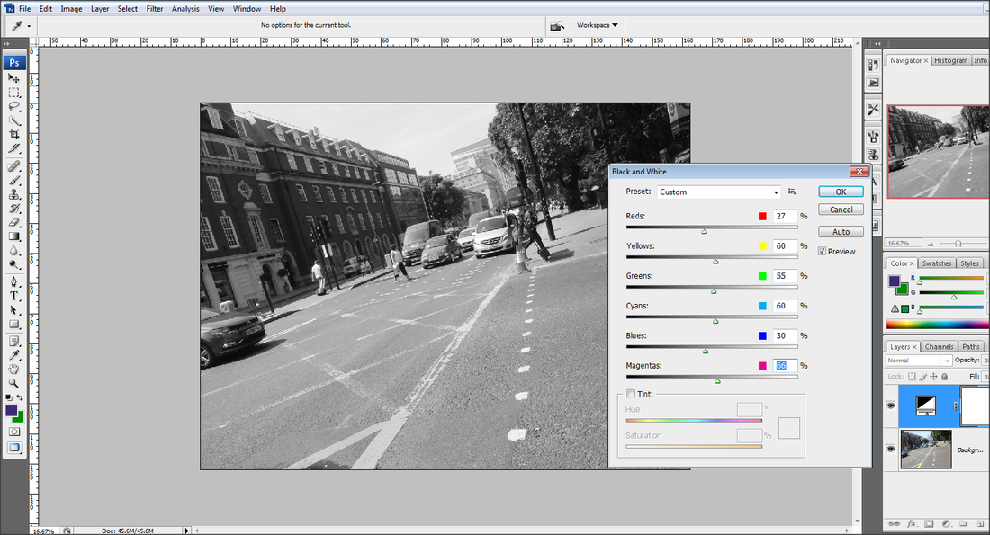
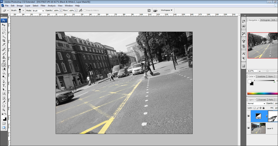
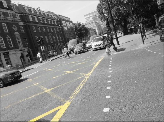
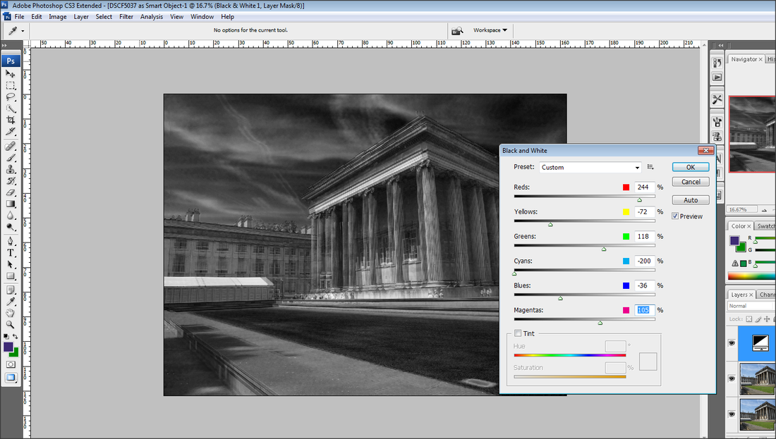
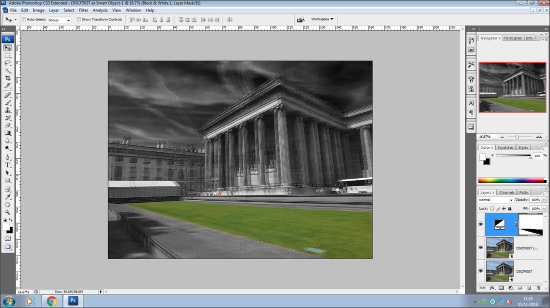
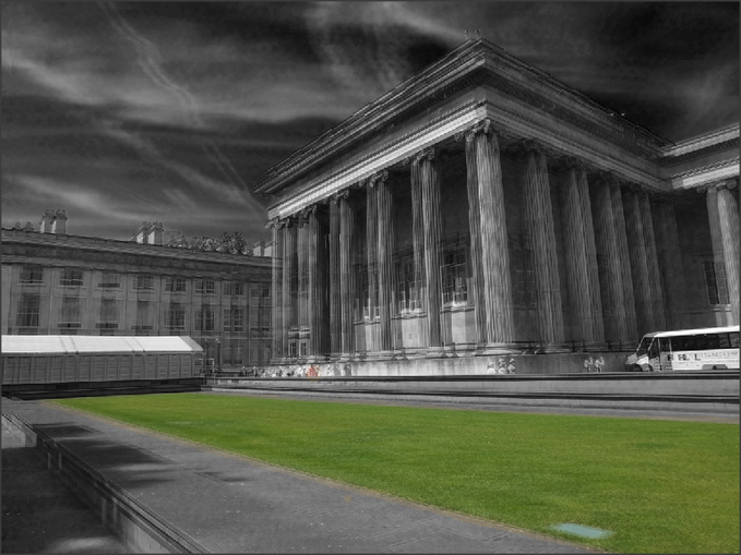
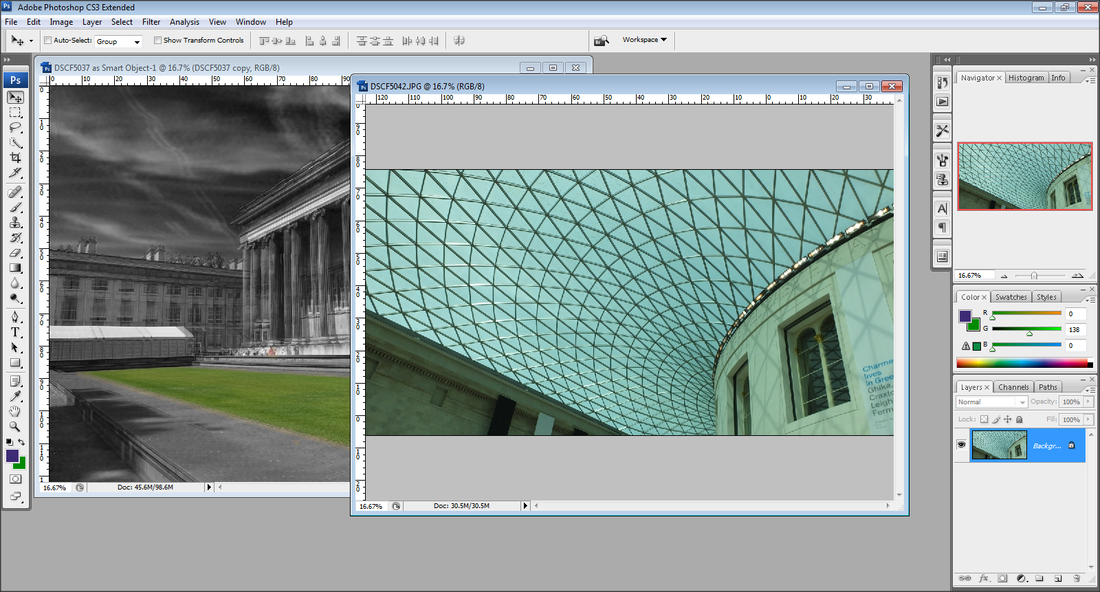
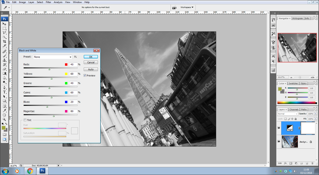
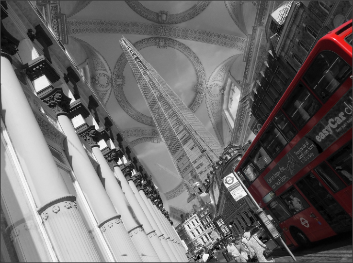
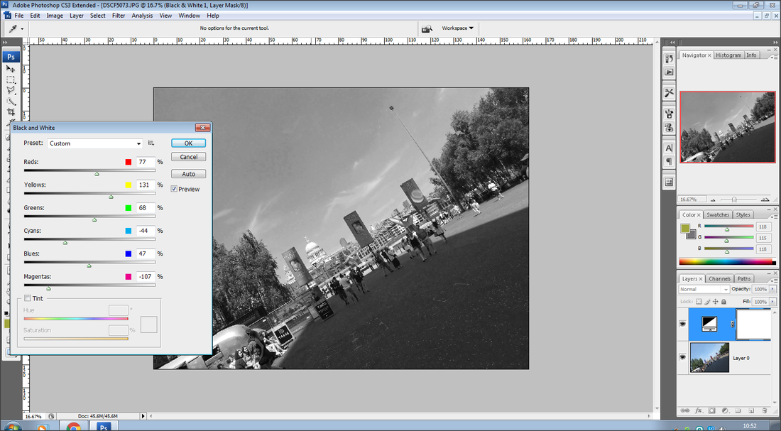
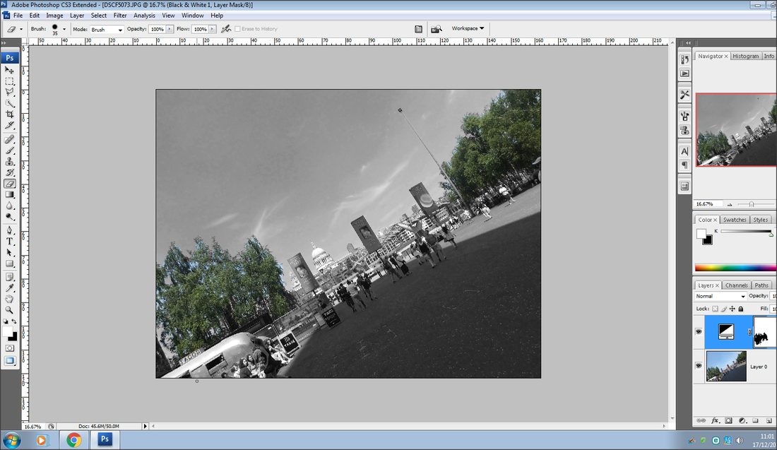
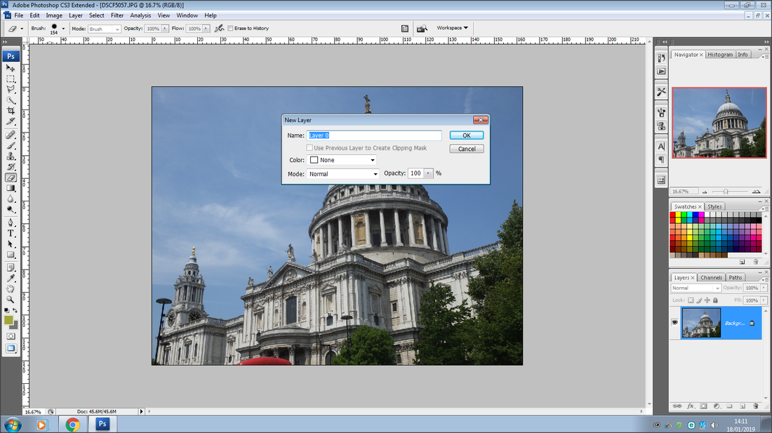
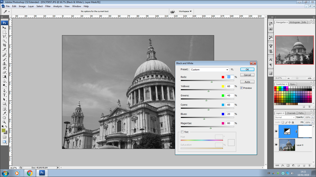
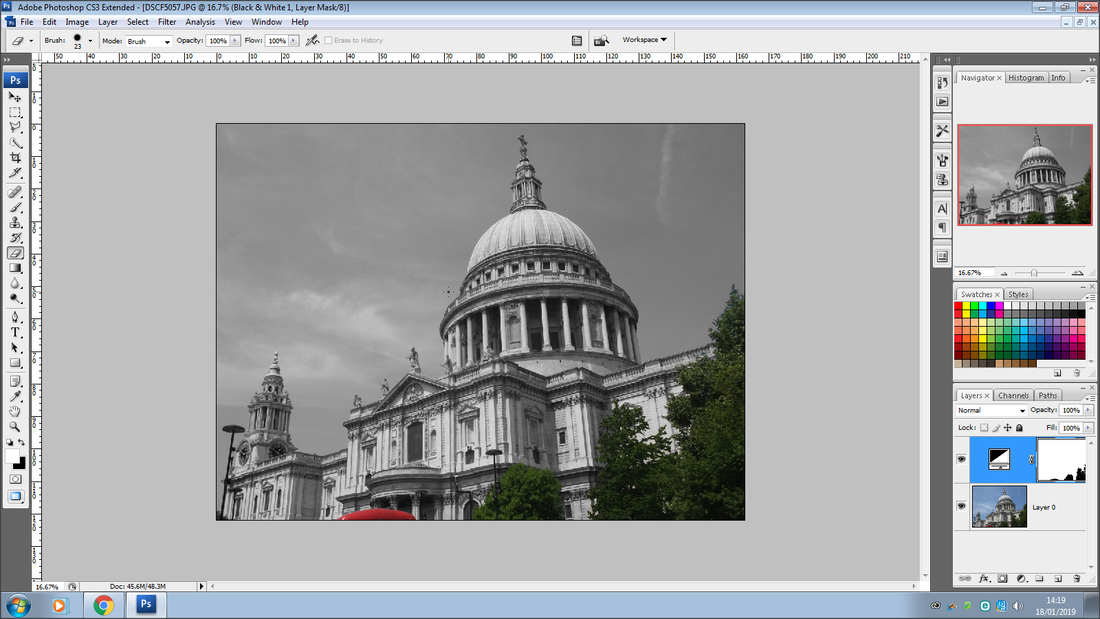
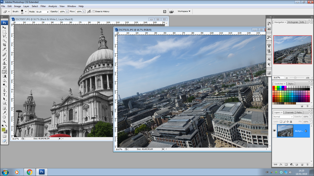
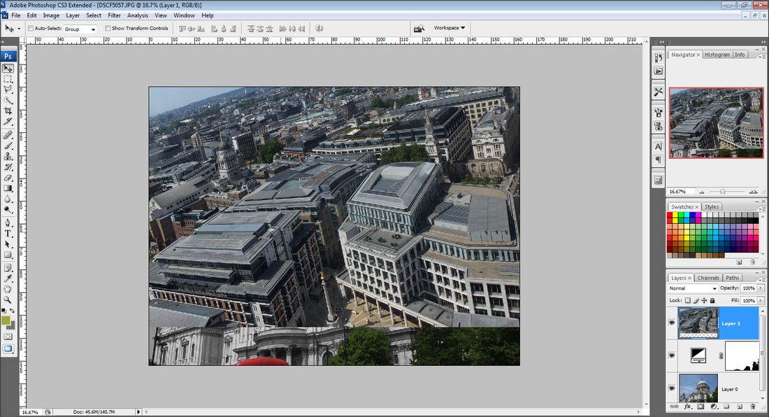
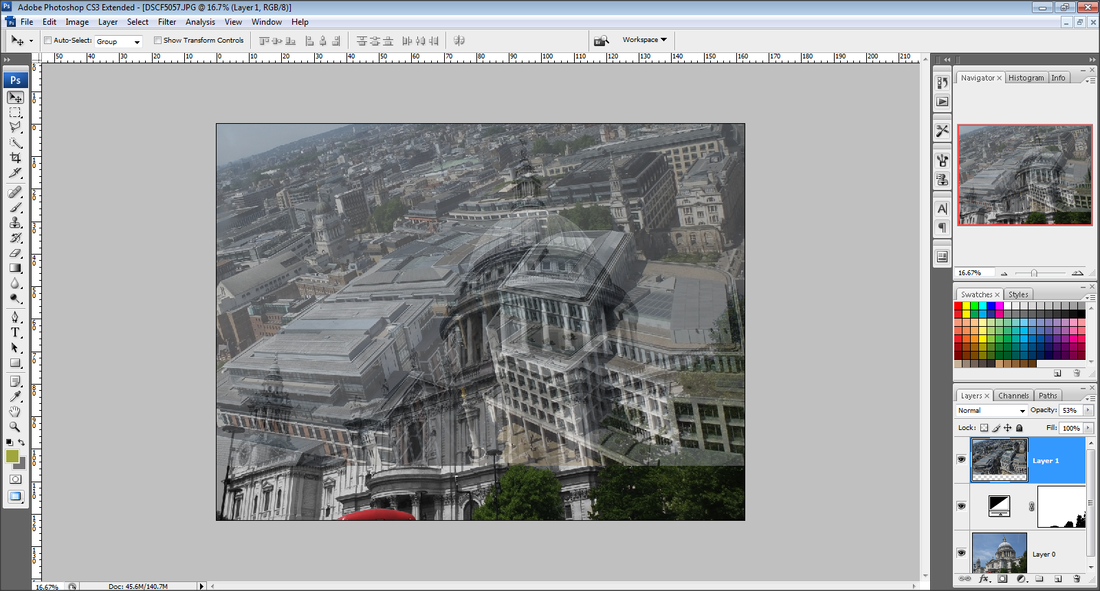
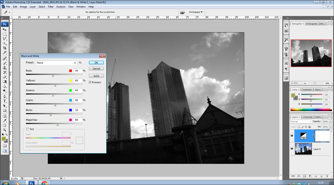
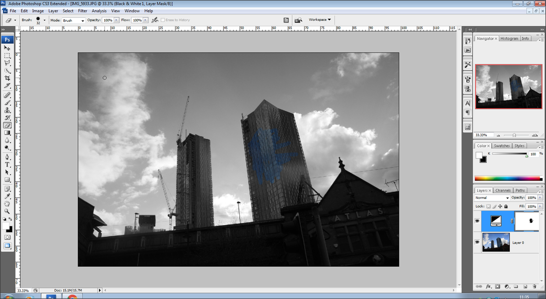
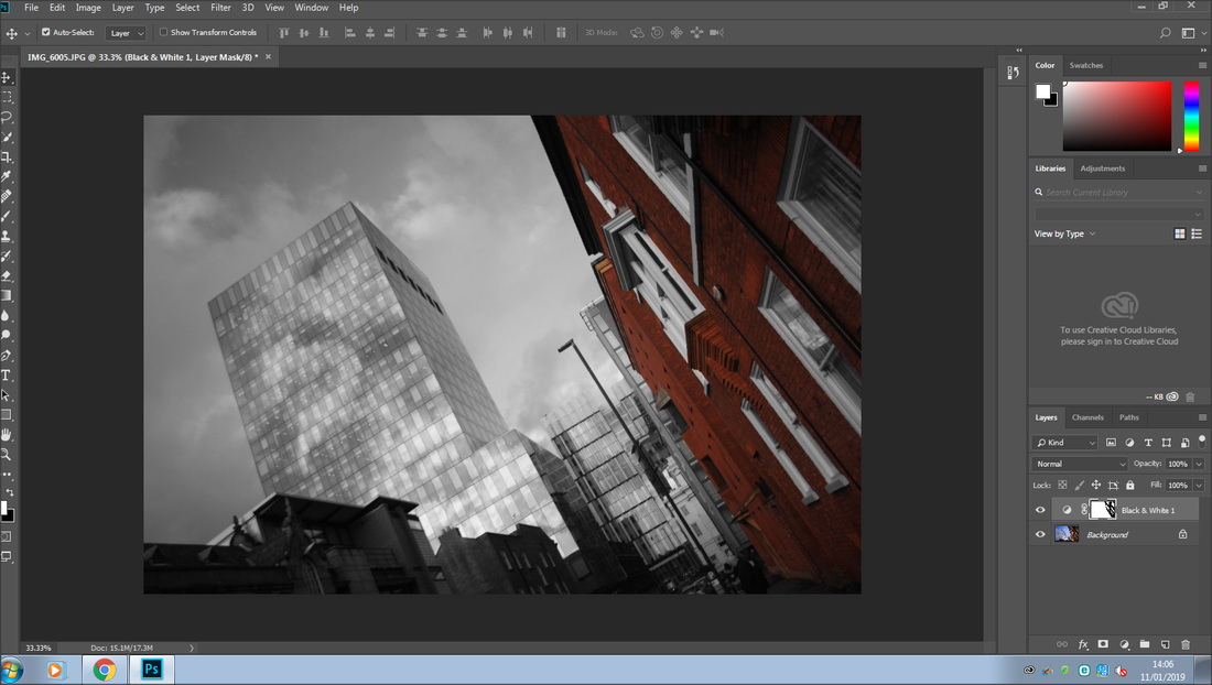
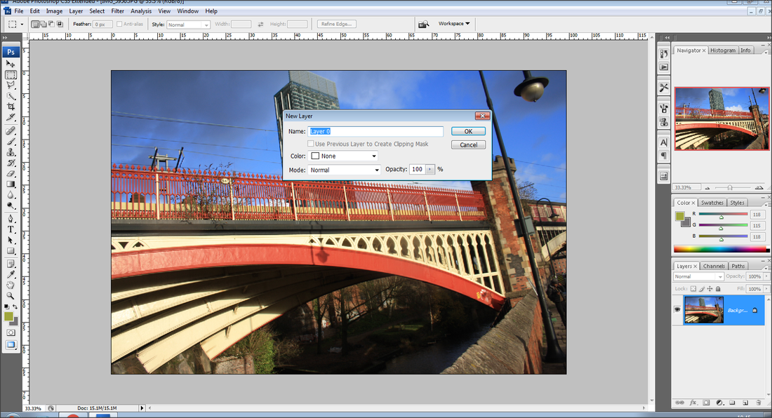
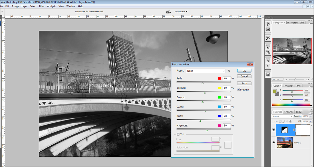
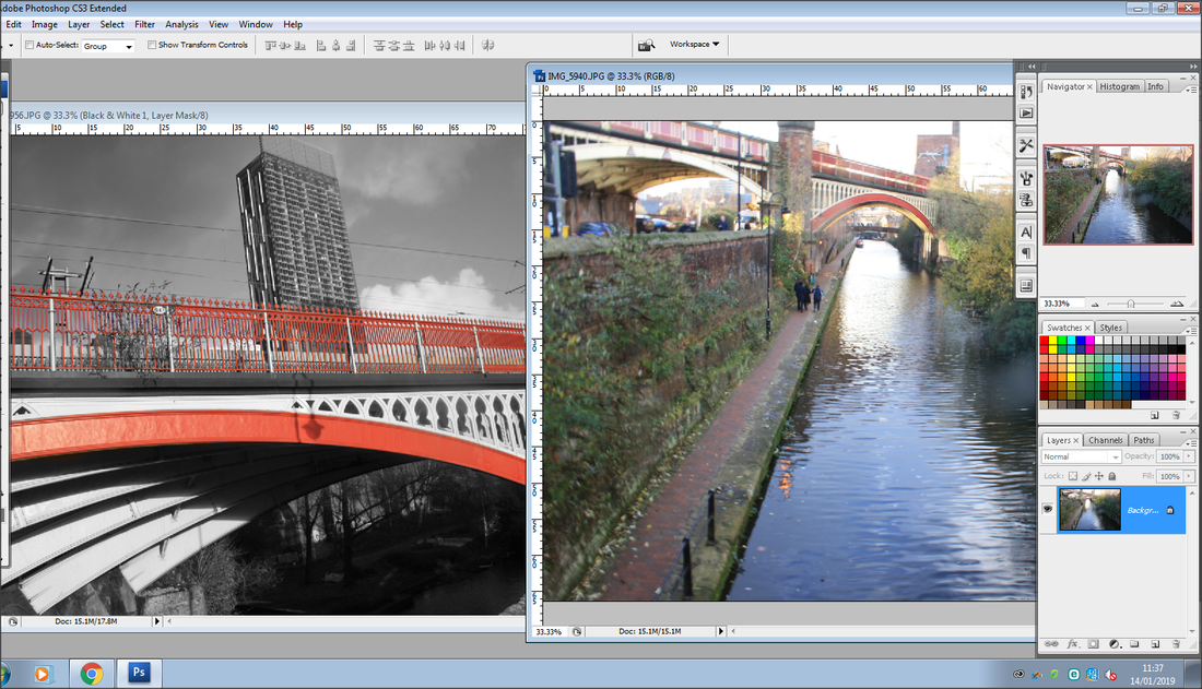
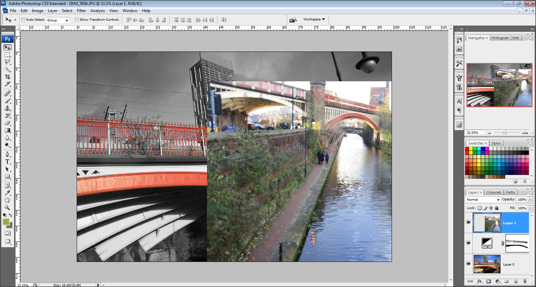
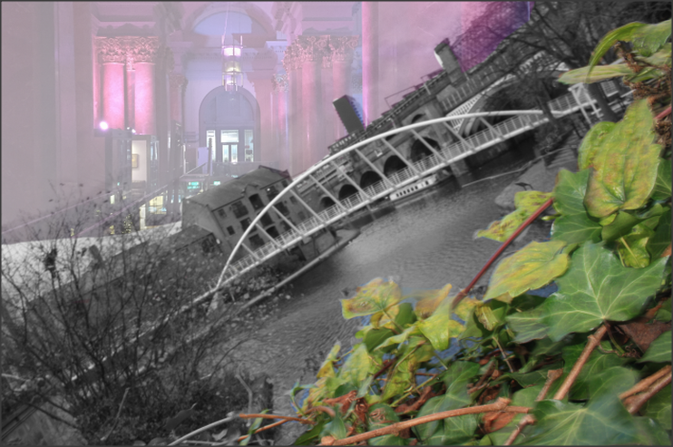
I have experimented with different Photoshop skills and the images above are my outcomes, For this project I am going to focus on the black and white theme and leave a small section in colour. After I am going to add more shapes and take my images on a further level to make my images look more effective.
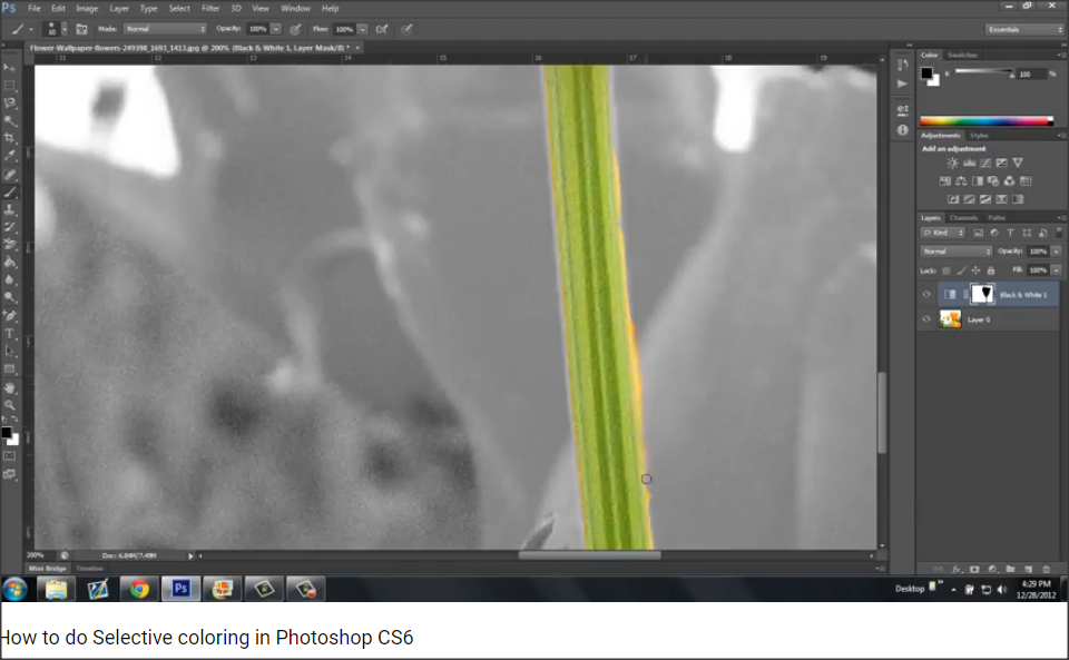
Nico Goodden
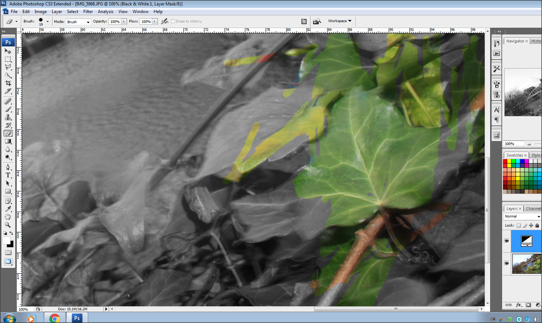
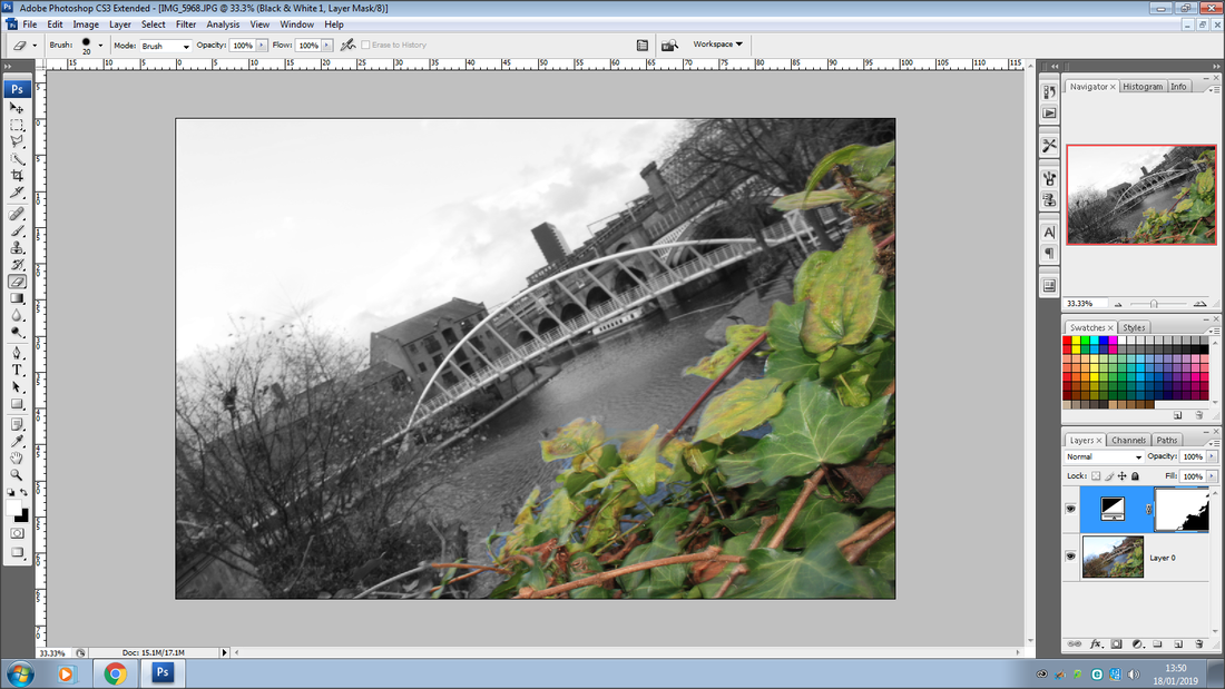
I did some artist research on selective colouring and the artist that caught my eye with her images was Nico Goodden, as she has done some images with selective colouring. Nico has done her images around London, and so am I, therefore her images give me lots of inspiration for developing my London images around the theme selective colouring.
Examples of Nico's selective colouring
YouTube Tutorial
|
|
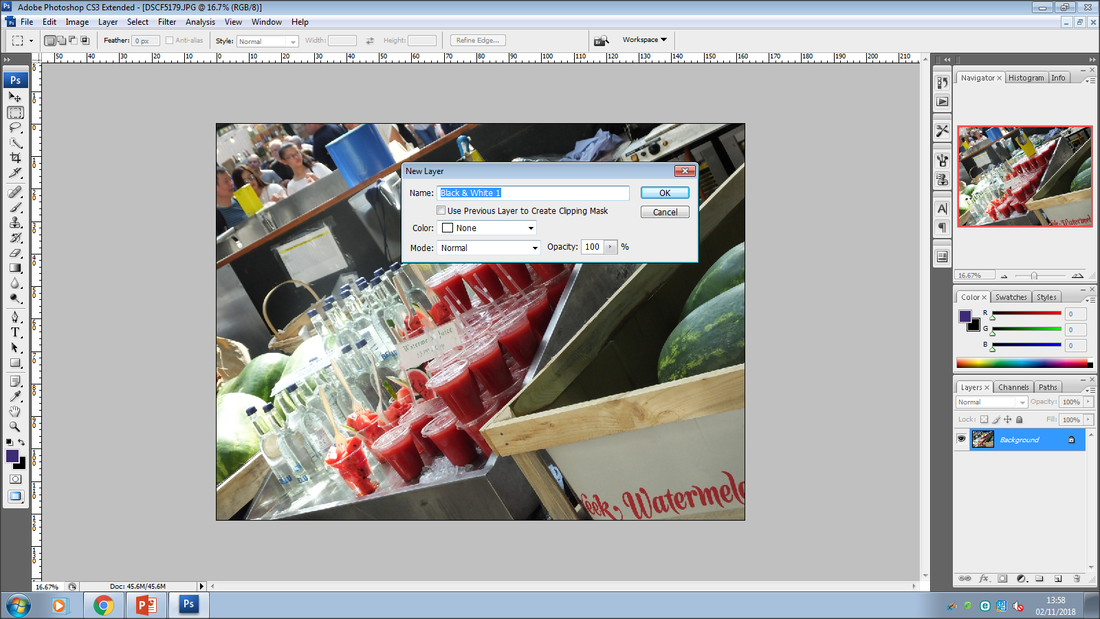
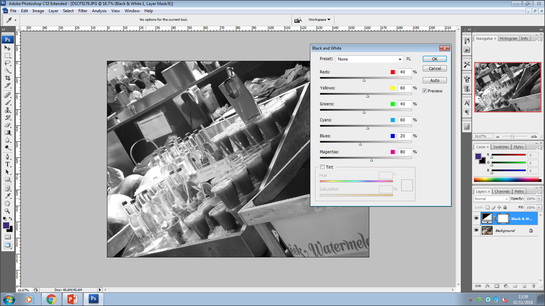
Before I started working on my selective colour theme, I watched a YouTube clip on how to work around the theme to help me, this has developed my ideas and understanding around selective colouring in PhotoShop.
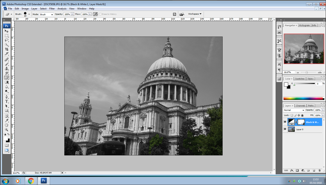
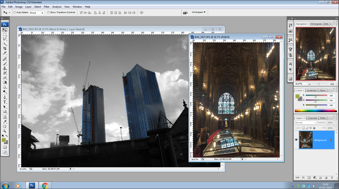
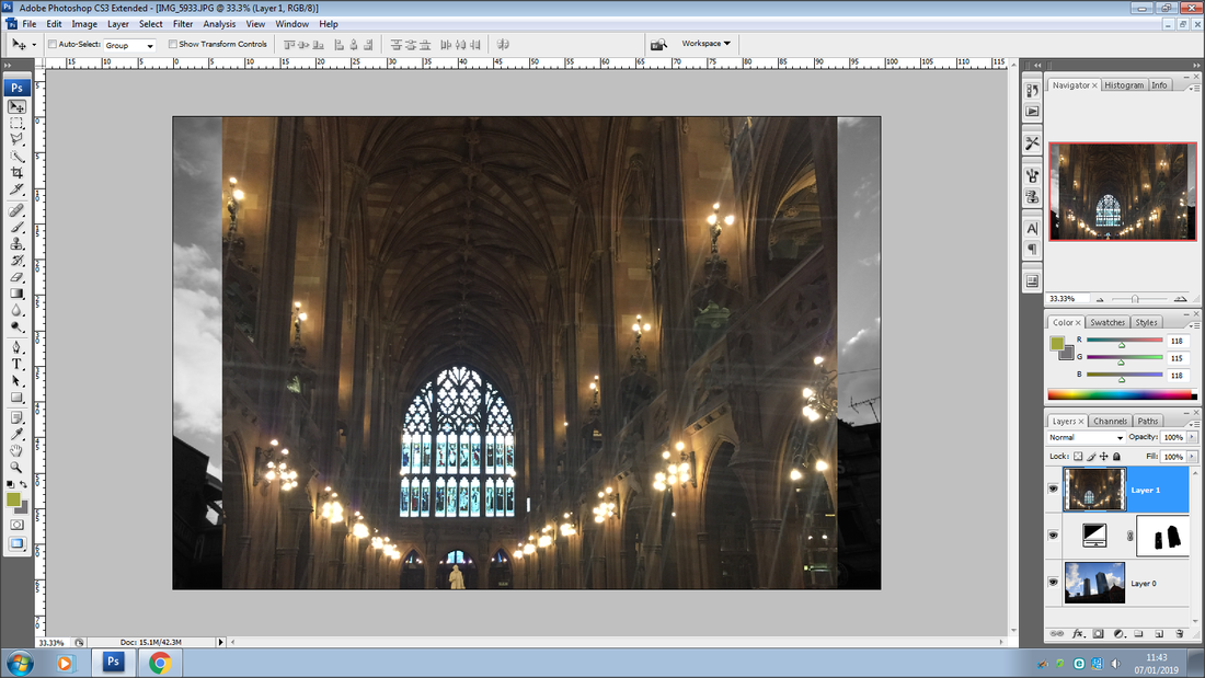
Photoshop On London Images
1st Image
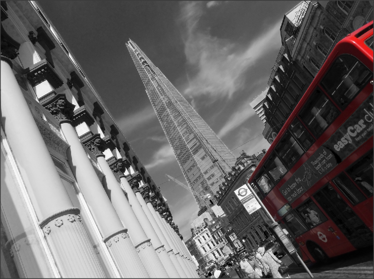
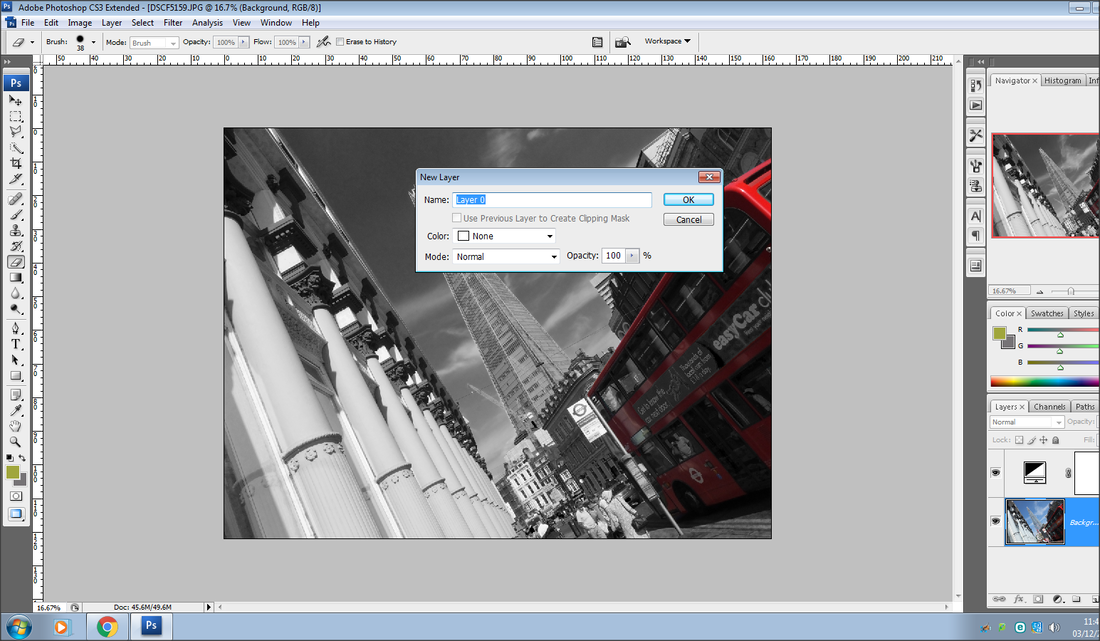
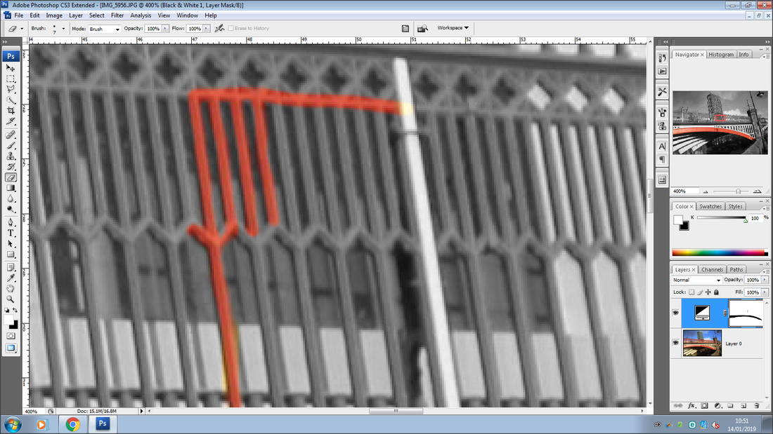
This is my first image I developed around the theme selective colouring. To me it is quite simple however as I go on with the selective colouring journey, I am going to develop it to a further stage.
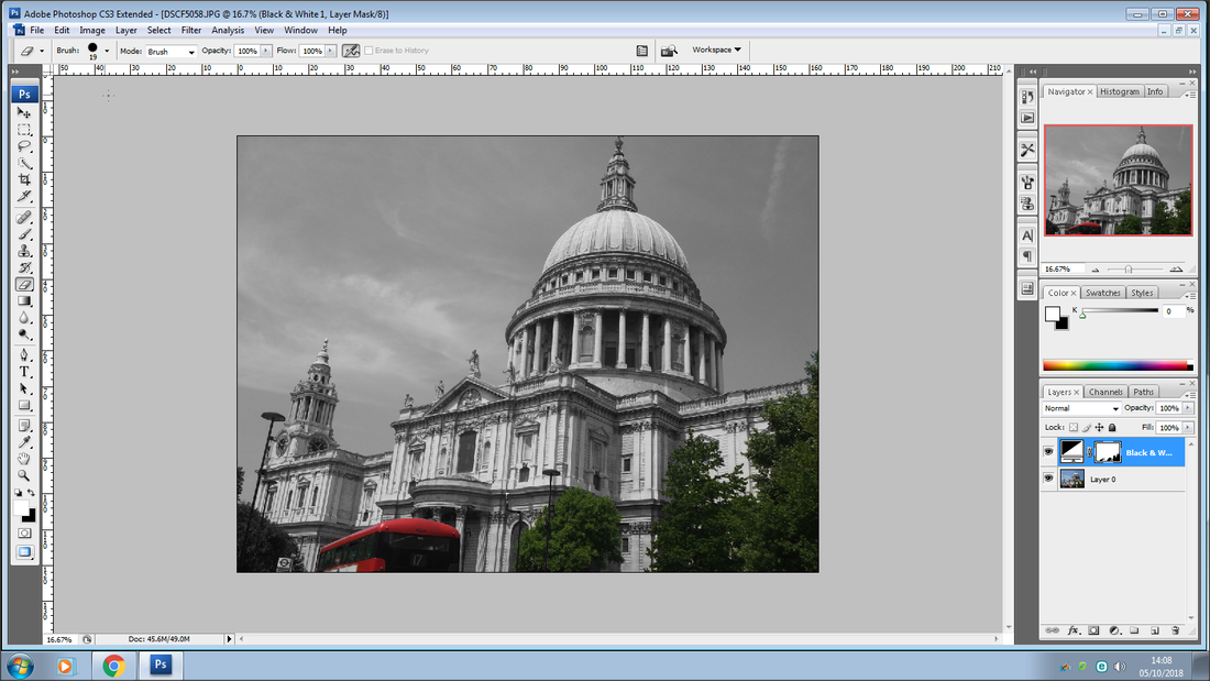
Second Image
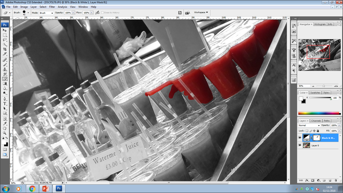
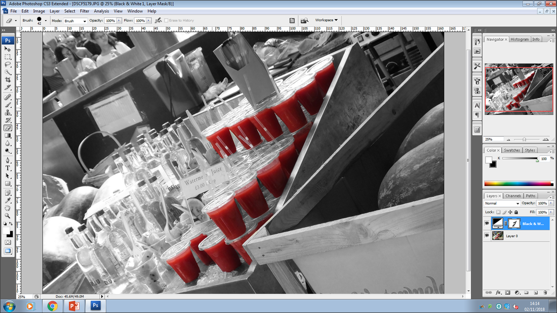
This is my second image I experimented on with, in this image I have chosen a specific colour and side I am going work with, however I have stillm kept it quite simple.
Third Image
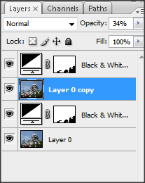
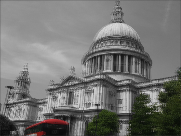
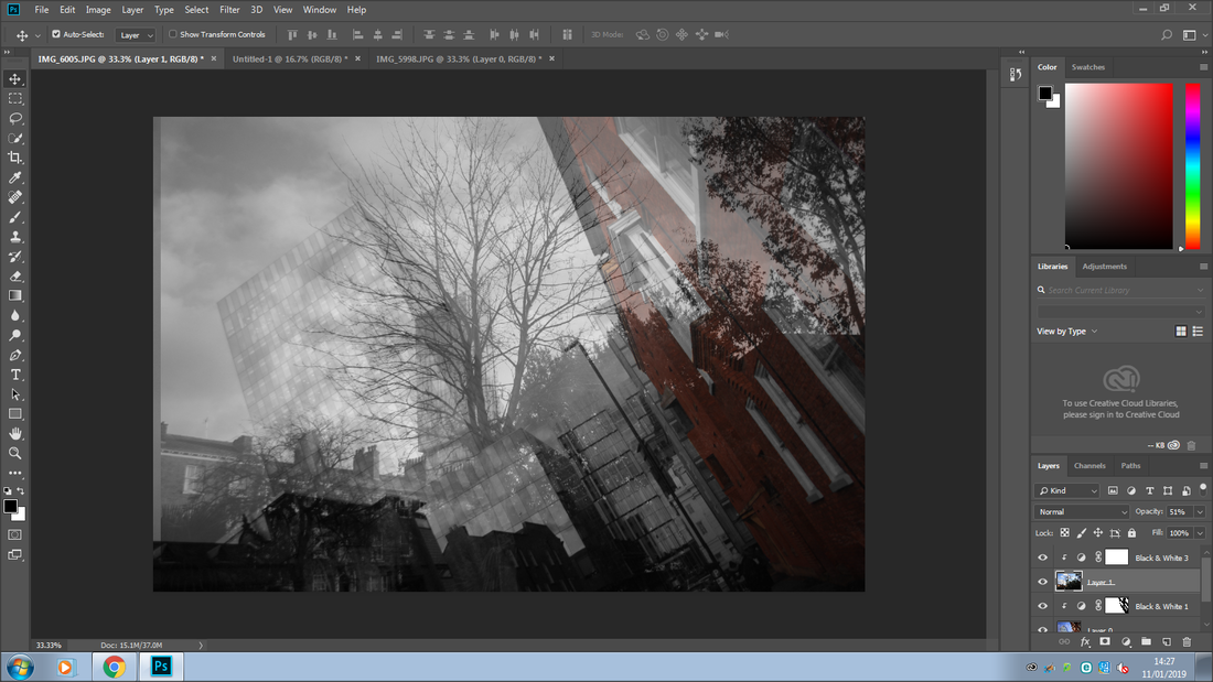
Developing my image
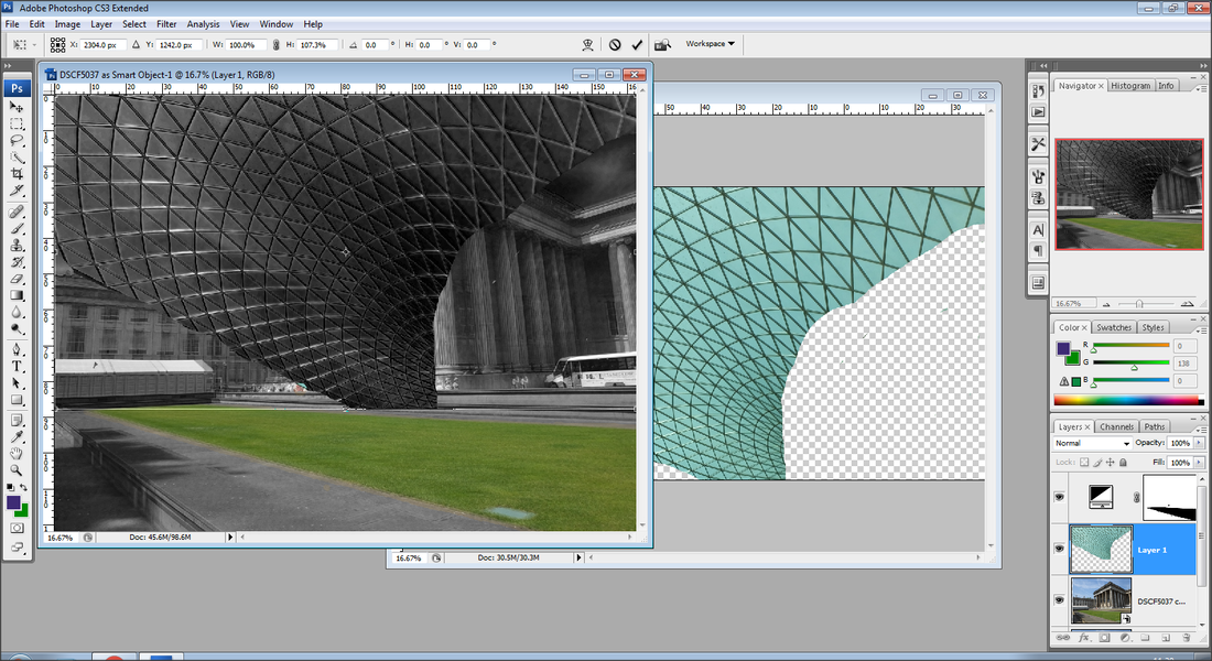

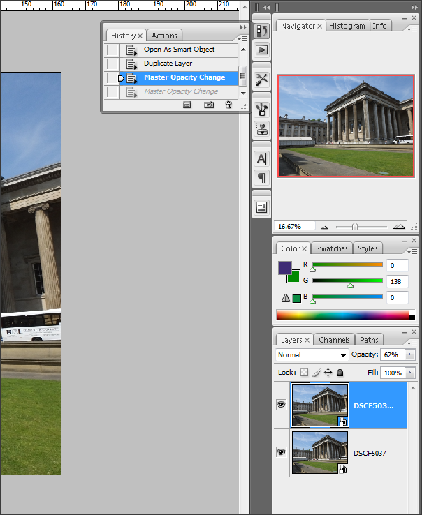
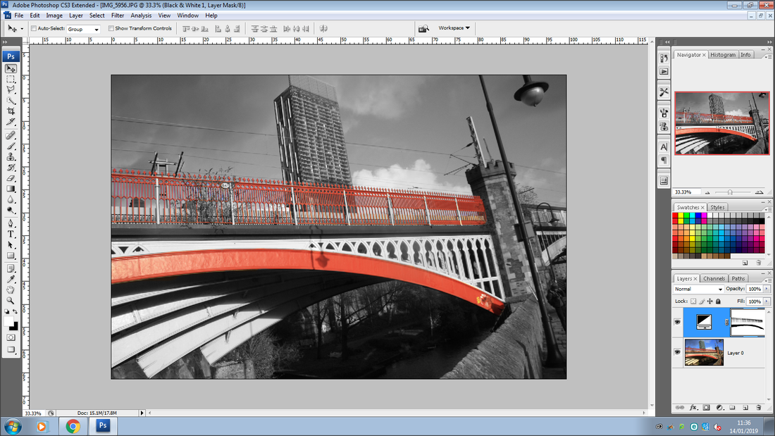
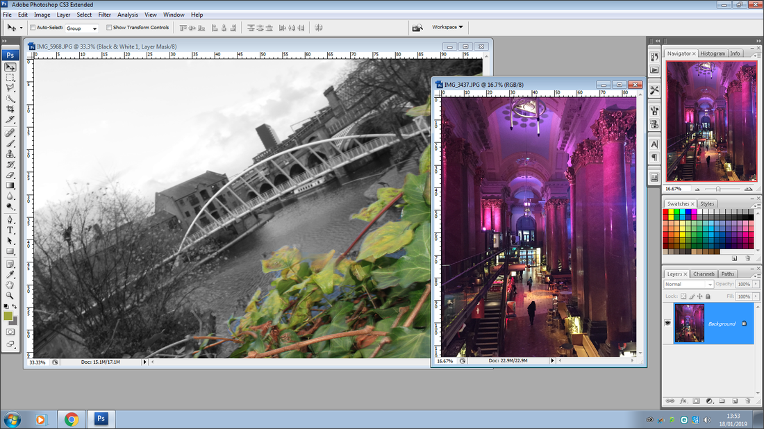
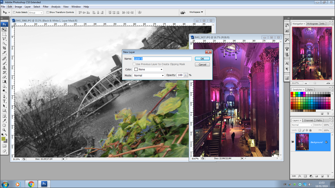
This is the third image I experimented with around the theme selective colouring, in this image I have added an extra layer and changed the capacity to give it a 3D look, to develop this image to a further level I have chosen a design from another image and copied it onto this image onto the sky. In this image I have also exposed a bigger amount of colour as well which makes it stand out more.
Fourth Image
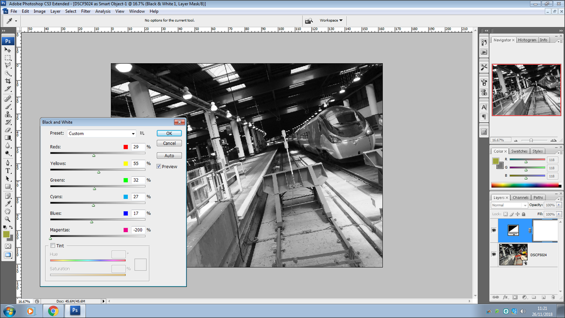
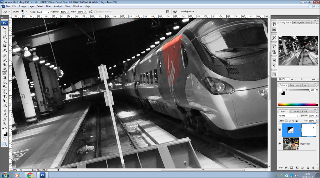
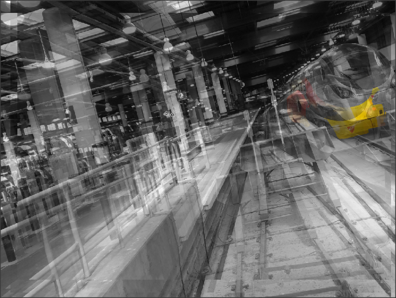
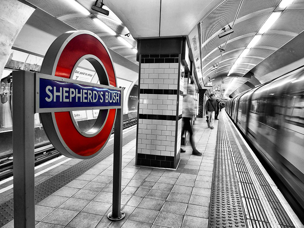
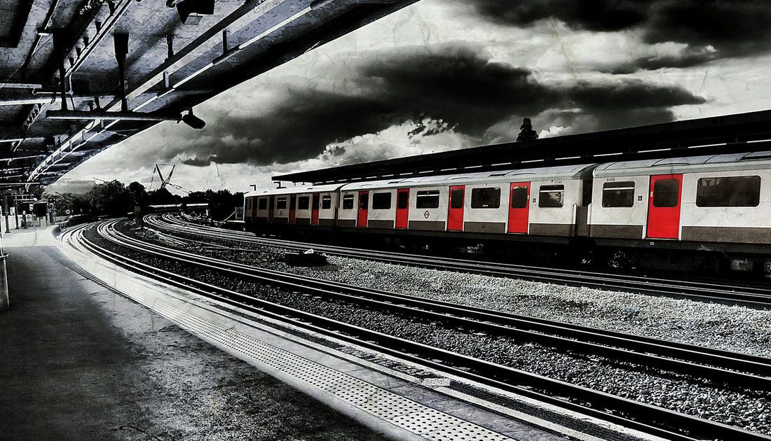
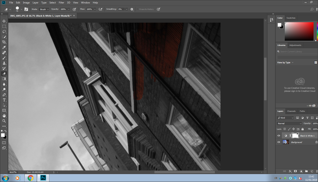
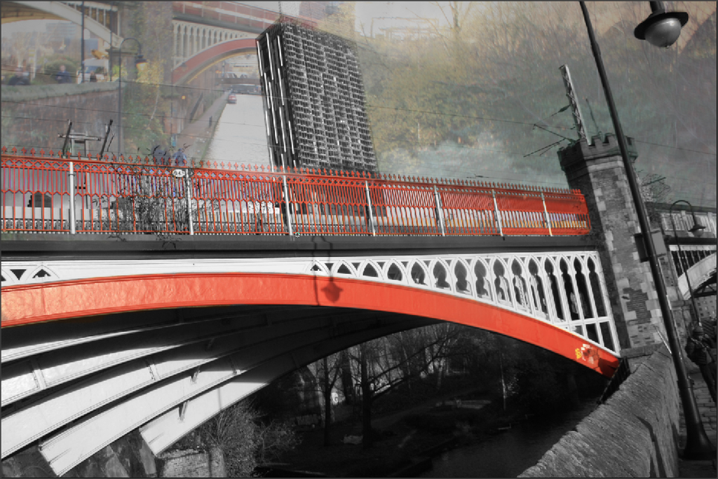
For my Fourth image I specifically selected the original colour of the front of the train, where as I left the rest of the image black and white. This is another example of the theme selective colouring. I then developed my image to a further level by adding multiple layers on top of each other to give it a weird effect.
Fifth Image
Sixth Image
Seventh Image

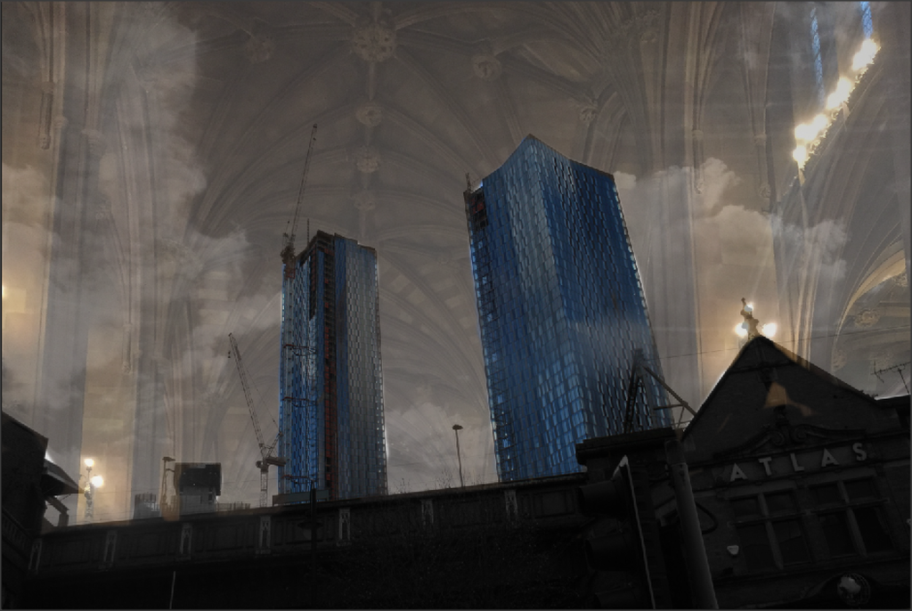
Development On My Manchester Images
To develop my images further, I am going to continue with my theme, however I am going to use my Manchester images and develop them on Photoshop.
First Image

Second Image

Third Image

Fourth Image
Final Outcomes


Developing My Final Outcomes

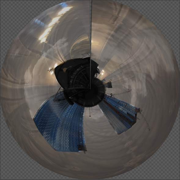

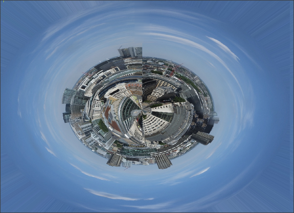
Development On My Globe
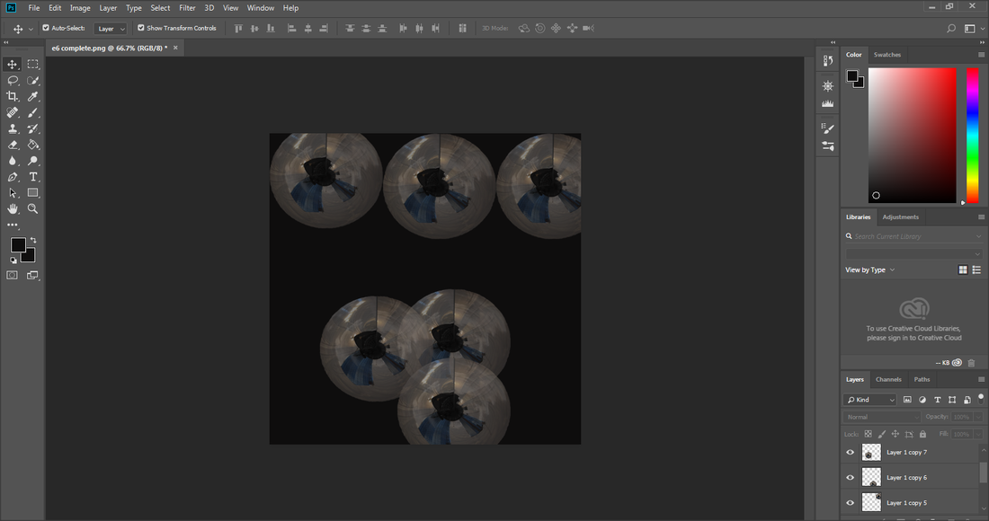
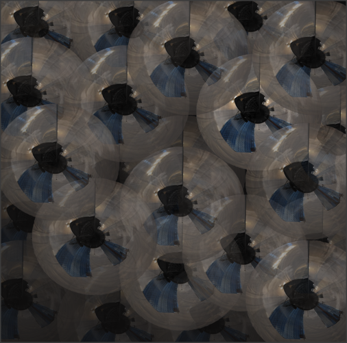
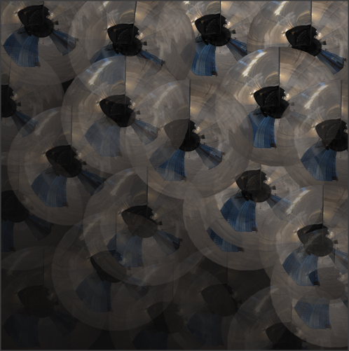
I have developed This image by making the globes fade away as the lower they go.
EVALUATION
The project that I have been been working on for the last year is 'LANDSCAPES', the reason this project took quite a long time is because we wanted to visit different places to catch the different seasonal times of the calendar, for example, in summer 2018 we went on a trip to London to capture urban landscapes, after that in October 2018 I went on another trip to Formby Beach to capture the autumn landscapes of the different trees, nature out there, and finally in December 2018, I went on another trip to Manchester town to catch the urban landscapes, however we went as it got dark to show the contrast on the daytime London landscapes to the nighttime Manchester landscape. Also on the side I went to Salford Quays in the evening and captured the lights of the buildings and the river on my phone as an extra piece of work.
I found this project quite creative and also a lot of thought and research was done to find some ideas and inspiration for my work, however overall I quite enjoyed this project as it taught me new things and also visited places I have not been before.
The area of the project I enjoyed the most was capturing the images for my project, because for every gallery of images we went to different places around the city and country to capture the perfect images and the perfect season, however during the experience of capturing the images I had to play around a lot with my camera settings, the setting I had to change the most was the aperture as the light changes through out the day therefore effecting the lenses and light on the camera.
Throughout this project I have learnt many new features and techniques on Photoshop, I have learnt how to use selective colouring on my images and also how to layer them on top of each other, however changing the opacity on the second layer so it blends in with the first layer. This has given me more confidence and also has taught me new things which will be helpful with using photoshop in the future when developing my images. Also during the experience of my landscapes project it has shown me things that I have never considered as being within the theme 'landscapes', this has also broadened my knowledge and has also made me think on a deeper level and also more of the creative side when working on a specific theme.
Throughout this project I have researched a variety of photographers for help, ideas and inspiration for my work. I used two main photographers for my project, the first photographer I used for my artist research was Irene Suchoki, Irene has captured many images of urban landscapes around the world, and her photography has helped me quite a lot with my images, as they have given me help on the type of angle and techniques I should be using to capture my images. The second photographer I used is Nico Goodden, I used her for my Photoshop ideas, as my theme for Photoshop was selective colouring and Nico Goodden's images were mainly based around selective colouring.
During this project the most enjoyable technique was developing my images on Photoshop, as I started my images with simple selective colouring, then went on a journey and started to add other layers making more deigns in my images. Also I feel all my outcomes are my most successful part of the Landscape project, as it shows my clear journey, and also shows how I have gone from a simple image when using selective coloruing, and then going on to how I have developed my images further.
During this project the main problem I faced was when capturing my images, as I constantly had to change my aperture for the lighting, at first I struggled to get my head round it, so I asked for help and then worked out how to change my camera settings every time the light changed, this was useful and quite helpful to me, because as we go out to capture the images the natural lighting is changing constantly throughout the day, and also depending on the type of area you are in, whether you are outside, inside or in shade.
If I had the chance to do this project again I would like to visit new places, to capture images for my urban and natural landscapes, also I would like to push myself on a further level and learn new skills on Photoshop to develop my images to a further extent.
Overall I am proud and happy with my landscape project as I feel I have shown a more creative side of me and also have shown a clear journey throughout this project, of how I started to where I have finished with my developed outcomes.
