2019 Photography Exam
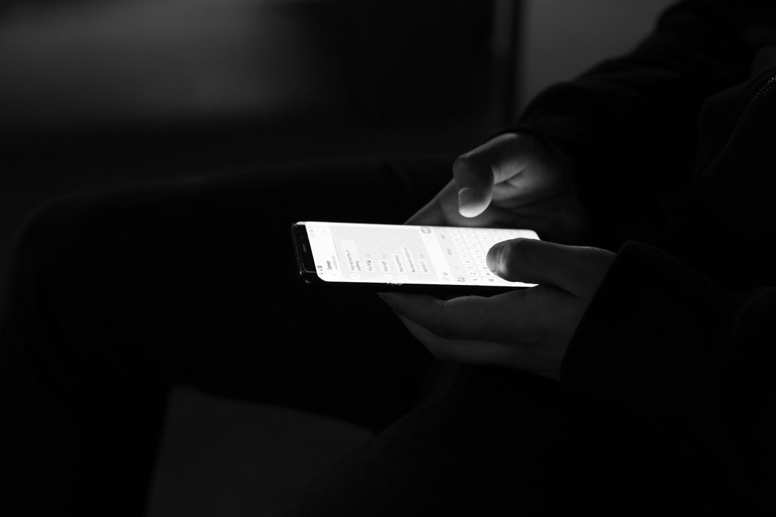
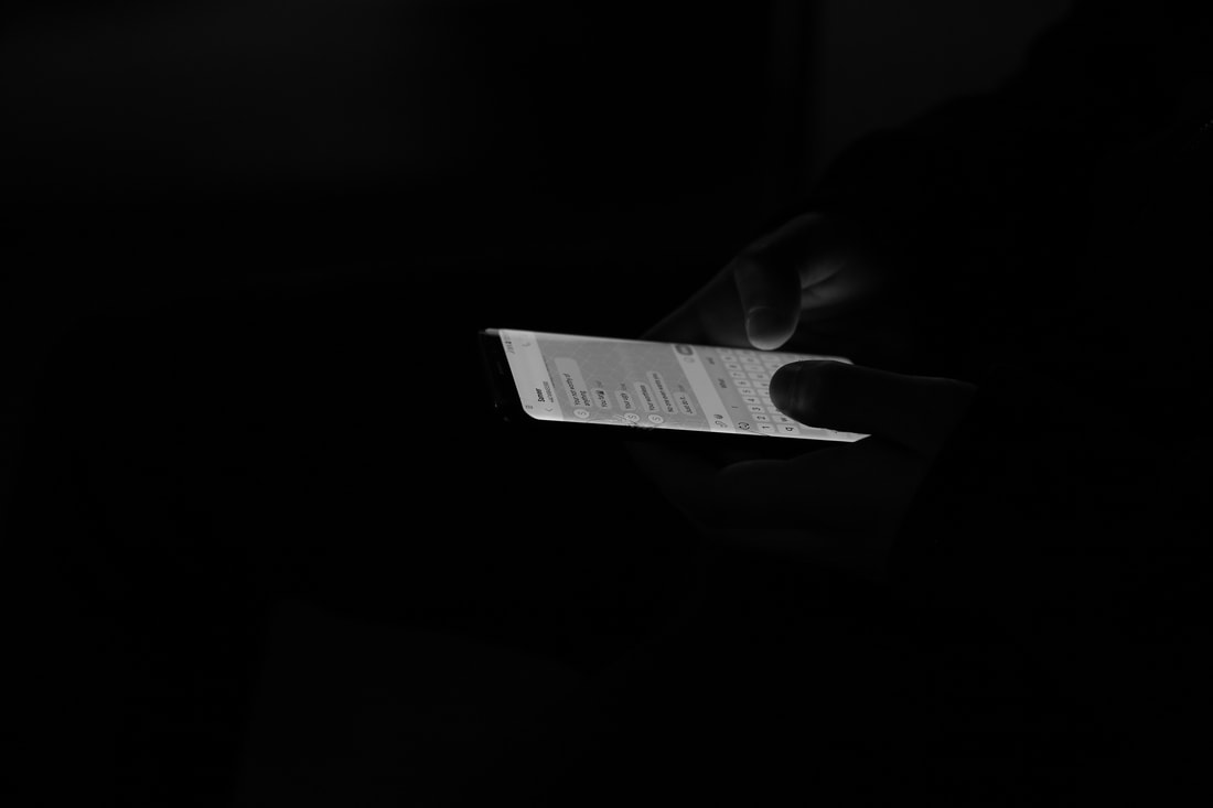
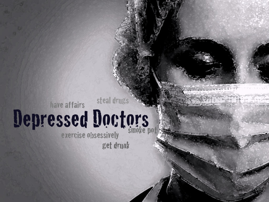
Q.3 MESSAGES
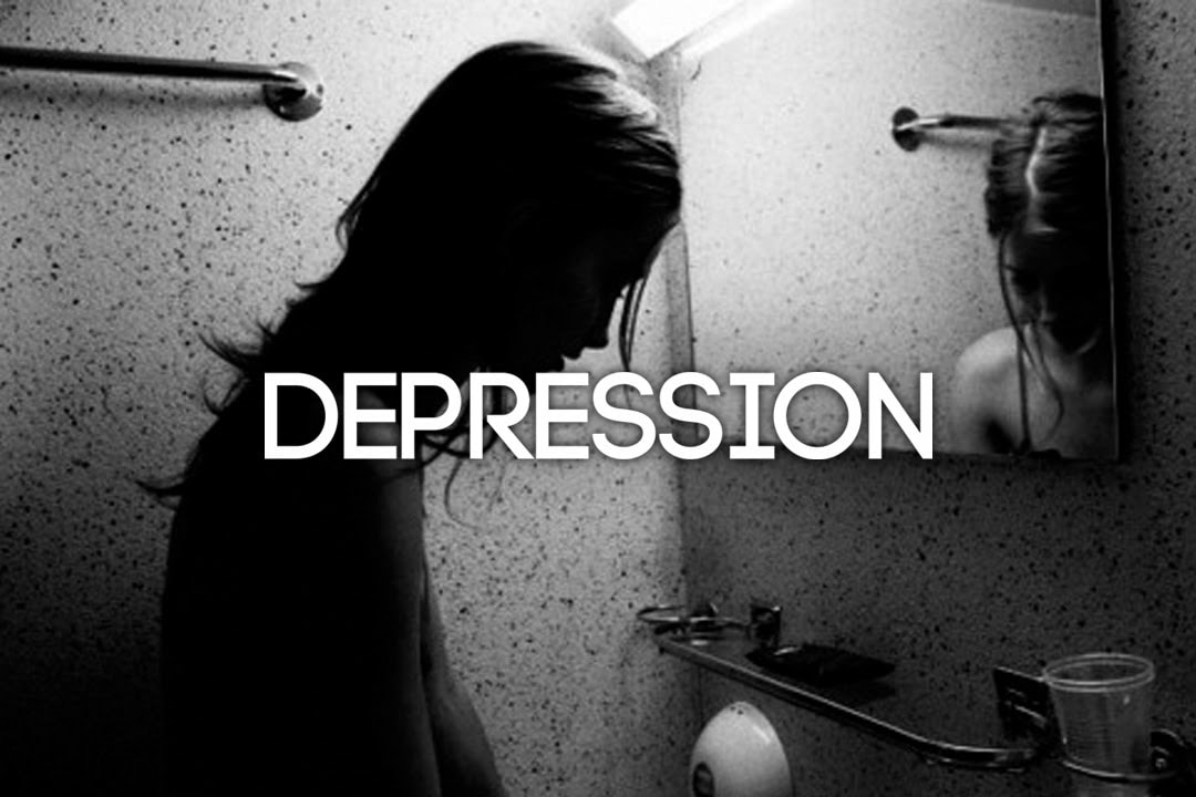
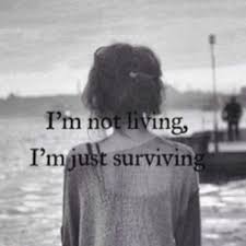
"DEPRESSION ISN'T JUST BENG A BIT SAD.
IT'S FEELING NOTHING.
IT'S NOT WANTING TO BE ALIVE ANYMORE..."
J.K ROWLING.
IT'S FEELING NOTHING.
IT'S NOT WANTING TO BE ALIVE ANYMORE..."
J.K ROWLING.
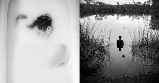
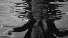
Statement of intent
I aim to produce a portfolio of varied of photographs demonstrating my ideas, research and development around the theme 'messages'. When deciding my exam question, I deeply thought on what was the right choice for me, and which theme would give me an effective final finish. I had my mind on a few questions however this theme connected with me the most. Throughout my coursework I have struggled to get my thoughts and messages across, however this question enables me to express myself and also to give messages out there to people, this also gives me a chance to show my creativity through varies of different ways. I selected messages as it covers many themes and thoughts which allows me to display many different ideas.
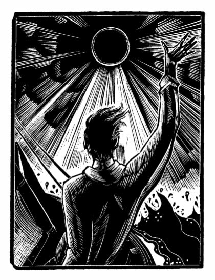
For my initial research I will start by looking at photographers who give messages across in there images, this will inspire and also give me many suggestion and ideas on how to develop my own images. The first photographer I have started to look at is Barbara Kruger, who portrays in showing messages through silkscreen prints, her work really speaks out to me, and has also given me inspiration on my own work. Secondly I have been moved by Martha Rosler's messages in her photography, as she combines words and phrases within her photos to convey a message across, her messages are based around political positions with a strong graphic identity. I chose these two photographers because they both display different ways of looking and getting a message across out there to people. I am also aiming to look into Edwards Honaker's photography, who is famous for portraying his own document of his own depression in a powerful way, his series of photography allow us to understand his suffering experience with depression and anxiety. I feel depression is a theme with many pathways which gives a deep and emotional message out there to people who are depressed and who feel lonely and isolated, in this day and age people keep there feelings and depression to themselves and I feel they should speak out about it to people for help and advice.
When I first chose the theme 'messages' my initial thoughts were motivational messages and quotes for people to relate to, however after doing my research and thinking thoroughly about it, I realised there are many more routes for my work to go down, such as messages to make someone feel a certain way, cyber bullying is also a message that gets across to someone, also messages to make someone feel left out, or messages to make them feel good about themselves. Also you can have messages you wish you gave to a family member or someone close to your heart before you lost them, or a message you want to give yourself in the future. All these are different messages to get across to someone, some in a positive way, although some in a negative way.
To show progression in my work, I will start off by doing my shoots which will be around the theme depression. I will then develop my work onto using photoshop and writing on my images different messages to make people feel depressed, lonely and unworthy. Finally I aim to print out some of my best photoshopped images as I want to design and put together my own book/script to show a story of depression. This will demonstrate a more creative side of me.
I would like to experiment with a wide range of techniques during this project. I am going to capture my images on a EOS 4000D DSLR Canon camera. However I may use my phone camera for outside of school shots. To develop my images on the camera I aim to use the black and white filter to show the theme depression in more of a deep and effective way, also the colours black and white connect with my theme quite a lot. I am then going to use photoshop on my images to develop them on a further level, and finally I am going to push myself on making a book/script as my final piece.
I have got until May 2019 to work on and finish this project, I aim to finish my initial research within the first week, then in the second and third week I hope to start planning and photographing my images, and also start to develop my work. In April/May I also hope to start planning and designing a book of my scripts I am going to make on photoshop. I will then have a 10 hour exam that will be split up within 3 days, after the exam this project will be completed with the best of my ability.
As my project progresses I will be going through my previous work on this project and improve on them to make them better and more effective which will allow me to gain more marks and also give me higher grade, this will also give me a chance to reflect on my work. I will mainly seek advice from my teachers and peers on how to make my work better, as I am always aspiring to push myself to the next level, to get the best possible final grade for my photography GCSE. After the final creation of my project, I will write an evaluation on what went well and what I would of differently or change given the time.
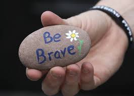
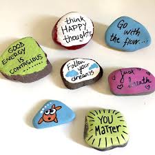
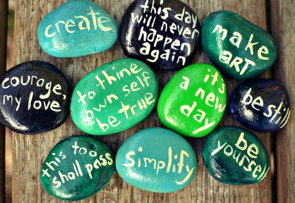
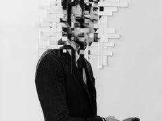
Mood-board

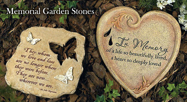
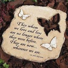
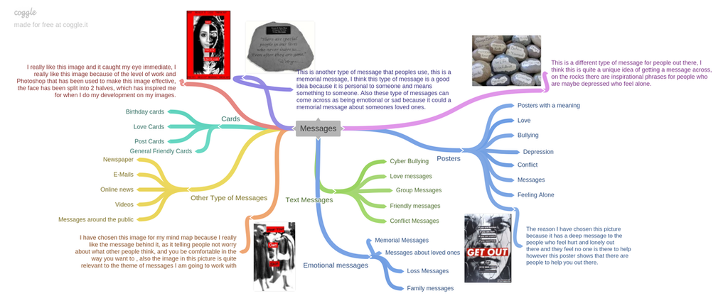
Mind Map For My Chosen Theme
Artist Research
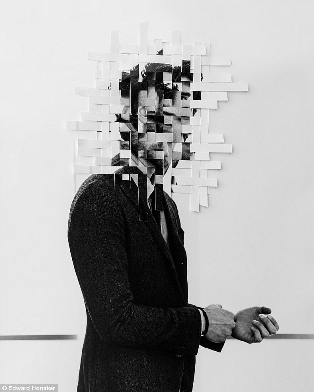
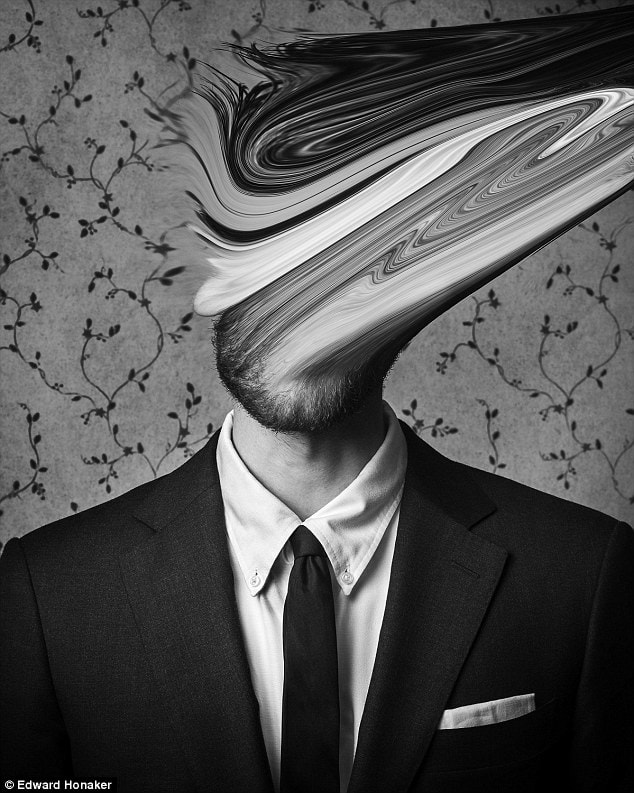
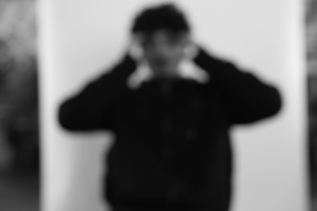
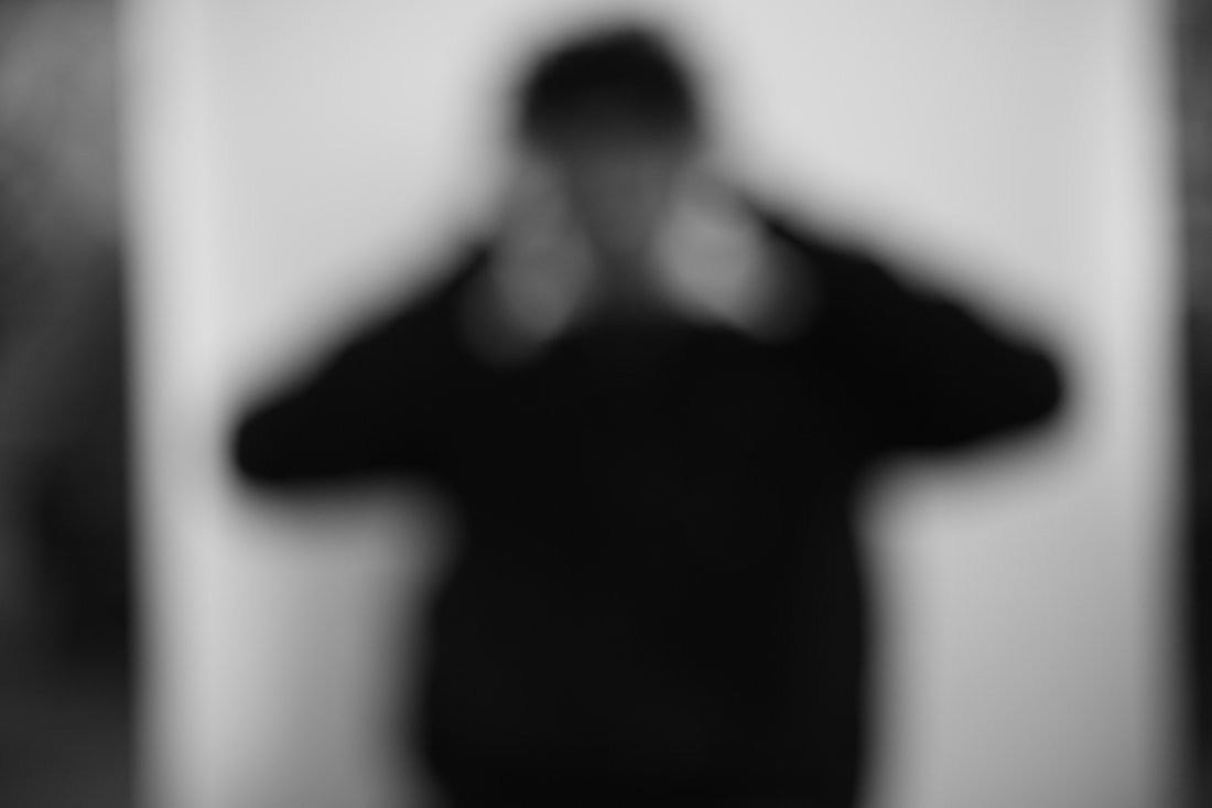
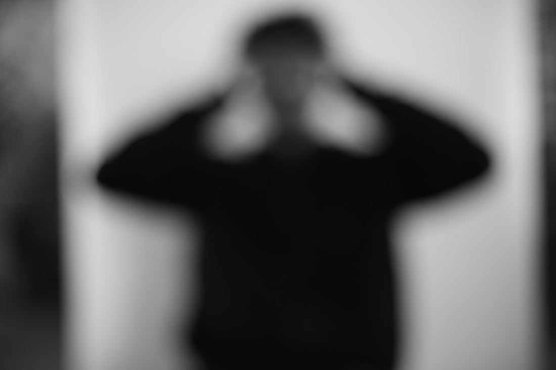
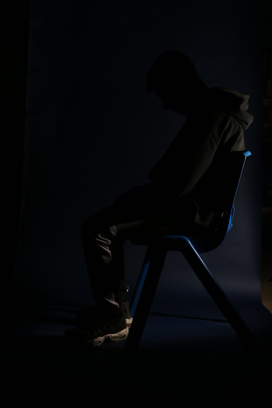
Edward Honaker
Edward is a photographer who's images I have connected with the most, and also I have chosen his for my artist research. Edward portrays his own document of his own personal experience within his images. Edward captures a series of images which illustrates his experience with depression and anxiety. Edwards photography really links with my work as the theme I have chosen to base my messages around is depression and feeling alone.
Examples of Edwards work.


Content/Composition-
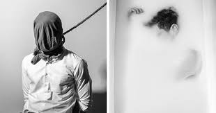
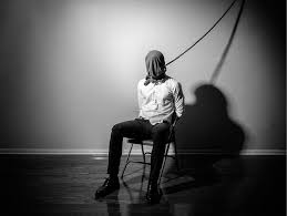
The main attraction in this image is the man that is sat on the chair with a rope rapped around his head, that has been placed in the middle of the image. The colours main colours in this image is black and white, the colours in this image really stands out to me as it connects with the theme of the image which is depression and suicidal thoughts. To me this looks like a recent image as it is clear and you can tell there has been many new techniques that has been used, such as the change of aperture within the dark room, and also the composition of the man. The man is the main effect of the image, which to me is showing that there are people out there who are doing this to themselves, which makes it more personal and emotional for the viewer. In the background there is only a blank wall with the shadow of the man and rope, to me this conveys he is lonely and isolated, and feels he doesn't have anyone.
The focus point of this image is the man sat on the chair, as he has been placed right in the centre of the image, this is the immediate attraction for the viewer, they have achieved this by putting a bag on a mans head with rapping a rope around his head. To me, the main leading line in this image is the rope that ties around the head, which goes up that could be tied to something else high up, to me it is quite a deep and emotional effect as it could indicate he is about to commit suicide, or has given up, as he is tied up to a rope he might be ready to hang himself, this could be quite emotional for the viewer as they could be quite relateable to this image. The lighting in this image is quite dark and harsh, which is a connection with the mood of the image. The boring, dim colours sets a negative mood and tone for the image, which shows something unpleasant and harsh could be happening in the image. I think there has been a large depth of field used in this image, as the whole image is clear and in focus, this allows it to be clear view so we can see the full image, and also see all the main event taking place. In my opinion the photographer has used a tripod to capture this image, to allow him to make a clear still image, this would be helpful as it will stop the image from getting any blurs or unclear areas. The image has been split up into two parts, there is the black floor and a white wall, which is a completely different contrast in the colours, this is also a easy eye catcher for the viewer.
Context-
"Edward is a photographer who's images I have connected with the most, and also I have chosen his for my artist research. Edward portrays his own document of his own personal experience within his images. Edward captures a series of images which illustrates his experience with depression and anxiety. Edwards photography really links with my work as the theme I have chosen to base my messages around is depression and feeling alone." (Research From the internet)
Comment-
To me there are many strengths to this image that Edward has used. He has thought carefully about the type of colours the man should be wearing, and also the composition of the man, the composition of the man is quite an important aspect in the image because it is the main attraction in the image. Also to me there has been thoughts about the lighting and effect in the room which does have an affect on the mood of the image. This image has really inspired me for my own work and also have given my ideas on what kind of things I should be capturing and how to capture them in the most effective way possible.
Connection-
This image links to my work because, to me the theme based in this image is depression, and the theme I am going to be working on with my chosen exam question 'messages' is depression, and also messages that make people feel lonely and depressed. In my opinion I think there is a clear message to this image, even though it is not written specifically on the image, I feel there a deep and emotional message behind it. To me the message for this image is to show there are people out there who feel lonely and depressed and they don't have any way of expressing themselves because they think there is no body out there to listen to them, and also for them the last result is suicide. I think Edward has put a black and white filter on this image as it matches up to the theme depression.
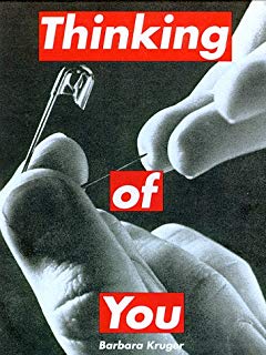
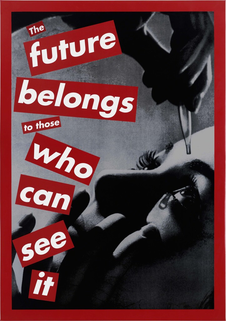
Barbara Kruger
Barbara is an American conceptual artist and collagist. Most of her works consists of black and white photographs, overlaid with declarative captions, stated white on red Bold Oblique or Helvetica Ultra condensed text.
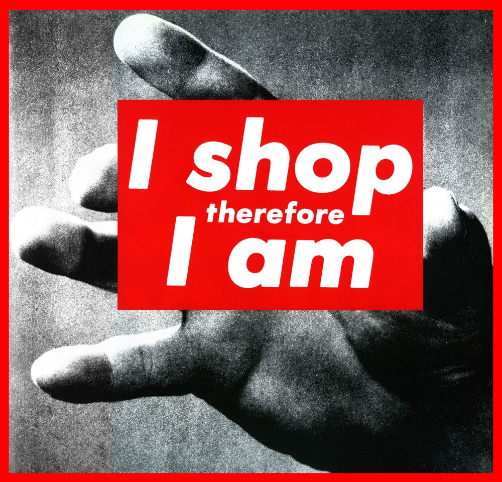
Examples of Barbara's work.
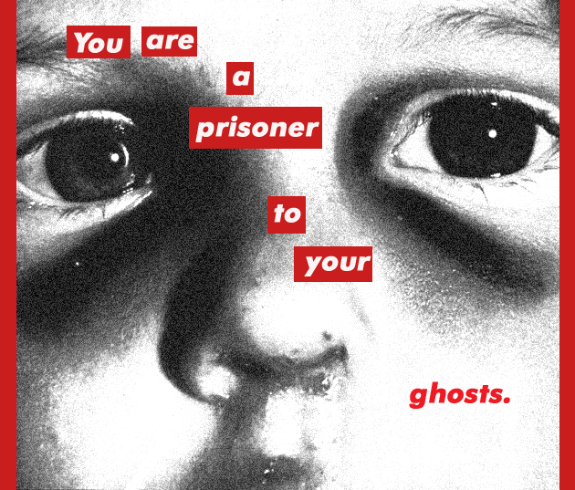
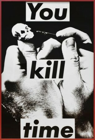
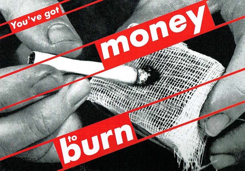

(Research From the internet) Content/composition-
In this image there has been a burning cigarette placed in the middle, which is the main eye catcher of this image. I think Barbara has specifically put a black and white filter on this image to connect with the deep and emotional message behind the image. I think this image has been captured in a studio as the background is plain back, and also is a close up image that is aiming on one specific object. I feel this image is quite old because it is not very clear and doesn't look as if newer techniques have been used, however maybe Barbara could of done this on purpose to put effect on the image. There is also big bold writing going across the image which makes the message clear and an easy attraction for the viewer, which makes the message quite important as it is big and needs to be an immediate attraction. There are no people used in this image, only a hand, this makes the image more effective and more emotional because it could be showing how people could be using there hands for the wrong actions.
The main focus point of this image is the hand which holding the burning cigarette. To me there are 3 main strong leading lines that go across this image which are where the words are written, they are big and bold to get an immediate message across and also to make it an easy eye catcher. I think Barbara has used dark lighting in this image to match the negative mood of the image. I think Barbara has used a large depth of field while capturing this image because the whole image is clear and in focus, this makes it seem like an important image as it has to stand out for the viewer. I don't think a tripod has been used, i think Barbara has taken this image free hand and have looked in the camera lens carefully while capturing this image. Barbara has used a black background for this image, this makes the hand more clear and stand out for the viewer.
Context-
Barbara's work really connects with my work as her work is based around posters which is mainly around the theme depression, her work has given me ideas and inspiration for my own work. I have done some research on Barbara she "is an American conceptual artist and collagist. Most of her works consists of black and white photographs, overlaid with declarative captions, stated white on red Bold Oblique or Helvetica Ultra condensed text." (Research From the internet)
Comment-
I really like this image because of the thought and detail that has been put in to show a deep and emotional message. Also I like the way she has made the words 'money' and 'burn' big and bold to make it stand out, this also shows the importance of the image she is trying to get across to people. To me the message behind this image is to show people are wasting money on buying cigarettes, which is technically burning money. Also it could show that there are people out there who are feeling depressed and anxious and this is there only solution for them to feel calm. This image inspires me as the theme I am working with is depression, and to me this image has a depressed message to it.
Connection-
To me I think the theme in this image is depression and negative thoughts, as there is a hand holding a burning cigarette, this connects to my work because the theme I am going to be working on is depression and messages that make people depressed and feel left out. This is image is black and white because I think it matches with the mood and theme of image, it also makes it more effective to the viewer.
Plan For My First Shoot
Test Shots
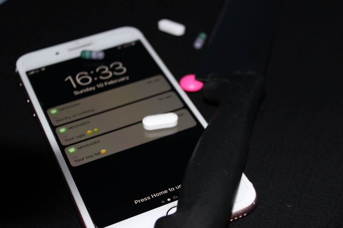
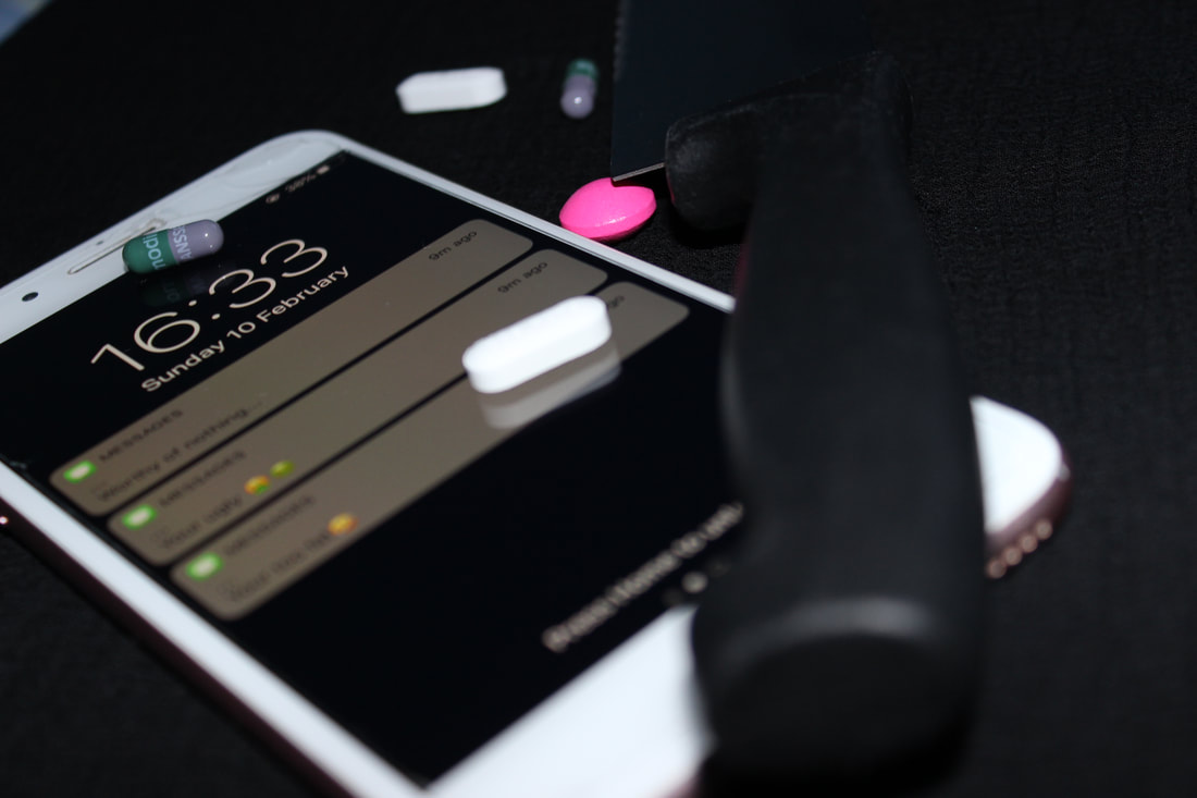
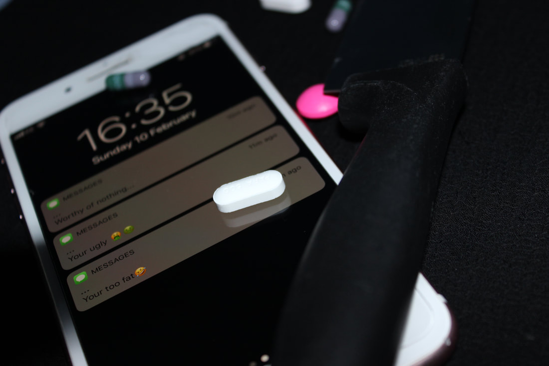
First Shoot
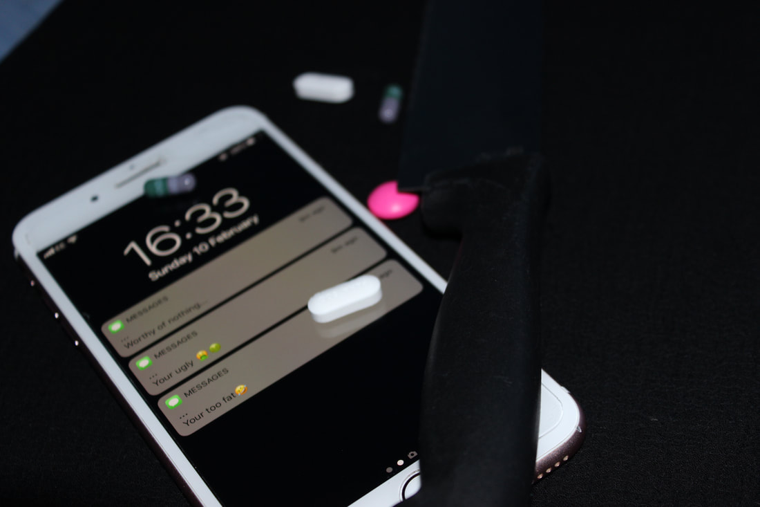
Best |
Worst |

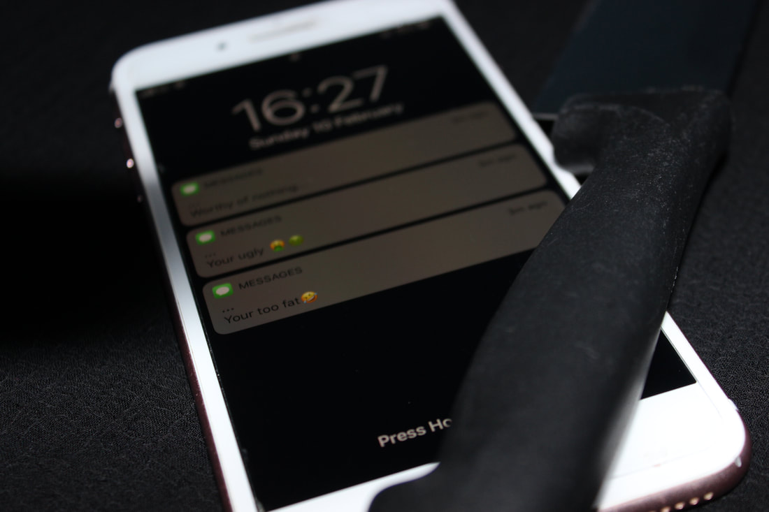
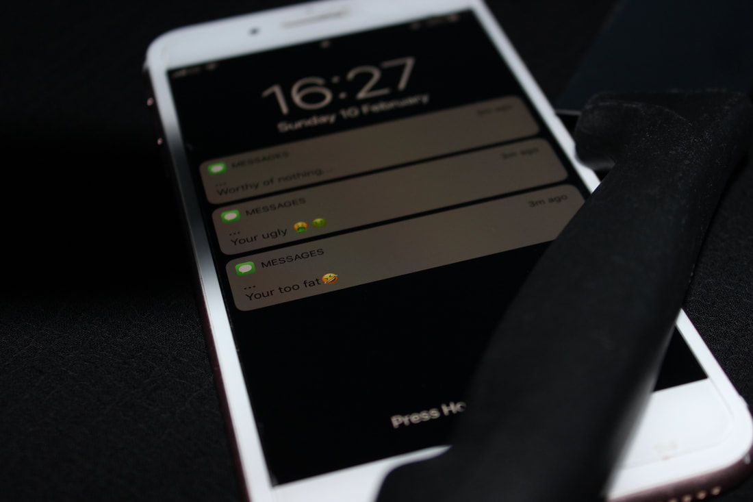
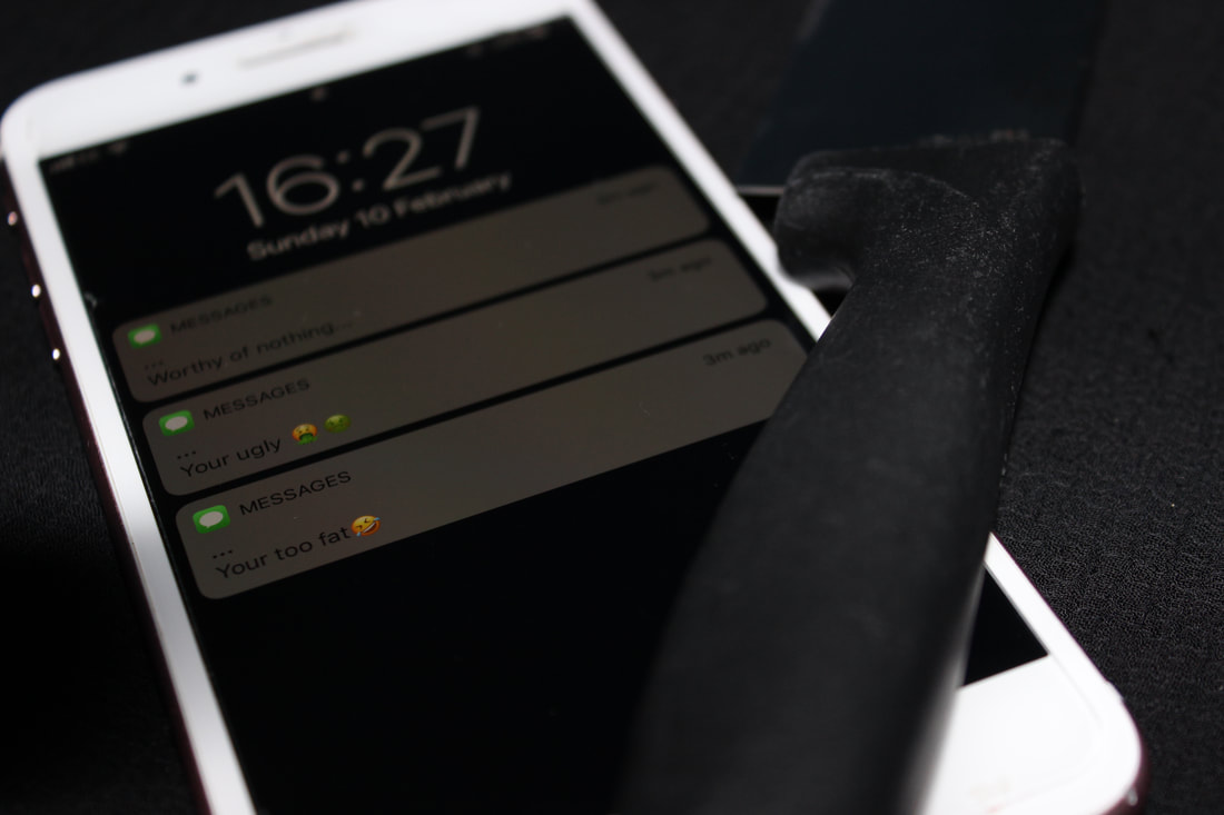
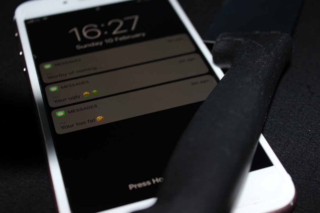
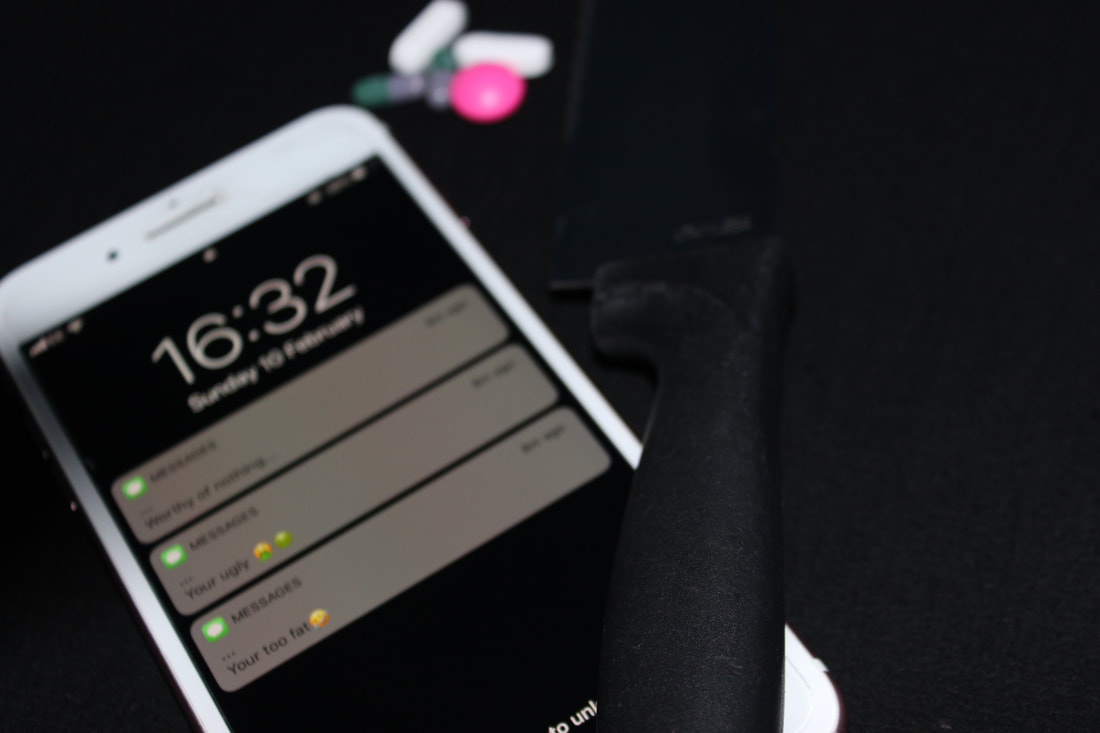
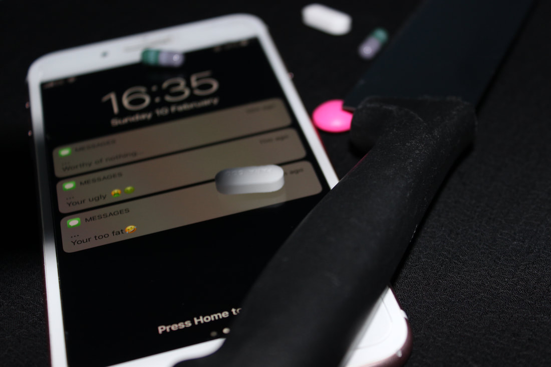
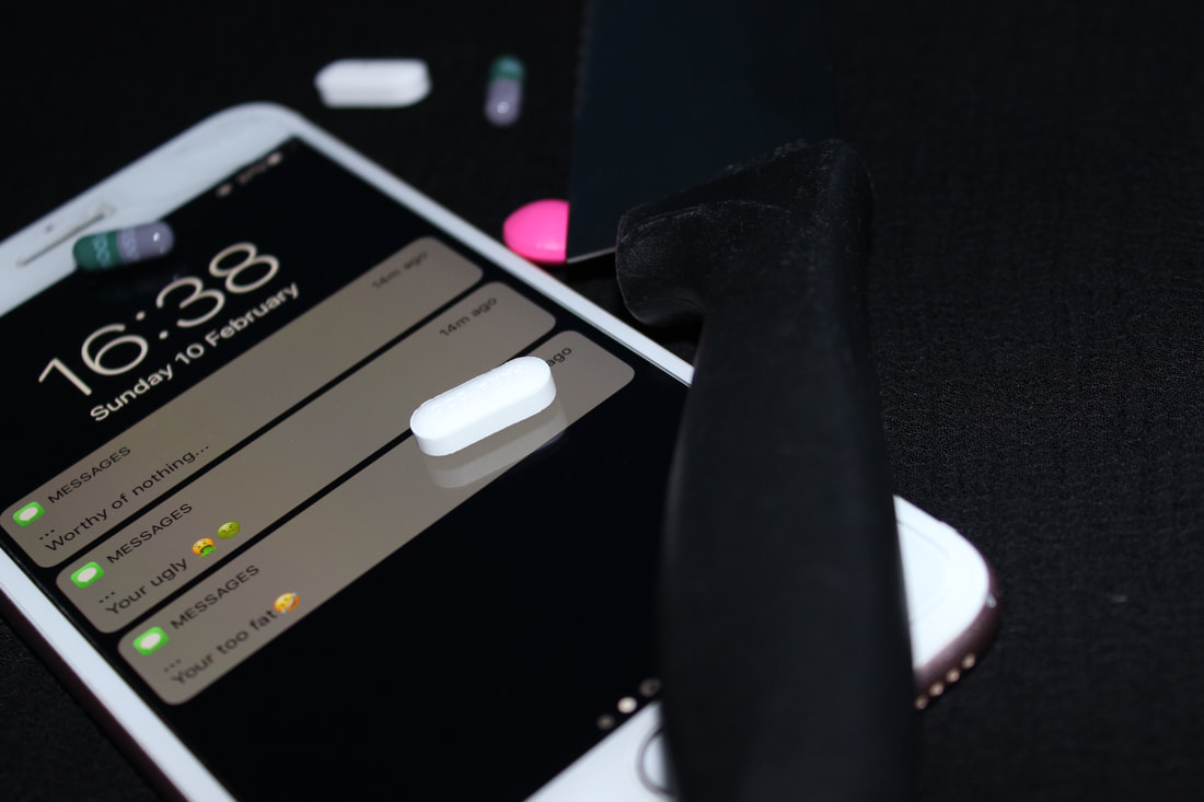
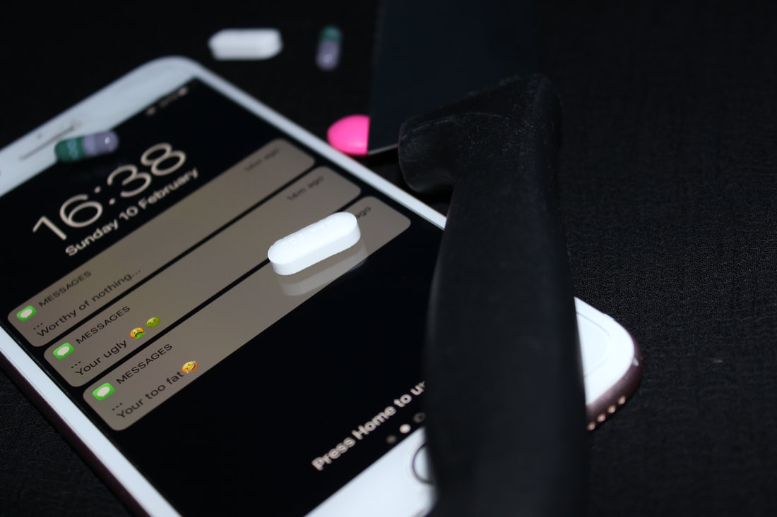
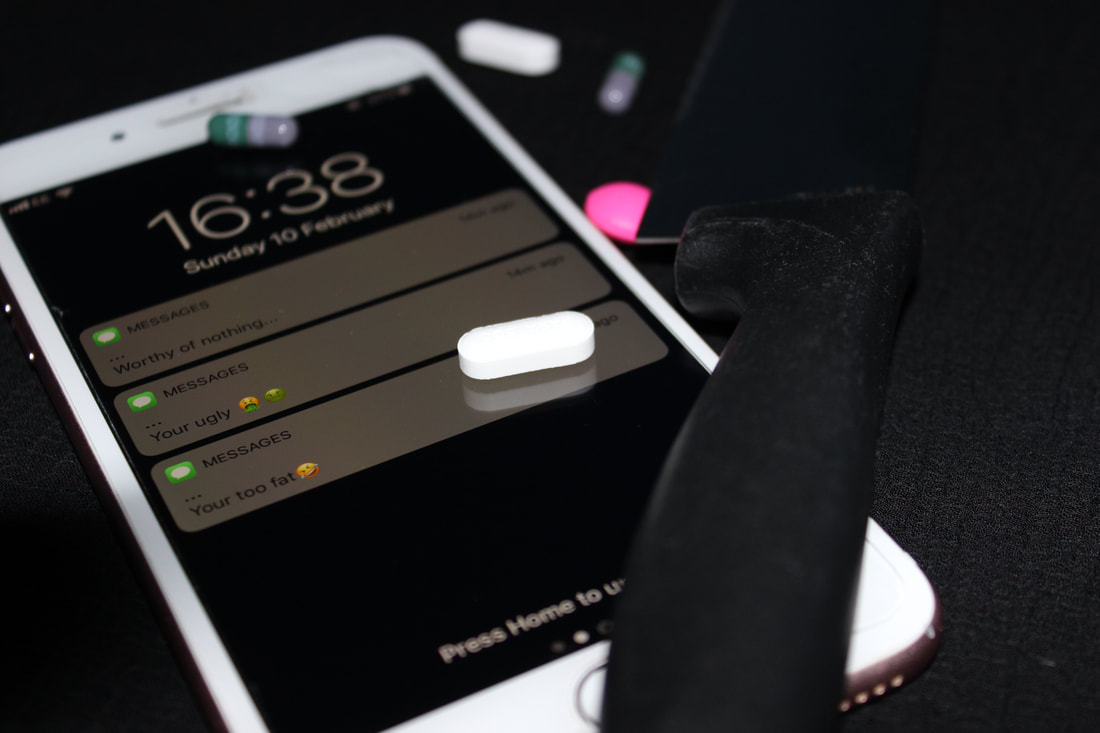
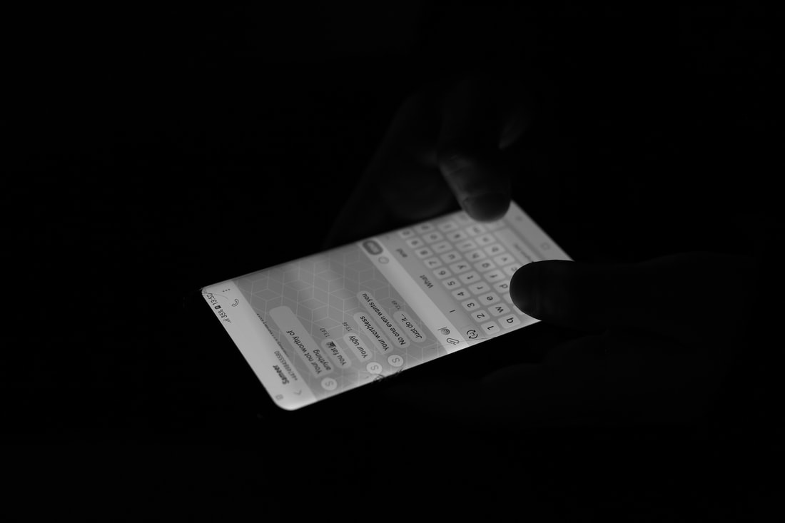
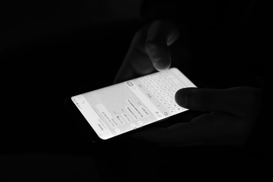
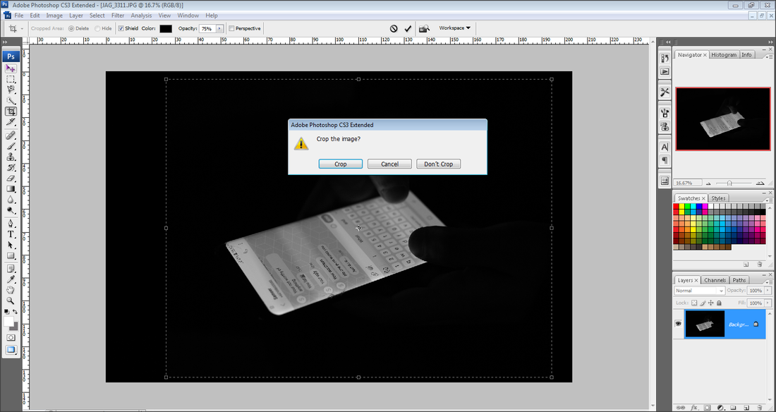
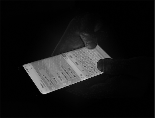
This is my best image from my first shoot because I have used a shallow depth of field, as I have made the writing in focus to make it clear, and have blurred out the background slightly. Also I have adjusted the aperture to make the lighting suitable for the image. I have also thought about the position of the knife and where to place the tablets.
|
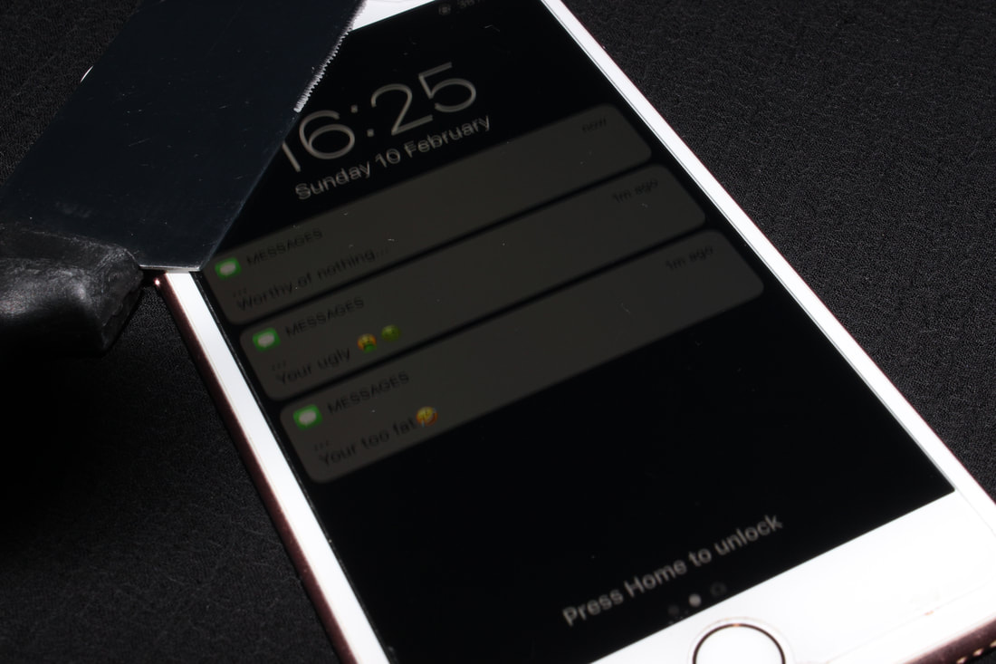
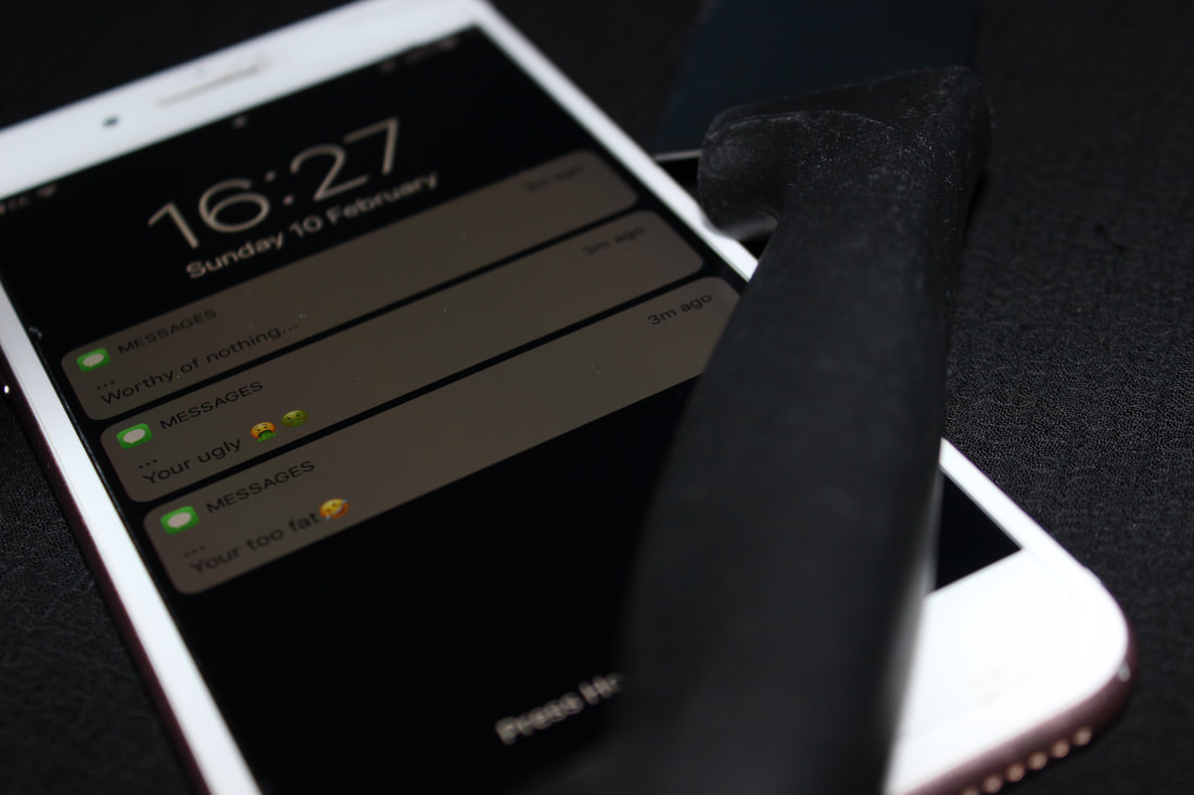
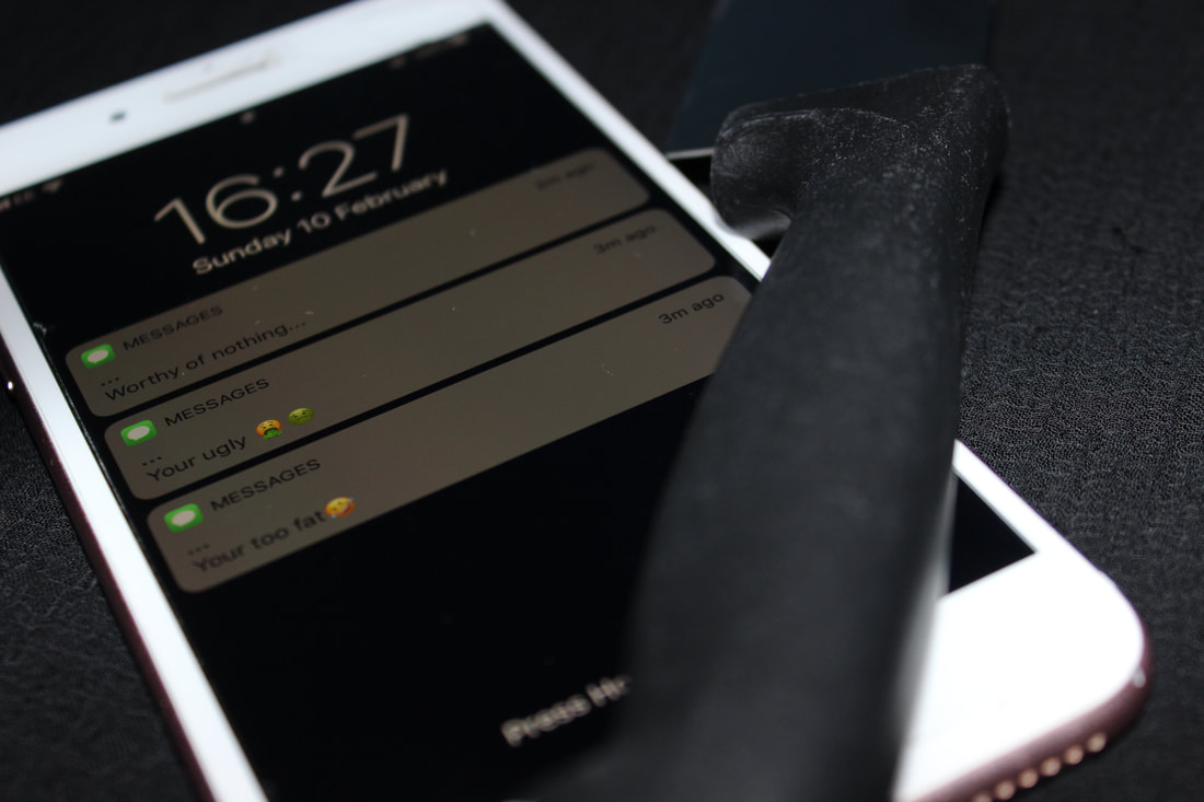
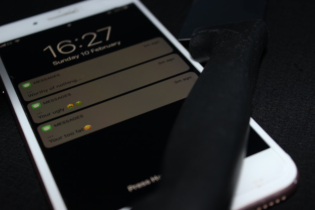
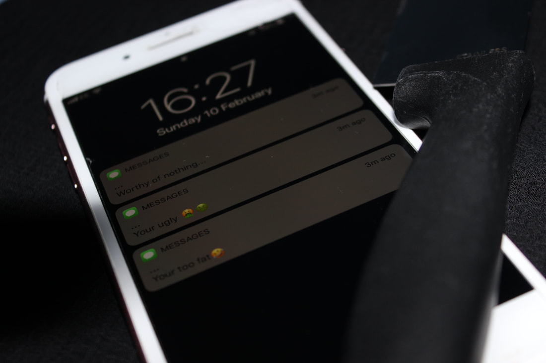
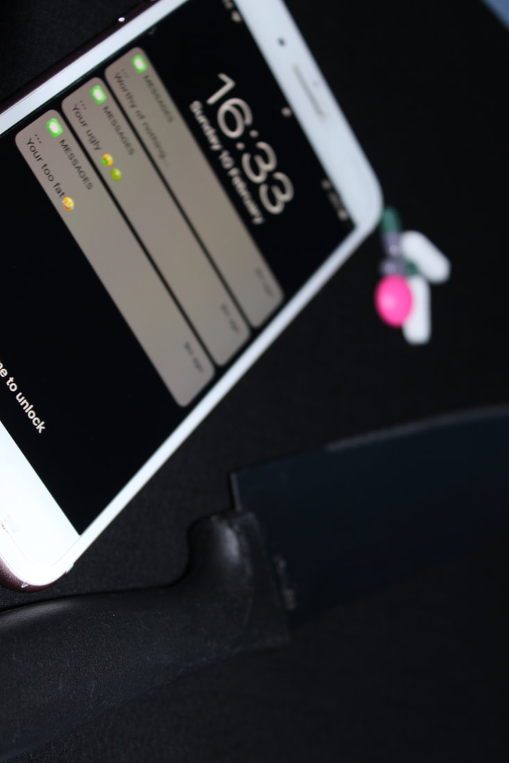
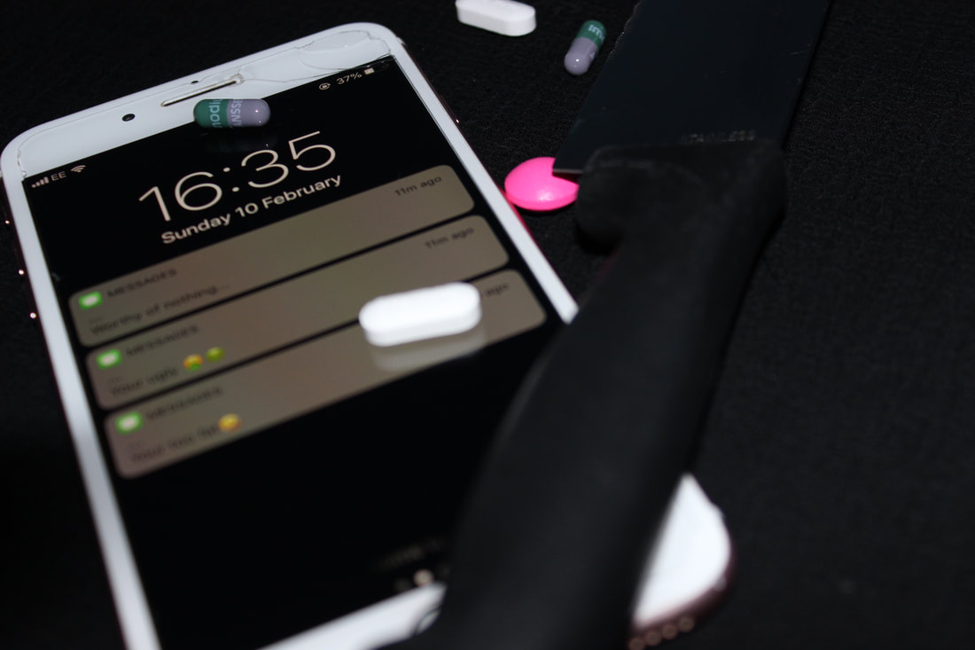
This is my weakest Image from my first shoot because it is dark and not quite in focus, also the messages on the phone are not clear and are quite hard to read. In this image I did not adjust the aperture therefore leaving the image quite dark.
|
Second Shoot
Best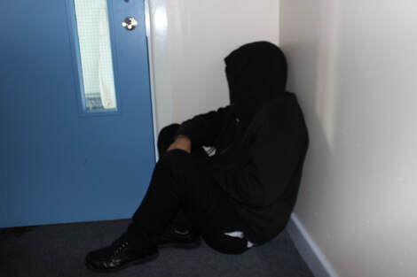
I feel this is my best image from my second photo shoot because while capturing this image I had to think about the composition of the model and also the lighting. This image is also in focus and clear for the viewer. While capturing this image I had to Play around with the aperture on the camera to get a good lighting for the image as it was in a dark room.
|
Worst
This is my worst Image from my Second shoot because the lighting is dark which makes the image quite unclear for the viewer. Also the side of models face is showing where as my intentions for this shoot was to keep the face hidden to hide the identity of the model.
|
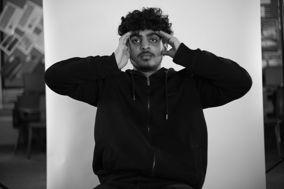
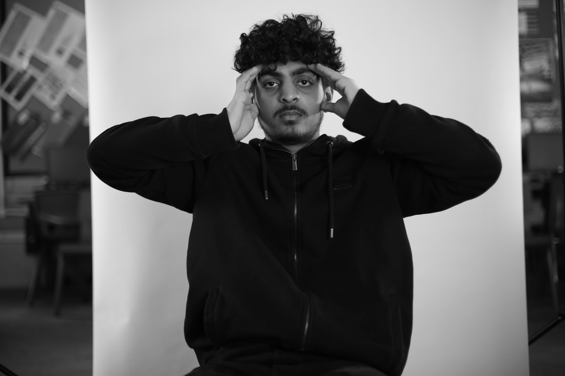
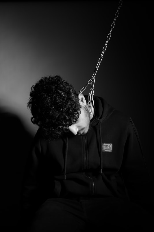
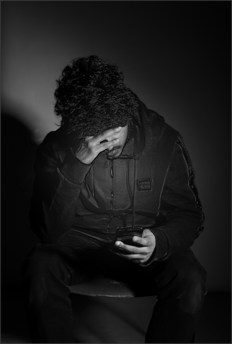
MY PROFESSIONAL SHOOTS
Shoot Set Up
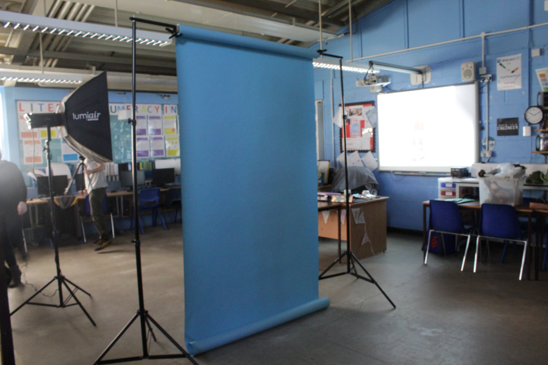
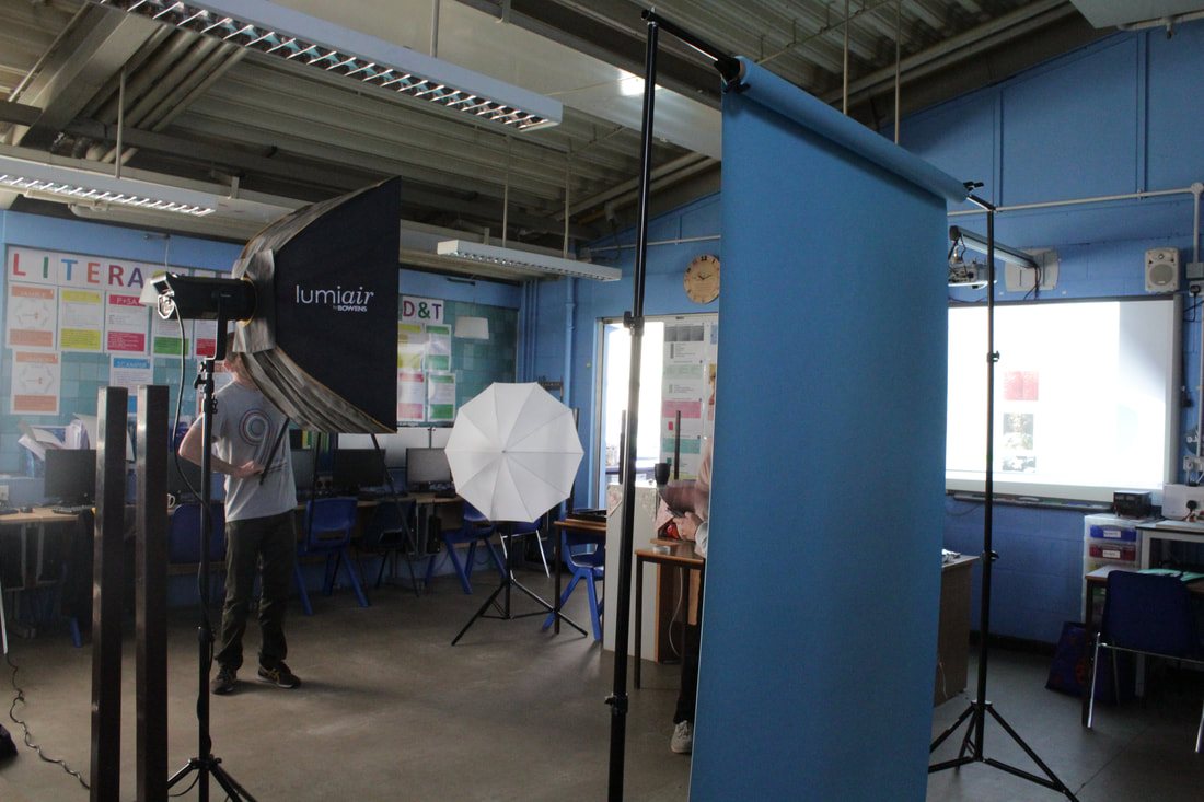
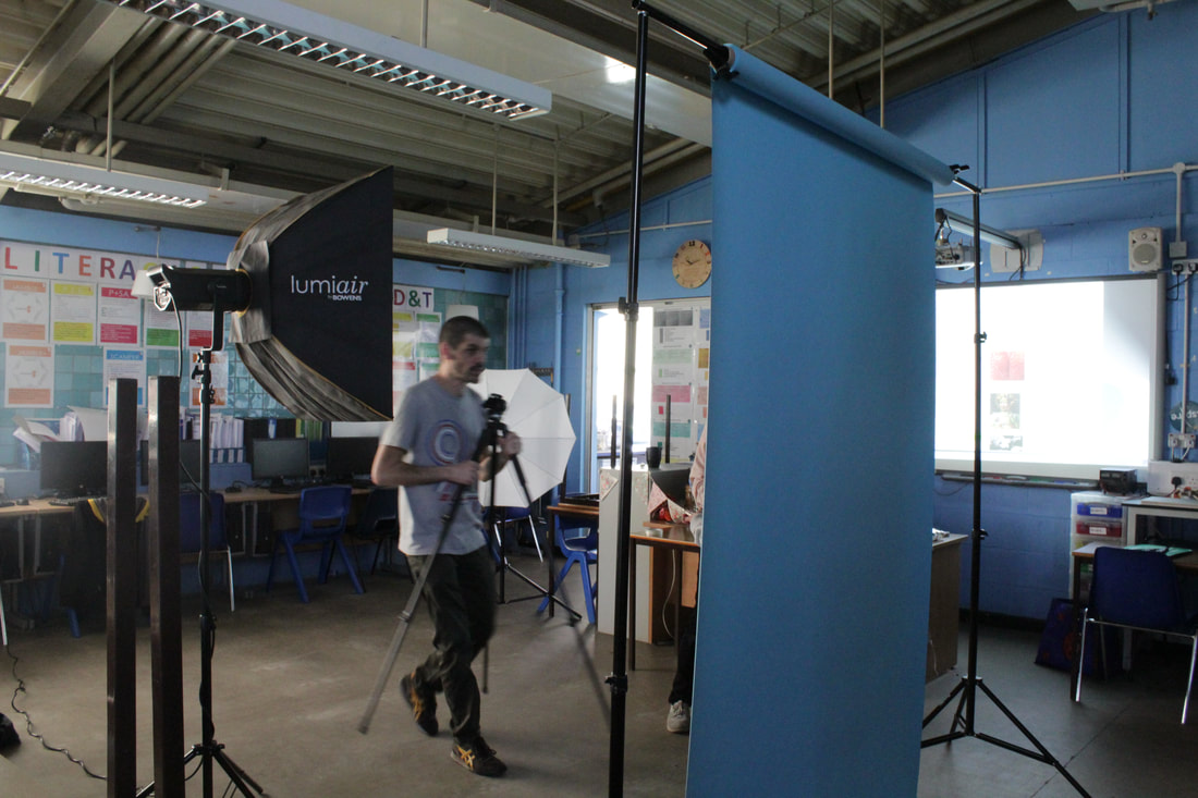
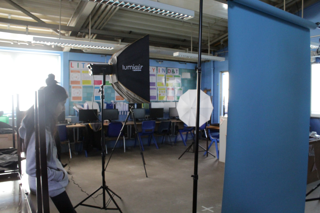
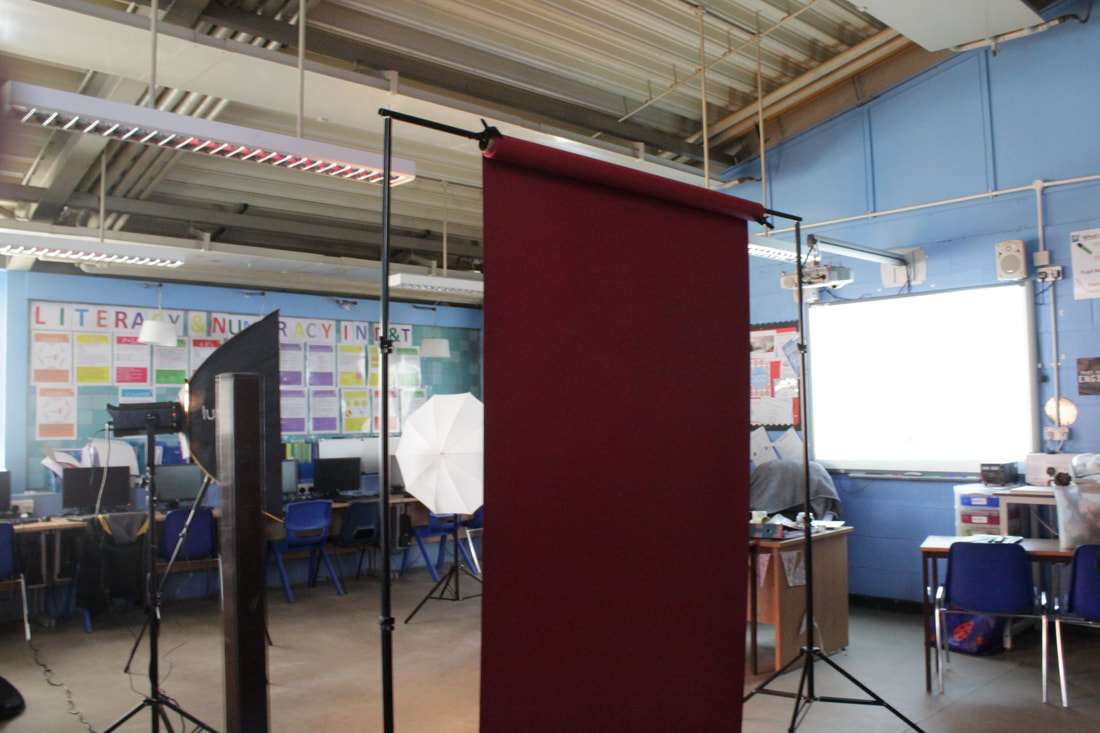
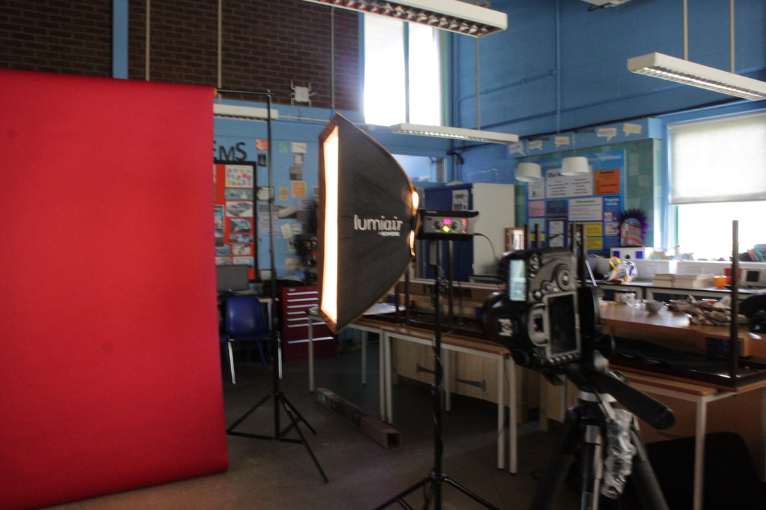
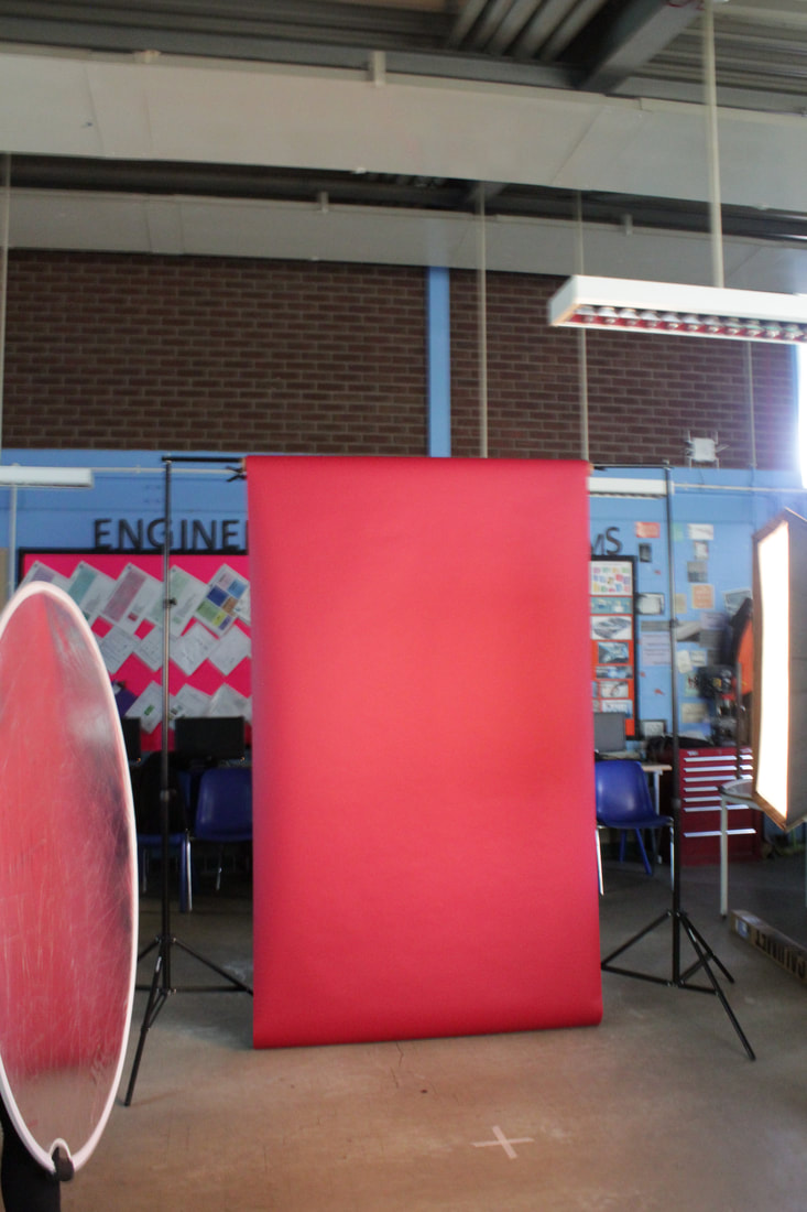
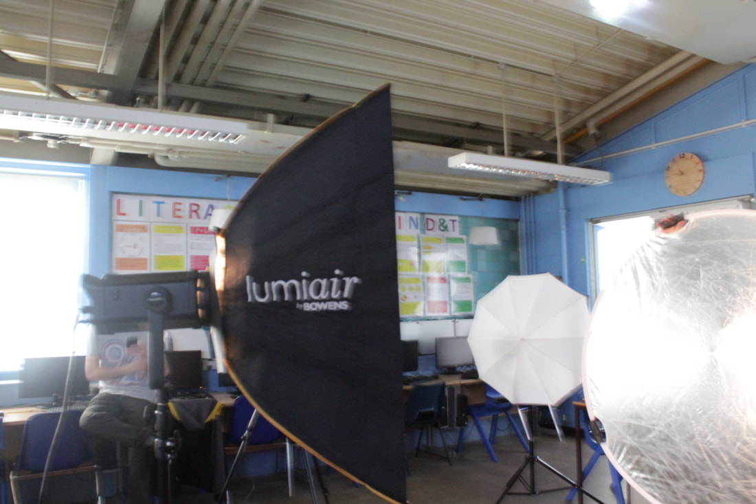
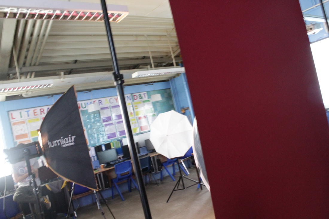
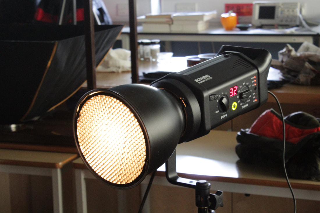
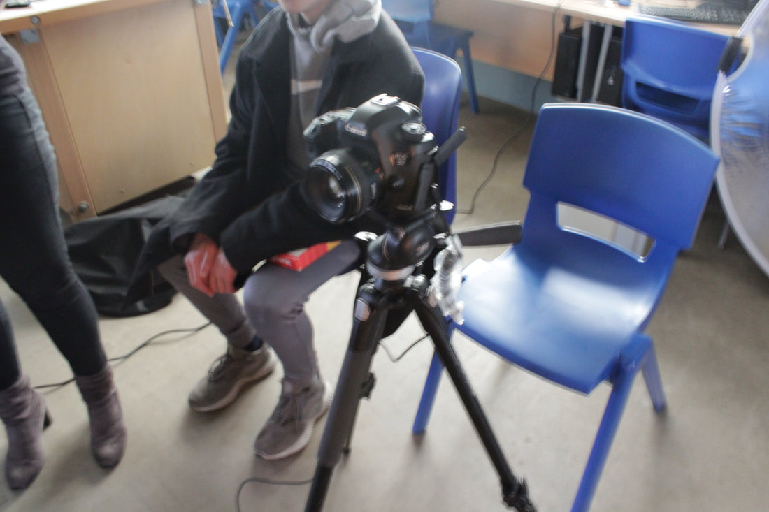
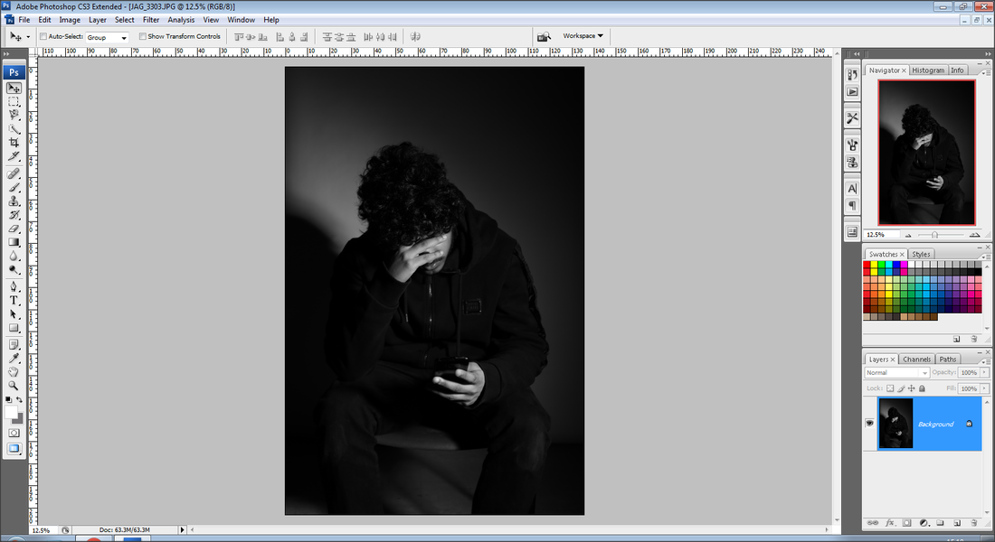
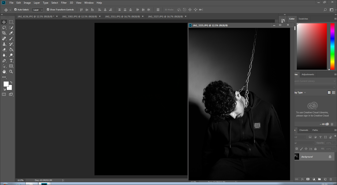
I took these shoots with a professional photographer called Justin, who came into our school and helped us take these images. I found him really as I captured images at really high quality, and got images I don't think I could do myself. For these images I put a black and white filter on them because it matches with my deep emotional theme that is messages that make people depressed.
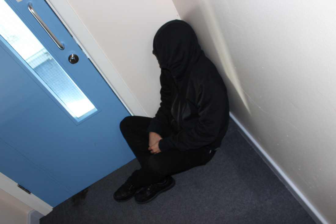
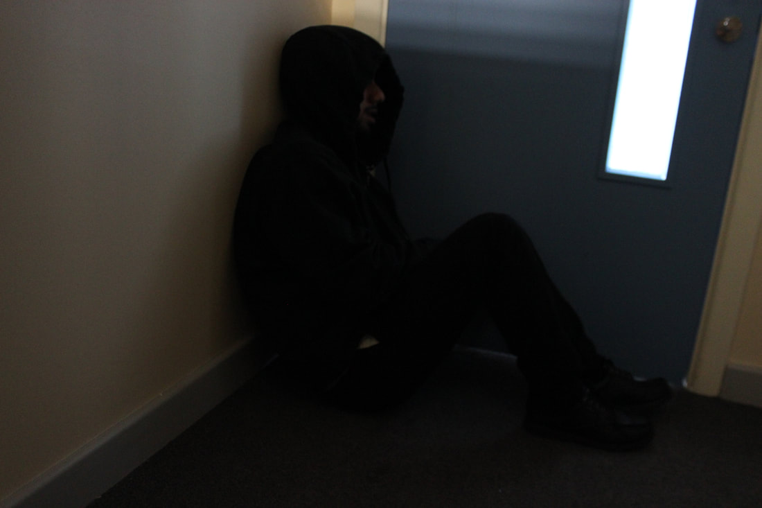
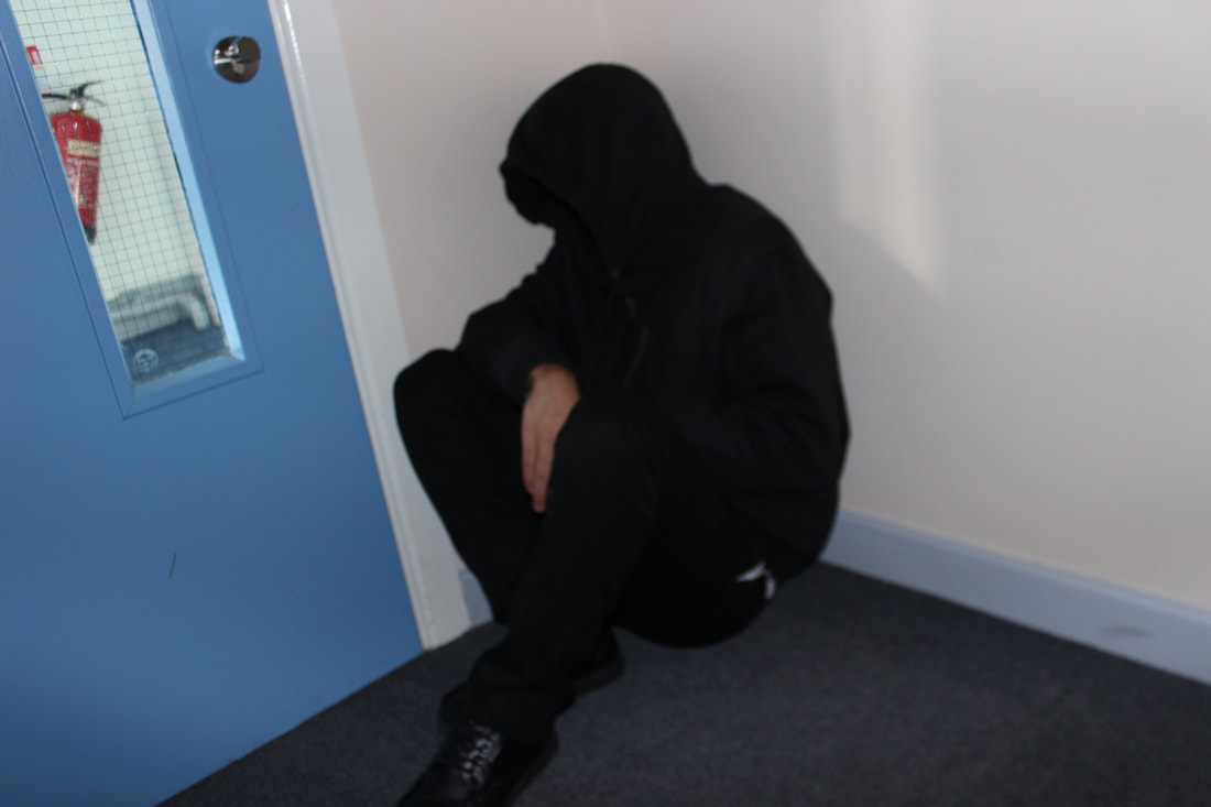
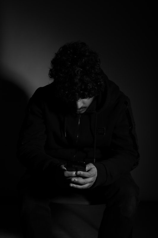
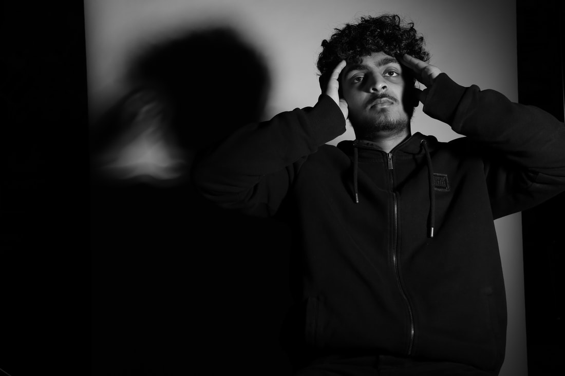
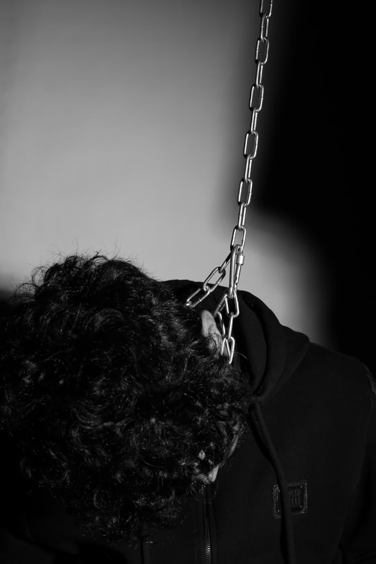
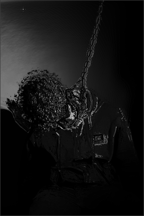
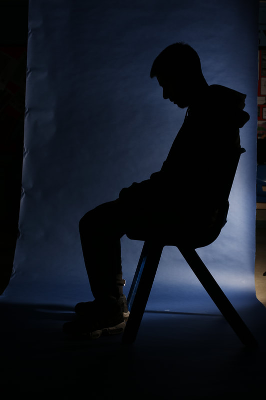
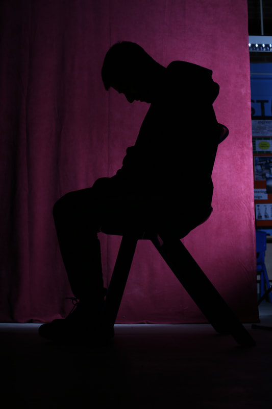
Shoot 1

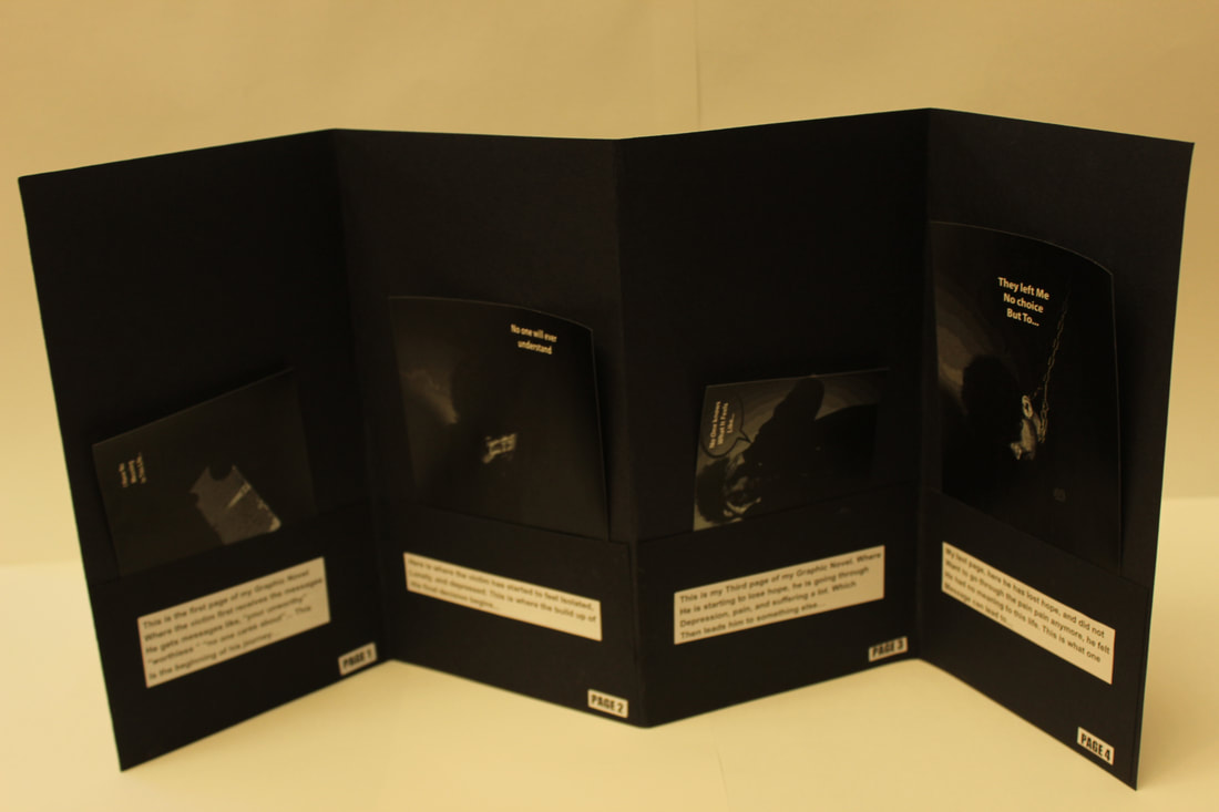
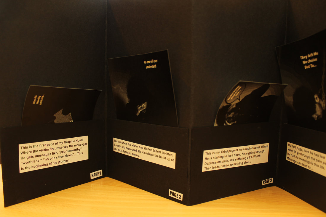
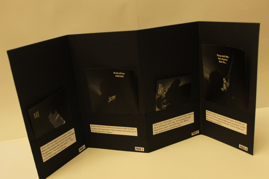
This is my Shoot 1. This is the first step of the story I am making, here is where the victim first receives the messages that make him become depressed and worthless. This is the beginning of the journey...
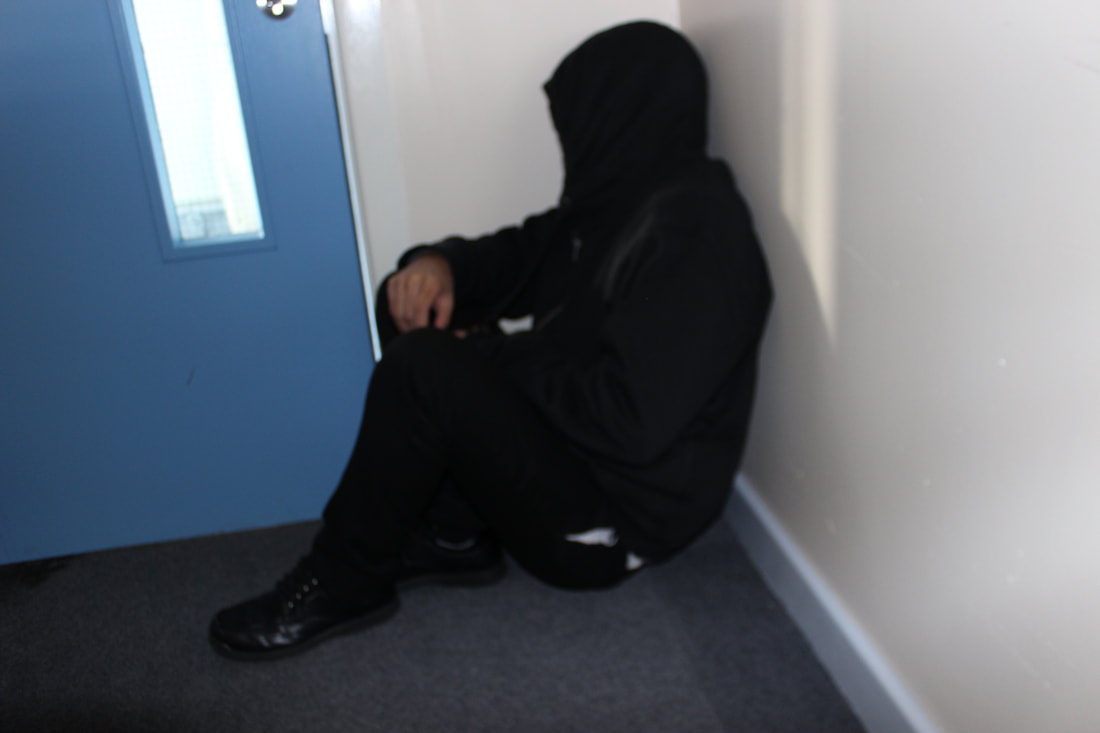
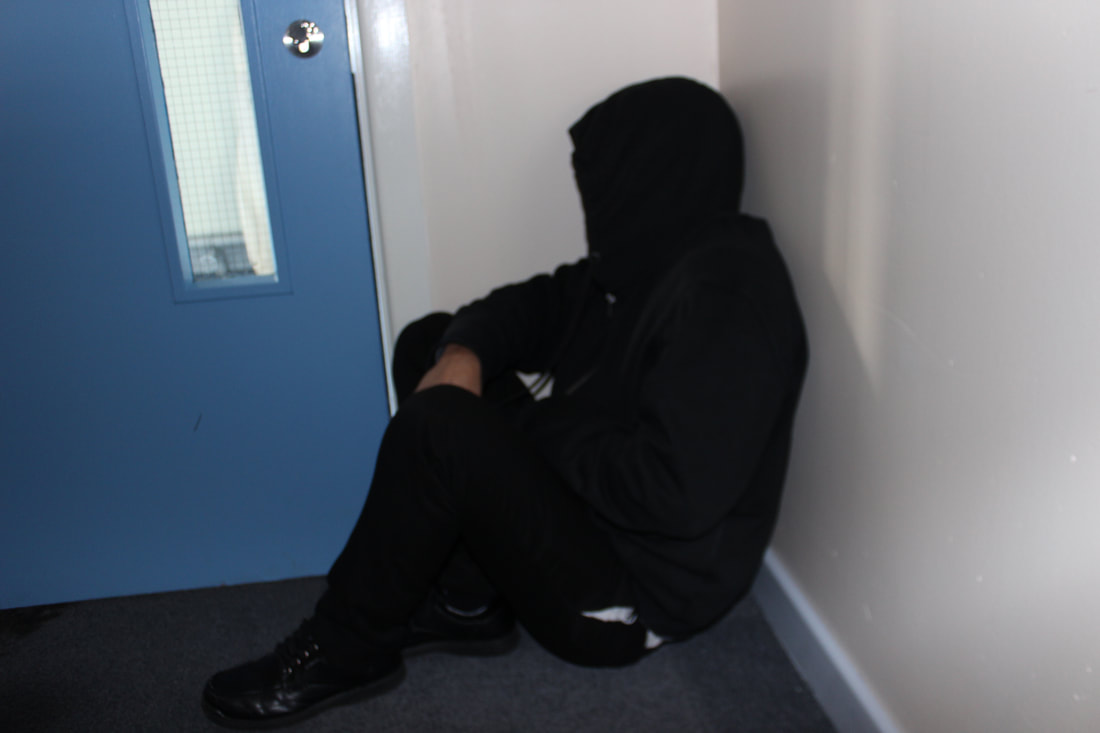
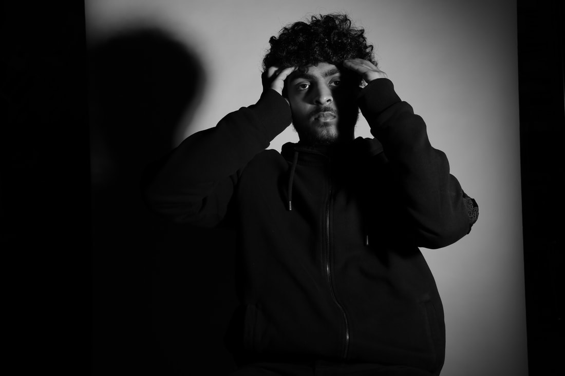
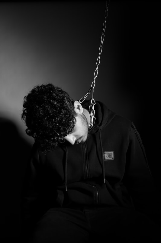
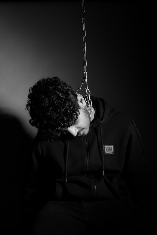
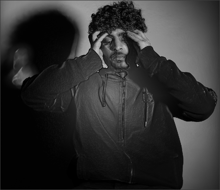
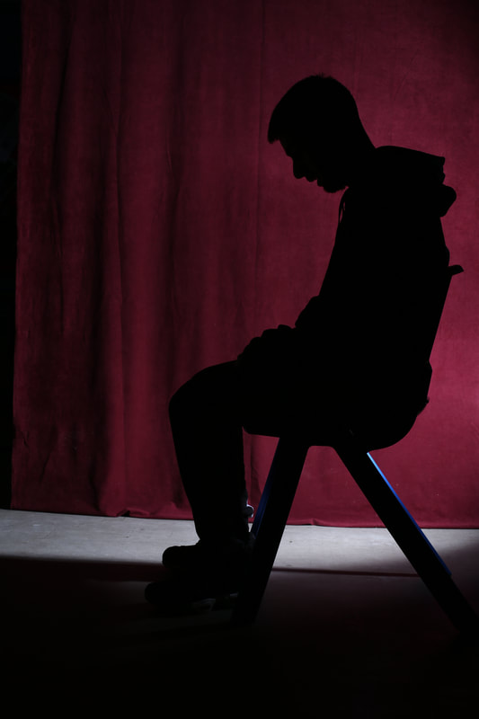
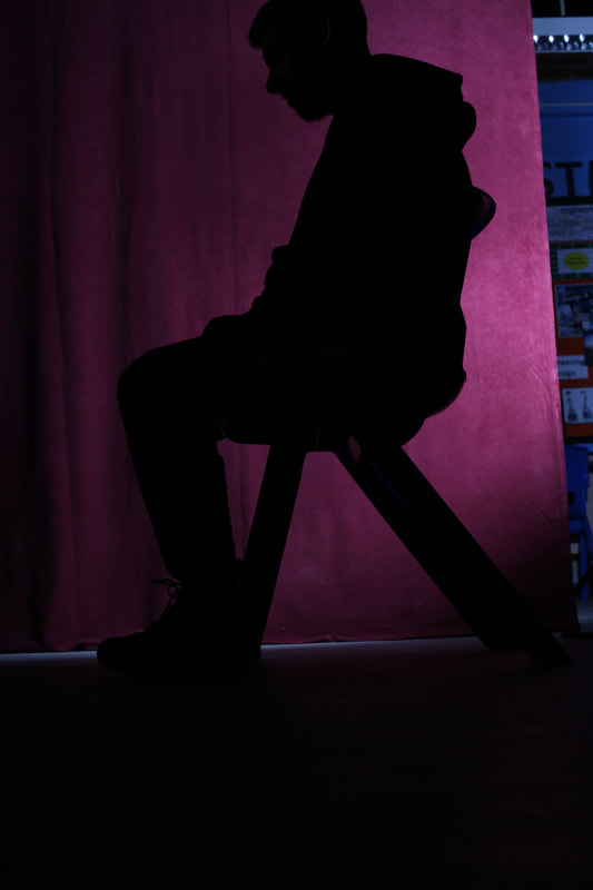
Shoot 2
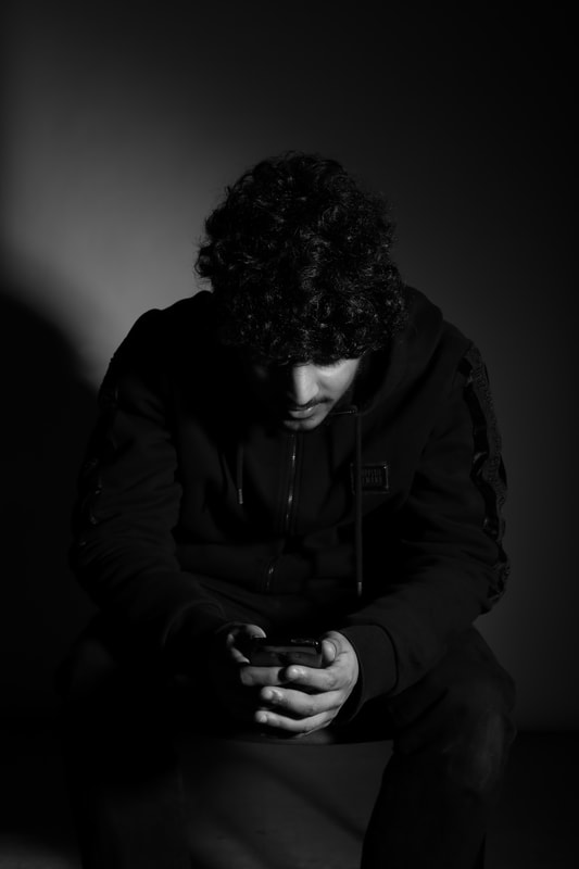


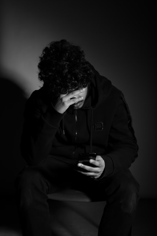


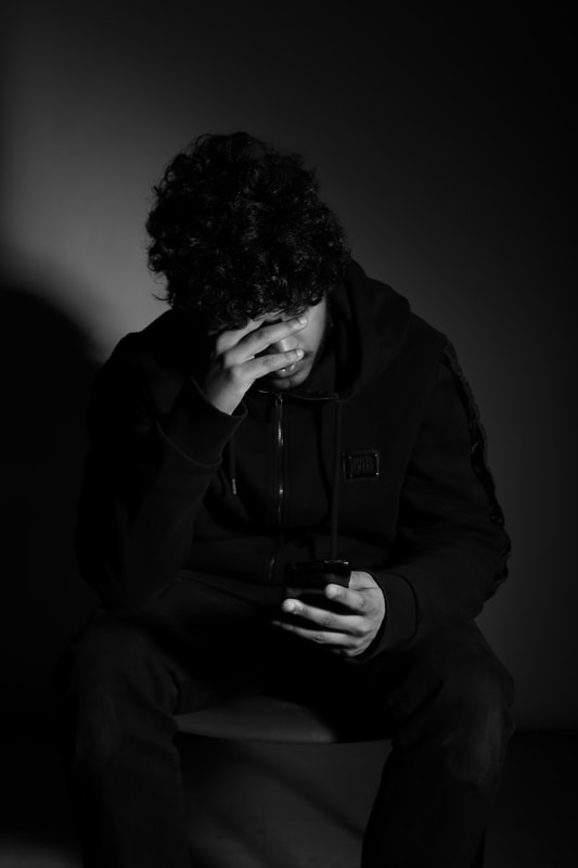


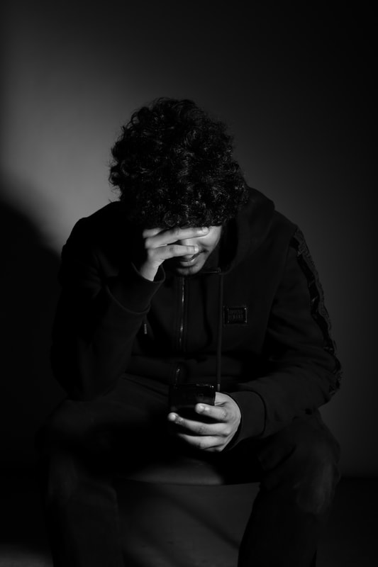
This is my second shoot, this is where the victim starts to feel lonely and depressed, and feels he has no one to ask for help and talk to.
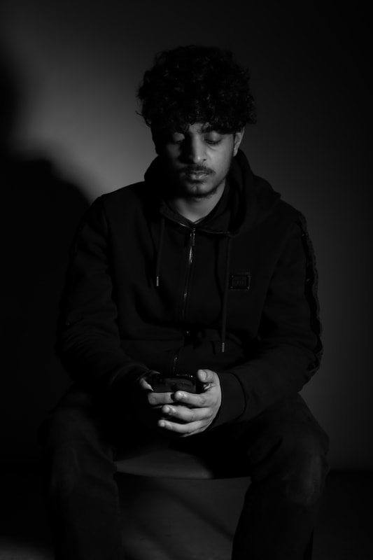
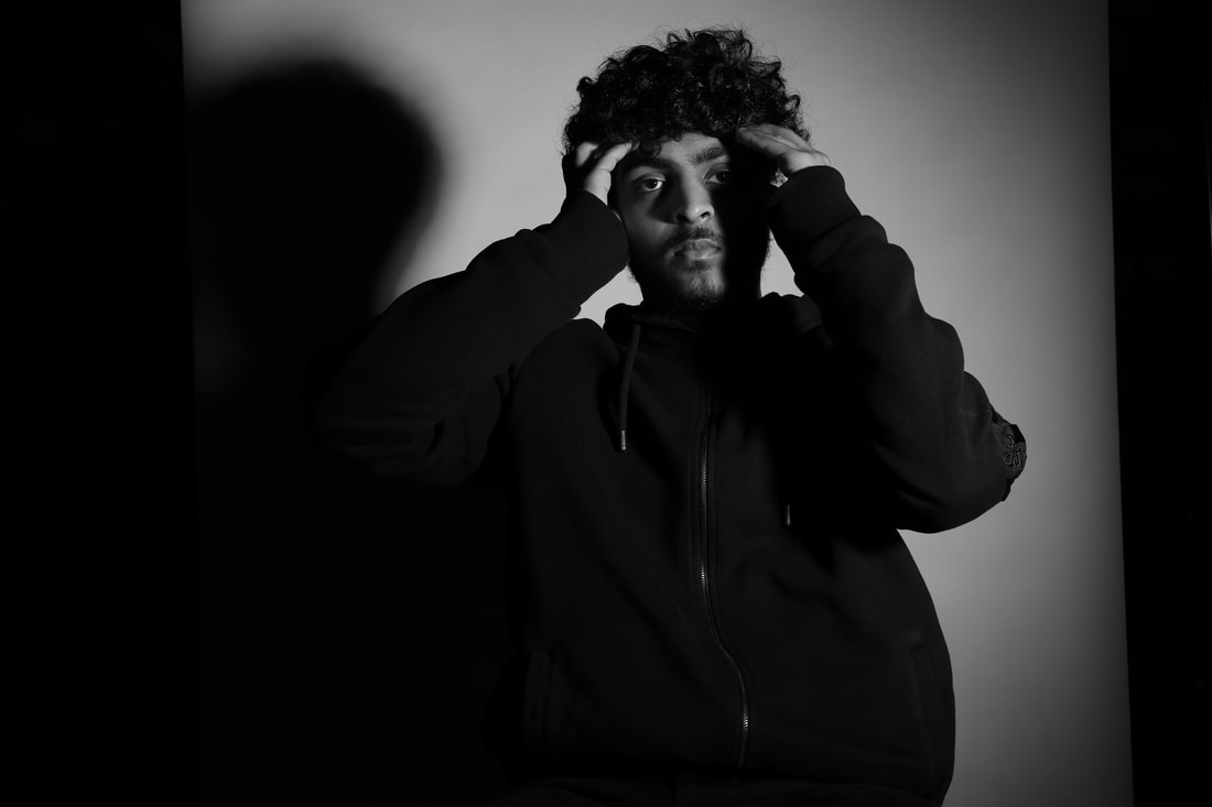
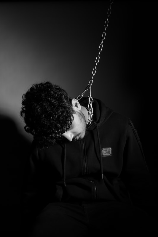
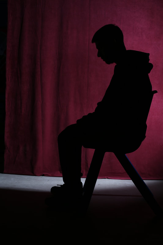
Best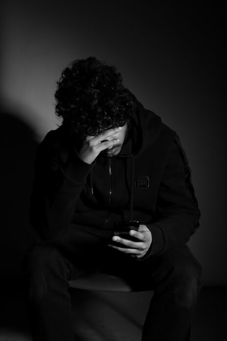
This is my best image from my second shoot because it shows clearly what is happening in the image as the depth of field is large. This keeps all the image is focus. Also the body language is done effectively so it is clear what is happening in the images and how he is feeling.
|
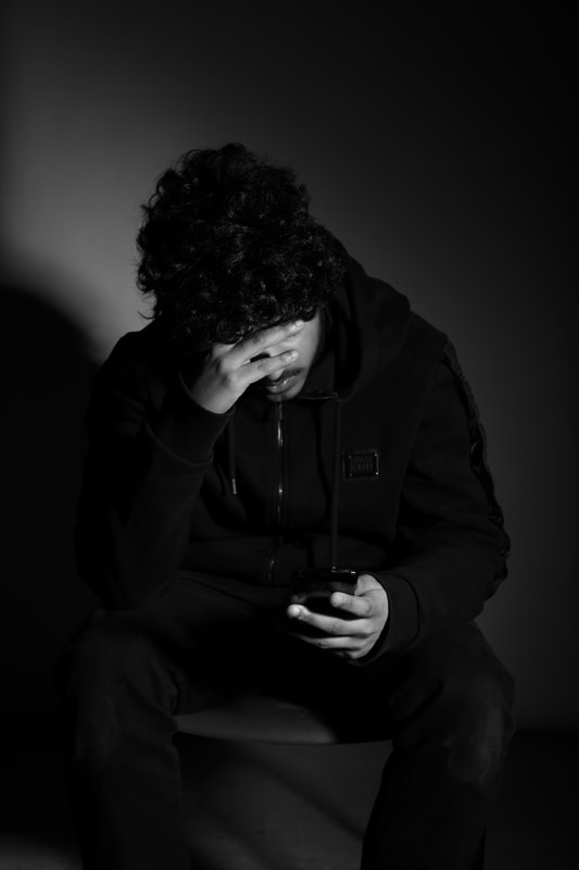
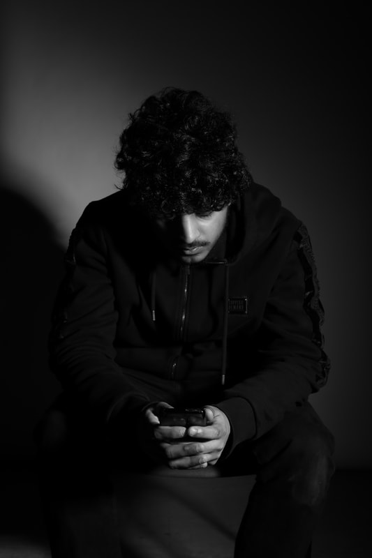
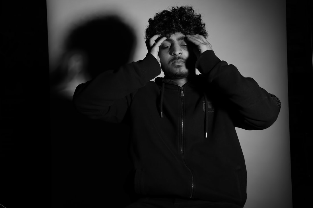
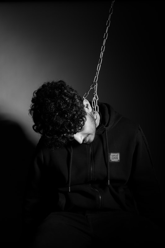
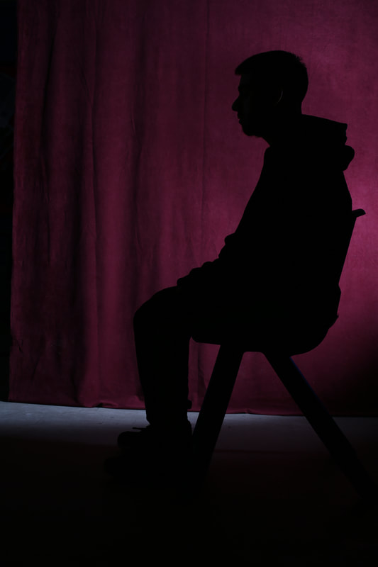
Worst
This is my worst image because the facial expression is not effective and does not show a deep and emotional emotion.
|
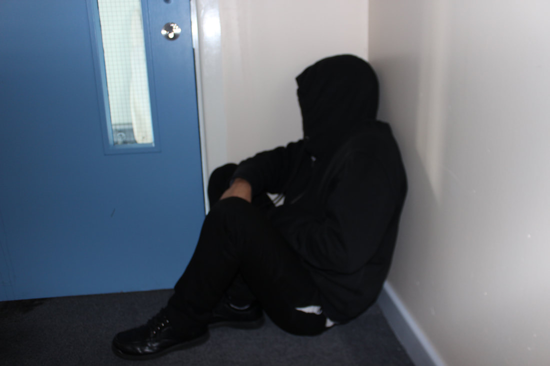
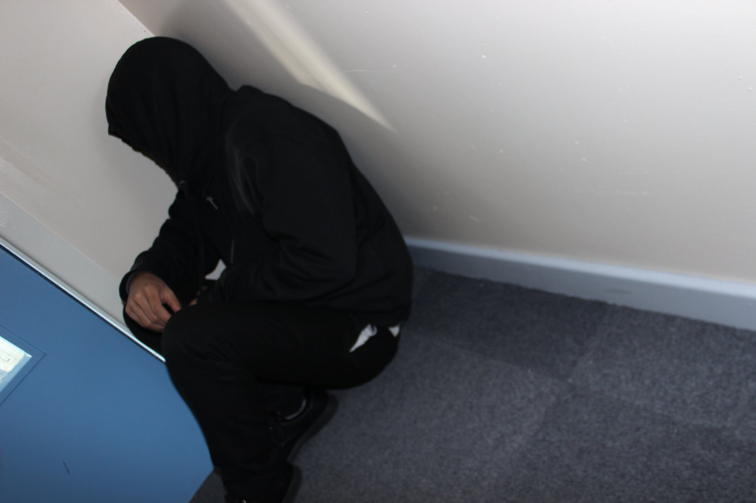
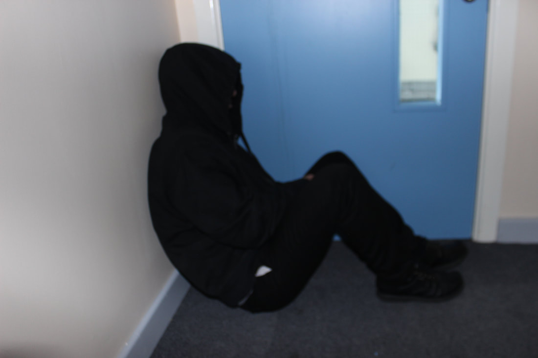
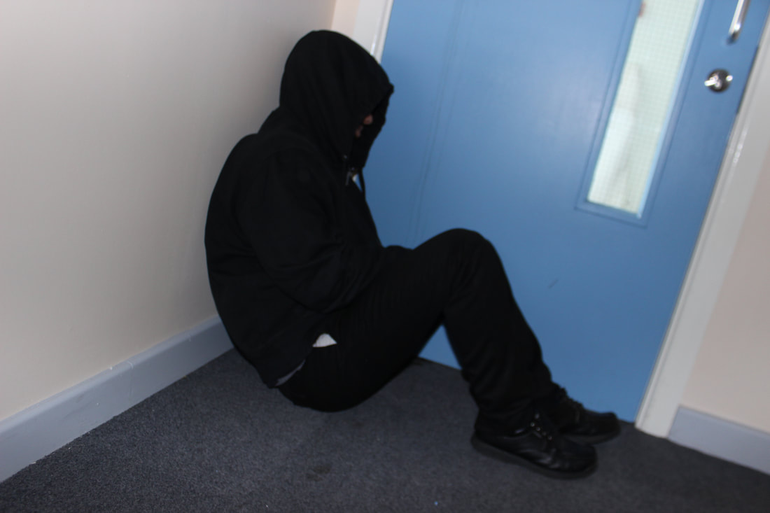
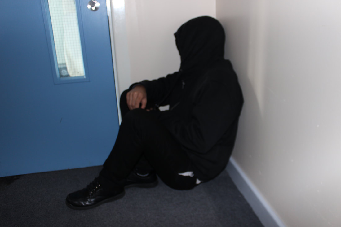
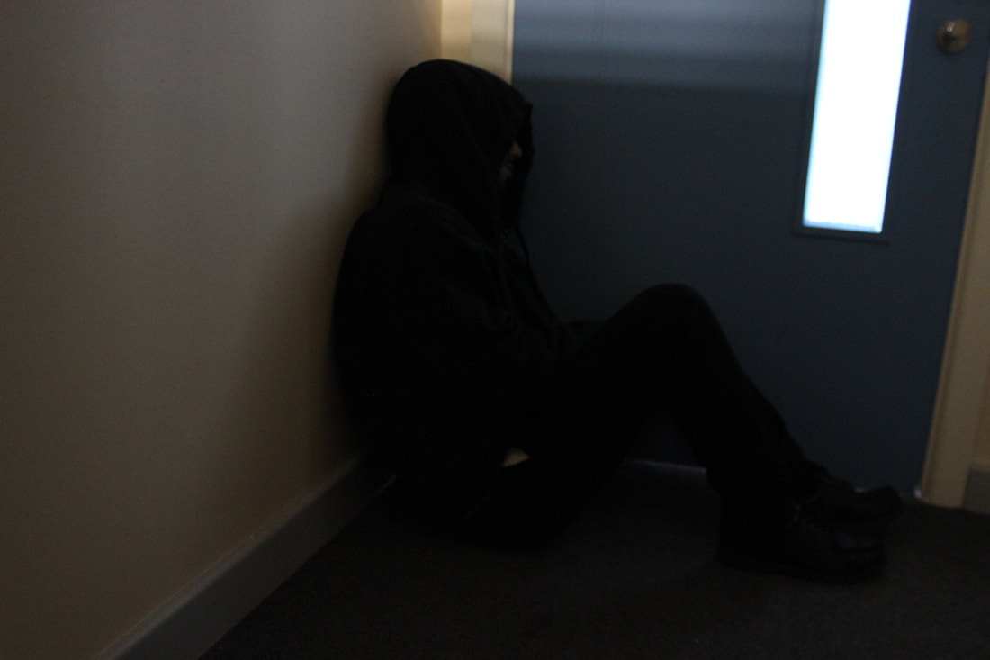
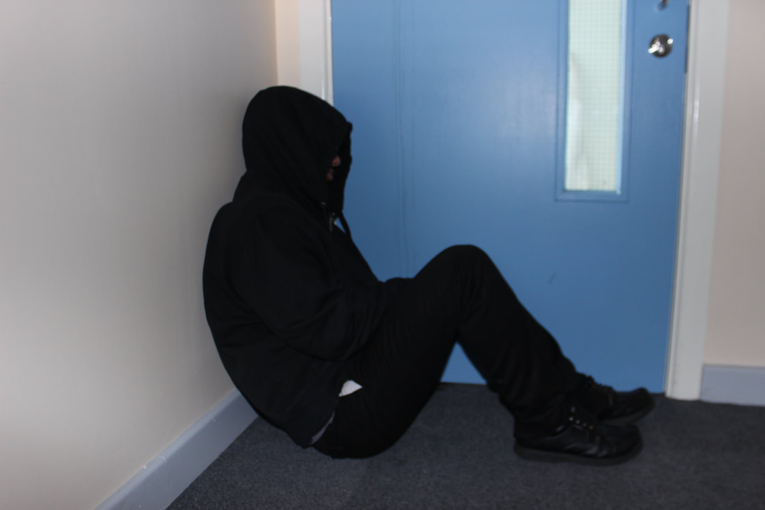
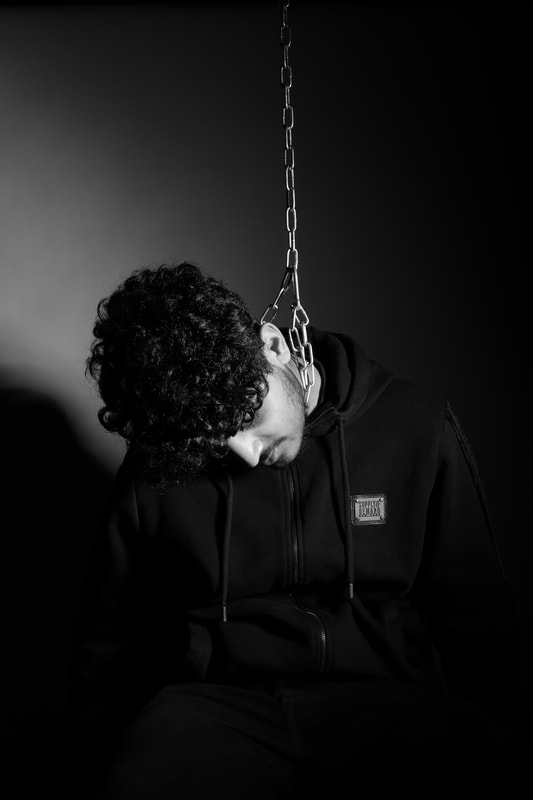
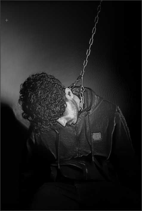
Shoot 3

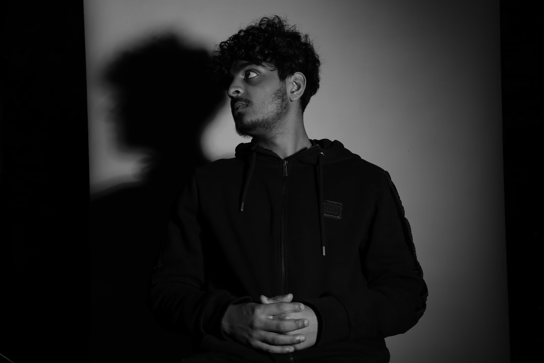


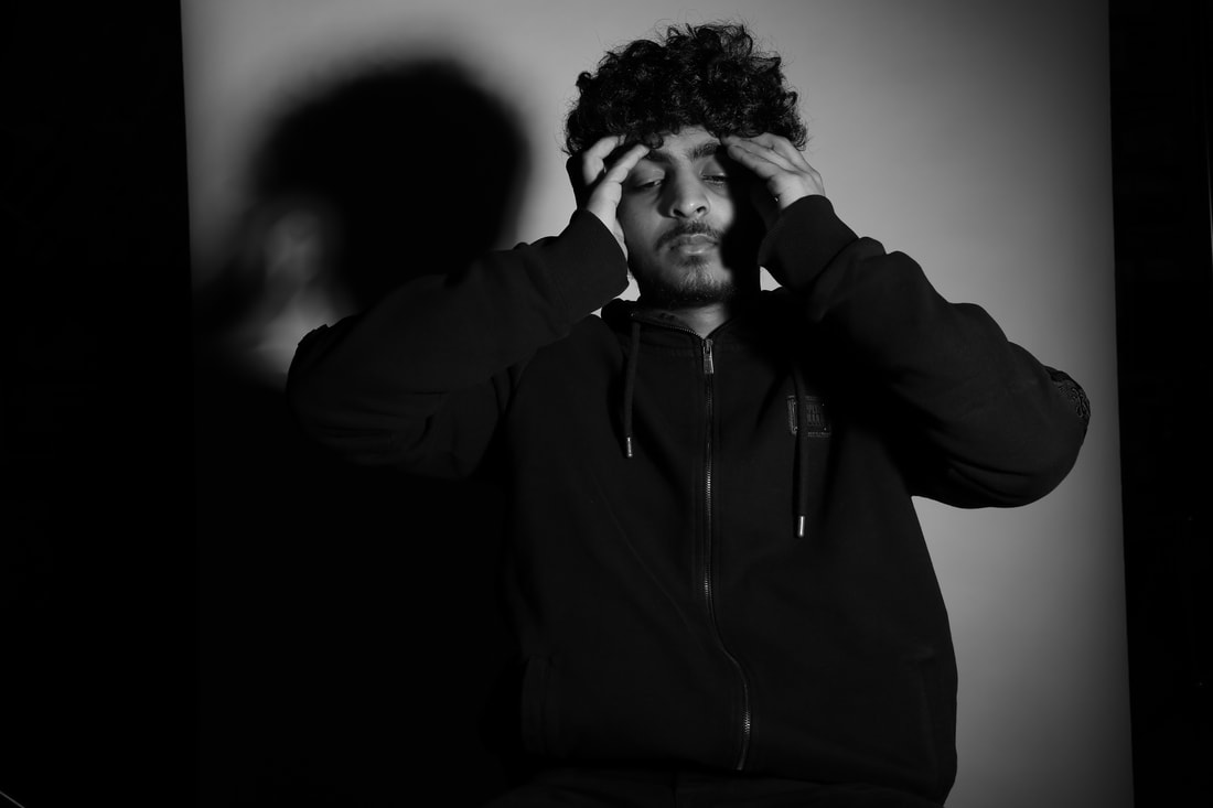

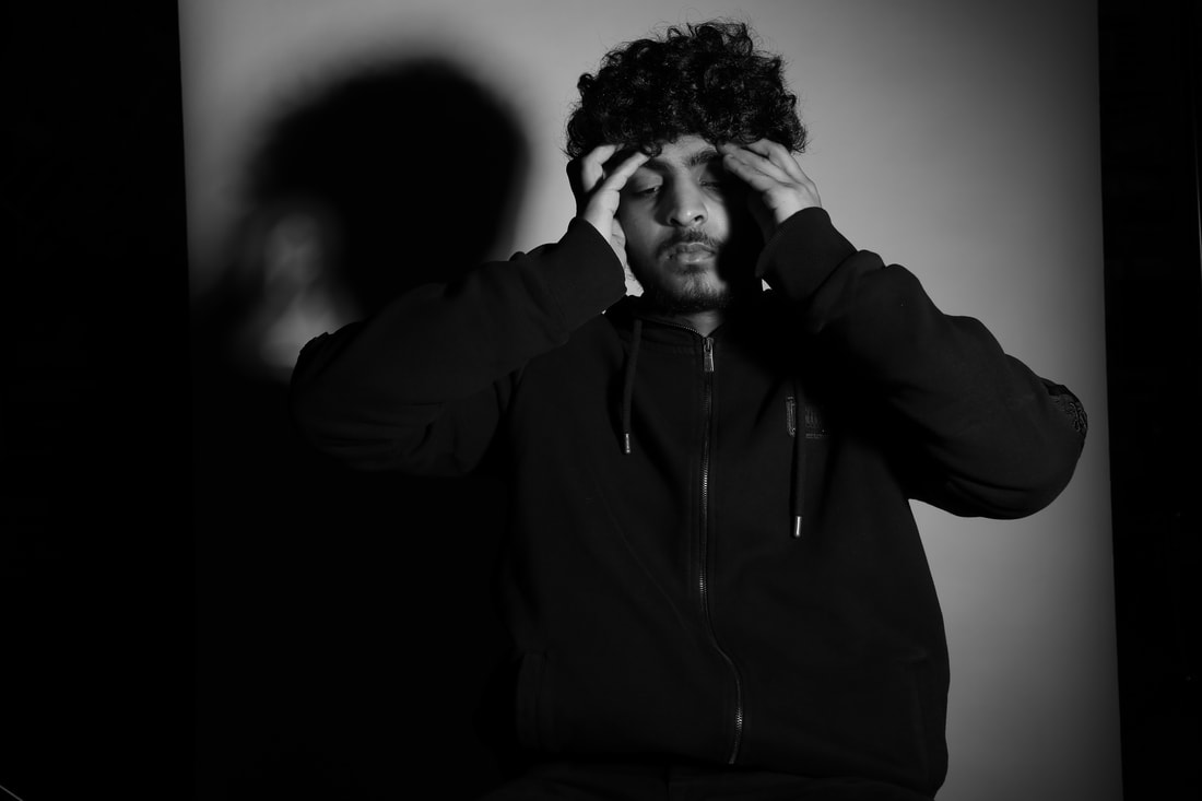
My third shoot is where the victim starts to have thoughts to end his life, and has given up as things have started to get worse and is not getting any better. This where it starts to become quite personal for the victim and is on the edge of life.
Best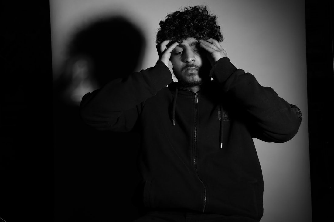
This is my best image from this shoot, as I took in consideration when thinking about the composition so the shadow is shown on the side of the victim. I have also thought about the facial expression of person to make it effective and more personal.
|
Worst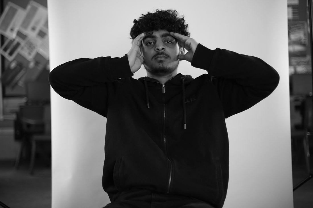
I feel this is my worst image from this shoot because the lighting is quite bad, and did no adjust it as much to make it effective. Also is facial expression is not personal or expressed in full detail. The composition of this image is not effective because he has been placed in the center of the image and takes up a lot of the space.
|
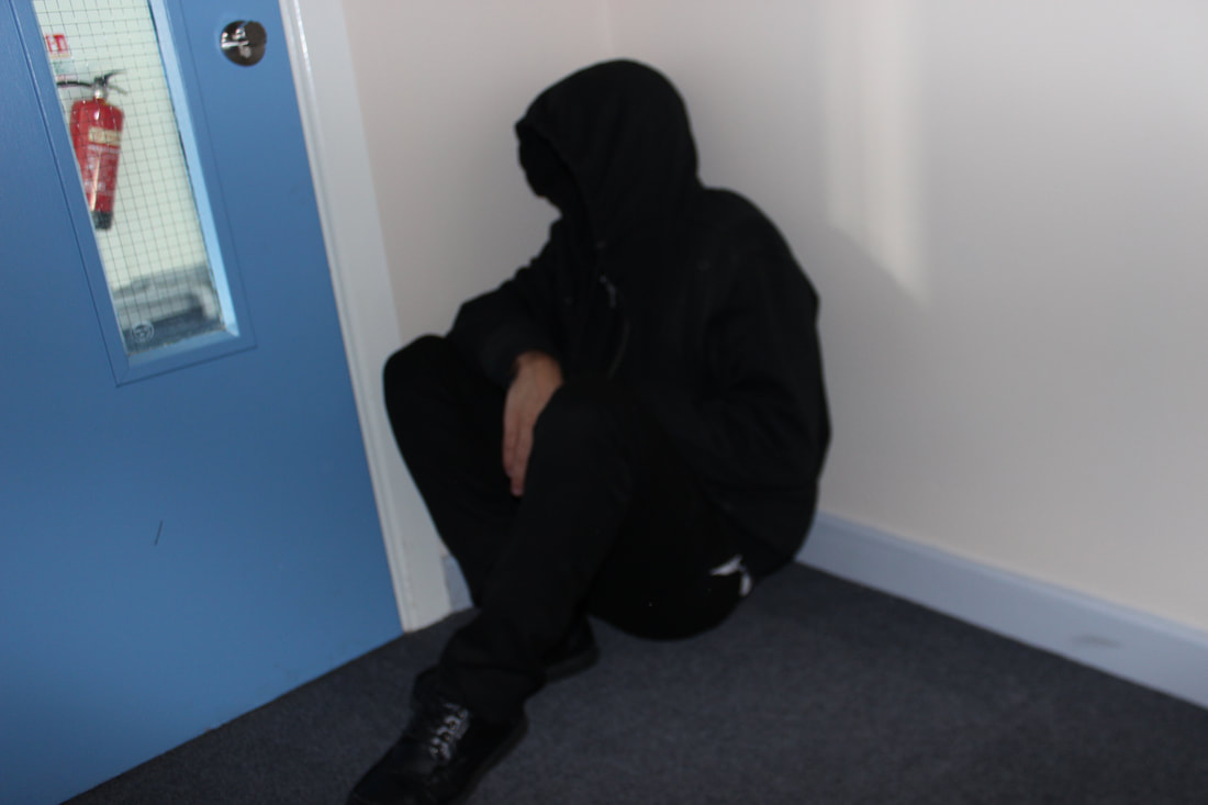
Shoot 4
Shoot 5


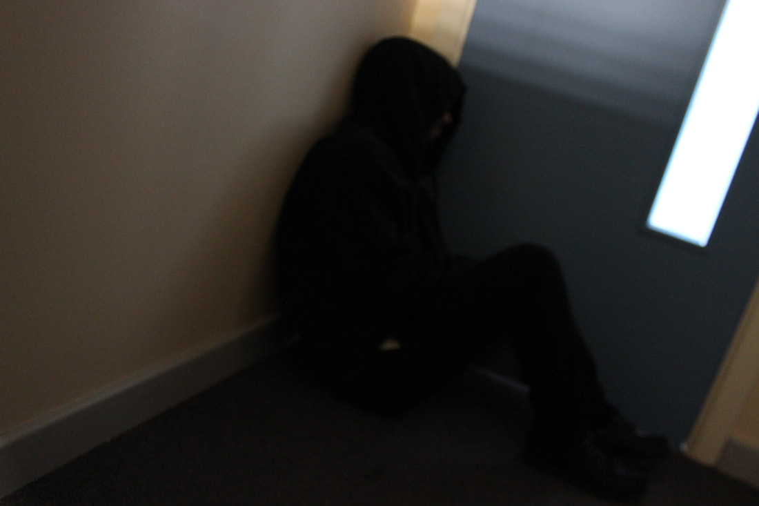
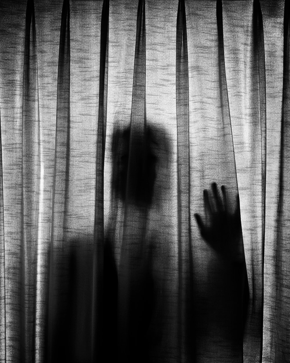
This the final shoot, where the victim as full lost hope and has felt there was no reason in living as he felt he was worthy of nothing and no body wanted him.
Best
This is my best image from shoot 5 because of the level of detail I have gone into for this image, I took the focus point, composition and lighting in consideration to get the best possible outcomes. I have also placed the light in a specific way to get a shadow on the side, which I feel makes the picture more meaningful and effective.
|
Worst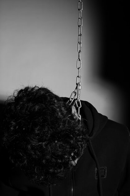
I feel this is my worst image from this shoot because the face is covered and the hair is in the way. Also I did not think carefully about the composition of the photo as the hair is taking up majority of the image.
|
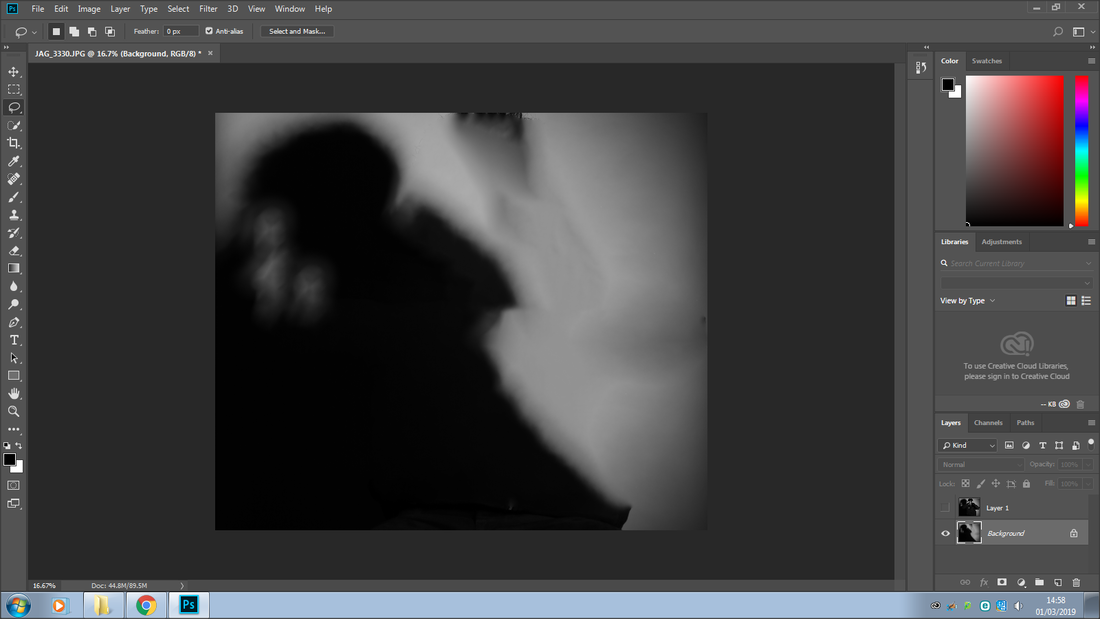
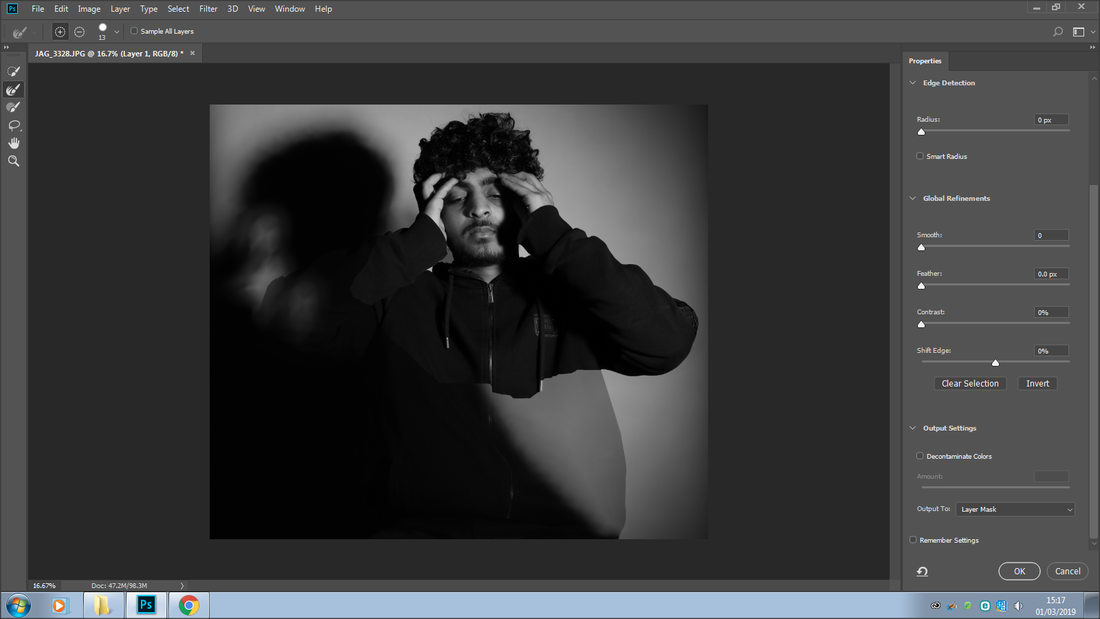
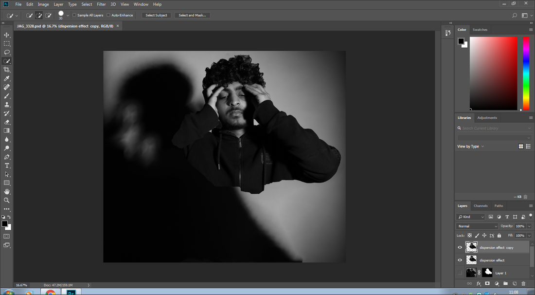
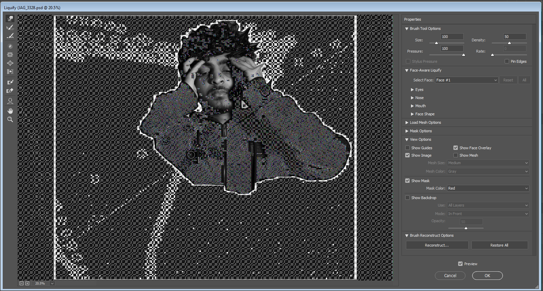
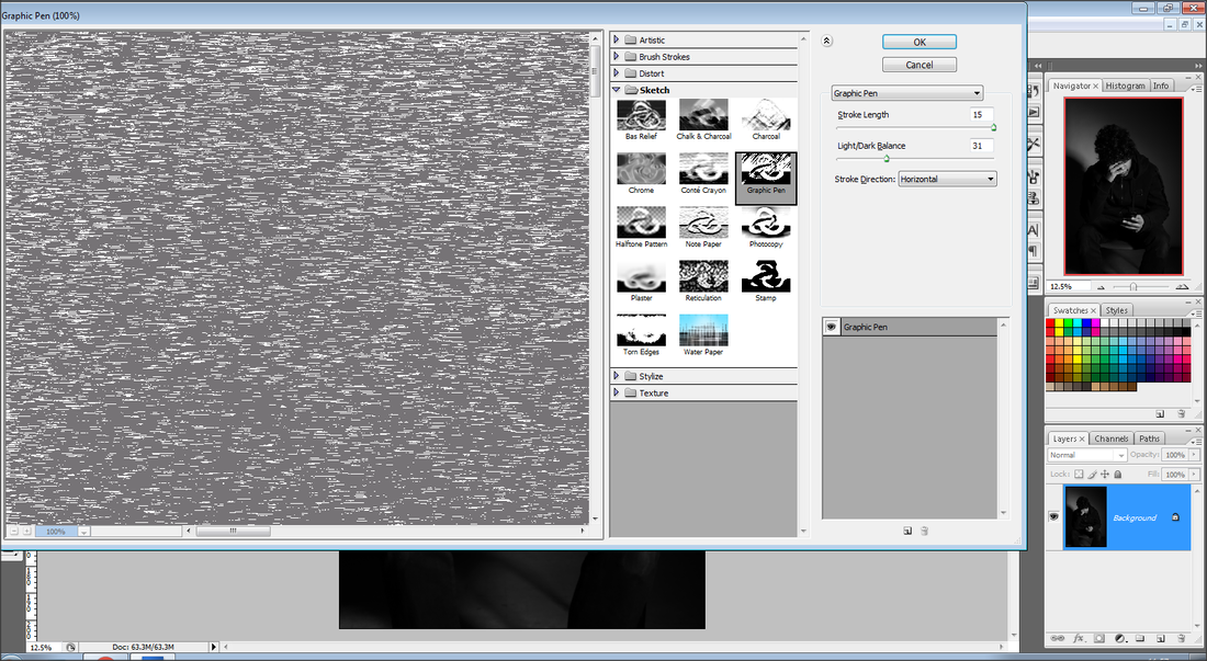
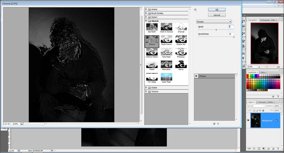
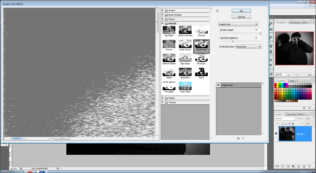
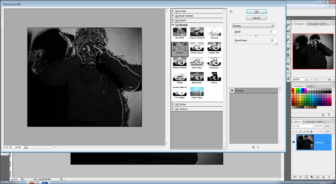
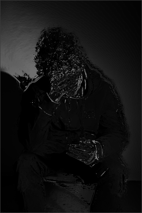
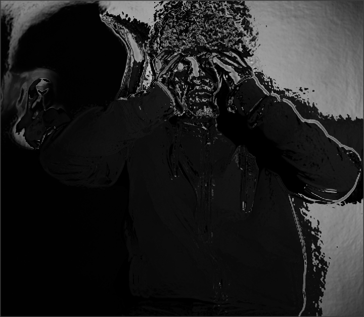
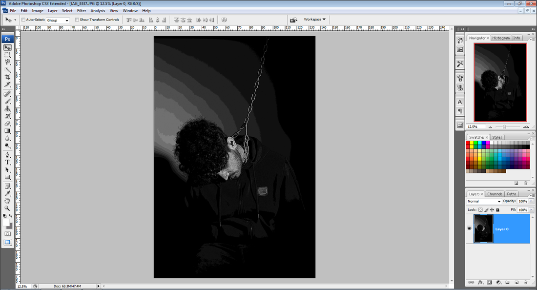
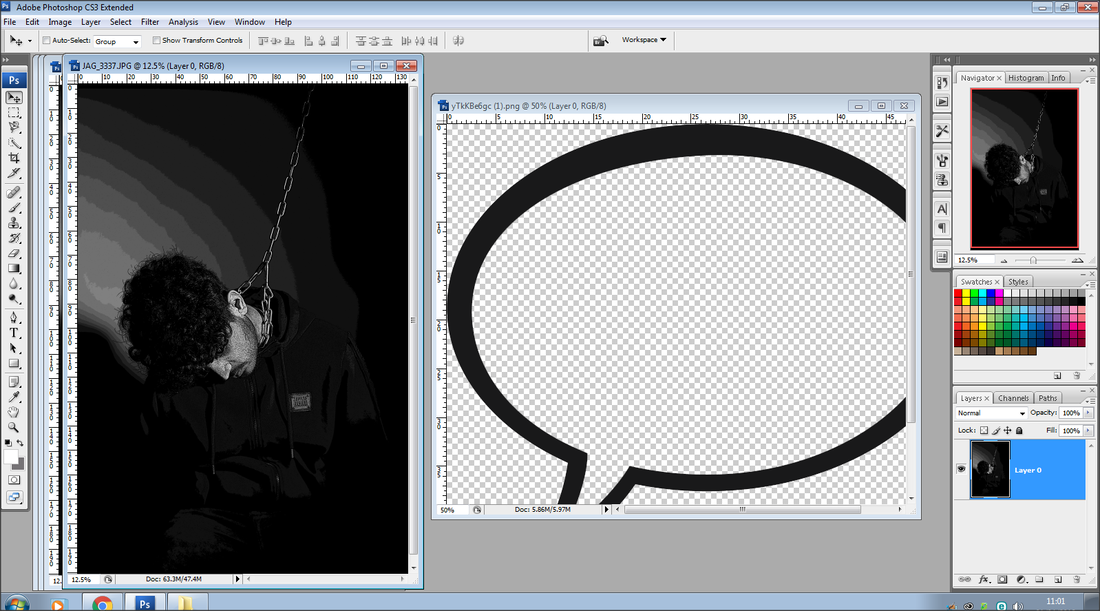
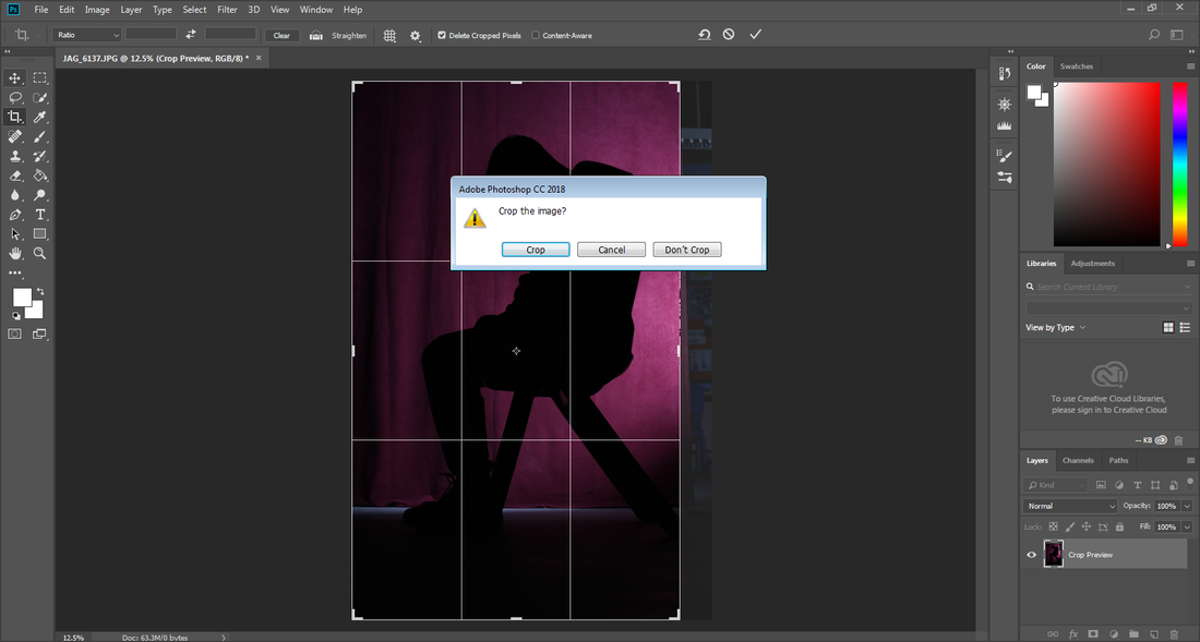
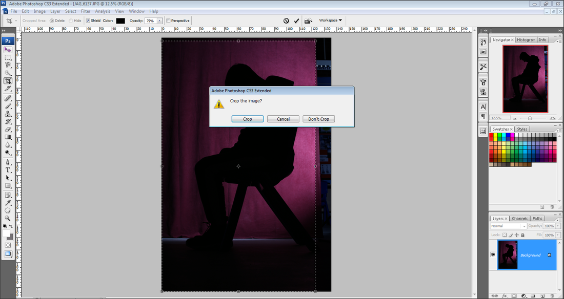
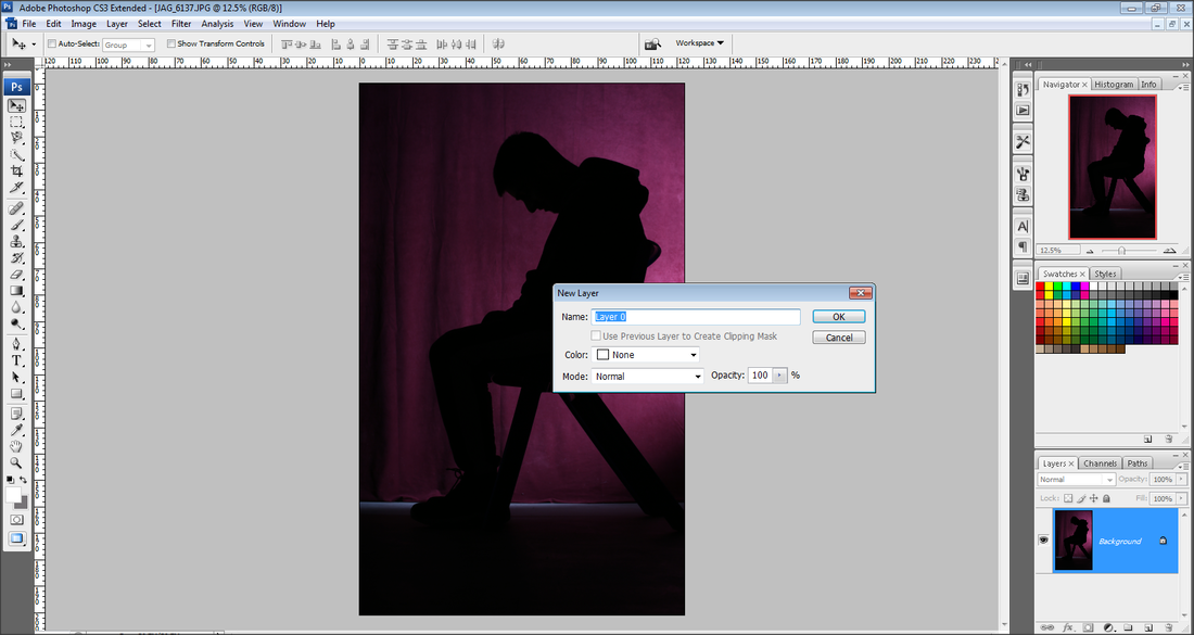
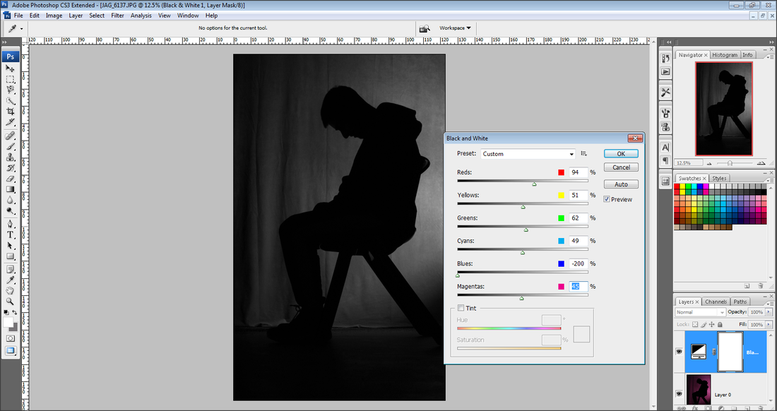
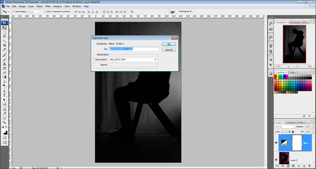
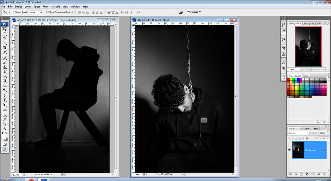
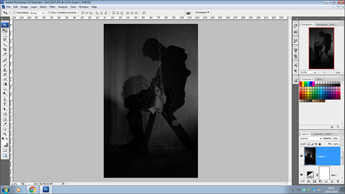
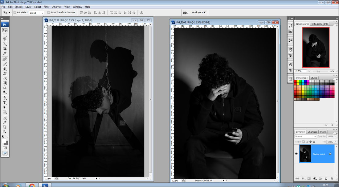
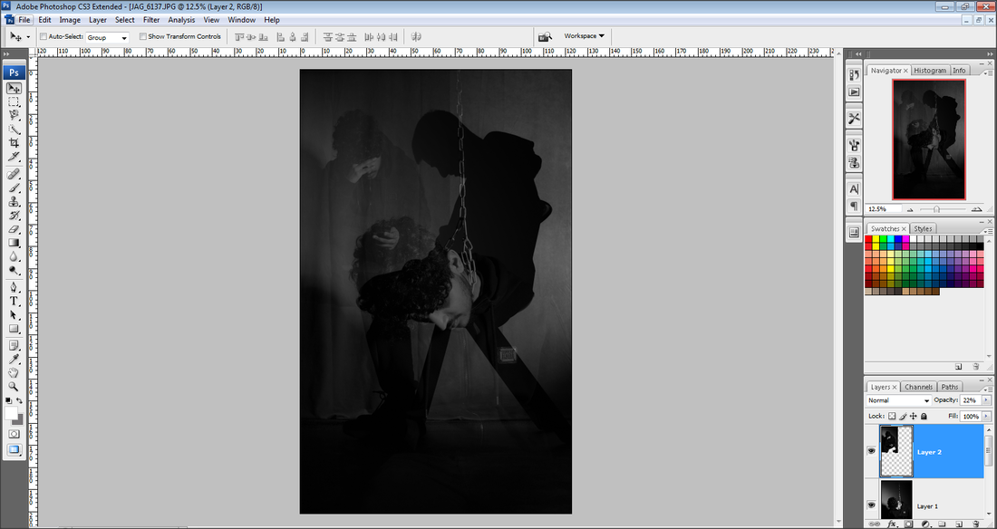
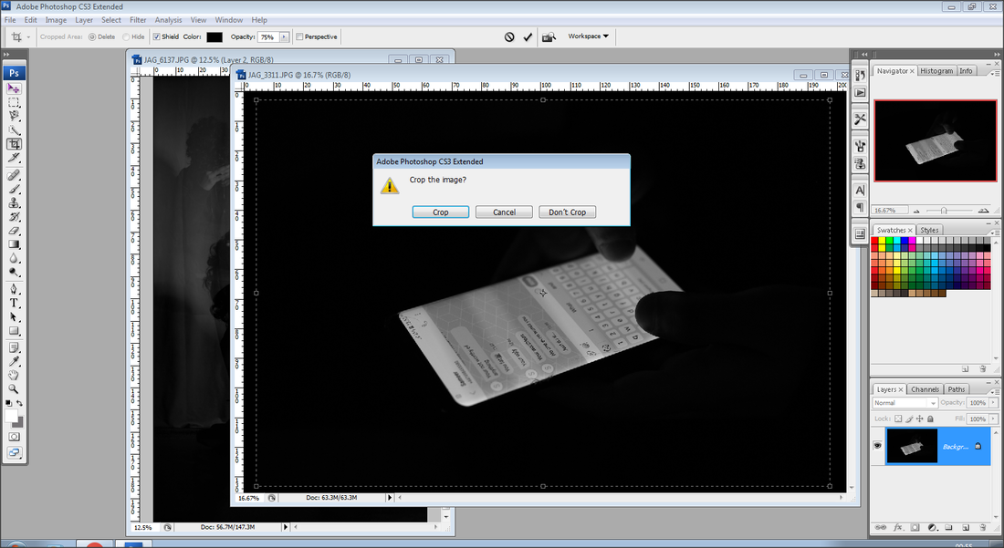
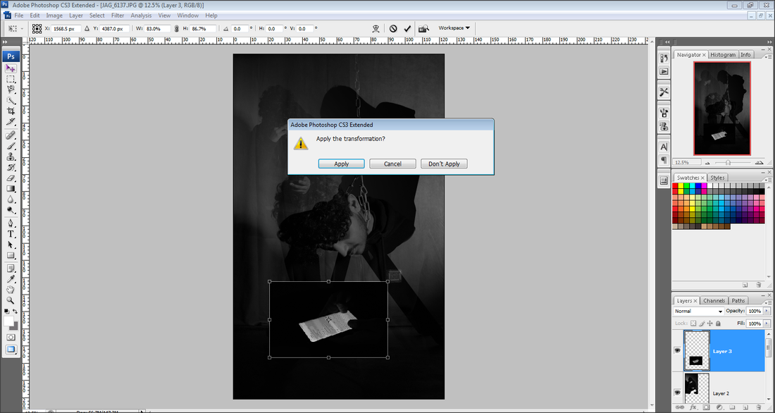
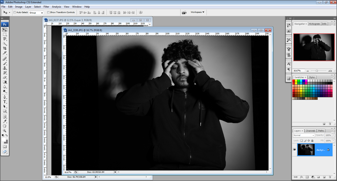
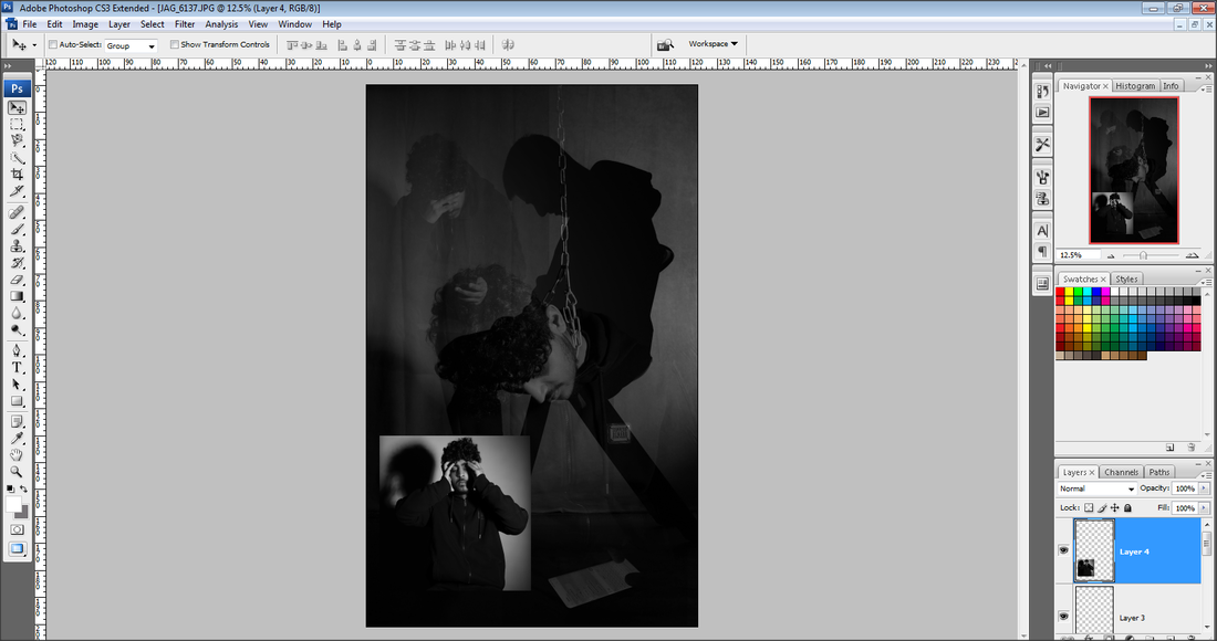
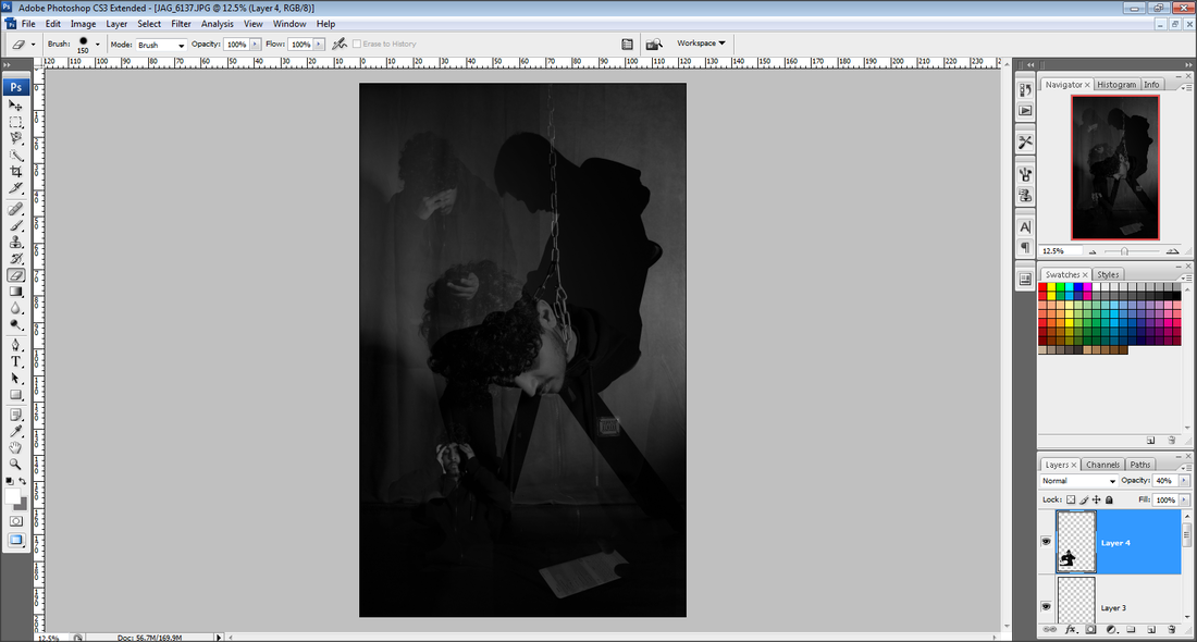
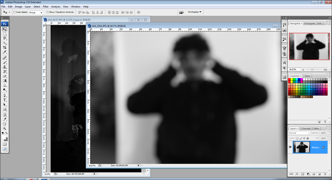
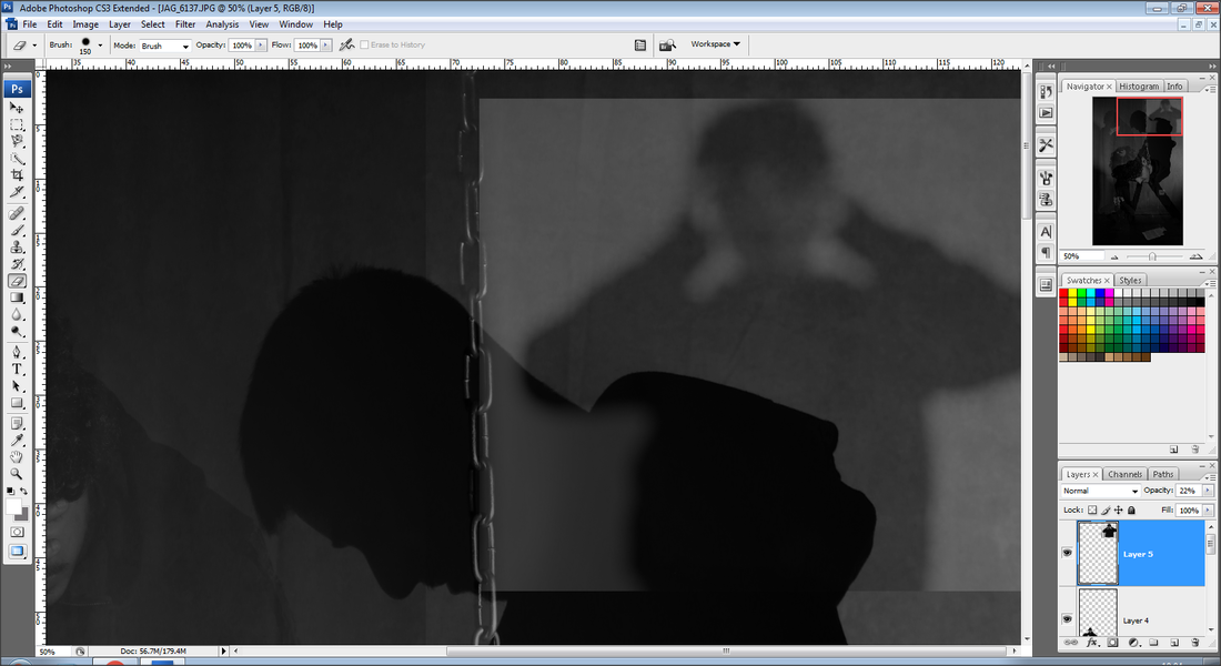
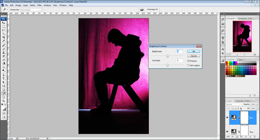
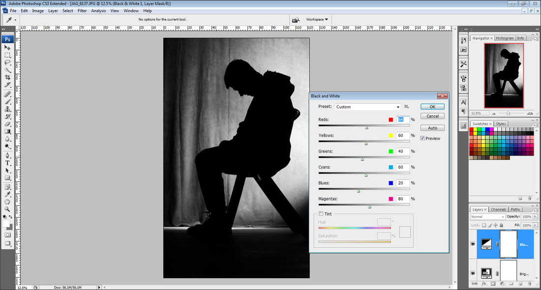
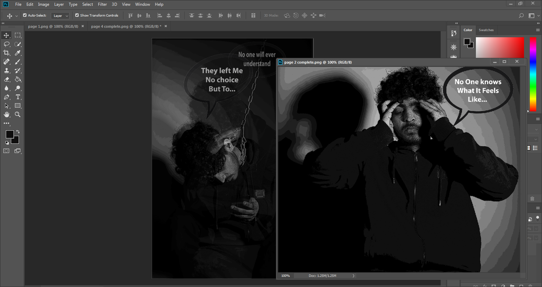
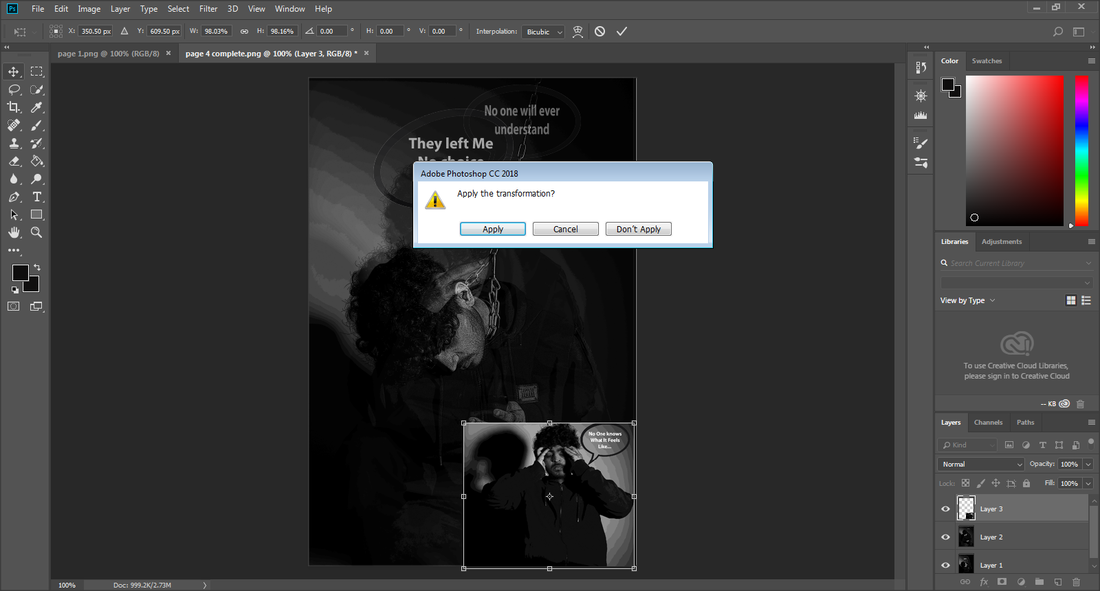
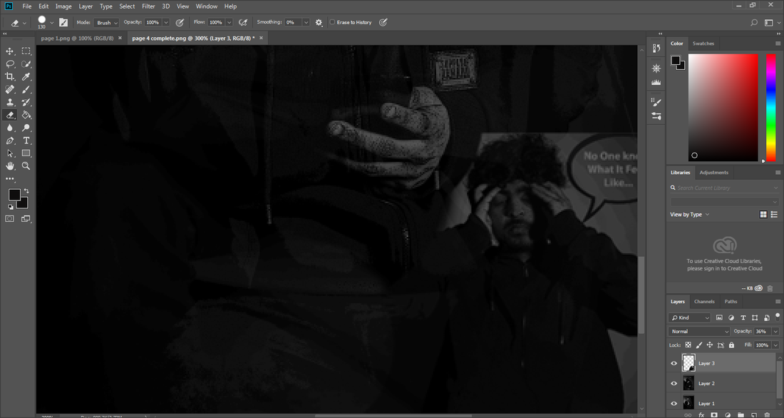
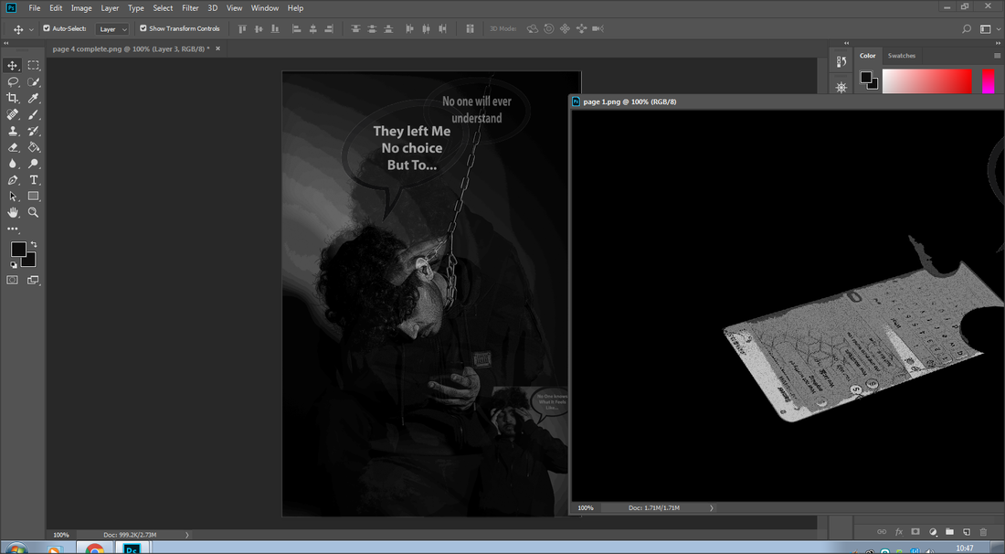
Experimenting With PhotoShop
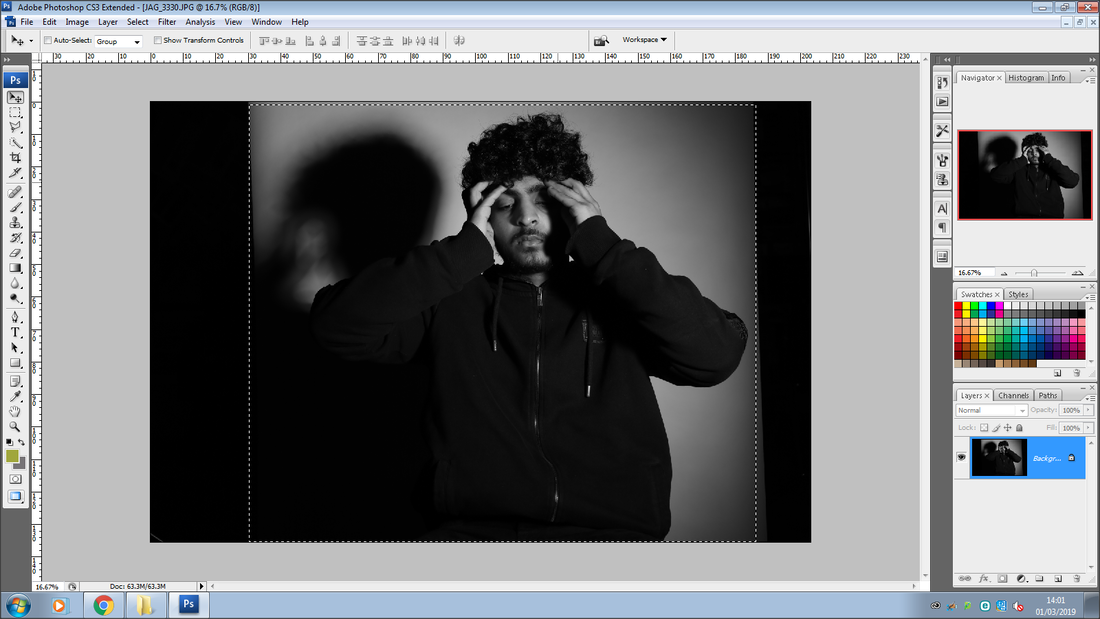
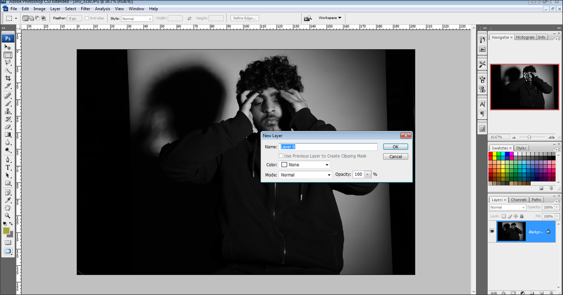
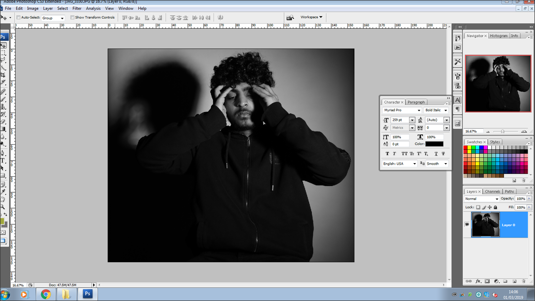
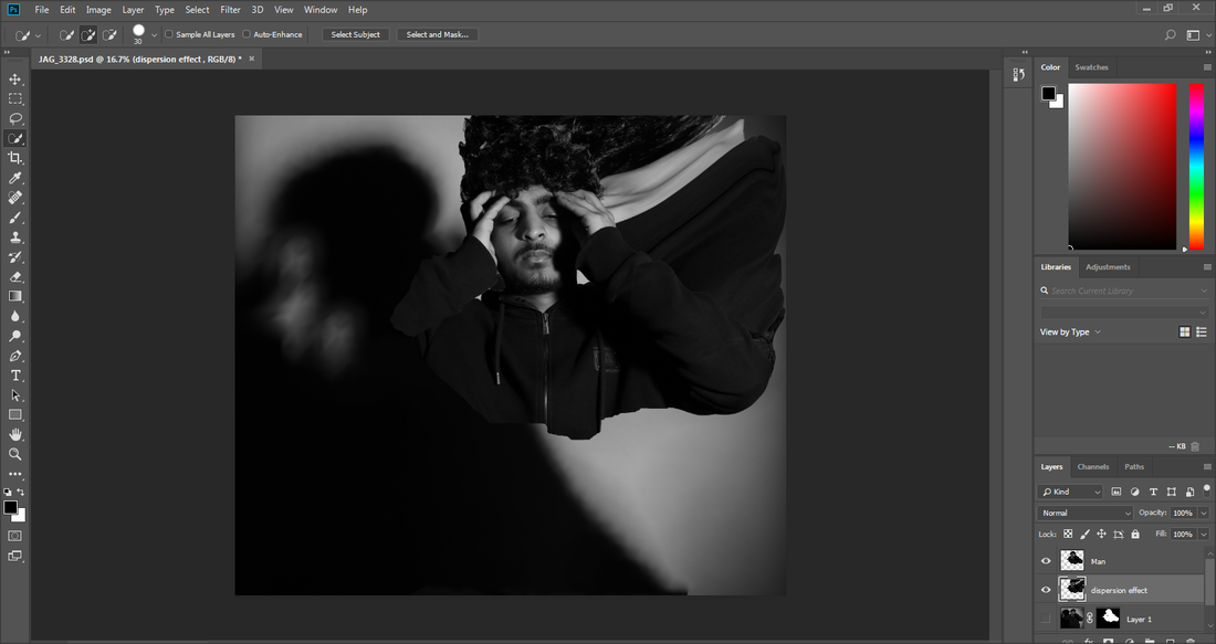
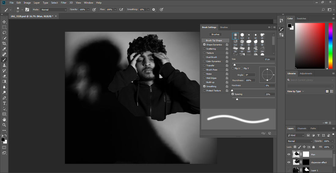
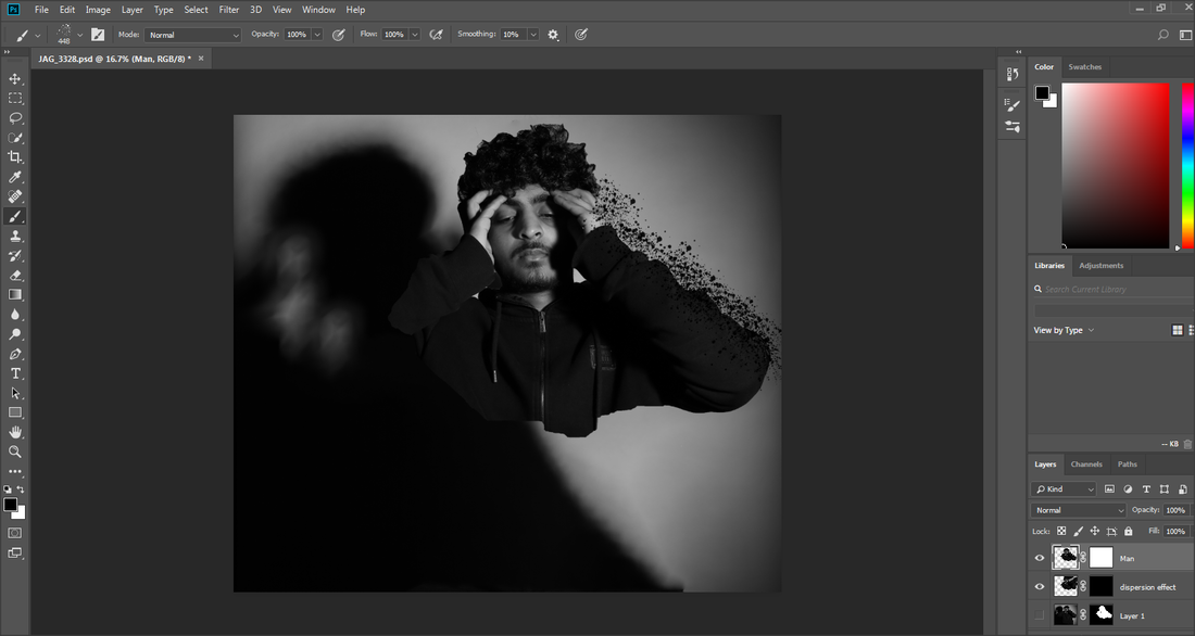
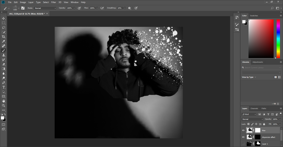
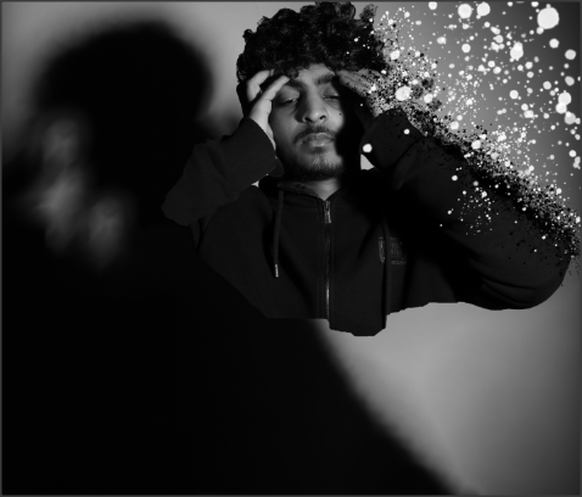
Build Up On My Graphic Novel
For my final outcome I hope to produce a graphic novel telling a story on someone who has experienced depression and suicide, for this I have already captured my images and am currently experimenting in photoshop with them. After I have found the perfect photoshop skill I am going to start building my graphic novel. To start off I have been researching different ideas on graphic novels for inspiration. I am making a graphic novel to show people that there are people out there who feel lonely and depressed and also helpless about it, and I want to show a message on how people really suffer from it and the outcomes that happen from depression to make people aware of it.
|
|

|
|
Working On my Pages


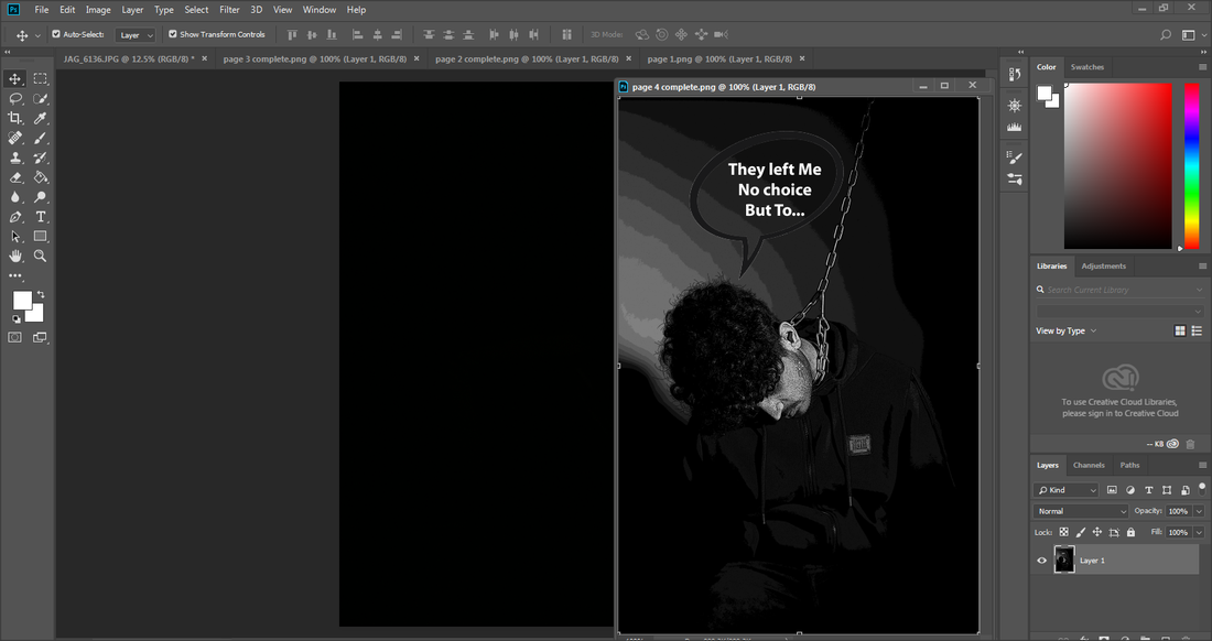
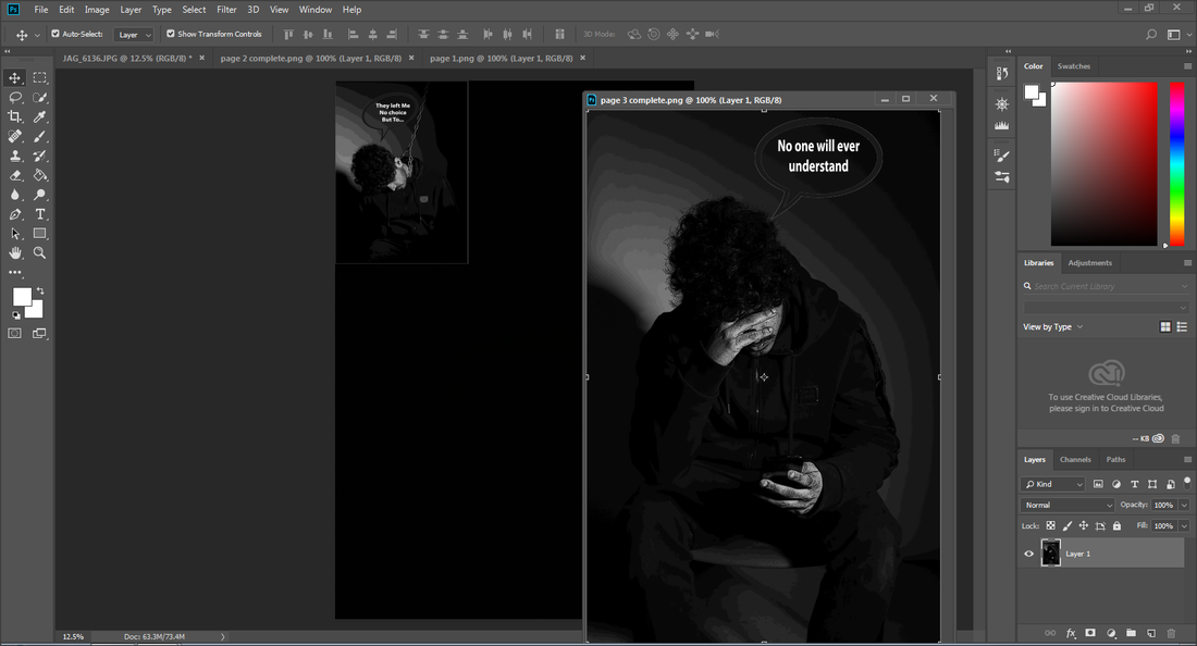
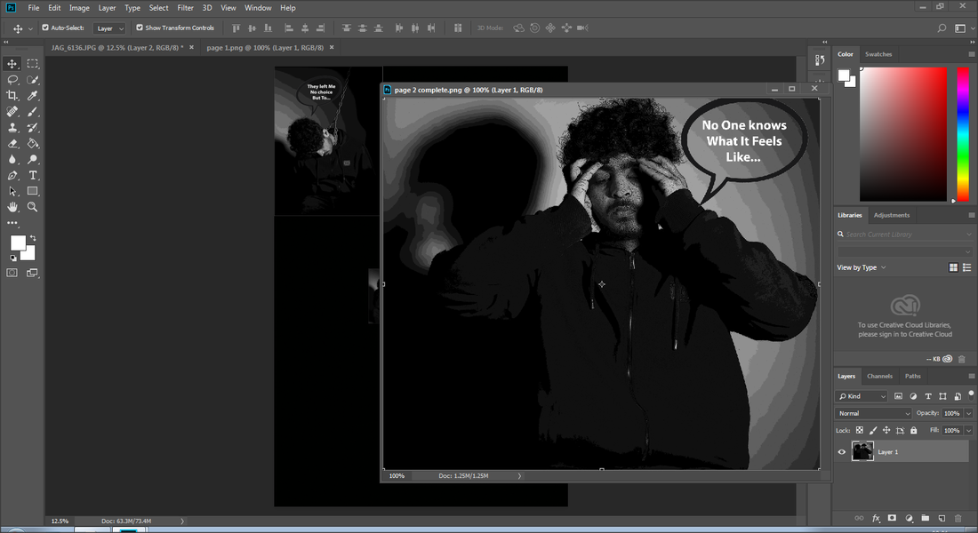
Completed Pages
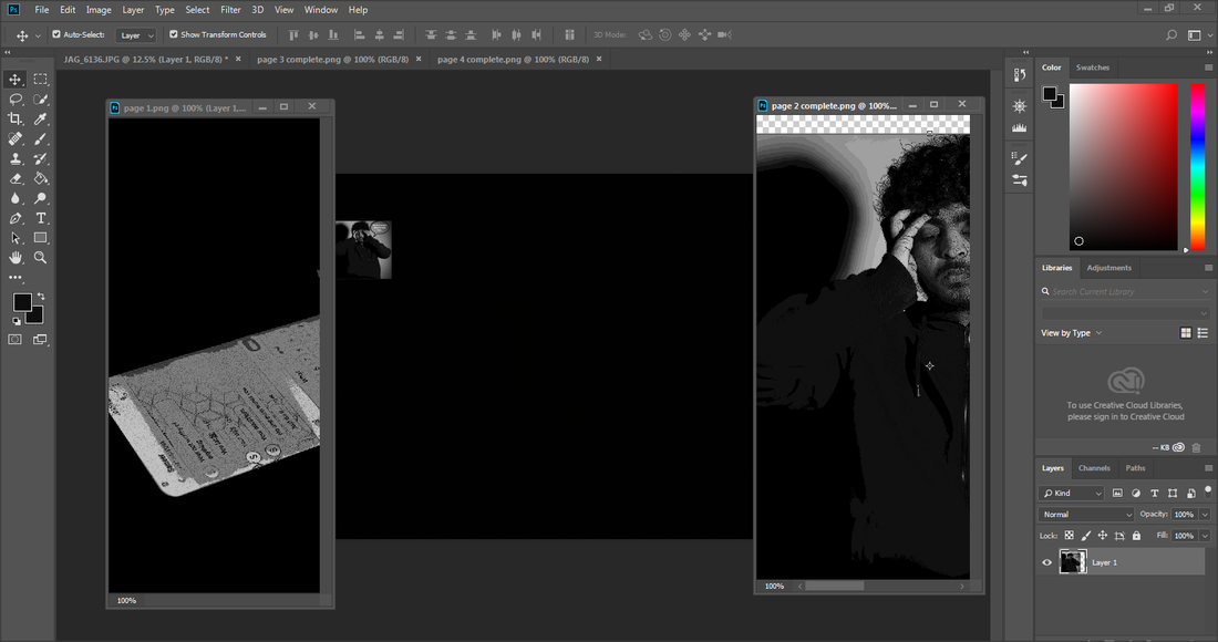
Page 1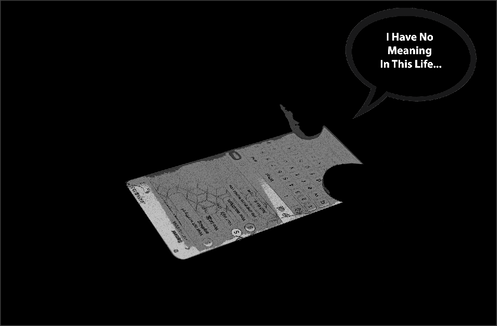
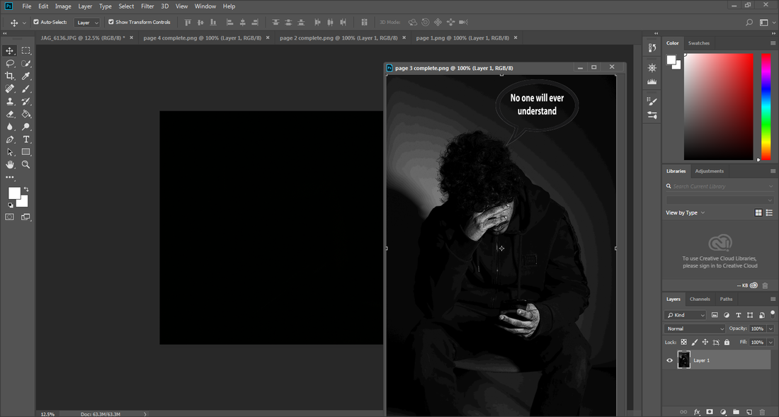
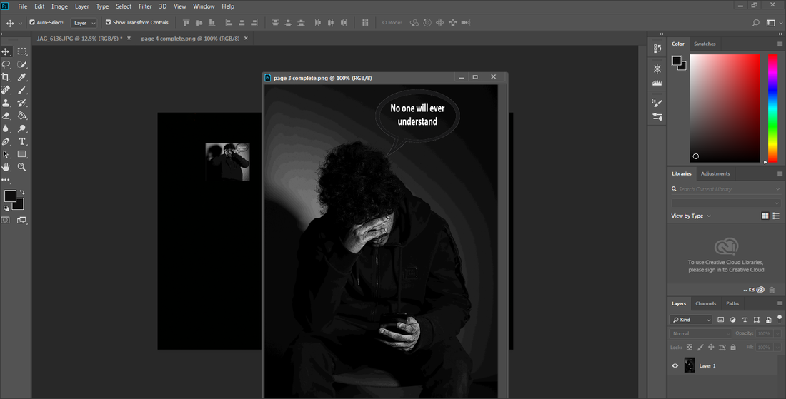
Page 3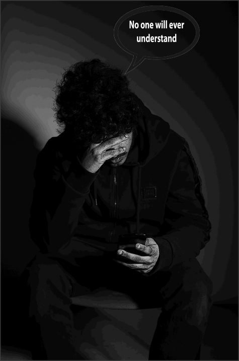
|
Page 2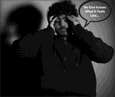
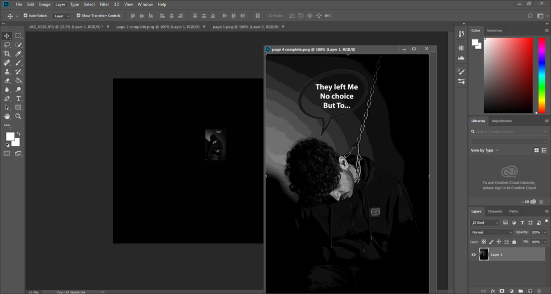
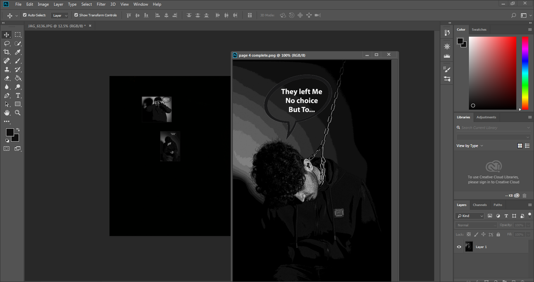
Page 4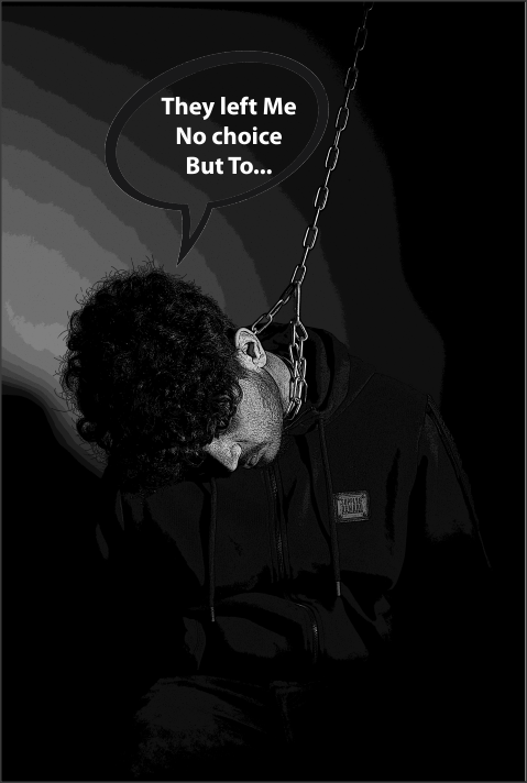
|
Front Cover Ideas
My Front Cover Images
Practicing my book.

FROM THIS POINT, 29.04.2019, I WILL NOT TOUCH MY PREPARATION WORK. THE ONLY WORK FROM THIS DATE WILL BE WORK CREATED FROM MY EXAM.
I am going to create 2/3 different front cover page idea's for my book.
First Front Cover Idea
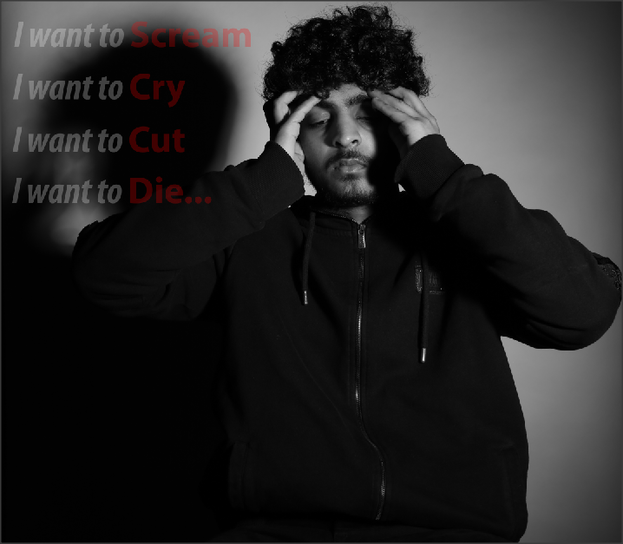
This is my first front cover page that I experimented with on Photoshop, When editing this picture I specifically used bald red writing on the words that I want to stand out, because them words are what my theme is about overall.
Second Front Cover idea
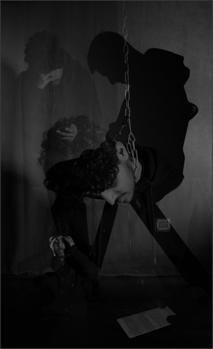
This is my second front cover idea that I experimented with Photoshop, when doing this image I layered multiple images on top of each other. I made each image size smaller then changing the opacity to let the image blend in the picture. This image shows everything happening all at once which could demonstrate all the stress and things going through someones mind when going through depression.
Developing My Second Front Cover Idea
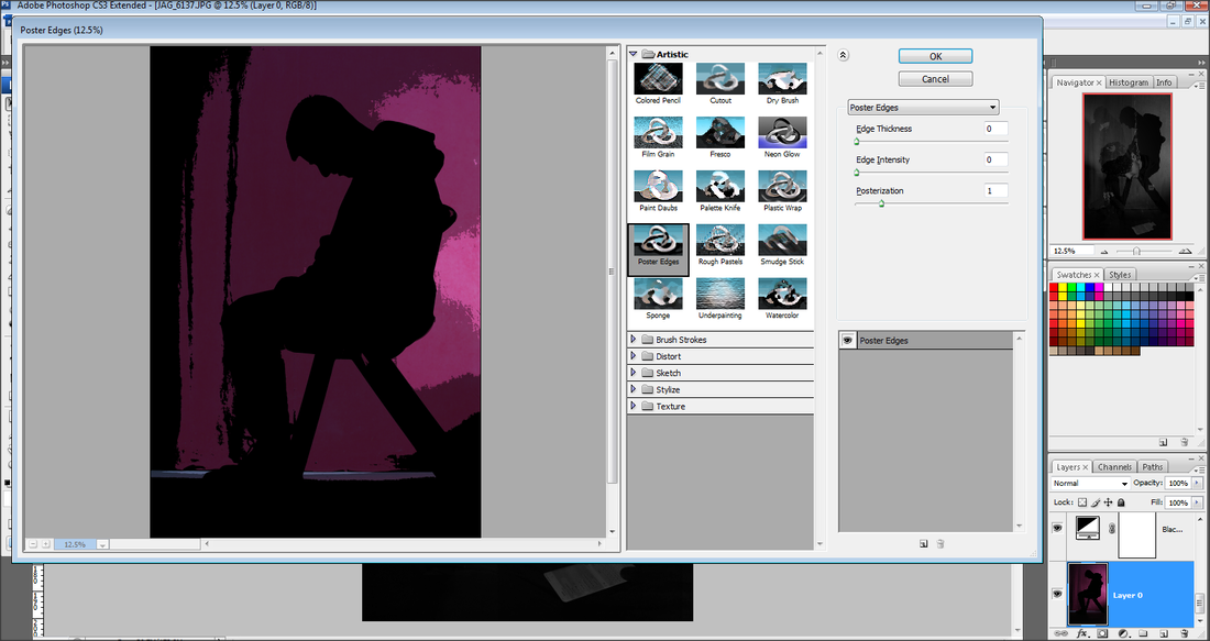
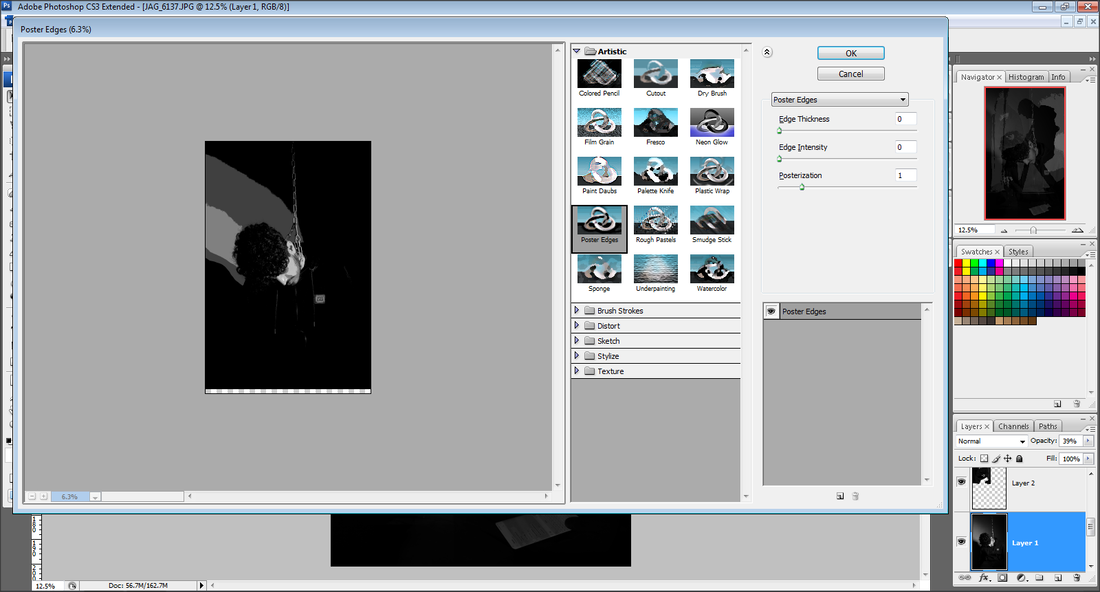
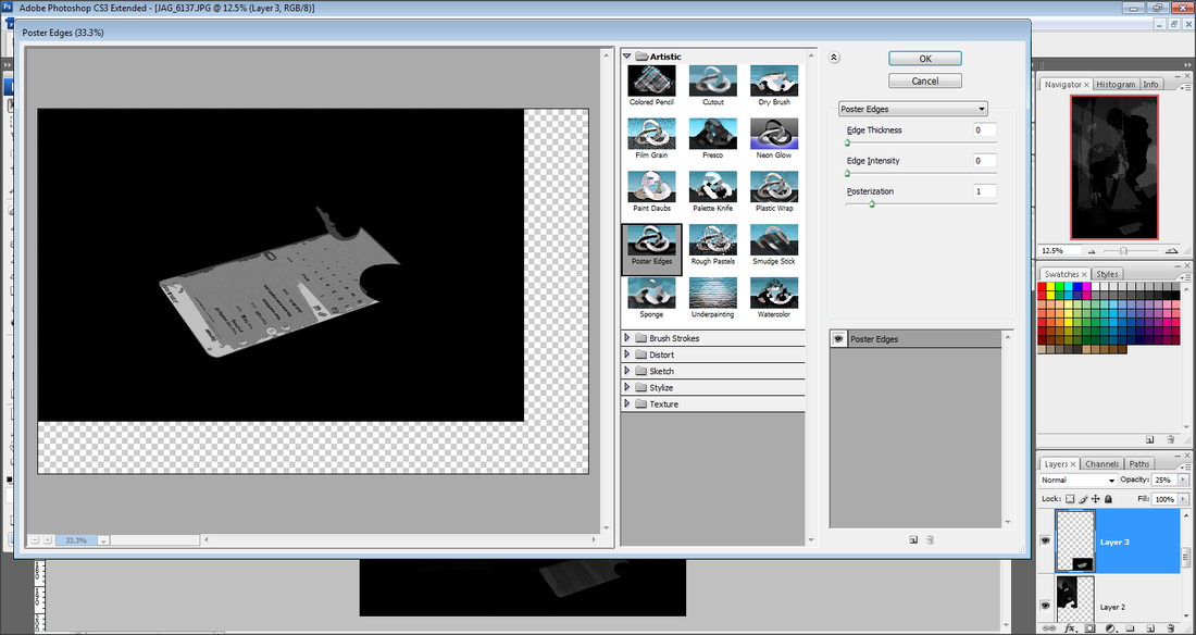
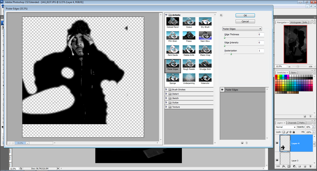
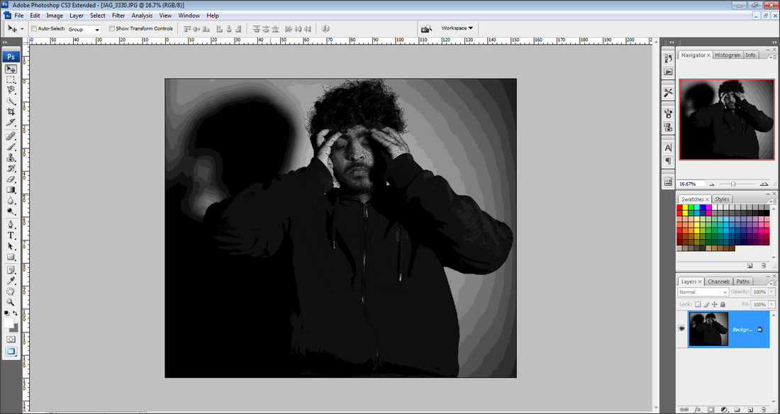
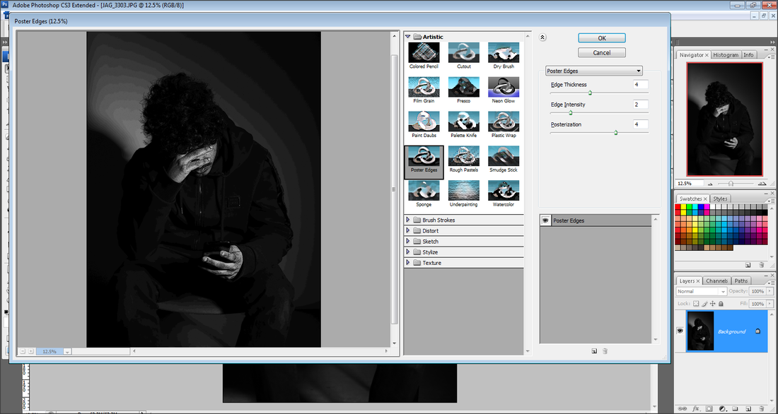
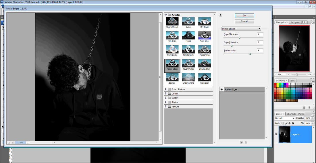
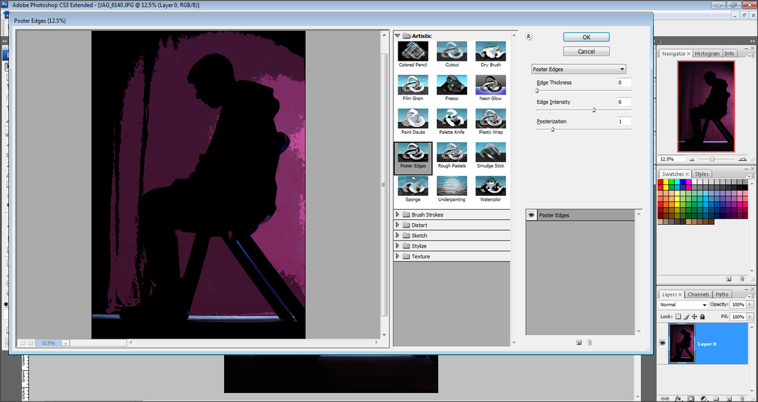
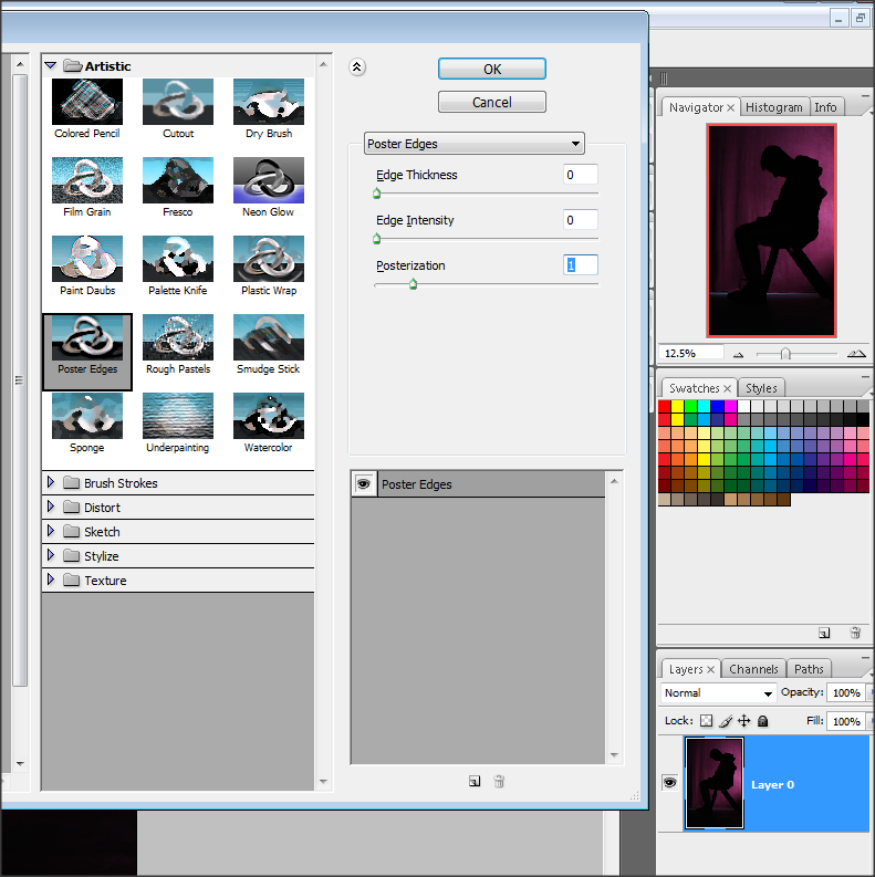
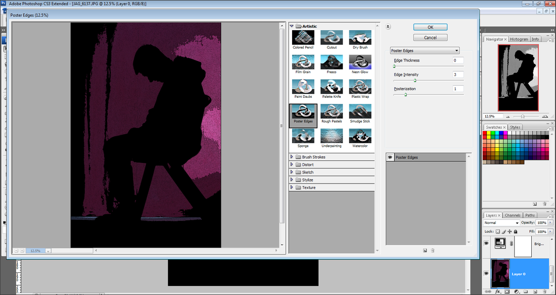
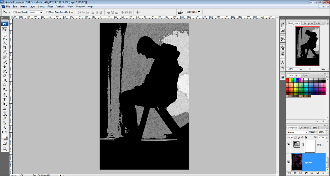
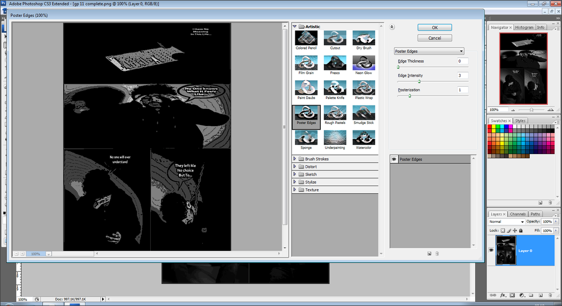
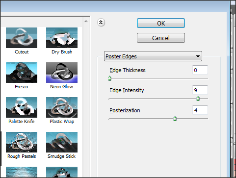
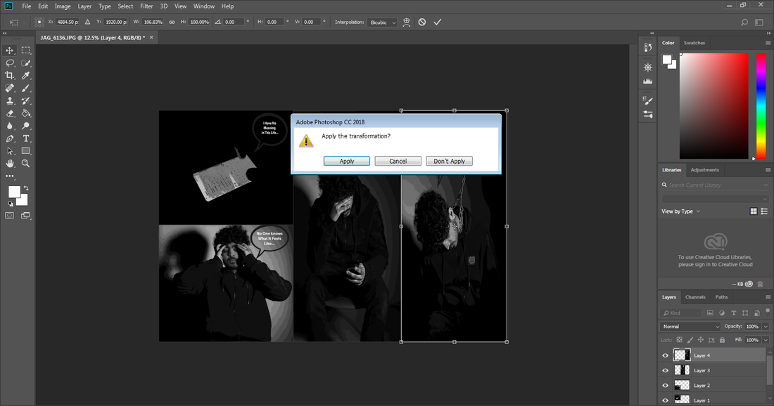
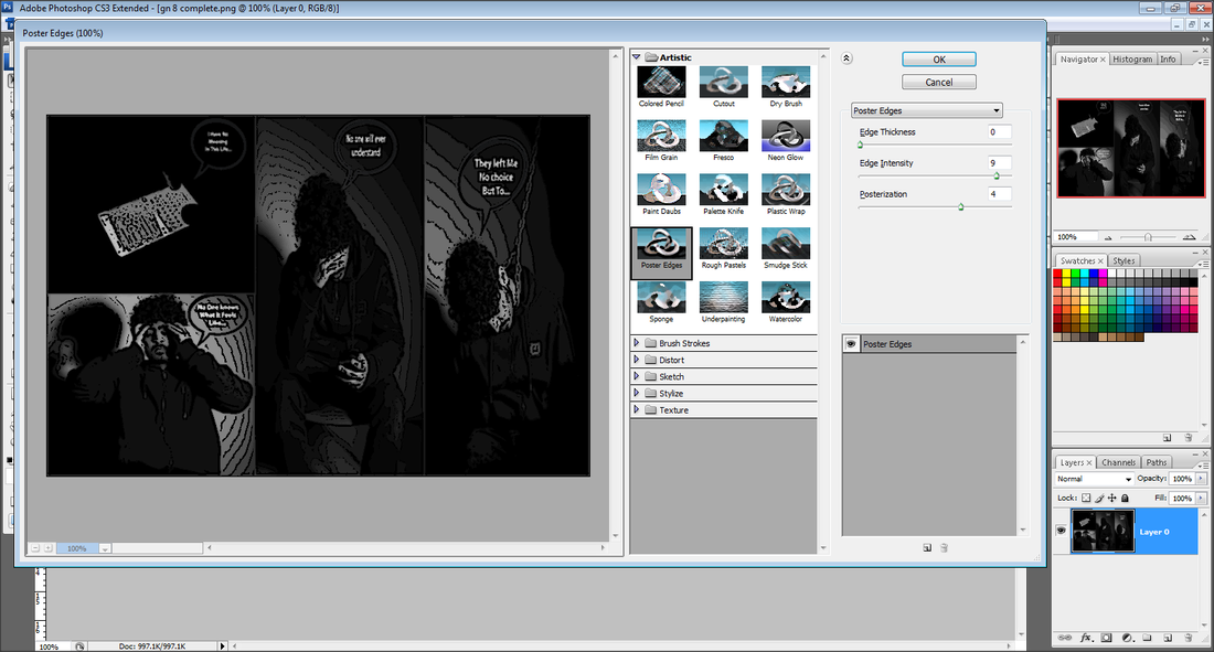
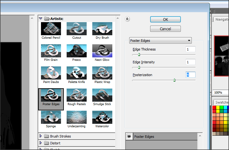
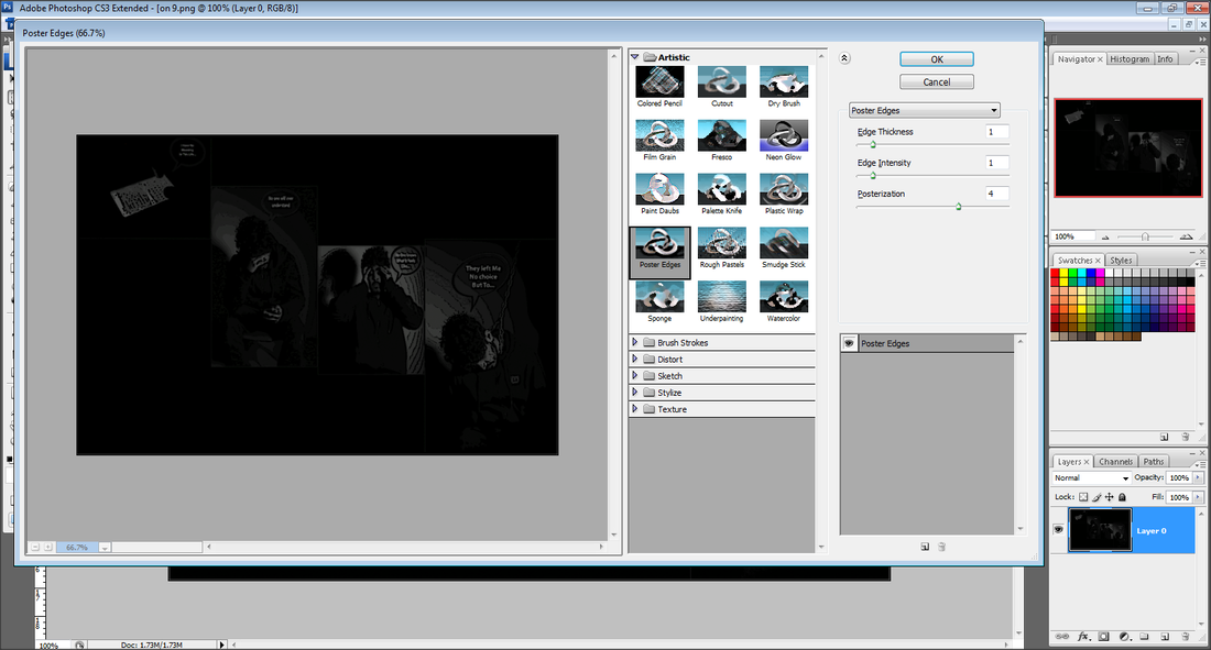
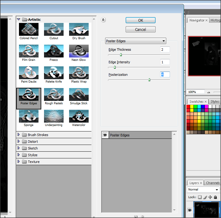
I have developed my Second front cover by using the 'POSTER EDGES' filter. I started by changing each individual into the filter. I used this specific filter because it best matches with my graphic novel effect that I am going to create.
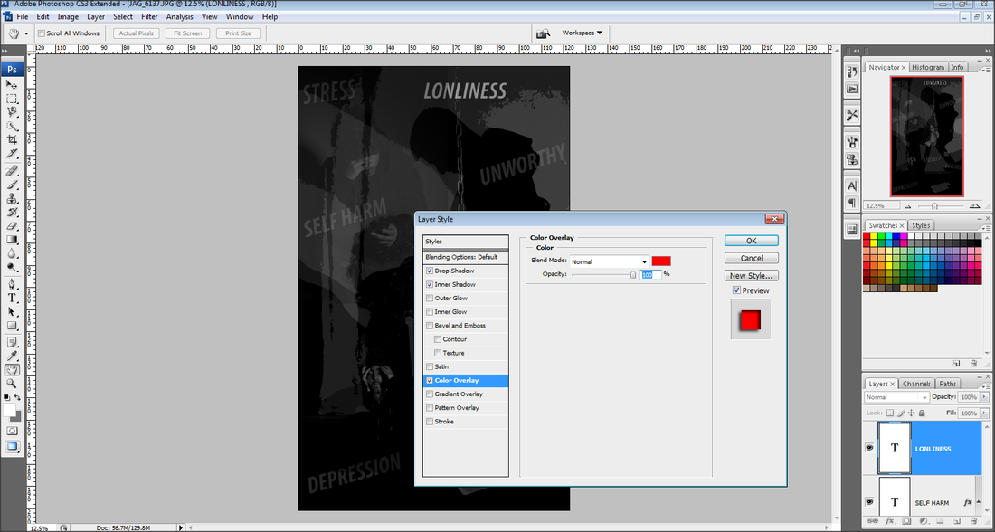
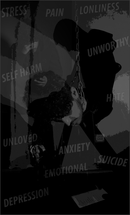
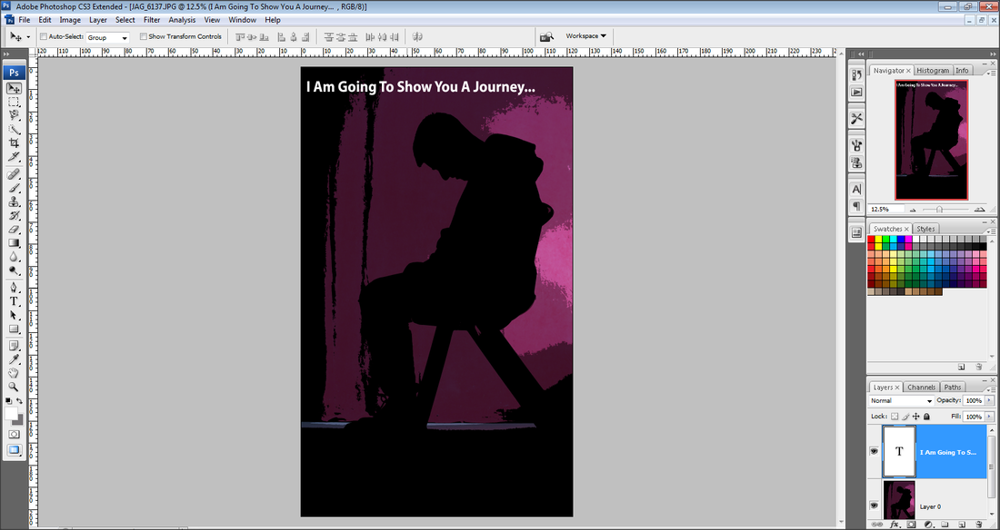
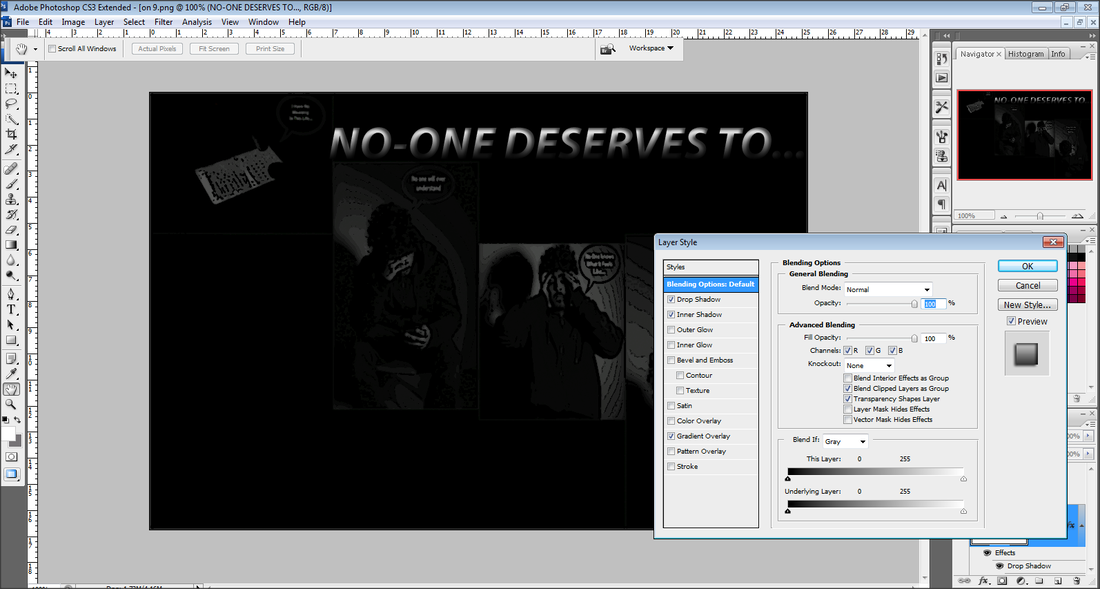
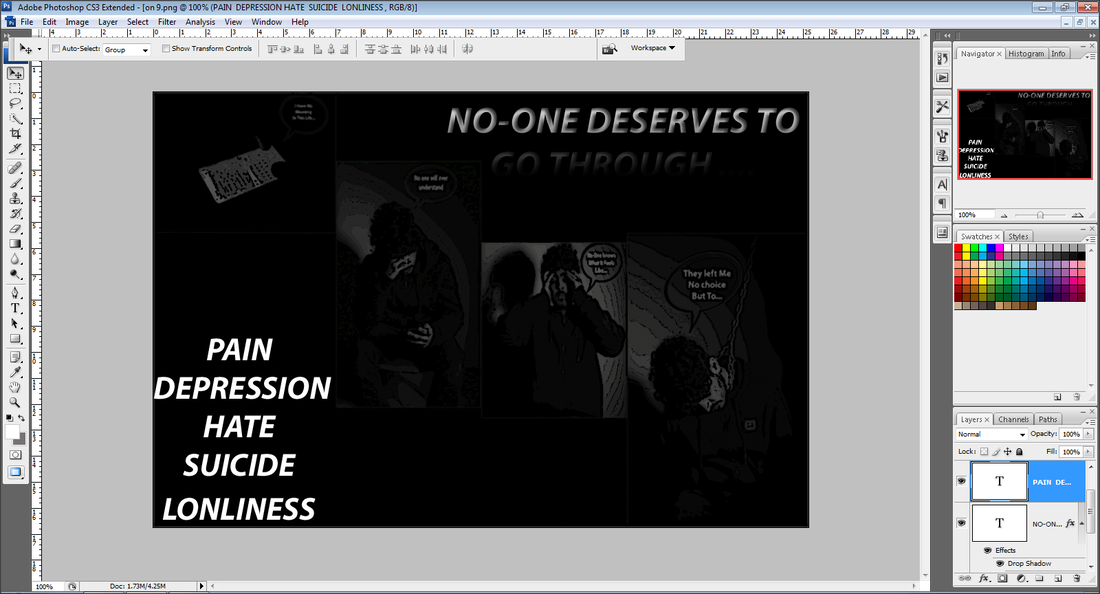
I have developed my Second front cover idea further by adding a variety of words that link to the overall theme of 'depression'. This would make my front cover more emotional and quite personal for the viewer. Also I feel it is more meaningful. When adding the words on, I changed the opacity of each word to make them blend them into the image.
Third Front Cover Idea
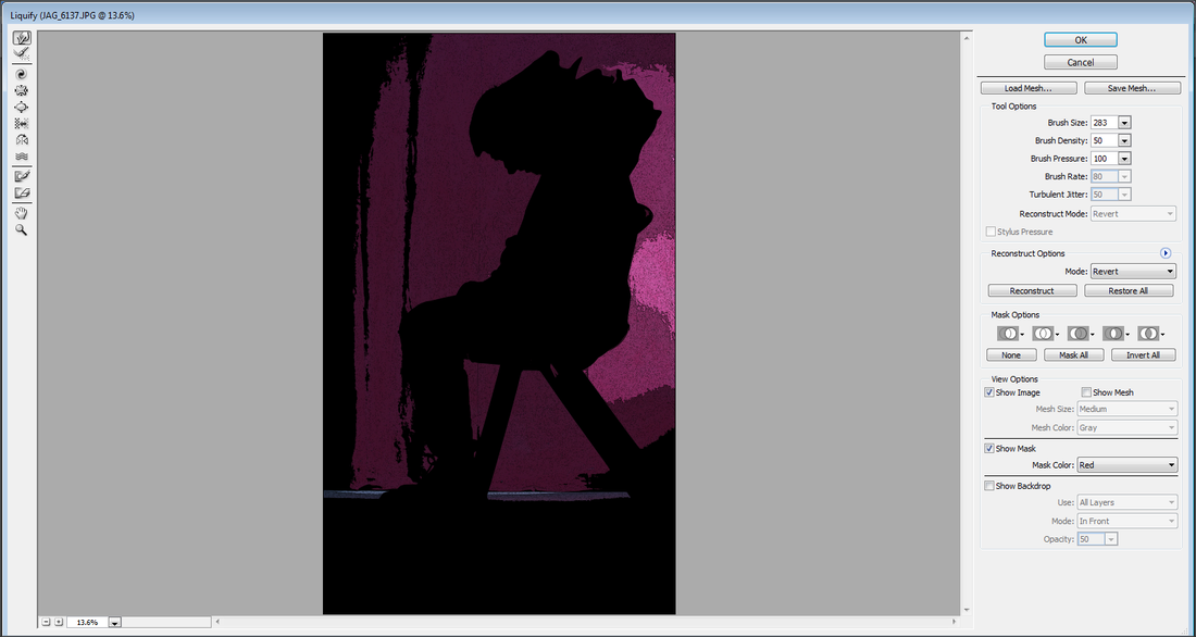
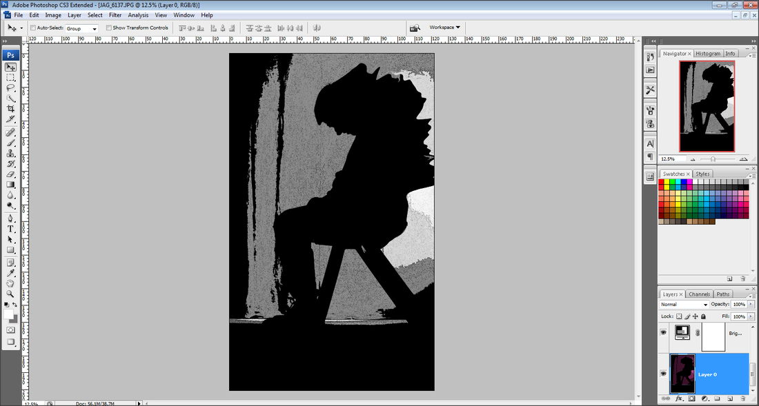
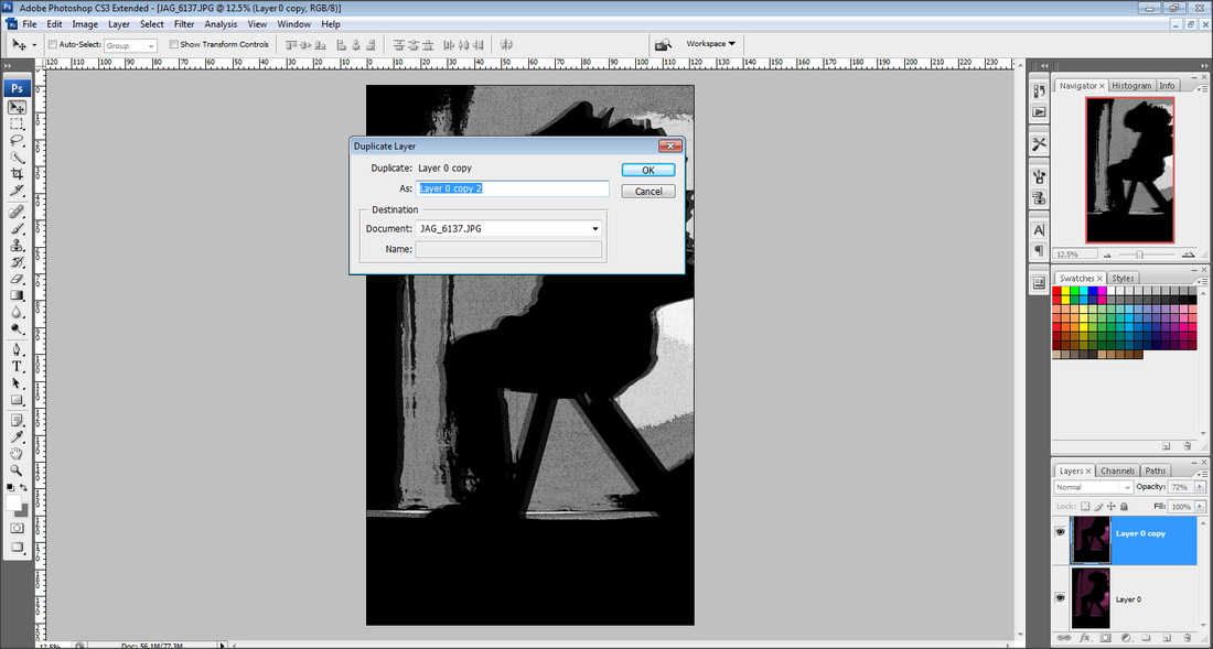
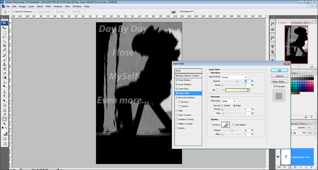
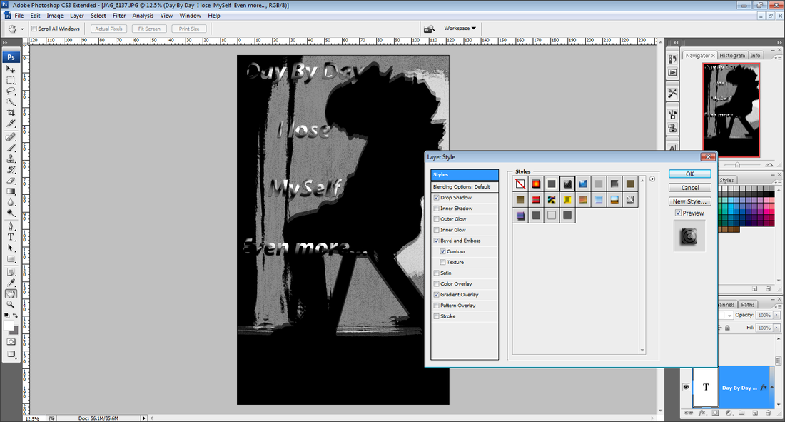
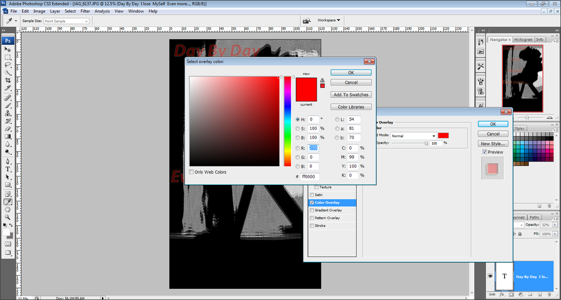

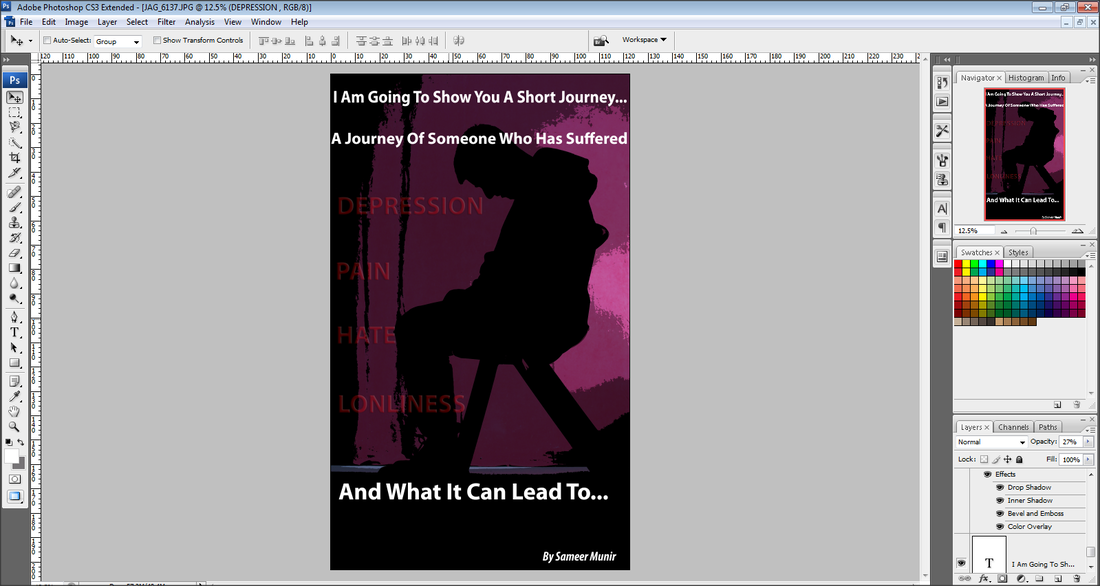
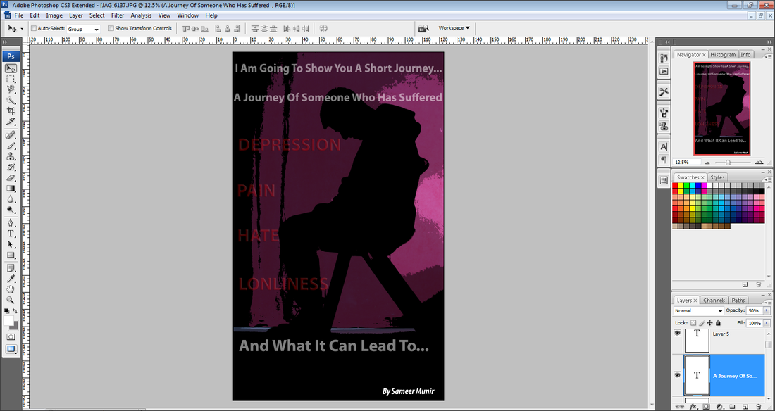
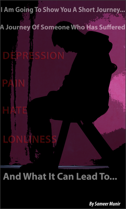
This is my Third Front Cover idea that I have experimented with Photoshop. While doing this Cover I used a range of techniques such as, using the 'poster edges' filter to give it the graphic novel style, also I used the liquify setting to stretch out the back of the model. I also duplicated the layer and copied the original layer, I then changed the opacity on the top layer, and moved it slightly to give it a blurry 3D look. When I wrote the message onto the image I used filters like, shadows, inner shadows, out glow, inner glow, and changed the colour of the writing, I did this so it stands out more and catches the viewers eyes. The reason why I have given this image a 3D look and stretched out the back of the model is because I feel it shows someone who is losing themselves and they own self is running away from them, as if they have lost there own self, which allows them not be there normal selves anymore and changes them into a different person.
My Final Front Cover Idea's For My Book
Book cover 1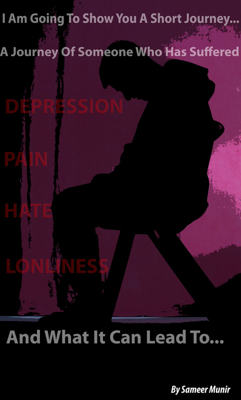
Book cover 3
|
Book cover 2
Book cover 4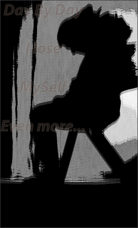
|
When making My book I am going to chose one of these book covers to make my book with. I have used 1/3 of my photography Exam on making my cover. The next 3 hours I have for my exam I have I am going to spend that time building my book and also taking pictures of the process from start to finish.
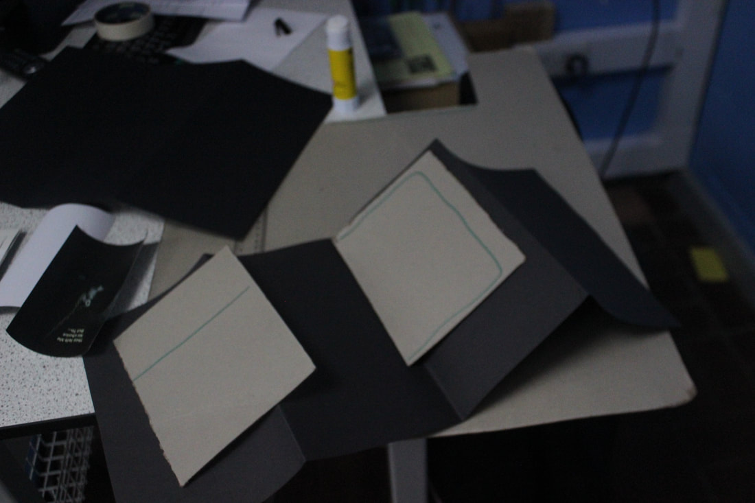
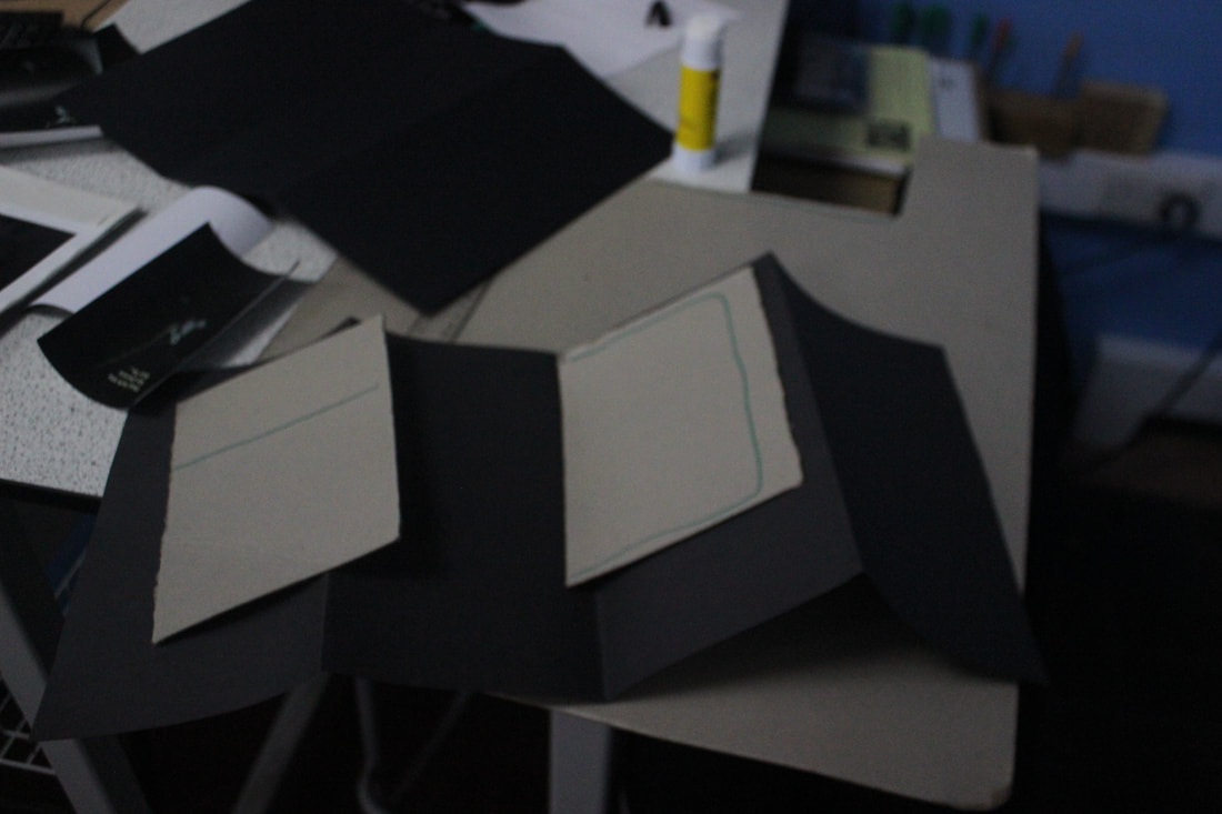
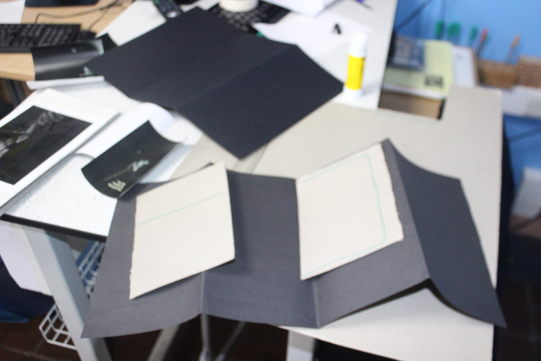
MAKING OF MY BOOK
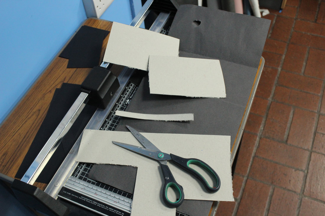
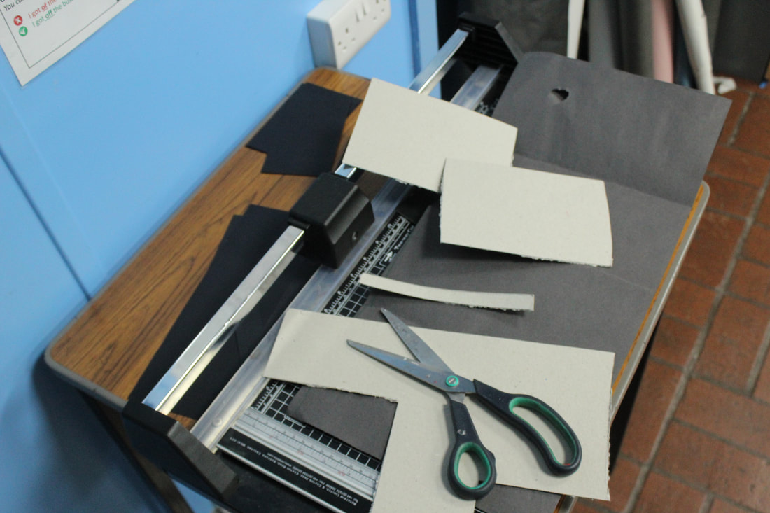
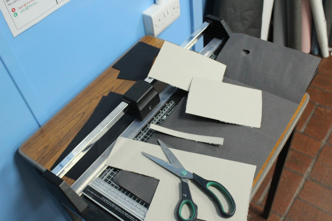
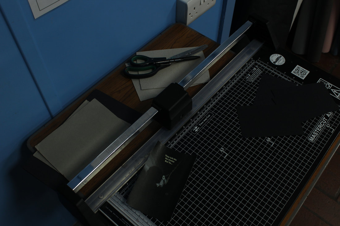
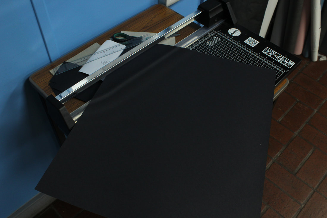
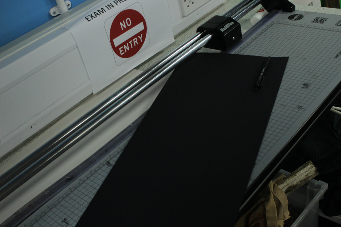
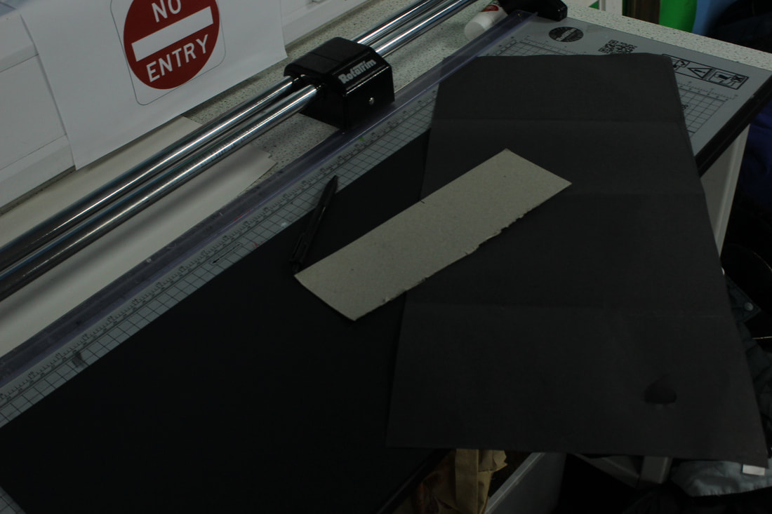
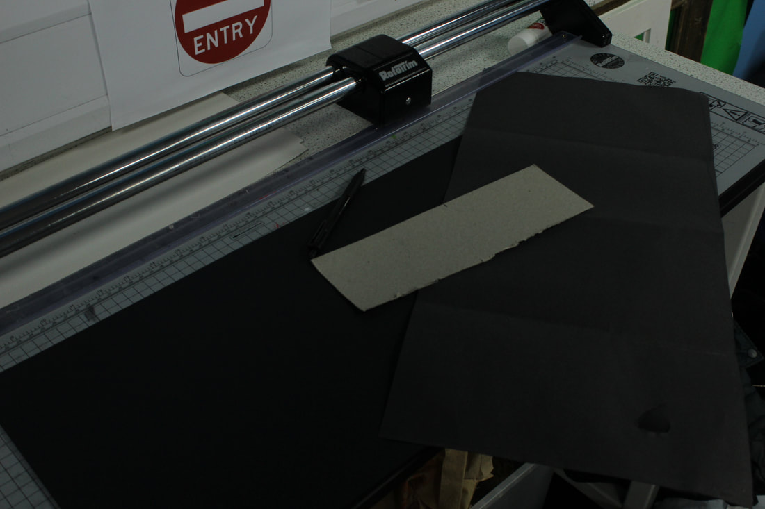
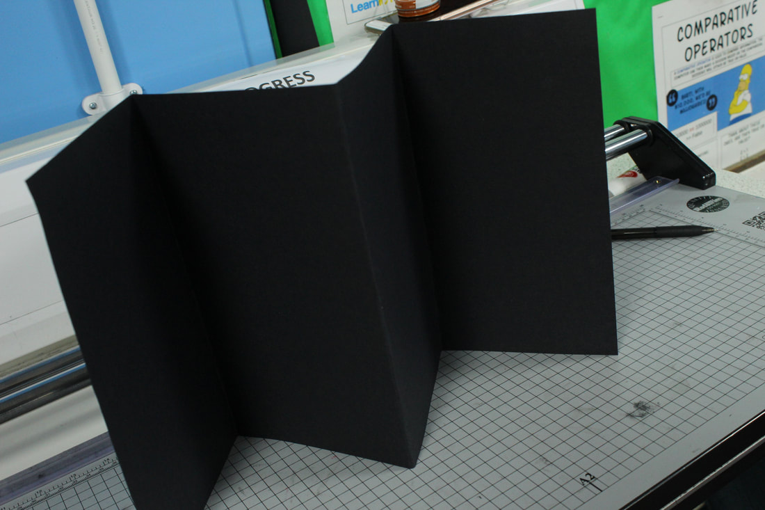
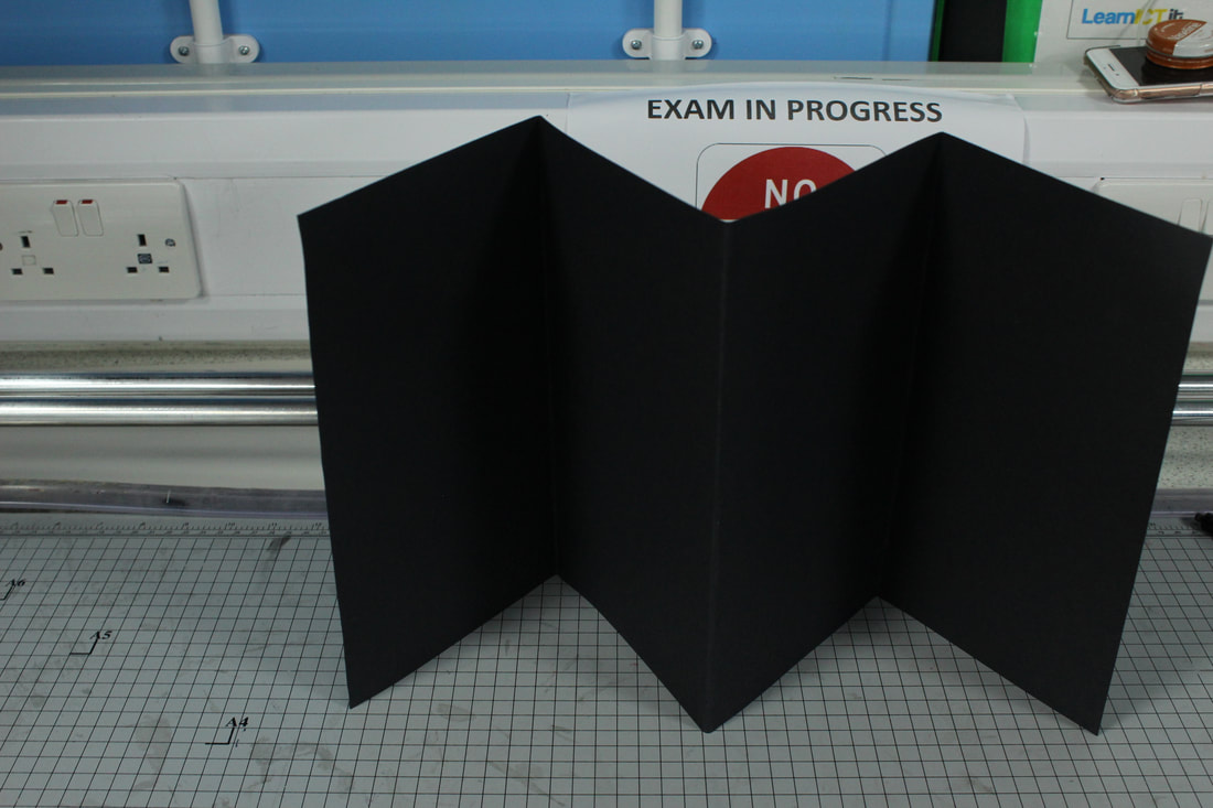
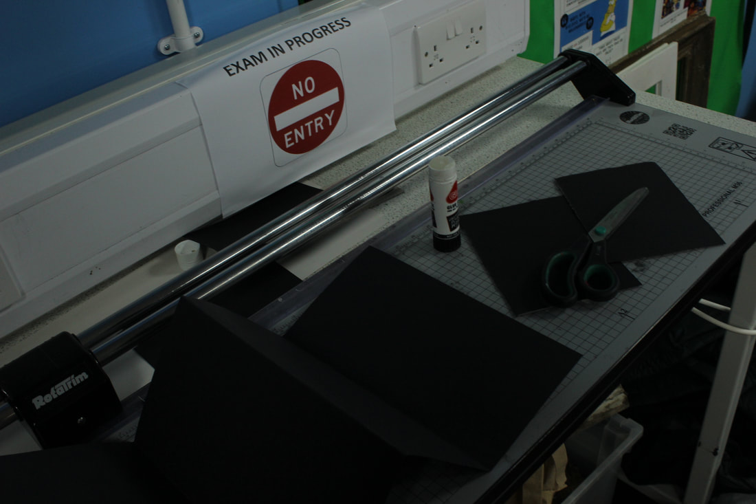
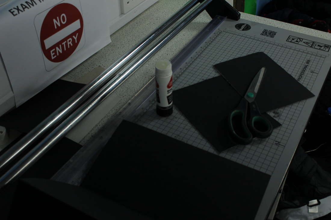
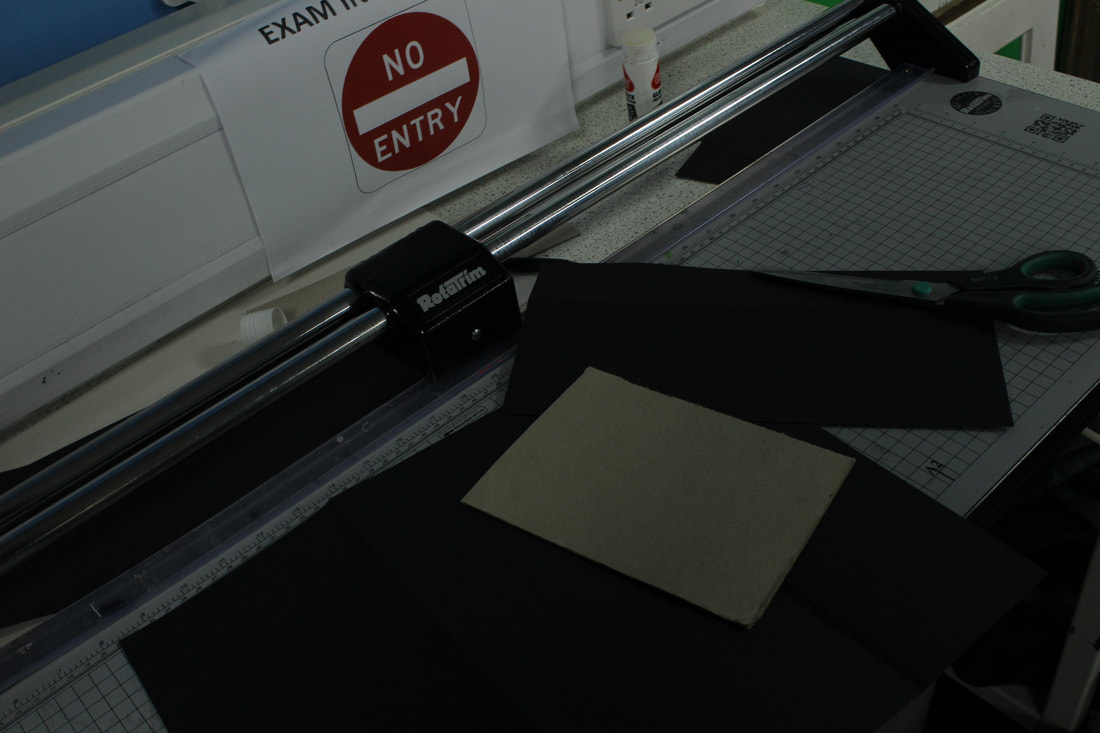
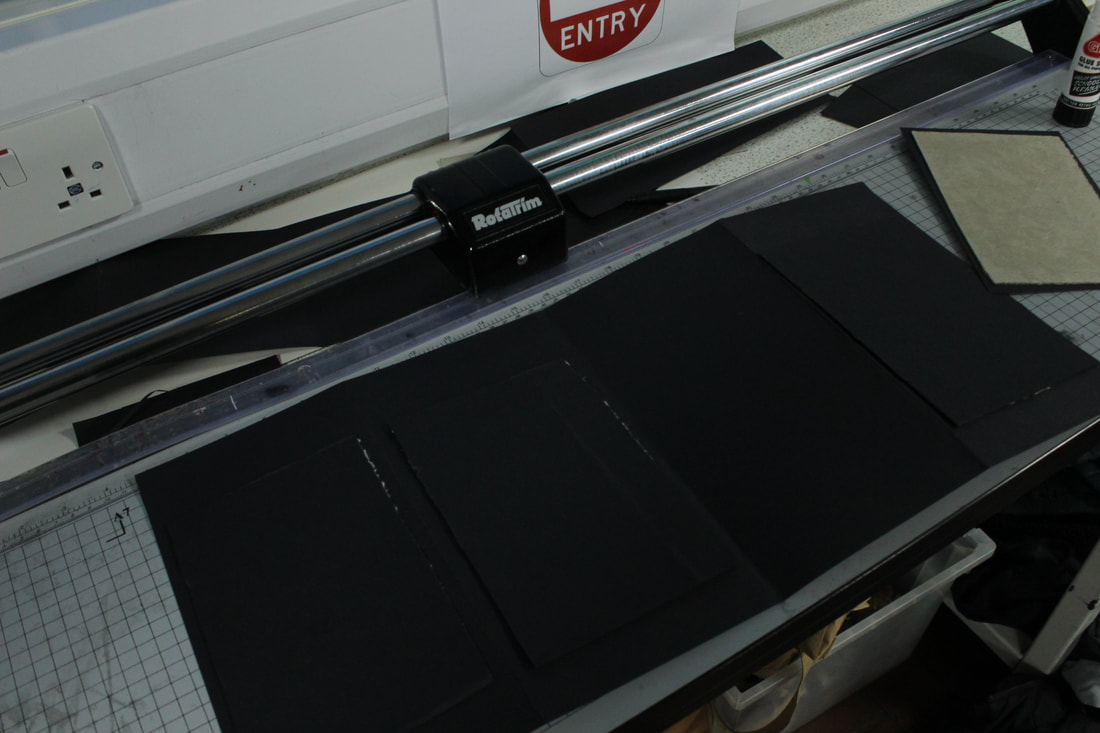
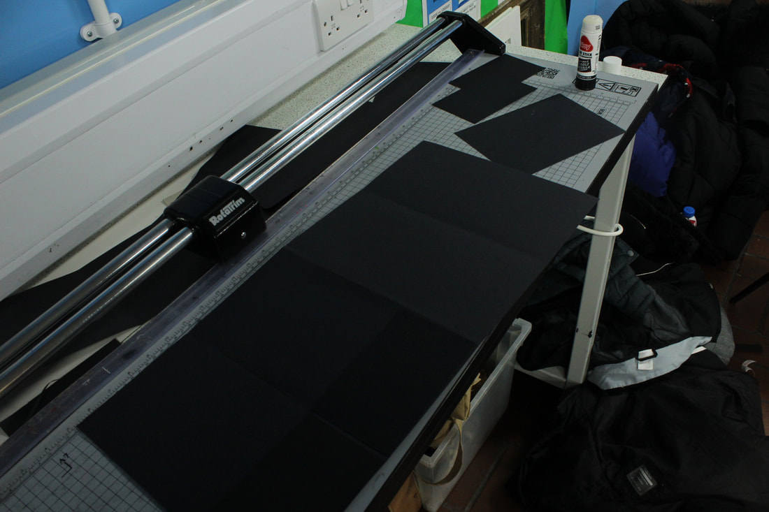
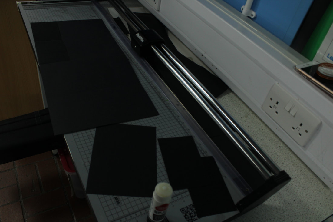
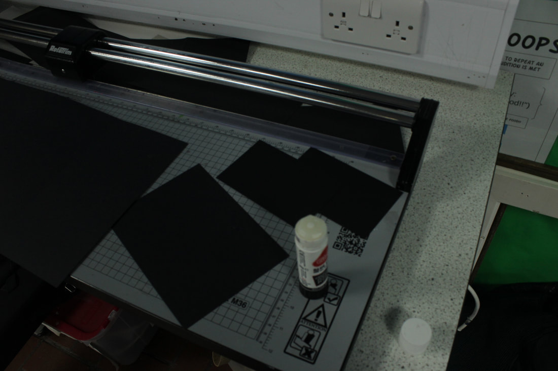
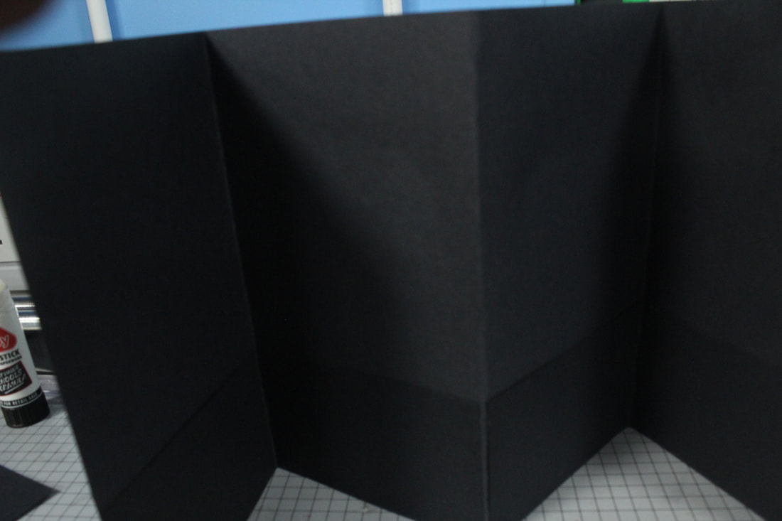
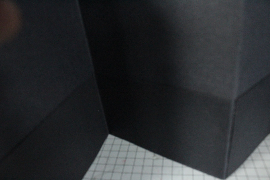
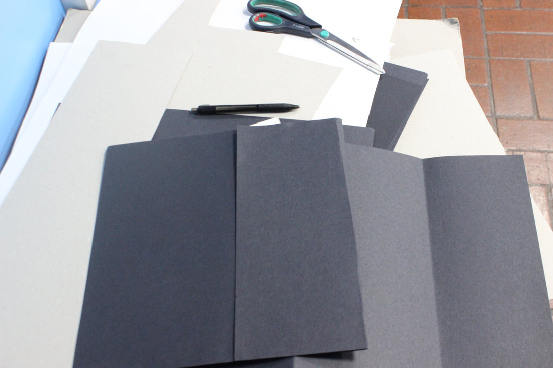
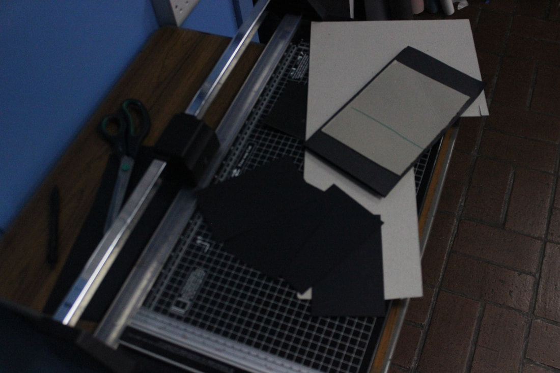
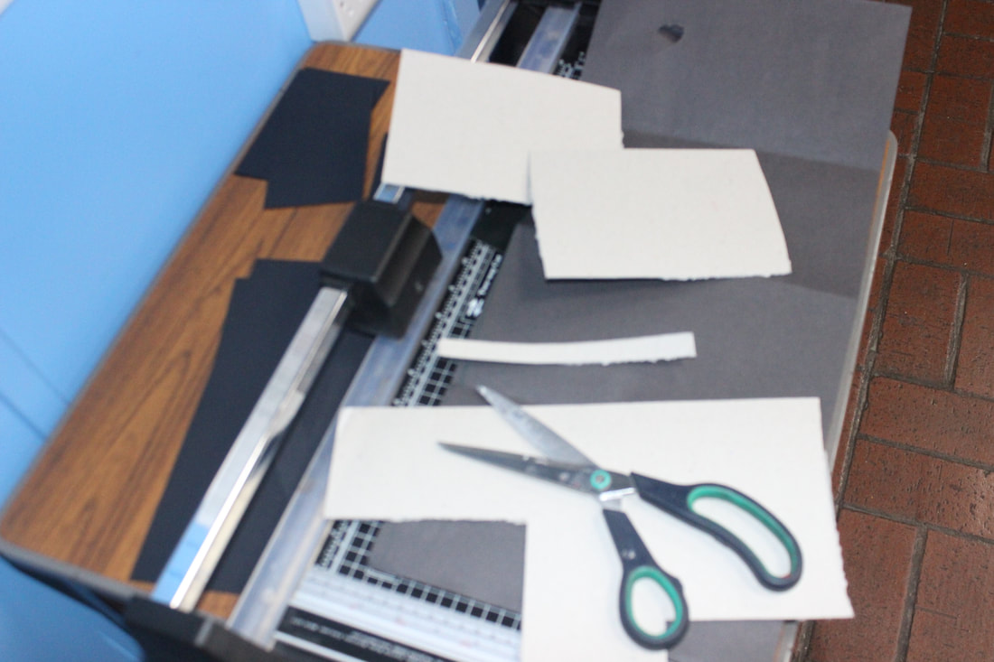
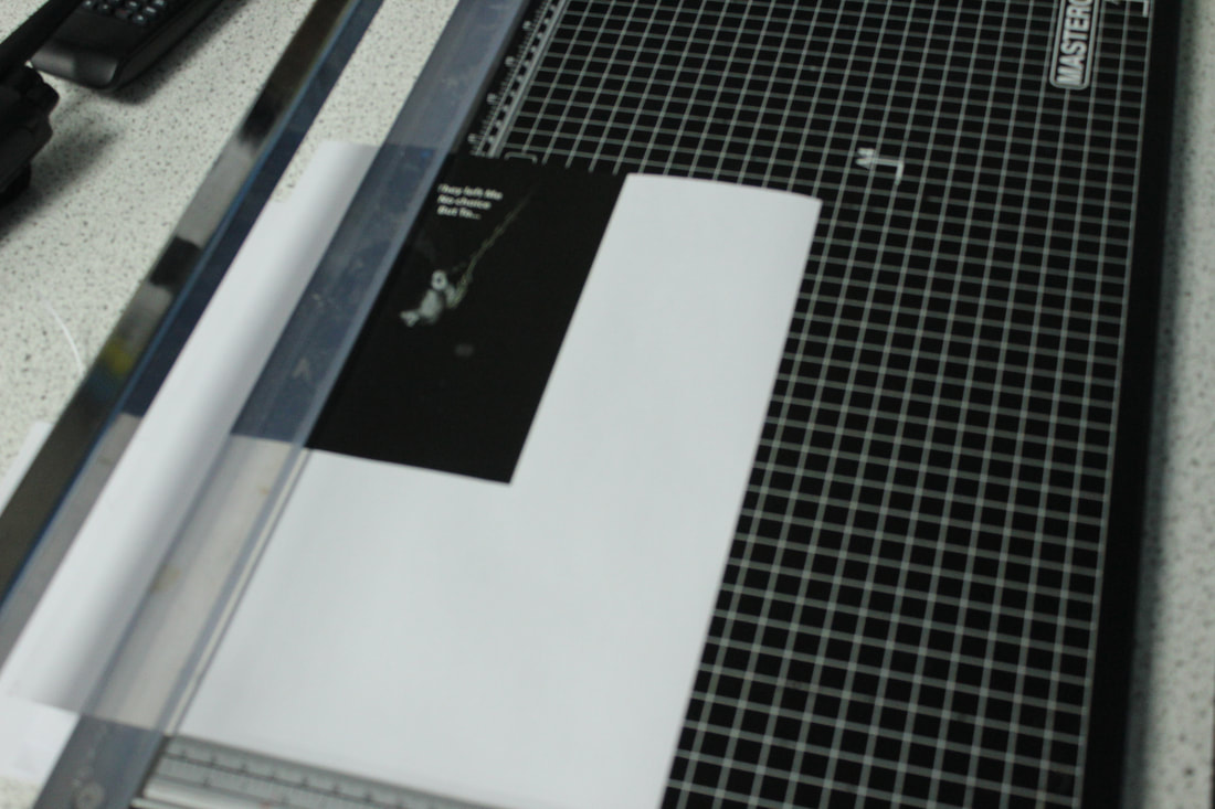
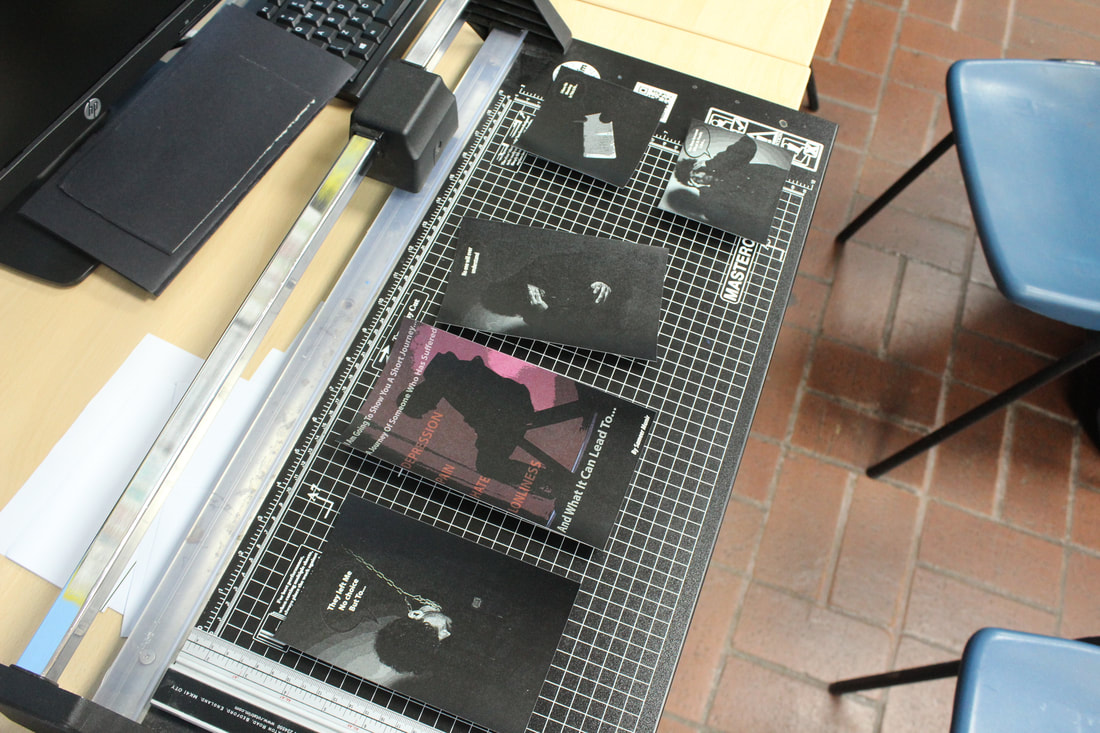
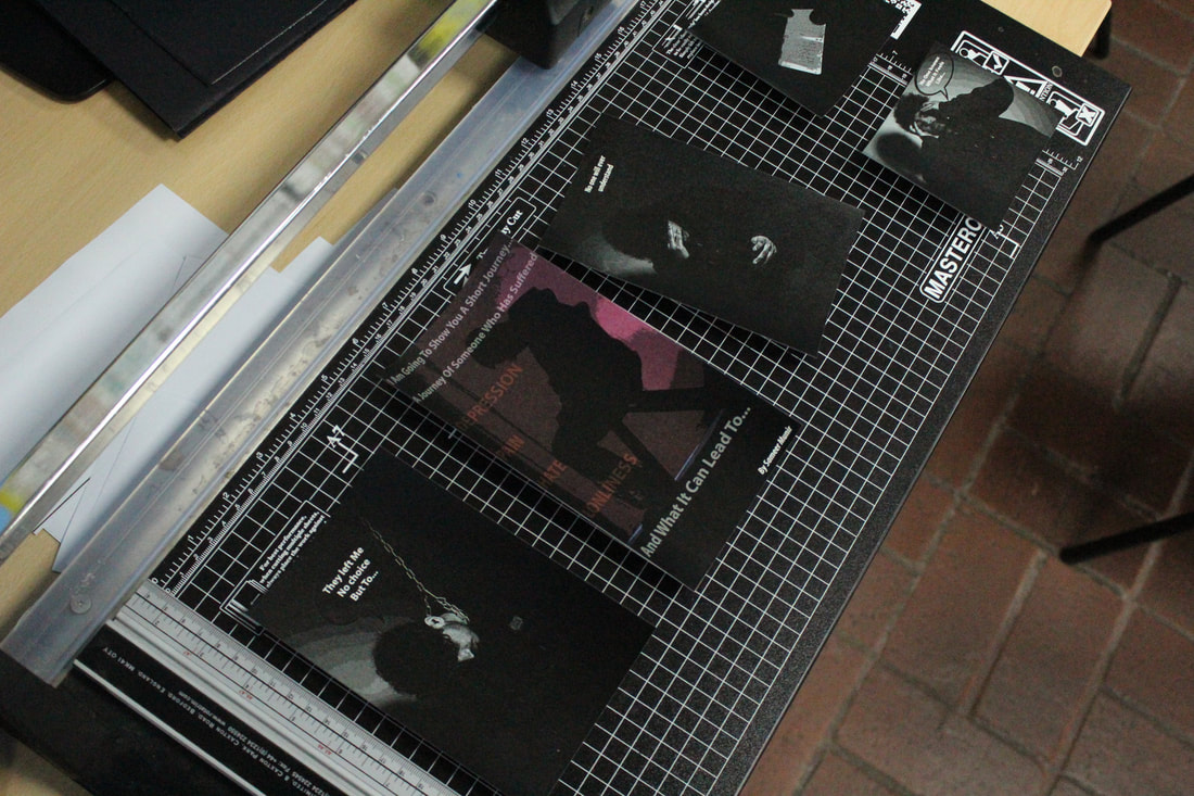
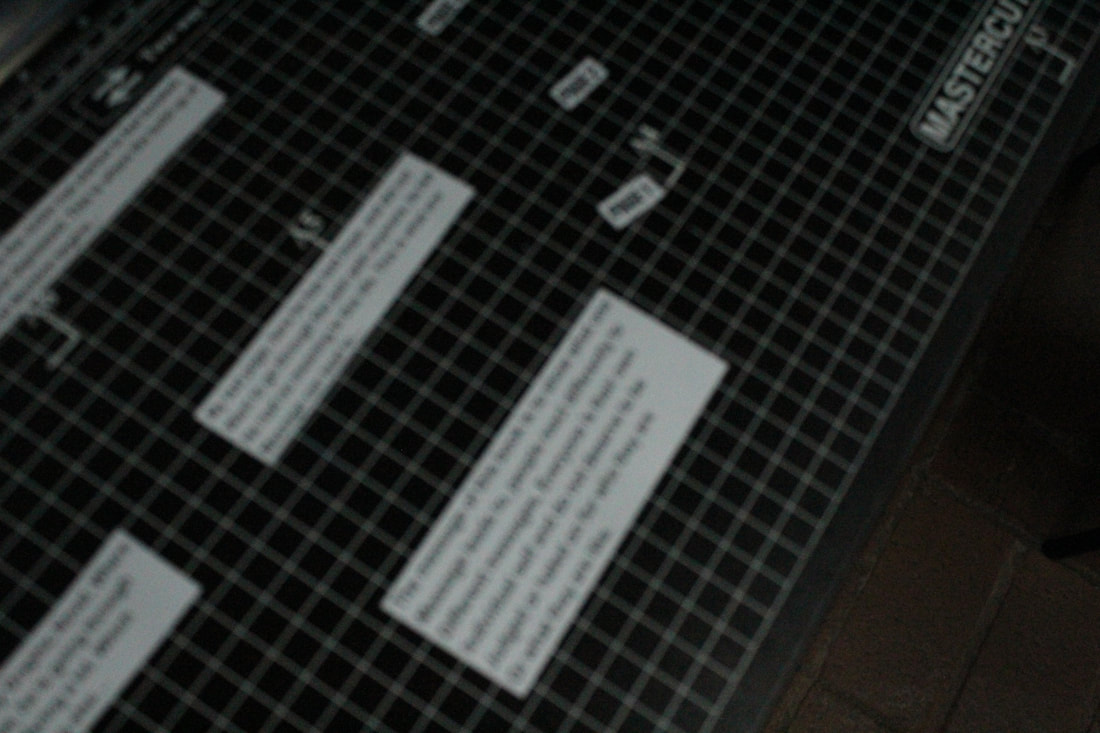
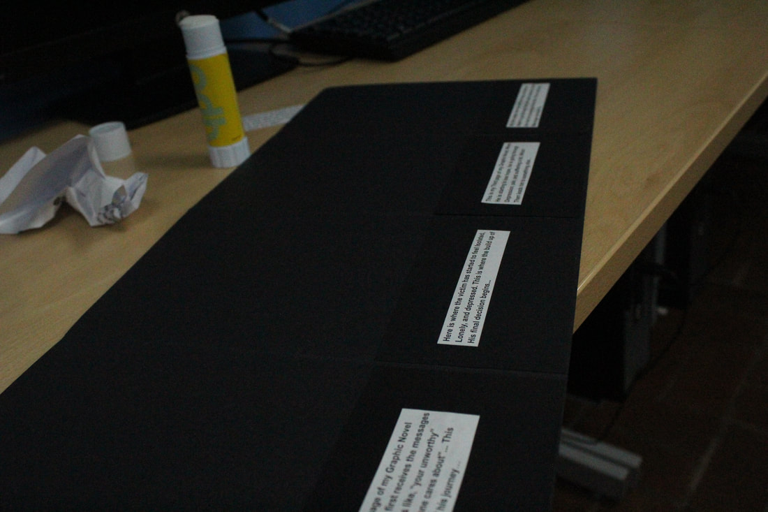
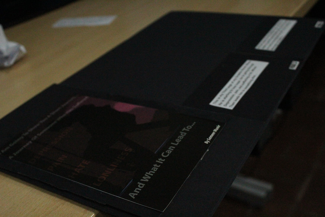
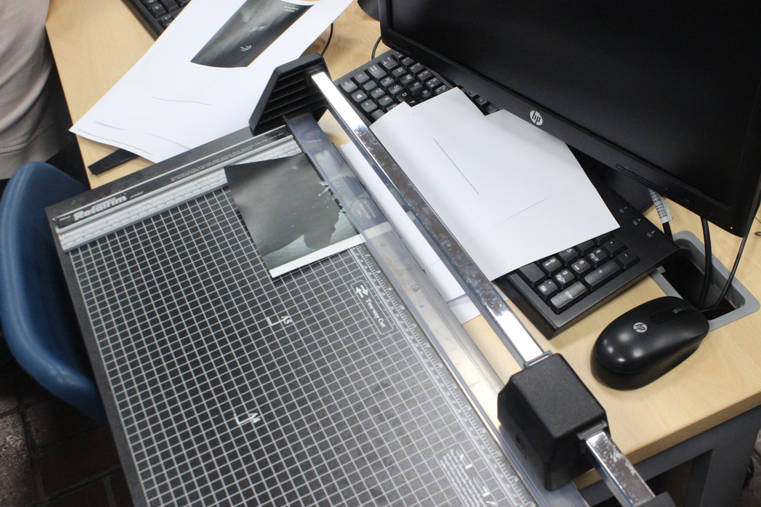
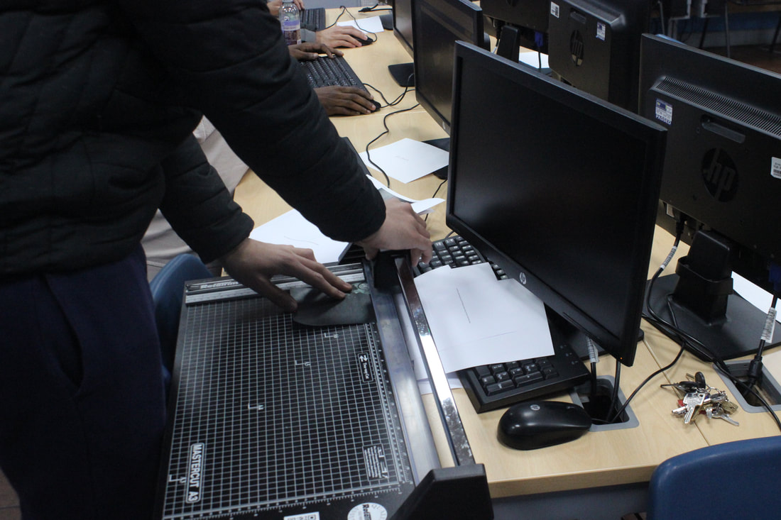
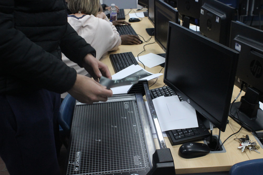
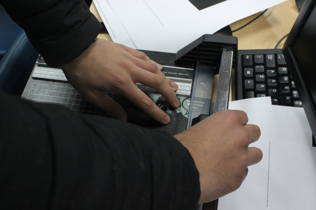
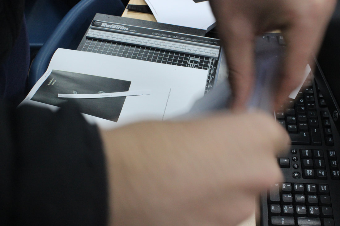
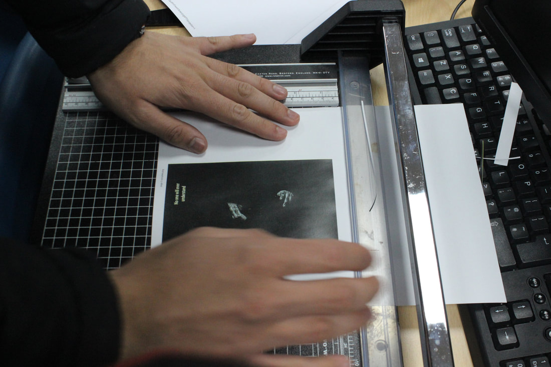
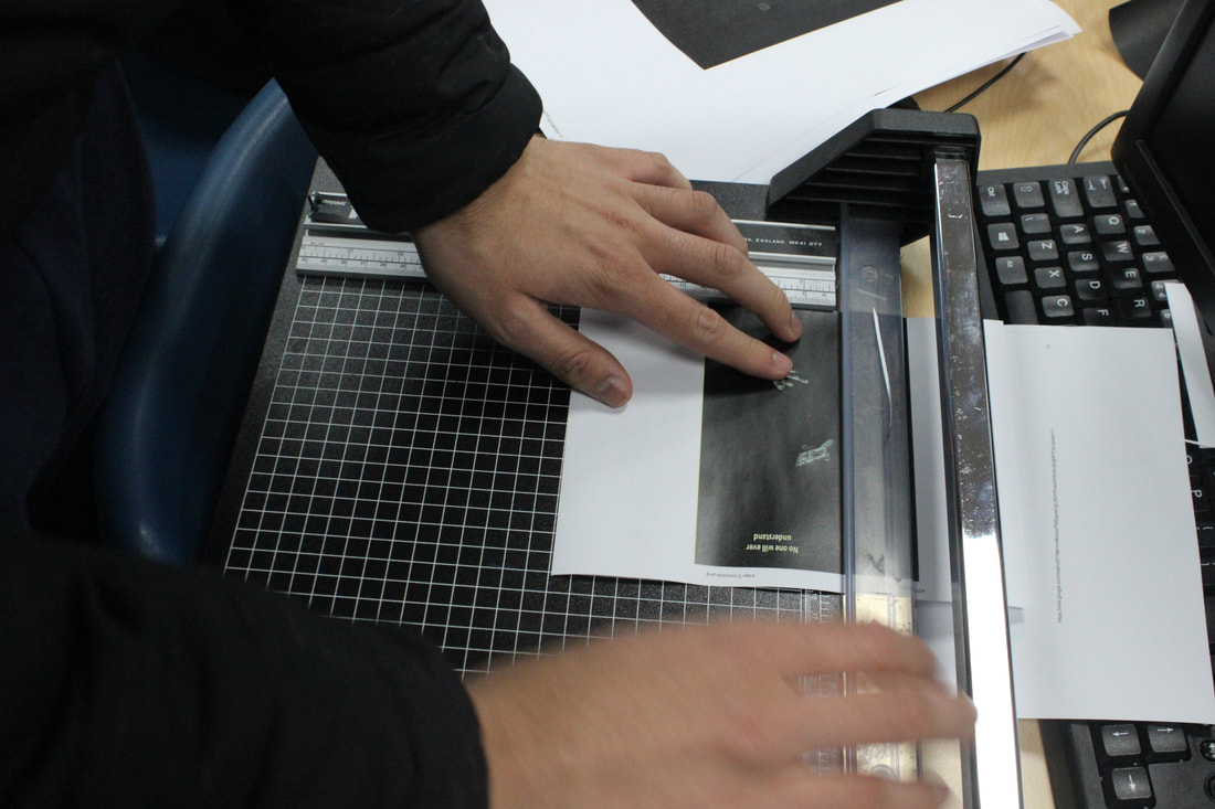
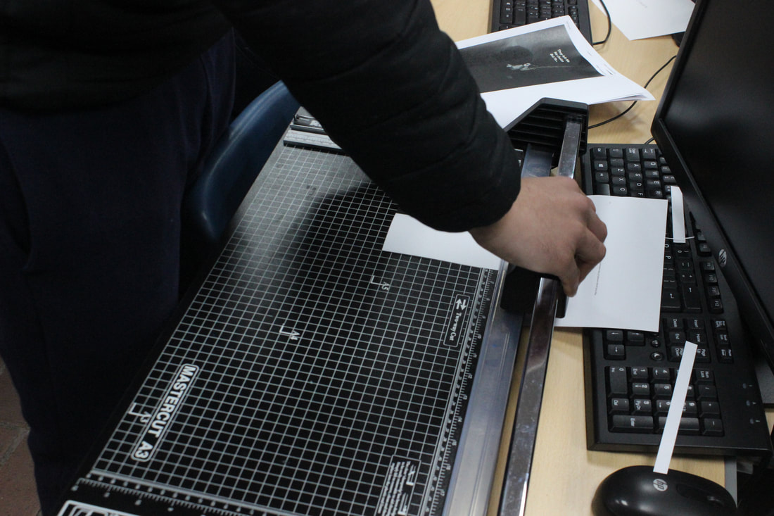
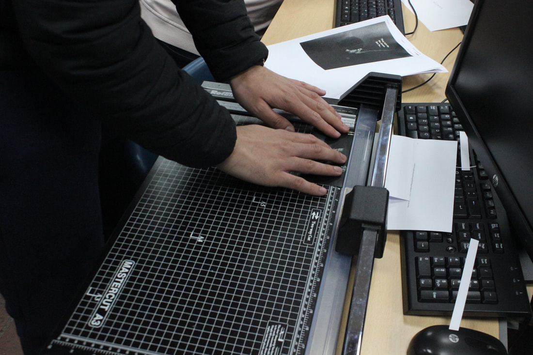
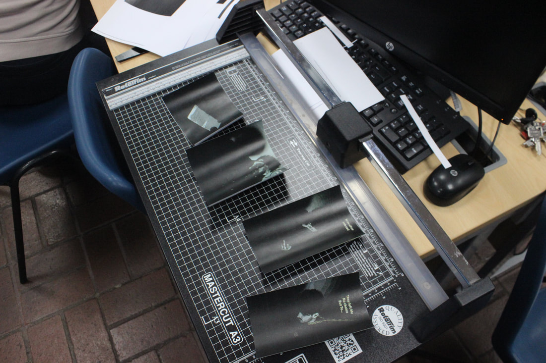
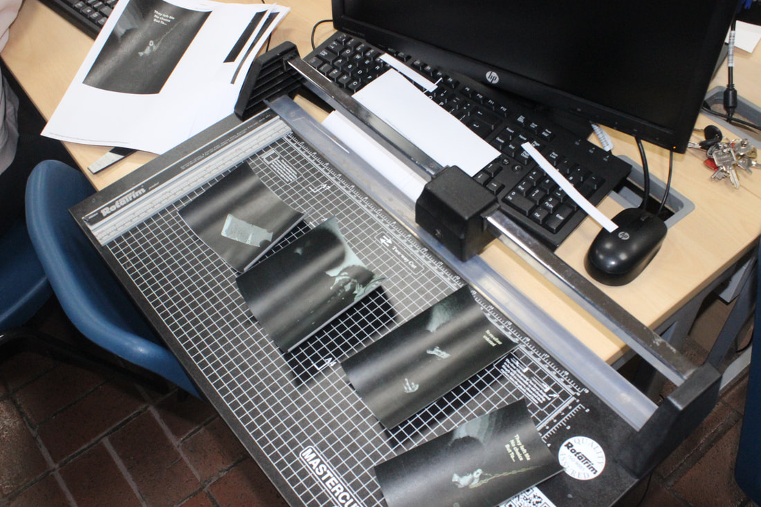
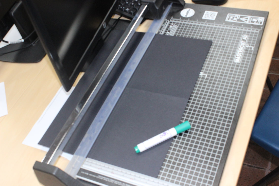
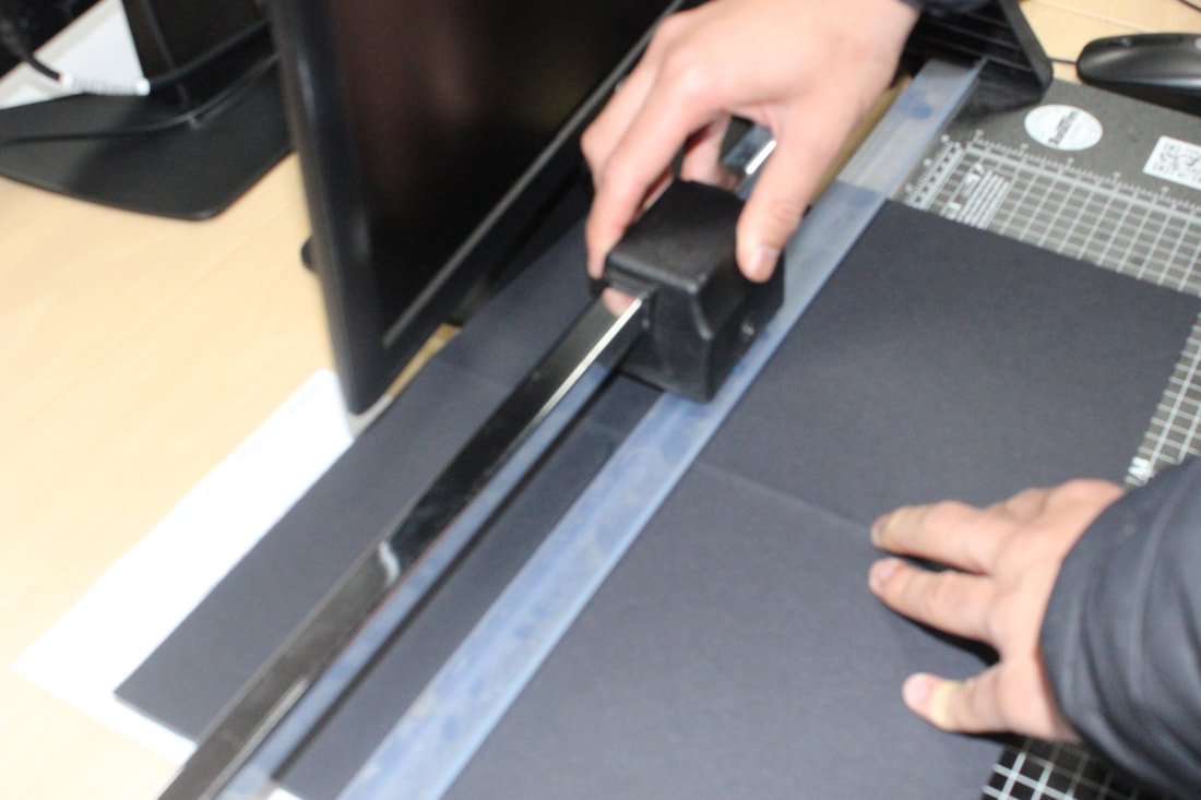
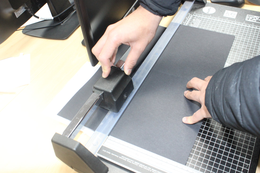
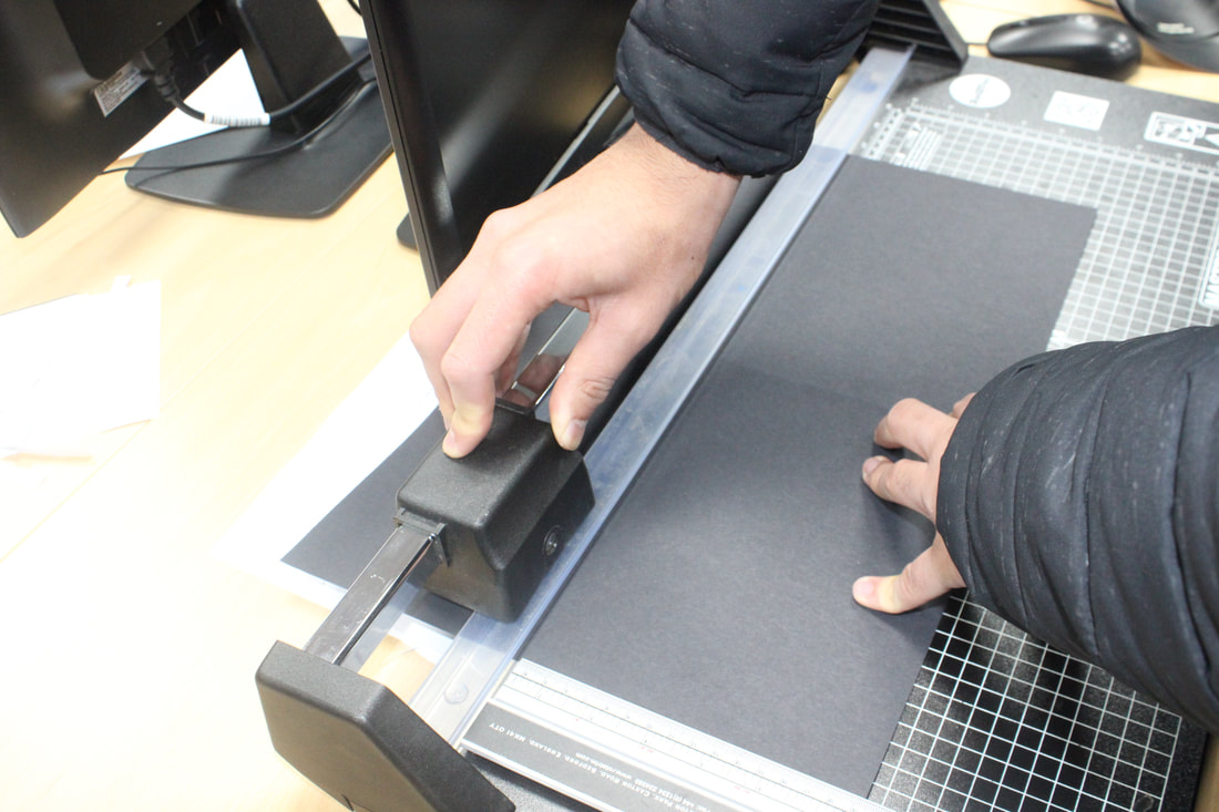
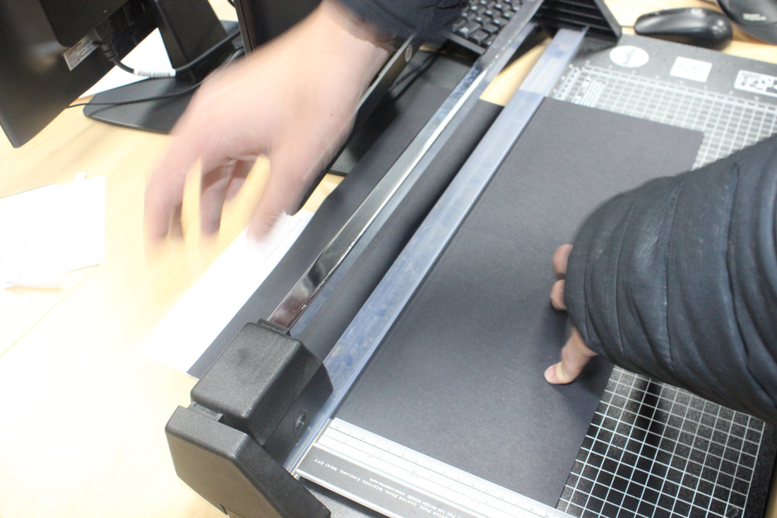
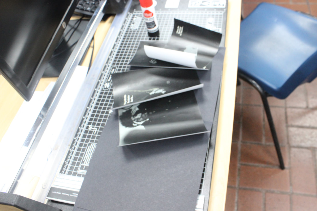
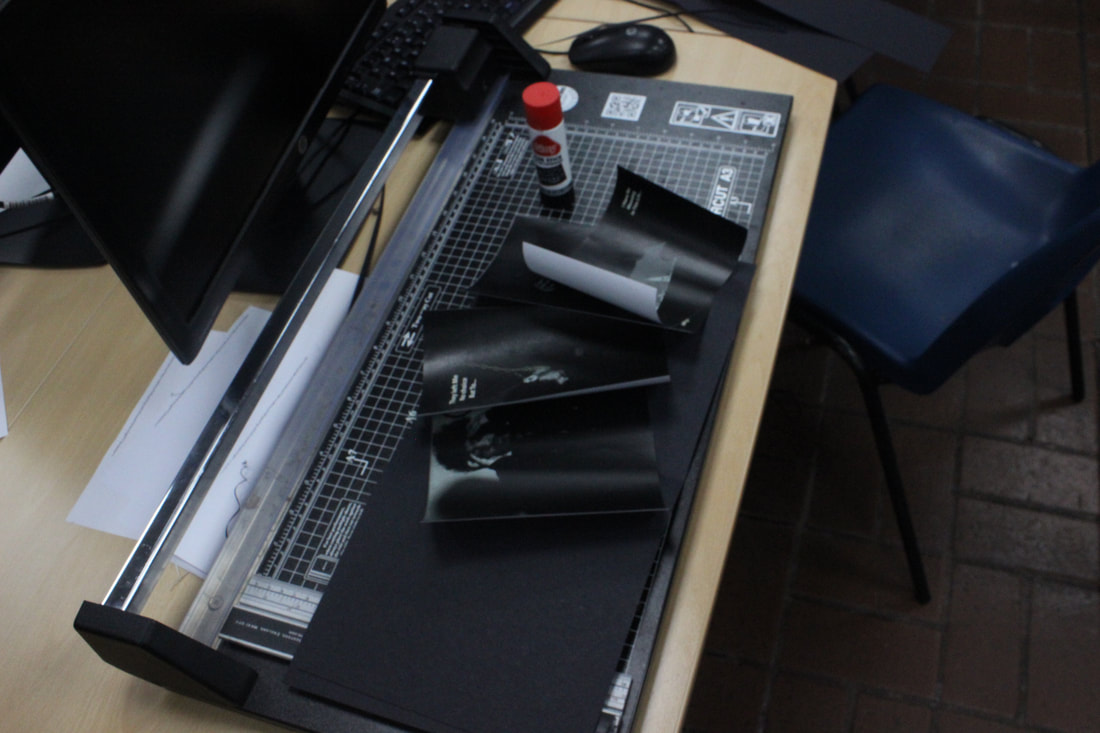
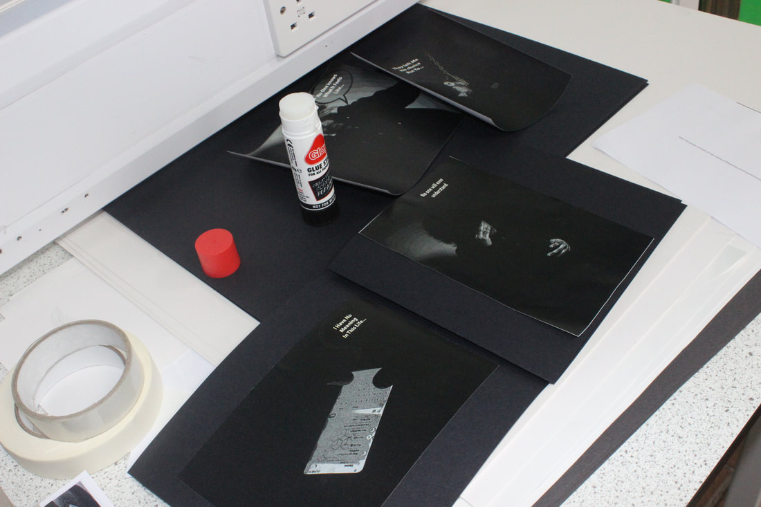
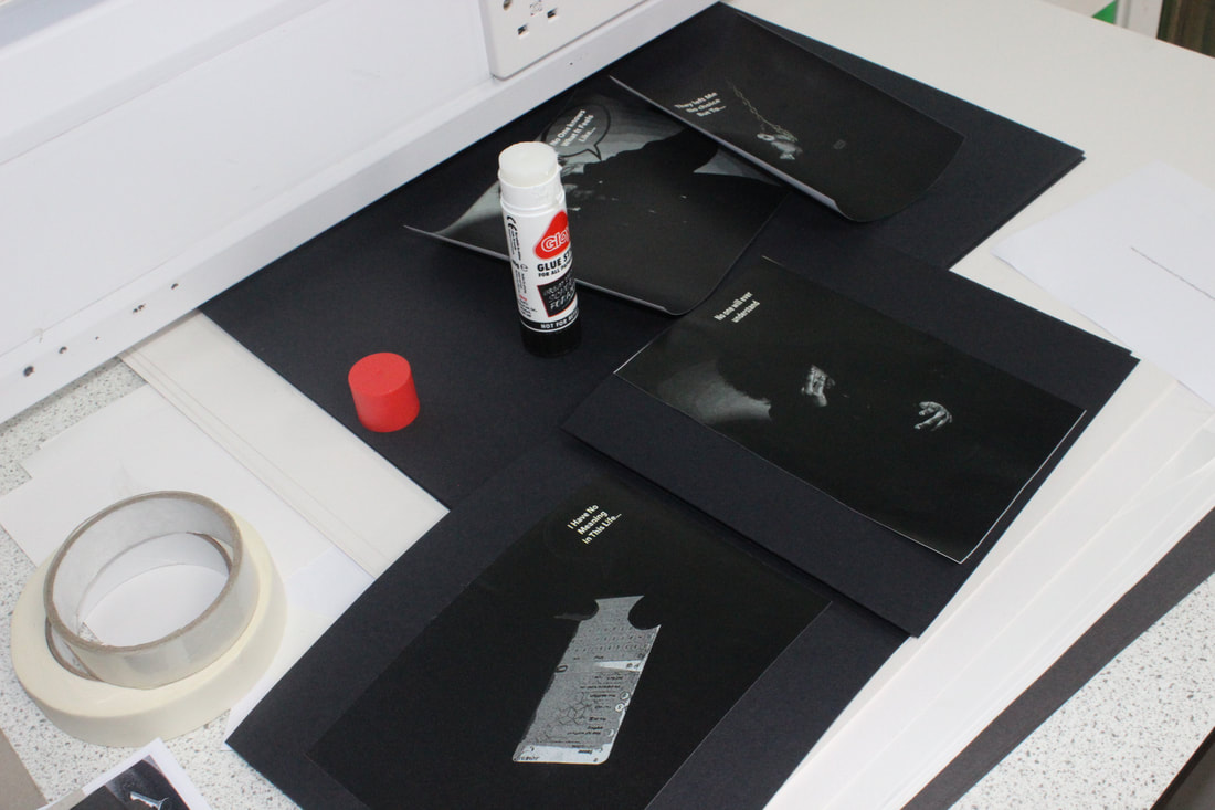
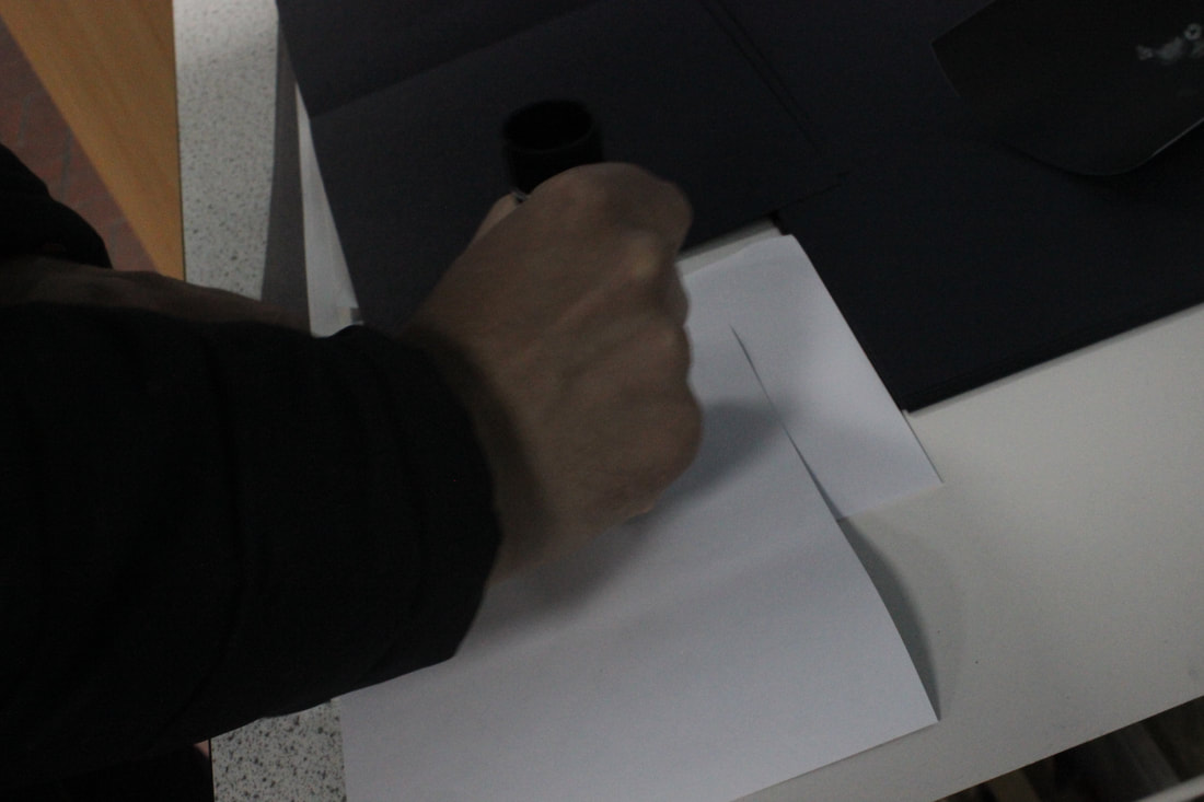
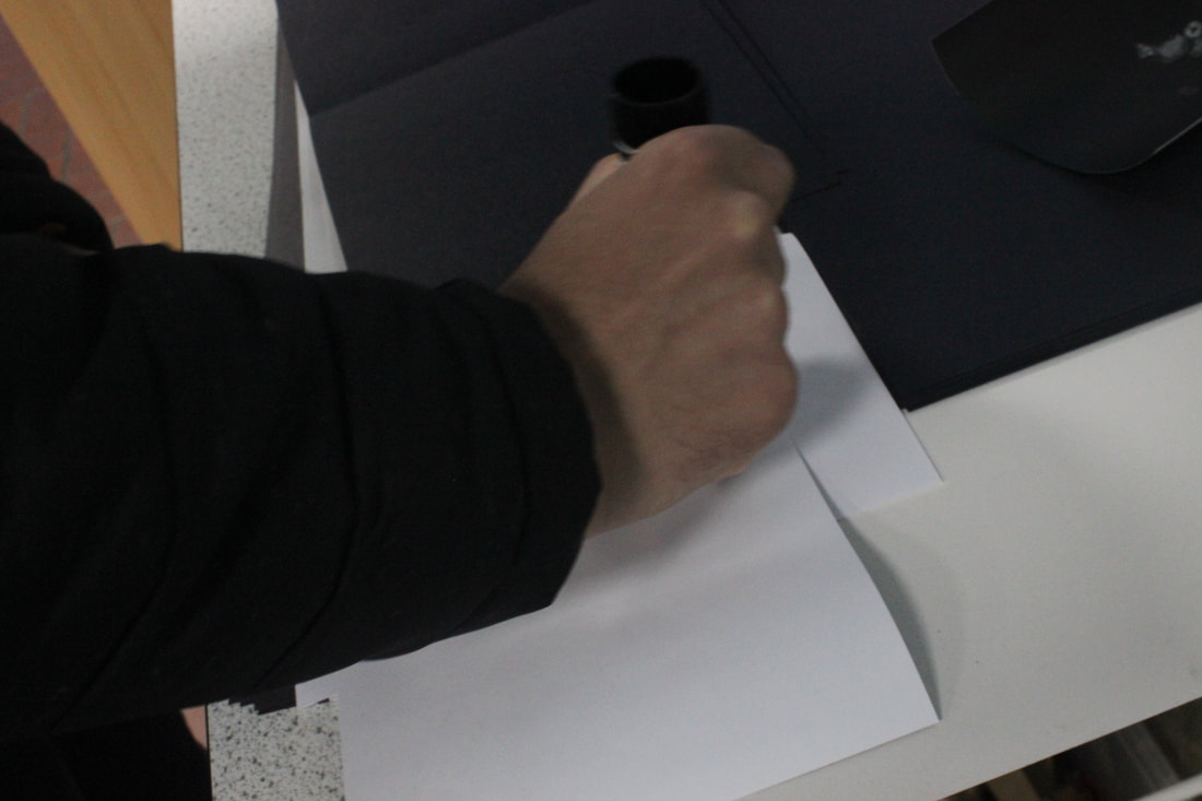
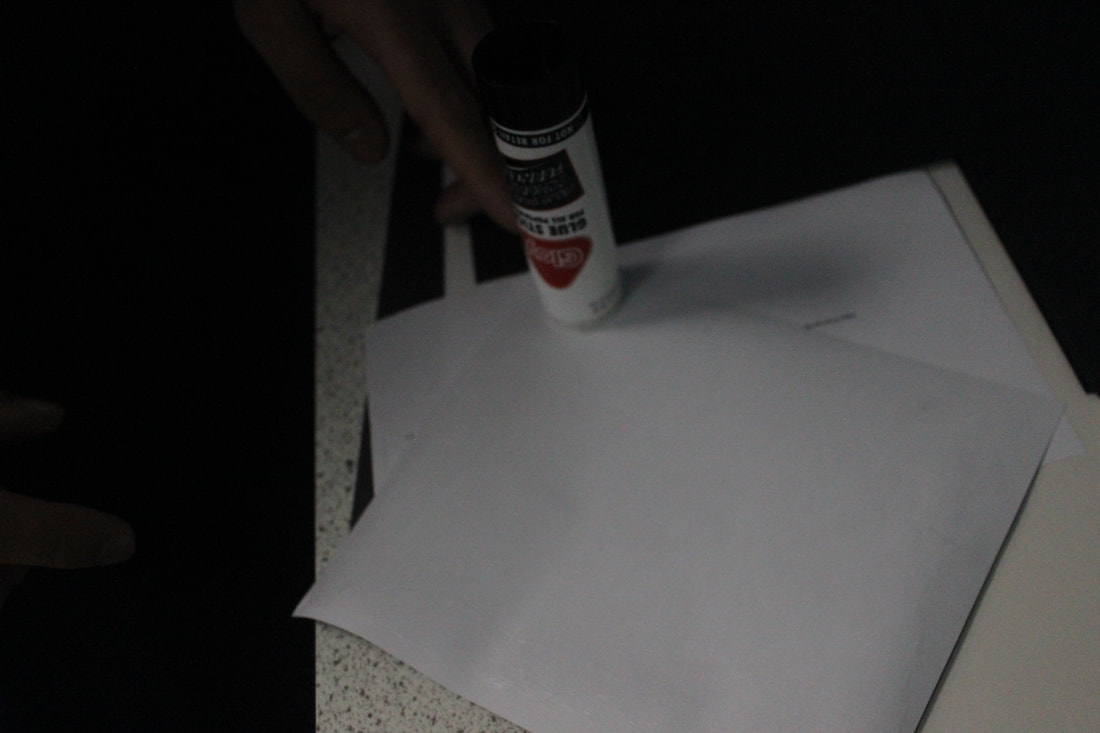
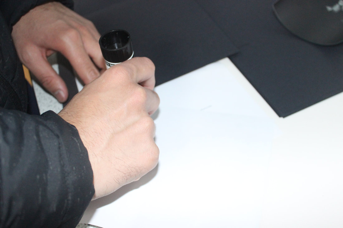
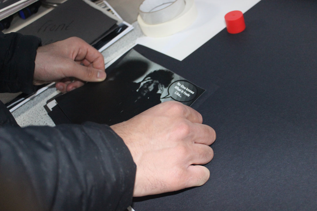
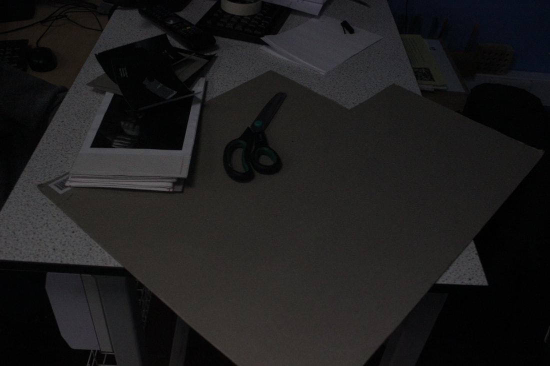
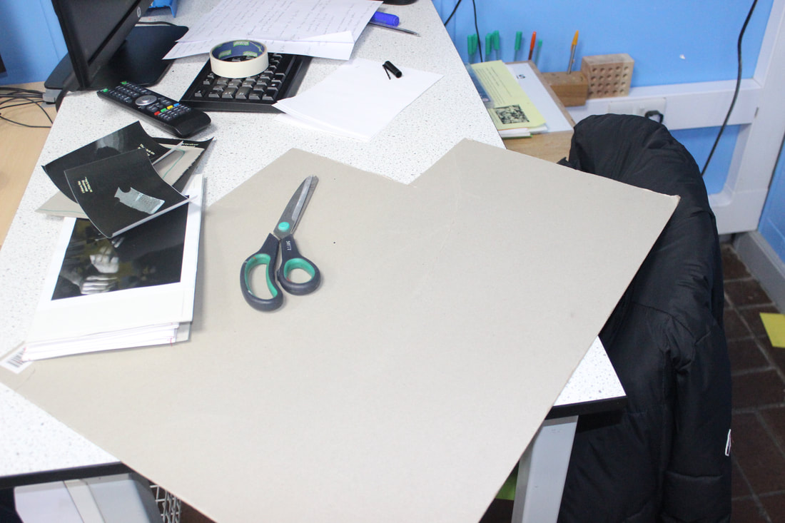
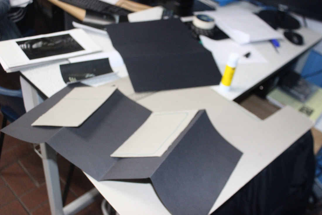
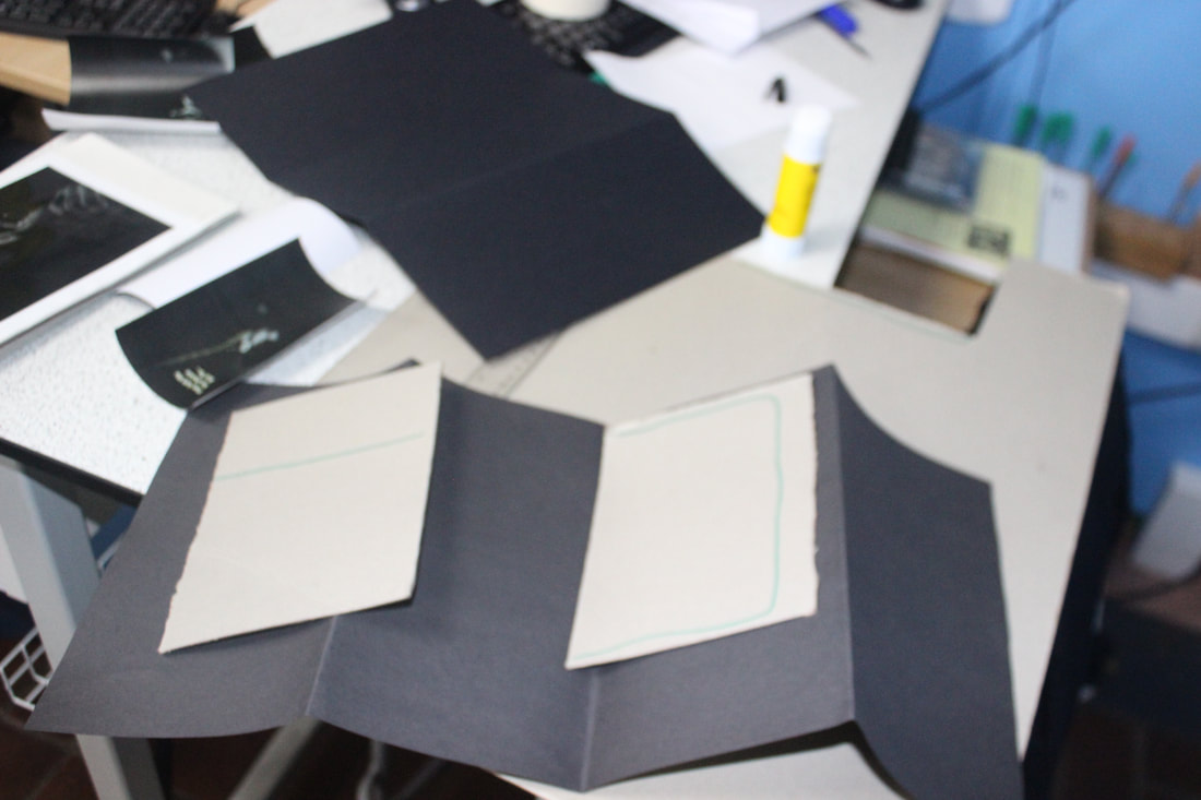
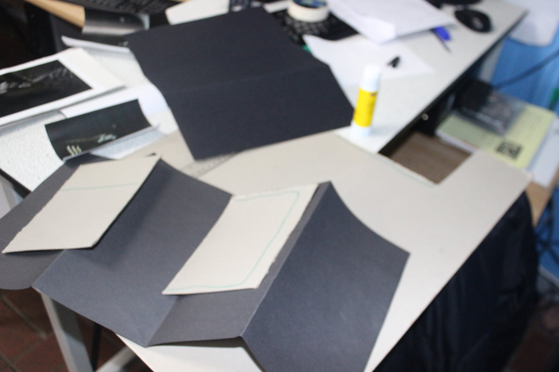
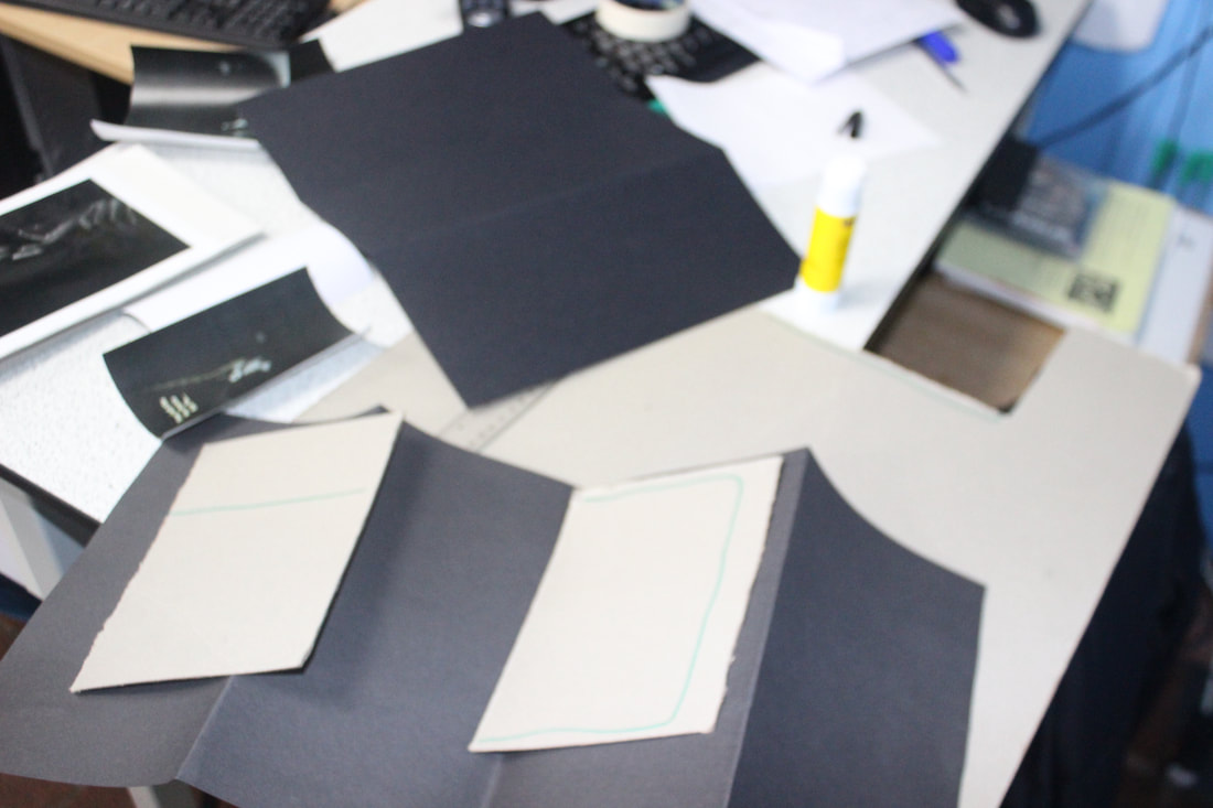
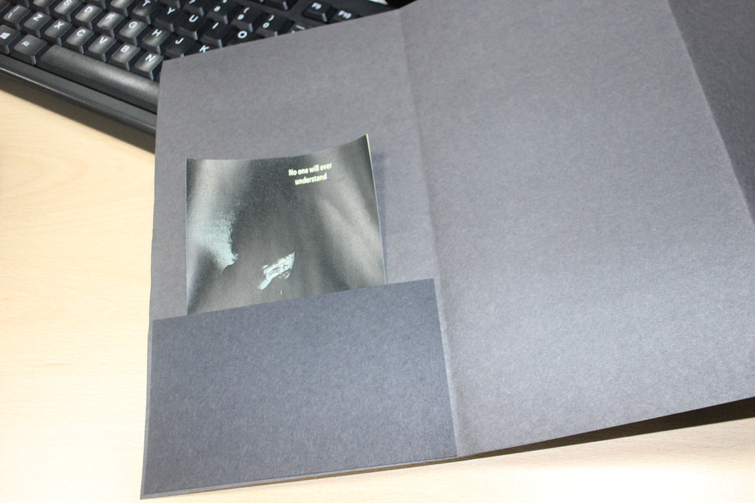
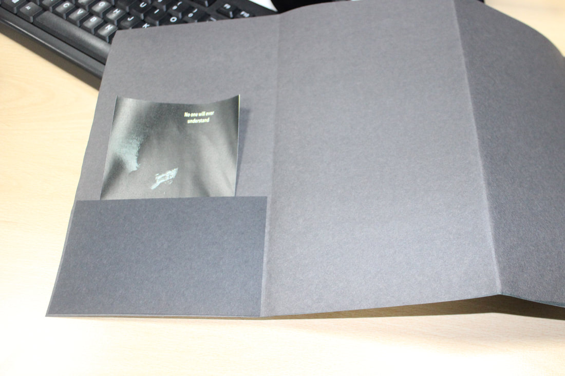
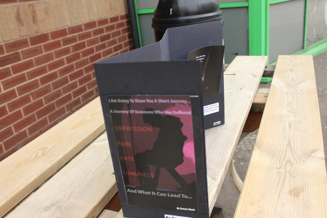
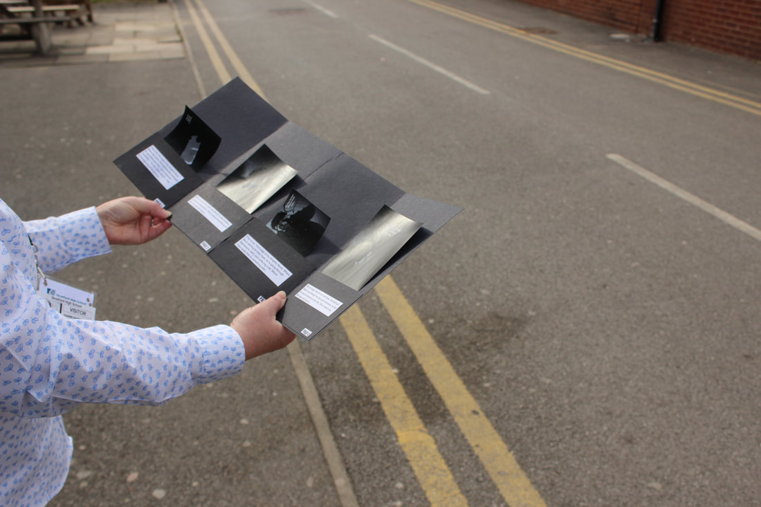
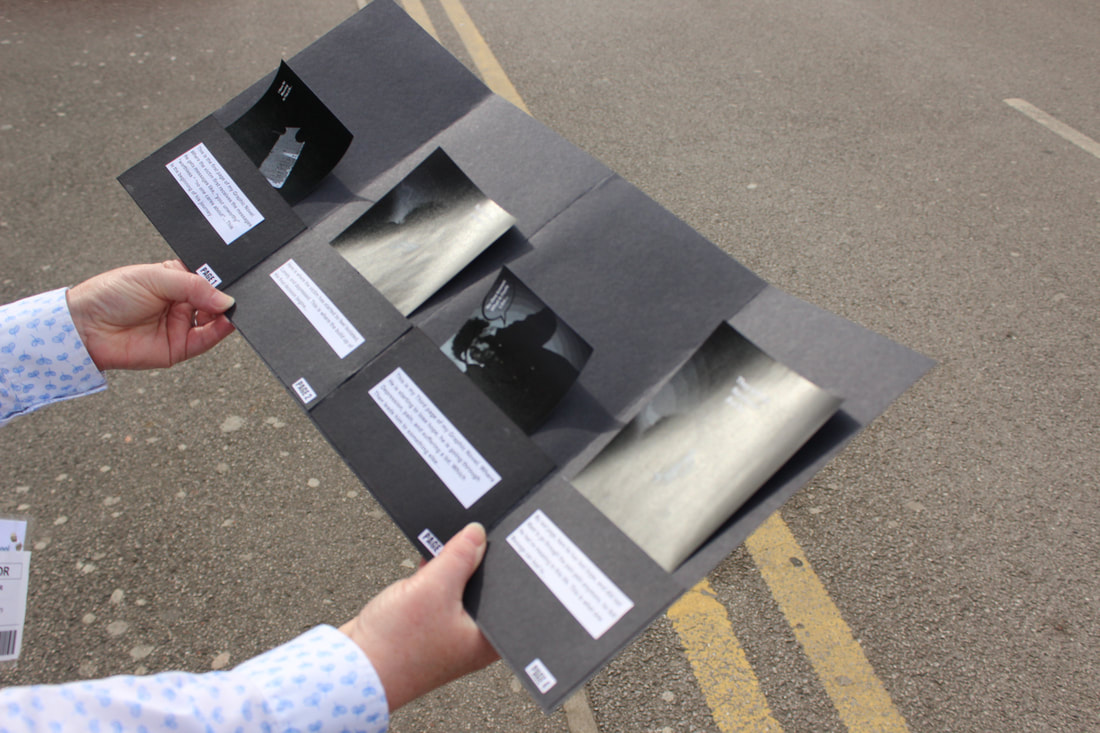
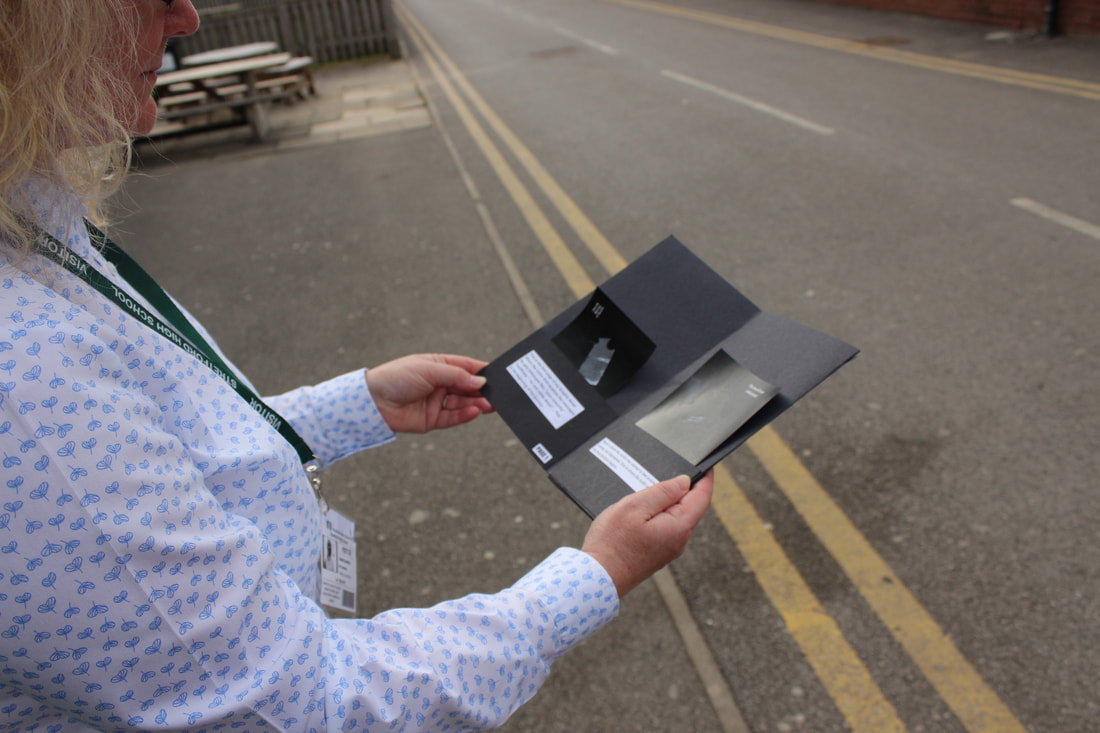
Here is the process of me making my actual book, and making the pages of where I am going to be putting my graphic novel. For this book I used a thick cardboard to create the strangeness of the pages and then stuck another black piece of card on top. For this book I specifically used black card because it matches the theme of depression quite well and also sets off a depressed, dull mood.
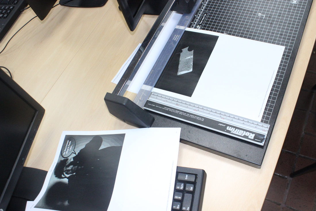
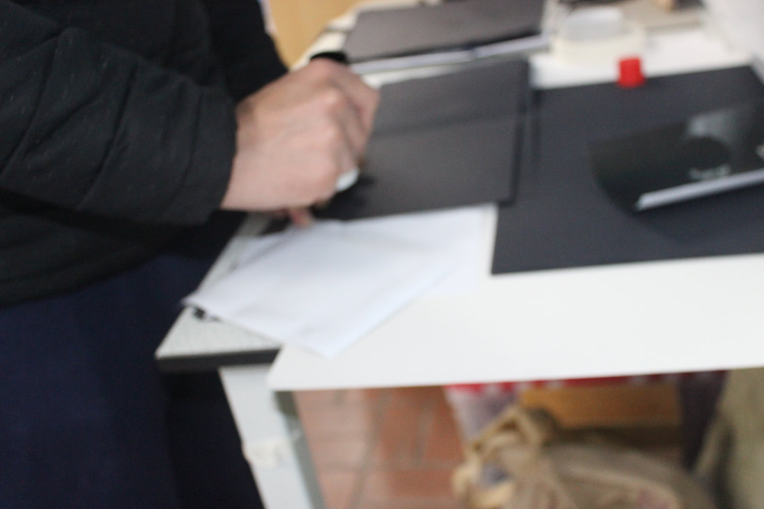
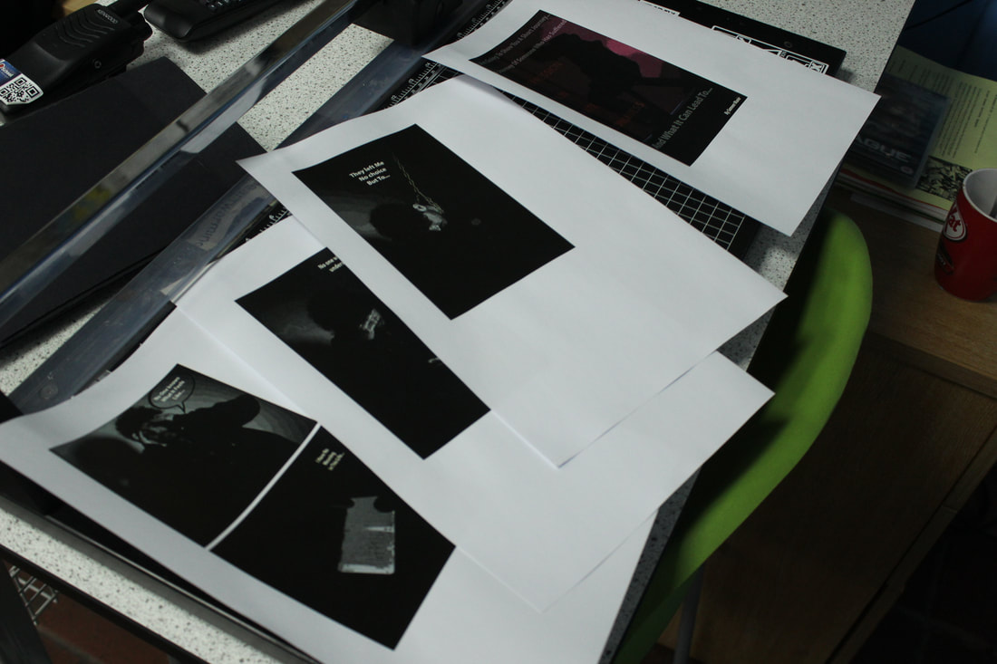
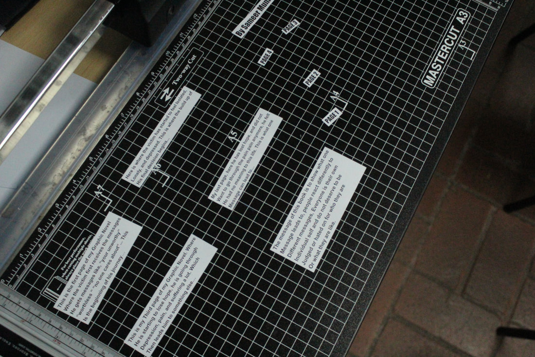
Here, I am in the process of writing text on each one of my page, I am going to print them out and stick it on. I have done this to explain what is happening in each page.
FINAL OUTCOME OF MY BOOK
|
|
This is my First Final outcome of my photography GCSE exam. I have finally created a book based around the theme of "messages", that I chose as my exam question. I want people to see this book, so it does make them think twice before sending out a message to someone that will make them feel lonely, depressed, and then lead them to end there life.
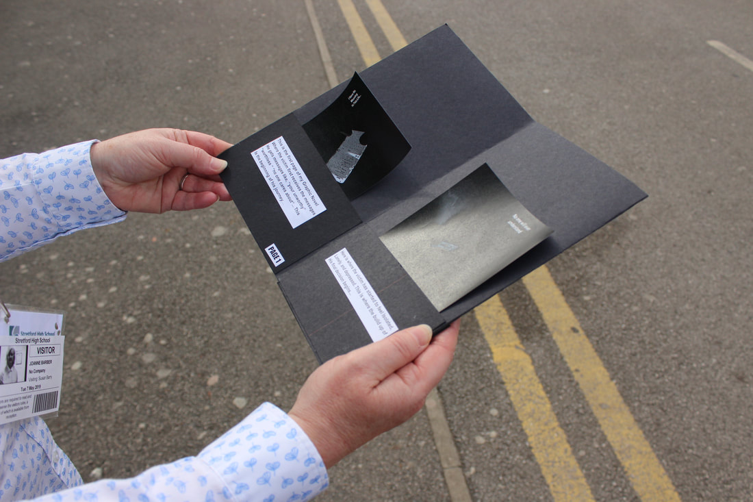
Book Being Used By Someone
|


|
Build Up On My Graphic Novel On PhotoShop
I am going to do 2 outcomes for my exam, the second outcome that I am planning on doing is making a graphic novel on Photoshop of all my images on one page. First of all I am going to experiment on Photoshop to see how I am going to overcome this.
First Idea Of My Online Graphic Novel
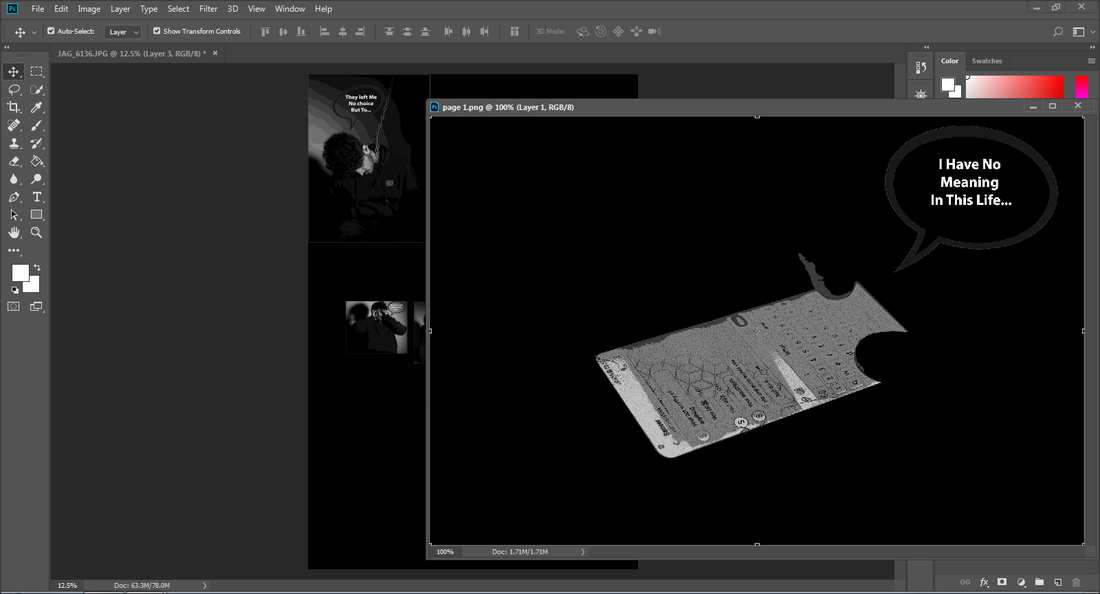
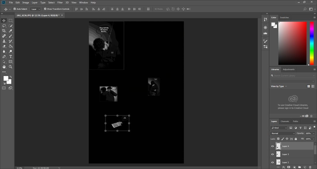
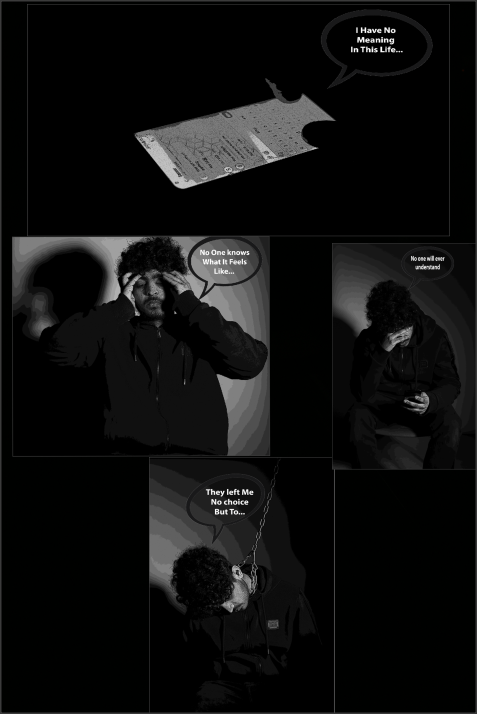
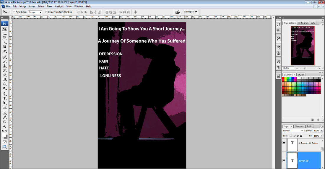
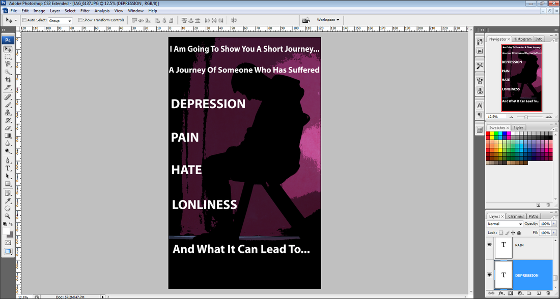
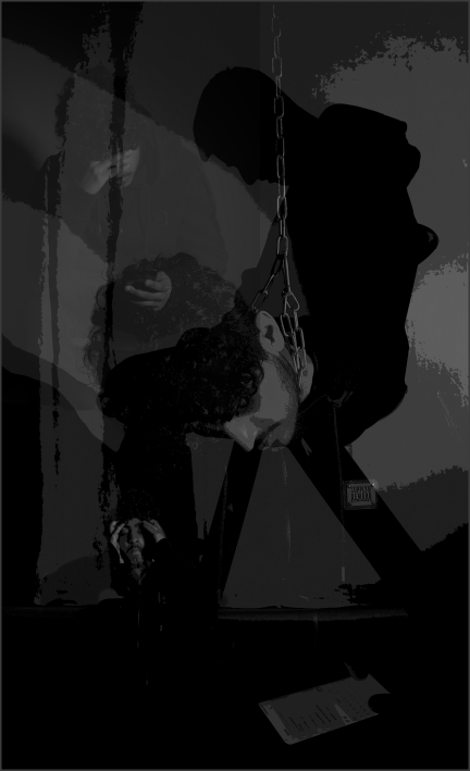
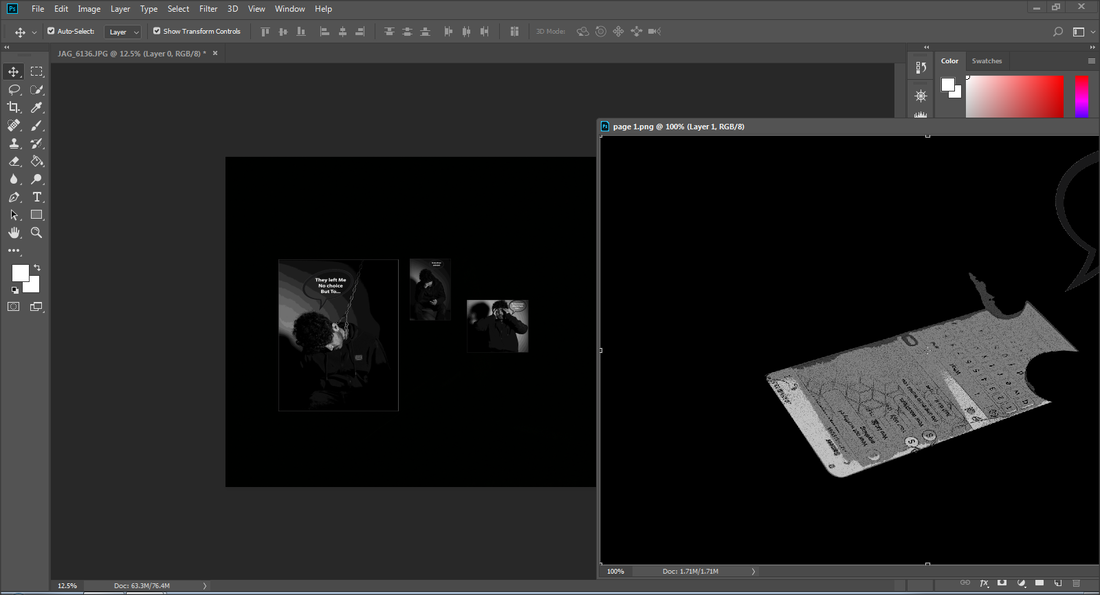
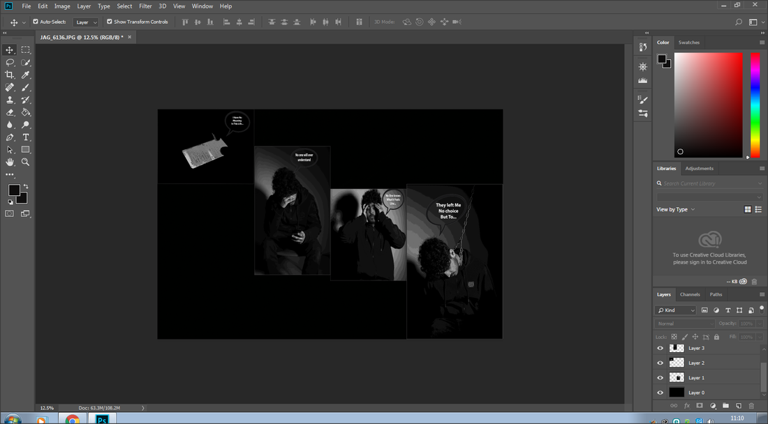
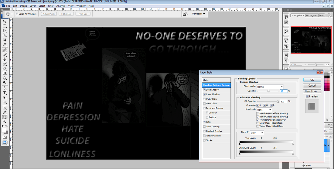
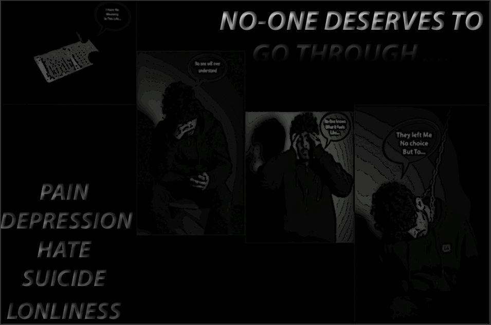
In this process of building my Graphic Novel online I am trying out different positions of my images to see which ways fit the best and which way is the most effective overall. I have started by doing 1 example of me trying out putting my images on a page to see what it will look like, and this is my outcome. To develop my graphic novel online I will be experimenting different positions of my novel.
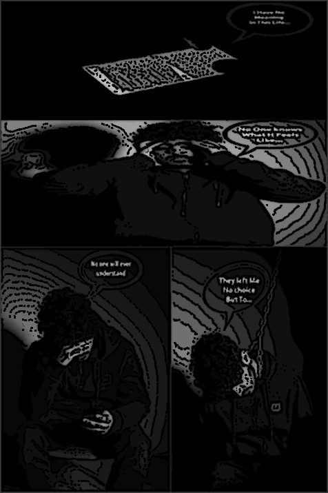
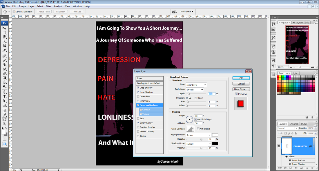
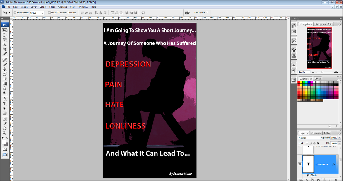
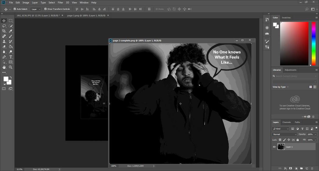
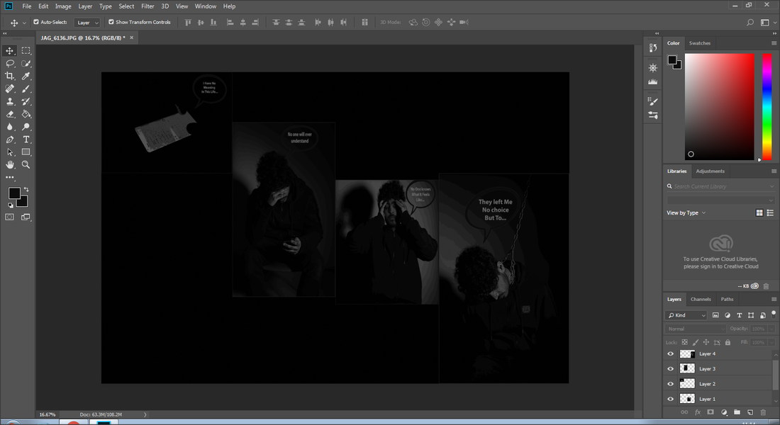
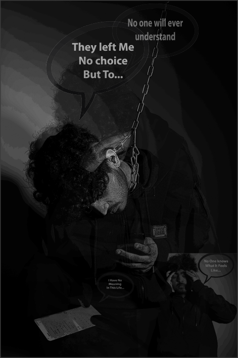
To develop my image I have added on a more graphic effect to make image more effective and look more like a graphic novel. I did this effect purposely because it does make the image quite unclear but clear enough to know the story line and what is happening in each image.
Development On My Novel
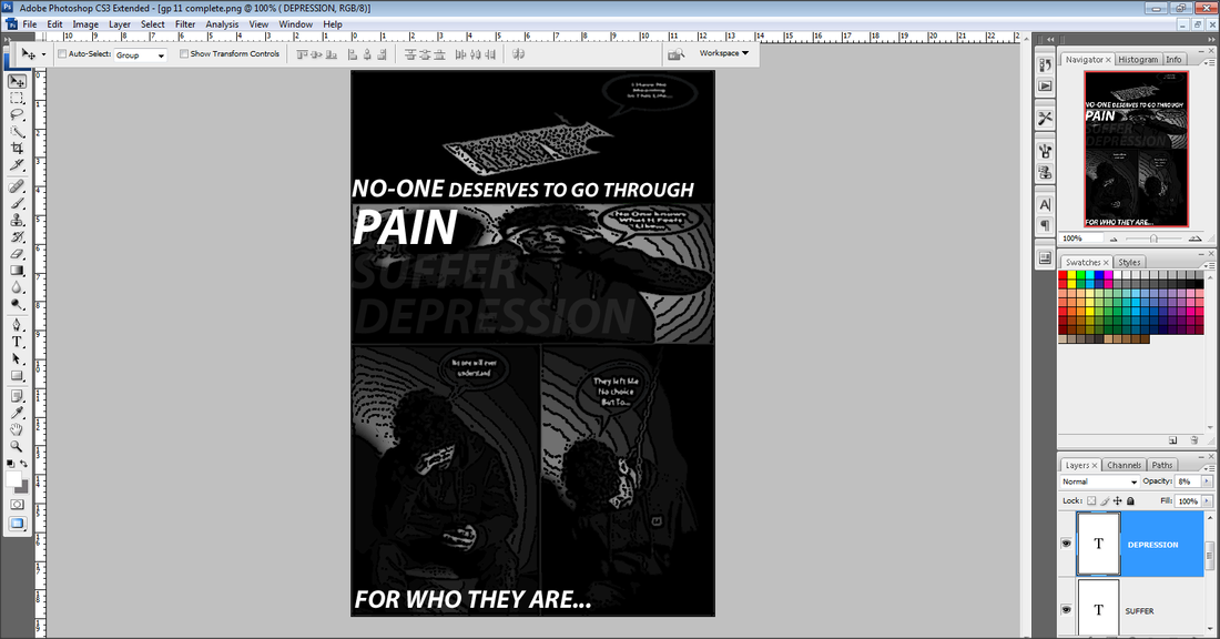
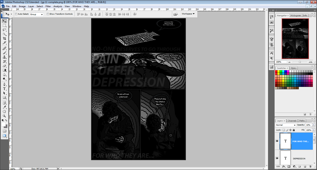
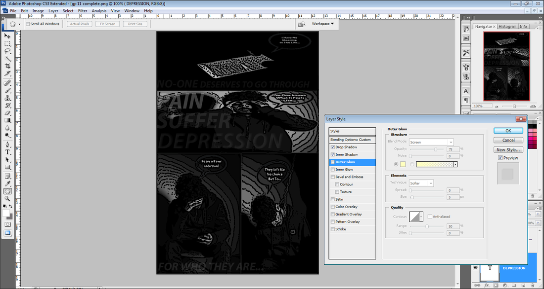
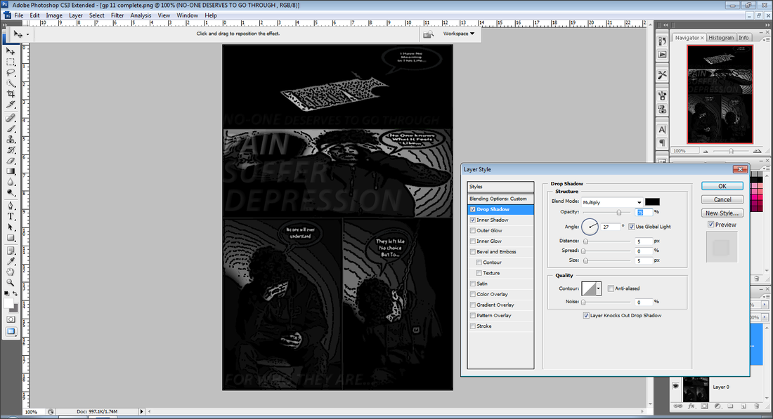

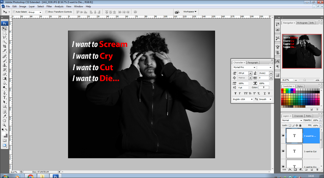
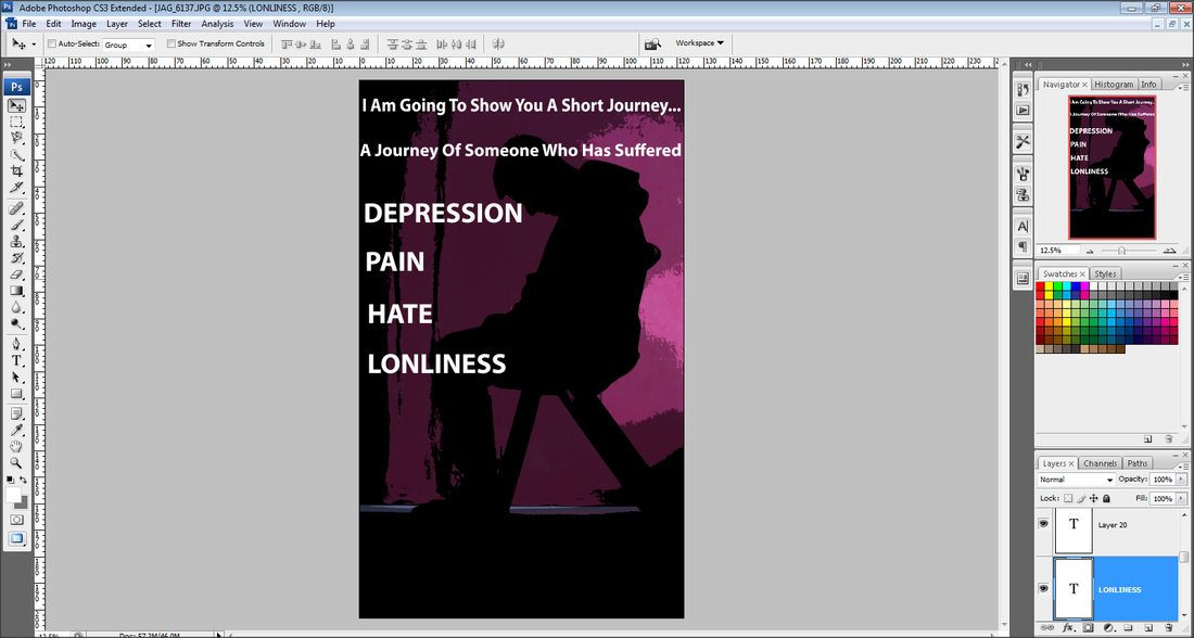
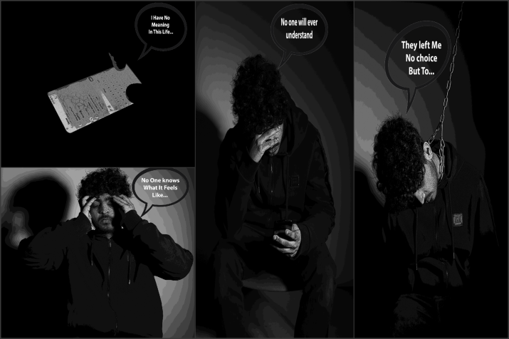
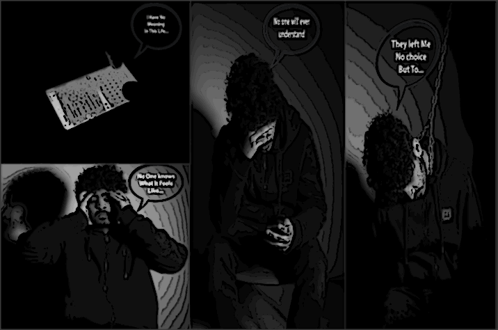
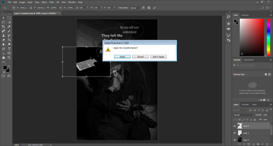
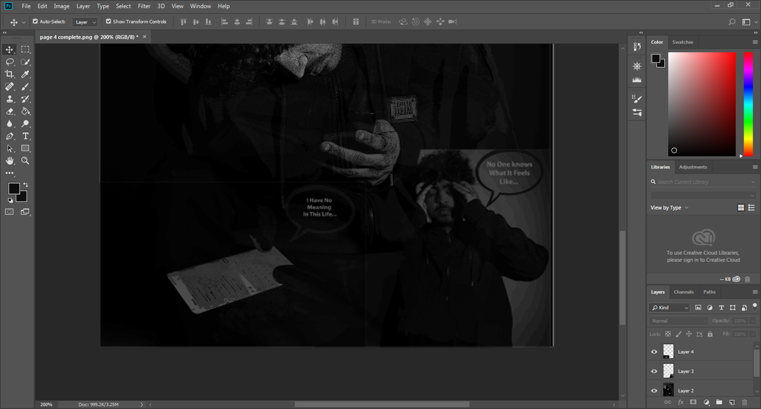
For the development of my Graphic Novel, I have added text on my image and have written a message onto it for the viewers as to show people its okay to be different and not to be the same, and no deserves to suffer or be in pain for who they are.
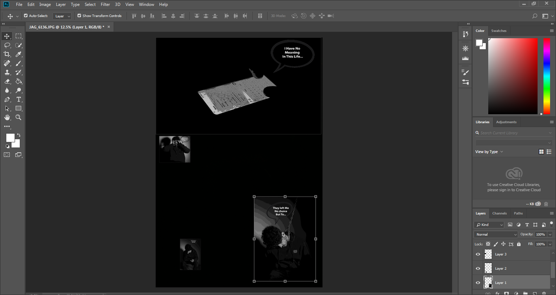
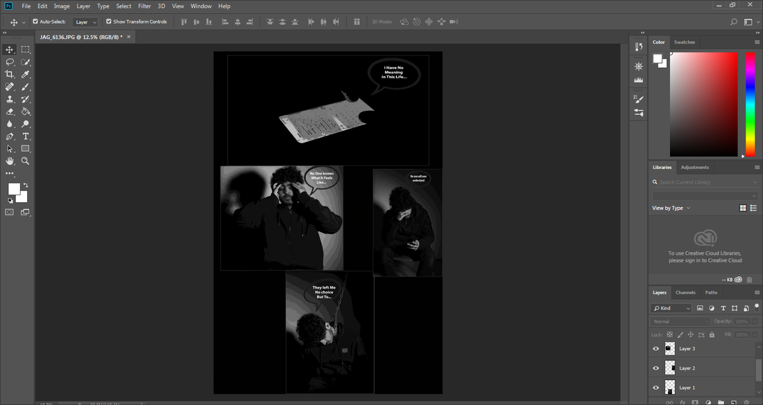
Second Idea Of My Online Graphic Novel

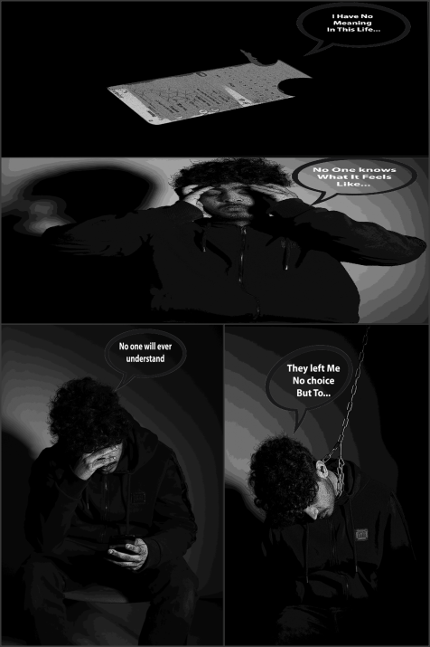
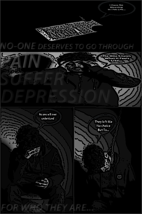
This is my second outcome I have made of my graphic novel, for this one I have rotated the image to make it look landscape as I am testing out different Ideas and positions for my Graphic novel.
Third Idea Of My Online Graphic Novel

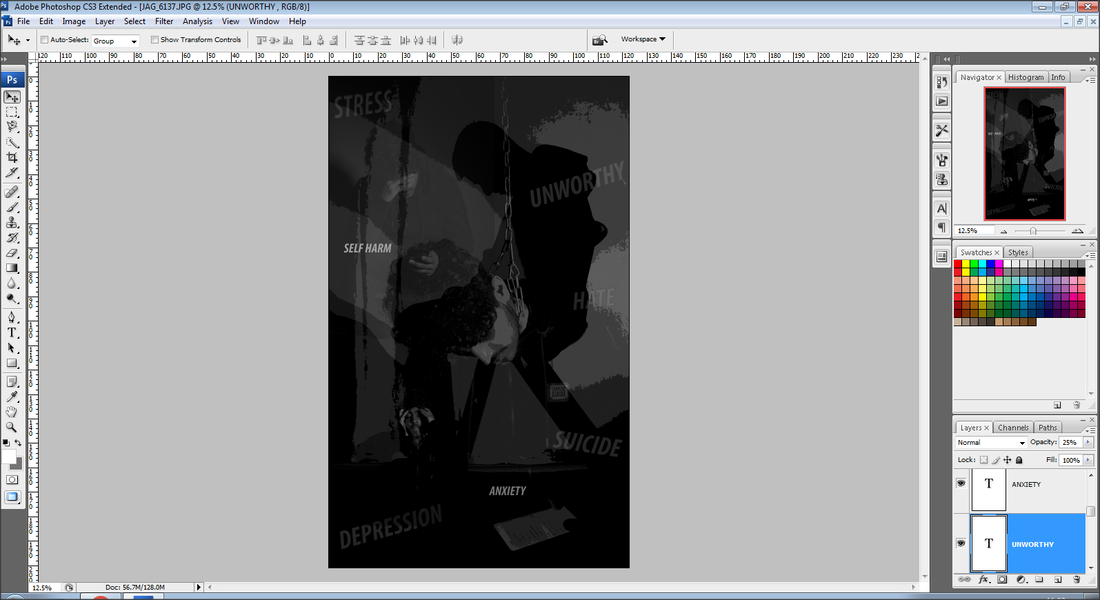
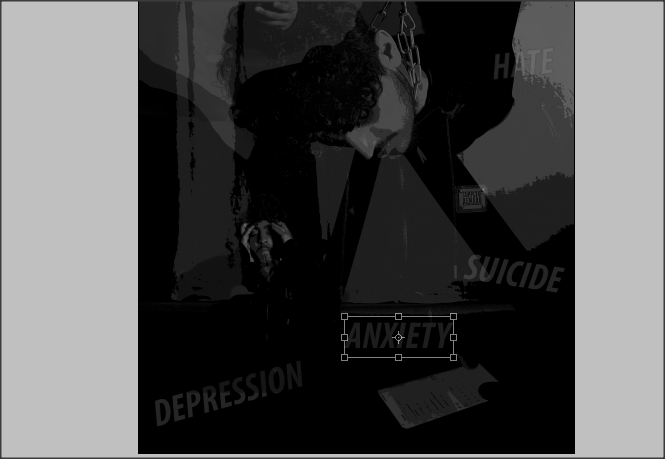
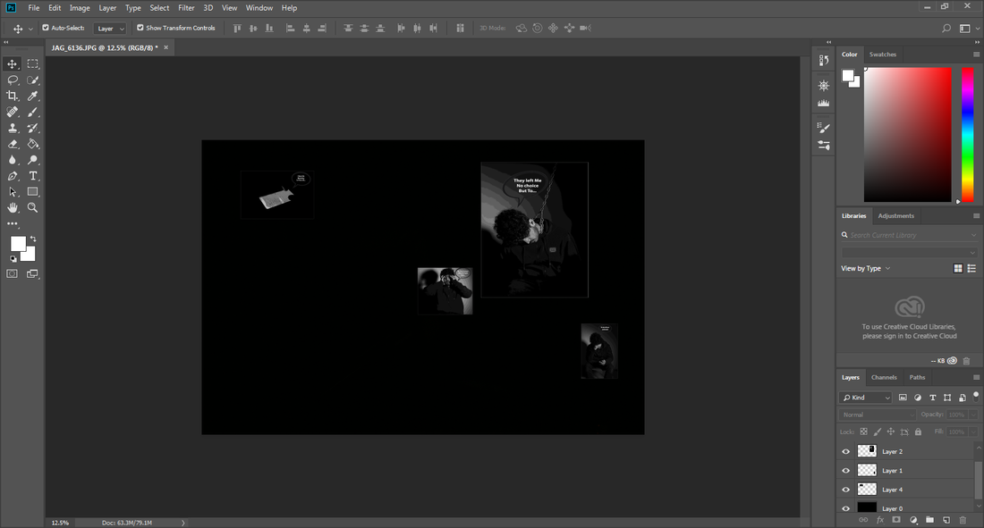
For My third Online Graphic novel, I have layered all my pages on top of each other and then slightly changed the opacity of the images so it slightly blends in with the other images, I have done it so it is clear to see what each image is showing.
Fourth Idea Of My Online Graphic Novel
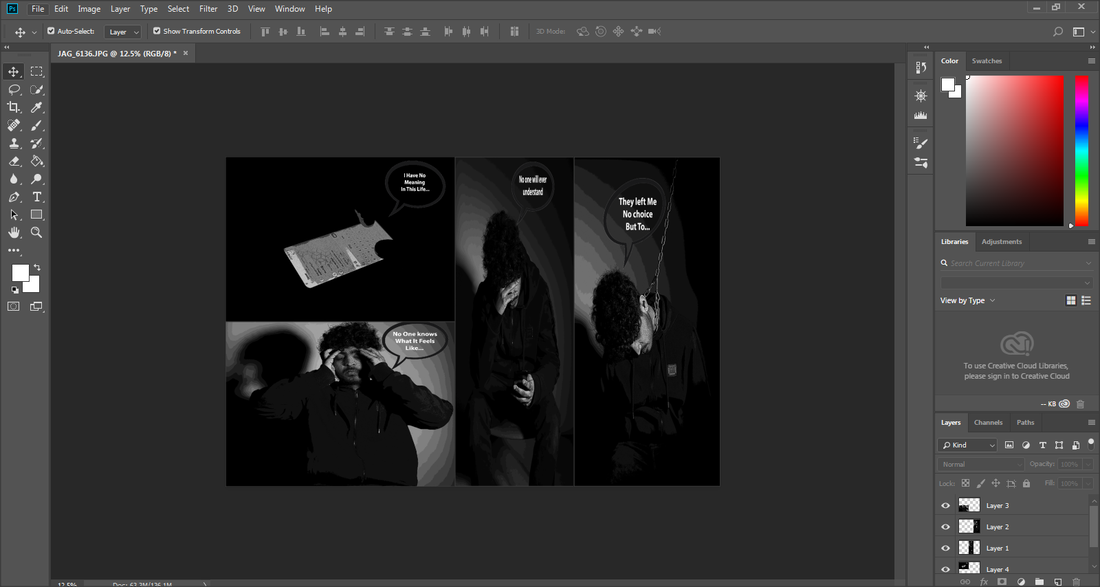
For my Third Online Novel, I decided to structure my images differently and do them diagonally, as I thought of writing a message in the left over space I had.
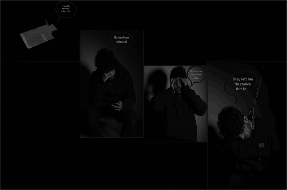
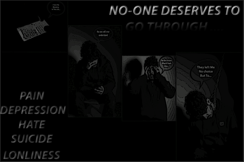
FINAL OUTCOMES OF MY ONLINE GRAPHIC NOVEL

EVALUATION
For the start of my project based around the theme 'messages', I started brainstorming ideas on coggle looking at different type of messages there is, after thinking hard about it I decided to base my theme around messages that make people feel depressed, lonely which can lead them to suicide, as I feel it is popular and big thing in this generation today.
For my exam I researched a variety of artists who are based around this specific theme, the two main artists that stood out to me the most was Barbara Kruger, and Edward Honaker. I specifically connected with Edward Honaker's work more, as I felt his images were stronger and had more of a personal and emotional meaning behind it. I explored his techniques and photo structure in depth to develop my understanding on the certain things I need to do to achieve the best possible images. While doing this I gained a large amount of inspiration and ideas. His images stood out to me because, I liked the composition of his images as they have been placed in a specific and effective way. Also the lighting really stood out to me, as there are shadows in the images which really drew my attention and stood out, most of his images are in black and white which reflects on the theme of depression, therefore this is why my exam shoot is in black and white as I feel it looks more effective and connects with the theme quite well.
After looking through Edwards work, I spent some time looking through Barbara Kruger's website, it did not really help me as much with my images, however her images helped me with one of my shoots, as majority of her images are closed up, I feel closed up images are more meaningful as they are focused on a specific action or object.
After doing an in depth research and thinking about it carefully, I finally decided on the type of images I am going to do for my exam. I also decided I am going to tell a meaningful, emotional and personal story of a journey of someone, someone who receives a negative message and then has an impact on his everyday life, and also want to demonstrate on what a message can lead to.
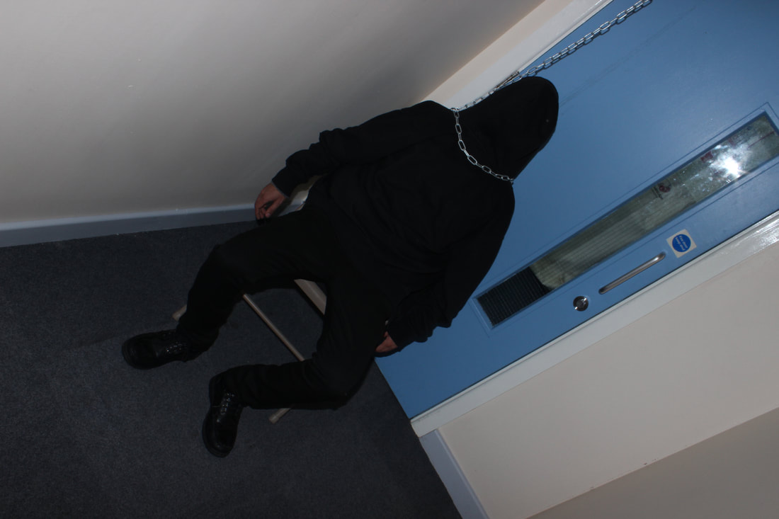
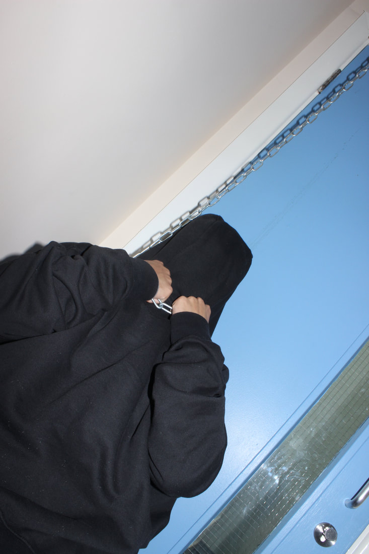
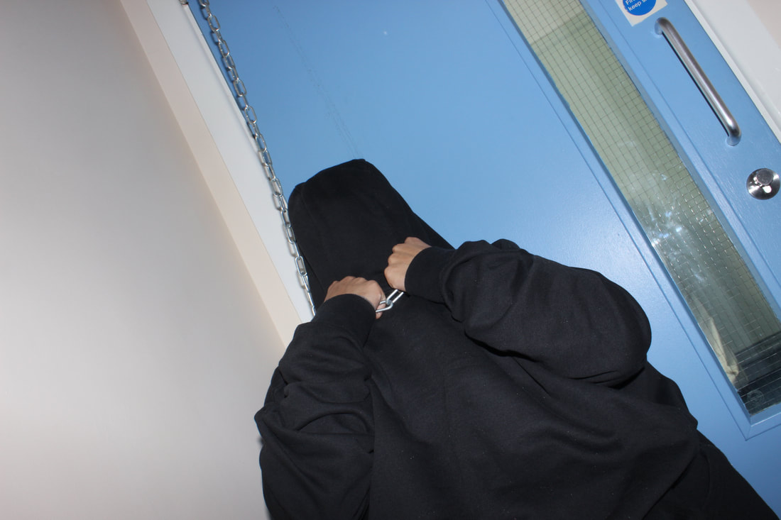
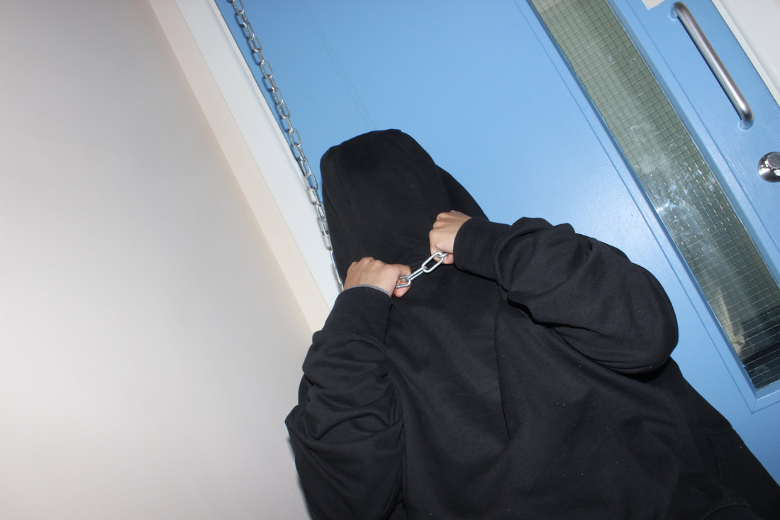
I then did some test shots on my peers to think how I am going to capture my images for the exam. For my test shot I borrowed a chain and brought in black clothes for my model, I then asked permission from some teachers for an available, dark room around the school. While doing these shots I used a digital canon camera. My test shot images did not come out as good as I wanted them to do however I felt this was a good chance for me to develop and think on what I need to do to make my images more better and effective. I then finally thought of more equipment I would need for my real exam images, such as a proper studio set, and plain black background.
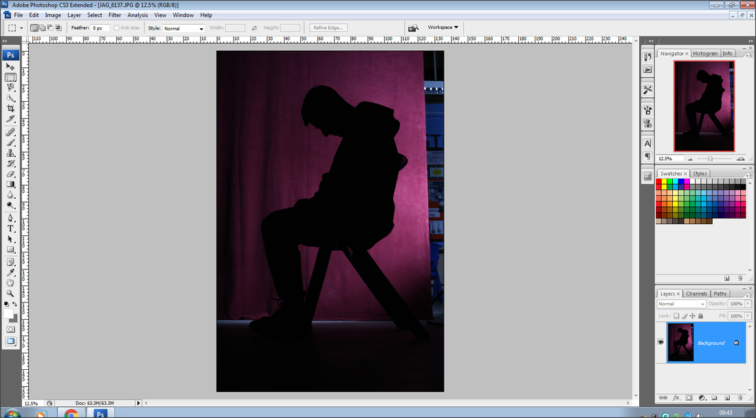
During the half term holidays a professional photographer named Justin came into our school to help and guide us for our final exam images. I found this a great opportunity for me to capture perfect images I would need for my exam as we had professional equipment and lighting. During the shoot I did have to experiment with several things, such as the lighting, the composition of the model, the equipment I need, the colour background that best suits the shoot, and also the camera settings, however I felt this was quite beneficial for me as I learnt new things that could help me. While doing this I managed to get all my images I needed for my exam which was good, as then I could begin to think about my final outcomes.
The final outcome I thought of doing was a Graphic Novel Book. I wanted to create a book out of my images. The type of book I wanted to make was a graphic novel. I then did some research on some ideas of different types of graphic novels and books I could use for my final outcome. After I thought of doing a book, however I found it wasn't something unique or eye catching. So I thought of doing a series of images telling a story about someone who has suffered depression, I did this on a piece of folded black card. Firstly I did some test books to get an idea of how I am going to do this and to know my mistakes, therefore improving on them for my real final outcome.
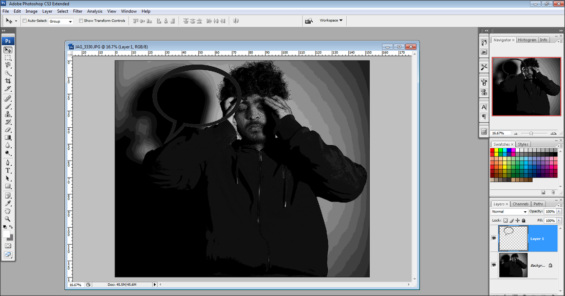
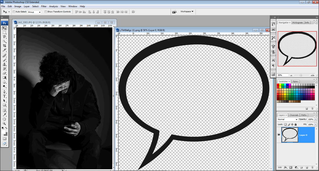
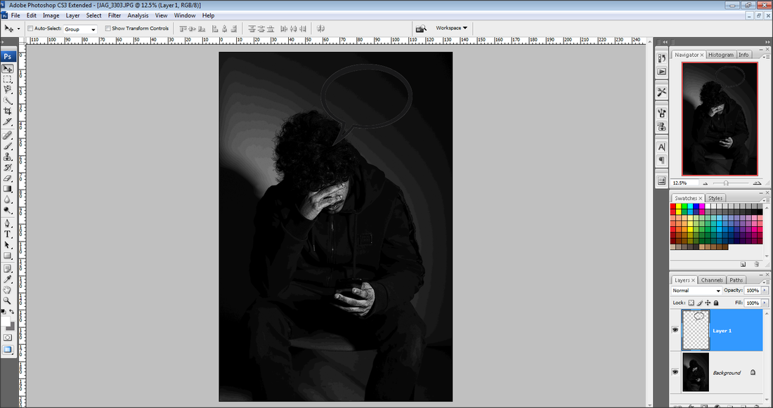
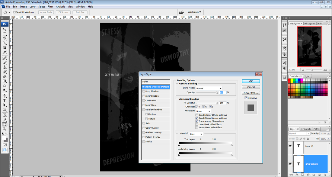
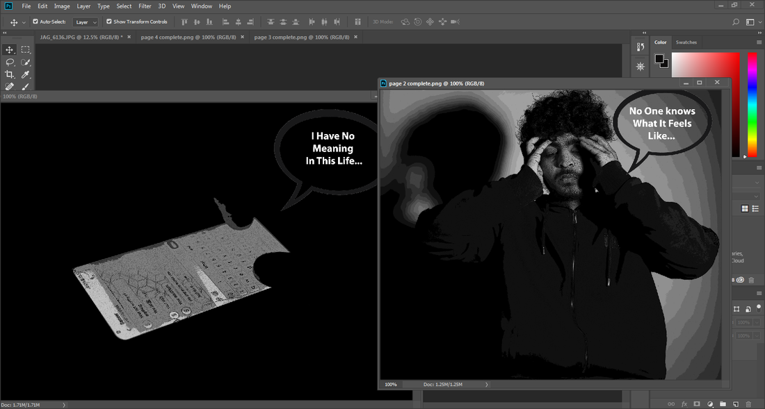
After finally deciding On the type of book I am going to do I started to experiment on Photoshop on building up my pages, I went through a variety of different effects and filters to see which best suits a graphic novel effect. After trying out different ones I felt that the effect called 'posters edge' looked the best and most effective. Secondly I decided to add some dialogue in a speech bubble to show how the person is feeling, I felt this would make my work go into a deeper level and more effective as it shows his emotions.
During the 10 hour photography exam, I produced a graphic novel book with my chosen edited images, with a short description on what each image is representing. Also to extend my Final Outcomes I decided to create a few Graphic Novels Online on Photoshop.
Throughout this project I feel I have learnt a large amount of new things and have gained more confidence while developing and thinking deeper when it comes to getting the best outcomes in anything. Also I am quite pleased and satisfied with how my work has come out, as I have planned it out quite well and have spent a lot of quality time and effort into building both my final outcomes, my book and my Online Graphic Novels.
For my exam I researched a variety of artists who are based around this specific theme, the two main artists that stood out to me the most was Barbara Kruger, and Edward Honaker. I specifically connected with Edward Honaker's work more, as I felt his images were stronger and had more of a personal and emotional meaning behind it. I explored his techniques and photo structure in depth to develop my understanding on the certain things I need to do to achieve the best possible images. While doing this I gained a large amount of inspiration and ideas. His images stood out to me because, I liked the composition of his images as they have been placed in a specific and effective way. Also the lighting really stood out to me, as there are shadows in the images which really drew my attention and stood out, most of his images are in black and white which reflects on the theme of depression, therefore this is why my exam shoot is in black and white as I feel it looks more effective and connects with the theme quite well.
After looking through Edwards work, I spent some time looking through Barbara Kruger's website, it did not really help me as much with my images, however her images helped me with one of my shoots, as majority of her images are closed up, I feel closed up images are more meaningful as they are focused on a specific action or object.
After doing an in depth research and thinking about it carefully, I finally decided on the type of images I am going to do for my exam. I also decided I am going to tell a meaningful, emotional and personal story of a journey of someone, someone who receives a negative message and then has an impact on his everyday life, and also want to demonstrate on what a message can lead to.
I then did some test shots on my peers to think how I am going to capture my images for the exam. For my test shot I borrowed a chain and brought in black clothes for my model, I then asked permission from some teachers for an available, dark room around the school. While doing these shots I used a digital canon camera. My test shot images did not come out as good as I wanted them to do however I felt this was a good chance for me to develop and think on what I need to do to make my images more better and effective. I then finally thought of more equipment I would need for my real exam images, such as a proper studio set, and plain black background.
During the half term holidays a professional photographer named Justin came into our school to help and guide us for our final exam images. I found this a great opportunity for me to capture perfect images I would need for my exam as we had professional equipment and lighting. During the shoot I did have to experiment with several things, such as the lighting, the composition of the model, the equipment I need, the colour background that best suits the shoot, and also the camera settings, however I felt this was quite beneficial for me as I learnt new things that could help me. While doing this I managed to get all my images I needed for my exam which was good, as then I could begin to think about my final outcomes.
The final outcome I thought of doing was a Graphic Novel Book. I wanted to create a book out of my images. The type of book I wanted to make was a graphic novel. I then did some research on some ideas of different types of graphic novels and books I could use for my final outcome. After I thought of doing a book, however I found it wasn't something unique or eye catching. So I thought of doing a series of images telling a story about someone who has suffered depression, I did this on a piece of folded black card. Firstly I did some test books to get an idea of how I am going to do this and to know my mistakes, therefore improving on them for my real final outcome.
After finally deciding On the type of book I am going to do I started to experiment on Photoshop on building up my pages, I went through a variety of different effects and filters to see which best suits a graphic novel effect. After trying out different ones I felt that the effect called 'posters edge' looked the best and most effective. Secondly I decided to add some dialogue in a speech bubble to show how the person is feeling, I felt this would make my work go into a deeper level and more effective as it shows his emotions.
During the 10 hour photography exam, I produced a graphic novel book with my chosen edited images, with a short description on what each image is representing. Also to extend my Final Outcomes I decided to create a few Graphic Novels Online on Photoshop.
Throughout this project I feel I have learnt a large amount of new things and have gained more confidence while developing and thinking deeper when it comes to getting the best outcomes in anything. Also I am quite pleased and satisfied with how my work has come out, as I have planned it out quite well and have spent a lot of quality time and effort into building both my final outcomes, my book and my Online Graphic Novels.
